Category Archives: Reviews

Review: Shade the Changing Girl #12

Shade the Changing Girl #12 Cover

The first year of Shade the Changing Girl concludes in multiple body swapping, life and death fashion as writer Cecil Castellucci makes all the story threads collide and artists Marley Zarcone, Ande Parks, and Kelly Fitzpatrick channel madness, love, and poetry in surreal psychedelic form. It’s the end of Honey Rich’s life, and the beginning of Loma Shade, Earth girl’s. The comic begins with a nod to Mulholland Drive and some satire of the Hollywood blockbuster system, but leaves Hollywood behind for human connection even if most of the characters are aliens.

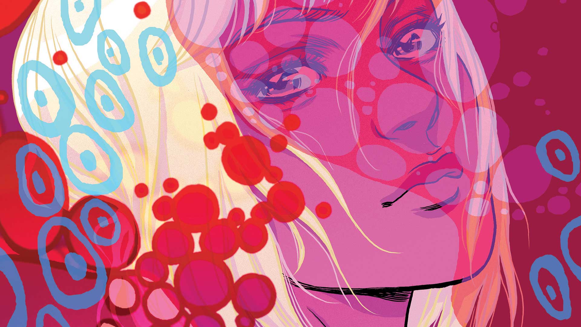
I cannot praise Kelly Fitzpatrick’s colors on backgrounds and the Madness circle things enough in Shade #12 throughout the series. There’s blue for when Shade (in Honey’s body) runs to reunite with Lepuck, and then an intense red when Lepuck realize that he’s talking to Honey in Shade’s body. Then, it turns a more subdued background when Lepuck remembers that Life with Honey was Shade’s favorite. The biggest highlight of Fitzpatrick’s work is the full page rainbow and pink splashes to mark Rac Shade’s triumphant return and shunning of his not-the-nicest boyfriend, Mellu.

MortalitySux

The return of Rac Shade marks the most experimental part of Shade #12 with Castellucci, Zarcone, Parks, and Fitzpatrick firing on all cylinders to craft a psychedelic delight. His words have filled the margin of numerous pages of Shade the Changing Girl, and his physical-ish presence in the Madness is pretty overwhelming. Castellucci and Zarcone show the non-linear nature of the Madness where “time means nothing” by having a double page spread where you spin a pencil to pick a scene to read. This double page spread does a decent job of distilling all the major relationships into one cohesive, color shifting, panel flipping unit. It’s an ability that only a true great soul, like Loma or Rac, can control, and Mellu ends up going all melting Nazi in the Raiders of the Lost Ark with his short lived powers.

It’s definitely more of a C-story, but I really latched onto the River, Teacup, and hippo friend, who is a Madness tracker, sub-plot throughout the second arc of Shade the Changing Girl. They are just smart, normal, yet outsider kids looking for Shade, who transformed a mean bully (Megan) into a quirky friend. I love River’s remarks about using the power of technology and the Internet (In his case, hacking his way to plane tickets, hotel, and a fake field trip to L.A.) to make a real life connection with Shade and bond with Teacup along the way. In the middle of a mind expanding, metaphysical story, Castellucci and Zarcone manage to capture the simple pleasure of meeting Internet friends in real life with a side of floating hippos, sort of chestbursters, and body swapping.

There is a real feeling of closure to Shade the Changing Girl #12, especially in Honey Rich’s death scene, which is richly philosophical (And Teacup quips about this part of it.) and down to Earth. Honey realizes that she would be pushing her boundaries to seek stardom in Shade’s body and finds a sweet release in mortality. Zarcone brings back the black and white Life with Honey Honey Rich as a final reminder that her sitcom touched the lives of people beyond the stars. Also, her death in the chrysalis shaped Madness vest gives Shade a new lease of life as a whole girl and not just an Avian messing around in Megan Boyer’s head.

Death and rebirth: it’s doesn’t get more beautiful and poetic than that. Shade the Changing Girl #12 explores these universal themes through the insights and character arcs crafted by Cecil Castellucci; the clean, yet bad dream-like art of Marley Zarcone and Ande Parks, and Kelly Fitzpatrick’s kaleidoscope rainbow color palette. It also sets up a newly whole Shade the Changing Girl for more adventures as a human girl.

Story: Cecil Castellucci Art: Marley Zarcone with Ande Parks
Colors: Kelly Fitzpatrick Backup Art: Katie Jones 
Story: 8.2 Art: 8.5 Overall: 8.4 Recommendation: Buy

DC Comics/Young Animal provided Graphic Policy with a FREE copy for review

Movie Review: IT

IT posterContent Warning / Trigger Warning: Sewer Clowns.

The new adaptation of Stephen King‘s It starring Bill Skarsgård as Pennywise the Clown is one of the best scary movies in a long time and even puts itself in the running for one of the best adaptations of King’s work. It’s scary. It’s funny. It’s nostalgic. But most of all, it keeps the focus where it should be — on the kids who call themselves “The Losers Club” — to deliver a poignant, touching story about growing up, loss, fear, and grief. And on top of that, it’s just a great scary movie.

But it’s not just a scary movie. Most surprising is just how funny it is at times. The Losers Club talk more like the kids from South Park (and therefore like your average 13 year old) and the humor helps cut the tension in important ways.

And yes, the film is scary. And not just in the easy-jump-scare-loud-noise scare we’ve become accustomed to. Since the monster feeds on fears, we see supremely disturbing and scary images brought to life. This is layered on top of super-creepy atmosphere that lurks under the idyllic charms of small town pastiche.

Director Andy Muschietti understands his craft and understands how to layer on the fright. Like any good magic trick, there’s the set up, suspense building, and the big reveal.

And the big reveal here is the film’s Pennywise the Clown. While they certainly show plenty of Pennywise in the film, they definitely take a less-is-more approach with him. Bill Skarsgård is fantastic. He’s taking as much of a page from Heath Ledger’s Joker (and Mark Hamill’s Joker) as he is from Tim Curry’s portrayal, and the results are creepy and intense.

The less-is-more approach with Pennywise means the focus ends up back where it belongs: the kids. And these kids are fantastic. Jaeden Lieberher (St. Vincent, Midnight Special) gets top billing as Bill, whose brother George is the first victim in the film. Finn Wolfhard (Stranger Things) is another familiar face who is no stranger to the nostalgia-laden horror story. But here he really gets to break loose as the kid with the dirtiest mouth and dirtiest mind, giving breath to the unfettered id that it is to be a 13 year old boy.

But the best performance among them is from Sophia Lillis, the lone female in the Losers Club. She is both independent and strong, while also vulnerable and scared. With her home life as much of a hellscape as anything involving evil sewer clowns, she brings an extra layer of emotion beyond anything any of the boys do.

Gone are so many of the affectations and deep worldbuilding of King’s original story– and it’s for the better. There is no jumping back and forth between times and adult and child versions of the main characters. There is no greater mysticism, giant turtles or spiders, or mumbo-jumbo. There is (thankfully) no child orgy. By jettisoning so much of this and focusing on a simple monster vs. kids story, we get the distilled essence of what makes King’s story work in the first place.

Purists will definitely have a problem with this adaptation, but one way to approach this is that the film seems more inspired by other great Stephen King adaptations, like Stand By Me, and other classic 80’s kid-centric adventure movies like The Goonies, Space Camp, Flight of the Navigator, D.A.R.Y.L., Big, War Games, Weird Science, The Neverending Story, or Explorers than by the original source material. But, fear not– the film leaves itself wide open for the inevitable sequel, ostensibly the story of the adult versions of our characters. . . which would be set today.

The movie makes possibly the smartest choice of all in making this a period piece set in the 80’s. Not only does that allow for maximum nostalgia, but it also keeps the story simple. Without things like cell phones, social media, helicopter parenting, etc, it makes it normal for kids to be outside riding their bikes, exploring sewers, and swimming in quarries. Yes, it even has a “cleaning up” montage with a jaunty soundtrack (in this case The Cure’s “Six Different Ways” — a deep cut from one of their best and most under-recognized albums). There are also dozens of Easter Eggs throughout the movie, from the movies on the marquee of the local theater to posters the kids have on their walls. It’s enough to make any 80’s or 90’s kid’s heart flutter.

And this is, again, where the film draws smartly from things like Stand By Me. The same sort of childhood nostalgia for the 1950’s audiences had in the 80’s (see also Back to the Future) is what many audiences feel now. So of course it makes sense to update this and set the film in the 80’s.

It is not a perfect film. It suffers from a few convenient plot holes and contrivances, but no worse than your average Marvel movie. And despite wearing its heart on its sleeve when confronting fears and grief, it doesn’t feel like we’re treading any really new ground here. That could be because we’re talking about the adaptation of a thirty year old novel. Or it could be that any film that comes out in 2017, especially of the horror genre, is going to have to stack up against the social commentary and innovation of Get Out. 

So it’s not the rebirth of cool– so what? It’s still an incredibly fun flick that will make you spill your popcorn bucket in fright and make you nostalgic for 1989 and that awesome, scary, fun time of being 13. You’ll float, too.

4 out of 5 stars

Review: Dastardly & Muttley #1

It’s a red-letter day for the good folk of Unliklistan as they start to power up their first atomic reactor. But after pushing the wrong button, the ultra-rare radioactive element, unstabilium, has been released into the atmosphere! Now it’s up to pilot Lt. Col. Richard “Dick” Atcherly and his navigator Captain Dudley “Mutt” Muller to save the day. Will they safely complete their mission? Or are things about to get a little…wacky?

Every so often you come across a comic you have to ask what the writers were on when coming up with it, Dastardly & Muttley #1 is definitely one of them as the classic Hanna Barbera cartoon characters are updated in a limited series set in the modern day. The Red Baron-esque background is updated and Dastardly is now a pilot investigating a nuclear explosion with his dog (don’t ask, it’s explained) and after a freak accident, well, it’s best to read the comic, but the cover gives the twist away.

It’s out there. Really out there. I feel I need to drop shrooms or smoke a bowl type of out there.

That’s not a bad thing at all as the comic, written by Garth Ennis, doesn’t take itself seriously at all and also doesn’t try to shoehorn in characters to a point it doesn’t work. There’s lots of winks and nods in the issue that had me smiling and it feels like a combination of Who Framed Roger Rabbit? and Top Gun with a little The Mask thrown in. That’s an odd combination but it works here.

The art by Mauricet is pretty solid and has a similar aesthetic to a lot of DC Comics’ other updated classic cartoon characters. While it doesn’t leap off the page and blow me away, Mauricet absolutely blends the grounded with the zany for a look that at times feels like a cartoon come to life. It’s a wacky story and the art brings that out when it needs to.

Where this is all going, I have absolutely no clue. But, the first issue is entertaining enough and has me looking forward to the next issue to see what’ll happen and what else Ennis can deliver when it comes to winks and nods.

Story: Garth Ennis Art: Mauricet
Story: 7.0 Art: 7.0 Overall: 7.0 Recommendation: Read

DC Comics provided Graphic Policy with a FREE copy for review

DC Weekly Graphic Novel Review: All-Star Batman Vol. 1: My Own Worst Enemy

It’s Wednesday which means new comic book day with new releases hitting shelves, both physical and digital, all across the world. We’ve got one more volume from DC Comics featuring Batman!

All-Star Batman Vol. 1: My Own Worst Enemy collects issues #1-5 by Scott Snyder, John Romita, Jr., and Declan Shalvey.

Find out what the trade has in store and whether you should grab yourself a copy. You can find it in hardcover at both comic and book stores now and in softcover in comic stores today and book stores September 12.

Get your copies now. To find a comic shop near you, visit http://www.comicshoplocator.com or call 1-888-comicbook or digitally and online with the links below.

All-Star Batman Vol. 1: My Own Worst Enemy
Amazon/Kindle/comiXology or TFAW


DC Comics provided Graphic Policy with FREE copies for review
This post contains affiliate links, which means that if you click on one of the product links and make a purchase, we’ll receive a percentage of the sale. Graphic Policy does purchase items from this site. Making purchases through these links helps support the site.

DC Weekly Graphic Novel Review: All Star Batman Vol. 2 Ends of the Earth

It’s Wednesday which means it’s new comic book day with new releases hitting shelves, both physical and digital, all across the world. This week we’ve got Batman!

All Star Batman Vol. 2 Ends of the Earth collects issues #6-9 by Scott Snyder, Tula Lotay, Giuseppe Camuncoli, Francesco Francavilla, Mark Morales, and Jock.

The trade is in comic stores today September 6 and book stores September 12.

Get your copy now. To find a comic shop near you, visit http://www.comicshoplocator.com or call 1-888-comicbook or digitally and online with the links below.

All Star Batman Vol. 2 Ends of the Earth
Amazon/Kindle/comiXology or TFW


DC Comics provided Graphic Policy with FREE copies for review
This post contains affiliate links, which means that if you click on one of the product links and make a purchase, we’ll receive a percentage of the sale. Graphic Policy does purchase items from this site. Making purchases through these links helps support the site.

Review: Harley Quinn #27

Frank Tieri kicks of this cute little one off issue in the Harley Quinn universe with “Master of Her Domain.” Harley Quinn #27 is a clever little issue that starts off with a roller derby bout (not a match as it’s described in the issue) and Harley is laying down the pain to her teams opponents. Putting that little faux pas aside (I’m sure it only irked me because I’m a derby gal) the issue is a younger in cheek fun spot pitting Coney Island protector Harley Quinn against Penguin in a battle to protect her hood.

Without giving away a fun little twist at the end that had me missing Palmiotti and Connor hella hard and ready to tear Tieri a new one, this issue was a tongue in cheek place holder that was on point. The issue ends with a nice little wink and nod to the current Harley fan base by having the character do the one thing that we never want her to do and then calling it out on her own. Well played Tieri and company, well played.

Eleonora Carlini provides some stellar art work. It’s fun and pretty to look at. Except for Penguin looking like a creepy marionette (which is solely a me issue, puppets give me the willies) I loved it. Even the after issue scenes in black and white were stunning.

Overall I loved this issue especially the “take a joke” ending. Tieri knows the fan base and he’s in on what we love about the P & C Harley and he plays with us. Kudos to Tieri and thanks for giving one of fave writing teams a break for a bit and Harley sitting like a boss.

Story: Frank Tieri Art: Eleonora Carlini
Story: 9.4 Art: 9.3 Overall: 9.3 Recommendation: Buy

DC Comics provided Graphic Policy with a FREE copy for review

Review: Iceman #5

“Oh no, love. You’re not alone. No matter what or who you’ve been… Give me your hands!”- “Rock ‘N’ Roll Suicide” by David Bowie

In Iceman #5, Bobby finally comes out as gay to his parents, and they don’t accept him unconditionally. It’s an issue that really hit home for me personally and is easily Sina Grace’s best writing on the series. The scenes where the Drakes ask their son insensitive, probing questions about his sexuality are more painful than any blow from the unstoppable, time displaced from the 1960s Juggernaut, who is this issue’s villain of the week. Artist Alessandro Vitti and colorist Rachelle Rosenberg draw a mano a mano battle between Iceman and Juggernaut that is juxtaposed with his coming out letter. These scenes show the cathartic nature of superhero comics for queer people, and their ability to make me escape from my issues with a tale of derring-do and overcoming seemingly unbeatable odds.

In previous issues,  I feel like Grace portrayed Bobby’s parents more sympathetically, but their insensitive, bigoted words towards him in Iceman #5 show why he didn’t come out to him earlier and wanted to do it via letter where he could filter and write out his thoughts in a more organized manner. Vitti draws them with big wrinkles and glaring, ugly expressions as they treat Bobby’s sexuality as hypothetical and even ask him questions about sex life. His mom even uses “mutie” and “queer” as slurs and blames his dad’s side of the family for passing these “genes” to him. Instead of accepting, she constantly talks about how he’s a disappointment, and Mr. Drake won’t even recognize him as their son anymore. Grace and Vitti defuse the tension a little bit with some Idie and Quentin Quire antics, but they get blocked off from the narrative by a literal wall of ice given a glistening sheen by Rosenberg. And Kitty Pryde shows she’s an amazing friend by giving Bobby the opportunity to cut loose against Juggernaut (He probably should have backup though.)

IcemanAngry

And after taking non-stop verbal body blows from his parents, a solo fight against Juggernaut is what Bobby (and the plot of Iceman #5) needs. When the battle begins, Vitti draws a craggier Iceman (Because he’s angry.), and Rosenberg emphasizes the red on his uniform shirt. The battle itself is a blockbuster one and extremely creative as Bobby doesn’t have to hold back against the Juggernaut, whose only motivation is to wreck stuff and kill the X-Men blue team, who brought him to present times from the 1960s.

The dad jokes are gone, and Vitti and Rosenberg replace with double page, shoujo manga-esque spreads of Bobby freezing the speed of light to hit the Juggernaut and then using his ability to change into a vapor to escape his clutches and finally put the kibosh on him. After these pages and a beautiful transformation, the fact that Iceman is an omega level mutant is at the forefront of his character and not just a trivia fact. As he mentions to his dad at the end of the issue, being honest about who he loves has helped him use his mutant powers more effectively. This is definitely true because Bobby does a lot of cool things this issue like impaling Juggernaut on an icicle and sending his ice golems to save civilians while he focuses on keeping Juggy occupied. Water is all around us, and in Bobby’s capable hands, it can be a powerful weapon. Vitti and Rosenberg get really creative with his powers in this issue, especially when he is about to beat the Juggernaut.

The bittersweet ending to Iceman #5 where Bobby and his dad have a polite chat about his letter, say they love each other, and reconcile in the snow rings true to my own experience as a queer man. My parents don’t approve of my sexuality, but they actually do still care about me, and we have a pretty good relationship. Personally, this makes me hurt a lot deeper than a simple Westboro Baptist Church type of hate because it’s infused with love.

Iceman #5 works as a comic because Sina Grace, Alessandro Vitti, and  holds a mirror to mine and other queer men’s experiences using mutant powers and superhero battles as big visual metaphors of both triumph and empowerment when Iceman defeats Juggernaut all by his lonesome and the feeling of being an outsider with his vapor abilities.

Iceman #5 is a powerful, cathartic end to the first arc of the comic and showed me that I’m not alone…

Story: Sina Grace Art: Alessandro Vitti Colors: Rachelle Rosenberg
Story: 9.5 Art: 7.5 Overall: 8.5 Recommendation: Buy

Marvel Comics provided Graphic Policy with a FREE copy for review

Review: Astonishing X-Men #3

untitledThe X-Men continue their fight against the Shadow King! But when Old Man Logan loses himself in the Astral Plane and Shadow King’s illusions, will he ever find his way back to his teammates? And what other horrors await our team?

After the events of Astonishing X-Men #2 (minor spoiler) with the team now on the astral plane, and being separated into two pairs and 1 solo, I knew the next few issues would be focusing on the split up characters and their path to confronting the Shadow King. Charles Soule starts us of with Old Man Logan and his journey through the astral plane. It’s an alright journey, telling the reader a bit about Logan’s past and what drives him, along with how he’s able to walk so easily through the astral plane and shake off the Shadow King like he’s nothing. Nothing terribly exciting, but not a bad read either. The flashes back to the real world and how the remaining X-Men are dealing with the authorities is getting a little dry, pretty much just a chance to reiterate why this is all going down. One thing it did manage to do was to get me missing the old Warren Worhthington III; I’m not a huge fan of this pacifist, peace loving character as it’s laid on a little thick here, but I am intrigued by the inner struggle between him and Archangel. I’m sure we’ll see an issue or two about that.

The art provided by Ed McGuinness, Mark Morales and Jason Keith is fine, but I really found myself missing the art from the first two issues. I know this book will be rotating through artists, and that’s great to showcase different talents, I just found myself finding this art feeling a little ‘cartoony’, lacking in some of the grit and darker tones of the last two issues.

Overall, this was an alright issue. I think I just feel spoiled after the first two issues, with lots of action and a fast pace, matched with great art and dialogue. This issue, as I mentioned, was fine and I expected the story to go this way when the team was split up. But it felt a little slow for me, nothing really earth shattering taking place, and the art just didn’t leave me with the high I felt after the start of the series. I am still very much a fan of this series and I’m looking forward to seeing more from this team and the ultimate showdown with the Shadow King.

Story: Charles Soule Art: Ed McGuinness Ink: Mark Morales Color: Jason Keith
Story: 7.0 Art: 7.0 Overall: 7.0 Recommendation: Read

Marvel provided Graphic Policy with a FREE issue for review

Review: 4 Kids Walk Into a Bank #5

The bank!

It’s all been building to this in a journey that’s built since April 2016. And even with the delays and the wait, it’s been worth the wait to see how writer Matthew Rosenberg and artist Tyler Boss wrap up their kids robbing a bank story.

4 Kids Walk Into a Bank #5 definitely delivers in what will probably be a controversional and debated final issue that leaves a lot open to interpretation and definitely is a gut punch in a lot of ways. Rosenberg with every issue has remembered that these are kids we’re dealing with and every issue that has been front and center in so many ways. This issue is no different as the plan to rob the bank goes into motion and of course things go off the rails. It’s not something I’m going in depth about because what happens and how Rosenberg presents it is shocking and heartwrenching in a lot of way. That’s partially due to the fact each of these kids are relatable and ones we grew up knowing (or in fact were).

The art by Tyler Boss is fantastic as always with a style that’s one of my favorite out there, similar to David Aja’s work on Hawkeye. There’s a sort of retro-cool about it that draws you in and his ability to create such personalities through each kids’ look and movements is fantastic. This is one where the detail in the artwork adds a lot to the story.

Letterer Thomas Mauer does a fantastic job as always and for those that have read the series knows Mauer has nailed it with certain characters and their speaking habits. The “volume” of the dialogue is controlled with mastery.

Just a fantastic ending that has me hoping for more but at the same time hoping we don’t Rosenberg leaves a lot up to debate and does so in a way that the adventure will continue through our imagination. If you haven’t read the series, this is one to go back to the beginning and see what you’re missing. Being able to sit down and read it in one sitting without gaps ups the enjoyment immensely, but even after such a wait, it’s completely worth it.

Story: Matthew Rosenberg Art: Tyler Boss Lettered: Thomas Mauer
Story: 9.0 Art: 10 Overall: 9.0 Recommendation: Buy

Black Mask Studios provided Graphic Policy with a FREE copy for review

Review: Lazaretto #1

After a pandemic strikes, a dorm complex at a small American college is quarantined with all of the students trapped within. What first starts out as youthful freedom from authority soon devolves into a violent new society.

Written by Clay Chapman, Lazaretto #1 is that ominous build in the horror story where you know all hell is about to break loose but just don’t know when it’s all going to drop. Taking an outbreak storyline and placing it on a college campus isn’t something I think I’ve ever seen and confining it even more so by eventually placing it in one dorm creates a story that’s defined by it’s lack of contact with the greater outside world and also the claustrophobia that’ll eventually set it. Like other stories, Die Hard being an example, the limited setting does the story good in multiple ways.

Chapman’s focus on an ever tightening world helps focus the reader in for an intimate horror story and gives us the impression of a noose tightening as a disease rampages and illness spreads. It’d be easy to go the other way and show the greater damage but by focusing in, Chapman not only provides us a better focal point but also helps amp up the atmosphere of dread in what’s about to go down. By also focusing the story on a college campus, Lazaretto twists headlines where we regularly see outbreaks of disease during the school year, it’s an experience we can all relate to in some way.

The story set up is solid and engaging, though the characters Chapman uses isn’t too groundbreaking. There’s the innocent White religious girl and the African-American city kid, both are our main protagonists and who bond well into the story. While there’s nothing bad about the characters, there’s just nothing that really draws me to them other than the situation they’re thrusted in to.

The art by Jey Levang is interesting. It’s not that I dislike the art, it just doesn’t quite jive with the story being told. A slice of life story about college, it’d work perfectly, but something with the horror theme thrown in, the art doesn’t quite match up. It takes some of the scariness away though Levang does do an excellent job of adding in splashes of the disease spreading both giving hints and reminding us it’s a microscopic battle being waged. It’s an aethstetic choice I enjoyed and a nice touch that keeps the story focused on the virality of what’s being passed around (as opposed to the “it’s in the blood” we get from zombie stories).

Lazaretto #1 is a solid beginning and I found myself getting past the mismatch of art to really enjoy the story that’s being presented and be so happy I’m long removed from college. The series has a lot of potential and the first issue sets up a thriller which feels like it’ll be an excellent mix of horror, suspense, and a bit of the college melting pot.

Story: Clay Chapman Art: Jey Levang Cover Art: Ignacio Valicenti
Story: 7.6 Art: 7.0 Overall: 7.5 Recommendation: Read

BOOM! Studios provided Graphic Policy with a FREE copy for review

« Older Entries Recent Entries »