Author Archives: Paul Manzato

Review: X-Men Red #4

XMENRED-1
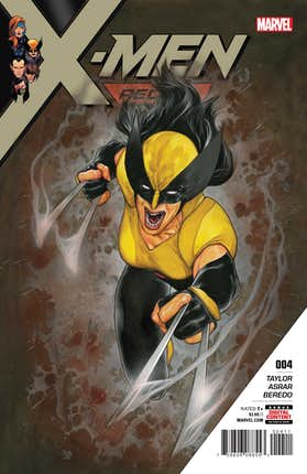
Jean Grey and her team of X-Men are trying to save the world…but one mutant could spoil that for everyone.  When an old friend of Jean’s is corrupted and turned against her, will Jean have to do the unthinkable?

Tom Taylor brings a little slower pace issue, but an important one as we see Jean’s team really coming together and their goal becoming even more crucial.  Cassandra Nova has always been one of those villains you love to hate; she really is just evil and will do anything to get her way, and doesn’t care about any casualties. This time around she’s found a way to turn people against mutants, whether they are aware of it or not. It’s an interesting take on “getting into people’s heads” and the scale at which she is deploying it will mean a lot of trouble for Jean and her team.

I’m also enjoying Mahmud Asrar‘s art in this book.  He really gives each character their own look and personality and really conveys their facial expressions really well.  I also have to give a nod to to the coloring by Rain Beredo. The colors just bring this great art to life, throwing the action right into your face and the full page panels really just make you stop to take it all in.

Overall, I’m really enjoying this title and liking the direction it’s headed in. I like the team line up (shout out to Trinary, a great new character) and really like seeing a character like Gentle become more then just a background player. And as I mentioned earlier, I’m really enjoying getting to hate Cassandra Nova again. Her plan is grand in scope and really presents a huge problem to Jean, her team and all mutants. It makes the book feel bigger, dealing with a globe of people being turned against mutants, instead of this usually being shown on a smaller scale.  I’m excited about this book and look forward to seeing where it will go next.

Story: Tom Taylor Art: Mahmud Asrar Colors: Rain Beredo
Story: 8.0 Art: 8.0 Overall: 8.0 Recommendation: Read

Marvel provided Graphic Policy with a FREE copy for review

Review: Champions #19

CHAMP-1Ironheart and The Unstoppable Wasp join the Champions at last! The team has grown but the mission stays the same – the Champions fight to make the world a better place for all! Writer Jim Zub (Avengers: No Surrender) and artist Sean Izaakse (Uncanny Avengers) reunite to push the Champions beyond their limits with any icy Antarctic adventure that will challenge everything they believe in! Don’t miss this first chapter of a new era of Champions – and the birth of a brand new hero!

Well, the creative team has changed. I am a huge fan of this book and have loved the ride it has taken me on.  When I heard that the team working on the book was changing, it had me worried. Not that this talent couldn’t do what they do, but worried if they could do what they do on this title. So I did my best to go into this issue open minded and see if it measured up. Short answer: no. Jim Zub does a fine enough job bringing us up to speed with the team and where they are now with their new members.  It just didn’t feel like anything exciting or page turning. The story is very generic, something we’ve all seen before and not done any differently. Same with the banter between the characters; nothing note worthy, just ok.

And Sean Izaakse’s art is fine. Some of his facial expressions look strange (especially some panels of Hulk) but that’s really the only knock I have against it. It looks ok, it’s good art. That’s all I can say.

I know I’m being pretty basic here but that’s really how this issue felt to me; basic. I know this is all going to come across as me sounding like a bitter fanboy, and ok maybe I am, but the magic is gone from the Champions. First, to get it out of the way, I hate this new Wasp (Nadia Van Dyne). There, I said it, let the hate commence. No, I didn’t read her series, but that was because what I saw of her in Avengers wasn’t enough to make me like her. I don’t have any real reason for the dislike, other then I just don’t like her. She annoys me. A lot. I am also not a fan of Ironheart joining the team. Her book I did read, or least I did when it started and stuck with it for a few issues, and it was good. I enjoyed her interaction with AI Tony Stark and how she was becoming the heir, as it were, to the Iron Man mantle. But it got old; Tony and Riri talking armor, flying off to fight a bad guy and then working on her armor in her garage. And repeat. And now here she is on this team, pretty much being the non-team player, working on her armor and being annoyed by having other people around. Then why join a team? Yes, yes, this will lead to character growth and development, but a few pages of her already just working on stuff and being annoyed by her teammates and I’ve had enough of her.

And it’s sad too, because there were other potential recruits that would have made better additions to the team, at least in my opinion. These were original characters that could have been fleshed out and added more depth to the storytelling. Red Locust, Patriot (Rayshaun Lucas), and Falcon (Joaquin Torres) are the three that really stand out to me; they had great origin stories, were new to the superhero scene and would really have fit in with the vibe and message of this book. I think the creative team missed a huge opportunity and just gave us something that was safe and that really just misses the mark.

And MAN do I miss Humberto Ramos‘ art on this book! His style was PERFECT for this title; it was youthful and bold and in your face. It really brought the energy and characters alive and it was a huge reason why I enjoyed this title so much. I really missed that in this issue.

Overall, as you might have guessed, I was underwhelmed with this new creative team and their debut issue. The story is generic with a “been there, done that” feel to it, and the art was just ok to me, with some really weird depictions of Hulk throughout. As I stated earlier, yeah I’m bitter about the talent changing on this book, but I really wanted to like this issue. I wanted great things for this title and for it to live up to it being one of my favorite books. I’m not so sure about it now. Am I giving it up? No, I won’t just let this one issue turn me off completely from a title I have raved about since issue one.  But I’m not optimistic about the direction it is going in. First impressions leave a lasting mark, and this new creative team did not leave a good one with this reader.

Story: Jim Zub  Art: Sean Izaakse  Color Artist: Marcio Menyz
Story: 5.0 Art: 6.0 Overall: 5.5 Recommendation: Pass

Marvel provided Graphic Policy with a FREE issue for review

Review: Champions #18

CHAMP-1
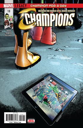
The new order changeth! After a series of tragic setbacks and shakeups, the Champions are faced with a grim decision – is it finally time to disband and give up the fight?

As I’m sure our regular readers have seen on this site, I am a huge fan of this book.  Right from issue one this book hit the ground running and gave us a great team of heroes who wanted to go out and change the world. They didn’t want to just go out and stop the bad guys, they wanted to spread their message around; make everyone a Champion.  The last few issues, however, have been dealing with problems more close to home. Mark Waid wraps things up in this issue, and really makes this personal for the team and gets them back on track with their mission statement; make everyone the hero; a champion. As past issues have done, this one really highlights the bond of this team, the founding members anyway, but also does a good job of bringing in the latest recruits, really showing us that the Champions and their cause are here to stay. I’d be lying if I didn’t say i wasn’t a little hesitant to see which new recruits stick around; I have been with this team from the start, and they have a dynamic and connection that a new member can easily throw out of whack. But, they have done a good job introducing these new members and how they interact with the originals, so I’m hoping the transition will be smooth and the book doesn’t suffer.

And as usual, Humberto Ramos is nothing but stellar with the art in this issue, and the book as a whole.  This is combined with colorist Edgar Delgado and inker Victor Olazaba. I have long said that Ramos was the best choice for this book and I stand by that statement now. His style is absolutely perfect for a youthful group of superheroes with every page showing emotion and action and just really bringing the narrative to life. Of course, the colors and ink work play in connection with this, but this team has been nothing but excellent, bringing life to these characters issue after issue.

As I’m sure you can tell, I loved this issue. It brought the current story arc to a close and reaffirmed the strong bond this team has for each other. Yes, there is a change to the team line up and as much as I am sorry to see one character leave, and I am excited to see where this team goes next. But not only is the team line up changing in the book, but the creative team on this book is changing as well. And that has me nervous. Jim Zub will be taking over the writing duties while Sean Izaakse will be taking over the art. Waid and Ramos have really given life to this book, and I can only hope that once the torch is passed, Champions is still as great as it has been. I’ll remain cautiously optimistic and stay excited to see where this book goes next.

Story: Mark Waid  Art: Humberto Ramos
Ink: Victor Olazaba Color: Edgar Delgado
Story: 9.0  Art: 9.0  Overall: 9.0 Recommendation: Buy

Marvel provided Graphic Policy with a FREE issue for review

Review: X-Men Blue #23

626719__SX1280_QL80_TTD_
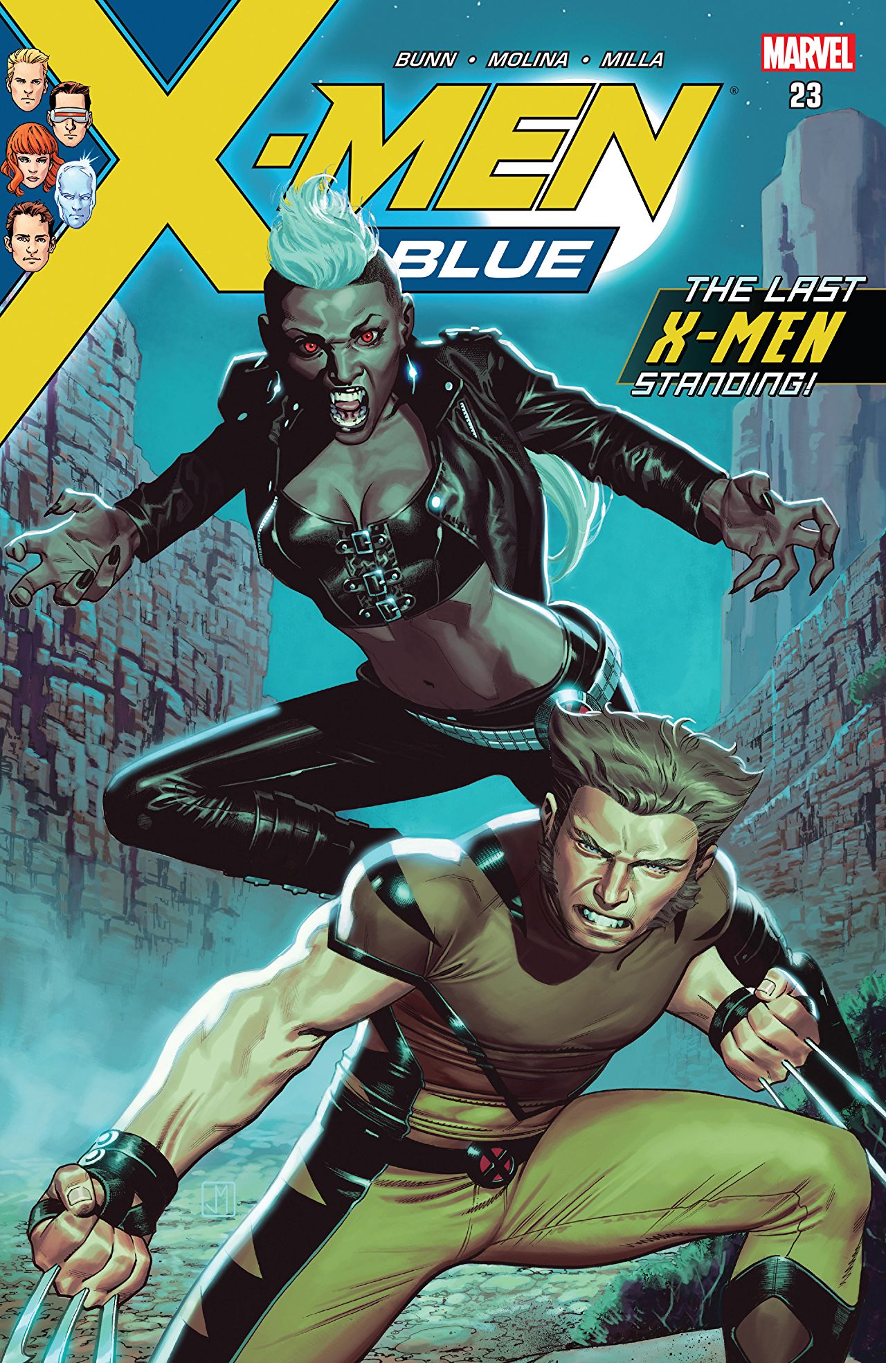
With the X-Men lost in space, Emma Frost, Havok, Bastion and Miss Sinister hatch their devious plans!  Is there a worse time for their most dangerous enemies to strike?  And wouldn’t it make matters much, much worse if Polaris once again fell victim to the body-stealing Malice?

The X-Men are off in space, in what I think is a very boring story involving Venom and symbiotes. With them gone, Magneto isn’t just sitting around waiting for his charges to return. X-Men #23 has Emma Frost has teamed up with Bastion, Miss Sinister, and Havok to create some sort of technology or biological means for mutants to be granted a secondary mutation. It’s a revelation that has me wondering if I missed something in past issues.

Writer Cullen Bunn brings us a comic that really had me feeling like I missed something and just drops the reader smack into the middle of the grand villainous plan. Maybe I’m just used to some build up, or at least some hints in previous issues that something is cooking, but here we are. It just felt like a lot of information to take in, crammed into a few panels, and really should have been laid out over a few issues.

And I was very excited to see Polaris becoming more visible in this book, as she is one of my favorite characters, but it doesn’t take Bunn long to have me rolling my eyes and ends this issue with something that happens way too easily. I don’t want to say what and ruin it but any long time X-Men fans will probably feel as let down as I was by the turn of events. I just don’t appreciate how weak it makes the character look and how easily things turn.

On a positive, I enjoyed the art done by Jorge Molina with colors by Matt Milla and Jay David Ramos. The characters look good, there’s movement and expression on their faces. I can’t say anything bad about it. It’s just solid art that unfortunately doesn’t save this issue from the story.

Overall, as you probably have guessed, I was not overly impressed with this issue. This new story feels rushed and crammed into a few panels, and a lot of players are thrown into this pretty quickly. The art is nice to look at, but it doesn’t really do much to alleviate the feeling of my head spinning after taking everything in. I’m all for a good story and lining up some great villains, but I prefer a build up and not just dumping everything out in a few pages and saying “here you go! process…”  Here’s hoping things slow down a bit next issue.

Story: Cullen Bunn Art: Jorge Molina
Color: Matt Milla, Jay David Ramos Letterer: VC’s Joe Caramagna
Cover: Jorge Molina Variant: Clayton Crain
Story: 5.0 Art: 8.0 Overall: 6.5 Recommendation: Pass

Marvel provided Graphic Policy with a FREE copy for review

Review: Champions #16

Following their staggering loss in their adventure with the Avengers, the Champions decide to double down on their mission to make the world a better place – but they know now they can’t do it alone! That’s right – it’s time for a membership drive!

I was very excited to see the solicit for this issue.  Who doesn’t wan’t to see one of their favorite teams expand and add new members; makes for more story possibilities, new interactions and dynamics on the team, and maybe some tension or romance. But I got way ahead of myself as this issue was more on the team reaching out to potential members to see if they were interested, and the responses were pretty much what I expected. However, what I didn’t expect was the separate story being told in this issue involving Vision and his daughter, and it was this story that really got me hooked, and pushed the membership drive story to the back burner.

Mark Waid presents us with a real struggle now being faced by Viv Vision and her father (spoilers ahead if you haven’t caught up…and if you haven’t, what are you waiting for??) During their last mission, Viv sacrificed herself to stop the High Evolutionary from destroying Earth; thinking her gone, Vision built a new “body” in order to “get” Viv back; but no one knew that she was transported to a different plane, and was able to escape and return back to her world…but she is now human, and there is now another android Viv. PHEW, a lot, I know. This story explores, by both Viv’s perspectives, what the other is thinking and feeling about now having a ‘twin’. It’s very interesting, seeing how both Viv’s are processing their new situation and adjusting to it. We also see a real struggle for Vision, having to balance the treatment between his daughters, in order for them to feel equal and not left out. It’s a really good read and really interesting to see how the same situations pose very different problems and effects on the two Viv’s. Personally, I’d love to see a whole issue devoted only to this story (maybe even two) but Waid really does a great job of weaving this more serious story within the fun and excitement of the team looking for new members.

As usual, Humberto Ramos delivers on the art in this book. I am a huge fan of his work, and have mentioned many times that he is the perfect artist to bring these characters to life. His style fits perfectly with the tone of a young teen book, but manages to convey the emotions and expressions of the characters that really meshes with the story being told. Another home run for Ramos in my opinion.

Overall, you guessed it, I loved this issue. But not for the reasons I thought. I was so excited for the new member search that I did not see the story involving Viv coming, and it totally grabbed my attention it made that the central story for me. Don’t get me wrong, I still loved seeing the team reaching out to potential members, and it was fun to see how the meetings took place, but it definitely played second fiddle to Viv and her struggle. And that is what has always been a driving point for me and this book; the writing and story telling is consistently solid. We get great action mixed in with witty banter, character development and stories that readers can relate to. Who hasn’t had to deal with feeling different or out of place? Or have to face a new challenge and not knowing where to start? This book is so much more then heroes going out to save the day and that is why it will continue to be one of my favorite Marvel titles out right now.

Story: Mark Waid  Art: Humberto Ramos
Story: 9.0 Art: 9.0  Overall: 9.0 Recommendation: Buy

Marvel provided Graphic Policy with a FREE issue for review

Review: X-Men Gold #20

The X-Men’s victory against the might of Scythian has come at a cost…which might kill them all! How can the X-Men survive on a barren planet? You do not want to miss the status quo-altering final page!

Yes, the X-Men are stranded on a unknown, barren planet.  Things are not looking good for our team of mutant heroes, as the opening pages show Storm thinking she is going to die on the planet. Marc Guggenheim does a good enough job setting up the feeling of despair throughout the various members of the X-Men and their situation. They are alone, hurt, and no one would know where to look for them. My only issue is the despair disappears pretty quickly and things seem to fall into place rather quickly for our heroes, and bing bam boom, they get home (spoiler alert). I mean, they JUST crashed in the last issue, and I would have liked to see them dealing with their situation for at a couple of issues at least.  But as mentioned, it all wraps up rather neatly, and too quickly for my liking, which really was a let down for this issue.

The moments between Kitty and Peter came off as a little melodramatic for my liking as well.  Don’t get me wrong, I’m very happy to see them back together as they have always been one of my favorite pairings within the X-Men, and I get they are in a dire situation and may not make it out. But man, the sugary sweet banter and declarations of love were a little annoying….and no, I am not an insensitive robot who ignores emotions, but seeing Kitty really take the reigns in this series as leader has been great, so to see her being so helpless and not really trying to do much (other then stay phased) really took away from the strong, leadership light she’s been cast in.  I’m not saying that a leader has to be cold an unfeeling, but it was a stark contrast to the Kitty we’ve seen from the beginning of this series.

I did, however, really enjoy the art in this book, courtesy of Diego Bernard (penciler), JP Mayer (inker) and Frank Martin (colorist). They all did a very good job of showing us the environment of this barren planet, the threats that are lurking, and the severity of the situation. They character depictions were well done, conveying their emotions and reactions to their situation really well. I’d say the art was definitely the highlight of this issue for me.

Overall, this issue was just ok for me. I do love it when the X-Men go out on a good space mission, and the beginning of this story arc was good, but it definitely did not stick the landing in ending the story.  Yes, the situation was dire, but it all just ended too fast and too neatly for me. I have issues on how easily Nightcrawler was able to figure out their way home, after only being on an enemy ship for a short time, as a captive, and not seeing much of their technology. And the “status quo” altering ending that the solicit promised? Any reader would have seen it coming pages before, so that was also a let down.  The art in this issue was really good, and for me, the only saving grace. Here’s hoping the next story kicks things up a notch and makes this title exciting again.

Story: Marc Guggenheim  Art: Diego Bernard, JP Mayer, Frank Martin
Story: 5.0 Art: 8.0 Overall: 6.5 Recommendation: Read (for us die hard X fans)

Marvel provided Graphic Policy with a FREE copy for review

TV Review: Marvel’s Inhumans S1E1 & 2 Behold…The Inhumans; Those Who Would Destroy Us

MARVEL'S INHUMANSAfter months of trailers, abysmal reviews and a less then stellar release in IMAX theaters, Marvel’s Inhumans made its television debut last week with a 2 hour airing of the first two episodes. Given the amount of bad press this series has gotten, it was impossible for me not to have read some of the reviews and thoughts on this show before seeing it for myself. But, I promised myself to keep an open mind; maybe it wouldn’t be as bad as critics were saying it was. 2 hours and many eye rolls later, I came to the conclusion that everything I had read was right; this was indeed the weakest entry in the Marvel cinematic/television universe. Warning, spoilers are possible; when I start ranting I just go with it.

Inhumans follows king Black Bolt, queen Medusa and the rest of the Inhuman royal family as they rule over Attilan, a hidden city on Earth’s moon where inhumans live in peace and safety among their own kind. As in the comic books, Black Bolt’s brother, Maximus, stages a coup against the royal family, thinking that he is better suited for the throne to lead the inhumans forward. This leads to the royal family fleeing their home and ending up on Earth, separated from each other and trying to devise a plan to get back home and stop Maximus.

Doesn’t sound bad, right? A monarchy on the run, family betrayal, all with super powered characters?  Sign me up!  Too bad the execution doesn’t connect with the idea. The biggest problem with Inhumans are the characters and how they are portrayed. Serinda Swan (Medusa) is stiff and wooden, not at all carrying herself as a queen, let alone how Medusa is shown in the comics. Anson Mount (Black Bolt) is pretty much just a guy standing around, as Black Bolt cannot speak unless he wants to destroy all of Attilan with his voice. Which is fine, that is the character, and the use of sign language allows him to communicate through Medusa which is different from the comics, but a nice touch to have him actually do something.  The rest of the time, he is just staring at his co-stars or mugging badly for the camera.  Seriously, some of his over exaggerated facial expressions had me laughing out load at my tv, so often in fact my dog got tired of hearing me and left the room. Iwan Rheon (Maximus) is the only one who shows any signs of acting. Though his Maximus plays off as a watered down Loki, at least with him we get some hints of emotion and purpose.

Karnak, Gorgon (or Gor-gone, as his name is pronounced in the show and drove me crazy every time!), Triton and Crystal round out the royal family, and I really have no need to go into much depth with them. With the exception of Karnak (Ken Leung) who shows some moments of being an interesting character, the cast really need to work on their delivery.  I felt nothing from any of them, and don’t think they were the right choices for their roles. Gorgon is in no way an imposing captain of the royal guard, and the acting shown by Isabelle Cornish (Crystal) did a real disservice to a character I have always liked. But this all really isn’t the actors fault (entirely) but rather of the dialogue and story they are given to work with. Sure, we have a royal coup, but that’s just a plot point; there is no real tone or direction to this story and it just seems to drag along from scene to scene (and believe me, it feels like a long drag).

And WOW, the settings and costumes! Attilan feels cold and sterile, both inside and out. More of an industrial warehouse and less like a kingdom and safe haven for a civilization. The costumes, if we call them that, are underwhelming and cheap looking.  I would expect a royal family to look a little more dignified and not be running around in pleather and leggings.  The make up isn’t anything spectacular either; we have Triton who’s only defining aquatic characteristic are some subtle gill lines on his neck, but otherwise looks like a melted Gumby with a slight ridge or seam running the length of this head.  Would it have been that hard to give him a fin like the books? And Gorgon’s hooves, or what are supposed to be his hooves, look like knee high boots and don’t really look like the impressive legs of his comics counterpart. In fact, that was a problem gnawing at me through the whole show; these Inhumans don’t look, well, inhuman! Yes, I know that not all inhumans have outward transformations, but through all the scenes of the various inhumans on Attilan, and Gorgon and Triton themselves, we don’t see any over the top, strange transformations. I understand this is tv, but Agents of S.H.I.E.L.D. gave us a Lash that matched the comics, and Raina had a huge transformation that was treated well for tv. A little more effort on this would have given Inhumans a more cohesive feel to the source material.

marvel-inhumans

Then there are smaller moments that really just angered me. Karnak is an inhuman who is able to find the flaw in anyone or anything. This ‘power’ was shown in an interesting way that I really liked.  But then we have Karnak attempting to climb down a mountain, and falls. He couldn’t see the flaw in his descent and work out a safe way to get to the bottom? Or Black Bolt, when he arrives on earth, is amazed by someone taking pictures on their cell phone, that he snatches it and with a caveman like expression, looks at it like some wonderful new thing. Yet in scenes before this, the royal family have wrist communicators that can bend from wrist watches to mini computers, and video screens that appear in thin air…hard to see why a cell phone would baffle him. But the worst moment for me (spoilers, as warned) is with Medusa. In early trailers, fans everywhere were appalled by how bad Medusa’s hair looked when using her powers. Even in this aired pilot, it isn’t the greatest accomplishment in special effects, but it is better then the trailers. But 30 minutes into the show, Medusa is stripped of her power, a little too easily if you ask me, and left broken on the floor. WELL, I guess that’s how they decided to address that problem! We don’t know how to handle it, so we’ll just get rid of it. I was so close to turning it off at that point.

By now, I’m sure I’ve made my feelings clear on this show’s premiere. Weak writing, stiff acting and cheap looking costumes and effects just make me shake my head and want to ask the higher ups at Marvel what the hell were they thinking to let this air? It certainly did not deserve an IMAX release, and the 2 hour premier just dragged along at a very slow pace. I didn’t come away feeling anything for these characters or the story, other then disappointment. The ONLY bright spot for me was Lockjaw.  The computer generated dog had me rooting for him more then the flesh and blood actors did.  I must be a glutton for punishment, because I am planning on tuning in next week. Not because I’m on the edge of my seat with anticipation, but to see if there is any chance of this getting better. It’s probably a lot to hope for.

Overall Rating: 3

Review: Jean Grey #7

RCO001Traveling the Marvel Universe preparing herself for her inevitable encounter with the Phoenix force, Jean Grey has learned how to fight from the likes of Namor, Thor and Psylocke. But now she wants to know more about her opponent than the best way to punch it. She wants to know what makes it tick. She wants to know what it’s made of. And to learn that, she’ll go to one of the few women who’ve harnessed its power: Wanda Maximoff, The Scarlet Witch!

When I saw the preview for Jean Grey #7, I was very excited for it to be released. Scarlet Witch is one of my favorite characters, and seeing her encounter Jean Grey to help with the coming Phoenix? I was so ready to dive into this issue! But not long into it, I could see this was going to be a let down, and by the end I was absolutely disappointed in this issue. Writer Dennis Hopeless brings us what can be easily called the weakest issue of the Jean Grey series. The story feels rushed and has a whole lot of things going on, making the story feel over stuffed without anything of real substance taking place. A monster cooking class that comes off as a little cheesy and a unexpected showdown don’t do this issue any favors, but my biggest beef with this chapter is the portrayal of ‘ghost’ Jean Grey. When this new element to the story was introduced, I was skeptical if this was indeed the spirit of the real Jean Grey who has come to help guide her younger self into facing the Phoenix.

After this issue, I am HOPING that this is not the real Jean Grey! Jean, the adult Jean, long time fans remember was, in many ways the heart of the X-Men. She had come a long way from being the ‘girl’ member of the team, to a strong, confident, compassionate person even after her rise and fall with the Phoenix. The Jean that shows up in this issue, a guiding spirit to younger Jean is just mean and snarky and just plain ugly. Her domineering and serious tone with her younger self could be explained as her trying to convey the severity of the situation, but it’s her exchanges and comments about Wanda that really made me grit my teeth and ask myself if Hopeless did any research at all on the original Jean, or if he just thought he’d write her so she fit into his story. The mean comments, the eye rolling and sarcasm came off as petty and juvenile and completely out of character. If she’s supposed to be helping her younger self when it comes to facing the Phoenix, I feel that force is going to take her over easily and bring back the Dark Phoenix.

Alberto Jimenez Alburquerque’s art also felt all over the place in this issue. There are some scenes which are presented beautifully, like when Scarlet Witch first arrives on the scene but other scenes, mostly the ones where ghost Jean reacts to Wanda’s words or actions, really take away from the story with their over exaggerated expressions and comical reactions. What few action scenes are in this issue are done nicely, but again it’s the over the top expressions that really take away from this issue.

Overall, as I’m sure I have made clear, I was really disappointed with this issue. Too much thrown in too fast and hit or miss art really brings this issue, and the series as whole down a few notches. But it is the characterization of ghost Jean Grey that completely turned me off. She was written totally out of character and was acting more like a child then her younger self ever has. I am really hoping that in the end this is not the Jean Grey we all know and love and it is another spirit that is just taking advantage of the situation. With the recently announced return of the adult Jean Grey coming soon, I really hope it is the later, because of this is a glimpse of the Jean Grey we’re going to be seeing again, I would rather they just left her as a fond memory.

Story: Dennis Hopeless  Art: Alberto Jimenez Alburquerque
Story: 5.0 Art: 5.5 Overall: 5.25 Recommendation: Pass

Marvel provided Graphic Policy with a FREE copy for review

Review: Uncanny Avengers #27

untitledIt’s hard to take a stand when the world keeps spinning…

The Unity Squad just wanted to get some sleep after all the chaos that followed the Hydra take over, but Graviton had other plans for them. Jim Zub brings us a good issue, giving this reader at least a fun, action packed issue that brings me back to the days of the Avengers just doing what they do best. Not worrying about a world take over, or mental break down or cosmic cube, but rather going toe to toe with an old school villain just wanting to bring a smack down.  This team has really found its footing and they smoothly move into action, including the Scarlet Witch who just came to the team last issue. Personally, I think Wasp should be leading this Squad instead of Rogue as it is a role she has played in the past, but I get that this book is trying to show Rogue growing and coming into her own.

Sean Izaakse does a good job with the art duties in this issue.  Each character has their own personality, the expressions and movements are fluid and the action scenes are fast and put us right into the battle. I wouldn’t mind seeing costume redesigns for a few characters, but that’s just an ongoing wish with me and this book.

Overall, this was a fun read and I enjoyed it. It really just brought me back to the times where it was the good guys squaring off against the bad guys without any politics or anything heavier bringing it all down. I am loving the addition of Scarlet Witch to the team, not only because she is one of my favorite characters, but I have always loved the dynamic between Pietro and Wanda and how they interact on the same team. A lot has happened between them recently, so it will be interesting to see them back together again.

Story: Jim Zub  Artist: Sean Izaakse
Story: 7.0 Art: 7.5 Overall: 7.25 Recommendation: Read

Marvel provided Graphic Policy with a FREE issue for review

Review: Astonishing X-Men #3

untitledThe X-Men continue their fight against the Shadow King! But when Old Man Logan loses himself in the Astral Plane and Shadow King’s illusions, will he ever find his way back to his teammates? And what other horrors await our team?

After the events of Astonishing X-Men #2 (minor spoiler) with the team now on the astral plane, and being separated into two pairs and 1 solo, I knew the next few issues would be focusing on the split up characters and their path to confronting the Shadow King. Charles Soule starts us of with Old Man Logan and his journey through the astral plane. It’s an alright journey, telling the reader a bit about Logan’s past and what drives him, along with how he’s able to walk so easily through the astral plane and shake off the Shadow King like he’s nothing. Nothing terribly exciting, but not a bad read either. The flashes back to the real world and how the remaining X-Men are dealing with the authorities is getting a little dry, pretty much just a chance to reiterate why this is all going down. One thing it did manage to do was to get me missing the old Warren Worhthington III; I’m not a huge fan of this pacifist, peace loving character as it’s laid on a little thick here, but I am intrigued by the inner struggle between him and Archangel. I’m sure we’ll see an issue or two about that.

The art provided by Ed McGuinness, Mark Morales and Jason Keith is fine, but I really found myself missing the art from the first two issues. I know this book will be rotating through artists, and that’s great to showcase different talents, I just found myself finding this art feeling a little ‘cartoony’, lacking in some of the grit and darker tones of the last two issues.

Overall, this was an alright issue. I think I just feel spoiled after the first two issues, with lots of action and a fast pace, matched with great art and dialogue. This issue, as I mentioned, was fine and I expected the story to go this way when the team was split up. But it felt a little slow for me, nothing really earth shattering taking place, and the art just didn’t leave me with the high I felt after the start of the series. I am still very much a fan of this series and I’m looking forward to seeing more from this team and the ultimate showdown with the Shadow King.

Story: Charles Soule Art: Ed McGuinness Ink: Mark Morales Color: Jason Keith
Story: 7.0 Art: 7.0 Overall: 7.0 Recommendation: Read

Marvel provided Graphic Policy with a FREE issue for review

« Older Entries