Tag Archives: ferran delgado

WildC.A.T.s #6 delivers a hell of a pivot to the story

WildC.A.T.s #6

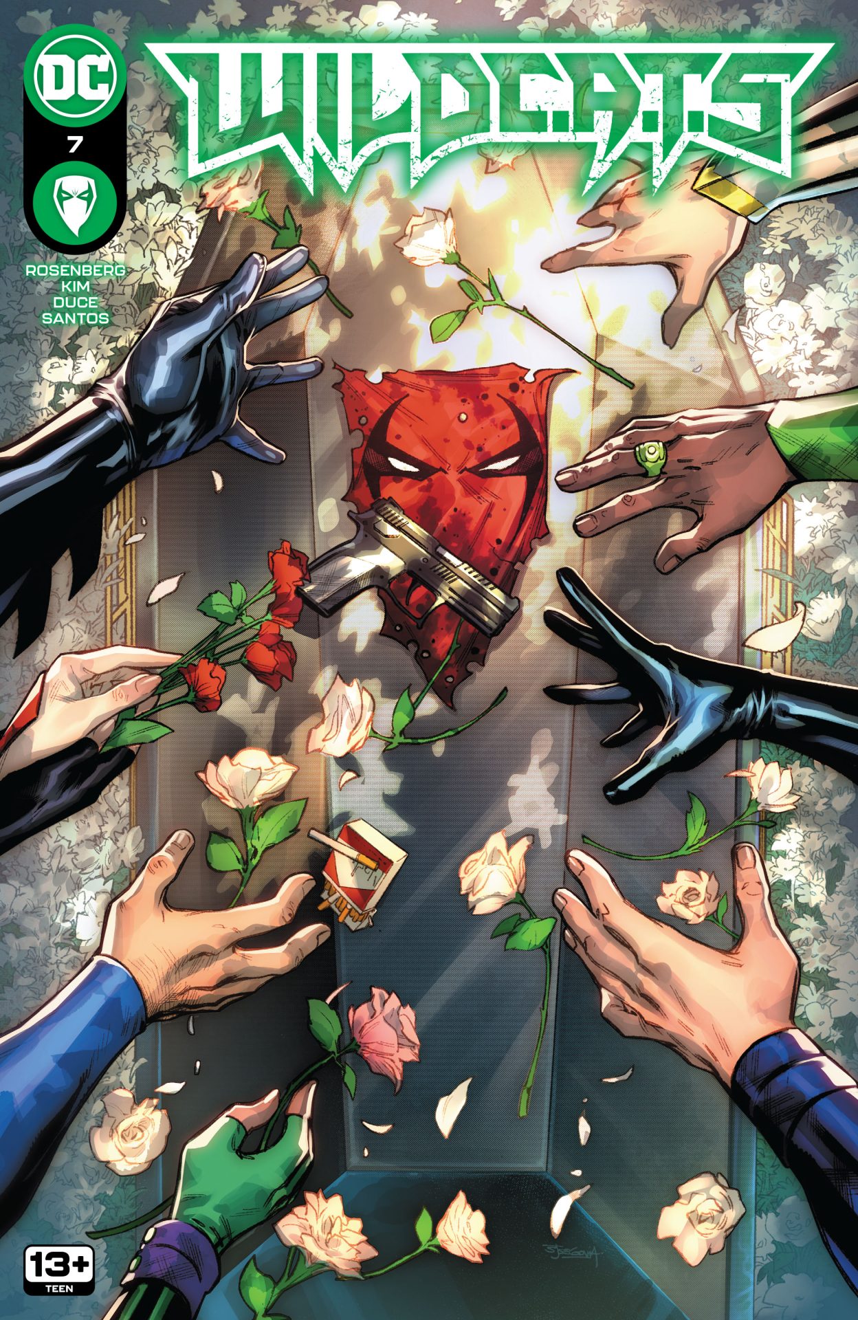
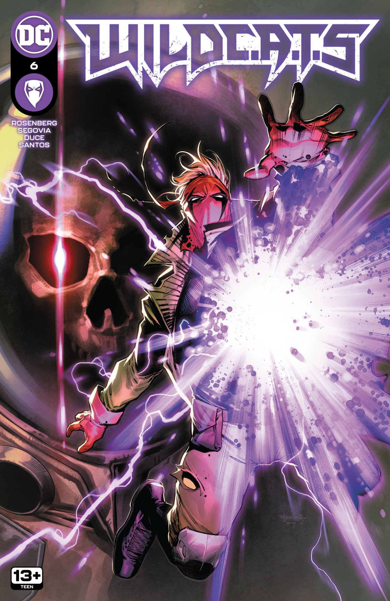
With much of the team and personalities established and all the players in place now, WildC.A.T.s #6 is a hell of a pivot for the series. The hints, the teases, it all comes together here as a the bigger picture begins to unfold. It’ll leave the readers asking one question really, are we the baddies?

Written by Matthew Rosenberg, WildC.A.T.s #6 wraps up the first trade arc with the team somewhat scattered and reeling from the death of Cole, aka Grifter. But, not everything is at it seems as the issue delivers a whirlwind of twists and turns that’ll propel the series in its next arc which promises to be a hell of a new direction. It further cements the series and characters’ place in the DC Universe, making it one of the best integrations of the Wildstorm universe yet.

Up to this point, it’s clear something isn’t quite right. Halo Corporation, while seemingly benevolent, clearly has something up its sleeve. All of curtains begin to be pulled back as what’s left of the team smells that something is rotten.

What’s great about Rosenberg’s work as well is his integration of the DC Universe as a whole. Not only have the Court of Owls been the villains behind the scene but the use of Superman, and now Clark Kent, has been excellent as well. Another pretty big hero shows up here too adding to the intrigued of where things are going from here. It’s been a solid folding in of new and old.

The art by Stephen Segovia and Tom Derenick has been great. With color by Elmer Santos and lettering by Ferran Delgado, the comic has looked fantastic with a mix of action, mystery, and humor. The interactions of the characters has been key and the art has conveyed not just the humor of the series but also the relationships between each character as well. The body language and facial expressions have been key throughout.

The series as a whole has felt like it has cracked the code of how to bring Wildstorm and DC together and WildC.A.T.s #6 delivers a launch for the wild ride to come. The series has been full of nostalgia as well as forging its own path. A welcome return of the characters has me excited to see where things continue to go and evolve.

Story: Matthew Rosenberg Art: Stephen Segovia, Tom Derenick
Color: Elmer Santos Letterer: Ferran Delgado
Story: 8.5 Art: 8.5 Overall: 8.5 Recommendation: Buy

DC Comics provided Graphic Policy with a FREE copy for review


Purchase: Zeus ComicscomiXology/Kindle

WildC.A.T.s #5 builds on the mystery and action

WildC.A.T.s #5

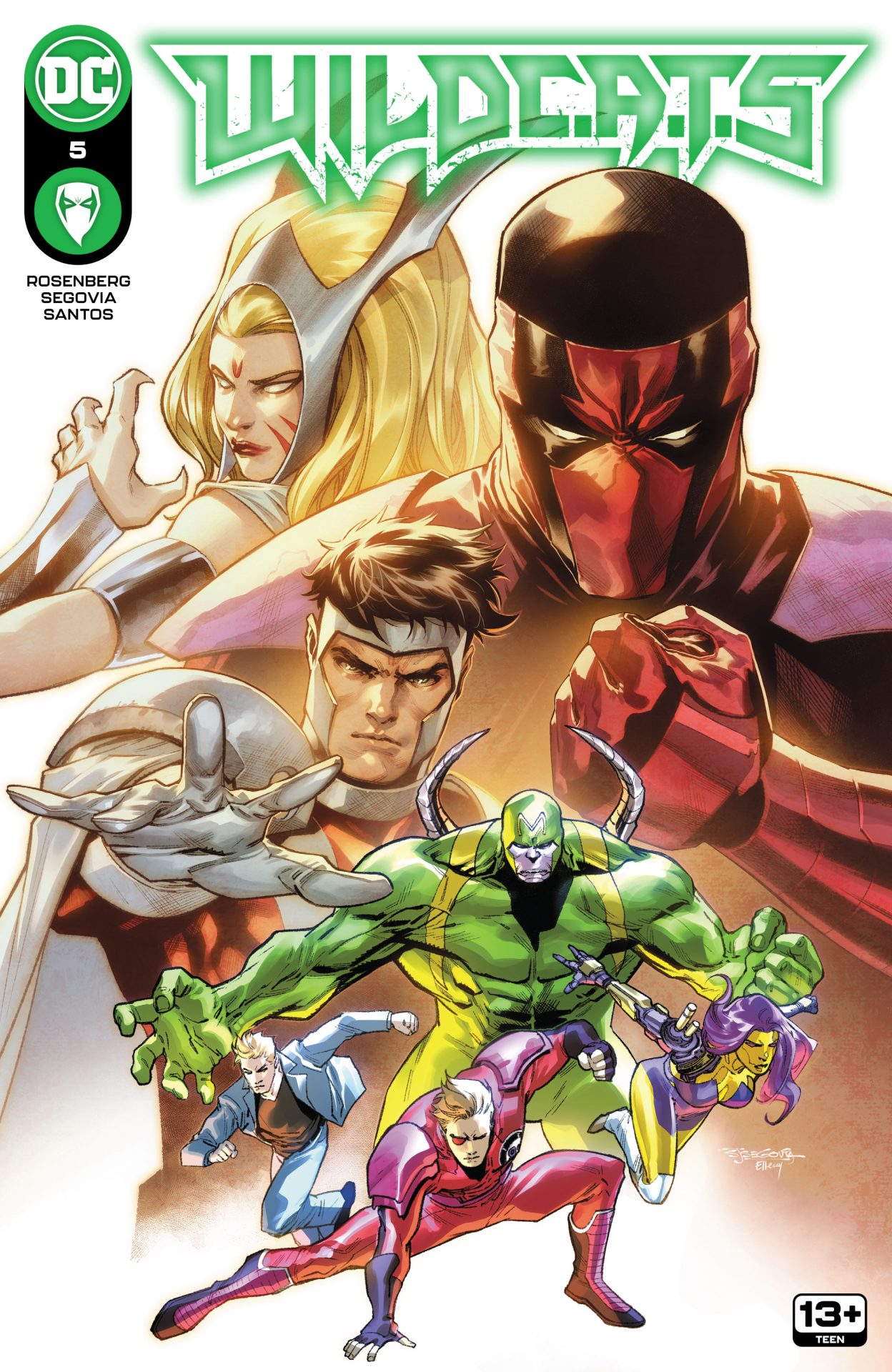
Five issues in and WildC.A.T.s has quickly become one of the most entertaining superhero action comics on the shelves right now. There’s been a fantastic mix of humor, action, and heart, updating a 30 year old property and properly integrating it into the DC comic universe. For the past few issues, tensions have been rising as a new Seven Soldiers have been introduced, stealing the spotlight and glory from the WildC.A.T.s team. WildC.A.T.s #5 builds in that further throwing out more questions and leaving a lot of head scratching.

Written by Matthew Rosenberg, the series has done a fantastic job of keeping a lot of classic elements of these characters, and the Wildstorm Universe, and mixing it up just enough for something that feels knew, different, and at the same time familiar. Cole is dead with his teammates trying to figure out what happened and if it even really is Cole’s body they saw. Then, there’s the issue with the Seven Soldiers who are clearly wildcards where something is… off.

WildC.A.T.s #5 takes all of that and just adds to the insanity as the Seven Soldiers, and especially Majestic, dealing with Superman who is interested in the hero who claimed he was from Krypton. Then there’s a certain classic character donning his costume adding to the bigger question as to what exactly is going on with the Seven Soldiers. And if that wasn’t enough, there’s the ending!? It all comes together for an issue that delivers a lot of action and throws in a lot of questions.

Where Rosenberg’s story really stands out is the ability to just nail every scene and situation with exactly what it calls for. The WildC.A.T.s and Seven Soldiers are two very different personalities of a team and each is on full display here. One is a dysfunctional team but still a team and “friends”. The other is just a team where you can sense a seriousness and tension within. It all plays perfectly on the page making you like one so much more and want to boo the other.

So much is helped by Stephen Segovia and Christian Duce who provide the art and make an appearance by Superman seem completely normal. With color by Elmer Santos and lettering by Ferran Delgado, the comic is great to look at delivering a lot of swift action and surprises. There’s also a solid delivery of jokes through body language. How characters stand, their face, their body language, all punctuates the moments and makes everything feel so natural.

WildC.A.T.s #5 is another fantastic issue that just has so much packed in. There’s shock appearances, good fights, lots of humor, a bit of everything coming together to entertain. There’s so many directions the series, and characters, can go, it’s a series that keeps readers on their toes playing off of nostalgia but plotting a new path.

Story: Matthew Rosenberg Art: Stephen Segovia, Christian Duce
Color: Elmer Santos Letterer: Ferran Delgado
Story: 8.25 Art: 8.25 Overall: 8.25 Recommendation: Buy

DC Comics provided Graphic Policy with a FREE copy for review


Purchase: Zeus ComicscomiXology/Kindle

WildC.A.T.s #3 is a hell of a lot of fun

WildC.A.T.s #3

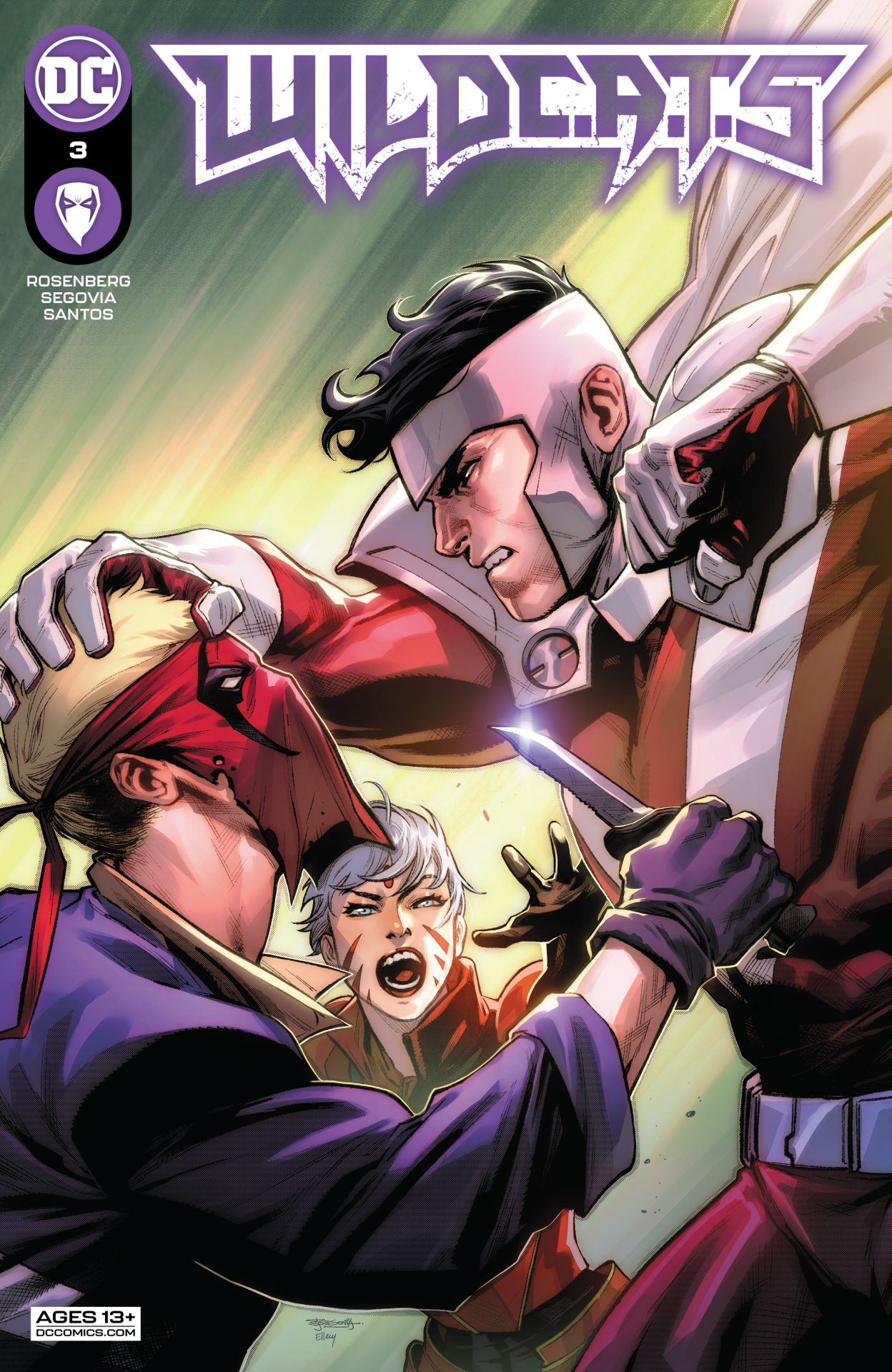
WildC.A.T.s #3 continues the upward momentum of the series with its best issue yet. As the previous issue ended, Halo was introducing its group of superheroes… the Seven Soldiers of Victory. Wait, what!? While the WildC.A.T.s do the actual work, it looks like this new team is going to get all of the credit, and you better believe that’s not going to sit well.

Writer Matthew Rosenberg delivers a beyond entertaining issue as we get to know this new superhero team with some great commentary from the WildC.A.T.s. It’s just perfectly played out that brings the larger than life feel of 90s comics but to the line where it all doesn’t feel eye-rolling comical. Rosenberg’s writing delivers a natural reaction that we can all see ourselves doing. Snide remarks lead into some tense moments and a few fists flying but it never crosses that silly line of two superhero groups fighting due to a misunderstanding. And through it all, Rosenberg delivers lines and moments that are hard to not laugh at. There’s a perfect delivery and comical timing that creates a comic that’s almost a superhero action comedy. It’s just… fun!

But, it’s not the WildC.A.T.s without some messed up mission and lots of action and Rosenberg delivers that as well. Grifter continues his mission to figure out what’s up with the Court of Owls, again with some amazing comedic timing and the rest of the team has to rescue a diplomat’s kid. It all goes spectacularly wrong as it always does with the team. But, at least it’s off the rails entertaining.

A lot of the timing and comedy as to do with Stephen Segovia‘s art. With Elmer Santos on color and Ferran Delgado‘s lettering, it’s all laid out on the page and delivered perfectly. Jokes about falling out of a window are played so well with a balance of what’s shown and what’s not. The reactions to the introduction to the Seven Soldiers is about what is said as much as the look on a face and body language of who said it. This is a great example of story and art perfectly aligned. Then there’s the action. The team delivers that with such great visuals, it feels like watching a summer action film. The sequences are over the top but delivered with such confidence and such a way that again it’s just… fun.

WildC.A.T.s #3 is exactly that, fun. It continues a series that takes what worked so well in the 90s but refines it. Much like the re-launches of this team throughout the years, this latest volume focuses on certain aspects and does them so well delivering a new take that has the DNA of what was but mixes it up just enough to deliver something new but familiar. After years of false starts, this is a series that might have finally cracked the code of re-introducing the world of Wildstorm into the DC Universe proper.

Story: Matthew Rosenberg Art: Stephen Segovia
Color: Elmer Santos Letterer: Ferran Delgado
Story: 8.5 Art: 8.5 Overall: 8.5 Recommendation: Buy

DC Comics provided Graphic Policy with a FREE copy for review


Purchase: Zeus ComicscomiXology/Kindle

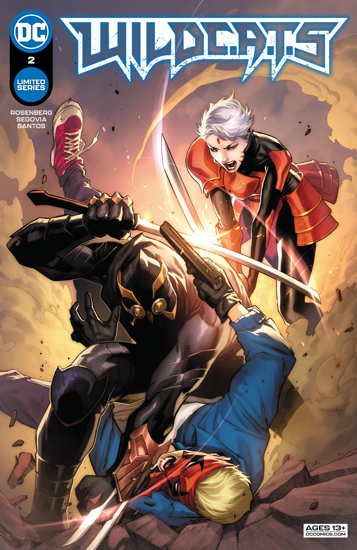
Review: WildC.A.T.s #2

WildC.A.T.s #2

When I think of 90s Image Comics, I think of comics that are more flash than depth. While they looked great, the stories were often muddled, disjointed, or incoherent gibberish. Things were up and down for a while with the publisher and overall it felt like art was the priority over story. In reality, you need a solid balance of both for a successful comic and even today some comics struggle. So, it was interesting to dive back in the world of WildC.A.T.s with a debut issue that launched the team into the spotlight once more after lurking in the background. The first issue was entertaining full of action and humor but overall it leaned heavy into the action end of things. WildC.A.T.s #2 finds that nice balance with action, humor, some solid character interaction, and a lot of surprises.

With their latest mission gone wrong, Cole and Zealot are stuck in the basement with a knocked out teammate and a mysterious cult around them and the security forces of the place they just hit in pursuit. But, what could be worse? How about the Court of Owls’ Talons! Yeah, it’s Grifter and Zealot versus Talons in what feels like the perfect nemesis for the team and the Halo Corporation.

Written by Matthew Rosenberg, WildC.A.T.s #2 is a solid second issue building off of the first and really getting things going. We get hints as to where this team came from and what their mission is with an ending that’s quite a surprise. But, Rosenberg delivers a perfect foil. The Halo Corporation, as presented, is a semi-benevolent corporation set on protecting this Earth and dimension. They have their hands in all sorts of goods but also a strike team to get their hands dirty. They manipulate things on a consumer scale. The Court of Owls manipulate things from the shadows, also with their own strike team to do battle. The team are solid adversaries and Rosenberg gives the first encounter a nice wtf aspect of it. He expands upon it with a debate as to what to do next about it all that hints there’s more going on.

The art by Stephen Segovia is fantastic with color by Elmer Santos and lettering by Ferran Delgado. There’s an interesting aspect to the art style with a lot of action but also a lot of more “straight” moments of boardroom meetings. The fact both can be done without it feeling a bit weird and no change in style is great. Zealot gets the spotlight during a sequence dealing with would-be assassins and the choice of panel use and art is great with Zealot looking like she pops off the page. The art too feels like it emphasizes the humor with moments that are both silly and straight at the same time.

WildC.A.T.s #2 improves on the first issue giving a solid villain for the team to go against and delivering surprises. This is a comic that delivers action but also the ramification of those actions. It takes what worked well with the original and updates things a bit with the team finally fitting in nicely with the DC Universe and delivering a bit more personality beyond how cool they look when they do battle.

Story: Matthew Rosenberg Art: Stephen Segovia
Color: Elmer Santos Letterer: Ferran Delgado
Story: 8.4 Art: 8.4 Overall: 8.4 Recommendation: Buy

DC Comics provided Graphic Policy with a FREE copy for review


Purchase: TFAWZeus ComicscomiXology/Kindle

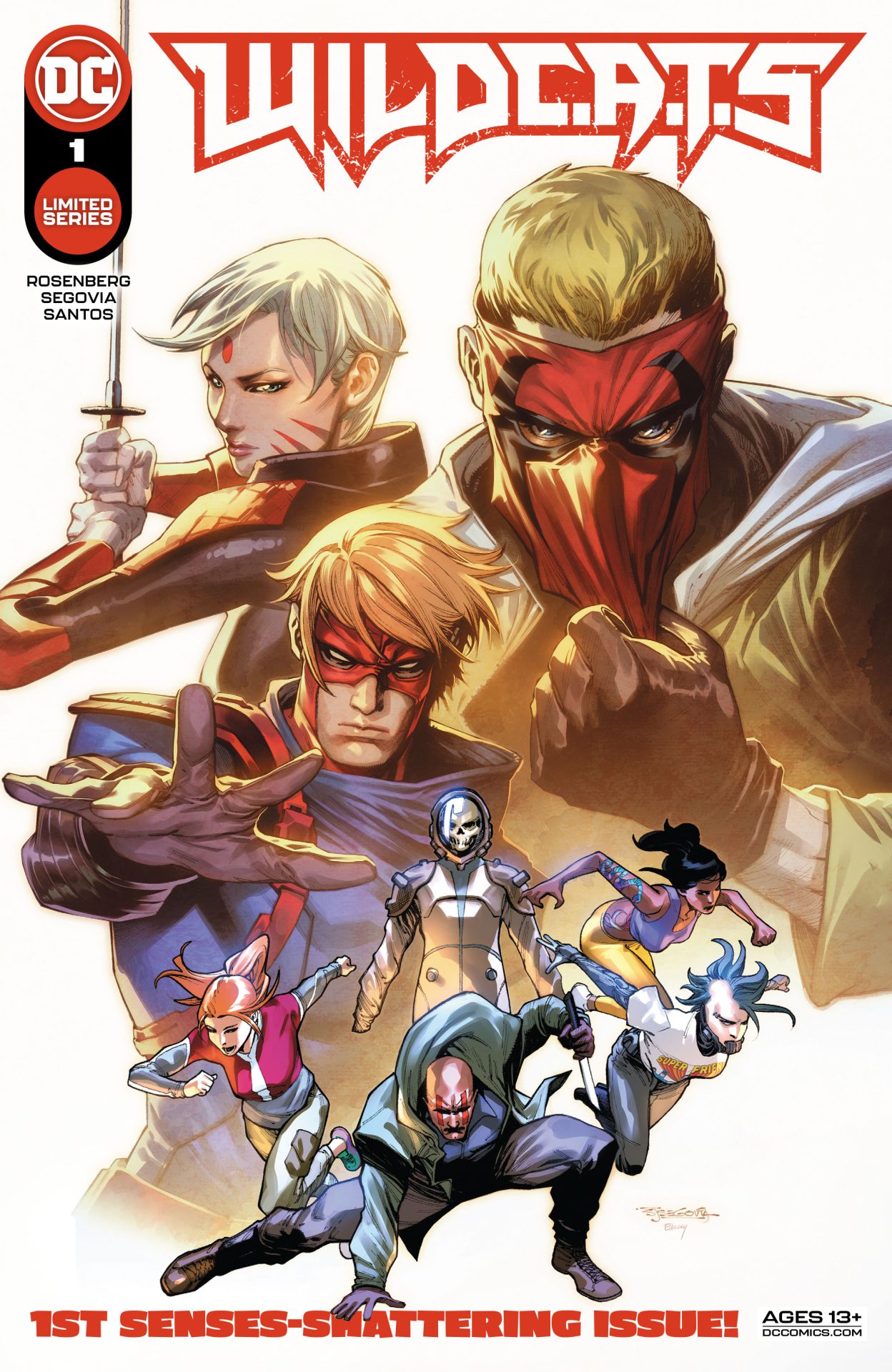
Review: WildC.A.T.s #1

WildC.A.T.s #1

I’m old enough to remember the launch of Image Comics all those decades ago. Each creator brought excitement with their launch titles. The look of each was so unique and interesting, a massive shift during that time period. Jim Lee launched WildC.A.T.s and I remember being disappointed. With most of Image’s initial titles I felt that way. They looked great but the stories lacked and were rather a bit disjointed. Over the years there’s been different takes and my view of the property changed. Wildcats 3.0 was a take on the team that I still think is fantastic and underrated. While DC has teased some of the characters of the years, they’ve never really fit and integrated well. So, I was intrigued by WildC.A.T.s #1 and by the end, I want to see more.

Written by Matthew Rosenberg, WildC.A.T.s #1 takes a lot of the elements of the classic team and brings them into the DC Universe. In recent months, we’ve seen more of the characters, particularly Grifter, showing up in mainstream DC stories. Now moved the Star City, the Halo corporation is up to something, and that something has to deal with the WildC.A.T.s team who are on various missions, that never seem to go right.

Rosenberg feels like he’s nailed the balance of the classic testosterone driven takes in the past and the current DC Universe. With a team featuring Deathblow, Zealot, and Grifter, they’re on a mission to get a scientist which goes off the rails. Grifter does what he wants. Zealot is the serious member dealing with the idiocy and Deathblow, well, read the comic. There’s a fun 90s action vibe about it all delivering humor along with the bullets flying.

The art by Stephen Segovia nails it all down well. It has the over the top aspect of the 90s but a bit more in today’s style. Along with color by Elmer Santos and lettering by Ferran Delgado, the comic looks solid with the characters having their looks updated a bit. The characters’ reactions stand out as they let their emotions fly yelling at each other and dealing with the insanity. There’s a lot of humor in Segovia’s details, enhancing the laughs Rosenberg bakes into the action.

WildC.A.T.s #1 is a fun debut that shows off a lot of potential. It brings back the nostalgia a bit but also does a good job of integrating this world into the ongoing DC Universe. It has me wanting to see more and even with this being a limited series, here’s hoping we do.

Story: Matthew Rosenberg Art: Stephen Segovia
Color: Elmer Santos Letterer: Ferran Delgado
Story: 7.95 Art: 7.95 Overall: 7.95 Recommendation: Read

DC Comics provided Graphic Policy with a FREE copy for review


Purchase: TFAW Zeus ComicscomiXology/Kindle

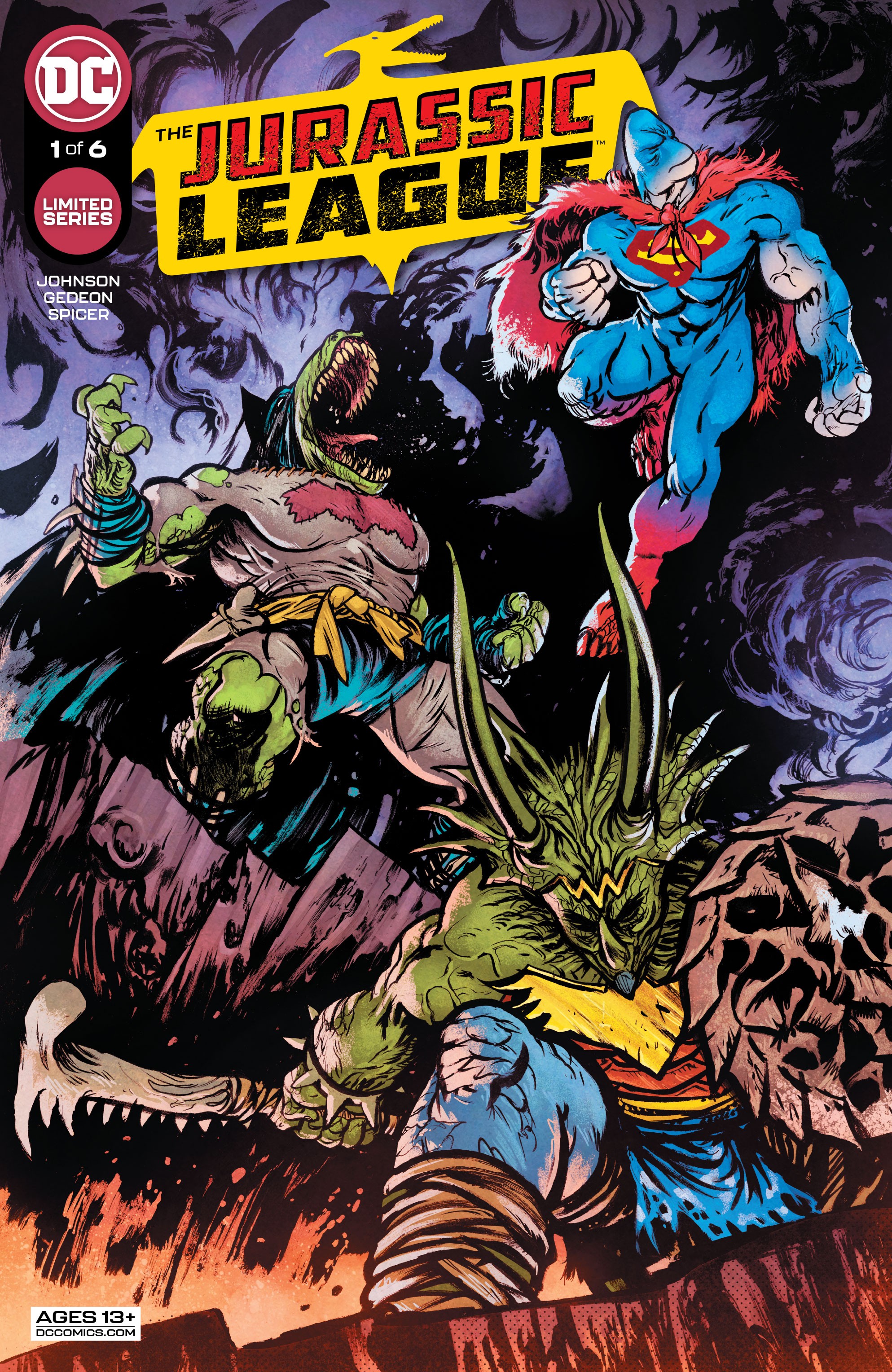
Review: The Jurassic League #1

The Jurassic League #1

What if DC’s superheroes and villains were dinosaurs! The silly concept has been made reality in The Jurassic League #1 which kicks off a somewhat entertaining series that begs readers to not think too much.

With a story by Juan Gedeon and Daniel Warren Johnson, The Jurassic League #1 delivers a spin on our familiar heroes with each being anamorphic dinosaurs that walk on two legs and talk. Now, there’s also regular dinosaurs and we’re not explained why there’s a difference between them, so there’s a lot of leeway that must be given. In other words, this is a comic to just roll with.

Batman, Aquaman, Superman, and Wonder Woman are all introduced, each a dinosaur version of their regular self with some aspects of what we know. There’s early humans which is a whole other things as well as dolphins… this isn’t really a comic you’re looking for scientific accuracy. Instead, it’s a big goofy fight and whirlwind introduction that never quite clicks. It feels more like something you might find in Mad Magazine than a limited series. A joke of an idea fleshed out for laughs. There’s some of that here but the comic feels like a series of vignettes as it introduces each character compounding on that short story punchline feel of it all. It uses some puns in names to some extent but then there’s others where it feels like someone just slapped “-asaurus” at the end of a name and called it a day. It’s weirdly both fleshed out and not.

The comedic aspect isn’t helped by Juan Gedeon‘s art. Joined by Mike Spicer on color, the art at times feels like it’s an homage to Frank Miller’s Dark Knight Returns and other times cosplay Dinosaurs. Like the overall concept and details, the art feels a little mashed together like it’s a bunch of short separate stories brought together in a way. Like each segment could or should be an issue by themselves and instead were cut up for this debut.

While the art for me is both a hit and miss what really stands out is the lettering by Ferran Delgado. The lettering packs a punch and has so much personality for every character as they battle it out. The lettering delivers a lot of the fun energy of the comic.

While I like the concept and appreciate the comic on some level, I just wasn’t a fan of The Jurassic League #1. There’s some great ideas and maybe it’ll get better, but the debut feels like it bounces around what it wants to be. There’s some comedy, a lot of action, and some serious aspects but none of it quite gels together. The comedy spans so much from spoofs to puns to physical pranks but even a lot of that feels like it’s set on the easy level. “Jokerzard” for instance doesn’t feel inspired as a joke or spin for the name of a dinosaur Joker. It’s just… ok. The Jurassic League #1 feels like it might go over with kids better but for me, there’s a lot other things I’d read first this week.

Story: Juan Gedeon, Daniel Warren Johnson Art: Juan Gedeon
Color: Mike Spicer Letterer: Ferran Delgado
Story: 6.0 Art: 7.0 Overall: 6.0 Recommendation: Pass

DC Comics provided Graphic Policy with a FREE copy for review


Purchase: comiXology/KindleZeus Comics

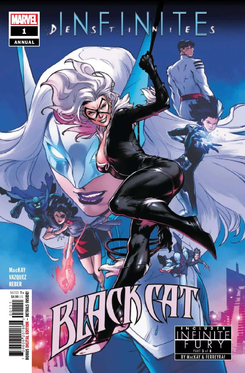
Review: Black Cat Annual #1

Black Cat Annual #1

Felicia Hardy, the Black Cat, gets stuck in South Korea and is forced into a team-up with White Fox and Tiger Division in Black Cat Annual #1. Their target? The super-powerful Taegukgi, who is working for a local crime lord. However, it goes from bad to worse when they find said crime lord and all of his henchmen dead, meaning someone else is now in control of a very deadly superhero.

One thing I’ve really enjoyed with the annuals this year from Marvel is that the stories have felt a bit different, from Iron Man being a mentor to Miles Morales in the Iron Man annual to the team-up with Tiger Division in this issue. I do wish these were just a bit bigger. I’m a fan of the old 64-page annuals. Back to Black Cat Annual #1, it’s nice to see some newer characters get a bit more use and if remembering correctly, collectors made a big deal out of Taegukgi’s first appearance. The fact that Black Cat ends up with a bomb planted in her neck and spends large amounts of time complaining about it to White Fox did seem a bit played out. Is there just no other way to get help from someone than by booby-trapping them?

Nick Fury’s story in the second part dealing with the infinity gems has been a better use of pages than some of the stories in the older annuals but to me, this chapter just seemed a bit too brief. Go figure. And if I guessed who the shadowy figure is, then I am a bit more excited to follow where this story goes. However, there’s a part of me that thinks It’s just more of Marvel Comics trying to make all their books feel just like their cinematic endeavors. It’s a little thing but they used to be called the infinity GEMS. If they had any stones, they’d go back to calling them that.

I thought the creative team did a fine job on this book. Jed MacKay wrote both parts of this book and one thing that stood out to me was his characters do “sound” different from one another. I liked Juan Ferreyra’s art better in the second half story. I really thought the style added to the story. And in saying that, Joey Vazquez’s art was good, too. I just preferred one to the other.

You could certainly do worse than buying or reading Black Cat Annual #1. It just didn’t feel like that much of a throwaway story and I’m also glad to see a character like Black Cat getting the much-needed push. I think those that read this issue have probably never heard of the added characters in this issue but that’s okay, you have to start somewhere. This issue was definitely worth a read.

Story: Jed MacKay Art: Joey Vazquez and Juan Ferreyra
Color: Brian Reber Letterer: Ferran Delgado
Story: 7.0 Art: 7.0 Overall: 7.0 Recommendation: Read

Marvel provided Graphic Policy with a FREE copy for review


Purchase: comiXologyKindleZeus ComicsTFAW

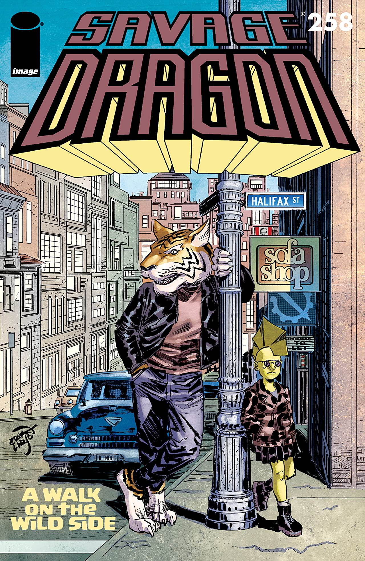
Review: Savage Dragon #258

Savage Dragon #258

Savage Dragon #258 takes readers on “A Walk On The Wildside”. Amy Dragon sneaks off on an adventure with Walter, the talking tiger. Sadly, dinnertime is not the time for such actions and they find themselves in trouble (and snow) moment after moment.

To be honest, Savage Dragon #258 was a bit of a snoozer. Amy and Walter’s little adventure wasn’t that exciting. The most exciting part was the beginning where Malcolm was battling the God of Thunder. After that, it delved into something a lot more chill and peaceful which didn’t really resonate with me. Partly, I don’t get to read every issue of Savage Dragon that comes out. I do want to say that while the story wasn’t my cup ‘o tea, I think that it’s an impressive feat that series creator Erik Larsen can keep Savage Dragon in some oddball adventures like this one, which helps it be unique.

While I wasn’t blown away by the story, Larsen’s art is still something to behold and this issue had quite a few moments where I liked what I was seeing. The opening page was full-on Kirby (in a good way) and what followed was a very energetic two-page splash. Nikos Koutsis is a fantastic colorist for Larsen’s work and I thought that this issue showed that. I do feel like Larsen has gotten a bit loose with his pencils, as compared to how I think his older issues of Savage Dragon look but I do still think there are quality visuals in this issue. It’s good to know that I can still appreciate the art on a book like this, even if the story doesn’t click with me.

Story: Erik Larsen Art: Erik Larsen
Letterer: Ferran Delgado Colorist: Nikos Koutsis Flats: Mike Toris
Story: 5.0 Art: 7.0 Overall: 6.0

Image Comics provided Graphic Policy with a FREE copy for review


Purchase: comiXologyKindleZeus ComicsTFAW

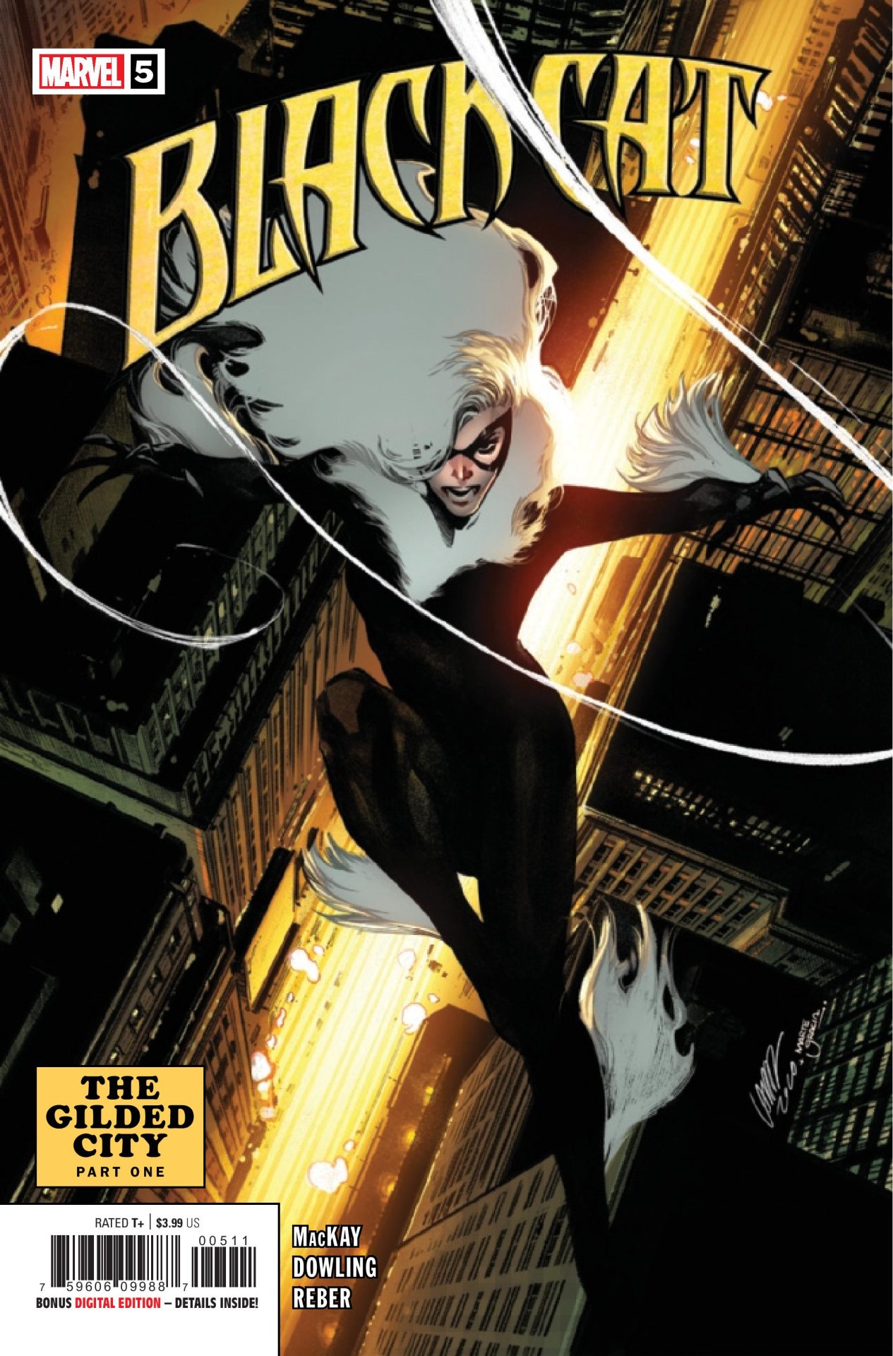
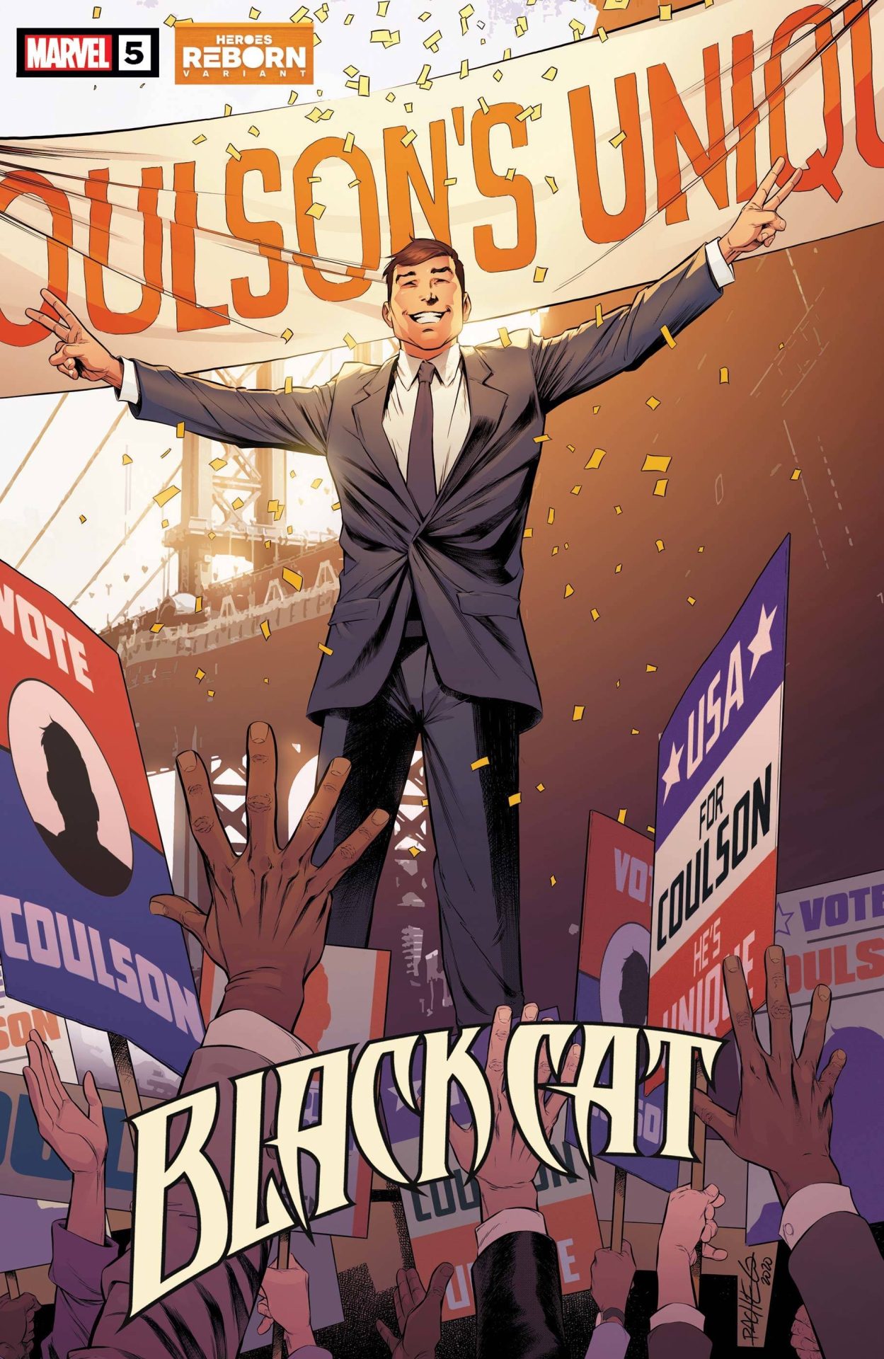
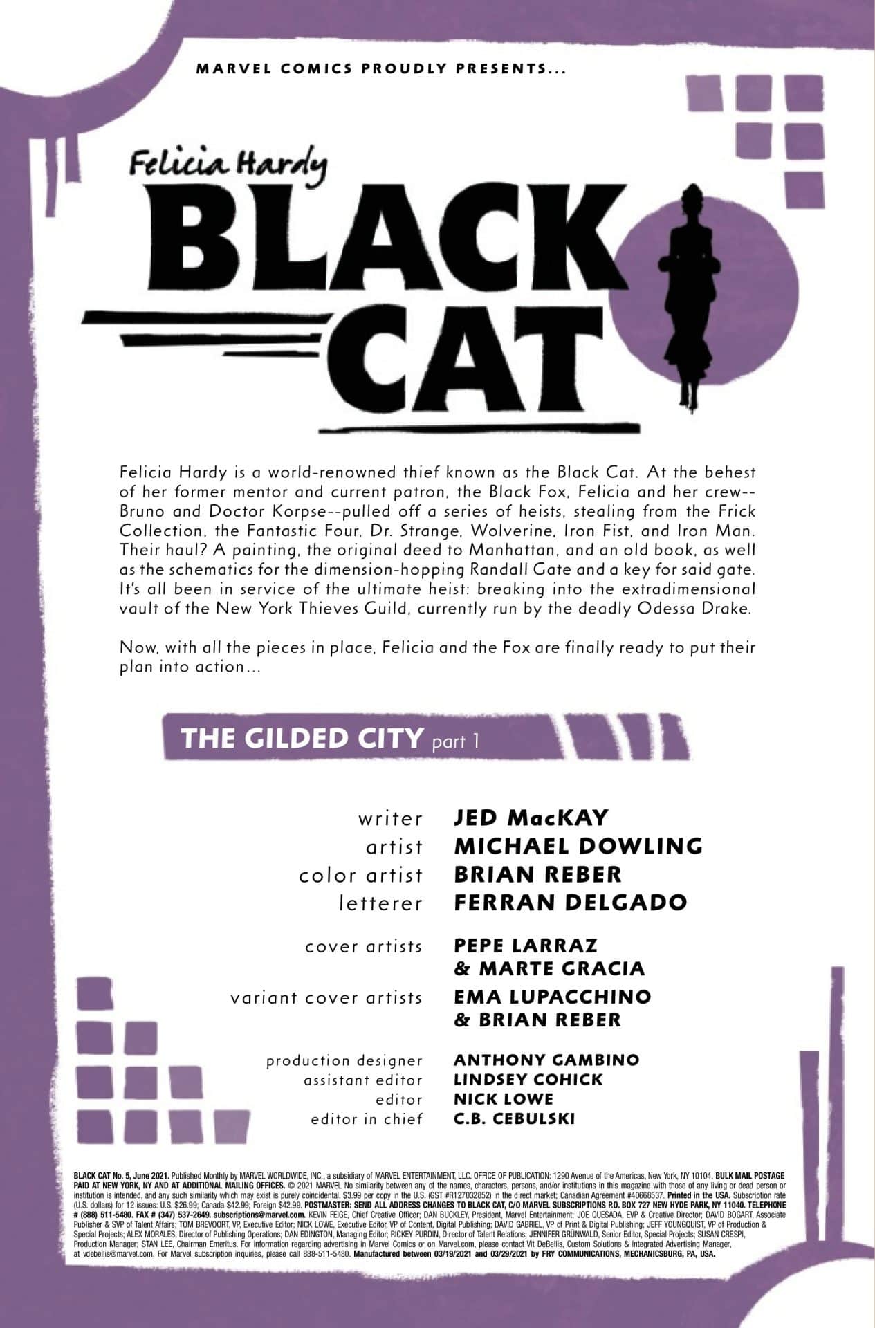
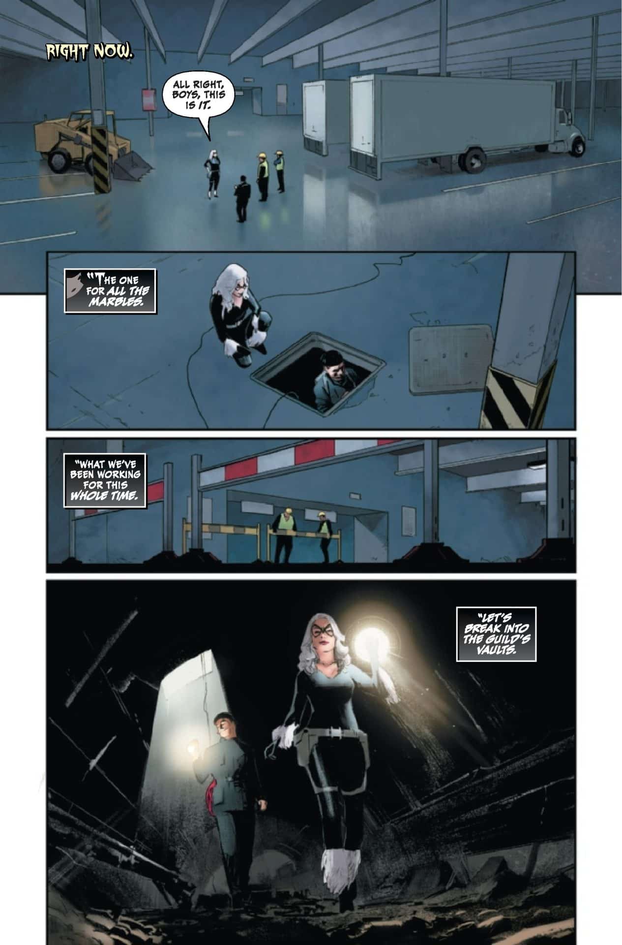
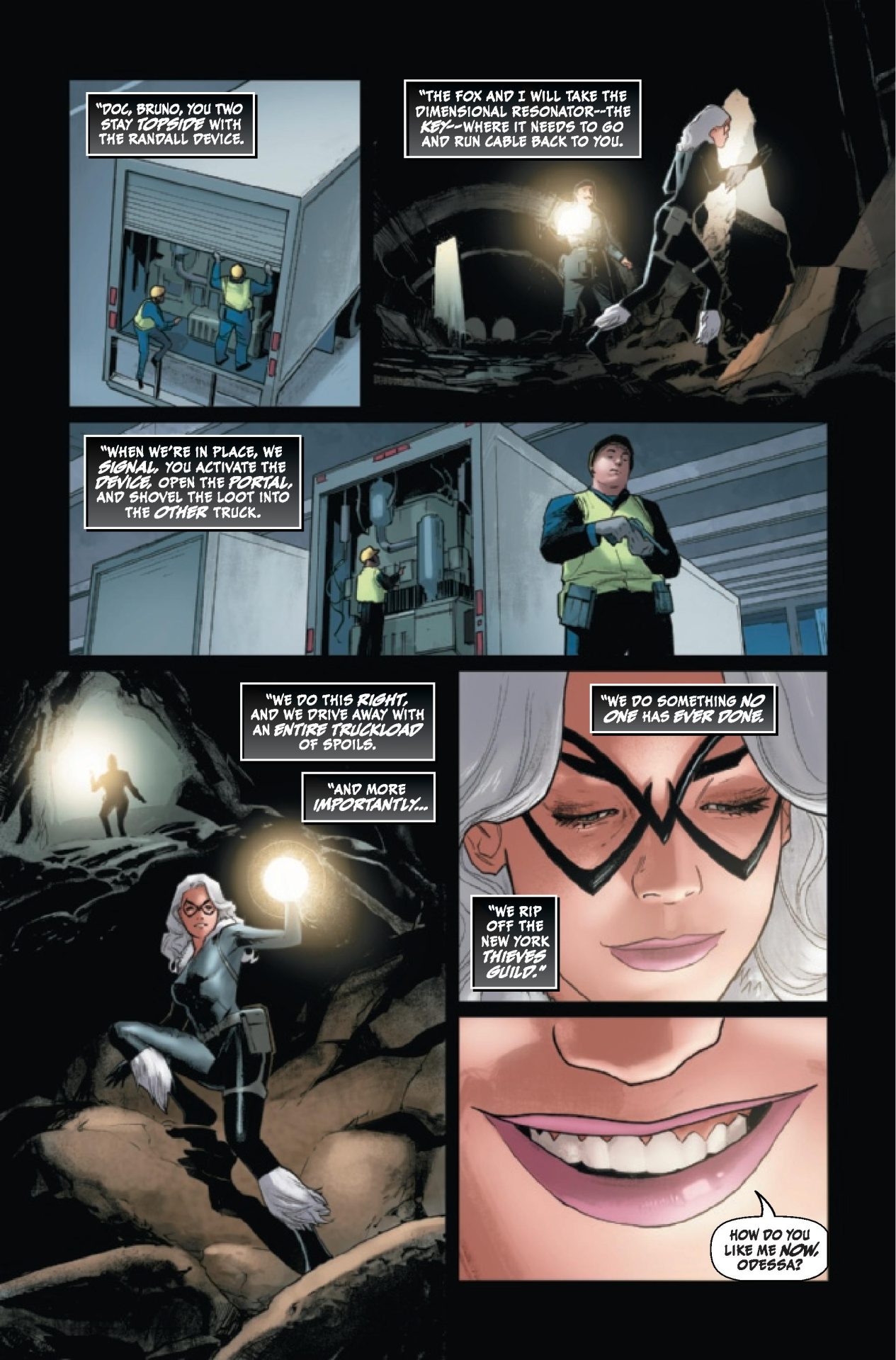
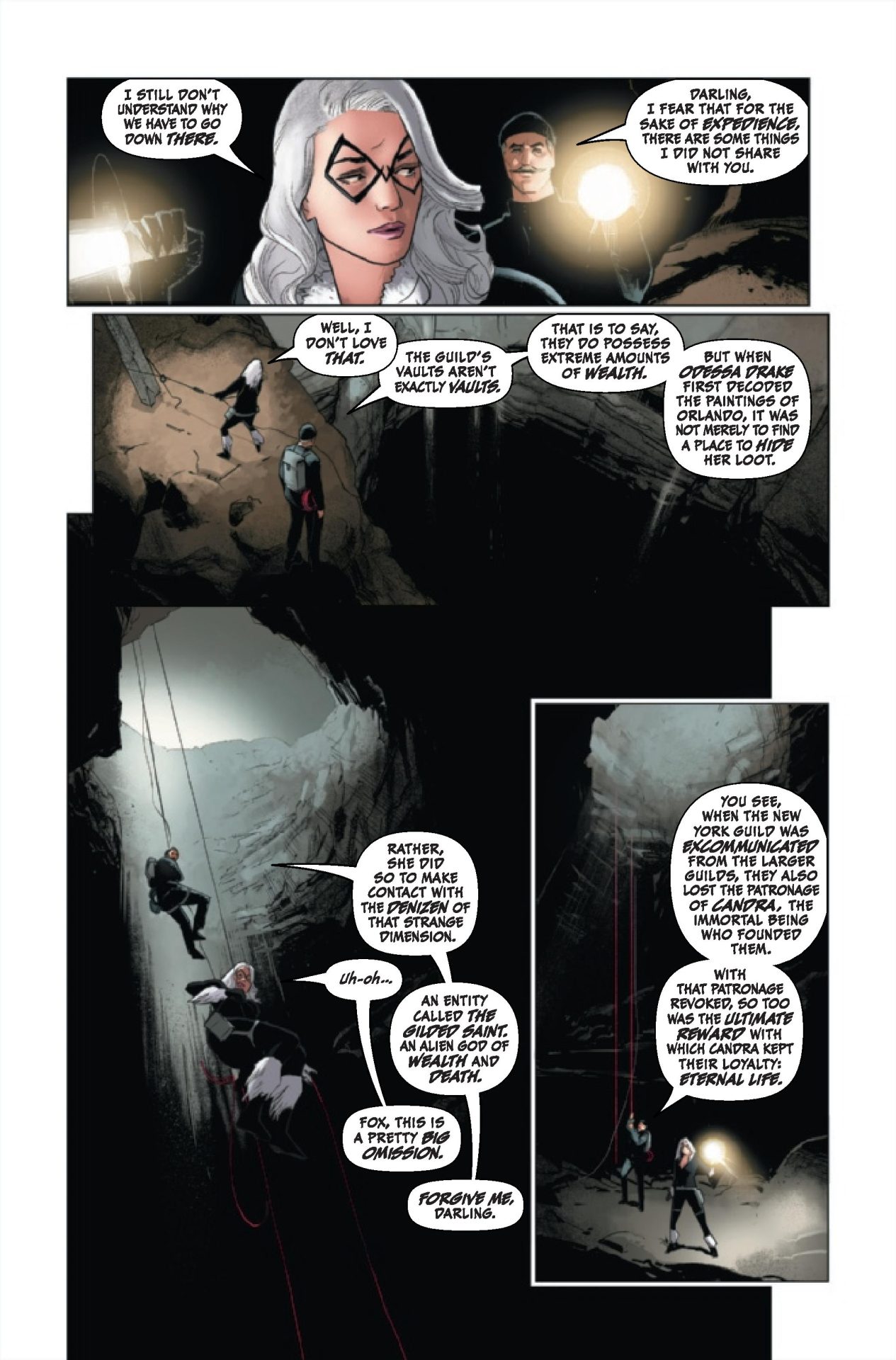
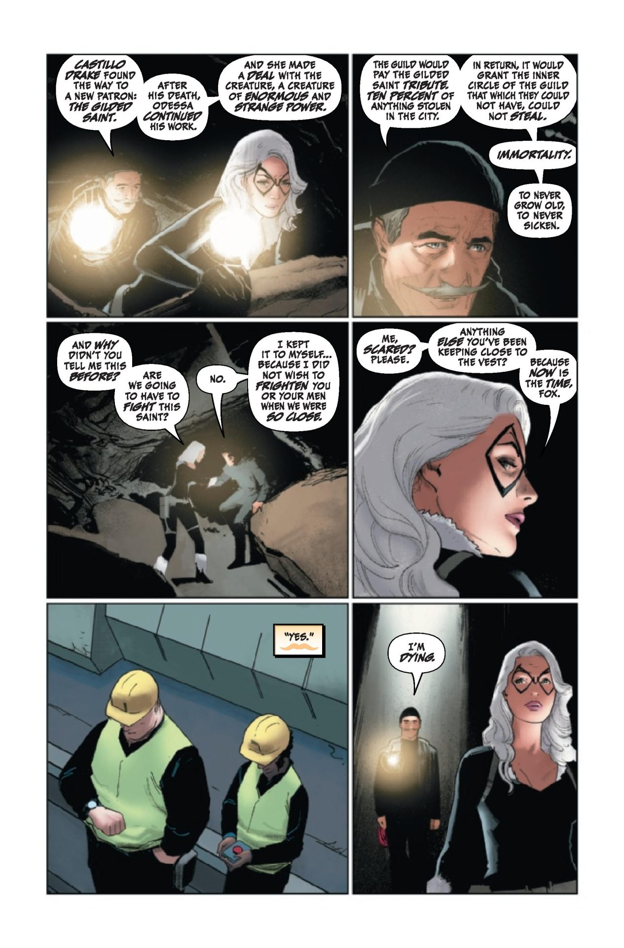
Exclusive Preview: Black Cat #5

Black Cat #5

(W) Jed MacKay (A) Michael Dowling (C) Brian Reber (L) Ferran Delgado
(CA) Pepe Larraz, Marte Gracia (VCA) Carlos Pacheco
Rated T+
In Shops: Apr 14, 2021
SRP: $3.99

THE CAT’S OUT OF THE BAG!
• The Black Fox has sent Felicia and her crew to steal all kinds of items from all the ends of the Marvel U. But why?
• You’ll only find that plan here as there is zero chance you’ve guessed it already.

Black Cat #5

Review: Black Cat #1

Black Cat #1

I really enjoyed writer Jed MacKay‘s previous work on Black Cat. Those volumes have been fun, sexy, with a certain cool factor. And thankfully, none of that is missed here as Black Cat #1 kicks off a whole new adventure. The new series kicks off as a tie-in to the current King in Black storyline presenting a challenge but it pulls off the unenviable task and does so well. New York City is under attack by the symbiote god Knull and the chaos has caused Felicia Hardy’s latest heist to be interrupted. So, Felicia is out for revenge as the greater battle looks to be lost.

MacKay continues to deliver cool when it comes to Hardy and the series. There’s something very “big screen” about all of this work previously and the first issue does the same. The scenes are over the top in their depiction and the dialogue delivers that solid back and forth banter. Black Cat #1 drops Felicia into the action giving her a good part to play in the overall event. But, it also plays to her strengths and hearkens back to earlier heists. The first issue uses the bigger storyline but at its core keeps Black Cat who she is. She’s not out to play superhero and battle her way through things. She steals stuff and the comic keeps it at that.

There’s also a solid mix of what MacKay does best. There’s some solid action and humor mixed together. But, there’s also Felicia dropped into a situation much bigger than she is. She realizes it and we get an honest assessment of what’s going on. Knull and his symbiotes are attacking New York City and there’s a sense of awe to it all. Felicia is our protagonist but also gives us an average person’s view of what’s going on. She’s both a hero here but also caught off guard fighting at the side of Captain America. She gives us an honest assessment of the reality of it all and something we the reader can relate to.

C.F. Villa‘s art is fantastic. Joined by Brian Reber on color and lettering by Ferran Delgado the art delivers eye popping action with a bit of sexy. There’s something that’s been refreshing about the previous volume and this first issue. It teases the sex of it all. It doesn’t go over the top and allows the reader to use their imagination to really titillate. Where others would have put an “ass” shot, Villa puts it just off the panel with just the top showing. There’s something that’s refreshing about that as it recognizes Black Cat being a sex symbol but also not making that front and center and distracting. There’s also an over the top factor of the action scenes which are all worthy of summer popcorn fun. You can tell the art team, along with MacKay, were having fun with the issue.

Black Cat #1 is another solid start for the series. It doesn’t hold back even when dealing with an event. It takes that aspect and uses it as a launching board in some ways keeping the focus on the character and what she does best. Here’s hoping this volume sticks around for a while because this debut is a hell of a lot of fun.

Story: Jed MacKay Art: C.F. Villa
Color: Brian Reber Letterer: Ferran Delgado
Story: 8.25 Art: 8.5 Overall: 8.35 Recommendation: Buy

Marvel provided Graphic Policy with a FREE copy for review


Purchase: comiXologyKindleZeus Comics

« Older Entries Recent Entries »