
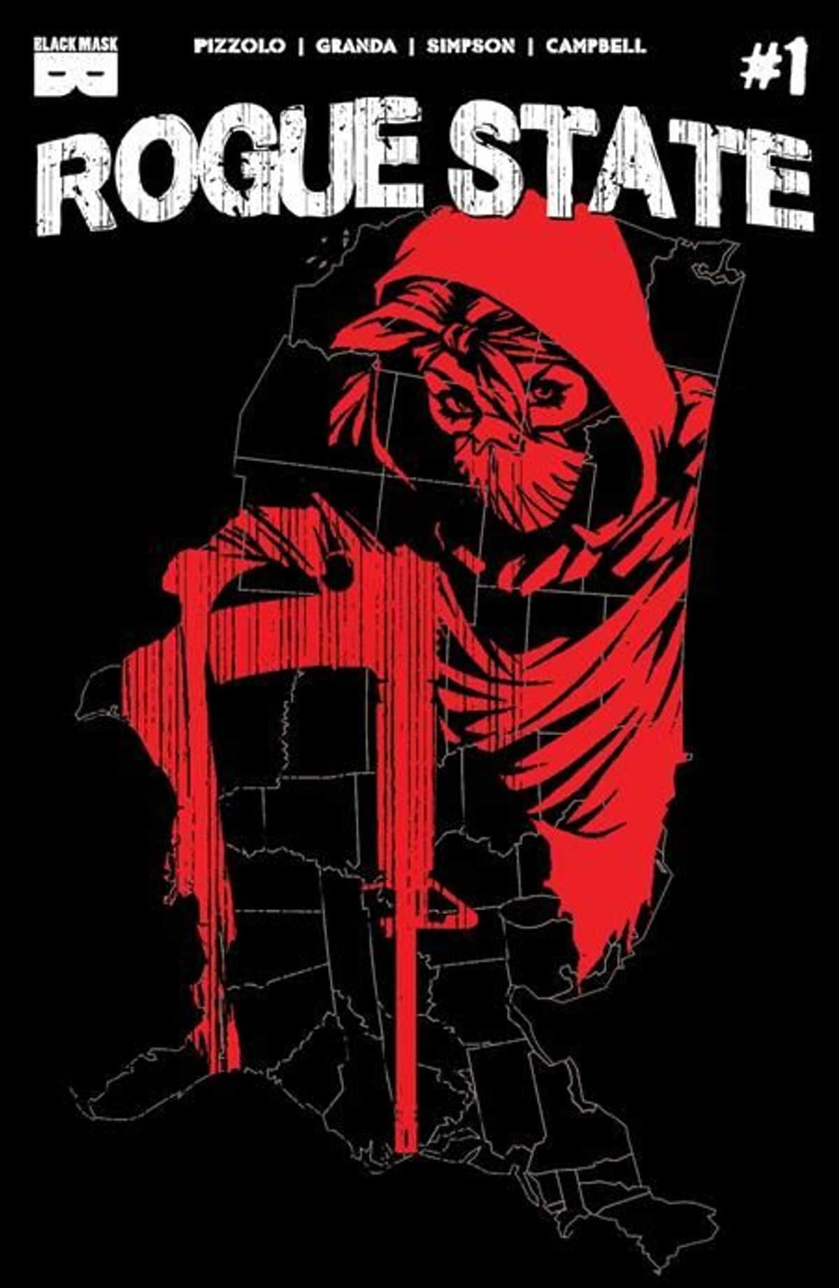
Review: Rogue State #1
What if a contested Presidential election plunged America into turmoil? What if political violence consumed the streets? And what if a raging Supreme Court, in a strict interpretation of the 2nd Amendment, legitimized and deputized all militias, transforming the entire country into a paramilitary police state? Rogue State #1 takes reality and moves it to the extreme so many of us are worried about.
Written by Matteo Pizzolo, Rogue State #1 is an interesting start but doesn’t quite have the hook that’s pitched. While I was provided the first three issues, I read what I believe is just the first (it’s one file, so wasn’t 100% sure) and there’s a lot of potential. The idea of a nation torn apart by an election is one that has so much potential for storytelling. Where this series is going is a mysterious figure eventually rising and whether that individual is a freedom fighter or a terrorist. Unfortunately, none of that is conveyed in the debut. Instead, we get an inept militia, corrupt cops, and a character who seems to be very acrobatic for unknown reasons. It all comes across as good ideas, but not meshed together well.
Where Rogue State #1 falls flat is that none of the crisis or danger feels felt. There’s little escalation from what we see every so often on television. BLM protests and Antifa/Proud Boy clashes have more danger, tension, and stakes felt around them. We get a main character who’s an unemployed architect that can scale buildings like Spider-Man and a clash between protestors and police. All of which feels a bit exaggerated or not exaggerated enough. There’s also something about drugs and bootlegging but none of that really feels relevant so far, it just fills space. In other words, the danger of the world is never really established. Pizzolo opens with an inept militia that can shoot something 20 feet away and come off more Barney Fife than Terminator.
Carlos Granda‘s art doesn’t help matters. Characters aren’t consistent in their look which at times distracts and moments that should have the feel of danger feel more like slapstick comedy. The art tone, and tone of situations as a whole, don’t match the pitch. Granda is joined by Brad Simpson on color and Jim Campbell on lettering. The color does stand out in its purples and pinks, a sky motif playing off the sunset and down of a new day. The lettering I noticed one issue where it looks like a word was cut off at the top of the word balloon, an odd mistake.
Rogue State has potential and maybe as it gets going things improve. But, as an opening issue, Rogue State #1 falls into the trap so many high concept comics have lately. The concept doesn’t match the execution and things fall short of what is promised. It feels a bit scattered in its focus overall. We’ll see if that continues to be true but for a first issue, this one stumbles.
Story: Matteo Pizzolo Art: Carlos Granda
Color: Brad Simpson Letterer: Jim Campbell
Story: 7.0 Art: 7.0 Overall: 7.0 Recommendation: Read
Black Mask Studios provided Graphic Policy with a FREE copy for review
Purchase: TFAW – Zeus Comics
Discover more from Graphic Policy
Subscribe to get the latest posts sent to your email.