Tag Archives: nolan woodard

Get Fury #1 delivers classic Garth Ennis and Jacen Burrows

Get Fury #1

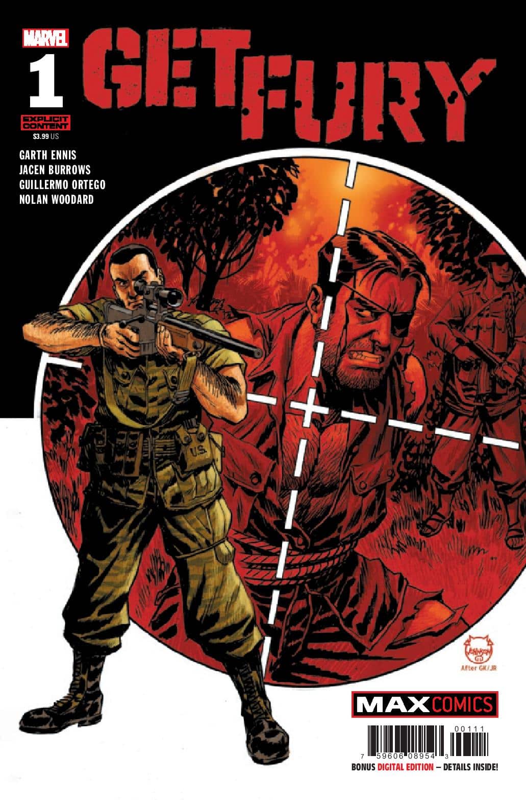
It’s 1971, there is a war raging in Vietnam, and Nick Fury has been captured by the Viet Cong. At this moment, they don’t quite understand that they have in their possession a man who knows enough secrets to damage the United States beyond comprehension. The C.I.A., however, DOES realize this and they can’t risk their enemy getting those secrets, so they dispatch the most deadly man in the U.S. Army – LT. Frank Castle. Get Fury #1 delivers a debut that bleeds classic Garth Ennis and Jacen Burrows delivering a great concept and over the top shocks.

When it comes to Garth Ennis mature rated comics, be prepared for shocks. They’re usually over the top stepping into comedic levels that is hard to take seriously. Get Fury #1 builds to those moments in what is a really solid concept and debut.

Set during the Vietnam War, Fury has been captured by the Viet Cong and holds so much information in his head, the U.S. is afraid he’ll be tortured for it. So, they send Frank Castle in, not to free Fury, but to eliminate him. Now, why can’t they rescue Fury? That’s explained. Why send Castle? That’s explained too. Ennis does an amazing job of not only setting up the concept but answering questions that might take readers out of it and does so in a very natural way.

Ennis also gives us some human elements to it as well. Fury is the leader we’d expect and want instructing his men on how to survive and delivering some key details. There’s some emotion as things go south for his team where you feel his anger. Castle’s introduction is one of the best I’ve seen with a moment that’s just fantastic as he goes back and forth with some other soldiers. It shows how… off… Castle is but also a code he goes by and how he’ll stand up for his men. It throws into question how he’ll handle the mission he’s presented with.

The art is solid with Jacen Burrows’ usual style. With ink by Guillermo Ortego, color by Nolan Woodard, and lettering by Rob Steen, the comic feels like it builds to the crazy with an ending full of bloody shocks you’d expect from this duo. What begins as horror goes to levels that are so excessive it’s almost comical and pulls the reader from being grossed out to entertained.

There’s a rawness to the comic in both its art and dialogue. It has its feet planted in the world of Ennis/Burrows and of the time. It’s full of dialogue and words that’ll make readers cringe at times with racist terminology which, while outdated today, is right at home considering the setting. But be warned, it’s there.

Overall, Get Fury #1 feels like a lost Rambo script in some ways. It takes classic characters, a real setting, mixes it up with a pretty straightforward mission, and adds in some ultra-violence. Altogether, it’s classic Ennis fans will enjoy.

Story: Garth Ennis Art: Jacen Burrows
Ink: Guillermo Ortego Color: Nolan Woodard Letterer: Rob Steen
Story: 8.0 Art: 8.0 Overall: 8.0 Recommendation: Buy

Marvel provided Graphic Policy with a FREE copy for review


Purchase: Zeus ComicsKindle

Loki: Agent of Asgard Infinity Comic #1-10 is FREE on Marvel Unlimited

Ahead of Marvel Studios’ Loki Season 2, Marvel Unlimited has adapted the first five issues of Loki: Agent of Asgard into the vertical Infinity Comics format! Exclusive to the Marvel Unlimited app and web service, Marvel’s Infinity Comics are a lineup of digital comics and series that are designed for vertical, mobile reading. Each Infinity Comics series also offers an ideal entry point into the world of Marvel Comics, either through ongoing series that tie into current comics continuity, or self-contained stories that dive deeper into the Marvel Universe.

Now, Loki: Agent of Asgard Infinity Comic #1-10 is FREE on Marvel Unlimited, and fans of Asgard’s God of Mischief will want to read this run in full. After getting a second shot after nearly losing it all in Young Avengers (2013), Loki worked on behalf of Asgard in this 2014 run by Al Ewing, Lee Garbett, and Nolan Woodard. Starting with a heist on Avengers Tower, an undercover mission in the casinos of Monte Carlo, and even a speed dating event in New York, this Loki is all grown up—and he’s stronger, smarter, sexier and just plain sneakier than ever before. But what could be Loki’s opportunity for a redemptive quest takes on a whole new meaning, and our slippery antihero must choose his allies wisely or risk disappointing the All-Mother and all of Asgardia…

Loki: Agent of Asgard Infinity Comic #1-10

Star Wars: Yoda #5 shows how darkness resides in all of us

Star Wars: Yoda #5

What does one o do when they see something bad about to happen? Imagine you knew something was going to happen, and you may have some power to stop it? This si where your moral compass contends with your logical side  This is where we most want to interfere or speak up.

What usually hold people back is the repercussions. As they wonder if it is something they ignore or it something that propels them to act. This is why we should always pay attention to our intuition.  In Star Wars: Yoda #5, Yoda and Dooku must trust the Fore that something dark is amidst.

We are taken to Alaris Prime, 12 years before, where Yoda is summoned to assist, as he meets a young Padawan who would become one of his most gifted students. We fast forward, and one of his students, Krrsisih, is filled with Dark side, as it seethes over his being, creating conflict where there is none. which leads  to Yoda unpack why the Padawan is so troubled, and it all comes down to tribal differences. Dooku arrives looking to help Krrsisih, as he still seeks  answers . By the issue’s end, the initiates are sent out on a wilderness retreat, but trouble arises when Krrsisih decides to fulfill a prophecy he saw in a dream.

Overall, Star Wars: Yoda #5 is an issue which shows how darkness resides in all of us. The story by Houser is exhilarating.  The art by the creative team is dazzling. Altogether, a story that being slow to hate, is harder than anyone can imagine.

Story: Jody Houser Art: Luke Ross
Color: Nolan Woodard Letterer: Joe Caramagna
Story: 9.0 Art: 9.0 Overall: 9.0 Recommendation: Buy

Marvel provided Graphic Policy with a FREE copy for review


Purchase: TFAWZeus ComicscomiXology/Kindle

The Forged #1 starts a familiar sci-fi action adventure

The Forged #1

In the 11th Millennium of the rule of the Eternal Empress, a squad of planet-smashing super soldiers find their routine mission to be anything but. These are the Forged. They take no prisoners. The Forged #1 kicks off the action with introducing us to the sci-fi world while also delivering a lot we’ve seen before.

Written by Greg Rucka and Eric Trautmann, there’s a lot I liked about The Forged #1. It’s a sci-fi story featuring soldiers being sent on a mission they have a bad feeling about. If that sounds familiar, it’s because we’ve seen that exact story many times before. And that’s the bad thing about The Forged #1 as well. We’ve seen a lot of it. While the art is great and the setting and characters are interesting, at its heart is a plot that’s been done over and over.

The Forged #1 is forged from a lot of what’s come before. In the description it’s mentioned that it’s inspired by Conan, Heavy Metal and “other comics you tried to hide from your parents.” In its DNA is also Aliens, The Fifth Element, Starship Troopers, and a lot more. None of that is a bad thing but it also puts the pressure on to deliver something that’s a bit different from all of those elements. Unfortunately there’s only a little of that.

What gives the series hope is its core of characters, the actual tactical team being sent on the mission. Their comradery and interactions save the comic and make it entertaining enough to check out as well as continue on to the second issue. Likeable characters, though each fitting a certain role, keep things going and make the read worth it.

What’s also worth it is Mike Henderson‘s art. With color by Nolan Woodard and lettering by Ariana Maher, The Forged #1 is an intriguing start taking place mostly on a ship. It’s all rather unremarkable for the most part, creating an almost sterile feel to the issue. And that’s actually interesting. With intriguing character designs in the stories they tell, it’s a world that feels a bit “clean” but with a slight grime just underneath the surface. There’s some great colors that pop at times enhancing intriguing page layouts at key moments.

There’s nothing inherently bad about The Forged #1. It’s entertaining sci-fi action. It’s problem is so far it’s sci-fi action we’ve seen before. The troops getting their orders preparing for the drop on a mission you know is going to get fubar. It’s rather pain by numbers in that way. Still, it’s an entertaining read setting up potential for an intriguing world and hopefully more interesting mission to come.

Story: Greg Rucka, Eric Trautmann Art: Mike Henderson
Color: Nolan Woodard Letterer: Ariana Maher
Story: 7.65 Art: 8.4 Overall: 7.75 Recommendation: Read

Image Comics provided Graphic Policy with a FREE copy for review


Purchase: TFAWZeus ComicscomiXology/Kindle

Exclusive Preview: Captain America: Sentinel of Liberty #5

Captain America: Sentinel of Liberty #5

(W) Collin Kelly, Jackson Lanzing (A/CA) Carmen Carnero
(L) Joe Caramagna (C) Nolan Woodard
(VCA) Paco Medina, Netease
Rated T+
In Shops: Oct 05, 2022
SRP: $3.99

The Outer Circle’s most recent defector leads Steve Rogers and Bucky Barnes to the Outer Circle’s headquarters – and to the answers Steve seeks about the origins of his shield. But Bucky already has his answers and is looking for solutions. Will decades of friendship be enough to outmaneuver an enemy who calls himself the Revolution? The world of Captain America is rocked in this can’t-miss issue that will have ramifications for years to come!

Captain America: Sentinel of Liberty #5

Exclusive: Judgement Day comes for Carol Danvers, Lauri-Ell, and Chewie in Captain Marvel #42!

Judgement Day descends for Captain Marvel in Captain Marvel #42. In this A.X.E.: Judgement Day tie-in, Carol, her sister Lauri-Ell and even Carol’s cat, Chewie must be judged! And Carol has had more than enough of being judged lately! How will the trio help determine if Earth lives or dies? As Carol and Lauri-Ell give their heroic best to prove their worth an…unexpected new player emerges.

Captain Marvel #42 is written by Kelly Thompson with art by Andrea Di Vito and colors by Nolan Woodard. It features a main cover by Juan Frigeri with variant covers by Gurihiru and Jamie McKelvie.

Captain Marvel #42 is on sale October 12th! Get an exclusive first look at the issue below!

Review: Captain America: Sentinel of Liberty #1

Captain America: Sentinel of Liberty #1

With two Captain America comics, one with Sam Wilson the other with Steve Rogers, I’ve been wondering how the two would stand out from each other and at the same time, how they might be similar. So far, the two debut issues are very similar… but in good ways. The two comics are similar in that they explore the differences between the two heroes who share a mantle and responsibility. Captain America: Sentinel of Liberty #1 focuses on Steve Rogers and its start is an entertaining one that delivers a lot of potential and entertainment.

Written by Jackson Lanzing and Collin Kelly, Captain America: Sentinel of Liberty #1 is Steve Rogers’ role as Captain America. The two take the character to his roots, exploring his past, and most importantly the man under the mask. Rogers heads back to his childhood home and attempts to create a life in the neighborhood he grew up. This isn’t his retirement though, as he also has to leap into action literally saving July 4th.

Captain America: Sentinel of Liberty #1 and its sister series are interesting in that they both follow a bit of a formula. They focus on the two individuals under the mask and also deliver a lot of action. The action though is really a driver of what’s to come for each series and its the “human” moments that are the most interesting for both.

In this case, we get some reflection from Steve as he moves into his new apartment and attempts to do some basic things like take classes at a local community college. It perpetuates the wholesome vibe of the character as he adjusts but also the years of experience as he reflects. Lanzing and Kelly deliver a hero we can relate to. Yes, he’s the embodiment of what we should aspire to be in so many ways, but he’s also very much grounded her having trouble with some basic things and interacting with his friends in very normal ways. Other than Bucky and the villain they battle together, the comic is generally absent of the rather grand world Rogers is neck deep in. It reminds us that he’s a man out of time but also just a man.

The art by Carmen Carnero is great. With color by Nolan Woodard and lettering by Joe Caramagna the comic looks great. It’s able to nail down so many moments. The art perfectly transitions from a touching reflective moment to almost rom-com-esque humor, to grand action sequences. It all fits together and flows as if there’s nothing that separates these sequences. The characters all have such personality as well.

What’s truly interesting is the mystery within the comic. The pitch is there’s unknown history involving Captain America’s shield and the comic delivers hints for the readers to decipher. That’s buried in the art and elsewhere driving clues that will have readers analyzing every panel, detail, and background. It’s an interactive, fun, and more engaging reading experience due to that.

Captain America: Sentinel of Liberty #1 is a solid debut with great art and a good start to a mystery. It just nails the beats and provides action, humor, and most importantly grounded moments we can relate to. It nails down what makes Steve Rogers an interesting character and with the other Captain America comic, the two together should deliver an interesting experience for a long time to come.

Story: Jackson Lanzing, Collin Kelly Art: Carmen Carnero
Letterer: Joe Caramagna Color: Nolan Woodard
Story: 8.25 Art: 8.25 Overall: 8.25 Recommendation: Buy

Marvel provided Graphic Policy with a FREE copy for review


Purchase: comiXology/KindleZeus ComicsTFAW

Preview: Amazing Spider-Man #77

Amazing Spider-Man #77

I’m not the biggest Spider-Man fan. He’s a character I’ve read on and off over the years picking it up when a new team comes on or a new arc begins. “Beyond” is the latest opportunity that ushering in not one creative team but a “board” guiding the character’s path. And what a path that has been so far. Ben Reilly has taken over as Spider-Man as Peter now lays in a coma fighting for his life and health. With Amazing Spider-Man #77, a new team from the “board” has stepped in to guide the issue and direction of the character.

Kelly Thompson is the writer for this issue which dials things back a little focusing on Beyond and Ben before setting him off to his next adventure. It’s an interesting issue really diving more into Beyond delivering hints throughout about this rather quirky corporation. Ben does a walk and talk with the mysterious Maxine Danger who heads up superhero development. Maxine drills Ben about his commitment to the project coming off as both threatening but also like someone trying to manage a business and taking things seriously. It’s hard to get a read off of the character to see if she’ll be part of whatever obstacles Ben will have to fight in the future.

With it, Thompson helps add more depth to Reilly who in these few issues has become a fairly well-rounded character full of doubt but you want to succeed. He comes off as real and sincere, someone we can relate to as readers. You understand his motivation and what’s holding him back in some ways. He’s trying to figure out his role and how he’s going to be the hero he wants to be. This isn’t an arrogant individual who has just put on the suit and swings away using the Spider-Man mantle. There’s thought and concern there.

Where the issue really pops is Sara Pichelli’s art. With the walk and talk there’s so much detail about Beyond Corporation that adds a lot to the company. We don’t know a lot about it so everything adds a little bit. With color by Nolan Woodard and lettering by Joe Caramagna, it comes off as a tech focused company that’s a little out there. Gags play through the background but each feels like there’s a story to tell. It’s a treat to read and just look at the art picking up every small detail.

Amazing Spider-Man #77 is a pretty solid issue. It adds a lot to the depth of the story and players and sets up the next adventure for Spider-Man. “Beyond” has done an excellent job of mixing the emotional, down to earth moments, with the fantastical superhero aspects. It’s not to late to hop on and swing into Spider-Man’s new direction and so far, it’s been well worth it.

Story: Kelly Thompson Art: Sara Pichelli
Color: Nolan Woodard Letterer: Joe Caramagna
Story: 7.75 Art: 8.25 Overall: 7.8 Recommendation: Read

Marvel provided Graphic Policy with a FREE copy for review


Purchase: comiXologyKindleZeus ComicsTFAW

Review: Fantastic Four: Life Story #1

Fantastic Four: Life Story #1

It’s a story that all comic book fans know: Four people go up to space on an experimental rocket where they are bombarded with cosmic rays. When they crash down to Earth, each of the four display a multitude of super abilities. They decide to band together for the betterment of humanity and call themselves the Fantastic Four. Fantastic Four: Life Story #1 kicks off a new take on Marvel’s first family.

The Fantastic Four have such a classic origin story. Why even tinker with it? That’s the question I was left with after reading this. I am not sure if this is meant to be canon within the Marvel U or what. With this latest rehash of Marvel’s first family’s origin, things are expanded in ways that sometimes just feel a bit unnecessary. I don’t want to nitpick everything because it’s not fair to the creative team and, to be honest, I’m a huge fan of the FF, going back to when I was a kid. They were one of the first Marvel books I picked up. Is it a case of me being too much of a fan and not wanting to accept change? Is it just a mediocre attempt at looking at the Fantastic Four in the 1960s?

Mark Russell’s update of the FF sees them being the fourth group to try and reach space. Reed meets with President Kennedy. Also present is Dr. Jones, another big-mind who ends up being passed on time after time due to Reed’s intellect and approach. The entire project shuts down and Reed is left to assemble a team and sneak a rocket up into space. With some minor tweaks, the FF is born from the flight, and Reed is left with a shocking vision from space, one of a devourer of worlds being out there.

So it falls to me to be a fan that can’t get past certain things. I just don’t like quite a few of the retcons thrown into this. It’s still not a bad book and I think someone new to the characters might get enjoyment from it. As a reviewer and a long-time fan, there’s a part of me that wants to chalk it up to not being the best story but I really think it comes down to just being an older fan set in his ways with these characters. And for a team of adventurers who’ve had the stories they’ve had, there’s not a whole lot of action within this book. Maybe one of the biggest problems I had with this is that going through the FF’s 1960 adventures, we got the mole man and a glimpse of Galactus and…that’s kinda it. No Doom, no Namor, no Frightful Four, or even the discovery of the Inhumans.

That said, I think one of Mark Russell’s strength’s is dialogue and there were a few times in this book where I really liked what was said. Reed’s 1967 answer to the question of the existence of aliens really stood out to me. And I did like Dr. Jones and the way he was woven into their history in key moments.

Life Story does have consistent good art throughout the issue. Sean Izaakse and Nolan Woodard do some solid work on this book. I really liked the colors throughout this issue and that can certainly go a long way. Like I said in my critique of the writing, there’s not a lot of action here so there’s not a bunch of cool-looking scenes of the FF’s adventures but Izaakse and Woodard make a lot of pages of people talking look pretty good.

Am I too hard? Am I too much of a fan of the Fantastic Four, unable to budge? Probably that’s the case. That said, I still found some enjoyment in this and it was way better than the Ultimate version from the early 2000s.

Story: Mark Russell Art: Sean Izaakse
Color: Nolan Woodard Letterer: Joe Caramagna
Story: 6.0 Art: 7.0 Overall: 6.5

Marvel provided Graphic Policy with a FREE copy for review


Purchase: comiXologyKindle Zeus ComicsTFAW

Review: The Union #1 is a Half-Baked Attempt at Both a new superhero Team and an Event Tie-In

The Union #1

I was familiar with Paul Grist’s work from his work with Grant Morrison on the underrated (And, at the time, highly controversial) 1989 British indie comic St. Swithin’s Day where a disaffected youngster sets out to assassinate Margaret Thatcher. With the exception of the first page that is both written and drawn by Grist in a cheeky cartoonish style, The Union #1 lacks this book’s satirical edge and dark humor and introduces a fairly generic team of UK-themed superheroes to fight some fairly generic symbiote types connected to the King in Black crossover. The visuals from Andrea Di Vito, Drew Geraci, Le Beau Underwood, and Nolan Woodard are decent and have some decent energy any of The Union members use their abilities like Kelpie masquerading as a puddle in a training session against British soldiers. I also liked the recycled Phonogram: Rue Britannia plot point though.

I’m a big Anglophile and was really looking forward to a new team of British Marvel heroes in The Union #1, but boy, was I disappointed. There are the seeds of some good ideas in the book with Grist and Di Vito establishing from the get-go that the team is a big media stunt complete with making sure that England, Wales, Northern Ireland, and Scotland are each represented by a team member. They also establish a media pecking order with everyone wanting to speak to Britannia, and Union Jack, who has appeared in comics for the past four decades and even had his own series several times, getting out and out shooed by the breakfast TV host parodies, Phil and Suzanne. It’s kind of funny because Union Jack is really the only character in the book with any kind of personality even if his narrative captions are pretty basic commentary on being a hero for a long time (Yay sliding timelines!) and the legacy of British imperialism. The other team members, Snakes, Kelpie, and The Choir also get to showcase their unique powers and be generally sassy towards their government handlers. This sounds like a superhero book, I could get into, like Justice League International with a UK flavor.

However, character development and the dynamic between The Union, the British government, and corporate sponsor Steve Darwin is all thrown aside for an editorially mandated King in Black crossover that will last all five issues of the miniseries. Paul Grist and Andrea Di Vito really get into generic superhero team-up beats complete with hapless bystanders falling under some form of mind ,er, symbiote control and a telegraphed taking out of a main character before you have a chance to really get to know them (Again, think Phonogram.). There’s also the ol’ team rallying together in a big team pose instead of a cliffhanger that makes me want to pick up the second issue. (I will because I’m a softie for British superheroes, and with his reputation, Grist deserves another chance.)

As I mentioned earlier, Andrea Di Vito, Drew Geraci, LeBeau Underwood, and Nolan Woodard’s art is probably the less egregious part of The Union #1. For example, Woodard uses deep blacks for the symbiotes against the cloyingly bright palette of the Somerset to show how silly all the media prattle seems against a real threat. In the same scene, Di Vito, Geraci, and Underwood channel medieval compositions when Britannia goes against a symbiote dragon while quipping about St. George not actually being British, which is a nice bit of satire about the emptiness and historical inaccuracy of nationalist symbolism from Paul Grist. If only the rest of the comic could have synthesized wit and action like these pages. However, I didn’t have many complaints about the art. It’s easy to follow, and each team member has a distinct design and power set even if their personalities aren’t as fleshed out yet.

Paul Grist, Andrea Di Vito, Drew Geraci, LeBeau Underwood, and Nolan Woodard introduce a new British superhero team in The Union #1, but the novelty of new characters (and the return of an old one) is soon overwhelmed by one-dimensional characterization, predictable plot beats, and the burden of having to be an origin story and event tie-in. Also, Grist’s script lacks the bite of his U.K. indie work even though he gets a couple of licks in. I’m really curious to see how much of his original vision was “editorialized” out.

Story: Paul Grist Pencils: Andrea Di Vito with Paul Grist
Inks: Drew Geraci, LeBeau Underwood with Paul Grist
Colors: Nolan Woodard Letters: Travis Lanham
Story: 6.0 Art: 7.0 Overall: 6.0 Recommendation: Pass

Marvel provided Graphic Policy with a FREE copy for review


Purchase: comiXology – Amazon – Kindle – Zeus Comics

« Older Entries Recent Entries »