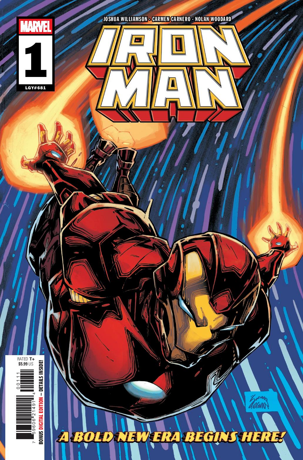
The unapologetic Iron Man is a once-in-a-lifetime hero – but the beating heart behind the armor is a once-in-a-century genius. Years ago, Tony Stark was knocking on death’s door, so he created the Iron Man armor to survive! What happens the next time death comes calling? What weapon does he create then? What if…someone else creates it first? These questions have haunted Tony for years, a ticking time bomb inside of him waiting to explode. Femme fatale Madame Masque has also asked these questions, and with the power of Advanced Idea Mechanics behind her…she’s ready to create the next great weapon. Iron Man #1 kicks off a new volume for the classic character but overall doesn’t surprise and excite.
I really enjoy Joshua Williamson‘s work. Birthright, Nailbiter, Dark Ride, G.I. JOE, his work for DC, it’s all been solid rides that hooked me from the beginning. So, his attachment to Iron Man had me excited for a character who I have had low interest in. Finishing Iron Man #1… that interest remains low.
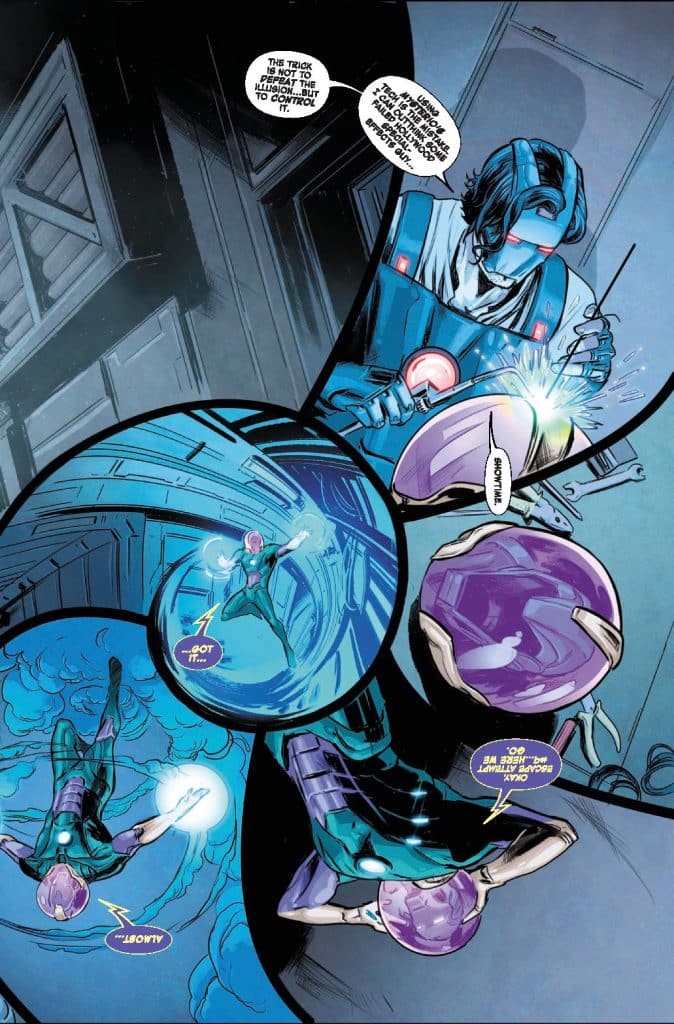
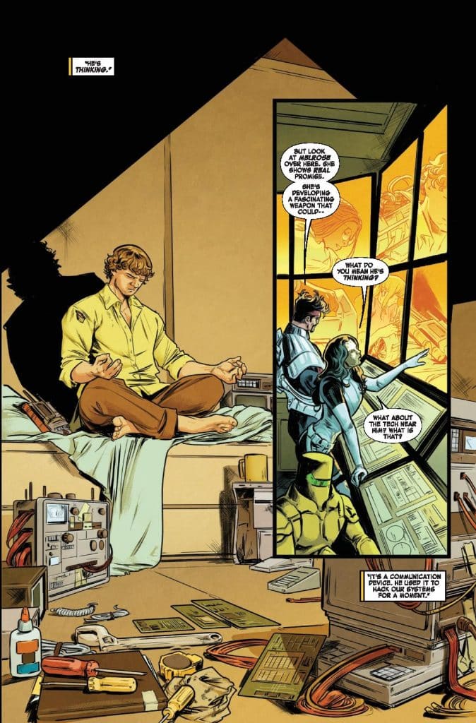
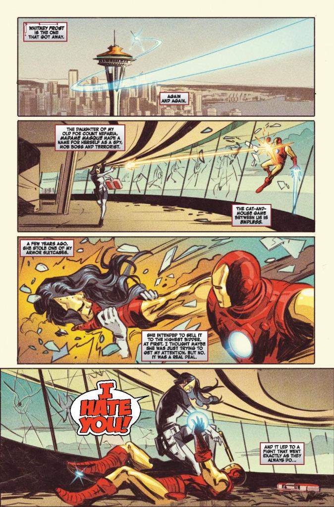
The start of the new volume has Stark celebrating an award for an individual who’s part of a “smart people incubator” he’s put together. Of course, when it comes to needing smart people, A.I.M. has interest which leads to a clash between Tony/Iron Man and Madam Masque and A.I.M. Masque has had an increased profile lately in the Marvel Universe clearly with something on the horizon to make her more of a player.
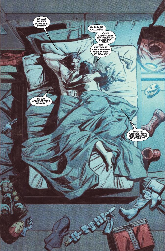
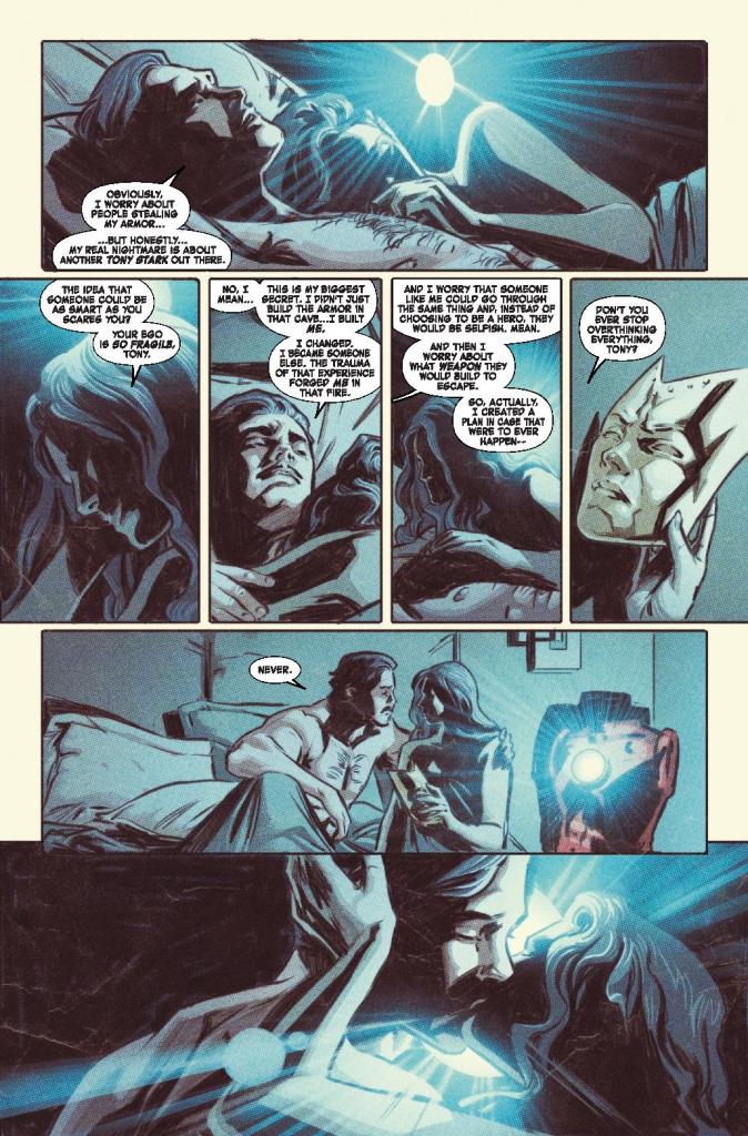
The comic has Tony being his usual mix of smarts, slightly aloof, and flirtatious with action that overall is entertaining but doesn’t feel so much as a debut as it does the start of a new arc for a series post event and well into its run. In other words, it might get some new readers but also not really memorable. It doesn’t stand out. But, Williamson delivers some potential with an ending that might echo back a bit and tying into some foreshadowing earlier in the comic.
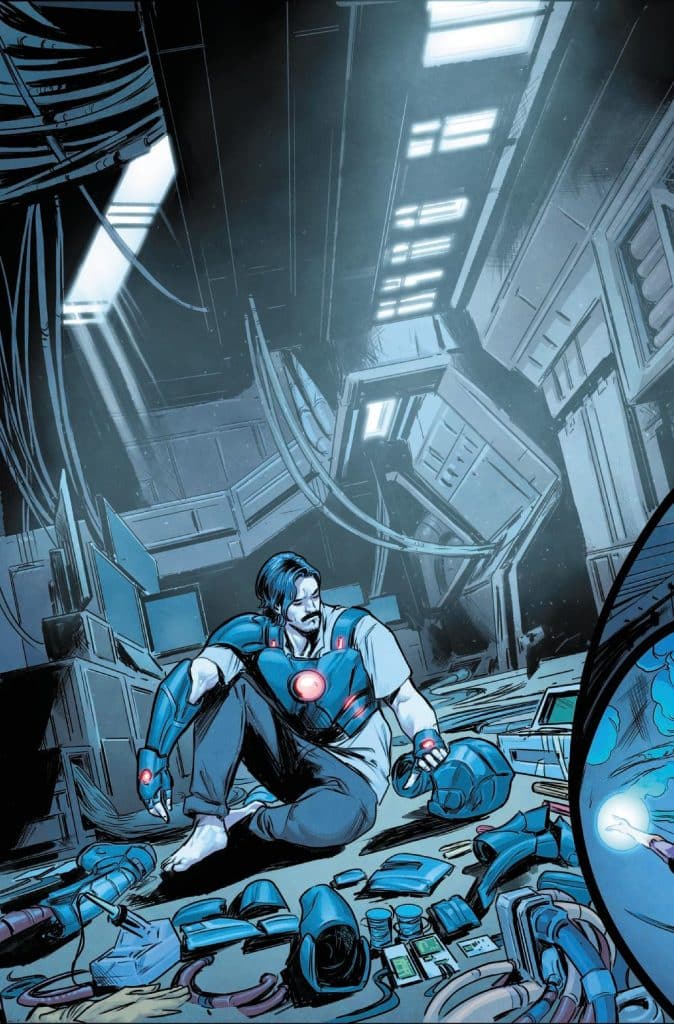
The art by Carmen Carnero is just ok. With color by Nolan Woodard and lettering by Joe Caramagna, it does what it needs to do but much like the story itself, doesn’t really stand out from the pack. It’s perfectly fine but Tony doesn’t look quite right and while the action is entertaining, it also lacks that slight punch you want in a debut issue.
Iron Man #1 isn’t bad. But, it also doesn’t excite enough to match what we know Williamson can do or a debut issue. It saves its big idea until the end and the lead up to that feels like an arc for a series that’s been around for years. This is one for the diehard Tony Stark and Iron Man fans and here’s hoping Williamson’s overall plans are a bit more exciting than this.
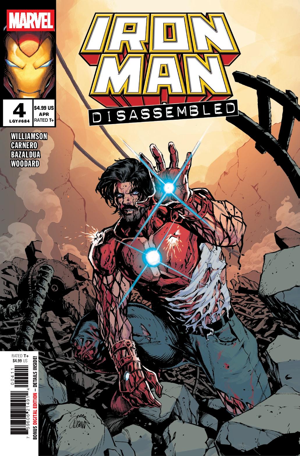
Story: Joshua Williamson Art: Carmen Carnero
Color: Nolan Woodard Letterer: Joe Caramagna
Story: 7.5 Art: 7.0 Overall: 7.5 Recommendation: Read
Marvel provided Graphic Policy with a FREE copy for review
Purchase: Zeus Comics – Kindle