Tag Archives: deron bennett

Review: Batman: The Joker Warzone #1

Batman: The Joker Warzone #1

DC’s “Joker War” has been a bit of a mixed bag for me as an event. Some of it feels like we’ve seen it before. While it has some good moments, it also feels like it never quite commits to the chaos. What bothers me the most is that the story feels like it’s just a bridge to what comes next. It’s not a story I feel like I can pick up on its own to enjoy. Through the issues of Batman, it never quite feels like a story that is a stand-alone adventure to enjoy. That might be even more pronounced in Batman: The Joker Warzone #1. It’s a tie-in comic filled with creative talent, solid stories, art, and a few “continued in 2021”. It’s also very good.

A Serious House” opens the comic. Written by James Tynion IV with art by Guillem March, color by Tomeu Morey, and lettering by Clayton Cowles it focuses on a confrontation between the Joker and Bane. The story is fantastic with a fascinating back and forth as Joker goes over his issues with Bane and contemplates ending his life. There’s a “play” like quality about the segment and with amazing art it’s the highlight of the issue. It sets up something for 2021 which feels a bit frustrating in that it telegraphs more to come instead of surprising and hints that the Joker survives “Joker War” for that to happen.

Family Ties” features writer John Ridley, art by Olivier Coipel, color by Matt Hollingsworth, and lettering by Deron Bennett. Focused on the Fox family, the story focuses on their receiving information to unlock Bruce Wayne’s fortune. But, Ridley takes that concept and adds so much to it giving us a mini-debate about what good Bruce, and thus Batman, are doing with all of this money. Could they use the money in a better way to help people? Should it go back to Bruce. With an ending that feels ripped from the headlines, Ridley shows why he’s one of the best storytellers in any medium today.

The Symbol” is by writer Joshua Williamson, art by David LaFuente, color by Hi-Fi, and lettering by Gabriela Downie. Orphan and Spoiler are on a mission to get a Bat-symbol where they wind up fighting Hench Master. Hench Master feels like a new character whose job it is to “train” henchmen for various villains. It’s a fun story that feels like it’d fit in any Batman anthology and an entertaining fun distraction that’s a bit cheerier with some good action sequences.

Ashes of Eden” is by writer Sam Johns, art by Laura Braga, color by Antonio Fabela, and lettering by Tom Napolitano. Ivy is dealing with the destruction of Eden. The entire segment is a declaration from Ivy about where her head is at and what’s to come. It’s also another story arc that we’ll see in 2021. What’s interesting, and possibly the most controversial, is Ivy seems to reject all humans and that might include Harley. Whether I’m reading too much into it, I have no idea but the Ivy/Harley stans may get a bit angry about what’s to come for these two.

Wrapping up the comic is “Clown Hunt” by writer James Tynion IV, art by James Stokoe, and lettering by Clayton Cowles. This is our first real story about Clownhunter who has stalked the Joker’s henchman and delivered brutal justice. We don’t know much about the character but we get our first good look at Clownhunter without the mask and better sense of what the citizens of Gotham thinks about him. There’s a lot of potential for a long-term interesting addition to the world of Batman and where this one goes is exciting.

Overall, Batman: The Joker Warzone #1 is a solid one-shot. It adds some stories within “Joker War” without making them vital. There’s a bit too much left to be experienced in 2021 which emphasizes my issues with “Joker War” overall. It doesn’t feel self-contained enough. If you took those segments and left out the “too be continued,” these would be really solid on their own. Even if you’re not reading “Joker War,” there’s enough here to enjoy and worth checking out. It’s the rare event one-shot where you can ignore the actual event.

Story: James Tynion IV, John Ridley, Joshua Williamson, Sam Johns
Art: Guillem March, Olivier Coipel, David LaFuente, Laura Braga, James Stokoe
Color: Tomeu Morey, Matt Hollingsworth, Hi-Fi, Antonio Fabela
Letterer: Clayton Cowles, Deron Bennett, Gabriela Downie, Tom Napolitano
Story: 8.25 Art: 8.25 Overall: 8.25 Recommendation: Buy

DC Comics provided Graphic Policy with a FREE copy for review


Purchase: comiXologyKindleZeus Comics

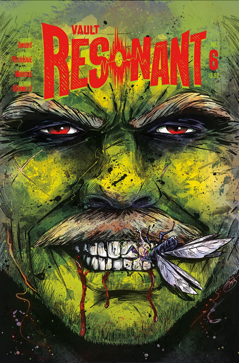
Resonant Returns in December 2020 with Skylar Patridge Joining the Team

Vault Comics has announced the return of Resonant, with artist Skylar Patridge joining the creative team. The series will return to monthly serialization in December 2020 with issue #6. David Andry and Patridge will be joined by colorist  Jason Wordie, letterer Deron Bennett, and designer Tim Daniel.  

Paxton, Claire, and Miki enact their plan to escape Honcho’s island, but they won’t get away without a fight! The arrival of Preacher, Maw, and their followers interrupts Ty’s new life with the Congregation, while Bec struggles to protect the family homestead from other hungry visitors.

Resonant originally debuted from Vault Comics in January 2019 to universal acclaim and multiple sell outs. Resonant‘s new story arc begins with issue #6, hitting stores shelves in December 2020.

Resonant #6

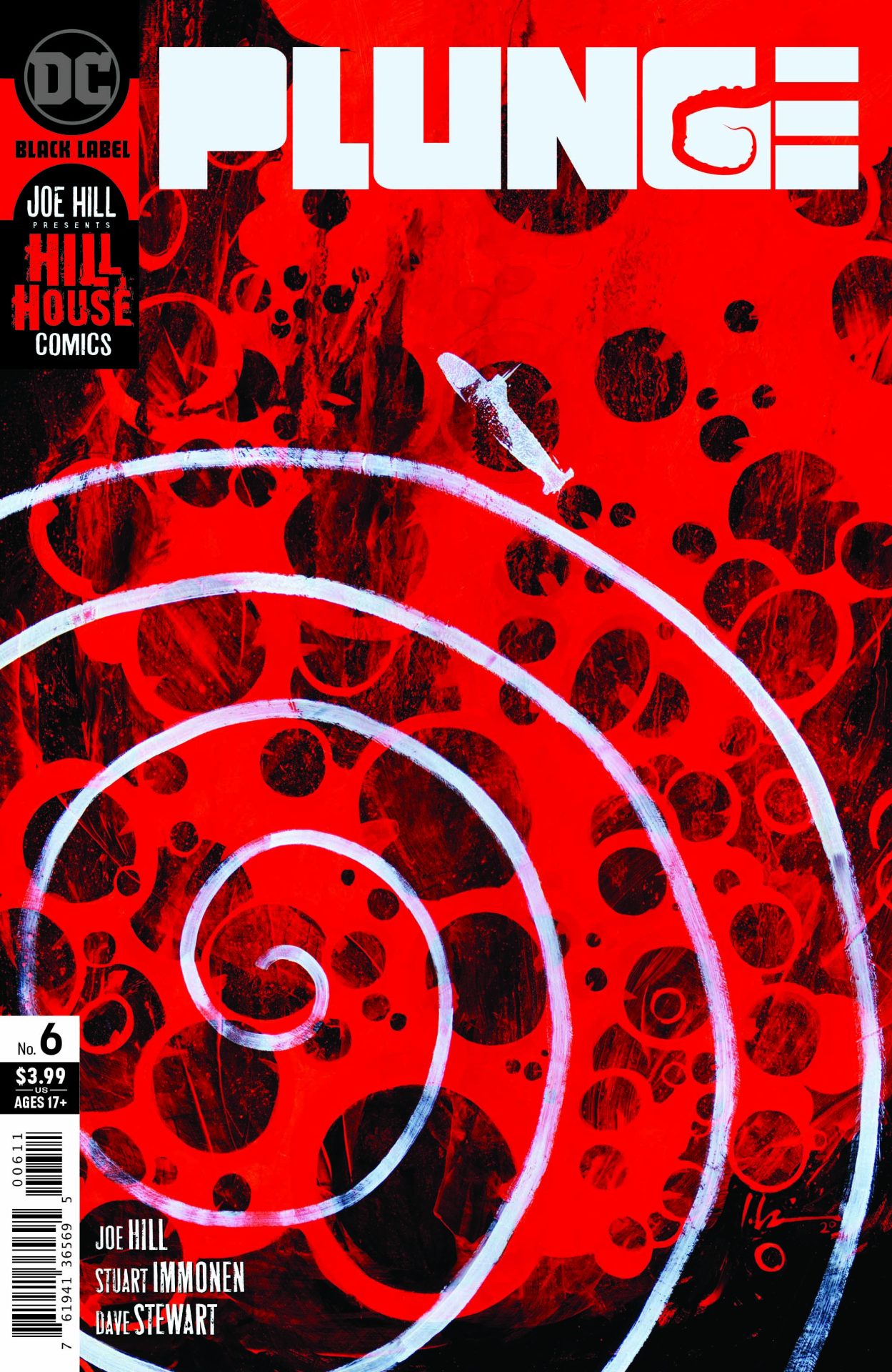
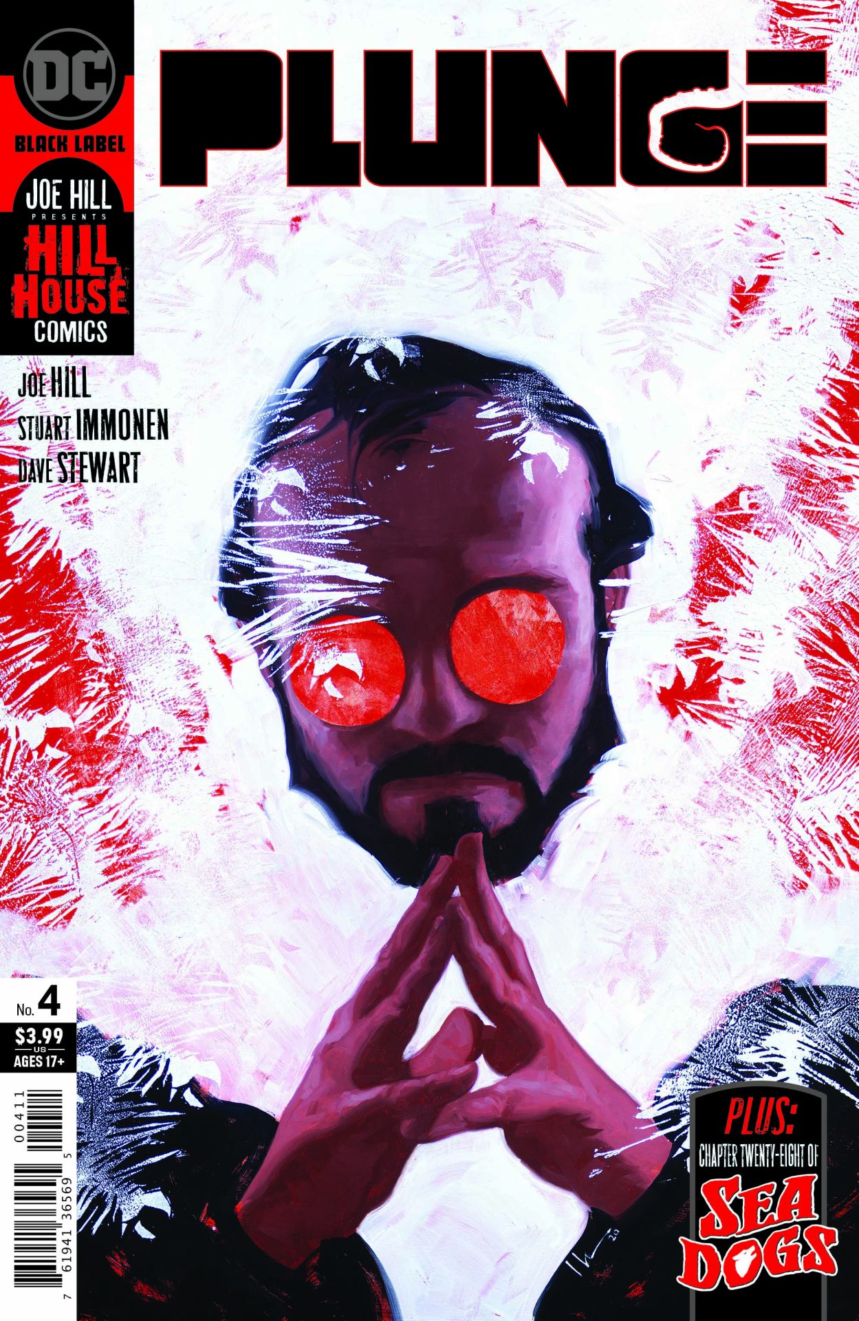
Review: Plunge #6

Plunge #6

Plunge #6 might be the perfect example of a horror story fumbling the finale. I’ve loved this series up to this point. But, that love has also floundered a bit as it became clear the series was rushing to a Cthulhu-like ending. It’s a great concept and amazing ideas looking for a great story to carry them through.

Written by Joe Hill, Plunge #6 feels like a monster movie where they’ve built up to the monster, got to the point, and then said, “let’s blow the budget.” It’s an ending that’s predictable and anti-climactic in so many ways.

For those who’ve gotten to this point in the series, the giant portal has been opened and the intelligent space worms have skittered back through freeing what’s within. That, not surprisingly is yet another Lovecraft inspired being here to destroy reality. Little is explained and we’re just expected to roll with it as our rag-tag group has to figure out how to destroy it and save everything.

The comic feels like Hill had a limited number of issues, ran out of ideas, and needed a way to wrap things up. Where the series leading up to this has been relatively creative and creepy, the finale just delivers things we’ve seen time and time again. The creative of the previous five issues is out the window for a cookie cutter ending.

Hill also leaves so much hanging and unanswered. This being can eat reality, so isn’t the reality of where it came from destroyed then? Why do the worms want to go back? What are they other than other-dimensional beings? There’s just volumes of interesting material to mine and the series feels like it’s hampered by its six-issue run. It needed to wrap up and this was the easiest way to do it.

The art is the usual fantastic. Stuart Immonen delivers sites that truly feel epic and the lookers on do come off as they are witnessing something grand. That’s helped by Dave Stewart‘s colors and Deron Bennett‘s lettering. As a Cthulhu-inspired spectacle, the comic does rock. There’s some inspiring visuals and interesting spins to concepts in the art. But, it also emphasizes this is something we’ve generally seen so many times before. The creep factor of the previous five issues is gone and we’re delivered over the top monsters.

Plunge #6 doesn’t stick the landing. It crashes hard. The series was one full of mystery and such interesting concepts and ideas. The package just doesn’t come together and jettisons all of them for a standard ending that’s been done before so many times. I wanted to see how this series ended but when I got to the end, it actually lessens what comes before spotlighting that it was great ideas with nowhere to go.

Story: Joe Hill Art: Stuart Immonen
Color: Dave Stewart Letterer: Deron Bennett
Story: 6.75 Art: 8.5 Overall: 7.0 Recommendation: Pass

DC Comics provided Graphic Policy with a FREE copy for review


Purchase: comiXology – Kindle – Zeus Comics
Preview: Plunge #6 (of 6)

Plunge #6 (of 6)

(W) Joe Hill (A) Stuart Immonen (CA) Jeremy Wilson
In Shops: Aug 25, 2020
SRP: $3.99

Sixty fathoms below the ocean’s surface, a massive hatch waits to be opened…Something within wants to emerge; wants to be born; wants to rise; wants to feed. The child is coming, desperate to fill its belly-by devouring reality itself!

Plunge #6 (of 6)

Scott Snyder, Tony S. Daniel, Tomeu Morey, Deron Bennett, and Will Dennis Kickstart Nocternal from Snyder’s Best Jackett Press

Imagine that tomorrow the sun simply doesn’t rise. You wait. And you wait, but night just continues… 

You can still feel the sun’s warmth – it must be there – but for some reason, light no longer reaches the earth. There’s only darkness. But this new darkness, there’s something strange about it, something terrifying. Because anything – or anyone – that stays in it too long starts to change… 

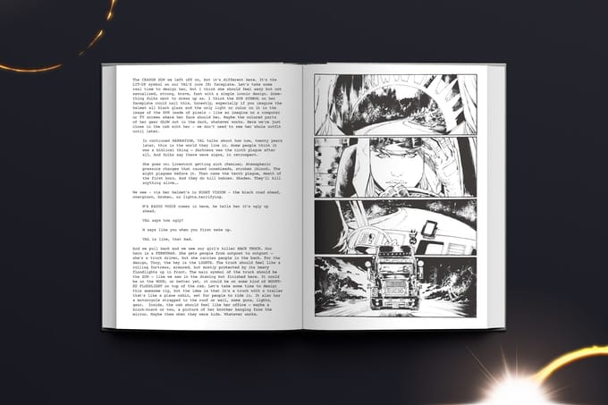
Bestselling comic book writer Scott Snyder, acclaimed artist Tony S. Daniel, colorist Tomeu Morey, letterer Deron Bennett, and editor Will Dennis are collaborating on Nocternal — a new creator-owned comic book series about humanity trying to survive in everlasting darkness — and launching a Kickstarter campaign for Nocternal Collector’s Edition, an exclusive, behind-the-scenes edition of the series’ debut issue. Starting at 72 pages, Nocternal Collector’s Edition is a one-of-a-kind reading experience, with Scott Snyder’s script displayed alongside Tony S. Daniel’s linework to provide a rare look at the process of making comics. If funded on Kickstarter, Nocternal Collector’s Edition will be released to backers ahead of Image Comics’ release of issue 1 this winter and would mark the first time that one of Snyder’s scripts has been published in its entirety. 

Nocternal takes place ten years after the world is plunged into an everlasting night that turns all living creatures into monstrous “shades.” Enter Valentina “Val” Riggs, a skilled “ferryman” who transports people and goods along deadly unlit roads with her heavily illuminated eighteen-wheeler. When an old man promising sanctuary offers Val a job to drive him and his granddaughter up through the Rocky Mountains, she takes it, hoping there might be some truth to his claim. What she finds in the end, though, is something much more horrifying than any shade…

To showcase Daniel’s line art in all its detailed glory, the creators are printing the collector’s edition in black and white, available in two formats: an unsigned softcover and a hardcover signed by Snyder and Daniel. Both editions will only be available to Kickstarter backers. The funding goal of $37K will cover the book printing, rewards production, and fees from Kickstarter, Stripe, and BackerKit. Any funds that are raised beyond the funding goal will help cover production costs for the first story arc, up until issue #6. Additional pledge tiers include a limited edition lithograph, a sketch by Daniel, a master class with Snyder, and more.

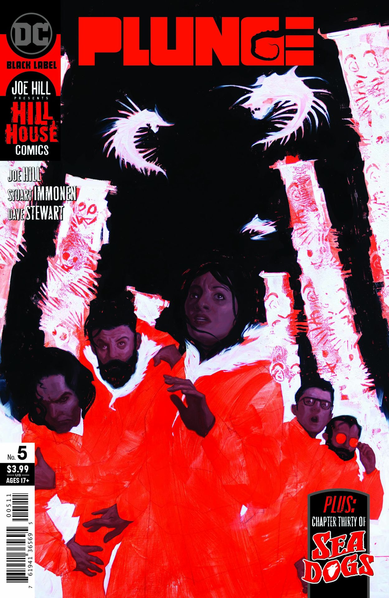
Review: Plunge #5

Plunge #5

If you’re a sci-fi horror fan, Plunge is a series that’s a must for you. Plunge #5 delivers a lot more reveals as we get a better idea of what the alien worms want and is full of betrayal and grief. When we last left them, the crew were debating whether to give the worms what they want or if there were other options.

But what’s in the hatch and what do the worms want?

Written by Joe Hill, the issue is claustrophobic in a way as the ship’s crew is locked away debating what to do. With some intelligent moves they use the infected individual to learn more about the worms delivering a reveal to us. While the direction hinted at isn’t quite Earth-shattering and somewhat predictable, it’s a good direction to go in to. What’s lead up to this moment is gone over and it’s full of creepy goodness.

What Hill does that’s fantastic is keep the story focused on the characters. You get a sense of fear and desperation, most importantly anger. There’s anger at what must be done and the sacrifice that happens. Much of the comic has a feel of a condense play in that way with a focus on a small group in a tight location.

As I said, the revelation itself isn’t anything major. It’s somewhat predictable and where I thought the series was going. While I was hoping for something different, this direction in a way keeps the story simple focusing more on the characters instead of a crazy idea.

All of this is helped by the art which focuses so much on the body language and facial expressions. Stuart Immonen and Dave Stewart as usual knock it out of the park. The series keeps it all disturbing without making things gross. It’s just enough to unnerve some readers (like myself). Deron Bennett‘s lettering too is key when it comes to the possessed individuals and their speech. Again, like the art, it adds a bit of unease to everything.

While the reveal in Plunge #5 isn’t original, there is a lot that is in the story. We learn a bit more about the worms and how they’re described adds to the atmosphere of the comic. And that atmosphere is so much of it all. This is a horror story with sci-fi elements but at it’s heart this is about a group of individuals who are presented with a mystery and difficult choices. The series continues to entertain and has nailed it at every issue. For those who enjoy horror, it’s a must get.

Story: Joe Hill Art: Stuart Immonen
Color: Dave Stewart Letterer: Deron Bennett
Story: 8.15 Art: 8.5 Overall: 8.4 Recommendation: Buy

DC Comics provided Graphic Policy with a FREE copy for review


Purchase: comiXologyKindleZeus Comics

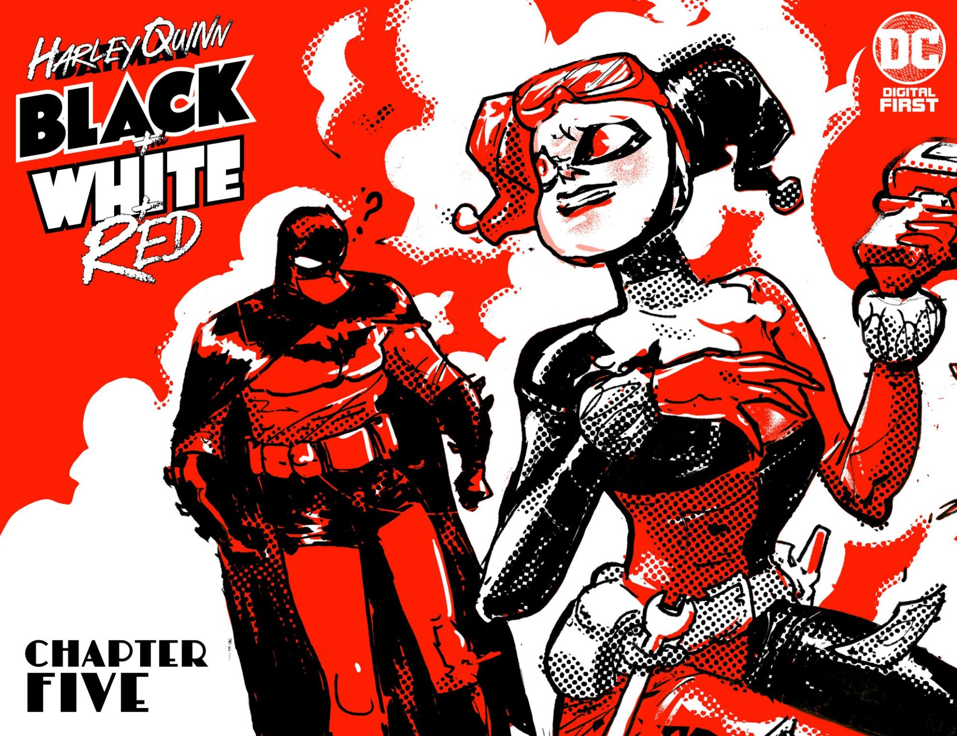
Review: Harley Quinn: Black + White + Red Chapter 5

Harley Quinn: Black + White + Red Chapter 5

Adorable is the best way to describe Harley Quinn: Black + White + Red Chapter 5. The DC Digital First series has been amazing with each release. This chapter is a prime example of the willingness to just have fun with the series. A digital series anthology, each chapter has featured a different creative team. With that, each chapter has delivered a different take on the character Harley Quinn. For five chapters it has shown how flexible a character she can be. The takes are all different and all are enjoyable. Interestingly enough, despite those differences, they’re all very much “Harley Quinn.”

Riley Rossmo handles the art and script duties for Harley Quinn: Black + White + Red Chapter 5. Rossmo is joined by Deron Bennett on letters. In it, Harley tells her version of history, and her own life, in a fairy tale like delivery. And I really do mean the history of the world as the comic begins from nothingness and ends with Harley’s passing. What’s fun about Rossmo’s delivery is the child-like quality of it all. There’s a playful innocence about it. The story is something a young kid would tell with over the top moments and exaggerations that come with a wild imagination.

But Rossmo also dives into the pain and love of Harley. Her relationship with the Joker is touched upon making it clear this was not a healthy relationship. There’s also a focus on the self-care Harley took part in with the help of her friends Catwoman and Ivy touching upon the loving relationship she has with both. There’s a honesty about it all that doesn’t sugarcoat things but at the same time doesn’t dwell and deliver trauma porn. Instead, the negative is turned into a positive as Harley focuses on how show rose above the Joker and what he had done to her to do good. How it’s depicted feels like how one might explain some of these things to a child which is befitting the type of story told.

Rossmo’s art is fantastic as always. There’s an enthusiasm and energy about it that matches Harley’s glee as she tells the story. There’s lots of small details added adding to the narrative beyond the words of Harley. A look by Harley at Ivy tells a thousand stories and a placement of a character or a small detail added gives you so much more than what’s being said.

Bennett’s lettering rocks as well. There’s small details to what’s done. Harley’s “diamonds” are included in dialogue boxes along with small blemishes. The lettering might be at an angle to match the angle of the panel. It’s all done so well and flows perfectly. The lettering “matches” Rossmo’s artistic style.

Harley Quinn: Black + White + Red Chapter 5 is fantastic, though that should be too surprising. There’s a mix of a fun story, fantastic art, great layouts, to deliver a digital experience that makes the price a steal. The digital series has been a home run so far and this latest chapter just adds to what is one of the best releases of the year. Another amazing chapter that’s an absolute must buy.

Story: Riley Rossmo Art: Riley Rossmo Letterer: Deron Bennett
Story: 10 Art: 10 Overall: 10 Recommendation: Buy


Purchase: comiXology

Summoners War is Coming to Comics in Summoners War: Legacy from Skybound

Game publisher Com2uS is teaming up with Skybound and Image Comics to create Summoners War: Legacy, a brand-new comic book series based on the worldwide mobile phenomenon Summoners War. Revealed during the “Skybound X Summoners War” panel at Skybound Xpo, Summoners War: Legacy is helmed by writer Justin Jordan and artist Luca Claretti, with colors by Giovanna Niro and lettering by Deron Bennett. It serves as an action-packed prequel to the Summoners War mobile game.

Fans who pre-order now will receive a “Con Exclusive” version of Summoners War: Legacy #1 for $10 USD, a special gold-foil issue that also comes with a redeemable in-game reward voucher for 200 Gems and three Scrolls. The con exclusive serves as a sneak preview into the larger Summoners War: Legacy comic book series, which will be published through Skybound and Image in the future.

With 32 pages of story and seven pages of additional material, Summoners War: Legacy takes place 35 years before the universe-shattering conflict at the mobile game’s center. The comic series features fan-favorite monsters, explores the fate of Durand’s parents, and expands on the mystical land of Alea and its colorful characters including Abuus, Rai, and Tomas. This riveting addition to Summoners War canon brings a rich lore to the franchise and draws new connections to the upcoming Summoners War games and the Summoners War: Sky Arena game that fans know and love.

Review: Plunge #4

Plunge #4

That was not what we were expecting. Plunge #4 delivers a lot of reveals and some teases as to what might be coming in this fantastic, and creepy, horror series. Is it a horror series? More sci-fi/horror series as revealed in this issue. Written by Joe Hill, Plunge takes place on a remote island with a salvage crew exploring what happened to a wrecked boat and its missing crew. That crew is alive decades later and full of secrets of the universe.

Plunge #4 is the big reveal issue giving us such a better idea as to what’s going on and what the mysterious worms are. It’s an issue that will make some reader’s stomachs churn with images that make you uneasy but at the same time it’s hard to look away. For me, it’s the right amount of disturbing.

It’s difficult to really review this issue without spoiling it. So, to keep it broad the reveals are really interesting and ominous. You know there’s more to it but not quite sure what that is. You also know that whatever the worms want, it’s probably not good.

And while Hill delivers all of that, he also delivers some fantastic dialogue. The issue has some shocking moments and those are enhanced by the lack of real action but it’s the dialogue that stands out. The reactions feel right in a movie sort of way. There are some smart-ass quips but generally, they’re perfect for the moment. The flow is fantastic making the issue a page-turner. That dialogue extends to the characters who do play stereotypes but each role enhances the overall story and enjoyment. None of those stereotypes are distracting at all and help drive the narrative.

The art by Stuart Immonen is fantastic. Along with colors by Dave Stewart and lettering by Deron Bennett, the art brings the perfect amount of unease. Some bugs get to me and issue delivers just enough of that for me without getting me to completely put the comic down. It shuddered a bit and my stomach churned a little but the visuals are never over the top. Stewart’s colors help with that delivering a sickly palette to Immonen’s designs. The comic feels cold and wet perfectly matching its setting.

Plunge #4 is another fantastic issue and the series as a whole is amazing. If you’re a fan of horror with a slight sci-fi tinge, it’s well worth picking up and getting. This is a comic that’s exciting to pick up and see where it’s going and what twists it has in store.

Story: Joe Hill Art: Stuart Immonen
Color: David Stewart Letterer: Deron Bennett
Story: 8.25 Art: 8.25 Overall: 8.25 Recommendation: Buy

DC Comics provided Graphic Policy with a FREE copy for review


Purchase: comiXologyKindleTFAWZeus Comics

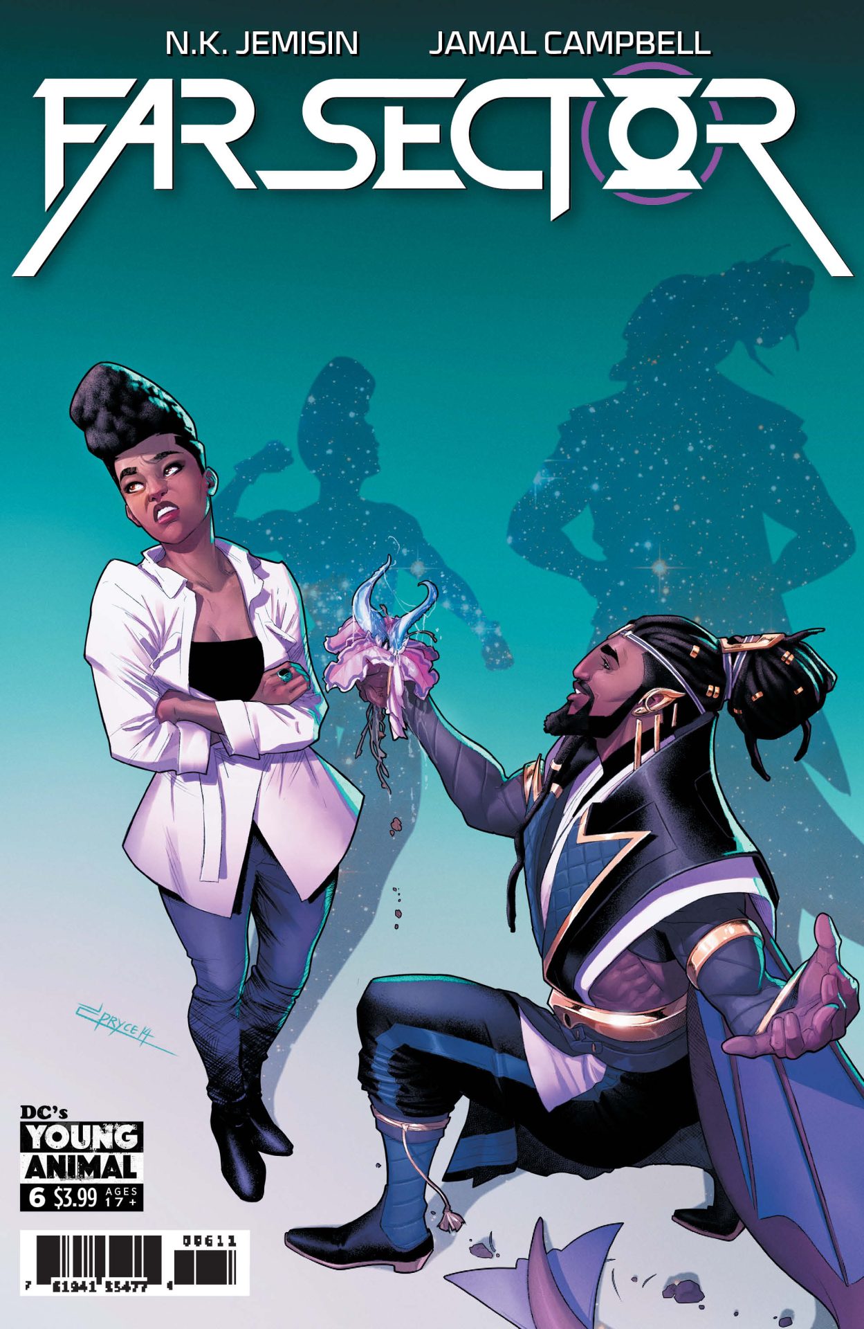
Review: Far Sector #6

Far Sector #6

To say DC’s Young Animal‘s Far Sector is capturing the zeitgeist of the time isn’t quite right. The series is at this point prescient. It deals with drug laws, police brutality, bureaucratic incompetence, social action, social justice, and more. The first issue was released in November 2019, months before COVID-19 was a thing and a half year before the current calls for justice and change across the United States. It’s a comic that was clearly written to talk about all of these issues which have been brewing for decades without knowing what was to come in reality. Far Sector #6 just so happens to release this week dealing with the fallout of police shooting at a peaceful protest killing individuals. It’s something that’s, unfortunately, playing out on our television screens and social media in real life as well.

Written by N.K. Jemisin, the series follows a Green Lantern named Jo, a former police officer and soldier on Earth, who is whisked away to an alien world. There, a murder has been committed that she must investigate. There’s also a political uprising brewing. The citizen’s emotions have been suppressed to create peace but a drug is allowing that to be overridden. Those that want to “feel” have recently protested for the right to take the drug. Those in control opened fired on the protesters killing some and injuring more. It’s eerily timed with recent events. Far Sector #6 deals with the fallout of that decision, one that so many of us wish would play out in real life. Don’t let that cover fool you. While the issue deals a lot with emotion, the series is a politically relevant whodunnit.

With leadership making decisions on logic, actual accountability is taken for their actions. The councilor who called for the shooting has taken responsibility and announced his resignation. That will take place after a referendum vote to legalize the drug “Switchoff.” This comes after an apology and investigation recognizing mistakes. Despite the closeness to reality, the issue didn’t quite hit the way I thought it might. Instead, we get a quieter issue of two characters discussing decisions and their roles and what has happened due to those decisions. The fact that the results feel adult in a way, with politicians taking responsibility, is cathartic and pollyannaish in so many ways.

But, what’s interesting is the debate within the issue of making decisions based on logic versus emotions. The issue never quite gives an answer as to which is right and which is wrong but it makes the reader ponder, especially with what’s going on today. In the comic, logic dictated actions which resulted in the death of peaceful protesters. In the real world, emotion drives the President which has also resulted in hurting peaceful protesters. There’s a lot to chew on just with that and so much more in the comic series left to go.

The art by Jamal Campbell continues to be stunning. With color by Campbell and lettering by Deron Bennett, the series is a beautiful dystopian fascist nightmare. The art is some of the best on the shelves today with colors that pop. The designs are amazing, the panel layout interesting, framing of scenes engaging. Campbell nails it in every way. Bennett’s lettering too is important. The series has alien languages, different fonts for some characters, and some fantastic use of lettering to create a sense of action. The aesthetics of the comic is on another level and has been throughout the series.

Far Sector might be one of the most important series on the shelf today. While it clearly went into things looking to discuss real-world issues, those issues have flared up and the comic has echoed moments we’re seeing played out in real time. While the lack of escapism might seem like a negative, it in fact feels like a positive. The comic is helping me process reality and work through what we’re seeing and experiencing. This series was already one of the best being released, it might now be one of the most important.

Story: N.K. Jemisin Art: Jamal Campbell
Color: Jamal Campbell Letterer: Deron Bennett
Story: 10 Art: 10 Overall: 10 Recommendation: Buy

DC Comics provided Graphic Policy with a FREE copy for review


Purchase: comiXologyAmazonKindleTFAWZeus Comics

« Older Entries Recent Entries »