
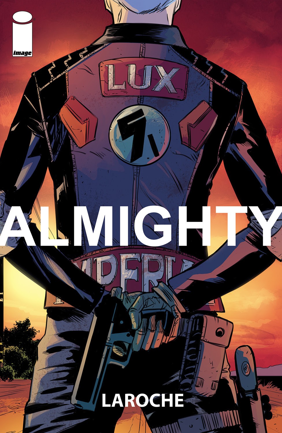
Almighty #1 is a frustrating start
The year is 2098 in a Third World America ravaged by economic collapse, anarcho-warfare, and a mysterious environmental disaster contained behind a massive wall. A girl has been abducted, and a killer has been hired to find her and bring her home. That setup for Almighty #1 sounds like an intriguing read but unfortunately the debut falls a bit short of being truly exciting and interesting.
Written by Edward Laroche, Almighty #1 delivers a pretty typical post-apocalyptic story. It hints at the world and the history which is far more interesting than the simple rescue and chase presented. A girl is being held by horrible people and a mysterious individual rescues her and takes her on the run from more horrible people who want her back. It’s not complicated and it’s something we’ve seen many times over with little to make it stand out. It doesn’t make it bad at all, it’s just very bland and typical missing out on chances to stand out from the pack.
Where Almighty #1 does stand out is its mysteries. We don’t know much about this abducted girl and why she’s wanted back nor her rescuer. There might lie the more interesting aspects of the comic, but as presented, it’s a tease and a dance than the clear focus of the series to come.
Laroche’s art though stands out. With Brad Simpson on color and lettering by Jaymes Reed, Almighty #1 features interesting characters and design choices that each tell a bit of the story. They’re hints at a world that’s far more interesting than the story presented. The rescuer Fale’s eyes and tattoos hint at a much deeper story and background than simple bounty hunter hired to bring an abducted person home. Small details like a car traveling down a highway tell so much about the world. There’s clearly a lot of thought put into all of that and it does stand out. It’s a world with a story that I want to learn more about.
Almighty #1 isn’t a bad debut, it’s just a teaser of what’s to come and it’s pretty standard. People are on the run and people are pursuing them. Beyond that, it’s a thin for plot but there’s potential here. Laroche has teased an intriguing world and hopefully that exploration delivers an interesting read. As is though, it’s a story we’ve seen far too many times.
Story: Edward Laroche Art: Edward Laroche
Color: Brad Simpson Letterer: Jaymes Reed
Story: 7.0 Art: 8.1 Overall: 7.0 Recommendation: Read
Image Comics provided Graphic Policy with a FREE copy for review
Purchase: Zeus Comics – comiXology/Kindle
 An enormous machine slowly materializes in a major West Coast city. Who sent it-and why-is a mystery, understood only by the malevolent beings gliding silently toward Earth through the inky vastness of space. In response, a multinational combat brigade called Gladiator Two-Six is deployed. Outfitted with next-generation military science and weapons, they’re tasked with stopping any extraterrestrial threat that emerges.


