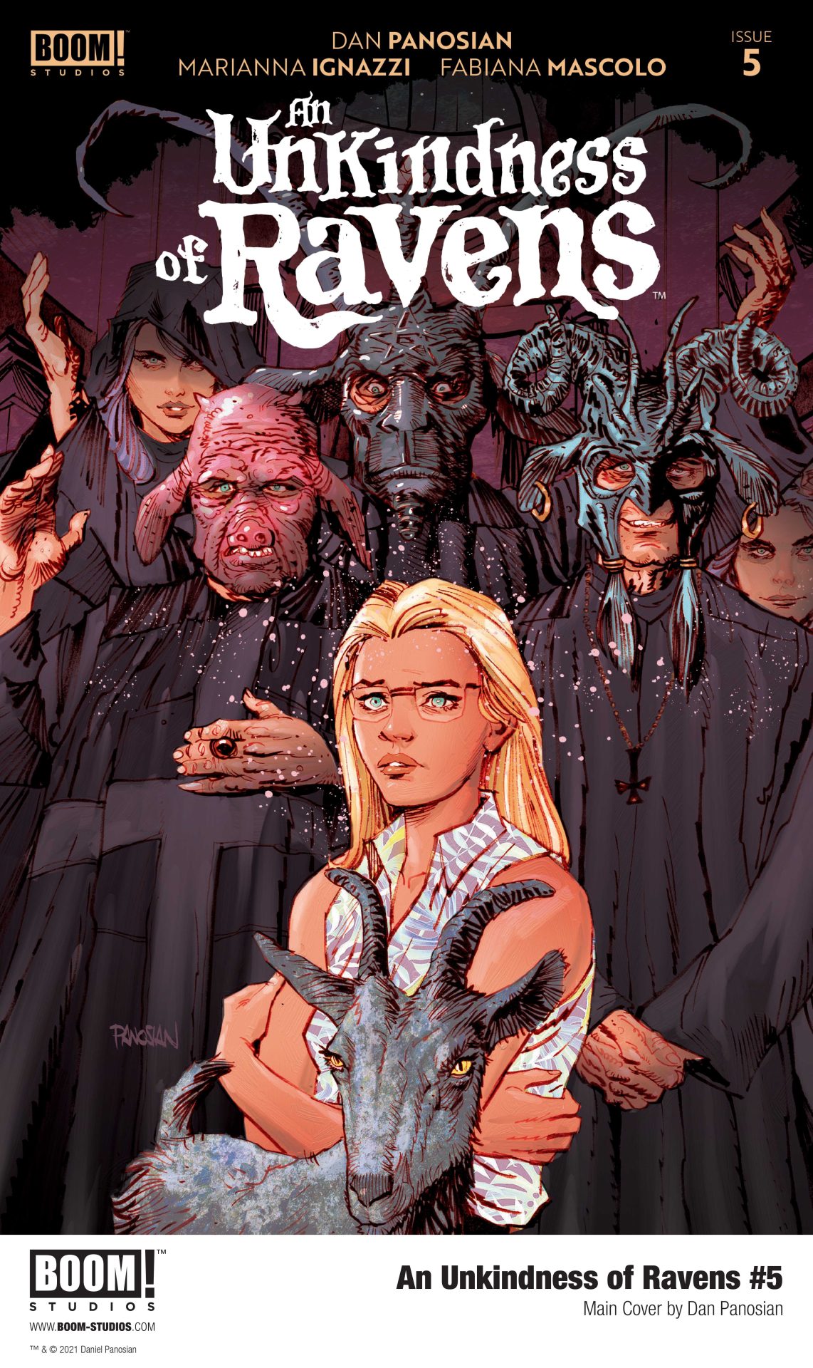
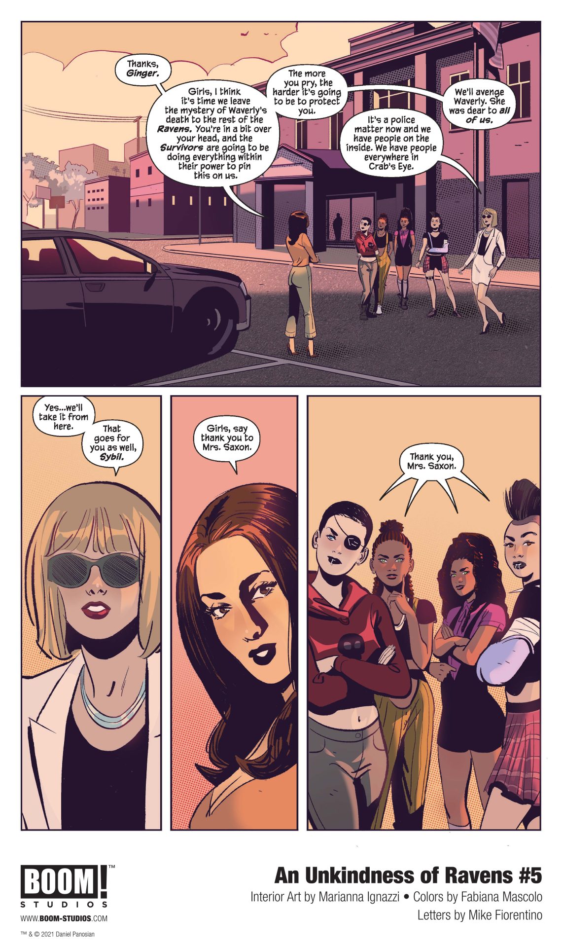
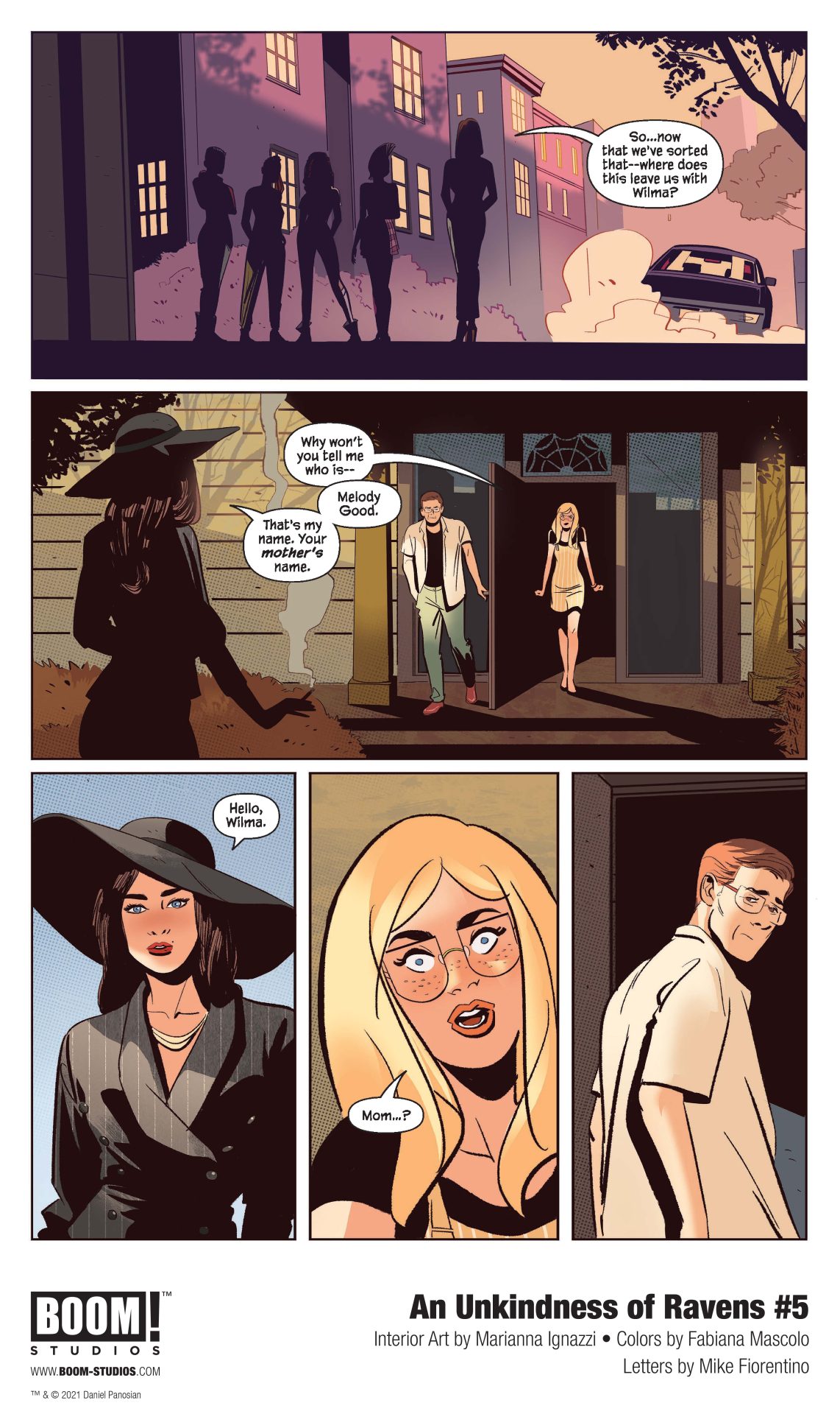
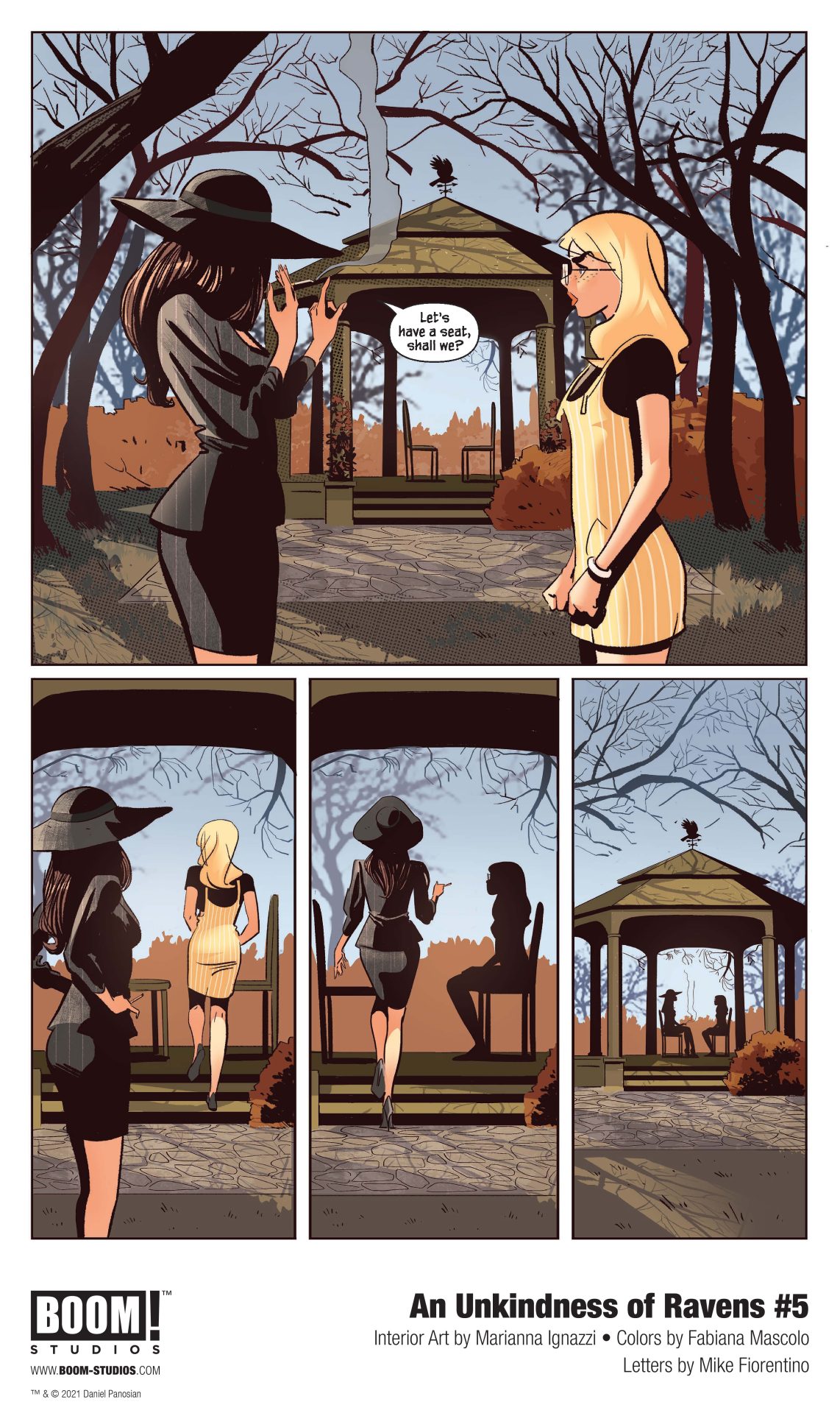
BOOM! Studios has revealed a first look at An Unkindness of Ravens #5, the series finale of the original series from acclaimed comics creator Dan Panosian, artist Marianna Ignazzi, colorist Fabiana Mascolo, and letterer Mike Fiorentino, a supernatural mystery about a group of high schoolers steeped in witchcraft and the town they live in filled with long-hidden secrets and unchecked power. Available on January 27, 2021.
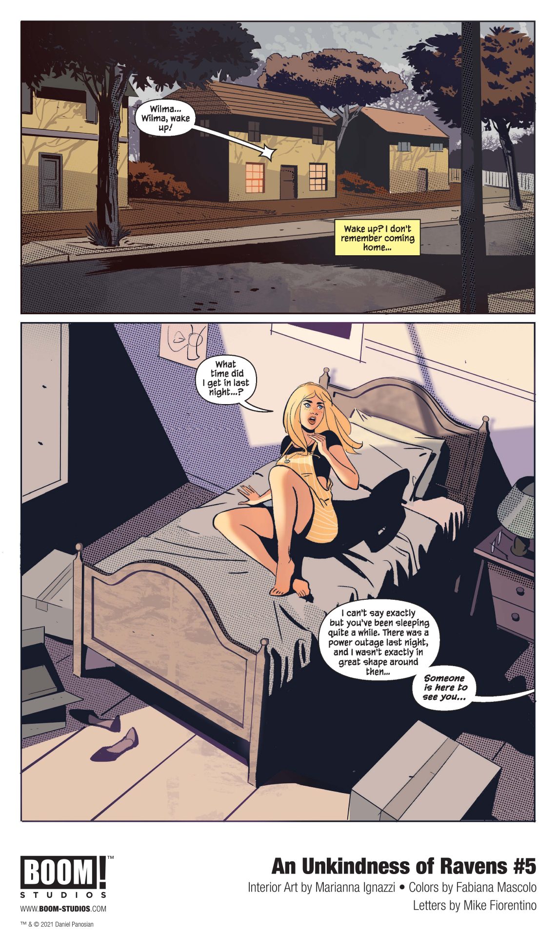
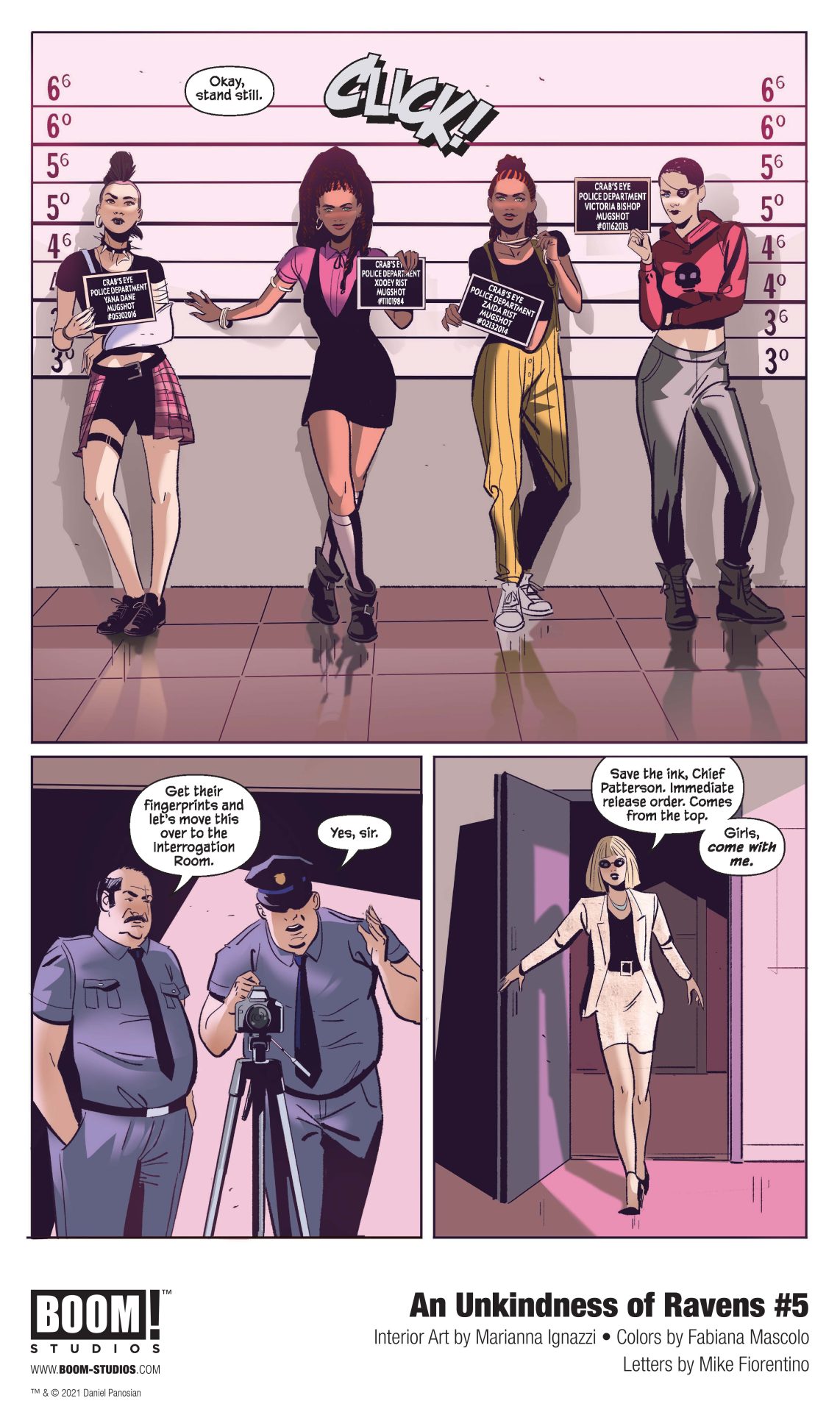
After discovering the truth about Waverly, our Ravens find themselves in over their heads, but Wilma is just beginning to understand the scope of her power and must now decide how she wants to use it…
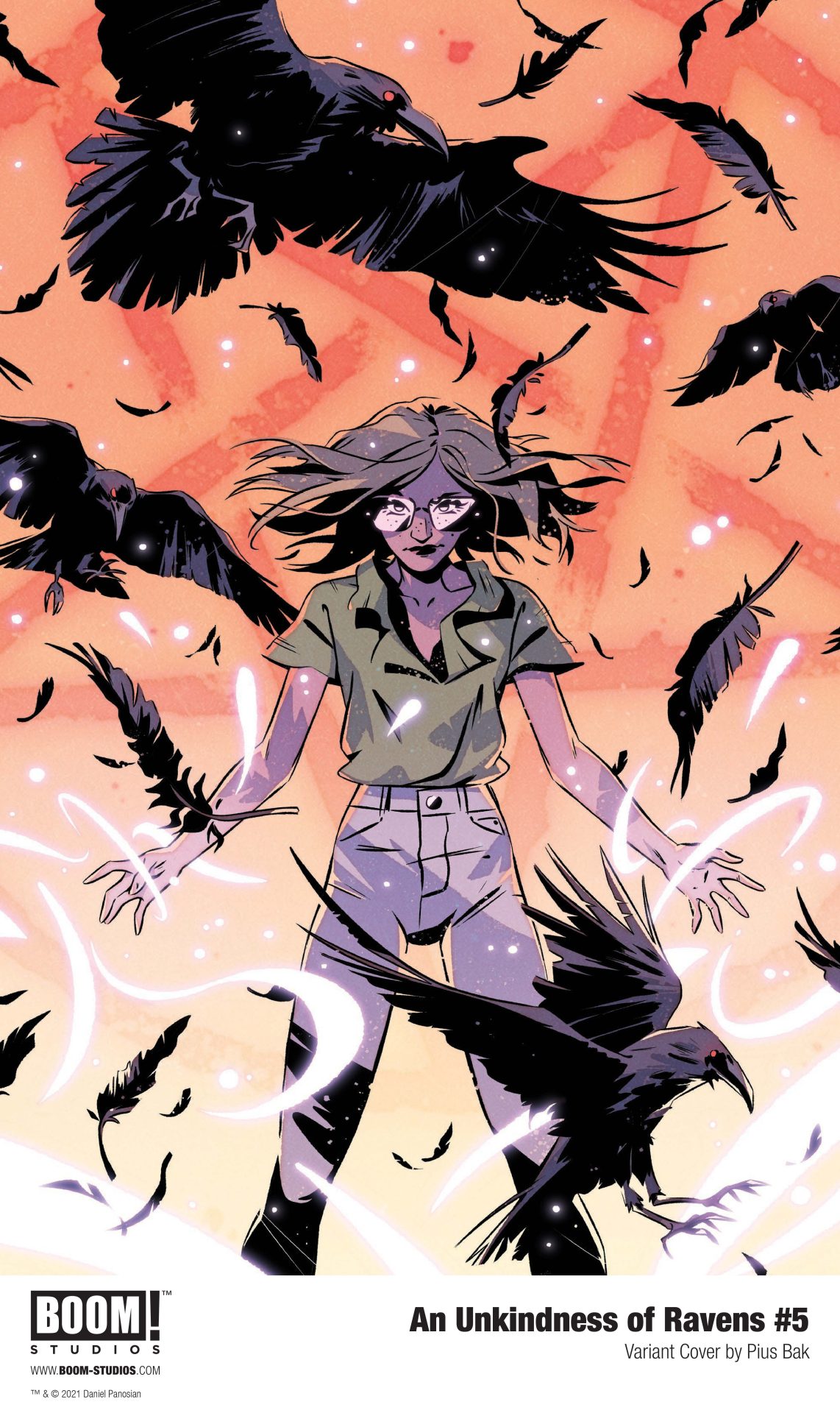
An Unkindness of Ravens #5 features main cover art by Dan Panosian, as well as variant cover art by Qistina Khalidah, and Pius Bak.
(W) Benjamin Von Eckartsberg (A) Thomas von Kummant (CA) Daniel Clarke In Shops: Jan 20, 2021 SRP: $3.99
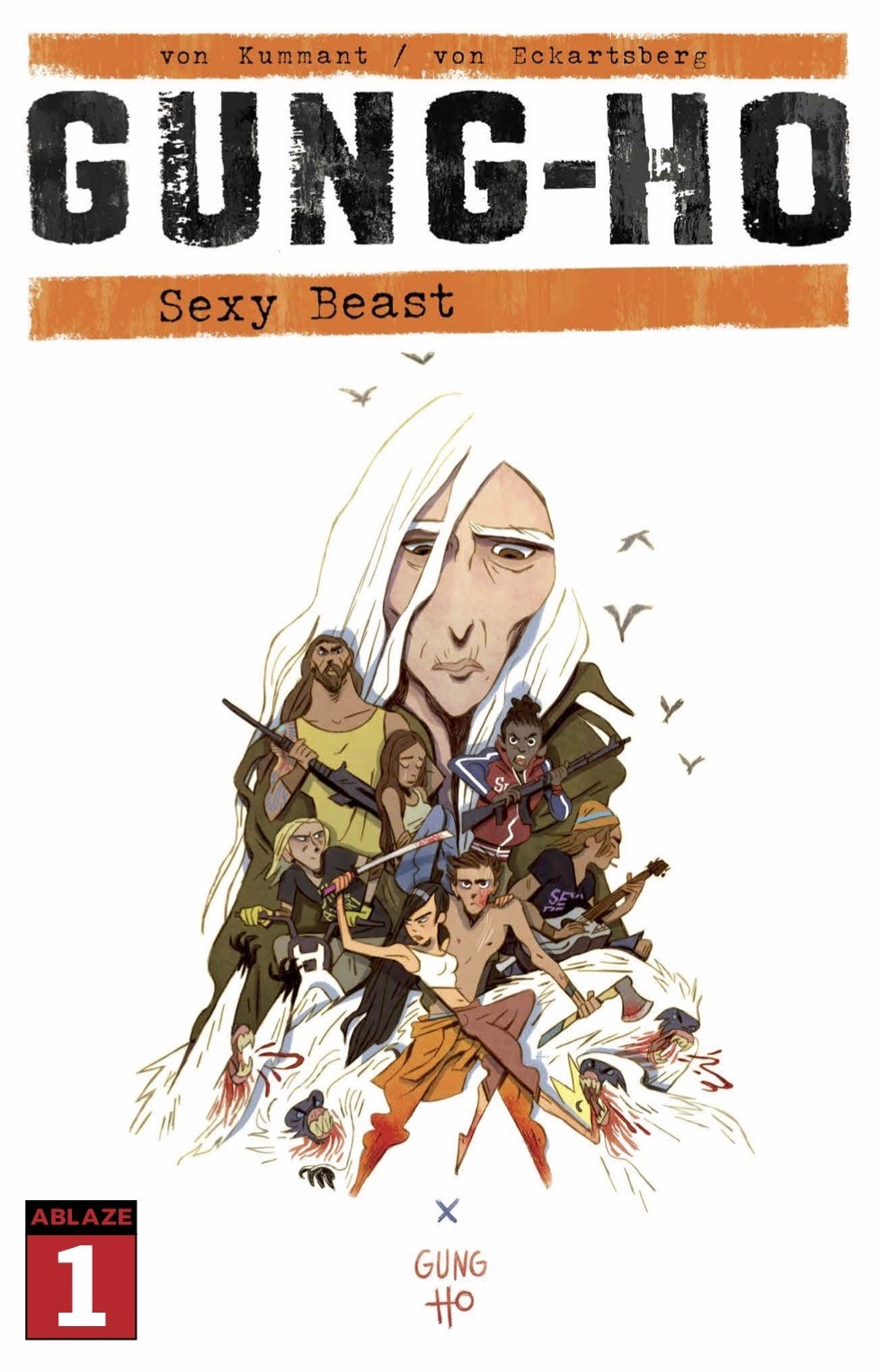
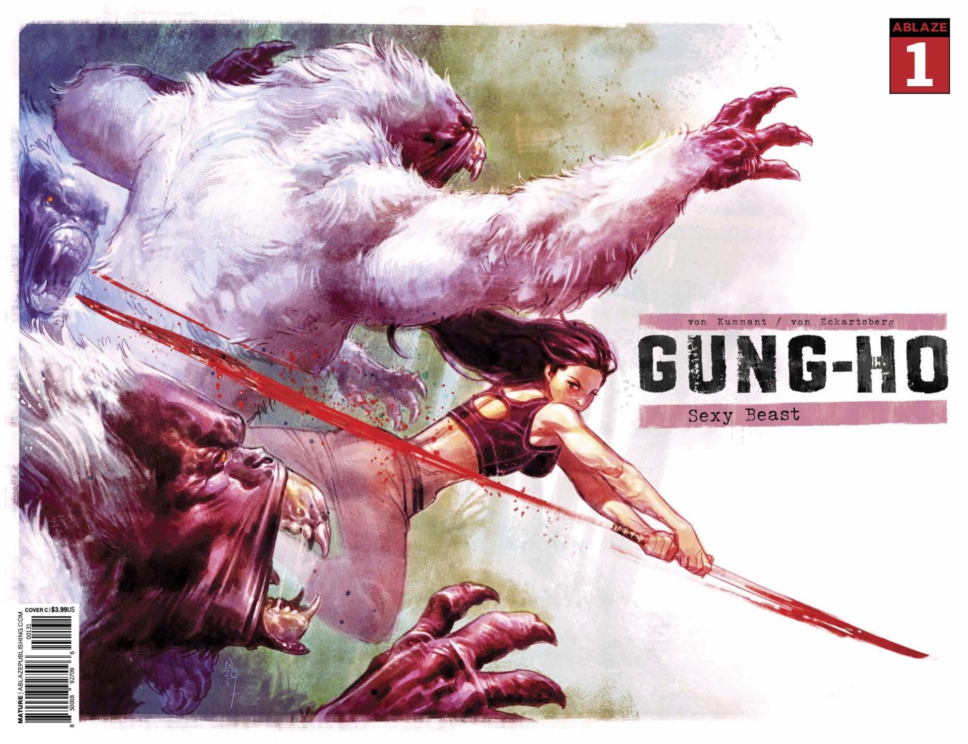
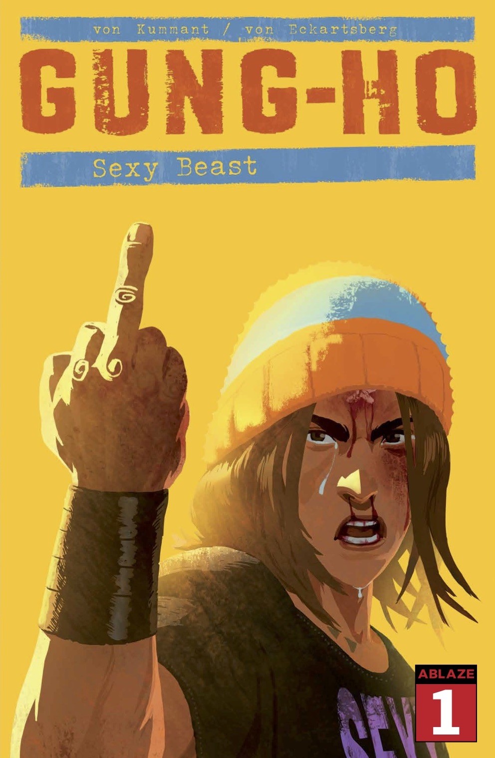
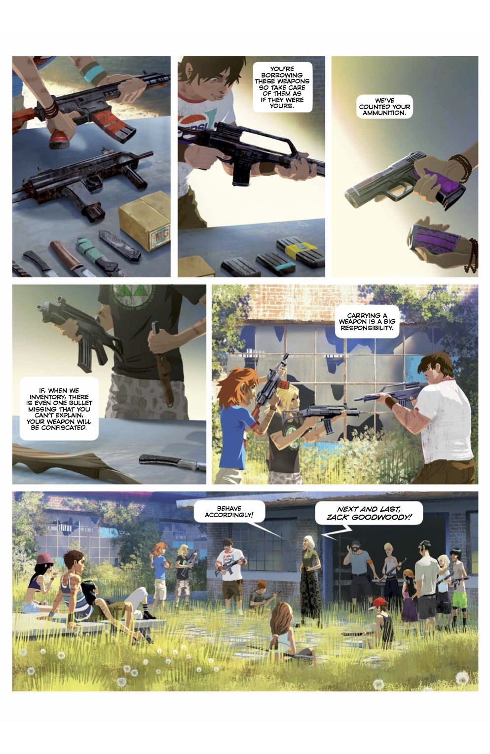
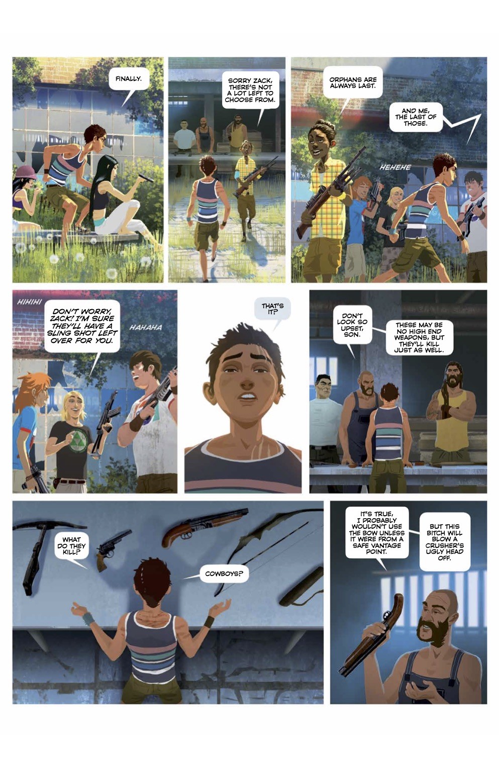
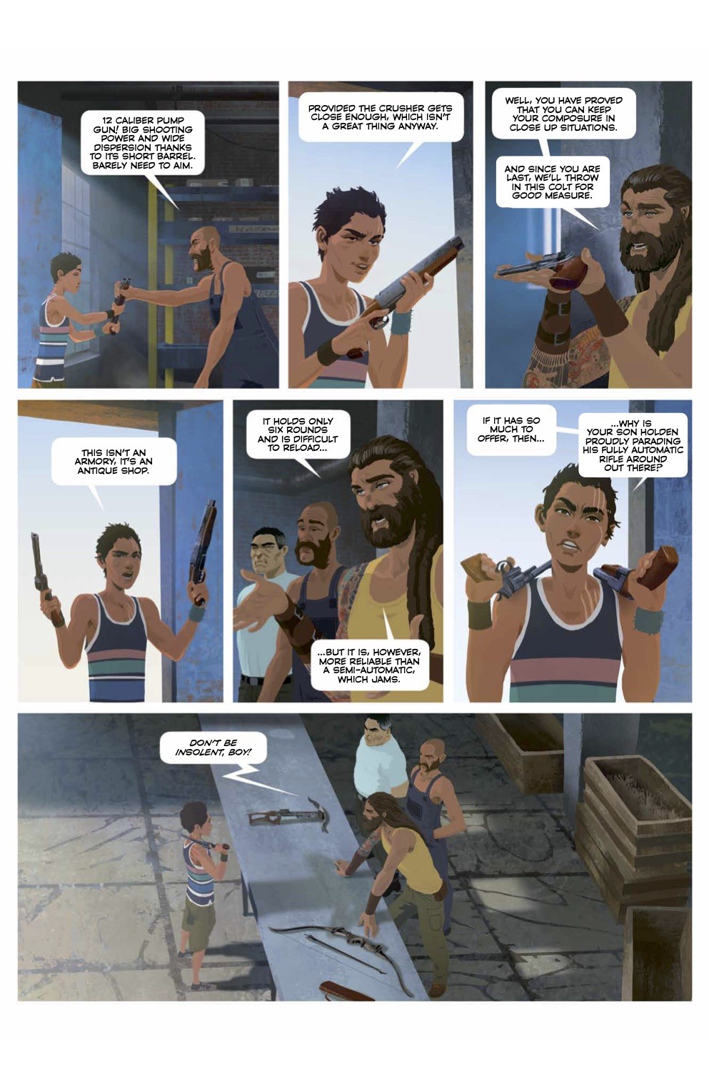
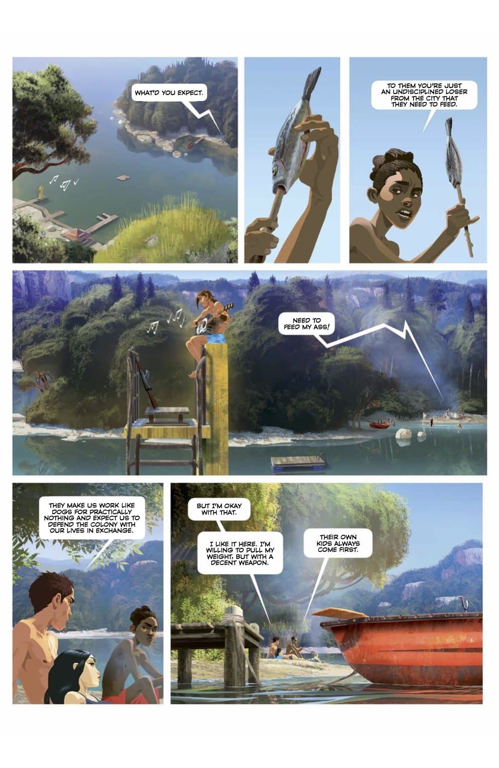
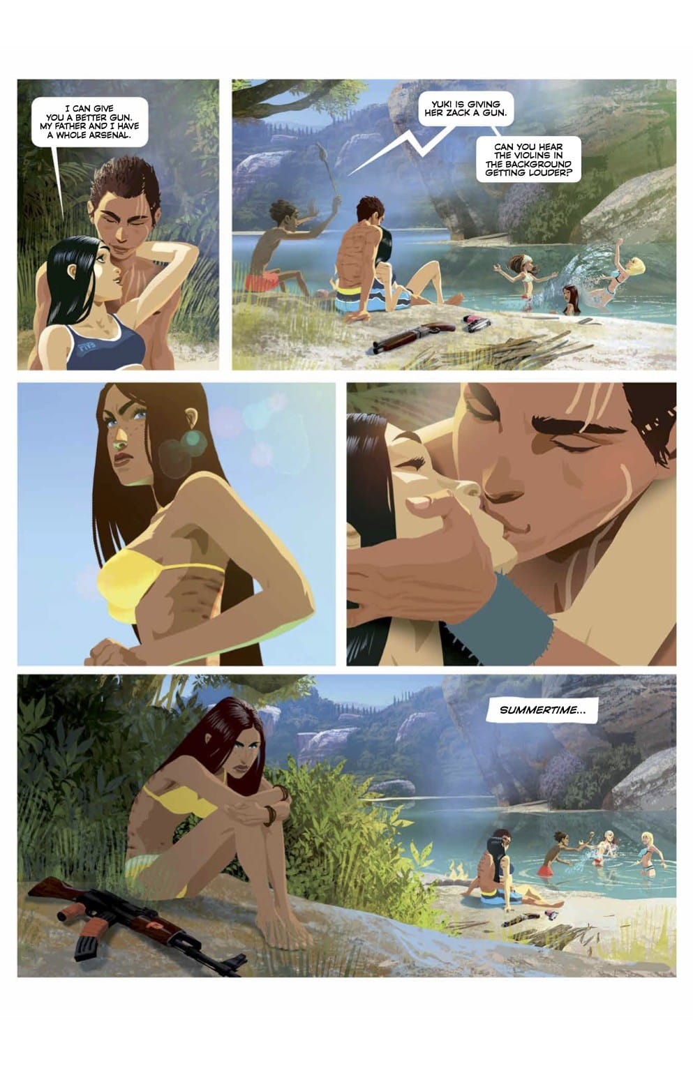
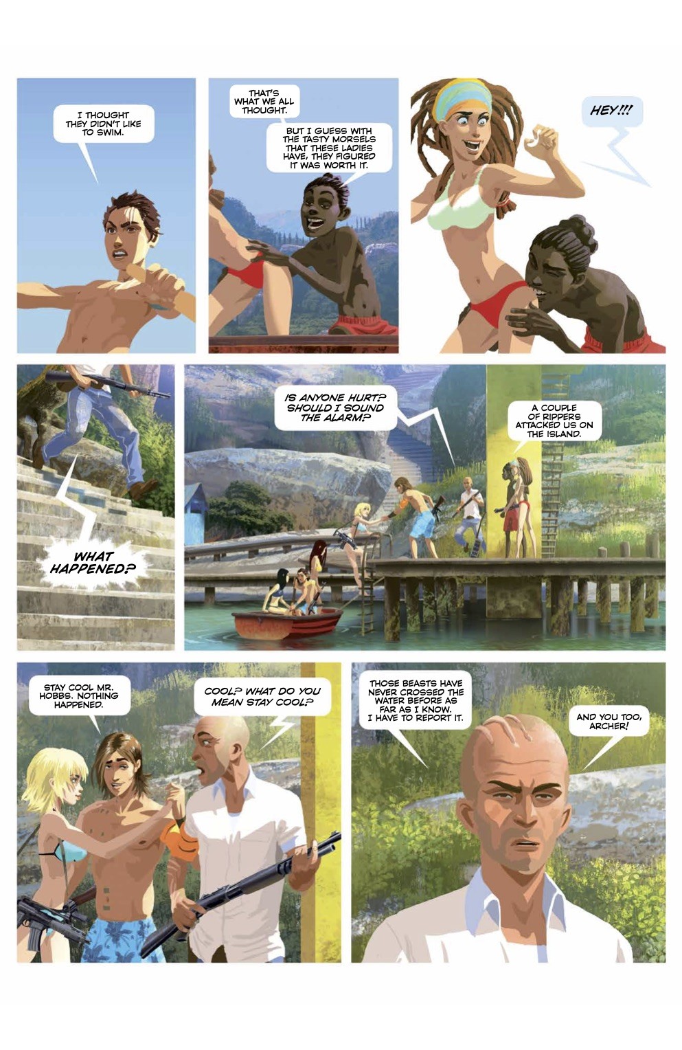
The return of Gung-Ho! “Sexy Beast” picks up a few weeks after the events in “Short Circuit”, where at Fort Apache, the situation is more tense than ever, as the threat posed by the rippers adds to an increasingly difficult life for the colony. Kingsten briefs the fort council on the situation following the stolen goods from the train. The colony is running out of supplies, heavy weapons and ammunition, and so it is decided to ration even more. She orders a team to be set up to find the stolen delivery in the danger zone. She also asks Bagster to put pressure on the government again for help. She believes a white wave is coming, a big attack from the rippers…
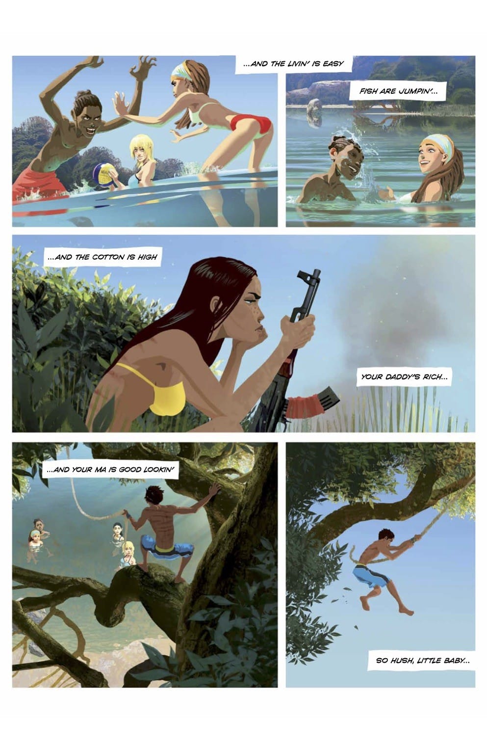
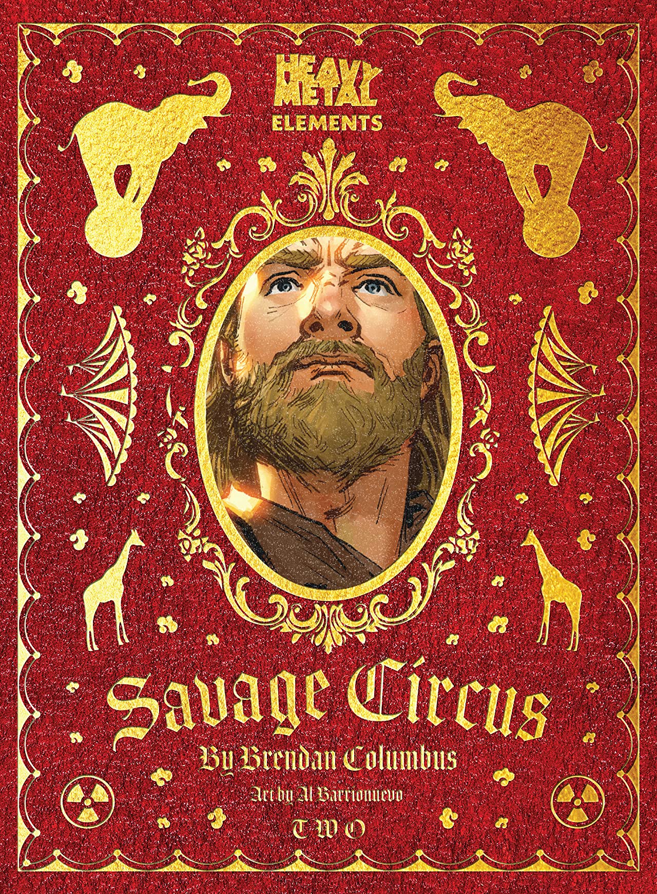
Take rampaging Gremlins and replace them with a circus worth of angry animals and the rampage and you have Savage Circus. If the first issue was the setup, Savage Circus #2 is the ship hitting the iceberg. It’s an issue full of disaster and it’s super entertaining.
Writer Brendan Columbus really gets the ball rolling with this issue that amps of the carnage to 11 compared to the first issue. And comparing it to the debut is partially what’s fascinating. The debut issue focused on a couple of characters and a heist with the train being the disaster on the horizon. The second issue continues the heist aspect of the issue but it turns into a side aspect. It’s kind of the deus ex machina to get the ball rolling for the release of the savage beasts from the savage circus.
It’s an interesting choice to go this direction and has me wanting to see where things go in future issues as far as that aspect. It’s easily something that just got us from point A to point B or play further into the series. As a reader, I’m unsure if how much that opening hook of a heist will matter as things continue.
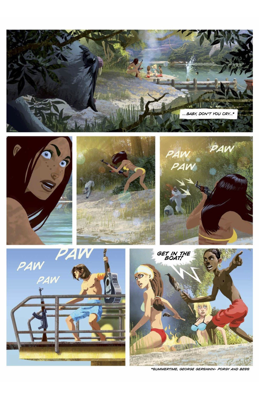
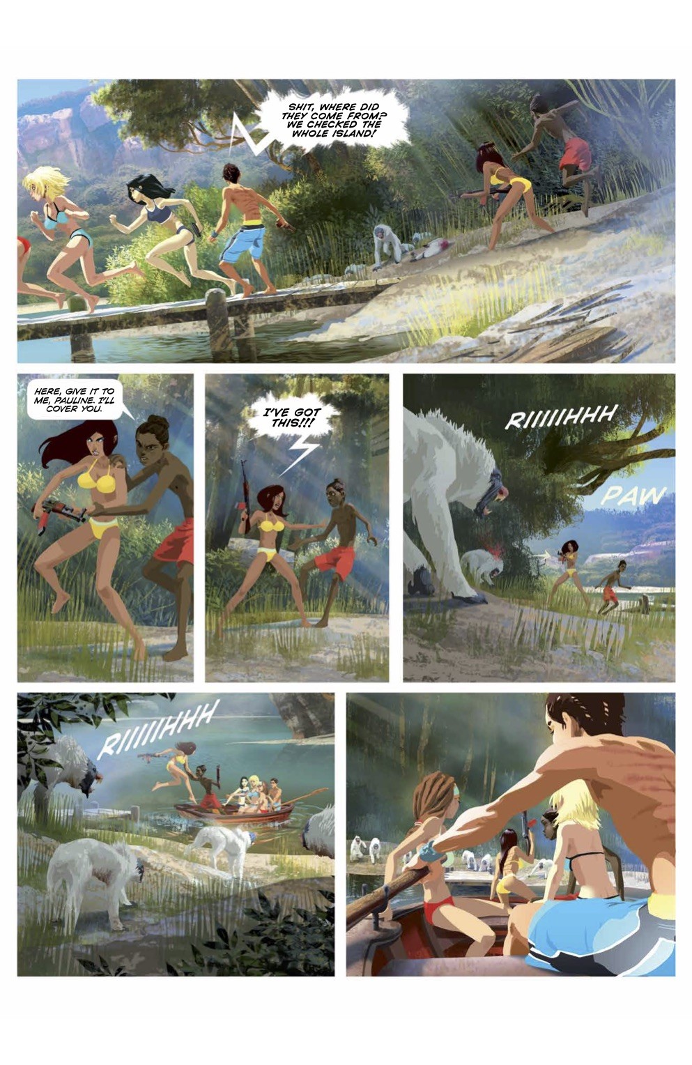
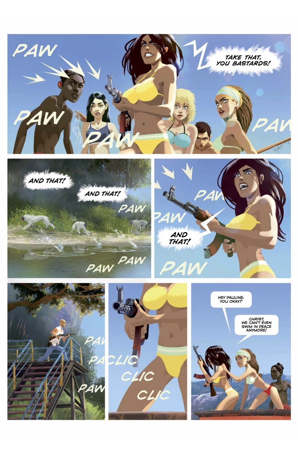
But, lets face it. The beasts on the loose is the draw now. The train is off the tracks and pissed off animals want some revenge for the abuses they’ve experienced. Yes, Columbus gives the animals some motivation as to why they’re killing people. And boy do they kill people. There’s an over the top level of carnage and death all rendered in creative gore.
Artist Al Barrionuevo seems to have fun with the destruction and death once the animals are loose. The imagery is over the top to take things into comical level. And that’s partially what makes it fun. Barrionuevo is joined by Candice Han on color and Dave Sharpe on lettering. Han delivers splashes of blood without making it overwhelming. The art is an orgy of destruction that’ll put a smile on readers’ faces.
Savage Circus #2 is a solid second issue that really gets things rolling, or derailed might be a better way to put it. The issue ups the carnage and action to a level that’s hard to not laugh at. It’s so over the top once things get going that it’s a bit amazing at how many ways the creative team has come up with in killing individuals. It’s a fun symphony of destruction during this winter season.
Story: Brendan Columbus Art: Al Barrionuevo Color: Candice Han Letterer: Dave Sharpe Story: 8.0 Art: 8.0 Overall: 8.0 Recommendation: Buy
Heavy Metal provided Graphic Policy with a FREE copy for review
An absolutely amazing series has only gotten better with each issue. The story follows Yasmeen as she attempts to settle in her new country while dealing with the torture she experienced at the hands of ISIS.
Yasmeen #6 wraps up the series as we get those final details about Yasmeen’s escape. Does the finale stick the landing? Find out!
Story: Saif A. Ahmed Art: Fabiana Mascolo Letterer: Robin Jones
Get your copy now! To find a comic shop near you, visit http://www.comicshoplocator.com or call 1-888-comicbook or digitally and online with the links below.
This post contains affiliate links, which means that if you click on one of the product links and make a purchase, we’ll receive a percentage of the sale. Graphic Policy does purchase items from this site. Making purchases through these links helps support the site
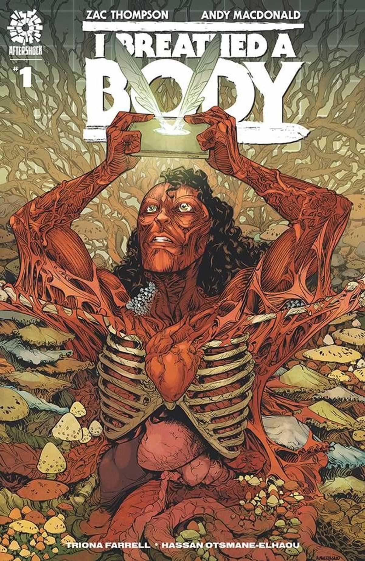
With a bit of trypophobia, making it through I Breathed a Body #1 was a bit rough. The imagery kept me uneasy and a bit squeamish. But getting through that, I Breathed a Body #1 is an interesting story about the power of technology and social networking.
Written by Zac Thompson, I Breathed a Body #1 introduces us to a social network and its star. A punk of a kid whose pranks hurt individuals, the apologies are hollow, and whose views deliver a lot of revenue.
There’s really something interesting here as the discussion about the power of technology companies and their ability to manipulate individuals. There’s also really smart discussion of the spiraling of technology and the rewarding bad behavior. These are real-world issues discussed today, real issues being debated.
Thompson has laid the groundwork for a horror story with a much deeper meaning to it. It does what a lot of horror does, deliver an examination of something beyond scares.
And those scares and unease are delivered by Andy MacDonald. The art is fantastic and kept me off-centered the entire time. There’s something to it that delivers an experience that’s both clean and sterilized and at the same time with a slight Hellraiser vibe about it. With Triona Farrell‘s color and Hassan Otsmae-Elhaou‘s lettering, the visuals keep me off-centered and a little nauseous. It’s probably how I should really feel about social media and the power of tech companies honestly.
Despite my trypophobia, I Breathed a Body #1 is an intriguing start of a series. There’s a lot to chew on for a comic that clearly has something to say. Things will be interesting to see where they go from here and what exactly is on these creator’s minds.
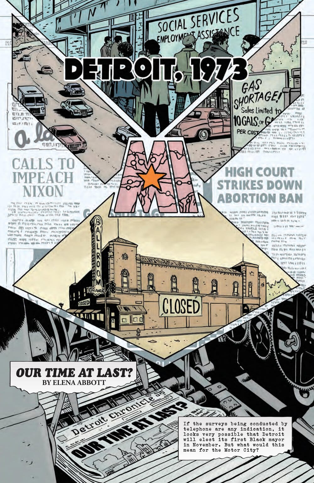
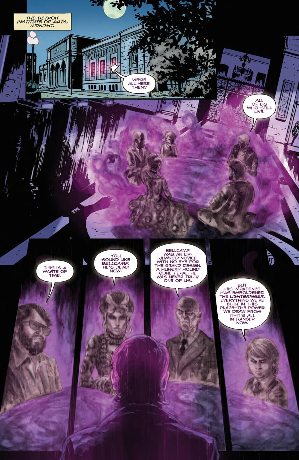
The minute I finished the first Abbott book by Saladin Ahmed and Sami Kivelä it became my go-to recommendation for people looking to get into comics. It still holds that position. A lot of it is due to how much like a contemporary comic it feels like, as if you were reading something that couldn’t have come out any other time, despite it being set in 1970’s Detroit while also borrowing ideas from the political thrillers and horror movies of that decade.
To say I was anxiously awaiting the first issue of its second arc is an understatement of the highest order. Following the investigations of journalist Elena Abbott—“a detective for the people,” as the comic proclaims—feels like taking a journey through the underbelly of America’s unique version of systemic racism, a brutal trek through it with the intention of deconstructing all of it with dark magic thrown into the mix to further power the metaphors at play in the story.
Abbott 1973
The second arc seems to be operating on the same wavelength, with Abbott facing yet another supernatural threat fueled by racial animosity, only this time the powers of corruption are looking to dismantle the candidacy of a Detroit mayoral candidate poised to become the city’s first black person to take up the position.
Set in 1973, Ahmed and Kivelä keep the titular journalist from straying from her old-school investigative methods, echoing movies like All the President’s Men in terms of how it develops a sense of danger that bubbles up with each attempt at shedding light on the potential sabotage of the black mayoral candidate. Each new sliver of information dug up through her investigation raises the stakes not just for the story she’s working on but for her very own sense of safety.
Ahmed and Kivelä achieve this in the first book, which focuses on elected officials dabbling in dark magic to keep black communities in a constant state of chaos and instability, a tactic that allowed the ruling class to justify anti-black measures in the name of public safety (not to mention precious votes).
In Abbott 1973, the protagonist is now well aware of the dark influences that are trying to disrupt Detroit’s political structure while also being conscious of the fact magic and journalism have a complicated history with the public standard of veracity and reliability.
Abbott 1973
While these ideas are difficult to separate from the character and her story, Ahmed and Kivelä manage to complicate Abbott’s daily grind even more with an added focus on social notions of femininity in the public arena and in the professional workspace.
The comic dives into these obstacles through a new black character that comes into Abbott’s newspaper organization as its latest publisher, a man called Mr. Manning. This new figure of authority insists on keeping up appearances concocted by male-dominated notions of etiquette and behavior, instructing Abbott on how women should dress and behave in the workplace.
Given the story’s focus on change, and how the election of Detroit’s first black mayor stands as a plea for it, Abbott 1973 #1 looks to the country’s past to reflect on the current state of politics, be it racial or otherwise. Just how deep the comic will go to comment on this remains to be seen, but it’s well on its way to add something to the conversation (especially in the context of a very divided United States that’s growing further apart on a daily basis).
Kivelä’s art continues to favor that 1970’s grittiness prominent in that decade’s movies, deftly weaving realism with supernatural sights that carry a kind of violence to them on mere presence alone. Each character looks storied, the result of a long line of personal experiences that carry over into their overall looks.
Abbott 1973
Mattia Iacono’s colors complements the seventies vibe of the story beautifully with muted colors that make the darker elements jump out of the page even more when they manifest themselves. It creates a heaviness around the more horror-inclined sequences and can feel downright oppressive when Abbott as at the receiving end of them.
On the dark magic side of the story, Abbott 1973 is careful not to allow it to get lost in the social commentary that’s clearly in display in every page. Be it in hints of paranormal activity or outright terror, the hauntings Ahmed and Kivelä have cooked up for Abbott feel like an organic element of the story and they do their fair share of the worldbuilding. They are integral to the comic’s message and are smartly implemented.
Abbott 1973 #1 is a perfect continuation of Elena Abbott’s investigations into how magic has been taken over by racists bent on keeping America divided. Ahmed and Kivelä have one of the best characters in comics in their hands and they seem to be well aware of it. Abbott is the kind of creation one hopes becomes an industry staple, producing hundreds of stories for years to come.
Script: Saladin Ahmed Art: Sami Kivelä Color: Mattia Iacono Letterer: Jim Campbell Story: 9.0Art: 9.0Overall: 9.0Recommendation: Buy and brush up on Detroit history
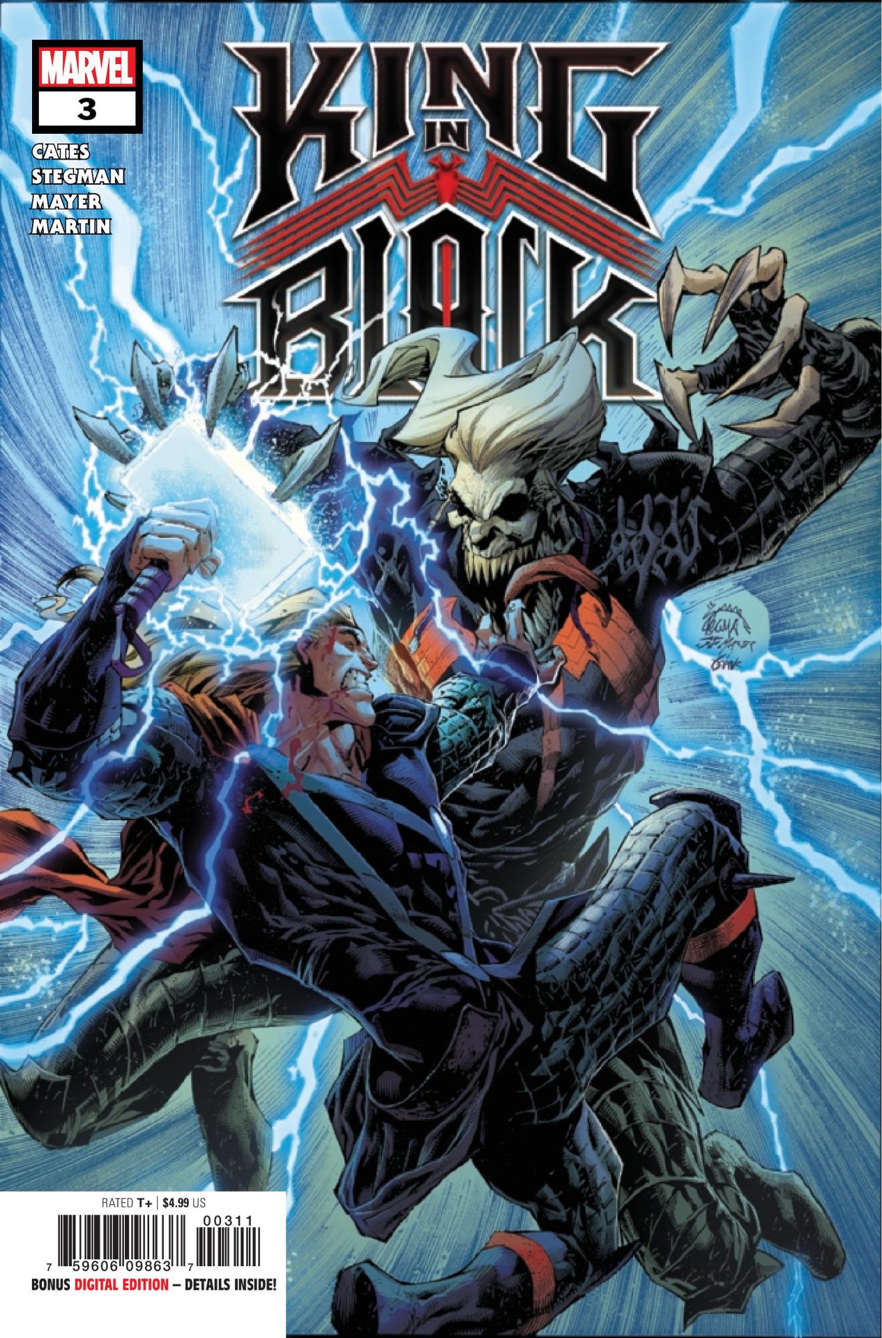
King in Black #3 continues the entertaining Marvel event delivering hints as to what’s to come. Knull has taken over the world bringing darkness to everywhere. There’s a glimpse of hope though. Eddie Brock’s son, Dylan, is channeling an unknown power, the light to defeat the darkness of Knull.
This is the first stand as a small group of heroes need to band together and fight back. Writer Donny Cates delivers another solid issue as what the fight back begins. Though it’s realistically a losing battle, Cates infuses the fight with hope. The heroes feel like heroes doing battle against impossible odds.
Cates delivers that with an interesting narrative. The narrator is a mysterious character who doesn’t make their presence known until the end. But, what’s said is what’s really intriguing. There’s hints as to what’s to come. Dylan’s power is coming from something, someone. Knull is darkness which means there’s someone that’s the opposite. Who is that? Get your speculation going as it’s sure to be someone big and really shake things up post event.
The issue is also very cinematic with action sequences that deliver some emotional resonance. The arrival of Thor to battle, Iron Man’s actions, these are moments that deserve to be on the big screen. They’re larger than life and that’s due to the art of Ryan Stegman.
Stegman continues to be one of the most exciting artists out there. His work with Cates has been fantastic and the duo are just in sync with what they deliver on the page. The images are jaw dropping at times. The moments really deliver that punch as things begin to go south. Everything looks fantastic no matter how over the top it all is. Stegman is helped by the ink of JP Mayer, color of Frank Martin, and lettering by Clayton Cowles. In a story that involves a world engulfed in darkness, the team keeps things colorful. It never feels “dark” but definitely gives you the sense of that world. The lettering is fantastic with Cowles giving such personality to Knull and his controlled through the choice of lettering and styles.
King in Black #3 continues an epic story. While it foreshadows things a bit too much the end of the comic made me forgive that with a new player on the field. Things really feel epic but at the same time the issue and story stays focused on a small cast. There’s been a string of misses as far as major events in recent years but King in Black continues to impress and exceed expectations.
Story: Donny Cates Art: Ryan Stegman Ink: JP Mayer Color: Frank Martin Letterer: Clayton Cowles Story: 8.65 Art: 8.75 Overall: 8.65 Recommendation: Buy
Marvel provided Graphic Policy with a FREE copy for review
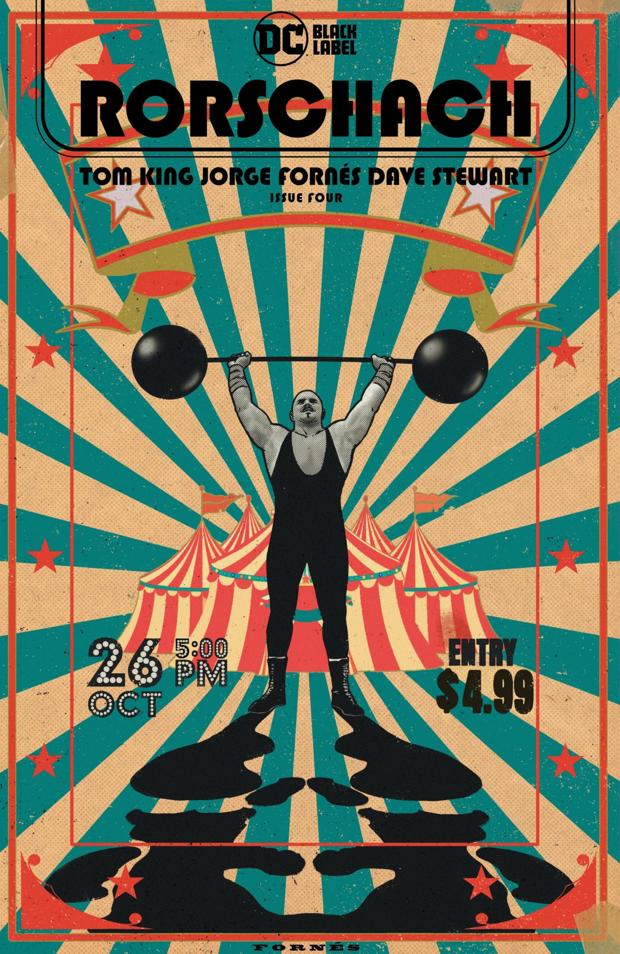
Rorschach as a whole has been an interesting series so far. While it’s draw is its tie-in to Watchmen, remove that, you have a pretty solid political thriller. With an attempted Presidential assassination having been stopped, a detective does what he can to uncover the why of it all and the individuals who were stopped, one being Rorschach. The other is the focus of Rorschach #4. Who was the person behind the domino mask? Rorschach #4 attempts to answer some of that.
Writer Tom King uses the issue to shed some light on Rorschach’s partner in crime. He uses the rather common framing of a police interrogation. Laura’s story is told from the perspective of a friend with whom she spent time in a circus.
Rorschach #4 sheds some light on the mysterious character though leaving a lot to open. It’s a very smart dive into characters and their motivations. But, more importantly, the issue is an examination of falling into a fantasy. How easy it is to be propped up and manipulated. How easy it is to be disconnected from reality. The issue is an examination in some ways of our modern times and how easy it is to commit horrific acts when in the enthrall of another.
There’s also a nice examination of conspiracies and how easy it is to fall into and believe, “fake news”. We get a new theory as to what happened to the heroes at the end of Watchmen and why. Mixed in with the television series, it’s all very interesting together.
King also throws in a lot to muddy up what we’ve been told before by what’s revealed. What’s really going on with Rorschach? Who was the person under the mask in the first issue? Is what we’ve been told true? Things are a bit up in the air right now.
Jorge Fornés‘ art continues to impress. Though the clothing and style still screams 70s, there’s so much here to take in. This is a psychological comic. There’s not tons of action. But Fornés keeps the visuals engaging and interesting. With Dave Stewart‘s colors and lettering by Clayton Cowles, Rorschach #4 is muted in some way. It’s not dour but a bit sad as we learn about an individual who was in love and led down a dark path by someone not attached to reality.
Rorschach #4 is an interesting comic. It’s a piece of a bigger puzzle that teases the bigger picture. It’s also a hell of a compact story taking place in an interrogation room. The team has put together what feels like a two-person play in comic form.
Story: Tom King Art: Jorge Fornés Color: Dave Stewart Letterer: Clayton Cowles Story: 8.0 Art: 8.0 Overall: 8.0 Recommendation: Buy
DC Comics provided Graphic Policy with a FREE copy for review
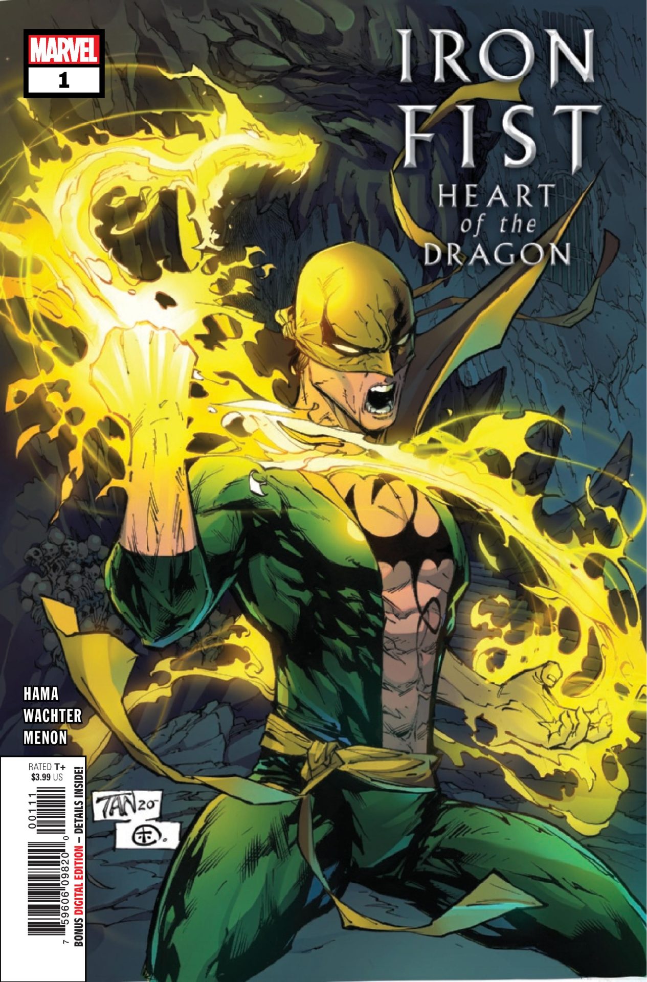
Writer Larry Hama brings his talents to Marvel’s Iron Fist. Iron Fist: Heart of the Dragon #1 kicks off a new adventure for the character which has him attempting to protect the Heavenly Cities as someone is hunting the dragons that power them.
The debut issue is an interesting one dropping readers mostly into the story and only slightly teasing details out. Iron Fist: Heart of the Dragon #1 feels much like Hama’s G.I. Joe work. There’s lots of focus on action sequences as the issue goes from one beat to another. It works in some ways but the packed in issue that has not one, but two major villains to battle, feels a bit too much like a video game. The first level has been cleared, so lets move on to the next.
In his journey, Iron Fist is joined by Fooh who feels more like a comedic extra and also the inventory screen in this video game like story.
Iron Fist: Heart of the Dragon #1 only slightly works as is. It might have been due to the high expectations from Hama writing but there’s something off overall. The comic is a bit choppy and doesn’t feature a natural flow as much as it does levels. First up is Taskmaster to battle and after is Lady Bullseye. There’s little explanation other than they have a mission to get a dragon’s heart, so it all comes off a bit as a thin plot mostly focused on the action. There’s a lot thrown in there but it’s all very thinly connected.
Dave Wachter‘s art is decent. With colors by Neeraj Menon and letterer Travis Lanham, the art captures the action and the packed in sequences. Iron Fist himself looks a little off with the face a bit too round and feels off. The eyes feel apart and face just looks odd. But, there’s some good action sequences and battles, each having a nice flow to them. As the comic moves along there feels like there’s more packed in which is handled without things being overwhelming and it being pretty clear to follow.
Iron Fist: Heart of the Dragon #1 is a bit mixed overall. It might have helped to have slowed things down a little and give more time to let the story be explained and details filled in. As is, the comic is pretty quick paced with the actual story being a little thin and specifics. There’s potential here with a turn your brain off sort of adventure. While it doesn’t meet of expectations, Iron Fist: Heart of the Dragon #1 still delivers some fun.
Story: Larry Hama Art: David Wachter Color: Neeraj Menon Letterer: Travis Lanham Story: 6.95 Art: 7.5 Overall: 7.0 Recommendation: Read
Marvel provided Graphic Policy with a FREE copy for review