Category Archives: Creators Corner

Leaving the Comics Classroom

A few weeks ago I ended my career in teaching. For the last nine years, I’ve taught high school English. For the last three, I taught a graphic novel class I’d created. In both contexts, I’d had times of triumph and feelings of frustration. Ultimately the frustrations won out and I decided to switch careers. Truthfully, the last couple of years of teaching I wanted out. I didn’t know what I wanted to do: I was looking for a career that also felt like a calling. Eventually, I decided that I needed a job that was better than teaching. Already I have my own calling with my writing.

While I have many reflections on teaching in general, I’m not going to cover them here. That would take a whole book. Instead, I’m going to focus on what’s more relevant to this site, my reflections on teaching graphic novels to teens. It’s something I’ve done previously (here and here). I’ve had some great success in the class. Some crushing failures. And, a whole lot of approaches that–like a lot of teaching curriculum–were okay. It pushed students to produce good work that they weren’t generally passionate about. They did well for their abilities.

The biggest success carried across all years teaching this class. Most students didn’t take the class because they were passionate about comics. In fact, most students taking the class hadn’t read comics recreationally at all, unless we count their time reading the Sunday comics. And, even then, most had only done that a few times. Most of these students came into the class thinking that comics weren’t for them. Partly because they equated superheroes with comics. They just took the class because it sounded easier than the other English elective options they had to choose from. 

This attitude was a source of one of my frustrations. Ultimately, it also paved the way for one of the biggest successes. At the end of each semester, every student became more open to comics. Every student saw that superheroes were a genre within the medium and that to equate comics with superheroes was foolish. Even more rewarding, almost every student ended up liking comics. Not everyone we read but comics in general. Almost every student said they preferred reading comics to traditional texts. If my aim was to convert students and help them love comics (and that was part of it, of course), I was certainly more successful at that than helping students love reading books in my other classes.

Maus resized

While they liked reading comics in general, they didn’t always like the comics that I thought were great. Years of teaching traditional books had prepared me in part for that. I was still somewhat shocked that many students didn’t appreciate Maus, one of our whole-class reads. Even more surprising and frustrating, though, was that sometimes students didn’t like a book club graphic novel they’d picked. Granted, they picked it out of a narrow choice of 15 or so graphic novels.

I would’ve thought more students would have liked Blankets or Watchmen, especially since they were texts that needed parent/guardian approval and had the time of edgy material I thought teens would like. Perhaps the most disappointing aspect of this was when students didn’t even choose to read some graphic novels that are truly great: Linda Medley’s fantastic Castle Waiting only had one student read it in all three years, the other copies lying lonely on the bookshelf; Jessica Abel’s illuminating Out on the Wire also only had one student read it in that same time, making me think less of my students and regret having the school purchase these texts. At the end of the day, though, those two students like them, and most students liked their other selections, so I take heart in that.

When I envisioned this course, I pictured students who wanted to analyze comics on a granular level. Students who spouted comics jargon from academic perspectives like Will Eisner’s Comics and Sequential Art, Scott McCloud’s Understanding Comics, and Jessica Abel and Matt Madden’s Writing Words and Drawing Pictures. What was I thinking? Students didn’t like using academic language to analyze traditional texts, wanting to stick to their own dialect in crafting responses. And that’s if they were even willing to read and discuss those texts!

Each year of teaching the comics class, I realized this trend held true for discussing comics. I liked thinking and talking about comics with Eisner’s thoughts about framing, McCloud’s panel transition types, and Abel and Madden’s thoughts on pacing. Students generally couldn’t care less whether it was a Moment-to-Moment or Action-to-Action panel. They only cared about if they liked the comic and if it connected with them on a personal level. It took a while for me to let go of my initial utopian vision of this class. Eventually, I started using less of these readings.

I still thought it was important to study some essential concepts. The panel transitions and panel types from McCloud were important to learn. Even if we didn’t use that language most of the time. There were some concepts that got too granular. I decided I could only make students read half of Understanding Comics instead of the whole thing. Eisner and Abel became options. The best creative analysis came from engaging in the process itself rather than abstractly discussing it to death. When we had to discuss graphic novels and the process–students would have better analysis of the creative process by discussing it with graphic novels they liked, with stories that resonated with them.

Brazen

Seeing these trends, this past year I shifted the order and curriculum of the class, leading to yet another success. Before, we’d start with reading the original version of Metamorphosis and then Peter Kuper’s version to compare and contrast. While the aim of that unit worked–to show students how graphic novels differed from novels and other traditional texts, it never hooked students.

These were consistently students’ least favorite texts. Kafka’s original was definitely disliked much more than the graphic novel version, if only because it was denser and took longer to read. Still seeing some value in studying these two texts, I moved them to the last unit. It was a unit that focused on adaptations (prose to comics, movies to comics, etc…) and decided to only read excerpts from the two, so that we gained the knowledge from our study without losing engagement (too much, at least).  This was also a good move since it aligned with our study of Persepolis. It was a study that had involved comparing and contrasting the graphic novel with the movie adaptation in a Socratic Seminar.

With that move made, the beginning of the year opened up: I decided to open it up to complete choice, giving students options from my classroom library (full of about 75 or more graphic novels) along with the school library. Students were more engaged in their texts than I’d ever seen, in that class or any other. They might not have liked to do activities, about their comics (because, after all, it’s work and most teens don’t like work–plus, analyzing texts isn’t something most people like to do, something that often kills the joy of reading in students and adults alike).

Part of this unit also entailed reading conferences, one-on-one discussions with me about their graphic novels. This is where I truly saw the passion in students for what they were reading, and the most ownership over thinking about their graphic novels. For those in the know, for those who know education theory and edu-babble, I had essentially implemented a Reader’s Workshop approach at the end of the year, something that largely worked (although, I’ll admit, I dropped conferencing after awhile, due to it taking too much time).

The Reader’s Workshop model is also often paired with the Writer’s Workshop model (something I did in my other classes where we read traditional texts and did more writing), but I knew I needed a different structure for the graphic novel class. I needed to create a Cartoonist’s Workshop, to focus on developing students’ abilities to create comics in traditional and digital ways. 

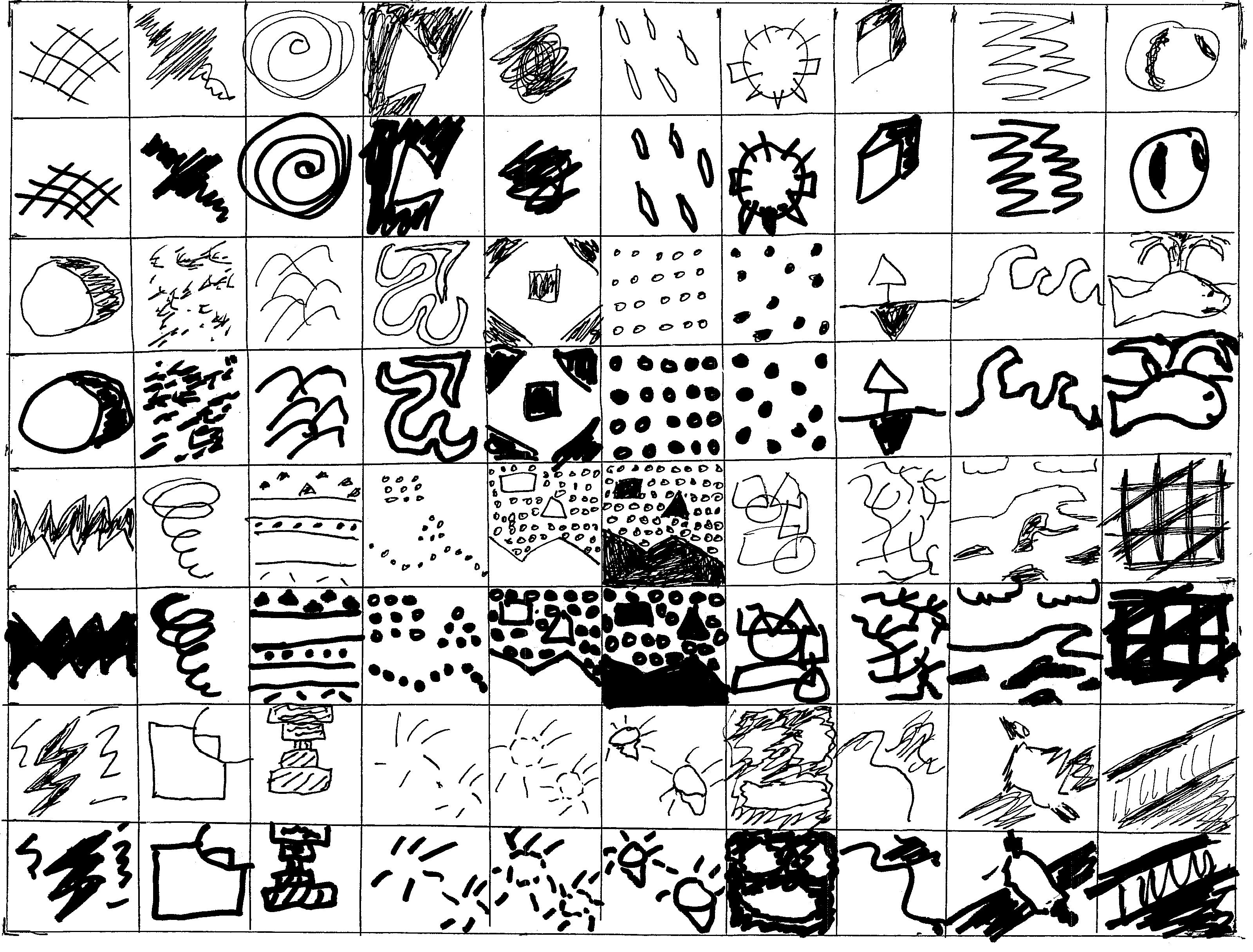
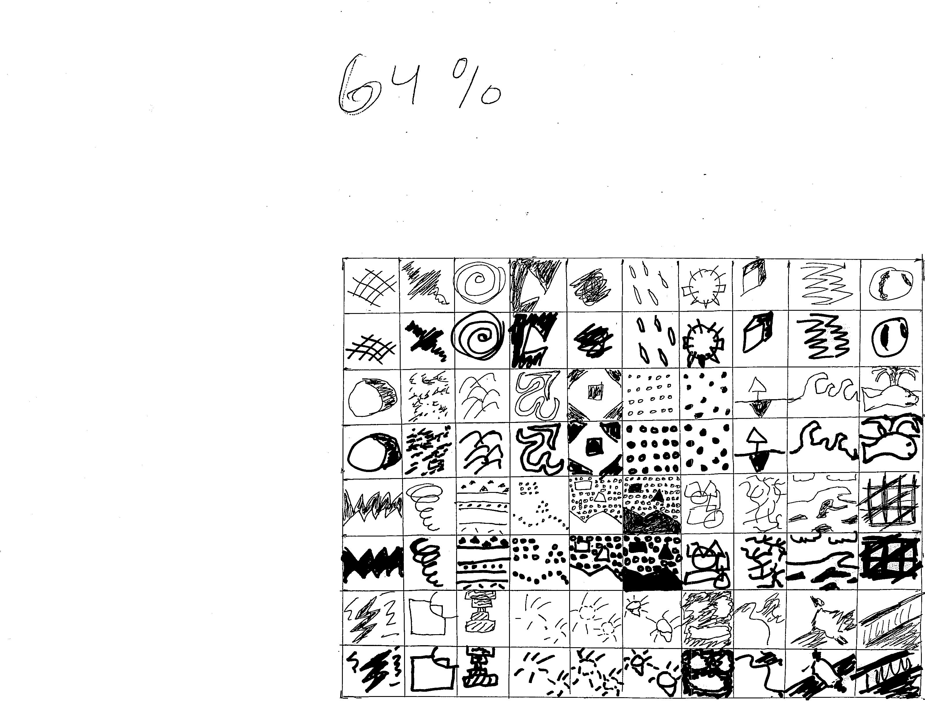
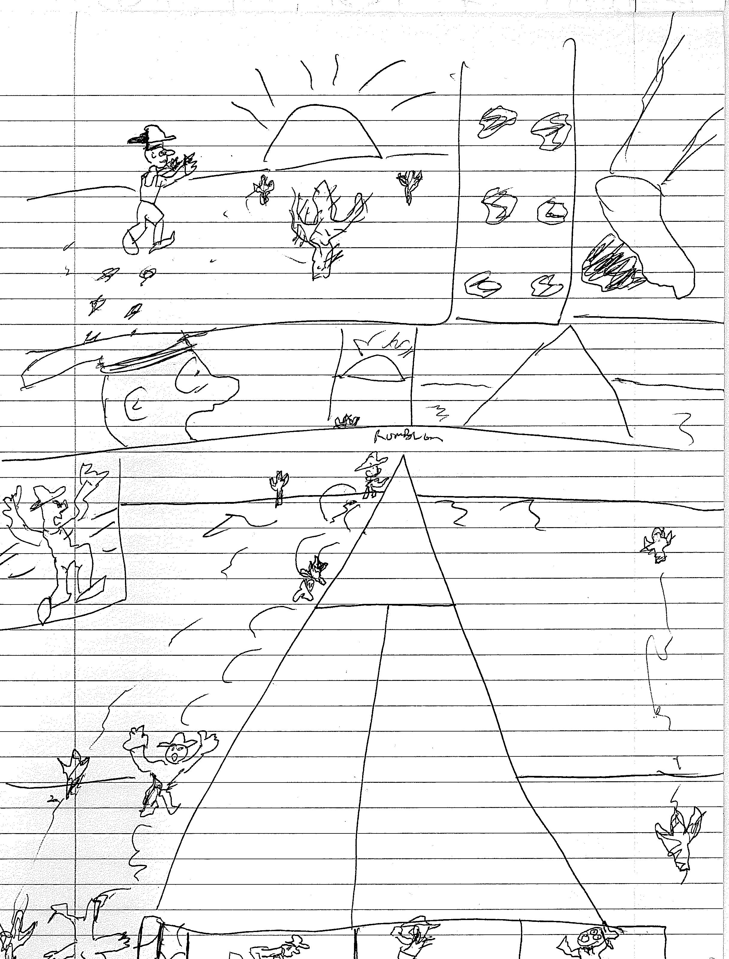
Now, I’d already done this to some degree. In the first two years, I’d had a running series of Behind the Scenes days where we went into a Mac Lab to explore different aspects of creating comics in Adobe Illustrator (after we’d spent a few days in the room thinking about creating plot and writing scripts). The idea was that students would have brainstormed a plot, written a page of its script, and then built off that story and concept in Adobe Illustrator as we learned to pencil, ink, color, and letter. I always gave students the option to start a new story, since that’s sometimes the creative process, but the students who did the best work often followed their initial idea through the whole semester.

Comics Classroom

Part of what made this approach different than the Cartoonist’s Workshop, though, is that we practiced these skills less in general, and we practiced these skills mainly in digital formats instead of letting students go old-school with pencil, pen, and paper. Another difference was simply in its timing and my own comic-creating knowledge. The first year, I’d only released a few issues of Rebirth of the Gangster, so my knowledge of some aspects of Adobe Illustrator and comic-creation was limited. As a result, I linked to a lot of video tutorials and websites to supplement students in their activities, giving them many resources to choose from, but this freedom became a double-edged sword. 

Students that were passionate about the process chose the best, yet most thorough and time-consuming resources, and produced the best final projects-at the end of the semester (a six- page comic about anything, something that also gave students the freedom to fly high or crawl). And these projects were better than the ones my last year when I used the Cartoonist’s Workshop approach. But other students wanted more guidance, or lacked the passion to utilize the best resources, and they produced some of the worst projects I’d seen in my whole time teaching the class.

The more I created comics, though, and the more I helped students problem solve their own digital comics, the better creator I became, one of the best (and most selfish) successes of teaching this class. Truly, if this class had been good for nothing else, I would appreciate teaching it because it made me evaluate my creative process, refining it even more because I wasn’t just thinking about creating comics after class ended. 

Becoming a better creator was the biggest step in preparing me for switching to the Cartoonist’s Workshop in my final year. It was an approach that led to better overall products from the average student if less spectacular ones by outliers. The shorter ceiling was probably because of the shift in the requirements for the last project. Not because I became a worse teacher for those few passionate student creators. Instead of giving students complete freedom to create any six-page comic, I had them create a six-page comic adapting anything. It could be a scene from a TV show, a movie, a song, a chapter, a whole fairy tale. They had a foundation to build off of instead of coming up with their own ideas.

Most students created better comics. They could focus on style, pacing, and other aesthetics since the content was already made for them. However, since the content wasn’t their own, that did stem some students’ creativity and passion; instead of applying solid craft to a personal vision of their own, they only had the craft.

Raising the floor of my students’ creative abilities was due in part because I was a better creator. But (humility aside), it probably had more to do with the fact that I had students keep a Cartoonist’s section in their notebooks. That lead to a lot more old-school comics. Students got more practice in creating comics and became engaged in the class since they were now creating more and discussing reading less. Most students might not have had a personal vision for the final project this year. But they had mastered more of their craft. That lead to a better comic from most students. On some level, this paralleled my journey in this course. I had lost my passion for teaching (teaching in general, and teaching comics to some degree). I had gained a stronger foundation of knowledge and a higher level of craft.

When I closed the door on my comics classroom the last time a few weeks ago, I walked to the staff parking lot with mixed emotions. I would miss the passion from the few students who wanted to create at a high level. I’d miss the evolution of students’ perception of, and enjoyment of, comics. I would miss the ability to refine my own creative process. But I wouldn’t miss the disengaged student taking the class for an easy D. The ones who just wanted to pass and graduate high school; I wouldn’t miss the students casting shade on some of my favorite reads; and I wouldn’t miss having to murder my darlings, to spend less and less time on the analytical texts. 

Comics Classroom

The control freak in me also despaired that the class wouldn’t end with me; another teacher would pick up the reins and steer future students down this trail. In some ways, I felt like Steve Ditko and Jack Kirby must’ve felt. We had done our work-for-hire, but now we had to see our creations move on in the hands of others. At the same time, I’m excited for the teacher who’s taking on the course and for the students who will be graced with his different vision. After all, in work-for-hire scenarios and creations, the creator isn’t always the best fit for every audience member. Some might glorify the Lee/Kirby years of the Fantastic Four; some might prefer John Byrne’s; Hickman’s run might resonate with others.

Comics Classroom

Ultimately, any great creation will have its ups and downs and will be received differently by different people. That’s the way life goes, and its only fitting that that’s the way a comics classroom rolls too. 


CJ Standal is a writer and self-publisher.  He is co-creator of Rebirth of the Gangster, which has been featured in Alterna Comics’ 2017 IF Anthology; he has lettered the webcomic Henshin Man; and he has written for online sites like Graphic Policy and the now-defunct Slant.  Follow him on Twitter and Instagram (@cj_standal), Facebook, and visit his website: cjstandalproductions.com.

Creator’s Corner: Exercises in Cartooning Weeks 10-12

I’m a writer, not an artist. But for one more week, I’m going to be a cartoonist with assignments from the great Ivan Brunetti’s cartooning class.

And you can join me on this journey–not only by seeing what I do, but by completing the exercises I do along with me.

*Note* To see Week 1’s adventures, click here, to see Week 2’s adventures, click here,  to see Week 3’s adventures, click here, to see Week 4’s adventures, click here, to see Week 5’s adventures, click here,  to see Week 6’s adventures, click here, to see Week 7’s adventures, click here, to see Week 8’s adventures, click here, and to see Week 9’s adventures, click here.

The great cartoonist Ivan Brunetti, also a teacher of comics/cartooning, has a book that publishes his course; it is a 10 week “class” that has a few exercises for each week, some of which I might even use in my own graphic novel class.  I thought it’d be fun–especially since I’m a writer and need to challenge my skills as an artist–to run myself through his course and post each of my exercise on here.  So without further ado…

Exercise 10

This is a culmination of all the assignments done so far: Brunetti wants his “students” to draw a 4-6 page comic (or around there–I think if you went longer, he’d be fine with that; he wants something extended, though, so going shorter doesn’t really work).
He has no rules other than that page count, to use black-and-white (other colors allowed if wanted), and to add lettering.

Here’s what I came up with (5 pages but it’s not the whole story; the one I’m creating–“Standard of Ur”, the first installment in a series titled Obej D’Art: A History of the World’s Greatest Treasures–got away from me).

I didn’t outline this piece ahead of time (just a page at a time) so that lack of strict structure has let me explore more, and in the process, create a longer, more complex piece.

To see the whole comic (and other free comics) check out my website at https://www.cjstandalproductions.com/Free-Comics.php.

Without further ado, here are the pages.

OBJET D’ART–“THE STANDARD OF UR”

Page 1: Woolley’s Journey

standard of ur p 01

OBJET D’ART–“THE STANDARD OF UR” PAGE 2:

Looting the Royal Cemetery

standard of ur p 02

OBJET D’ART–“THE STANDARD OF UR” PAGE 3:

Pieces of History

standard of ur p 03

OBJET D’ART–“THE STANDARD OF UR” PAGE 4:

A Puzzle Box

standard of ur p 04

OBJET D’ART–“THE STANDARD OF UR” PAGE 5:

The Art of the Deal

standard of ur p 05


A few notes of reflection:

  1. I decided on doing this non-fiction, relic-based work for a few reasons.  First, I love history (I teach English, but I also have a history major).  Secondly, I know my anatomy and character work is rough to say the least, so I wanted to draw something that played to my strengths–objects, setting, and parts of people–and downplayed my weaknesses–drawing whole people.
  2. On reflection, I think the scratchy, unpolished nature of this piece works for the subject matter (Form follows function here).  Given that it’s about an ancient relic that itself didn’t have the fanciest artwork, especially after it experienced degradation, my scratchy line-work seems like it could’ve been done at the same time the Standard was created.
  3. Finally, although I love going old school, the number of mistakes and the cost in time due to those mistakes inspired me to buy a Wacom tablet and go digital–I’m not doing that until after finish the Standard short piece.  After all, I don’t want the rest of this piece to look suddenly better when that doesn’t fit the substance and style of the whole piece.
  4. I also like the ease of digitally lettering, but I might go old-school for that one piece of my next entries: hand-lettering can add more nuance, personality, and a better fit for hand-drawn panels.
  5. I like the chapter/page title “The Art of the Deal” because it offers a concise, contemporary connection to a piece of history–I’m always trying to find those present, human touches that can make history come alive.  That being said, it’s not an endorsement of President Trump or that book (I’ve never read it).  So Never Trumps and Trump suppoters, don’t read too much into it.


That’s about it.  Thanks for joining me on this long journey–it certainly turned into about a year instead of just 3 months, but I hope you understand that teaching, writing Rebirth of the Gangster, self-publishing, and having a life got in the way.  I appreciate your patience, and I hope to hear some feedback from some of you and see you at future conventions.

As always, to contact me or just see what I’m up to visit me at https://www.cjstandalproductions.com/

And if you’d like to continue reading about the Standard of Ur and other great objects in world history, check out https://www.cjstandalproductions.com/Free-Comics.php.

Thanks for tuning in, and I hope I inspired you to be the cartoonist you are!

Creator’s Corner: Exercises in Cartooning Week 9

I’m a writer, not an artist. But for the next 2 weeks, I’m going to be a cartoonist.

And you can join me on this journey–not only by seeing what I do, but by completing the exercises I do along with me.

*Note* To see Week 1’s adventures, click here, to see Week 2’s adventures, click here,  to see Week 3’s adventures, click here, to see Week 4’s adventures, click here, to see Week 5’s adventures, click here,  to see Week 6’s adventures, click here, to see Week 7’s adventures, click here and to see Week 8’s adventures, click here.

The great cartoonist Ivan Brunetti, also a teacher of comics/cartooning, has a book that publishes his course; it is a 10 week “class” that has a few exercises for each week, some of which I might even use in my own graphic novel class.  I thought it’d be fun–especially since I’m a writer and need to challenge my skills as an artist–to run myself through his course and post each of my exercise on here.  So without further ado…

Exercise 9

The requirements for this exercise are pretty wide open:

A) draw a one-page story, using any layout and any number of panels you want to

B) the final size should be 11 x 17 inches, even if reduced (good thing I did mine on Bristol board!)

C) use at least one color, not counting black, white, or gray (you can use those, but they don’t count as “one color”)

D) have a title in the comic itself, in its composition

E) consider adding a sub-narrative, something that contrasts with the main narrative, sees it from a different perspective, etc…

With those as my guiding suggestions, I created this:

Some reflection on my comic and insight into my choices:

This comic was heavily inspired by my childhood: partially through characters and events, but mainly through the type of comics, books, etc… I was reading at the time.

Jack is loosely modeled after me; he’s a geek and a loner who loves comic books.   I wasn’t physically bullied like he is in this piece, but I experienced some verbal bullying and teasing.  Because of this–like Jack–I often read comics, books, and other media as a form of escapism/wish-fulfillment.  I sometimes pictured myself being like Wolverine, slicing through my enemies (I wouldn’t really do it of course, but imagining it released stress temporarily–it might be worse for stress in the long run, but I didn’t always use the best coping skills as a kid [still don’t!]).

Sergeant Starbird is based on Spaceman Spiff, Calvin’s alter-ego in the comic masterpiece Calvin and Hobbes.  I loved reading this strip as a kid, partly because I heavily related to Calvin’s overactive imagination and stronger desire to live in a fantasy world than deal with the schmucks in the real world.

Now, to focus on the focus of this assignment: color.  I colored the comic and Sergeant Starbird scene (one of those sub-narratives Brunetti talks about) with Copic markers; the rest of the scene was colored with colored pencils.  This was supposed to show that Jack’s fantasy life was more dynamic and more entertaining than the real world, which is certainly how I often feel about fiction vs. reality.  I had also just purchased those Copic markers, so I was also looking for a chance to use them.  But–as any good creator knows–balance and purpose matter, so hopefully you can see I didn’t overdo my use of those Copics.

The end result: a cross between Calvin and Hobbes and my own life.  Ideas for next installments: “Jill in Jeopardy”, which would focus on her similar situation (not very popular, uses books as escapism); “Jack and Jill in Jeopardy”, which finds them bonding over their shared plight and entertainment preferences.  See–it might start out a little sad, but it’ll get happy eventually.


That’s it for this week.  Stay tuned for my next entry: the last one (Whew!  I like these exercises, but I’m ready to move on and create my own stuff without the guidelines).

As always, check out my other work and my latest news at cjstandalproductions.com or follow me on Twitter @cj_standal.

Creator’s Corner: Exercises In Cartooning Week 8

I’m a writer, not an artist. But for the next 3 weeks, I’m going to be a cartoonist.

And you can join me on this journey–not only by seeing what I do, but by completing the exercises I do along with me.

*Note* To see Week 1’s adventures, click here, to see Week 2’s adventures, click here,  to see Week 3’s adventures, click here, to see Week 4’s adventures, click here, to see Week 5’s adventures, click here,  to see Week 6’s adventures, click here and to see Week 7’s adventures, click here.

The great cartoonist Ivan Brunetti, also a teacher of comics/cartooning, has a book that publishes his course; it is a 10 week “class” that has a few exercises for each week, some of which I might even use in my own graphic novel class.  I thought it’d be fun–especially since I’m a writer and need to challenge my skills as an artist–to run myself through his course and post each of my exercise on here.  So without further ado…

Exercise 8

Prep Work

Think of two artists: one “good” artist and one “bad” artist.  Find a favorite page of the “good” artist and a least favorite page of the “bad” artist.

Lately, I’ve been digging Chaboute’s work, and I especially was enthralled by the style and storytelling in Alone.  I picked this page from Alone for my “good” artist.

As a kid, I loved Rob Liefield, but I’ve since come to dislike his style.  I chose a page from his “Heroes Reborn” Captain America title, a title I read and loved as a kid (and I think I even drew this page in my early childhood attempts at drawing, which involved mimicking artists I liked).

Time to Draw!

Now that you have those pages, you will redraw a panel from each page.

First, redraw a panel from the “good” artist in the style of the “bad” artist.

The “good” artist via a “bad” artist

Here’s my version of Alone by way of Rob Liefield with my apologies to him (I didn’t draw an exact panel from the page I showed, more like a step in between panels):

I tried to mimic Liefield’s obsession with cross hatching, shading, and bulging muscles.  I also tried to add a trademark “Liefield grimace”, but I didn’t draw that as well as he can.  As far as the pose, this owes more to the Captain America pose–Liefield has a lot of dynamic poses where characters explode in all sorts of directions, even if it’s not anatomically possible.

Even though I’m partially making fun of Liefield in this post, Brunetti wants you to think of something valuable that the “bad” artist can offer and when you might use that style.  Here’s what I have:

–Compared to Chaboute, Liefield does have more dynamism and movement in a single image than most of Chaboute’s images, especially what you see above (I’d argue that Chaboute has more movement and dynamism across panels, because Chaboute has a great sense of cinematic storytelling).

–No surprise, but this dynamic movement is mainly suited to superheroes or other over-the-top action stories.  I probably wouldn’t use it seriously in a story, unless the Liefield style was being used to show something other than “reality” (a TV show the character is watching for instance); I also might use it if I wanted to vary art styles across a piece to show different “eras” (like Rob Veitch and Joe Bennett did superbly in Alan Moore’s Supreme, itself a comic that Liefield created).

The “bad” artist via a “good” artist

Then, redraw a panel from the “bad” artist in the style of the “good” artist.  Here’s my take on Captain America leaping, via Chaboute with my apologies to him too:

I don’t think I actually did a good job imitating Chaboute, but here’s what I was trying to do–I wanted to use shading more like Chaboute (something I did with the gloves, boots and stripes on his torso).  I also wanted to rein in the extreme proportions that Liefield is famous for, so this version of Captain America is a little more realistic-looking and relatable to an average reader than Liefield’s is.  However, I think that Chaboute is more detailed than I was; in trying not to add unnecessary details and cross-hatching, something I think Liefield often does, I might have simplified too much.  It actually reminds me more of Paul Grist and his work, which can be seen below.

Similar to Brunetti’s requirement to find the good in a “bad” artist, Brunetti now wanted me to find the bad in a “good” artist and to brainstorm when I’d use some of those traits.  Although I love Chaboute, here’s what I came up with:

–Chaboute doesn’t have too much movement in a single image, whereas by copying Liefield’s jumping Captain America in a faux-Chaboute-style I was able to bring more movement in that single image.  I already alluded to this point earlier, but it bears repeating.

–Chaboute doesn’t have a lot of gray in his drawing; he relies more on stark contrasts between black and white.

–With this in mind, I would use more of the dynamic poses (properly proportioned of course) in action scenes, but I’d also add more dynamic poses to small scenes that have a key action that might seem subtle compared to punching someone and jumping.  I also would use a little more gray in setting objects like buildings.  I don’t think it’s needed for the actual background or characters–I’d leave those using an interplay of black and white, but I think gray could add more depth to some background objects.

While I’d still take Chaboute over Liefield any day of the week, this was a good activity to reinforce a key idea I have about creating anything artistic, an idea I drill into my students’ heads so much they get sick of me repeating it:

There are no bad tools or bad approaches; there are only bad moments for those tools or bad balances of those approaches.

That’s it for this week: stay tuned for the last few entries! As always, check out my other work and my latest news at cjstandalproductions.com or follow me on Twitter @cj_standal.

Creators Corner: Creating Rebirth of the Gangster, Part 9– Self-Publishing and Distribution

Over the summer, I wrote a few parts in a series detailing the creation of my comic Rebirth of the Gangster (on sale now!)

In case you missed it, check out these links to the first three parts-

Part 1: The Birth of the Idea

Part 2: Brainstorming and Outlining the Plot

Part 3: Outline, Synopsis and Chapter Breakdown

Part 4: Scripting the Action

Part 5: Finding the Right Artist

Part 6: Pages in Progress and the Artist/Writer Collaboration

Part 7: Submitting the Comic and Cover Letters

Part 8: Filtering through Publisher Feedback

And now, for Part 9: The final installment in my series about creating and publishing Rebirth of the Gangster!

After being rejected by all the publishers I sent my comic too (it wasn’t completely worthless, though, since I received some good advice, as I covered in Part 8), I decided to self-publish Rebirth of the Gangster.  Self-publishing does come with a taboo, of course, but the revenue and respect given to self-publishers has been growing in recent years (The Martian was a self-published book at first, for one example of self-publishing being worth money and industry cred).

the martian

While much of self-publishing deals with the details of print and distribution, I decided to release individual issues digitally and distribute graphic novel collections of each six-issue story arc.  After I made that choice, the next step for any self publisher is to figure out how to get your comic in the hands and hearts of fans. While I would like to get printed copies to fans, frankly Diamond Distributor isn’t very friendly to independent comics–they will only guarantee payments if enough copies have been sold to stores in their ordering phase.  And I wasn’t–and still am not–in a financial position to take on that kind of risk. So, I started exploring the largely uncharted waters of digital sales.

I did some research–looking online and then sending questions to companies to get some answers about their reach, their payout structure, their editorial requirements and more.  Not only did this help me understand my options better, I was able to distill these findings into a Slant article for others: giving them a map and compass to navigate digital terrain.   That article is no longer available, since Slant went under and the domain was lost, but here’s what I wrote:

In recent years, the comic industry has been adapting to new demand for digital versions of their comics (although print is still a viable option), which has led to companies creating numerous platforms with some key differences in pricing for customer, payout to creators, editing and submission process, philosophy, and degree of involvement.  

Platforms like Selz, Pulp Free Publishing, Gumroad, and Sellfy all responded to interview requests; other platforms of note (Amazon’s Kindle, Barnes and Noble’s Nook, Comixology, Scribd, and Tapastic) didn’t respond to interview requests but were researched for the following information.  A huge thanks to Zeno Telos Press and Publishers Weekly for some of the research that supplements the interviews.


The Basics for Each Site

Platform Customer Cost Creator Payout and Platform Cut of Profits Editing and Submitting Process
Comixology Varies by comic–there is a section titled “Free Comics” though 50% (after credit card fees and cost from Apple, Google, Kindle) Can submit once an account has been created with company information and payment information. Get started here.
Amazon Kindle Varies by comic, but you can also join Kindle Unlimited, their Netflix-esque program.  It costs $9.99 a month and gives access to as many books as the customer wants. If the sale price  is less than $2.99, the creator gets 35%
If the sale price is greater than $2.99 and less than $9.99, the creator gets 70%*
If the sale price is more than this, the creator gets 35%
Submission information here.
Barnes and Noble Nook Varies by comic Barnes and Noble didn’t have this easily available, but a source says that as of Oct-2013, this is the payout structure:

Prices from $ 0.99 to $ 2.98 = 40%

Prices from $ 2.99 to $ 9.99 = 65%

Prices from $ 10.00 to $ 199.99 = 40%

Submit here.
iBookstore Varies by comic. 70% They didn’t list any specific requirements, but they posted this set of steps here.
Pulp Free Publishing Kevin Bricklin, founder of Pulp Free Publishing states:

“After Apple’s 30% fee, we share 70/30 with creators.  70% for the Creator and 30% for PFP (that equates to 49% of the sales price to the creator)”
There is a Premium Package–a one-time payment of $99 lets creators keep 100% of sales.

Although they don’t have editorial requirements, they do say they have the standard “ page specifications (which are required so that the comics can look good on retina devices)”, according to Bricklin.
Comics Fix
(website is offline while they relaunch their service)
8.99 a month, Netflix style–this was their pricing plan before they took their site down to reboot and relaunch it 50%

This was also what was listed before.

No information available.
Selz Varies by comic Melissa Whidjay, Selz community manager says, “All we keep is a small transaction fee on each sale, which is usually under 5% of your sale price. You get to keep the rest!” They don’t have editing requirements, but Whidjay did give this advice for file format:

It’s totally up to you! We let you sell pretty much all file types, but your best bet is to publish in PDF as it’s the most widely accepted file type for reading comics. “

Sellfy Varies by comic 95% No editing process–they’re only interested in running “ a third party [that]  manage[s] the sales and download link delivery”, according to customer service manager Matthew.
Gumroad Varies by comic 95%. The only requirement Sahil Lavingia, founder and CEO of Gumroad, gave was “the standard NSFW stuff (though since we’re not a marketplace, we can sway more freely).”

Details on how to submit here.

Scribd Netlix style subscription for unlimited comics, books, audiobooks and sheet music: $8.99 a month; there are individual texts for sale too, with varying prices There are a few different creator payout guidelines:
For an individual sale: 80% after $0.25 processing fee.
There are a few different payout options for subscription readers, depending on publishing service used by creator:
Smashwords:If books are read past the 30% mark: 60% of sales. 10 reads between 15-30% will also count as an individual sale.
Draft2Digital:

If books are read past the 30% mark: 60% of sales.

BookBaby:

55% of sales
INscribe Digital:

This is another option but the royalty structure wasn’t outlined.

Submission information here (broken down by categories like publishers, self-publishers, etc…).
Tapastic Some are free, but some have varying costs Monthly Support: 85%

Ad Revenue: 70%

Storefront: 50%

Submission information here.


More Detailed Descriptions of Each Site

Comixology You Tube Channel

While Comixology didn’t respond to interview requests, there is some further information available about their platform. Comixology was acquired by Amazon in April of 2014.

Most people buy individual titles and issues, but Comixology does have a subscription option, although there isn’t any discount for subscribing to an issue.  They currently have thousands of titles available (7500 individual issues, 700 of which are free) and thousands of individual submit titles available (creator-owned and self published titles, not ones published by big companies like Marvel and DC).

John D. Roberts, cofounder of ComiXology and director of Submit, describes their submit program this way: “Submit has the broadest range of comics and graphic novels possible, and that’s what customers really enjoy about it.  From superhero to queer comics, slice-of-life graphic novels, all-ages manga, and beyond, the readership of Submit titles is as varied as the books submitted.”

If you’re a creator looking to submit your comic to Comixology, it has to meet their quality standards (not outlined on their website).  They say the process should take 3 months minimum, but it can sometimes be longer (6 months or longer) depending on whether the creator meets Comixology’s specifications right away, needs to make changes, or other issues.

The big specifications problem, according to Roberts, is creators producing poor digital quality when converting their files to PDF.  He says that these PDF files often “suffer from artifacting and pixilation, primarily due to excessive compression. Some of the more popular PDF tools have compression defaults that are hard to find and change, and thus we get a ton of files that we can’t use”.  He also reminds creators that they’ll be competing–on Comixology and in general–with big companies that have strong formatting for their digital content.


Kindle You Tube Channel

Amazon Kindle also did not respond to interview requests.  

Similar to Comixology, Amazon has content requirements, mainly formatting, that a comic needs to reach to be accepted.

Creators make less for individual issues on Amazon than they do on Comixology, so some people suggest releasing individual issues elsewhere, and then submitting graphic novels to Amazon.  They do admit that submitting individual issues to Amazon is good exposure and increases marketability.


Nook You Tube Channel

Barnes and Noble also did not return requests for an interview.  The most current information available is already described above.


iBooks Video

iBooks also did not return requests for an interview.

When submitting to iBooks consider this following information about file format, given in the Q and A here: You can submit your work for publication in the iBooks Store as an .ibooks file, where you can sell it or offer it as a free download. You can also export your book from iBooks Author as a PDF, text file, or .ibooks file which you can distribute outside the iBooks Store or through iTunes U.


Pulp Free Publishing You Tube Video


Tapastic You Tube Video


Sellfy Vimeo Video


About Scribd Video–interview with CEO and CTO


Intro to Gumroad on Vimeo


Video Tutorials for Selz


That’s it!  After 9 detailed parts, my behind-the-scenes look at the making of Rebirth of the Gangster is over!

I hope you enjoyed them all (and if you missed any, click on the links at the beginning of this article): for future news and behind-the-scenes looks, check my website out: cjstandalproductions.com.

Creator’s Corner: Exercises in Cartooning Week 7

I’m a writer, not an artist. But for the next 4 weeks, I’m going to be a cartoonist.

And you can join me on this journey–not only by seeing what I do, but by completing the exercises I do along with me.

*Note* To see Week 1’s adventures, click here, to see Week 2’s adventures, click here,  to see Week 3’s adventures, click here, to see Week 4’s adventures, click here, to see Week 5’s adventures, click here, and to see Week 6’s adventures, click here

The great cartoonist Ivan Brunetti, also a teacher of comics/cartooning, has a book that publishes his course; it is a 10 week “class” that has a few exercises for each week, some of which I might even use in my own graphic novel class. I thought it’d be fun–especially since I’m a writer and need to challenge my skills as an artist–to run myself through his course and post each of my exercise on here. So without further ado…

Exercise 7

This exercise focuses on tools (use either a brush, a dip pen, or a technical pen–a fountain pen or marker also work) and the lines/shapes/textures each tool naturally makes or resists drawing.

Once you have two-three of these tools, you need a 11 x 17 board. To set up this board for your exercise create a grid of 10 x 16 squares (about 1 inch each); leave a 1/2 inch as margin all the way around the board.

Fill each square with one type of mark, pattern, or texture made by one tool. Feel free to get as abstract as you want, making any types of hatches, blotches, use of pointillism, etc… Use all three tools on this page.

At times, duplicate the same mark in a nearby box, but use a different tool. This helps you see which tools are better suited to make specific types of marks. In my example, I used only two tools–a technical pen and a marker–and I used one tool per row, duplicating the image beneath it with the next tool.

Here’s what I came up with–I didn’t quite have the 10 x 16 grid, but you should know by now that I adjust the exercises to work for me:

While it might seem obvious, the marker was better suited for marks that were largely shaded or filled in; the technical pen was better suited for detail work and didn’t shade very well (plus using it to shade wasted some valuable ink).

The only step left in this exercise has to do with duplication and resizing: most comics aren’t published in a 11 x 17 format, so it helps to know what your images would look like in a more traditional, printed format.

To accomplish this, Brunetti recommends copying and resizing your work to 65%, 50%, and 35%. I did this, but I used 25% instead of 35% and 64% instead of 65%, just because those were the default resizing settings in my copier, and I didn’t know how to change it.

Here are each of my examples, with the resized percent written in for clarity:

I like the 64% or 50% the best (even more than the full sized one). I think 25% is too small, and I don’t think making it 35% would change my opinion on that.

The reason I like the 64% and 50% better than the full sized version might have something to do with my confidence in my drafting skills. Yes, these are more abstract, so there aren’t really many ways to mess up the drafting, but in the full sized version I noticed a few stray marks/marks that got away from me. The 64% or 50% versions are small enough to minimize those errors, so I can’t see them, but they’re not so small that I can’t see the other, necessary details.

Thanks for stopping by, and I’ll see you for Week 8!

In the meantime, keep updated on these adventures, my other works–including #free comics!–and my blog at cjstandalproductions.com.

Creators Corner: Creating Rebirth of the Gangster, Part 8 – Filtering Through Publisher Feedback

Over the summer, I wrote a few parts in a series detailing the creation of my comic Rebirth of the Gangster (on sale now!)

In case you missed it, check out these links to the first seven parts-

Part 1: The Birth of the Idea

Part 2: Brainstorming and Outlining the Plot

Part 3: Outline, Synopsis and Chapter Breakdown

Part 4: Scripting the Action

Part 5: Finding the Right Artist

Part 6: Pages in Progress and the Artist/Writer Collaboration

Part 7: Submitting the Comic and Cover Letters

As any aspiring writer, artist, or any other creative person will tell you: sending in submissions as an unknown is hell.  And I don’t have anything new to add to that point. The stress of waiting for a response would kill me–I don’t do well with unknowns and things I can’t control, so I would pull out my phone, praying for a new response to pop up in my inbox. I did this obsessively: sometimes every 5 minutes. In fact, I knew it wasn’t healthy behavior and would only lead to further stress, but I still kept checking, just like an addict keeps going back for a re-up of her favorite escape. As of this writing, there are still companies that haven’t responded to my submission (this is pretty standard for unknown creatives, but that fact doesn’t make me feel better).  

Eventually, however, a few companies started getting back to me. The bad news: they were all rejection emails. The good news: many of them gave me feedback that I could use to refine my comic. After all, I could wallow in the rejection all I wanted–and I did for a while, crying in the shower like Tobias in Arrested Development–but that wouldn’t help me get this comic off the ground. I like to think we are all on a path of continuous improvement, at least if we have the will to put one foot in front of the other, and I decided to use this experience to make me better, faster, stronger.  

Read on for excerpts from emails (or summary of the some feedback, if the email had a confidentiality disclaimer on it), along with my reactions in bold. Some of it I accepted, and some of it I rejected; hey, I want to grow, but I don’t want to be a puppet for publishers.


Email 1 from Markosia Publishing:

The art is a problem for us, and that is half the battle. The publisher does use a different in-house art style than Juan, so I partly see where they’re coming from. But they’re crazy to think that Juan isn’t the perfect fit for this story. So, while this made me review the research component of submissions to check typical art styles of a comic, I largely ignored it.  Even more confusing, TJ Comics gave me the exact opposite feedback, saying, “Whatever you do, don’t let go of Juan.”

It also needs re-lettering, not so much of an issue but again it doesn’t help the pitch. This comment was echoed by TJ Comics (so at least they were on the same page with something): “The lettering is not professional and inconsistent. You don’t want to have different font sizes based on the amount of dialogue, and you want to be sure that the captions can be read clearly. The captions are placed cleverly in some spots but immediately the placement of the text on page 1 panel 3 gets muddied by the background.” They were both definitely right about this–and by implication, I needed to spread out my dialogue across more balloons, instead having it all in one or two big chunks–so I went back to the Illustrating board (Adobe Illustrator that is), and fixed this problem, sometimes needing a few tries to get that consistency.

final draft p 1

Final Draft pg. 1

first draft p 3

First Draft pg. 1


second draft p 3

Second Draft pg. 3

first draft p 3

First draft pg. 3


final draft p 3

Final draft pg. 3

third draft p 3

Third draft pg. 3


One other thing that can be off-putting to some people is anything to do with word gangster. It gets people to assume straight away and that takes away from the experience.

Your story sounds deeper than just a regular gangster story and maybe a new title will help with that.  I thought about this and came up with the alternate title A Family Affair, which conveys the generational/systemic/secretive motifs I was looking for in the comic, but when asking most people, they preferred the original title.  They thought the alternative was too bland (and that might have been what Markosia was looking for–a title that won’t offend or alienate others). But, as I tell my students when talking about writing, your work is only good if it elicits an emotional reaction.  So, as far as I was concerned, Markosia was 1 for 3 on their feedback. Let’s see how other publishers fared.


Email 2 from TJ Comics:

Appreciate the submission. We love your passion and enthusiasm.

Whatever you do, don’t let go of Juan. And yes, this is a story best suited to black and white. Two things stick out about the pages. 1) The cover needs a catchier logo and should have some color to it. It also doesn’t really tell us what the story is about. And based on the title and synopsis, it’s not really a “Rebirth” of a gangster, so much as it is a Journey to becoming. (more on that in a moment). Rebirth is supposed to imply the rebirth of the family as a gangster family, but maybe they weren’t digging that thematic idea; it’s also supposed to connect to the national resurgence of crime and stereotyping black people as criminals, but maybe that’s too complex for this company.  They were right on that the cover needed color and a catchier logo.

2) The lettering is not professional and inconsistent. You don’t want to have different font sizes based on the amount of dialogue, and you want to be sure that the captions can be read clearly. The captions are placed cleverly in some spots but immediately the placement of the text on page 1 panel 3 gets muddied by the background.

Story-wise, 24 issues is a lot for an independent/creator-owned comic of this magnitude. Frankly, it’s unrealistic and you would need consistent sales and marketing to justify a series of that length from unknown creators, let alone consistent and increased month-to-month distribution.  I see where they’re coming from in terms of the financial worry, but I didn’t want to compromise my vision this much for a financial consideration–I have another job, so my main intent with this comic is to just get it out there and make it as strong creatively as I can. There are too many characters and way too many plot threads when in reality at the end of the day the story should be primarily about Marcus and Hunter.  Hmm…what about Game of Thrones?  The Walking Dead? The Wire?  I guess they’d also say The Avengers and Justice League of America wouldn’t work because there are too many characters in those comics.  And wouldn’t focusing more on female characters, a gay character, and Latino characters create a wider appeal, not less of one?

That’s where the strength is, and it’s an intriguing hook to have a successful black character contrasted against a broken white character and the sins of their fathers. But what’s Marcus and Hunter’s real journey? There are some interesting things at play and I think the story could be consolidated to focus on the relationship between Marcus and Hunter and their fathers. Was he so remorseful about killing John that he changed his life and encouraged Marcus to become a lawyer? Is Hunter’s primary motivation to seek revenge by turning Marcus to a life of crime for the sins of their fathers? The real meat of the story is there, that’s the most intriguing plotline. You can still have many of the other characters, but their journeys and arcs should be supplemental to the main characters’.  These are all good questions, and just because I have 4 other supplementary characters doesn’t mean I can’t focus on Hunter and Marcus.

Your ultimate endgame is the moral dilemma that Marcus faces and that final confrontation with Hunter. Marcus doesn’t have to be the perfect person, but it seems as though he should have an understanding of right and wrong and not wanting to become the man his father was at one point.  That’s the whole dilemma for Marcus outlined in the synopsis and the script, so I’m thinking they didn’t read it closely enough.

This is really a story you could tell (and have solid success with) in 96 pages or less. It would be best suited in print as a graphic novel that could be serialized digitally.  I also had other advice to serialize this digitally and then turn it into a graphic novel, so this makes sense, which is what I’ve been doing (not the 96 pages part though–clearly we have a difference about the scope this comic should have).

For future pitches, some advice that I learned over time and a few failed pitches myself. In your cover letter, you’re trying to sell yourself a bit too much. Your story is what matters and what makes it unique. A description of your work and experience should be no more than a paragraph and a brief explanation of the story and why you are telling it should follow. Fair point: as with all writing, especially cover letters, strive to be concise.  This is the hardest thing for me to do in a cover letter when I want to impress, but they’re absolutely right.

The one-page synopsis is way too detailed and that was my first red flag that there might be way too much going on in the story. You really want one major plot thread that sticks out with smaller secondary plots subtly weaving their way into the main plot.   The secondary plots all do this (Small Spoiler Alert! Katilyn and Lorena go through their own struggles, which helps lead them to the plot of Hunter and Marcus; Randy’s plots within the robbery connects to the framing of his father by Curtis; Dennis and Lizzeth’s romance creates a hole in Marcus and Hunter’s gang, creating tension toward the end to make it seem like the plan isn’t going to work, so that Marcus is able to nominate Devonte and create more tension within this gang –how does this not weave into the main plot?)

You want to hold the reader’s attention with the primary journey and it often gets lost in the smaller details and situations throughout the extended narrative. While I don’t think they have the right perspective on these secondary characters and subplots, it is good advice for me to keep the main journey in mind.  So, even though the outline shows that a chapter should focus on a character, that doesn’t mean it is only focusing on the character; I’ve added more Marcus scenes in the second chapter based on this advice, for instance, so this advice is partially helpful.

Thanks for submitting and we hope to hear from you again soon!


Email 3 from Anonymous Publisher:

There was a publisher who said their feedback was not for publication, but I’ll briefly summarize their feedback. They said they couldn’t publish it, but that it was a fun work and that I should consider Kickstarter as a way to publish it electronically and/or in print. While I had thought of this idea before, it was nice to see it reaffirmed–especially the idea that I could start with digital serialization and Kickstarter campaigns and then move to print campaigns for the graphic novel that collects each individual story arc, all of which I did.


Email 4 from Creator’s Edge Press:

Email 4A:

Thanks for sending us your work.This book looks fantastic.

But I think I must explain a few things about CEP before we move any further… We are in a position to get your book out to a broader audience, but we’re not comic tycoons with deep pockets. Typically, we ask any creator bringing us a book to pay for the print run (keep in mind that we have a pretty decent deal worked out with our printers, so you get to take advantage of that as opposed to going it alone). The split is 50/50 of the profit (once the price of each book is returned to you on a sale by sale basis) no matter how many sell, we pay out twice a year and we NEVER want to own your book. The property always stays yours.

Basically, I’m interested in the new project and I’d like to read more before we make our final decision.

Also, keep in mind that an outfit like ours isn’t really doing a lot of single issue comics. It’s easier for us to promote a graphic novel of a full story arc and it’s cheaper for you to print them in the long run. It just makes sense all around. We can release the singles digitally to spark a following, but print should be reserved for trades and graphic novels. (things over 80 pages) BTW, setting up a “digital only” contract with us costs nothing. There’s no real money in it (downloads don’t yield much cash), but it will be something we can promote until the rest of the book is completed OR until you can find the cash to print the graphic novel.

If you’re thinking of self-publishing anyway, give us a try. If we enjoy a book, we’re going to try to get it into the hands of others who will like it. It’s just that simple. But we’re not as big as even Arcana (especially now that they are under the Boom umbrella). We’re pretty grassroots and mostly make our bread and butter at cons and shows. Also, keep in mind that while we will submit the book to Diamond, they are not the end-all-be-all of our sales. In fact, as the industry changes, large outfits like Diamond are having less and less faith in small press and indie books. What I’m getting at is: Don’t count on Diamond. At all. Our main focus is conventions, shows, direct sales, etc. The more people we can get the books out to the better. But we cannot depend on the distributors. Just want everything to be as clear as possible.

Now I’d like to take a moment to talk about our company structure. CEP is a network of creators helping creators. So, when one creator of a CEP book goes to a show, while their book is the star (obviously, because you are there to sign books), the rest of our titles are available. So, you do a show near your home town with your book and the others in our library, the same thing is happening with the other creators all over the country. You are getting exposure at every con we attend and you don’t have to leave your house. And CEP tries to pay for tables at the bigger shows, so all you have to do (if it’s in your area or you are travelling to it) is show up and sit at the table. Any money collected from the sales of books is sent back to us. Any sales of art, personal swag, etc. is yours to keep.

But, if you pay for the table at a local con (as CEP can’t pay for every show), you keep all money from sales of YOUR book to offset your overhead. Your book is still selling and the CEP brand is getting out there. We’re happy.

Let me know if this is something that interests you and we can talk further.

Thanks!

Travis Bundy (CEP Art / Submissions Director)


Email 4B:

Hi Travis,

Thanks for your quick and detailed feedback.  I need to look at it a little more closely, but here’s my first response:

1) I’m still interested in working with you, but maybe more to publish the story arcs/graphic novels instead of the individual issues: I’d probably go digital for individual issues if I’m working with you.

2) Would you be able to send me a quick run-down of printing costs through the printer you use?

(divided by page count, black and white vs. color, and number of copies being printed–if there are other categories you normally use, of course throw those in)

Thanks


Email 4C:

It all depends on what the end size of the book is (dimensions and page count), Let me know what one one volume would be and I can get an approximate cost.

Also, if you plan to do it this way, we would require at least the first 2 graphic novels to be completed before committing to the project. No offense to you, but we have to be sure about people’s level of commitment before we involve ink and paper lol!


Email 4D:

The size would be standard comic size:

7 inches wide x 10.5 inches

The page count for individual issues would be 22 pages, but the page count for graphic novels would be 132 pages.


Email 4E:


Thanks. What is your address? We typically ship half the books to us and half to you (250 each – 500 total book run) and I need them to calculate shipping costs into this. That way you can sell them on your end as well and have them available for cons.

I sent my address to him, but I’m not putting it here.


Email 4F:

I got some numbers back from my printer.

To do a 7×10 book, 132 pages + cover, 500 copies your cost would be $3,886.02. That’s roughly $7.77 per book. If we sell them for $15, we give the cost to print that copy back to you off the top and then split the remainder 50/50. So, per sale, you’d get $11.39 and we would get $3.61. If we sell directly to stores, it will be less, (as we could only charge half of the cover price to the store), but we won’t take a cut on those sales. And any copies you sell on your own the money is yours to keep. But we let you set your own pricing on your book. If you want to sell it for more or less, just let us know.

If this sounds like something you’d like to pursue, we’d want to see the full first book before we could make our final decision. But you should have all the nuts and bolts in place before we move forward.


Email 4G:

Hi Travis,

Thanks for getting back to me and outlining your model with specifics.

Would it be an issue if I sold the individual chapters digitally (so I can afford to keep paying Juan and possibly bankroll some of the printing costs) and then sent the graphic novel to you to print?  Or would you not like the fact that it’s available in a different format in smaller chunks earlier?


Email 4H:

If you want to do the digital sales on your own, we are totally fine with that. We can also sell the copies digitally, but honestly it really should be written off as a marketing expense. There’s very little money in indie digital sales. My recommendation would be to do a kickstarter campaign and ask for a bit more than is needed to print. That way, you can pay him up front and then more on the back end per sale.

If we get the rights to print a graphic novel, we’re good. In fact, one of our titles already had issues printed before the GN. So it’s all good. Preferably we’d like our imprint on the digital copies as well, but it’s not necessary if it’s an issue.

Let us know! Thanks!


I thought about taking them up on this offer when I was in my first few issues of the series, but it on further thought, it seemed more like a vanity press option.  And even if it wasn’t a vanity press, it still seemed like too much of a financial investment to work with a company that doesn’t have that wide of a reach, making it unlikely to offer a good return on that investment.

After all of this feedback and some reflection I decided to self-publish individual issues digitally and compile each storyarc into printed editions.  It’s definitely an uphill struggle, but I think it’s worth it for the creative control and financial freedom that it lends itself to. In fact, you can get the first printed edition now, collecting issues 1-6 and the first arc, “Meet the Family”.

Before I started self-publishing, I had to examine digital platforms, so stay tuned for that, my last installment in “Creating Rebirth of the Gangster”.

And, after I found the platform, I did run a successful Kickstarter campaign, which I covered already–happy reading and creating!

Creator’s Corner: Exercises In Cartooning: Week 6

I’m a writer, not an artist. But for the next 5 weeks, I’m going to be a cartoonist.

And you can join me on this journey–not only by seeing what I do, but by completing the exercises I do along with me.

*Note* To see Week 1’s adventures, click here, to see Week 2’s adventures, click here, to see Week 3’s adventures, click here, to see Week 4’s adventures, click here, and to see Week 5’s adventures, click here.

The great cartoonist Ivan Brunetti, also a teacher of comics/cartooning, has a book that publishes his course; it is a 10 week “class” that has a few exercises for each week, some of which I might even use in my own graphic novel class.

I thought it’d be fun–especially since I’m a writer and need to challenge my skills as an artist–to run myself through his course and post each of my exercise on here.  So without further ado…

Exercise 6.1

This is what Brunetti calls a “thought exercise”; while you can jot down notes, it’s not required, and it’s not like the other exercises that require drawing.  Here’s that thought exercise:

Imagine that you’re walking in a desert and you come upon a cube.  Describe (in writing or in your head) that cube.  Think about size, texture, the material the cube is made of, whether the cube does anything (or whether the desert or something else acts on the cube, etc…).

I thought of a small cube that was made of solid silver, gleaming to reflect the whole desert like a mirror.  And–it might be cheating–but because of the desert locale, I pictured a pyramid (also small and made of silver) floating above the cube.  The cube itself sat in the sand on the desert ground.

With that in mind, we move onto the next exercise–one that uses this cube in a comic.

Exercise 6.2

This exercise focuses on creating a one-page comic that tells a story about that cube.  The main focus of this exercise, though, is to break away from a rigid, uniform panel structure and create what Brunetti calls a “hierarchical structure”.

If that sounds like some fancy edubabble, rest assured that you know what he’s talking about.  He’s talking about creating a comic that uses different sized (and possibly differently shaped) panels.  The hierarchical structure implies more subjectivity, according to Brunetti, more of a chance for the creator to emphasize and downplay details, to focus on tone, or to focus on actions in a more purposeful way.

Essentially, he argues that you should use smaller panels to convey a claustrophobic tone or convey smaller actions, effectively slowing the pace.  On the flip side,  using larger panels conveys an expansive and maybe even intimidating tone and–generally speaking–creates a quicker pace to convey big actions.   I’ve made adjustments like these to panel sizes and shapes in Rebirth of the Gangster, but I’ve still mostly adhered to a uniform grid, so this exercise was a fun reminder to vary it a little more.

Here’s my comic, which focuses on panel size but also went a step further (I’m looking for some extra-credit Brunetti!): I place smaller panels inside the bigger panel (sometimes not even using panel borders for those smaller panels) to create an even bigger sense of immensity with the bigger panel and to have some more dynamic storytelling.

I use some smaller panels to slow the pace and focus on small details (the second panel focuses on footprints in the sand and the third focuses on a foot slowly moving forward to leave one of those footprints); I also use a small panel to reiterate the sun and the heat, creating an oppressive tone (which is the closest to a claustrophobic reality this comic will get, being in the desert).

However, the bottom panels create a claustrophobic effect, not in reality but in the feel of the image.  The explorer is still in wide-open desert, but he’s dwarfed by the huge pyramid, so the panels are smaller to make him feel more confined and claustrophobic in comparison to the pyramid.  (I moved away from the cube and focused on a pyramid rising out of the ground).

The biggest panel is clearly the pyramid, but it’s filled with other smaller panels (other smaller moments): The top of the pyramid is in a separate panel to convey that the explorer only sees that at first.  That panel features a “RUMBLE” sound effect which–combined with the explorer rolling down the page in mini-panels and the ground changing (the horizontal lines)–indicates that the pyramid is rising.  I like this approach in general, because it keeps setting and the pyramid alive while still moving story/character forward with small panels, but I still need to figure out how to clarify to the reader that the pyramid is rising.  (Maybe more sound effects and a true small panel on the right side that shows the pyramid rising next to the unsteady feet of the explorer).

All in all, a fun exercise and cool product, despite that area for improvement (and yes I know I don’t have, shall we say a “classical” drawing style, so that’s an area for improvement: I have resigned myself to focusing more on improving storytelling than drafting skills for the time being, which is the bigger issue in the above comic).

Well, that’s it for this week’s cartooning exercise and model.  You can see more of my work at cjstandalproductions.com. Check out previous week’s in the above links, and I’ll see you for Week 7!

Creators Corner: Creating Rebirth of the Gangster, Part 7–Submitting the Comic and Cover Letters

Over the summer, I wrote a few parts in a series detailing the creation of my comic Rebirth of the Gangster (on sale now!)

In case you missed it, check out these links to the first six parts-

Part 1: The Birth of the Idea

Part 2: Brainstorming and Outlining the Plot

Part 3: Outline, Synopsis and Chapter Breakdown

Part 4: Scripting the Action

Part 5: Finding the Right Artist

Part 6: Pages in Progress and the Artist/Writer Collaboration

Comic publisher submission guidelines_ Making RotG part 7-page-001

Image from “The Definitive List of Comic Publisher Submission Guidelines for 2018”


Step 1: Research:

Most advice on submitting to comics publisher comes down to a few things:

Do the research on the company and editors, so that you can tailor a cover letter to their strengths and interests and enlist an agent.  This advice also helps save time: after all, if you create a superhero comic and you submit to a publisher that doesn’t produce superhero comics, you’ve just wasted both your time and the publisher’s time.

 Of course, if you have an agent, they’ll take care of this for you, leaving you free to focus on the creative aspect of the comic.  As a self-publisher with no agent, I don’t have that luxury, so I’ve always submitted directly. I’ve sent out some requests for representation, but I’ve hooked as many fish with those requests as I hook actual fish when I actually go fishing.  In other words, I’ve only had a few nibbles, a few responses, but nothing that I could bring home.

To do the first step, research, I created a spreadsheet with the following format:

Name email or other contact info Past work that’s a good fit Why my work is a good fit Requirements for submission Anything else


This spreadsheet led to me creating entries like this:

215 Ink submissions@215ink.com The Price–noirish feel (not the fantastic element);
Ignition (possible place in the anthology for first chapter);
Ghost Lines (noirish feel);
Broken (noirish feel, haunted by family legacy);
Black River (noirish feel);
The parentheses in the previous column explain why it’s a good fit Introduction about yourself and your credentials as well as the creative

team on the project.
● One sentence summing up your story.
● One page (at most) summary of your story.
● Completed pages for review.
(I didn’t have anything for the Anything Else column)


One last note on agents: even though I don’t have one, I’d jump at the chance for representation, but I don’t have any representation offers coming my way yet. This might explain why some publishers (like Image Comics) haven’t even replied to me–they’re busy enough, so they’ll probably only respond to known commodities.


Step  2: Cover Letters

Although all of the advice says that you should tailor your cover letter to specific publishers and editors–and I did do that–I tweaked that advice a little.  I work best from a template that has flexible sections, so that was my middle ground to save time and still have some personal aspects of the letter tailored to the publisher and editor.  

The first template I created looked like this:

To


(first paragraph here–talk about stuff that editor or publisher has done that makes RoG a good fit; maybe talk about some personality element of an editor that meshes with me; end on thesis, why this comic is strong and a good fit)


I have attached the first 8 pages of Rebirth of the Gangster, completed by Juan Romera (the artist of Strange Nation, Tall Tales of the Badlands, Los Muertos, Clockwork, Chillers, and more).  In it, you’ll see that Juan Romera and I have a strong sense of comic book storytelling: we use strong panel transitions, action-to-action, subject-to-subject, or whatever option is best suited to the story, character moment, or theme.  We truly understand that words and images need to be interdependent in a comic. Some quick examples of this: the first page shows how this juxtaposition can be done ironically–”born out of darkness into light” right next to a murder is ironic–or can be done to reinforce a thematic element–that same quote and “take nothing and make it something” reinforce the motif of redemption; the “want more and more” paired with a woman reaching for champagne highlights the motif of greed.  Additionally, I’ve only added dialogue if it’s necessary to add a character moment or thematic concern that can’t be done by the image alone. Sometimes, I’ve deleted dialogue that was originally in the script, because the strong image and sequential storytelling make it redundant, which shows that I’m truly creating for the comic book medium and my artist. These pages should also show that we have a strong sense of “camera” movement in a page, with specific shots done to increase tension, characterization, or thematic development.


I’ve also attached a five-page synopsis of the whole story (not just the first issue).  It has a logline and the ____ meets ____ style pitch that shows I know how to boil my story down to different audiences and space/time constraints (for further proof, ask for my one-page synopsis).  In the synopsis itself, you’ll find that I have a strong sense of building a beginning, middle and end to conflict and character arcs. Every character has a relatable motivation and arc for us to follow and care about.  Maybe most importantly, each scene also serves multiple purposes (plot, character, and theme), which shows that I am able to convey a lot in one chapter and scene. I’ve paired this with another attachment–the outline–to show how I have a strong sense of pacing and of juggling an ensemble cast.  Of course the synopsis and outline are just a vision that could be adjusted based on editorial feedback.


I appreciate the time you’ve taken to read my work, and I truly believe I am a great fit for you and your company. At the end of the day, though, I would appreciate any feedback.  If you don’t think this comic is a good fit for you, but you think it would be a good fit for some other editor and/or publisher, I would appreciate any advice on that (contact info and why this is a better fit for them; ideally, I’d love an email endorsement from you to that editor and publisher).  Thanks again, and please consider how good a fit I am for your company: I have shown a level of professionalism that highlights my willingness to learn, adapt, and grow, which will sustain any publisher and worker in the comic industry.


Brevity-is-the-soul-of-wit

Image from IAS Papers

From reading this, you can probably tell that I wasn’t concise enough, and that I didn’t talk enough about the actual story of the comic.  So my next cover letter would start with my logline and then get into the letter proper, as seen below. While it still might be too long, it’s an improvement on the pitch.

Two sons–one rich and one poor, one black and one white, one with both parents living and one with a dead father and a dying mother–get sucked into a world of crime as they are haunted by their families’ secrets and a murder as old as the sons themselves.  


Dear ______________________


I’m writing to see if you or anybody at _______ would be interested in publishing my comic presently titled Rebirth of the Gangster (or, given recent feedback I’ve received about the present title, the possible alternate title could be A Family Affair).  It’s illustrated by Juan Romera (the artist of Strange Nation, Tall Tales of the Badlands, Los Muertos, Clockwork, Chillers, and more).  I envision our comic as a series released in individual issues, but it could also be released as four graphic novels, divided by story arcs, which you can see in the outline I’ve attached.  It’s essentially Breaking Bad meets The Wire with Othello thrown in; it’s a crime and noir driven family drama that examines society from many angles.


I have attached two covers (one for each possible title) and the first 8 pages of Rebirth of the Gangster.  Right now, it’s just inked in black and white, but I would consider adding coloring with further financing.  In the pages as they are now, though, you’ll see that Juan and I have a strong sense of comic book storytelling: we use what’s best suited to the story, character moment, or theme.  We truly understand that words and images need to be interdependent in a comic, developing irony, theme, character, and tone. Additionally, I’ve only added dialogue if it’s necessary to add a character moment or thematic concern that can’t be done by the image alone.  Sometimes, I’ve deleted dialogue that was originally in the script, because the strong image and sequential storytelling from Juan made it redundant, which shows that I’m truly creating for the comic book medium and my artist. I’m actually planning on deleting the one piece of dialogue in page 7, because the art shows the drama and character motivation enough.  I’ve paired this art with the script for the first issue and character sketches.


I’ve also attached a five-page synopsis of the whole story (not just the first issue).  It has a logline and the ____ meets ____ style pitch that shows I know how to boil my story down to different audiences and space/time constraints (for further proof, look at my one-page synopsis).  In the synopsis itself, you’ll find that I have a strong sense of building a beginning, middle and end to conflict and character arcs. Every character has a relatable motivation and arc for us to follow and care about.  Maybe most importantly, each scene also serves multiple purposes (plot, character, and theme), which shows that I am able to convey a lot in one chapter and scene. I’ve also attached an outline that breaks the story down into individual chapters or issues and story arcs (potential graphic novels). Of course the synopsis and outline could be adjusted based on editorial feedback.


I appreciate the time you’ve taken to read my work, and I truly believe I am a great fit for you and your company. At the end of the day, though, I would appreciate any feedback.  If you don’t think this comic is a good fit for you, but you think it would be a good fit for some other editor and/or publisher, I would appreciate any advice on that (contact info and why this is a better fit for them; ideally, I’d love an email endorsement from you to that editor and publisher).  Thanks again, and please consider how good a fit Juan and I would make to you or someone else at __________

Now that you’ve seen some templates, take a look at a cover letter to Self Made Hero Publications:

To Dan Lockwood and the other editors at Self Made Hero:


I’m writing to pitch my first comic Rebirth of the Gangster.  I have been published before (by Slant), but that’s only been written work.  Despite my rookie status in the comic field, my comic proposal reflects a level of professionalism and artistry rarely attained by few rookies, let alone veterans.  Rebirth of the Gangster is a multi-layered family and crime drama (centering on an Iago-Othello vibe between Hunter and Marcus, the son of the guy who killed Hunter’s dad), and it would be a great addition to your lineup: you show that you’re willing to go beyond superheroes and you’re willing to publish in black and white, as seen by the magnificent The Sculptor.


I have attached the first 8 pages of Rebirth of the Gangster, completed by Juan Romera (artist of Strange Nation, Tall Tales of the Badlands, Los Muertos, Clockwork, Chillers, and more).  In it, you’ll see that Juan Romera and I have a strong sense of comic book storytelling: we use strong panel transitions, action-to-action, subject-to-subject, or whatever option is best suited to the story, character moment, or theme.  We truly understand that words and images need to be interdependent in a comic. Some quick examples of this: the first page shows how this juxtaposition can be done ironically–”born out of darkness into light” right next to a murder is ironic–or can be done to reinforce a thematic element–that same quote and “take nothing and make it something” reinforce the motif of redemption; the “want more and more” paired with a woman reaching for champagne highlights the motif of greed.  Additionally, I’ve only added dialogue if it’s necessary to add a character moment or thematic concern that can’t be done by the image alone. Sometimes, I’ve deleted dialogue that was originally in the script, because the strong image and sequential storytelling make it redundant, which shows that I’m truly creating for the comic book medium and my artist. These pages should also show that we have a strong sense of “camera” movement in a page, with specific shots done to increase tension, characterization, or thematic development.


I’ve also attached a five-page synopsis of the whole story (not just the first issue).  It has a logline and the ____ meets ____ style pitch that shows I know how to boil my story down to different audiences and space/time constraints (for further proof, ask for my one-page synopsis).  In the synopsis itself, you’ll find that I have a strong sense of building a beginning, middle and end to conflict and character arcs. Every character has a relatable motivation and arc for us to follow and care about.  Maybe most importantly, each scene also serves multiple purposes (plot, character, and theme), which shows that I am able to convey a lot in one chapter and scene. I’ve paired this with another attachment–the outline–to show how I have a strong sense of pacing and of juggling an ensemble cast.  Of course the synopsis and outline are just a vision that could be adjusted based on editorial feedback.


I appreciate the time you’ve taken to read my work, and I truly believe I am a great fit for you and your company. At the end of the day, though, I would appreciate any feedback.  If you don’t think this comic is a good fit for you, but you think it would be a good fit for some other editor and/or publisher, I would appreciate any advice on that (contact info and why this is a better fit for them; ideally, I’d love an email endorsement from you to that editor and publisher).  Thanks again, and please consider how good a fit I am for your company: I have shown a level of professionalism that highlights my willingness to learn, adapt, and grow, which will sustain any publisher and worker in the comic industry.

*By the way, I ended with contact info and address in all of them, but come on–like I’m going to put that here*.


That’s it for this installment of “Creating Rebirth of the Gangster“.  Join us next time, and in the meantime, check out all installments of Rebirth of the Gangster or visit me at my site.

Creator’s Corner: Exercises in Cartooning: Week 5

I’m a writer, not an artist. But for the next 6 weeks, I’m going to be a cartoonist.

And you can join me on this journey–not only by seeing what I do, but by completing the exercises I do along with me.

*Note* To see Week 1’s adventures, click here, to see Week 2’s adventures, click here,  to see Week 3’s adventures, click here and to see Week 4’s adventures, click here.

The great cartoonist Ivan Brunetti, also a teacher of comics/cartooning, has a book that publishes his course; it is a 10 week “class” that has a few exercises for each week, some of which I might even use in my own graphic novel class.

I thought it’d be fun–especially since I’m a writer and need to challenge my skills as an artist–to run myself through his course and post each of my exercise on here.  So without further ado…

Exercise 5.1

At the top left corner of your paper, draw a face–adding only a nose and eye, along with an eyebrow above that eye.

Draw the same picture to the right of this one; continue this to the end of the paper.

Then, beneath the row (at the left side of the paper) draw a different eyebrow for that face. To the right of this one, draw a new face with a new eyebrow.  Continue this, every now and then duplicating the same drawing and eyebrow.

Create multiple rows for this (Brunetti had his whole page full but I only filled about 2/3 of the page).

In addition to practicing consistency, something other exercises have done, this exercise also shows how one small change can lead to a dynamic change in emotion.  Take a look at how I changed emotion with just a different eyebrow!

This week had a homework assignment (I don’t know why he differentiates between homework and exercise).  And to be honest, there have been other homework assignments I haven’t done (as a teacher, that seems hypocritical, but this course isn’t for a grade, just for my growth).

The assignment: create a 12, 16 or 24 panel strip, making each panel the same size.

For the story, use your childhood as inspiration, either thinking of a place meaningful to you, a person meaningful to you, or a memorable event.  You can add a caption for the title, but don’t add any other captions; this caption should be handwritten, not type-set.

My title is an homage to the Beach Boys song, and I also added a few images next to it to symbolize what the cartoon reveals about my interests and personality. Here’s mine, using my bedroom (the geek’s sanctuary) as the focus:

« Older Entries