
Creator’s Corner: Exercises In Cartooning Week 8
I’m a writer, not an artist. But for the next 3 weeks, I’m going to be a cartoonist.
And you can join me on this journey–not only by seeing what I do, but by completing the exercises I do along with me.
*Note* To see Week 1’s adventures, click here, to see Week 2’s adventures, click here, to see Week 3’s adventures, click here, to see Week 4’s adventures, click here, to see Week 5’s adventures, click here, to see Week 6’s adventures, click here and to see Week 7’s adventures, click here.
The great cartoonist Ivan Brunetti, also a teacher of comics/cartooning, has a book that publishes his course; it is a 10 week “class” that has a few exercises for each week, some of which I might even use in my own graphic novel class. I thought it’d be fun–especially since I’m a writer and need to challenge my skills as an artist–to run myself through his course and post each of my exercise on here. So without further ado…
Exercise 8
Prep Work
Think of two artists: one “good” artist and one “bad” artist. Find a favorite page of the “good” artist and a least favorite page of the “bad” artist.
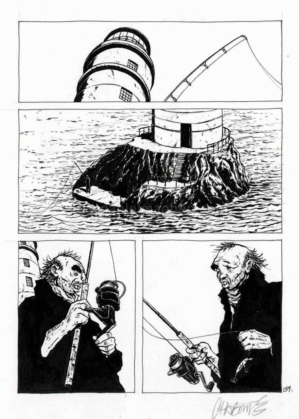
Lately, I’ve been digging Chaboute’s work, and I especially was enthralled by the style and storytelling in Alone. I picked this page from Alone for my “good” artist.
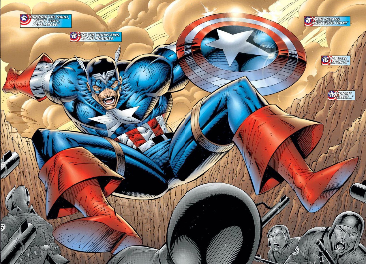
As a kid, I loved Rob Liefield, but I’ve since come to dislike his style. I chose a page from his “Heroes Reborn” Captain America title, a title I read and loved as a kid (and I think I even drew this page in my early childhood attempts at drawing, which involved mimicking artists I liked).
Time to Draw!
Now that you have those pages, you will redraw a panel from each page.
First, redraw a panel from the “good” artist in the style of the “bad” artist.
The “good” artist via a “bad” artist
Here’s my version of Alone by way of Rob Liefield with my apologies to him (I didn’t draw an exact panel from the page I showed, more like a step in between panels):
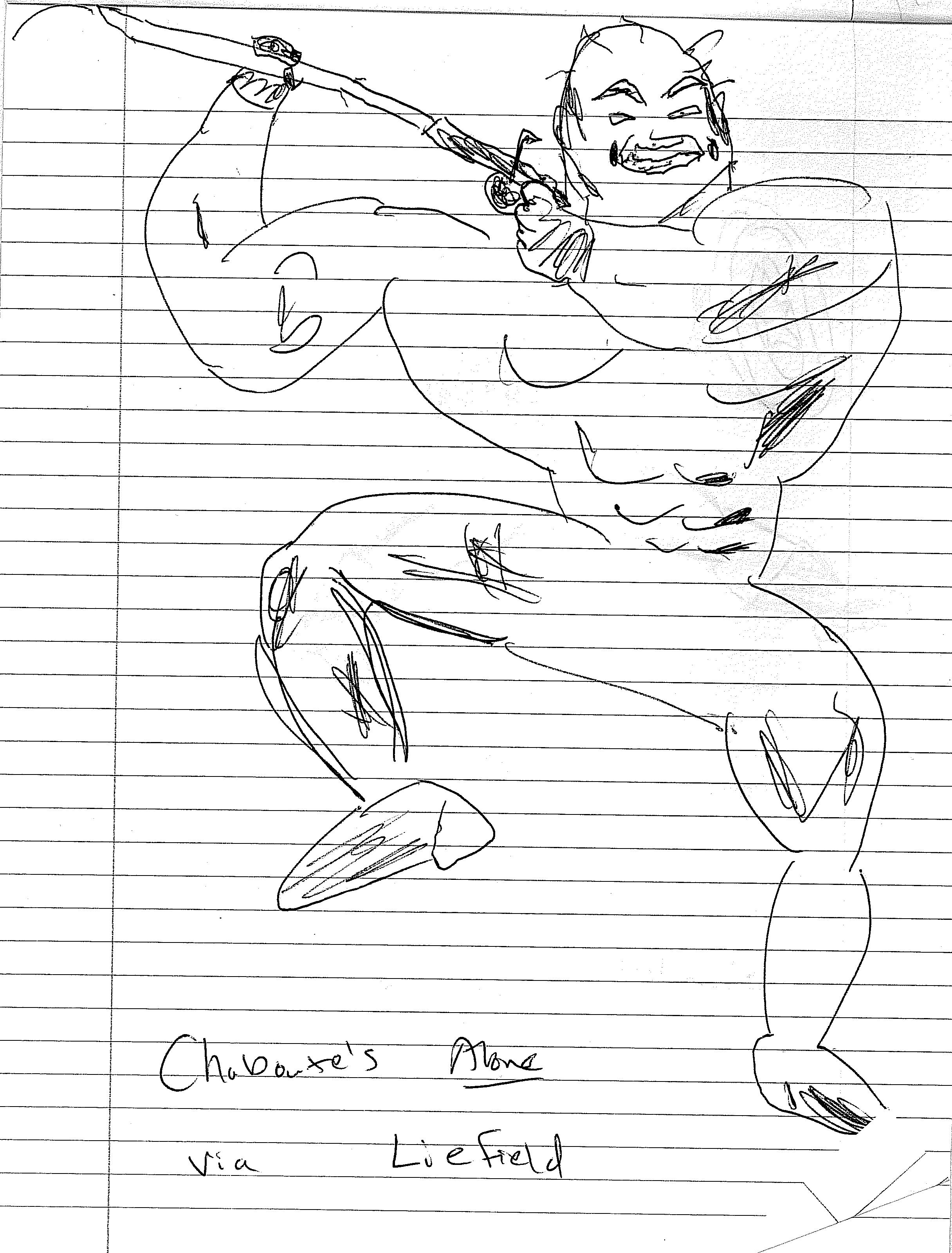
I tried to mimic Liefield’s obsession with cross hatching, shading, and bulging muscles. I also tried to add a trademark “Liefield grimace”, but I didn’t draw that as well as he can. As far as the pose, this owes more to the Captain America pose–Liefield has a lot of dynamic poses where characters explode in all sorts of directions, even if it’s not anatomically possible.
Even though I’m partially making fun of Liefield in this post, Brunetti wants you to think of something valuable that the “bad” artist can offer and when you might use that style. Here’s what I have:
–Compared to Chaboute, Liefield does have more dynamism and movement in a single image than most of Chaboute’s images, especially what you see above (I’d argue that Chaboute has more movement and dynamism across panels, because Chaboute has a great sense of cinematic storytelling).
–No surprise, but this dynamic movement is mainly suited to superheroes or other over-the-top action stories. I probably wouldn’t use it seriously in a story, unless the Liefield style was being used to show something other than “reality” (a TV show the character is watching for instance); I also might use it if I wanted to vary art styles across a piece to show different “eras” (like Rob Veitch and Joe Bennett did superbly in Alan Moore’s Supreme, itself a comic that Liefield created).
The “bad” artist via a “good” artist
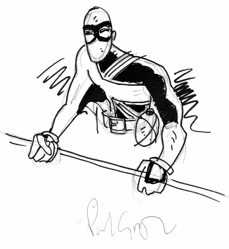
Then, redraw a panel from the “bad” artist in the style of the “good” artist. Here’s my take on Captain America leaping, via Chaboute with my apologies to him too:
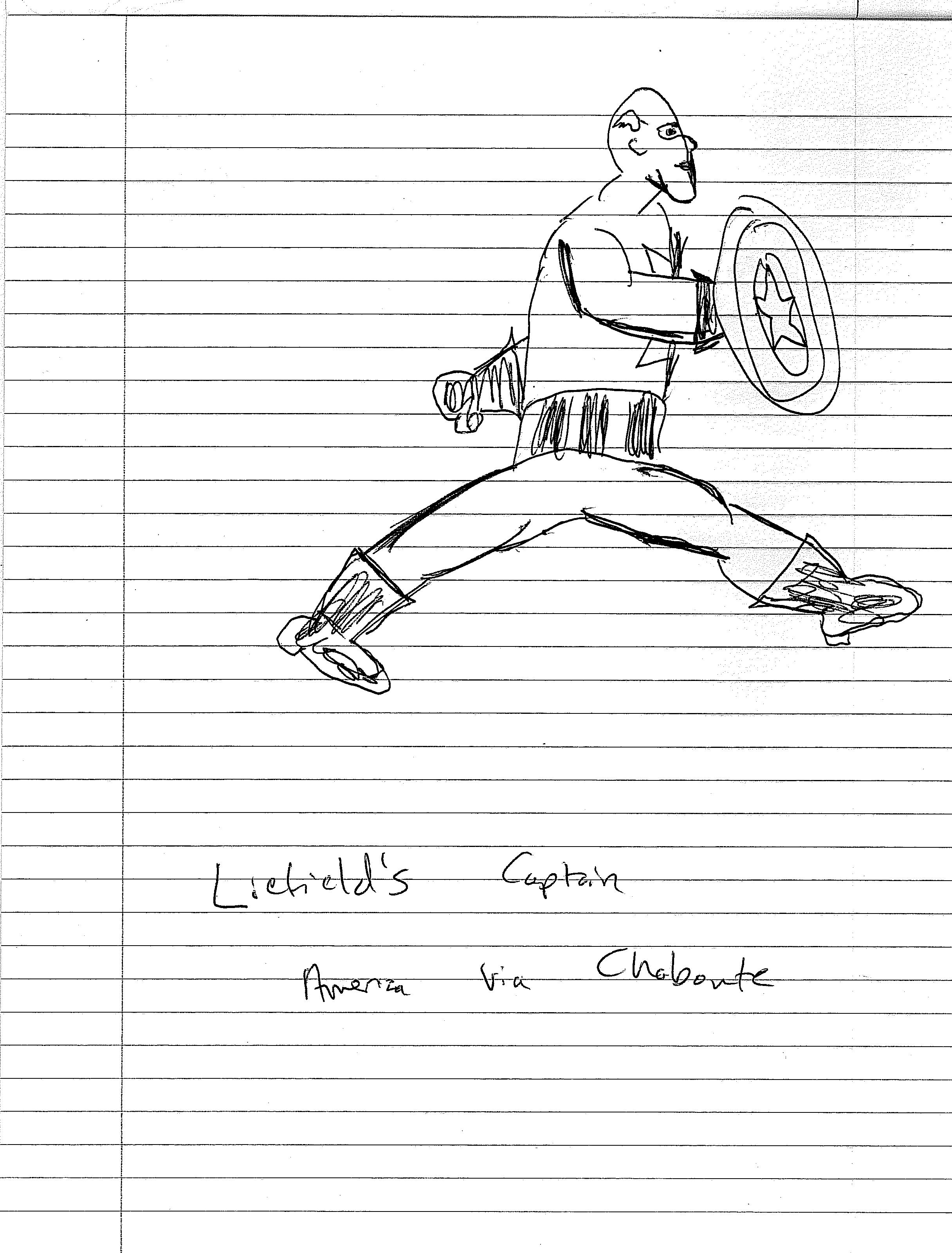
I don’t think I actually did a good job imitating Chaboute, but here’s what I was trying to do–I wanted to use shading more like Chaboute (something I did with the gloves, boots and stripes on his torso). I also wanted to rein in the extreme proportions that Liefield is famous for, so this version of Captain America is a little more realistic-looking and relatable to an average reader than Liefield’s is. However, I think that Chaboute is more detailed than I was; in trying not to add unnecessary details and cross-hatching, something I think Liefield often does, I might have simplified too much. It actually reminds me more of Paul Grist and his work, which can be seen below.
Similar to Brunetti’s requirement to find the good in a “bad” artist, Brunetti now wanted me to find the bad in a “good” artist and to brainstorm when I’d use some of those traits. Although I love Chaboute, here’s what I came up with:
–Chaboute doesn’t have too much movement in a single image, whereas by copying Liefield’s jumping Captain America in a faux-Chaboute-style I was able to bring more movement in that single image. I already alluded to this point earlier, but it bears repeating.
–Chaboute doesn’t have a lot of gray in his drawing; he relies more on stark contrasts between black and white.
–With this in mind, I would use more of the dynamic poses (properly proportioned of course) in action scenes, but I’d also add more dynamic poses to small scenes that have a key action that might seem subtle compared to punching someone and jumping. I also would use a little more gray in setting objects like buildings. I don’t think it’s needed for the actual background or characters–I’d leave those using an interplay of black and white, but I think gray could add more depth to some background objects.
While I’d still take Chaboute over Liefield any day of the week, this was a good activity to reinforce a key idea I have about creating anything artistic, an idea I drill into my students’ heads so much they get sick of me repeating it:
There are no bad tools or bad approaches; there are only bad moments for those tools or bad balances of those approaches.
That’s it for this week: stay tuned for the last few entries! As always, check out my other work and my latest news at cjstandalproductions.com or follow me on Twitter @cj_standal.
Discover more from Graphic Policy
Subscribe to get the latest posts sent to your email.