
Creator’s Corner: Exercises in Cartooning Week 7
I’m a writer, not an artist. But for the next 4 weeks, I’m going to be a cartoonist.
And you can join me on this journey–not only by seeing what I do, but by completing the exercises I do along with me.
*Note* To see Week 1’s adventures, click here, to see Week 2’s adventures, click here, to see Week 3’s adventures, click here, to see Week 4’s adventures, click here, to see Week 5’s adventures, click here, and to see Week 6’s adventures, click here.
The great cartoonist Ivan Brunetti, also a teacher of comics/cartooning, has a book that publishes his course; it is a 10 week “class” that has a few exercises for each week, some of which I might even use in my own graphic novel class. I thought it’d be fun–especially since I’m a writer and need to challenge my skills as an artist–to run myself through his course and post each of my exercise on here. So without further ado…
Exercise 7
This exercise focuses on tools (use either a brush, a dip pen, or a technical pen–a fountain pen or marker also work) and the lines/shapes/textures each tool naturally makes or resists drawing.
Once you have two-three of these tools, you need a 11 x 17 board. To set up this board for your exercise create a grid of 10 x 16 squares (about 1 inch each); leave a 1/2 inch as margin all the way around the board.
Fill each square with one type of mark, pattern, or texture made by one tool. Feel free to get as abstract as you want, making any types of hatches, blotches, use of pointillism, etc… Use all three tools on this page.
At times, duplicate the same mark in a nearby box, but use a different tool. This helps you see which tools are better suited to make specific types of marks. In my example, I used only two tools–a technical pen and a marker–and I used one tool per row, duplicating the image beneath it with the next tool.
Here’s what I came up with–I didn’t quite have the 10 x 16 grid, but you should know by now that I adjust the exercises to work for me:
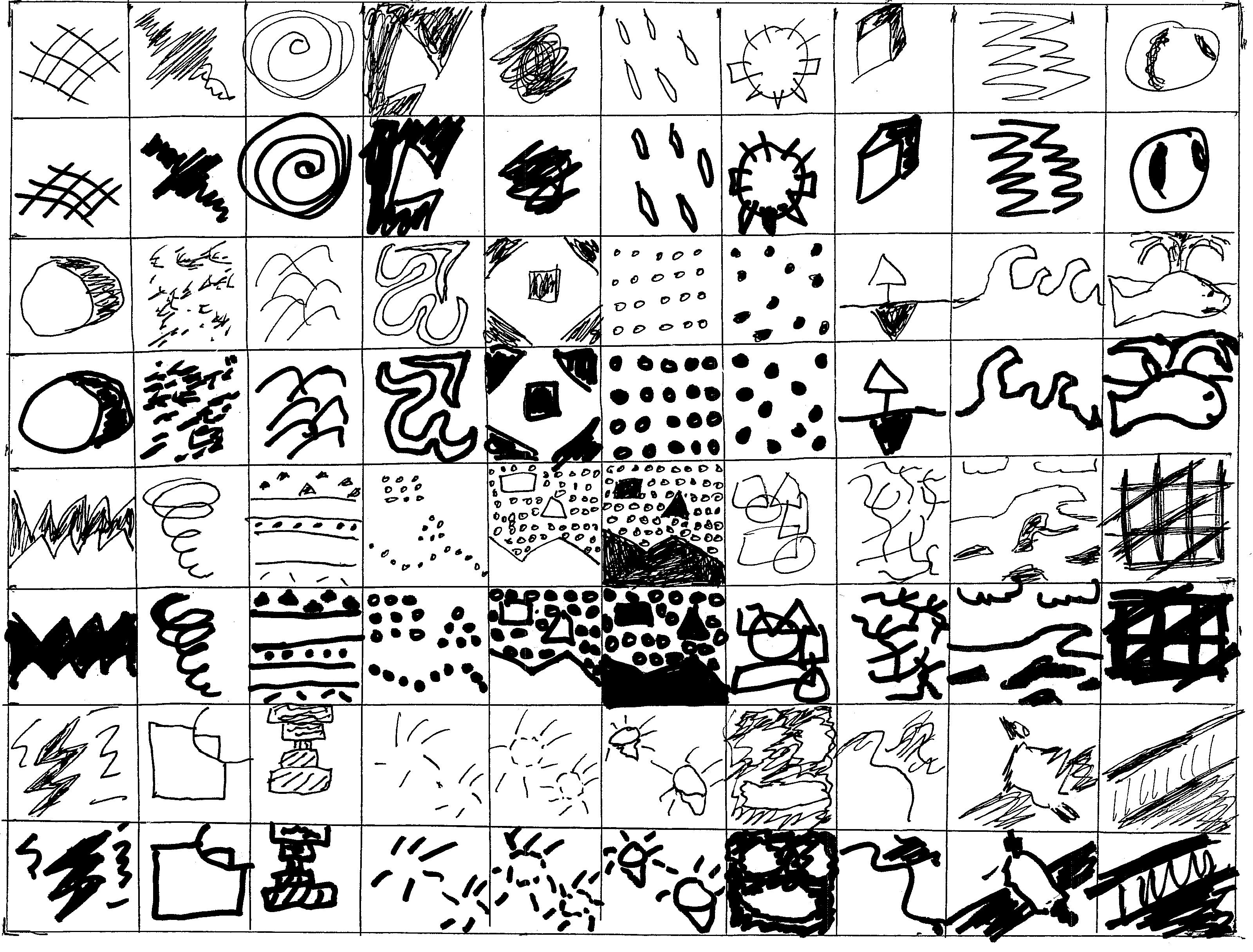
While it might seem obvious, the marker was better suited for marks that were largely shaded or filled in; the technical pen was better suited for detail work and didn’t shade very well (plus using it to shade wasted some valuable ink).
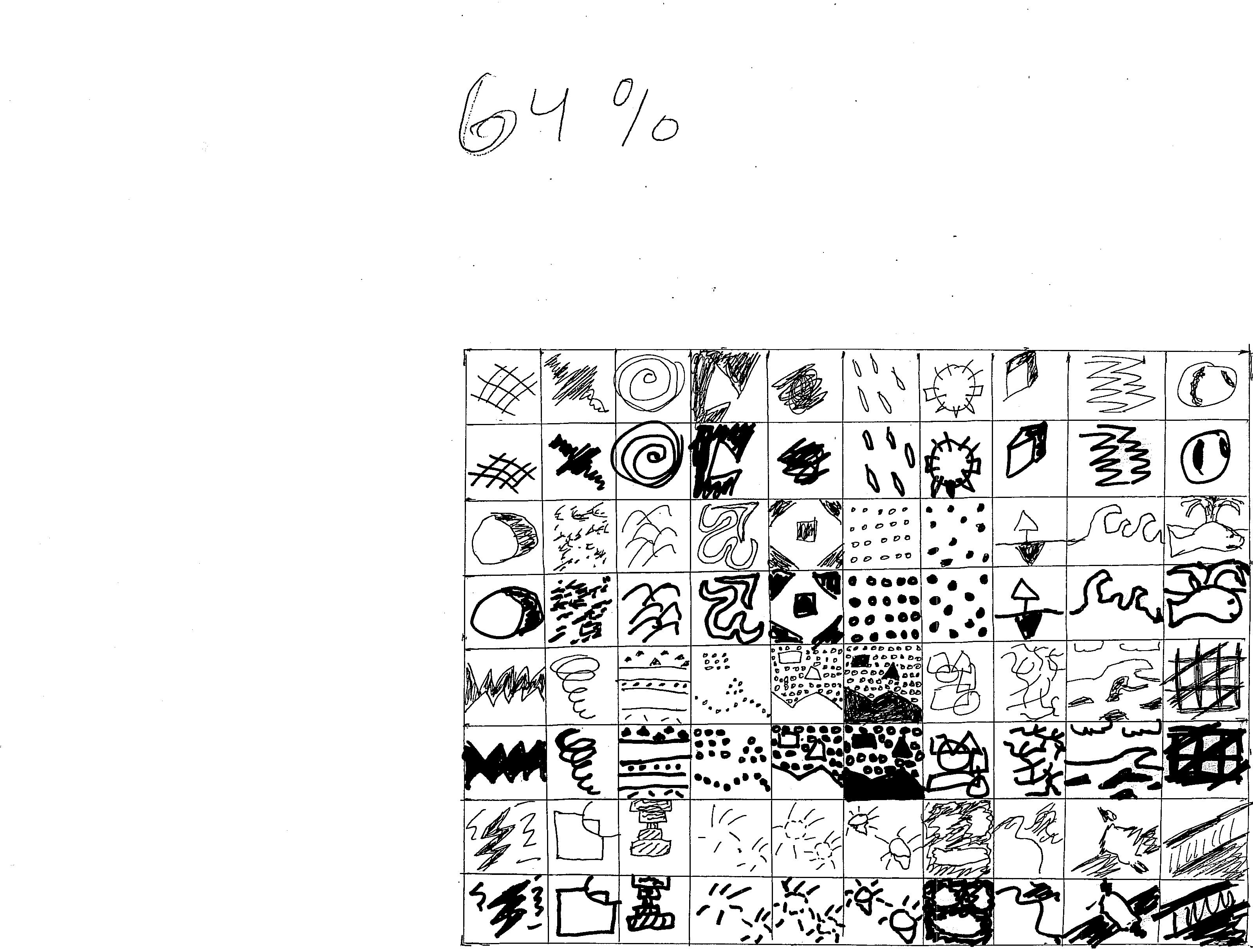
The only step left in this exercise has to do with duplication and resizing: most comics aren’t published in a 11 x 17 format, so it helps to know what your images would look like in a more traditional, printed format.
To accomplish this, Brunetti recommends copying and resizing your work to 65%, 50%, and 35%. I did this, but I used 25% instead of 35% and 64% instead of 65%, just because those were the default resizing settings in my copier, and I didn’t know how to change it.
Here are each of my examples, with the resized percent written in for clarity:
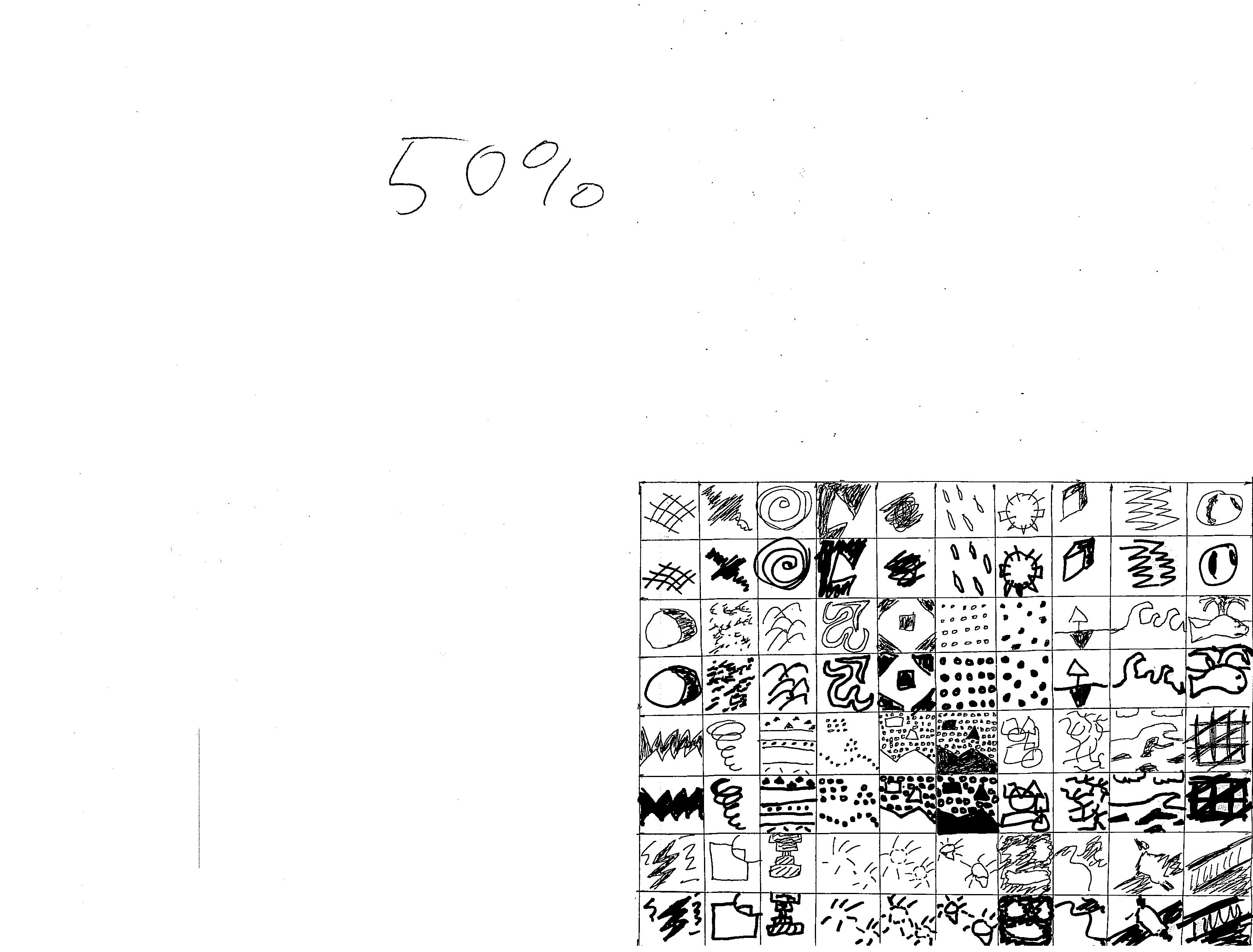

I like the 64% or 50% the best (even more than the full sized one). I think 25% is too small, and I don’t think making it 35% would change my opinion on that.
The reason I like the 64% and 50% better than the full sized version might have something to do with my confidence in my drafting skills. Yes, these are more abstract, so there aren’t really many ways to mess up the drafting, but in the full sized version I noticed a few stray marks/marks that got away from me. The 64% or 50% versions are small enough to minimize those errors, so I can’t see them, but they’re not so small that I can’t see the other, necessary details.
Thanks for stopping by, and I’ll see you for Week 8!
In the meantime, keep updated on these adventures, my other works–including #free comics!–and my blog at cjstandalproductions.com.
Discover more from Graphic Policy
Subscribe to get the latest posts sent to your email.