Tag Archives: deron bennett

Review: Plunge #3

Plunge #3

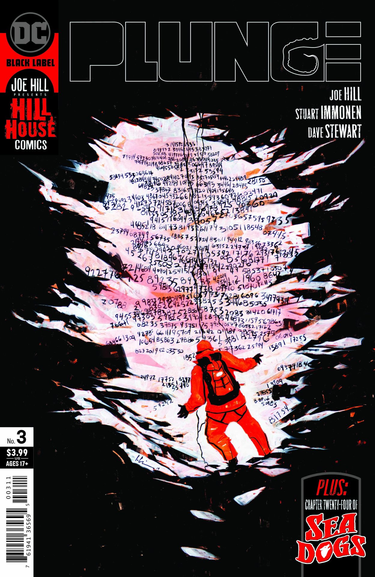
Creepy, weird, WTF, that’s all that can describe Plunge #3, the horror comic by writer Joe Hill. The revelations in the issue are both plentiful and scant as the comic builds mystery upon mystery like a puzzle being formed.

The story follows a salvage crew sent on what’s clearly a shady recovery mission by a corporation. It’s very ALIENS in that way. Where they believed that the crew had perished, we learn here that’s not the case after being teased the last issue. What happened in those 40 years? I couldn’t tell you as Hill delivers a comic that feels like rambling after rambling and that’s kind of the point.

What Hill has done is put the reader in the position of the salvage crew. We’re not a casual observer but an active participant learning as they learn. There’s little more that we know and instead and treated to their reaction because it’s our reaction. The issue will leave you scratching your head, maybe less so if you’re really into mathematics. If not, there’s Wikipedia.

The art by Stuart Immonen with color by Dave Stewart is fantastic. It really nails the unease of the issue. While not quite in the “scare” camp, the design and color choice definitely has a sickly feel about it. That look enhances the atmosphere for the reader building upon the riddles and questions that Hill has laid out. It also made me feel a little ill at times with its general septic look. Deron Bennett‘s lettering stands out as those discovered have a very specific speech pattern and lettering to enhance their condition.

Plunge #3 is the issue that took what I thought was a pretty straightforward horror story and instead through an equation into the mix that left me scratching my head. As a single issue it’s maddening. It leaves you with so many questions. As part of the whole, I’m sure it’ll be excellent. It’s definitely not an issue to start with and not one you can read on its own. By this point of the story, you’d expect some questions and mysteries would be answered by Hill has taken the formula and mixed it all up.

Story: Joe Hill Art: Stuart Immonen
Color: Dave Stewart Letterer: Deron Bennett
Story: 8.0 Art: 8.75 Overall: 8.15 Recommendation: Buy

DC Comics provided Graphic Policy with a FREE copy for review
Check Out the Cover and a First Look at House of El by Claudia Gray and Eric Zawadzki

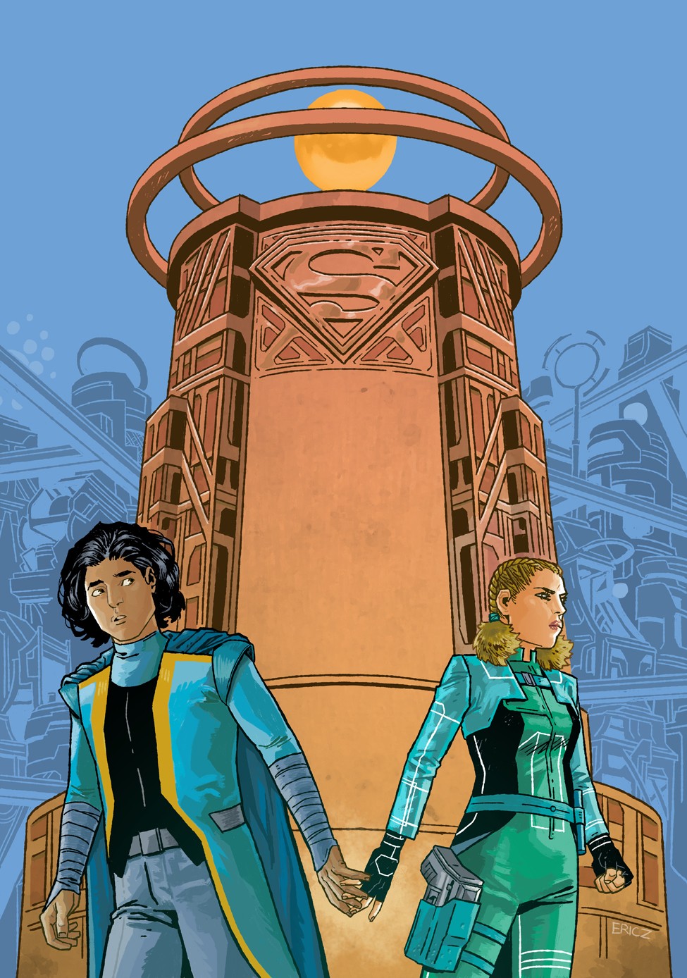
Known for her acclaimed Star Wars novels, Evernight series, and other sci-fi/fantasy works, YA author Claudia Gray is coming to DC next January to share a brand-new vision of the destruction of Krypton, one of the most famous tragedies in all of comics. In House of ElGray will explore life on Krypton through the eyes of Zahn and Sera—two teenagers who are different in every way—as they come together to investigate the dangers threatening their planet. The three-part young adult graphic novel series will be brought to life by illustrator Eric Zawadzki, and the first installment will debut January 5, 2021.

House of El Book One: The Shadow Threat

Written by Claudia Gray
Illustrated by Eric Zawadzki
Colored by Dee Cunniffe
Lettered by Deron Bennett
On sale: January 5, 2021
MSRP: $16.99
Available to pre-order now.

Welcome to a brand-new vision of one of the most famous tragedies in all of comics from New York Times bestselling author Claudia Gray and illustrator Eric Zawadzki. In this first graphic novel in a trilogy, explore Krypton like never before: through the eyes of two teenagers on opposite sides of the same extinction-level event.

Zahn is one of Krypton’s elites: wealthy, privileged, a future leader. Sera is one of Krypton’s soldiers: strong, dedicated, fearless. Their rule-bound society has ordained that their paths should never cross.

But groundquakes are shaking the planet’s surface. Rebellious uprisings are shaking the populace. Krypton’s top scientists—Jor-El and Lara—conduct a secret experiment that is meant to reform their planet from the cellular level up. Zahn and Sera must join forces to investigate the hidden dangers truly threatening Krypton. In the process, they form a bond that just might endure past the end of the world…

House of El Book One: The Shadow Threat

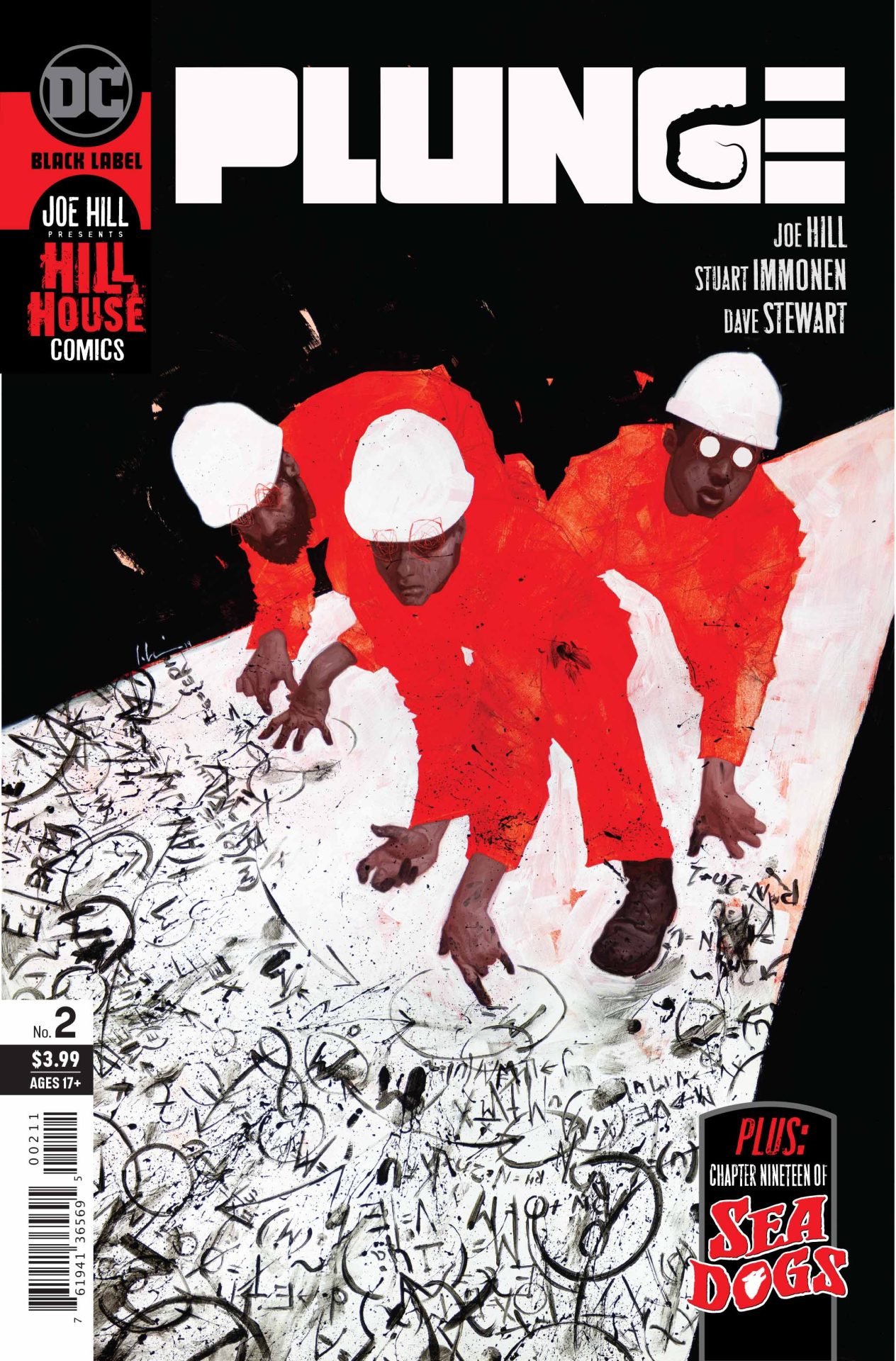
Review: Plunge #2

Plunge #2

I’m not much of a horror fan but Plunge #2 delivers chills and unease. It’s exactly the type I like. Written by Joe Hill, the second issue picks up on the discovery of a dead body and from there just layers on the creepy factor.

What Hill does especially well is pile on new mysteries while not frustrating the reader. We’re two issues in and reveals would be a bit premature but at no point is it frustrating. I found myself uttering “wtf” multiple times but that’s part of the fun and entertainment.

This isn’t horror in the hacker/slasher sense. Hill’s delivery is a tense psychological thriller that may have a big bad bug as the actual villain. Or, is it all psychological? Hill keeps us guessing.

But Hill goes beyond the scares and makes sure to deliver characters we’ll like. While Plunge #2 dials back the character focus it still gives us a bunch of solid moments. There’s enough humor to break the tension and already I found myself reacting to actions like “don’t go in there.” There’s that internal interactive element that makes horror fun. It helps too that so far all of the characters are likeable. Some are more so than others but none are at the point you want to see them die, even the shady ones I have my questions about.

All of this is helped by Stuart Immonen‘s art and Dave Stewart‘s colors. There’s an unease about it all. The blues of the comic gives it all a sickly feel in a way adding to the vibe of it all. The comic is all about giving the reader an off feel about everything. What should be straightforward often isn’t with enough detail to create angst without grossing readers out. At no point does the comic go into over the top gore but there’s more than enough to get to the point of disturbing.

Plunge #2 continues the psychological horror thriller adding to the mystery of it all and going for unease instead of scares. It delivers a fantastic mix of characters and settings with a look that helps create a creepy tone. This is a must for those that enjoy this sort of horror and for even those that don’t.

Story: Joe Hill Art: Stuart Immonen
Color: Dave Stewart Letterer: Deron Bennett
Story: 8.5 Art: 8.5 Overall: 8.5 Recommendation: Buy

DC Comics provided Graphic Policy with a FREE copy for review

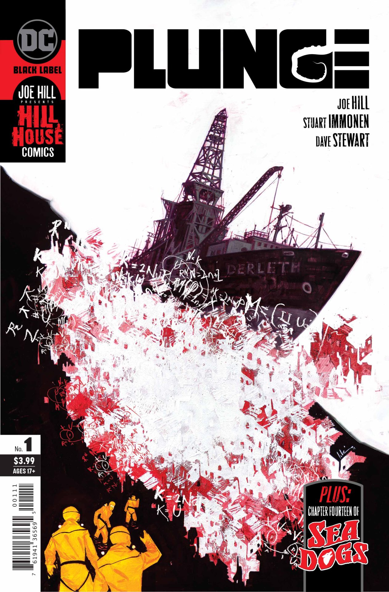
Review: Plunge #1

Plunge #1

While I’m not a horror fan, there’s a certain type I do enjoy. Those tense stories whose focus is more on the build-up than cheap scares are more in my wheelhouse. Plunge #1 delivers that and more in a fist issue that’s full of tension and character.

Written by Joe Hill, Plunge #1 isn’t anything particularly new. Instead, it does things we’ve seen before really well. A nautical experience, Plunge tells the story of a ship that begins to emit a distress signal nearly 40 years after it wrecked. What happened? Why the sudden signal? That’s all a part of the mystery. We know things are going to go smoothly in the salvage, we just don’t know how it’ll go sideways. And that’s part of the enjoyment.

Beyond the tension, Hill focuses on the characters. Each has a lot of personality and by issue’s end, you’ve got a good sense as to who everyone is. There’s also some solid laughs that break up what easily could have been a serious and dour first issue. The comic almost goes out of its way for laughs and that focus is a smart one. It makes the horror of it all a bit more ominous. You get the sense there’s something looming, even when you’re guard is down laughing about rubber dicks.

Stuart Immonen‘s art is fantastic. Along with Dave Stewart‘s colors and Deron Bennett‘s lettering, the visuals build on that subtle dread Hill goes fore. With lots of blues and browns, there’s a dirty but organic feel to the art that, much like the characters has personality. That’s the aspect that really stands out. Immonen’s style plays well to the character interactions with highly expressive looks and delivery of dialogue. There’s an almost play like aspect to it all. Bennett’s lettering too becomes key as the story progresses and we get to the final reveal. It delivers a style that emphasizes the shock of it all.

Plunge #1 is a fantastic debut. It’s a must for horror fans and especially for those who like films like the Abyss, Jaws, and Leviathan. We’re just in the setup phase but the mix of characters and missions creates a start that’s beyond engaging and a hell of a beginning.

Story: Joe Hill Art: Stuart Immonen
Color: Dave Stewart Letterer: Deron Bennett
Story: 10 Art: 9.0 Overall: 9.5 Recommendation: Buy

DC Comics provided Graphic Policy with a FREE copy for review

Take the Plunge with Hill House Comics. Check Out an Early Look

Plunge #1

Written by Joe Hill
Art by Stuart Immonen
Colored by Dave Stewart
Lettered by Deron Bennett
Cover by Jeremy Wilson
Variant cover by Gary Frank
In shops February 19, 2020
Final orders due January 27, 2020
SRP: $3.99

Hill House Comics Brings New Terror from Beneath the Waves in Plunge!

What happens when you combine horror icon Joe Hill (Basketful of Heads, Locke & Key), the return of legendary artist Stuart Immonen (Superman: Secret Identity), covers by Jeremy Wilson, variant covers by Gary Frank, the tension of deep sea exploration, mysterious cargo and the innate fear of sharks, together in one package?

You get the next spine-tingling launch from DC’s Hill House Comics, Plunge!

In the aftermath of a devastating tsunami, an exploration vessel known as the Derleth begins sending an automated distress signal from a remote atoll in the Bering Strait. The only problem is that the Derleth has been missing for 40 years. Marine biologist Moriah Lamb joins the Carpenter Salvage team to recover the Derleth’s dead…only to find that in this remote part of the Arctic Circle the dead have plenty to say to the living…

Joe Hill, Stuart Immonen, Dave Stewart and Deron Bennett’s plunge into terror begins here, featuring covers by Jeremy Wilson and variant covers by Gary Frank!

Plunge #1

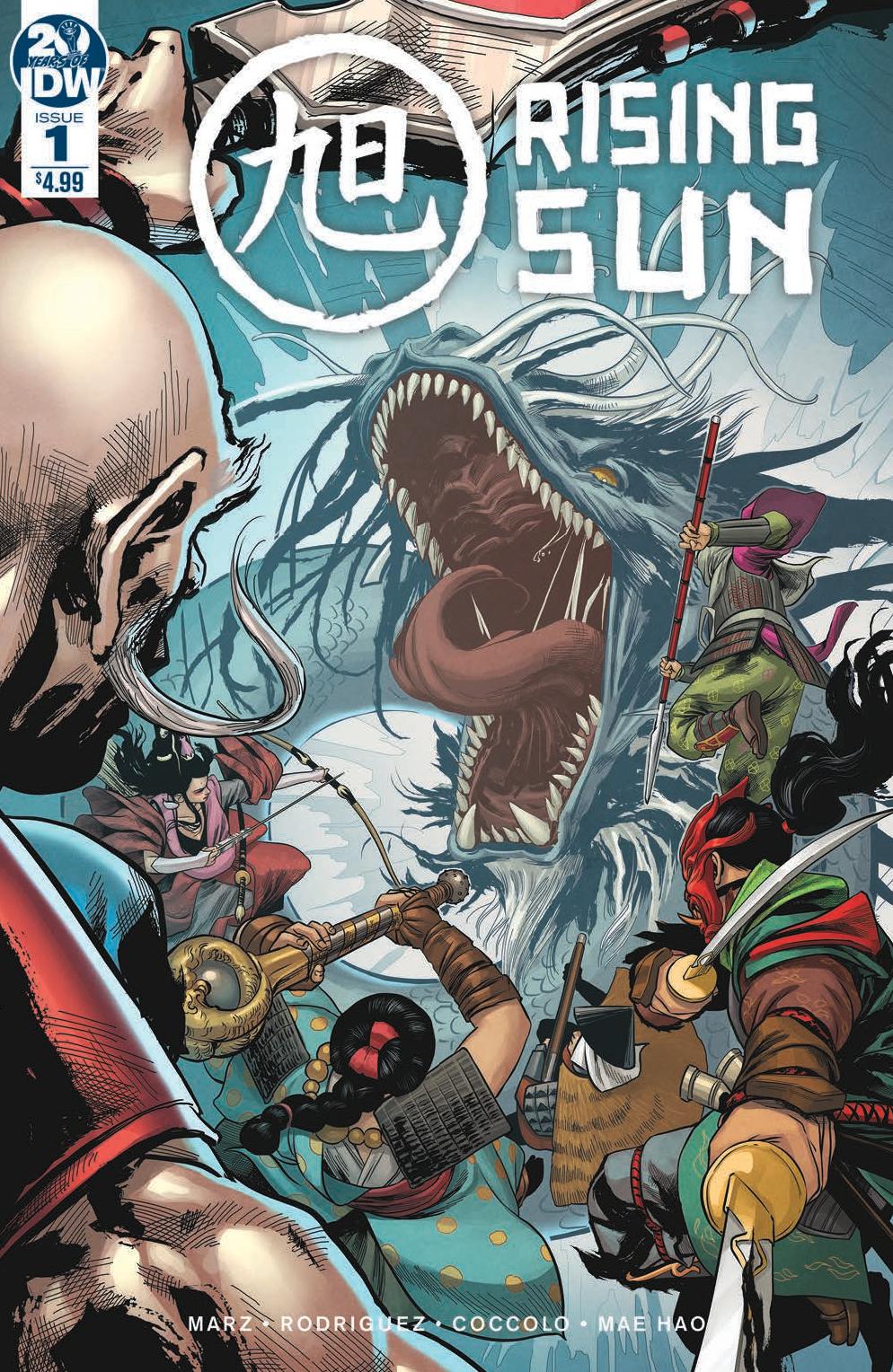
Review: Rising Sun #1

Rising Sun #1

I’ve never played the board game Rising Sun. Despite my love of board games, I couldn’t tell you what the game is even about. Rising Sun #1 adapts the popular board game from CMON into comics and does a decent job of it all. Written by Ron Marz and David Rodriguez the story focuses on warriors from different clans brought together to take on the monsters ravaging their lands and put a stop to the source. It’s a story we’ve seen before many times. This spin on the familiar plot stands out a bit due to its focus on the characters.

I can’t compare the comic to the game, or how well it adapts it, but the comic itself is an entertaining read. The plot is something we’ve seen but Marz and Rodriguez deliver something a bit more. Through the injury of one of the warriors, we learn about the others. It’d be easy to do flashbacks to reveal who each is but between the initial battle and subsequent events in trying to save their friend, we get a good sense of every character. There’s a lot packed into the issue explaining the world and it all flows easily.

The art by Martin Coccolo helps keep the focus on the characters. With colors by Katrina Mae Hao, each has personality in their design. Looking at each character, you get a sense of their clan and who they are. The body language too helps convey it all. Like the overall plot, the art feels familiar but at the same time stands out. It does a solid job of giving us details on the world and characters without being too obvious and saving the need for clunky dialogue explaining the clans and personalities.

Who knows how well the comic reflects the board game but what’s presented is an entertaining read taking us through a familiar plot but doing so with a lot of personality. The comic also comes with some material to use for those who do play the game adding a nice bonus and reason for gamers to get it. A good start that stands out as more than a cheap cash in on a property.

Story: Ron Marz, David Rodriguez Art: Martin Coccolo
Color: Katrina Mae Hao Letterer: Deron Bennett
Story: 7.5 Art: 7.5 Overall: 7.5 Recommendation: Read

IDW Publishing provided Graphic Policy with a FREE copy for review

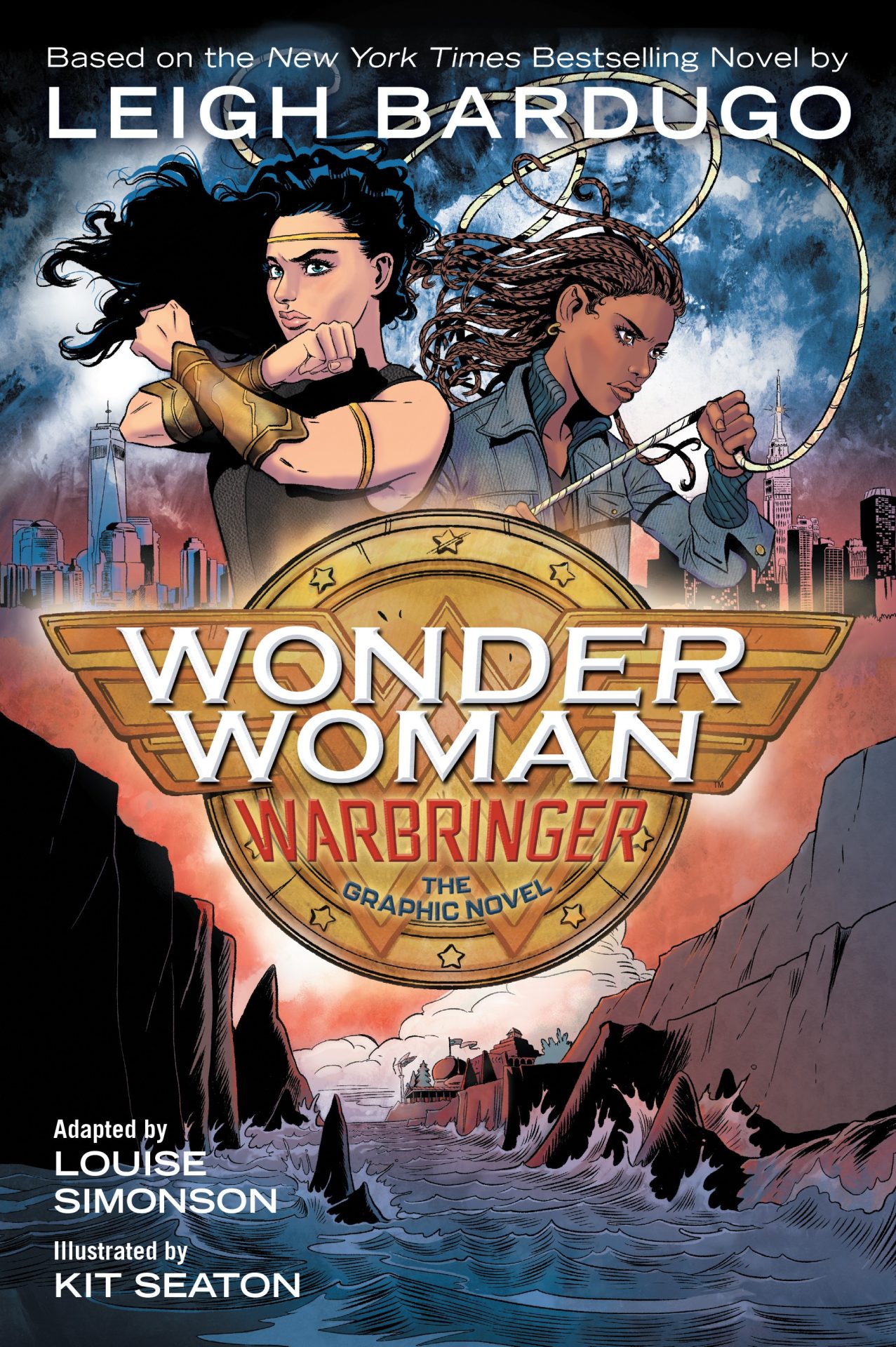
Review: Wonder Woman: Warbringer

The world is on the brink of war and chaos and a young Wonder Woman must venture forth to save it.

Story: Leigh Bardugo, Louise Simonson
Art: Kit Seaton
Color: Sara Woolley
Letterer: Deron Bennett

Get your copy in comic shops now and in book stores on January 7! To find a comic shop near you, visit http://www.comicshoplocator.com or call 1-888-comicbook or digitally and online with the links below.

Amazon
Kindle/comiXology
TFAW

DC Comics provided Graphic Policy with a FREE copy for review
This post contains affiliate links, which means that if you click on one of the product links and make a purchase, we’ll receive a percentage of the sale. Graphic Policy does purchase items from this site. Making purchases through these links helps support the site

Wonder Woman: Warbringer Gets a Trailer

Wonder Woman: Warbringer

Adapted by Louise Simonson from Leigh Bardugo’s prose novel
Illustrated by Kit Seaton
Colored by Sara Woolley
Lettered by Deron Bennett
On sale January 7, 2020
MSRP: $16.99

She will become one of the world’s greatest heroes: WONDER WOMAN. But first she is Diana, Princess of the Amazons. And her fight is just beginning. Based on the New York Times bestselling novel by Leigh Bardugo, this graphic novel adaptation brings to life Diana’s first adventure beyond the hidden shores of Themyscira.

Diana longs to prove herself to her legendary warrior sisters. But when the opportunity finally comes, she throws away her chance at glory and breaks Amazon law—risking exile—to save a mere mortal. Even worse, Alia Keralis is no ordinary girl and with this single brave act, Diana may have doomed the world.

Alia just wanted to escape her overprotective brother with a semester at sea. She doesn’t know she is being hunted. When a bomb detonates aboard her ship, Alia is rescued by a mysterious girl of extraordinary strength and forced to confront a horrible truth: Alia is a Warbringer—a direct descendant of the infamous Helen of Troy, fated to bring about an age of bloodshed and misery.

Together, Diana and Alia will face an army of enemies—mortal and divine—determined to either destroy or possess the Warbringer. If they have any hope of saving both their worlds, they will have to stand side by side against the tide of war.

Wonder Woman: Warbringer

Review: Far Sector #2

Far Sector #2

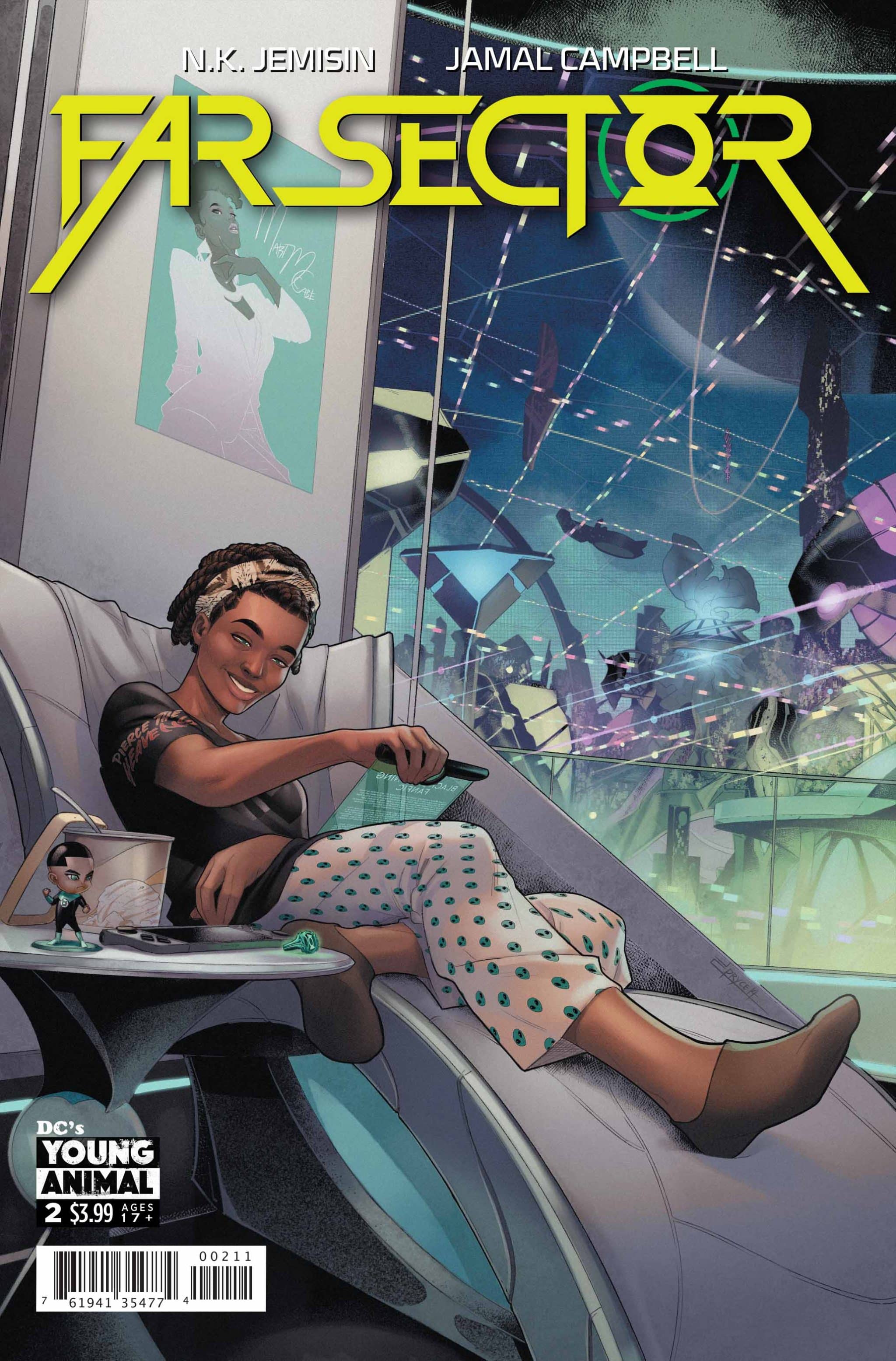
Far Sector #2 is a hell of a detective story. Though it takes place on an alien world and involves a Green Lantern, at its heart, it’s a crime tale. It’s also fantastic.

Writer N.K. Jemisin keeps the story grounded in numerous ways. Though there’s aliens and a fantastical world, Jemisin focuses on the main characer Jo. It’s an interesting story that cares as much about giving its main lead depth as it does the action and mystery. But that extends beyond Jo. Jemisin makes sure we learn about the world and the alien races it inhabits.

What’s most interesting is Jemisin keeping the story familiar. There’s the relationships and interactions between characters that stands out. But, there’s also familiar concepts like drug abuse and use. It’s sci-fi being used to mask real-world issues.

The art by Jamal Campbell is amazing. Joined by Deron Bennett on lettering, the comic is as amazing visually as it is to read. There’s a style to it all that feels fresh and fantastical. The designs are hauntingly beautiful and reflect the concepts presented. They invoke emotion but at the same time feel devoid of it. Underneath that beauty something feels sinister about it all. The art evokes an emotional read adding to Jemisin’s detailed dialogue.

Far Sector #2 is a fantastic follow-up. It adds depth to characters and the world while moving the murder mystery forward. Only two issues in a twelve-issue series, I’m already saddened there’s an endpoint. This is a world I already want to see more of.

Story: N.K. Jemisin Art: Jamal Campbell
Color: Jamal Campbell Letterer: Deron Bennett
Story: 9.0 Art: 9.0 Overall: 9.0 Recommendation: Buy

DC Comics provided Graphic Policy with a FREE copy for review

Review: Dark Knight Returns: The Golden Child

Dark Knight Returns: The Golden Child

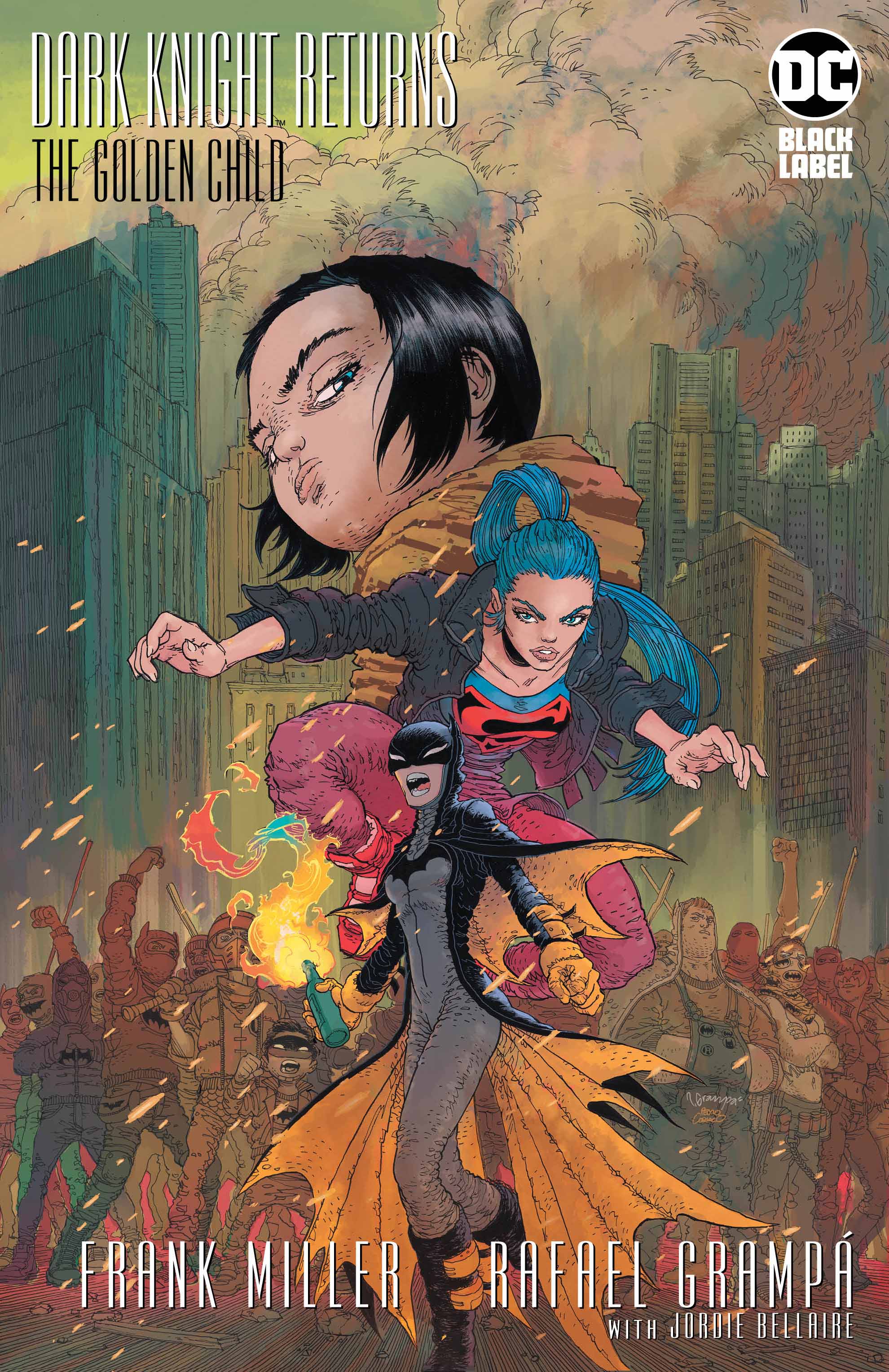
Dark Knight Returns: The Golden Child is Frank Miller‘s latest entry into his world of Batman. Following up on The Master Race, the comic feels like a bunch of ideas jotted down but not fleshed out. It’s a mess of a result.

The story revolves around Lara, Carrie Kelley, and a young Jonathan Kent. Miller sets up some interesting dynamics between the three. Lara struggles with humanity and Carrie devolves into her cold role as Batwoman. Jonathan is caught between the two. With godlike power he’s conflicted as to what it means to be human and compassionate. That could be a story unto itself with an easy conflict. It’d play off of themes Miller has previously addressed in other volumes. Instead, we get his take on the current state of political affairs and interference in elections. The result is a jumbled mess of a result.

Miller decides to make the villain of the story a combination of Darkseid and Joker whose initial gambit is meddling with an election. Donald Trump is their candidate and they manipulate the masses through computers and protests. It all feels rather odd for the pairing and with motivation unclear it comes off as lazy writing. It’s a plotline and two character that didn’t need to exist for an interesting follow up.

The end result is a comic that feels like Miller is attempting to say something but he’s unsure of how to do that and maybe even what it is he’s trying to say.

Rafael Grampá handles the art duties this time around. Jordie Bellaire joins on color with John Workman and Deron Bennett handling lettering. The art style is interesting with some scenes looking fantastic and at other times characters looking like distorted beings. There’s times it all works but at others it’s hard to not be distracted by giant foreheads.

There’s something interesting in the Dark Knight Returns: The Golden Child but the end result is a mess of a result. The story comes off as if it thinks it’s an intelligent take on the current state of affairs. But, then the dialogue betrays all of that with such memorable lines like “I’ll rip yuh gonads off.” The dialogue at times is laughable, and not in a good way. It’s a frustrating comic with flashes of Miller’s brilliance but a final result that’s a chaotic mess.

Story: Frank Miller Art: Rafael Grampá
Color: Jordie Bellaire Letterer: John Workman, Deron Bennett
Story: 5.0 Art: 6.5 Overall: 5.5 Recommendation: Pass

DC Comics provided Graphic Policy with a FREE copy for review

« Older Entries Recent Entries »