Tag Archives: le beau underwood

Preview: Star Wars: Hyperspace Stories-Tides of Terror #4

Star Wars: Hyperspace Stories-Tides of Terror #4

Writer: George Mann
Penciller: Luis Morocho
Inker: Le Beau Underwood
Colorist: Michael Atiyeh
Letterer: Comicraft
Cover artist: Eduardo Mello

After making a startling discovery about the cause of the disaster, Jedi Master Kit Fisto dives to the sea floor in a last-ditch effort to rescue those trapped on the sinking Axil Research Station. Among the submerged ruins, he comes face-to-face with the fearsome Xorfin. Can Fisto best the monsters and save the station, or will the remaining researchers become leviathan food?

Star Wars: Hyperspace Stories-Tides of Terror #4

Preview: Star Wars: Hyperspace Stories – Tides of Terror #2

Star Wars: Hyperspace Stories – Tides of Terror #2

Writer: George Mann
Penciller: Luis Morocho
Inker: Le Beau Underwood
Colorist: Michael Atiyeh
Letterer: Comicraft
Cover Artist: Eduardo Mello

Axil Research Station is in chaos! After a massive explosion rocked the underwater base, Jedi Master Kit Fisto and his Padawan, Nahdar Vebb, try to evacuate as many people as possible. But time is running out! Seawater is flooding the station, and with giant beasts lurking in the depths, it’s a race to make it to the surface…

Star Wars: Hyperspace Stories - Tides of Terror #2

Preview: Star Wars: Hyperspace Stories – Tides of Terror #1

Star Wars: Hyperspace Stories – Tides of Terror #1

Writer: George Mann
Penciller: Luis Morocho
Inker: Le Beau Underwood
Colorist: Michael Atiyeh
Cover Artist: Eduardo Mello

Jedi Master Kit Fisto has been sent to the ocean planet Torbus, alongside Mace Windu Shaak Ti, to investigate a controversial underwater research facility. But when disaster strikes, his diplomatic excursion quickly becomes a rescue mission! Kit Fisto and his fellow Jedi must race against the clock to save innocent lives from the hungry leviathans that circle in the depths.

Star Wars: Hyperspace Stories Tides of Terror #1

Knowhere Games Variant Covers for Star Wars: Hyperspace Stories – Tides of Terror Revealed

Dark Horse has revealed two variant covers for Star Wars: Hyperspace Stories – Tides of Terror by Tony Fleecs, available in standard color and B&W with spot color (virgin) editions for retailer Knowhere Games.

You can pre-order the set (of 2 covers) today directly for $40.00 or individually for $20.00 from Knowhere Games. Retail order cutoff June 23, 2025.

Jedi Master Kit Fisto has been sent to the ocean planet Torbus, alongside Mace Windu Shaak Ti, to investigate a controversial underwater research facility. But when disaster strikes, his diplomatic excursion quickly becomes a rescue mission! Kit Fisto and his fellow Jedi must race against the clock to save innocent lives from the hungry leviathans that circle in the depths.

Star Wars: Hyperspace Stories – Tides of Terror is written by George Mann with art by Luis Morocho, ink by Le Beau Underwood, color by Michael Atiyeh, and a main cover by Eduardo Mello.

Knowhere Games
125 Vallecitos de Oro Suite J, 
San Marcos, CA 92069

On-sale date for Star Wars: Hyperspace Stories–Tides of Terror is July 30, 2025, just in time to pick up your copy in person after the San Diego Comic Con fun.

Preview: Star Wars: The High Republic Adventures #7

Star Wars: The High Republic Adventures #7

(W) Daniel Jose Older (A/CA) Harvey Tolibao
In Shops: Jul 10, 2024
SRP: $3.99

The next thrilling chapter of the High Republic saga starts here! There’s no rest for the weary in the High Republic! After their reunion and only a moment’s respite, Lula, Zeen, and their friends learned that the Nihil Stormwall has encroached further into Republic Space. Now, the team of young heroes prepare to defend the planet Eriadu, and the Republic at large, from an impending Nihil invasion!

Star Wars: The High Republic Adventures #7

Exclusive Preview: Moon Knight #20

Moon Knight #20

(W) Jed MacKay, Danny Lore (A) Alessandro Cappuccio, Ray-Anthony Height
(C) Rachelle Rosenberg (I) Le Beau Underwood, Scott Hanna (L) Cory Petit
(CA) Stephen Segovia, Rachelle Rosenberg (VCA) Chris Allen and Guru-eFX, Gerardo Sandoval and David Curiel, Philip Tan and Frank D’Armata
Rated T+
In Shops: Feb 01, 2023
SRP: $4.99

There’s blood on the streets as assassins work their way through a list of names containing those who once formed Moon Knight’s Shadow Cabinet. But with a number of potential targets and no idea who’s next, how can Moon Knight save his former associates?
PLUS: Just in time for Black History Month, a second story in which the crescent crusader crosses paths with the Sheriff of the Vampire Nation, Blade!

Moon Knight #20

Review: DC vs. Vampires: Killers

DC vs. Vampires: Killers

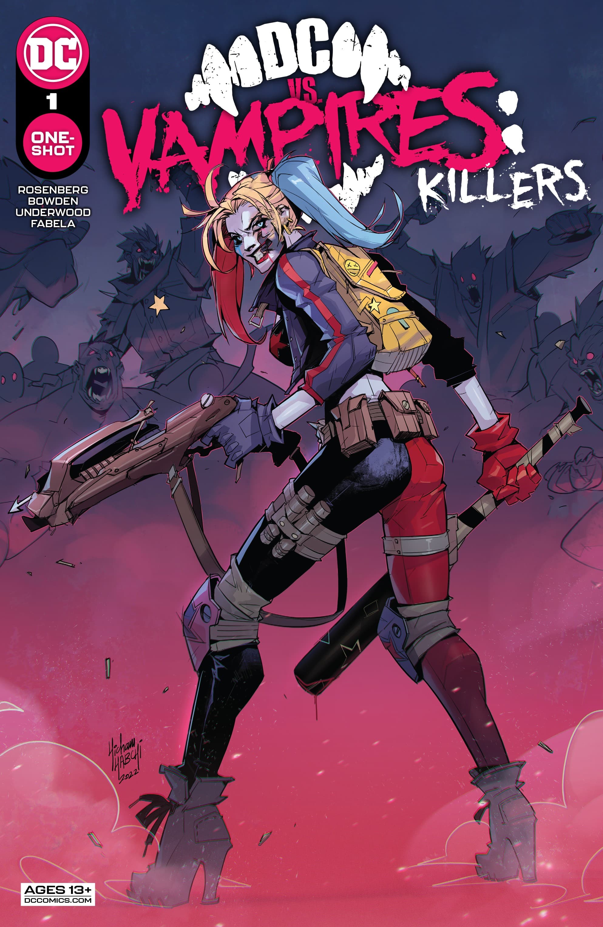
While we wait for the main series to return, DC vs. Vampires has been getting a series of one-shots to fill in the time, and expand the story. When I think of one-shots to a mini-series or event, I tend to have a negative opinion. The often feel like filler looking to cash in on a character or group. DC vs. Vampires‘ two releases break that mold. They are vital to the main story expanding on the world and setting up what’s to come. DC vs. Vampires: Killers is the second release delivering a glimmer of hope for the darkened world.

Written by Matthew Rosenberg, the one-shots have done a great job of expanding the miniseries event. They focus in on a specific aspect or character shifting the story from what was being told. If they were included in the main series, they’d feel like too much of a break and the flow of the series would suffer. As one-shots, that’s avoided though they fill in the gap as we wait for the series to return.

Harley Quinn has a crew of her own, now the crime boss of the vampire controlled Gotham. She’s presented an opportunity to smuggle out a glimmer of hope for humanity and must make a decision as to what to do.

Rosenberg, like the previous one-shot focused on Damian, creates another amazing chapter of the series. Like that other comic, this one is also pretty vital if you’ve been reading the main series. It gives us what’s likely to be part of the end game for the series and is our first bit of hope that the vampires might be able to be defeated. Like the main series, it keeps readers on their toes, guessing what will happen next and who has been turned into a vampire. But, even with that rather gloomy setting, Rosenberg find the humor in Harley as she does what she usually does.

The art by Mike Bowden and Eduardo Mello is great. It captures the kinetic energy that is Harley Quinn while keeping a look that fits nicely with the main series. They’re joined by Le Beau Underood and Livesay, with Bowden and Mello, on inks, Antonio Fabela on color, and Troy Peteri handles lettering. The comic’s visuals are top notch matching the quality of the series as a whole. There’s some great physical and visual humor to go along with Rosenberg’s, at times, snappy dialogue. To see the fate of Clayface and where that goes and not laugh is difficult. Without the visuals, it just wouldn’t play well at all.

DC vs. Vampires: Killers is a solid addition to the event. It’s another key comic and part of the story that just wouldn’t fit well in the main series. It’s a must for those already reading the series and might get those not interested in checking it out.

Story: Matthew Rosenberg Art: Mike Bowden, Eduardo Mello
Ink: Le Beau Underwood, Livesay, Mike Bowden, Eduardo Mello
Color: Antonio Fabela Letterer: Troy Peteri
Story: 8.0 Art: 8.0 Overall: 8.0 Recommendation: Buy

DC Comics provided Graphic Policy with a FREE copy for review


Purchase: comiXology/KindleZeus ComicsTFAW

Review: Wolverine: Patch #1

Wolverine: Patch #1

As a long time fan of Chris Claremont, his mark on the Marvel Universe cannot be denied. The impact he had just on the popularity of the X-Men is the reason why they are one of the most known superhero team outside of comic fans. The depth and care to which he took most of the characters through is why George Lucas joined him for a trilogy of medieval fantasy books in the 1990s. The work he did on the Dark Phoenix Saga set the standard for comic universe events.

He took a character like Jean Grey and gave her more dimensions than the previous creators as well as real drama to the previously droll comic. This is why when Falcon and The Winter Soldier came on air, longtime X-Men fans like me geeked at the fact they journeyed to Madripoor. This is where Wolverine had his bar and mutants found refuge away from the rest of the world. In Larry Hama’s return to Marvel, he tells a story where Logan was still known as his other moniker in the debut issue of Wolverine: Patch, as he gets in a bit of trouble along the way.

We’re taken to the Princess Bar, where Patch AKA Logan, Tyger Tiger and Archie Corrigan , who gets a proposition for a job, which leads them tot the mountains of Madripoor where apparently something underhanded is going on. Before they could make any progress, they get waved on a SHIELD Helicarrier where Nick Fury  gives them his version of a fair warning, as SHIELD has their counterintelligence operations going on the island. By the issue’s end, some Russian bigwigs arrive, the reader finds out more about the experiments that the mercenary army is doing in the mountains and Patch (Logan) finds some unexpected company in the form of mutant mercenaries who give him an unfair fight.

Overall, Wolverine: Patch #1 is a story which  feels like a an espionage thriller right in the middle of the X-Men Universe. The story by Hama is scintillating. The art by the creative team is gorgeous. Altogether, one of the best books of 2022 already.

Story: Larry Hama Art: Andrea Di Vito
Ink: Le Beau Underwood Color: Sebastian Cheng Letterer: Clayton Cowles
Story: 9.0 Art: 9.0 Overall: 9.6 Recommendation Buy

Marvel provided Graphic Policy with a FREE copy for review


Purchase: comiXology/Kindle – Zeus Comics – TFAW

Review: Wolverine: Patch #1

Wolverine: Patch #1

Wolverine is a character who has throughout the years worn many different hats. If there’s an era or style of story you enjoy, there’s probably one featuring Wolverine of that type. For a while, Wolverine was hanging out in Madripoor as a personality called Patch (he wore a patch, get it). Hanging out with Tyger Tiger and running a bar, the character dealt with the seedier sides of the Marvel Universe. Wolverine: Patch #1 takes us back to that time in a comic that feels retro in so many ways and that’s not necessarily a good thing.

Written by Larry Hama, Wolverine: Patch #1 has Wolverine being tasked to find out what’s going on in some jungles. There’s Generals, weird experiments, and something to do with Russians. It all has a retro-James Bond feel to it all, down to Wolverine… I mean Path… wearing a tuxedo with a flower through much of the issue. There’s crooked leaders and lots of mystery all around while there’s nothing particularly bad about the comic, it’s also not all the exciting either. It just kind of is. Wolverine: Patch #1 feels like a story I meant have read in the classic Wolverine series or Marvel Presents in the 90s or maybe a backup stories in those.

The issue feels like an 80s James Bond story with a bit of the cheese and colorful characters that you’re never quite sure whose side they’re on. The story, the look, the overall vibe feels like something we’d have read in the 1980s.

The art by Andrea Di Vito is good. With ink by Le Beau Underwood, color by Sebastian Cheng, and lettering by Clayton Cowles, the art has a feel that matches the story. There’s a retro aspect of it all and feels like it sort of leans into the silliness of the story. As I mentioned above, Wolverine rocks his Patch white jacket and flower through the comic and over time it takes a bit of damage but generally remains looking good, a mutant power of the its own I guess. Visually it just sticks out for some reason and just feels like it matches the overall vibe of the comic.

Wolverine: Patch #1 isn’t bad in any way but it also doesn’t stand out. You read it and kind of wonder of what the point is other than adding some nostalgia. So far, it doesn’t give us anything new. There’s not some interesting exploration of the time or character. It’s just a standalone story so far with a “classic” feel of it all. This is one for fans looking for a bit of nostalgia.

Story: Larry Hama Art: Andrea Di Vito
Ink: Le Beau Underwood Color: Sebastian Cheng Letterer: Clayton Cowles
Story: 7.0 Art: 7.0 Overall: 7.0 Recommendation: Read

Marvel provided Graphic Policy with a FREE copy for review


Purchase: comiXology/KindleZeus ComicsTFAW

Review: The Union #1

The Union #1

I read The Union #1 before King in Black #1 which actually helped the experience in some ways. Focused on a new team bringing together heroes from around the United Kingdom, the story is an introduction as it dives directly into an event tie-in.

Written by Paul Grist, The Union #1 is both good and bad. As far as an introduction to the team and their goal, there’s things that work. The issue revolves a lot around the team being introduced to the nation as an example of its unity. The use of the media and morning television smells of a realism and interesting aspect. The team is being introduced to the nation as well as to the reader. But, it also shows that the team is as much as public relations move as it is one of national security. It forces the reader to question why members have been chosen and if it’s due to their abilities or because they fit some aspect the PR team deemed important.

There’s a lot there to build off of as it shows some cracks already in the team and you wonder how it’ll play to the actual reality Britain and the region is going through. That’s touched upon but not really enough. That’s part of the bad of the issue as well. It touches upon reality and uses it to some extent but it mostly is just a line or two instead of a real discussion.

What really works is the tie-in to King in Black. The team is unaware as to what’s going to happen and if read before the main event issue (also out this week) it acts as a greater surprise to the reader. Like them, we’re surprised at the event unfolding before them and us. Reading the two issues in the reverse order, that surprise and sense of “what the hell” is lost. We the reader are no longer surprised, we have knowledge the comic characters don’t.

The art by Grist and Andrea Di Vito is pretty good. There’s a nice focus on the characters and their interactions that emphasizes the team dynamics. It doesn’t go over the top with the action but still delivers some solid designs and use of panels. Drew Geraci, Le Beau Underwood, and Grist provide the ink while Nolan Woodard handle colors. As the story progresses and the attack begins the art and color shift a bit to better show off the darkness coming. It never fully falls into darkness though and sticks to its lighter visuals.

The Union #1 is a rare debut tie-in that works really well. The issue plays off the attack quite well while building up an interesting dynamic for the team. The building blocks are here for what could potentially be a very entertaining story. It’s just a question to see what it does with the seeds its sown.

Story: Paul Grist Art: Andrea Di Vito, Paul Grist
Ink: Drew Geraci, Le Beau Underwood, Paul Grist Color: Nolan Woodard Letterer: Travis Lanham
Story: 7.0 Art: 7.0 Overall: 7.0 Recommendation: Read

Marvel provided Graphic Policy with a FREE copy for review


Purchase: comiXologyAmazonKindleZeus Comics

« Older Entries