Tag Archives: badrock

Mini Reviews: Badrock #1, Of the Earth #3, Sonic x Godzilla #1, 3W/3M Foundations

Badrock #1

Sometimes, the staff at Graphic Policy read more comics than we’re able to get reviewed. When that happens you’ll see a weekly feature compiling reviews of the comics, or graphic novels, we just didn’t get a chance to write a full one for.

These are Graphic Policy’s Mini Reviews and Recommendations.

Logan

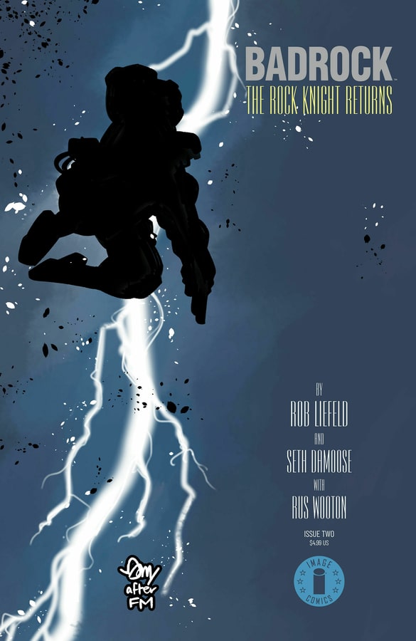
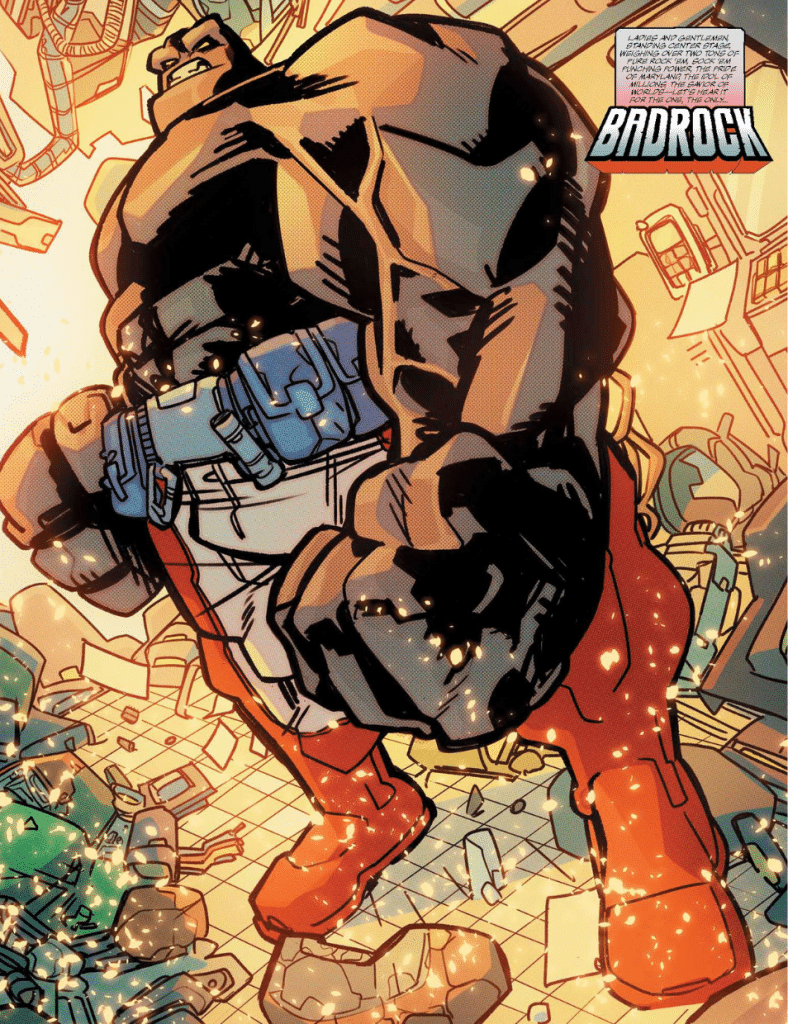
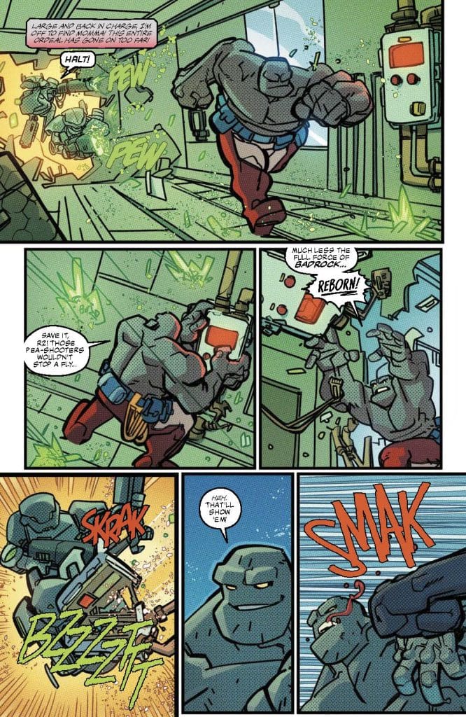
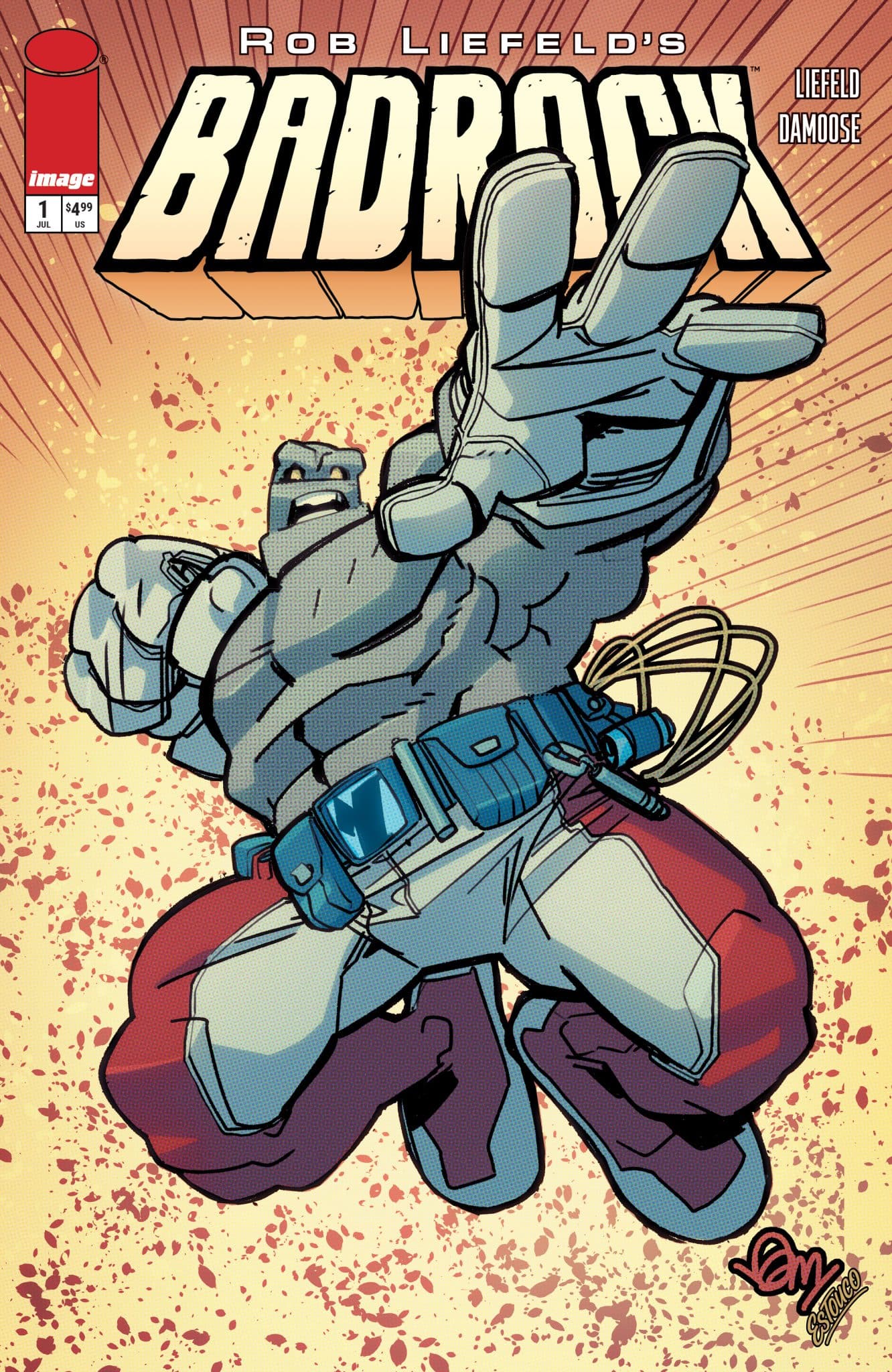
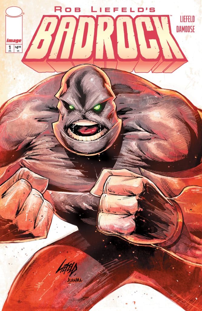
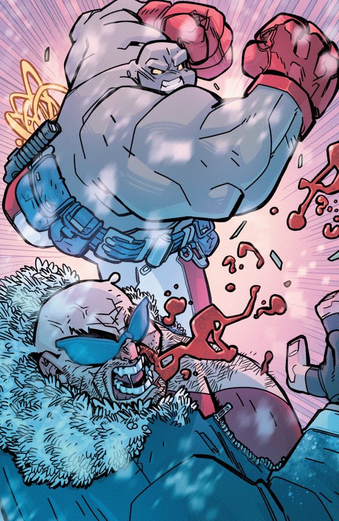
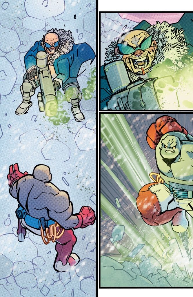
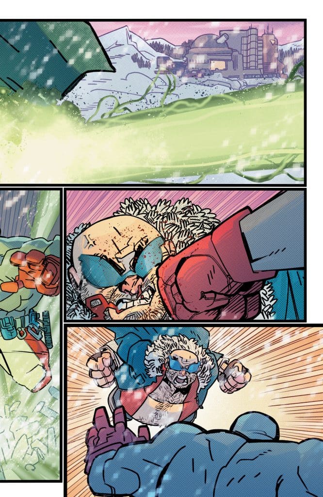
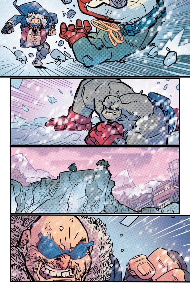
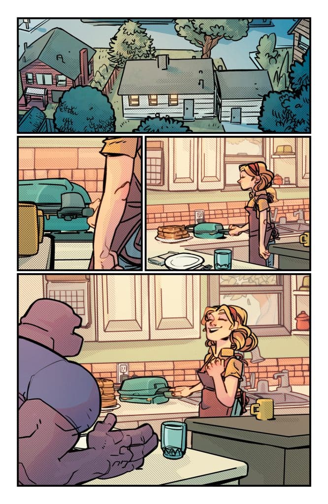
Badrock #1 (Image) -“Hello fellow kids” and wearing the comic’s writer’s podcast t-shirt aside, Badrock #1 is inoffensive action-packed fun. He’s basically if the Thing were a teenager, and his bond with his mom is wholesome. After a flash forward, Rob Liefeld and Seth Damoose build the book around their relationship. Badrock #1 has real heart and is the complete opposite of 90s edgelord. This extends to Damoose’s art, which has a powerful, primitive quality to it like Jack Kirby by the way of Liefeld, but he’s seen a few episodes of Venture Bros. Overall: 8 Verdict: Buy
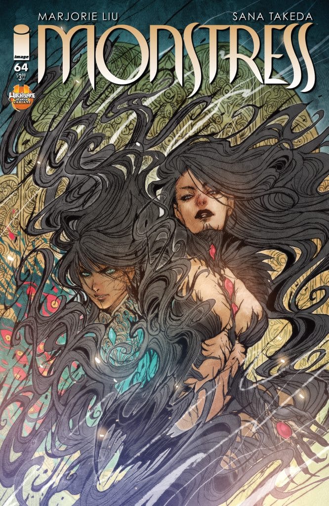
Of the Earth #3 (Image) Of the Earth has really started to hit its stride in the past couple issues. Letterer Hassan Otsmane-Elhaou makes the dialogue or lack of dialogue from protagonist Tabby’s grandma and a Fossil Oil employee that much creepier to go with Charlie Adlard and Pip Martin’s shadowy visuals and Chris Condon and Andrew Ehrich’s suspenseful script. Also, the back matter plays a key role in the comic kind of contradicting what we’ve just seen. Condon and Ehrich’s give Tabby and salt of the Earth oilman Thomas an easy rapport and trauma bond that grounds the comic as we start to get a real glimpse of the Wildcatter. Overall: 8.2 Verdict: Buy
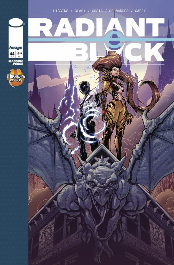
Sonic x Godzilla #1 (IDW Publishing) – The Thunder of a battle between Team Sonic and Eggman is stolen by Mothra and Mechagodzilla in Sonic x Godzilla (Who’s not in the comic) #1. Nick Marino, Jack Lawrence, and Reggie Graham put the focus on fisticuffs in this first issue while still carving out some space for character connections. I love Amy Rose’s intuitions about Mothra even as the Queen of Monster causes chaos in the Sonic universe. This is a shoot first, ask questions later type of comic, but fun in the last few minutes of a Saturday cartoon episode way. Overall: 7.6 Verdict: Read

3W/3M Foundations (Dark Horse) – Although Mike Del Mundo, Mike Huddleston, and Jerome Opena provide mind opening artwork, reading 3W/3M Foundations without subscribing to the companion Substack is like diving into the Silmarillion without reading Lord of the Rings. Foundations showcases a trippy sci-fi world centered around complex systems of science, magic, and religion. However, Jonathan Hickman and Nick Spencer wisely use the relationship between a father and his kids as a frame story. I’ll admit I’m semi-invested in that aspect, but the rest of the world is nigh-impenetrable. I dig some of the character designs, especially for the Three Mages and Syg the White Stag, but if you’re looking to get into a new fictional universe, this isn’t a good place to start. Overall: 6.4 Verdict: Pass

Badrock goes solo this July with Rob Liefeld and Seth Damoose

Rob Liefeld will team up with artist Seth Damoose to bring fans an exciting Youngblood spinoff in the upcoming Badrock. This action-packed new series will focus on one of Youngblood’s most beloved characters and launch in July from Image Comics.

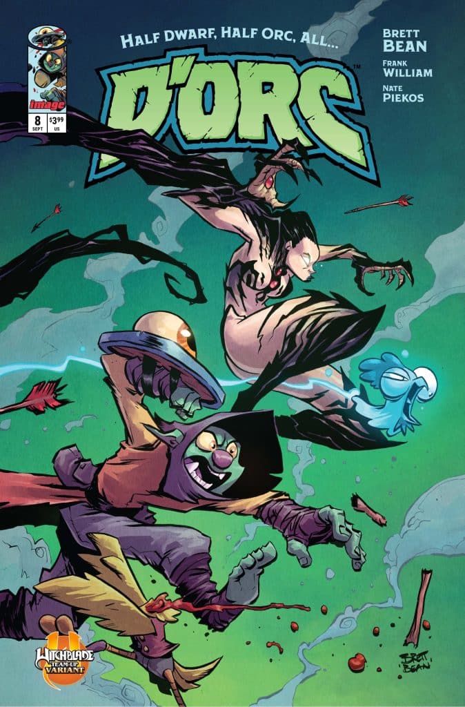
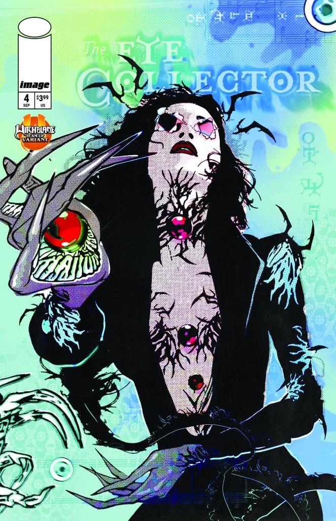
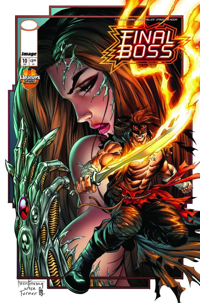
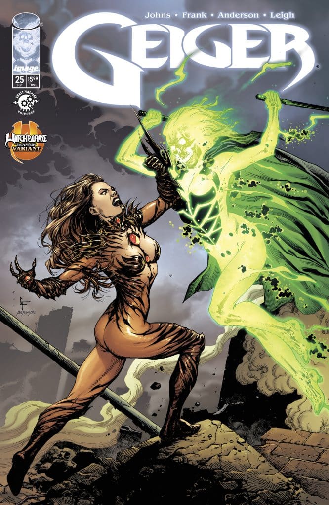
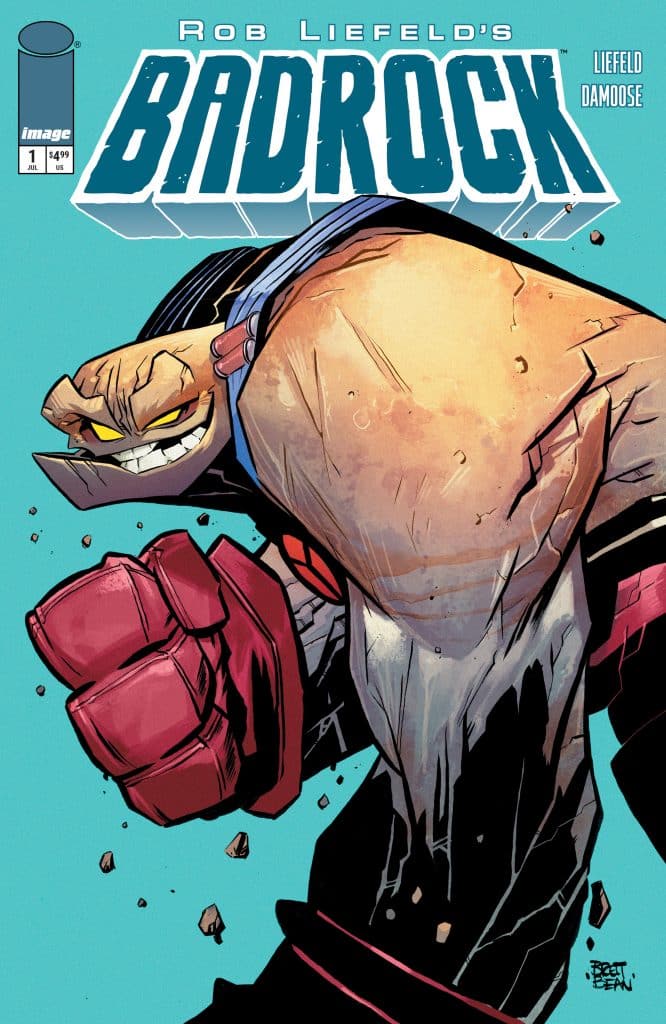
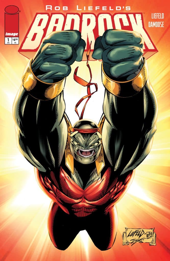
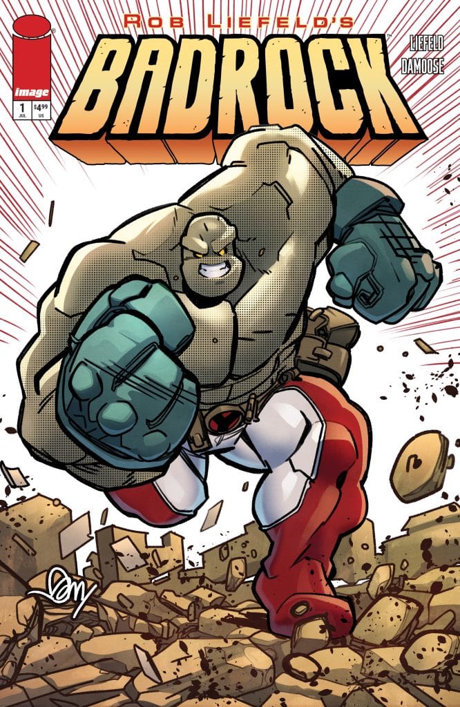
The new series will also feature thrilling variant covers by Liefeld, Damoose, and Brett Bean.

The youngest and most dynamic member of the world’s greatest super squad blasts off in his own solo spotlight! When Badrock’s mom is abducted, he is forced to submit to the demands of her mysterious abductors.

Badrock #1 will be available at comic book shops on Wednesday, July 15.

Badrock #1
  • Cover A by Seth Damoose – Lunar Code 0526IM0269
  • Cover B by Rob Liefeld – Lunar Code 0526IM0270
  • Cover C by Brett Bean – Lunar Code 0526IM0271
  • Cover D by Rob Liefeld – Lunar Code 0526IM0272
  • Cover E by Seth Damoose – Lunar Code 0526IM0273
  • Cover F by Blank Sketch cover – Lunar Code 0526IM0274

Beyond Deadpool: A Few of Liefeld’s Other Character Designs

NewMutants98Well, it’s happened: Deadpool is a certified movie star. It was only a matter of time, thanks to that peculiar mix of charm, snark and psychosis spilling out of our boy Wade. But there’s another weapon in Mr. Pool’s arsenal: that killer set of threads he sports. Oh sure, it’s red for a reason, but that’s not all. It’s memorable, it’s sleek, it’s tactical and it has the cool factor out the wazoo. Originally created by Fabian Nicieza and Rob Liefeld in 1991 and making his debut in The New Mutants #98, Deadpool started climbing the mountain of celebrity and never looked back. And it’s safe to say that his costume greatly increased his appeal.

Now it must be mentioned that Rob Liefeld has historically been a controversial figure in his chosen field, but that’s not what this article is about. Rather, let’s take a look at some of Liefeld’s other character designs from the (general) time of Deadpool’s creation and compare their looks with his striking little black and red number. Are they ready for their close-up as well, Mr. DeMille (or Tim Miller)?


Cable

Well yeah, I had to put Cable in first, he’s gonna be in the sequel (fingers crossed for Keira Knightley). He’s also got a lot going on. For starters, the whole left side of his body is living metal from the Techno-Organic virus, so he’s kinda like half-Terminator (and he’s from one of those dystopian futures that are so popular). He’s got the whole battle-scarred old soldier look going on, like Clint Eastwood if he had an awesome cybernetic eye implant. Also: lots of heavy weaponry, large shoulder pads and plenty of pouches to hold stuff (yeah, it’s an old joke about Liefeld’s designs, but it kinda works for a soldier to have utility belts all over himself). Cable’s design is a pastiche of ideas that are strong on their own, but add up to a strange whole. His design is visually interesting but doesn’t have the symmetry or color of Deadpool’s. Still, can’t wait to see him in the sequel.

Cable

Shaft

Every superhero universe has to have an expert archer, and Rob Liefeld’s Image Comics imprint Extreme Studios was no exception. Thus we have Shaft, who only WISHES he had a theme song as fantastic as Richard Roundtree. But still, he does have a bow that fires its arrows by magnet power instead of a string, so he’s got that one up on the rest of the “outdated projectile weapons” crowd. Beyond that, he has a face-encircling headgear that calls to mind Gambit, among others. His initial design was not short on bandoliers and pouches, though the ability to carry gear around seems fitting for a master archer (are any of these characters ever shown fishing around in these pouches for anything, or do they always remain decorative?). Shaft’s color scheme is red and white, making him look slightly like Aquafresh toothpaste without the green part. It’s a somewhat interesting design that works, but it still doesn’t quite have the wow factor provided by the interplay of red and black in Deadpool’s look.

Shaft

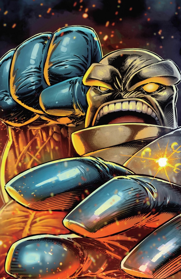
Badrock

Another founding member of Youngblood, Badrock is the big bruiser on the team, even though he’s just a teenager. His look is mostly about showcasing his stone-like hide, but he did wear some serious shoulder pads in his first appearance and beyond. One striking aspect about Badrock’s look is his jutting lower jaw, giving him that determined underbite shared by The Iron Giant and Vin Diesel (hmmm…). Beyond that, Badrock’s actual costume(s) have consisted of various tight spandex that emphasize his bulk but don’t lend themselves to attention-grabbing designs of their own. Much like Ben Grimm or Concrete, the character’s body that resembles natural material IS their look, and that’s what springs to mind when they are mentioned.

Badrock

Domino

Domino is another character that is memorable more for a physical characteristic than for what they wear. Created by Nicieza and Liefeld during their run on The New Mutants, Domino is another of those deadly super-weapon experiments which governments just never get tired of financing. While for clothing Domino generally wears form-fitting black (sometimes with purple accents) tactical gear, it’s that black spot over her left eye that contrasts so well with her chalk white skin and really sticks in the reader’s mind. Such a simple characteristic, but powerful in the way it resonates with her codename. Her luck generating powers, her mysteriousness and even her deadliness are all suggested by the spot over her eye. It’s a solid bit of character design.

Domino

Diehard

The coolest Diehard that wasn’t married to Demi Moore is this guy, actually a series of artificial bodies that carry the consciousness of the original hero. His look is the closest to Deadpool on this list, at least in the fact that they both possess the same featureless full-face mask that suggests something other than human might be underneath. Diehard’s version is white with a dark stripe down the middle, giving it that pleasing contrast and increasing the cool/scary ratio. The rest of his suit’s color scheme is a little busy though, with both gold and red added to the dark blue and white. In my opinion, that degrades the unity of his look a bit in relation to Deadpool’s solid black and red motif. A cool design but just a bit off balance.

DiehardLiefeld was a busy guy back then, helping create the early ’90s like that. There’s love for his work and there’s criticism, but it’s simply a fact that he created a hefty body of work in a relatively short time. While in my opinion Deadpool is one of Liefeld’s more successful co-creations, there’s a good chance that these characters will have their own moments to shine before a larger audience (and not just Cable, who we know is on his way). I wouldn’t mind seeing Domino pop up in the X-Men franchise, and Youngblood could make for a cool team movie if handled correctly. Sure, they may not be as pretty as Deadpool (really though, who is?), but that doesn’t mean they can’t get the job done.