Category Archives: Reviews

Mind vs. Machine is a fantastic look and recounting of Kasparov vs. Deep Blue

The hopes of humanity rest on the shoulders of one chess player in this true graphic novel about the epic chess match between a human and a super computer, by bestselling author Steve Sheinkin, Chess Grandmaster Maurice Ashley, and award-winning comics artist Thien Pham.

It’s May 1997 in Manhattan, New York. World champion Garry Kasparov is about to begin a six-game match against Deep Blue, the cutting-edge super computer developed by a team of visionaries at IBM. No machine has ever defeated a chess champion in a multi-game match.

If it happens, it will be a major turning point in human history. It will be, as Newsweek declares on its cover, “the Brain’s Last Stand.”

Will the human mind prevail? Or is this checkmate for humankind?

Story: Steve Sheinkin, Maurice Ashley
Art: Thien Pham

Get your copy now at your local comic shop or digitally and online with the links below.

Bookshop
Amazon


Roaring Brook Press provided Graphic Policy with a FREE copy for review
This post contains affiliate links, which means that if you click on one of the product links and make a purchase, we’ll receive a percentage of the sale. Graphic Policy does purchase items from this site. Making purchases through these links helps support the site

The Amazing Digital Circus, Vol. 1 is interesting but feels a little bit unfocused and scattered

These cute, cartoony characters hate their lives and just want to escape! An official adaptation of The Amazing Digital Circus animated series.

Are you ready to witness the most jaw-dropping, heart-stopping, mind-bending paraphernalia you’ve ever laid your eyes upon? Then allow your ringmaster, Caine, to welcome you to the Amazing Digital Circus!

After putting on a strange headset she discovered in an abandoned building, a young woman finds herself inside the Amazing Digital Circus! Transformed into a cartoon jester named Pomni, she discovers she’s trapped in this glitchy digital world alongside a whole host of crazy and colorful characters. Will she be able to find the exit door and escape, or will she be stuck there until she loses her mind?

Story: Glitch Productions, Gooseworx
Art: Sakura
Translation: Nova Skipper
Touch-up Art and Lettering: Ayoub Bensidi

Get your copy in comic shops!

Bookshop
Amazon


VIZ Media provided Graphic Policy with a FREE copy for review
This post contains affiliate links, which means that if you click on one of the product links and make a purchase, we’ll receive a percentage of the sale. Graphic Policy does purchase items from this site. Making purchases through these links helps support the site

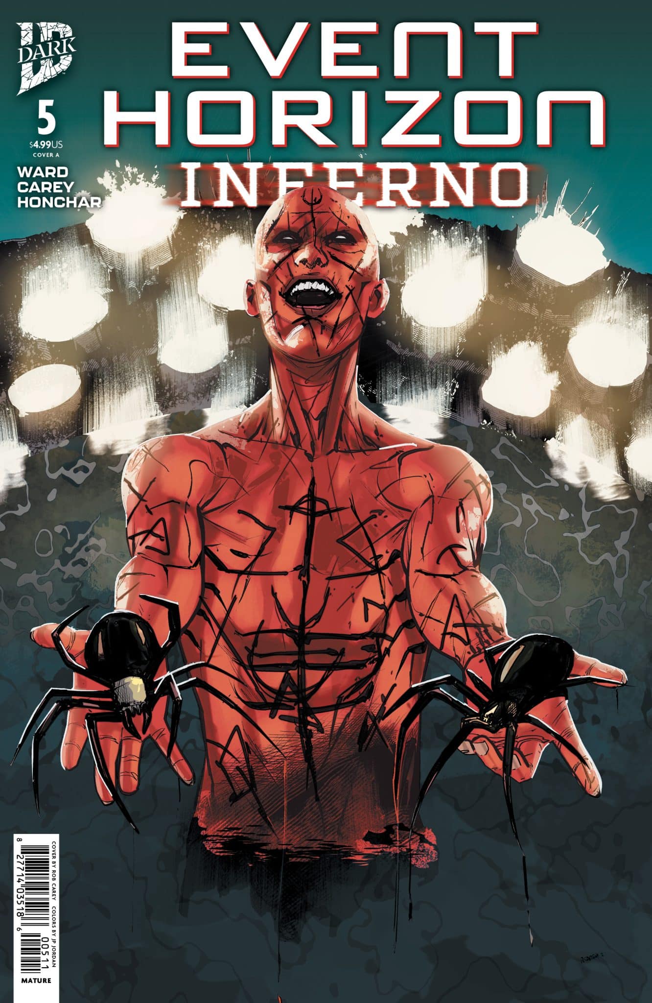
Event Horizon: Inferno #5 delivers an action focused finale

Event Horizon: Inferno #5

Daniel Durante thought that he was above the laws of Heaven and Hell. That he could come to this awful place and, as he’d done all his life, take from it what he wanted. Daniel Durante was wrong. Event Horizon: Inferno #5 wraps up the sequel of the tale of a greedy man getting exactly what he wised for!

Event Horizon: Inferno has been an interesting sequel. IDW Publishing has previously given us a prequel to the horror movie Event Horizon with Dark Descent. That prequel comic series shared a lot with the original film in tone and giving us events and answers tied to it. Event Horizon: Inferno as a sequel isn’t as connected, instead focusing on Daniel Durante and his want to getting to the ship and access to hell. In my review of earlier issues, I described the sequel as Aliens to the movie and prequel’s Alien. That sequel was much more action focused as opposed to the original’s more horror leanings. This is similar with Inferno much more of an action oriented story, just set with horrors all around.

Written by Christian Ward, Event Horizon: Inferno #5 keeps that focus as the remaining survivors attempt to make it back to their ship to escape, Durante attempts to get all he desires, and the ship wants to trap everyone to feed itself. The comic really breaks down into two different paths, Durante trying to get what he wants while others scramble and battle their way to safety. It’s a fine ending and works with the previous four issues. On it’s own, it feels a little anticlimactic in some ways with some dialogue falling into the cheese category.

The art by Rob Carey with color by Xenon Honchar and lettering by Alex Ray looks good. Like the story itself, it falls more on the action spectrum of what’s depicted than the horror with the comic mostly featuring red tentacles and a hoard of demons that are a bit hard to really see beyond the blob. This isn’t an issue with the disturbing visuals the property is known for but it’s good overall, doing what it needs to do.

Event Horizon: Inferno #5 feels like a bit of a whimper of an ending but overall it’s good and wraps things up well while leaving things open for more horror to come. There’s a lot of interesting concepts in the series and the finale does a good job of giving its definitive thoughts on some of them. For those into the horror series, it’s one to check out.

Story: Christian Ward Art: Rob Carey
Color: Xenon Honchar Letters: Alex Ray
Story: 7.5 Art: 7.75 Overall: 7.5 Recommendation: Read

IDW Publishing provided Graphic Policy with a FREE copy for review


Purchase: Zeus ComicsKindle

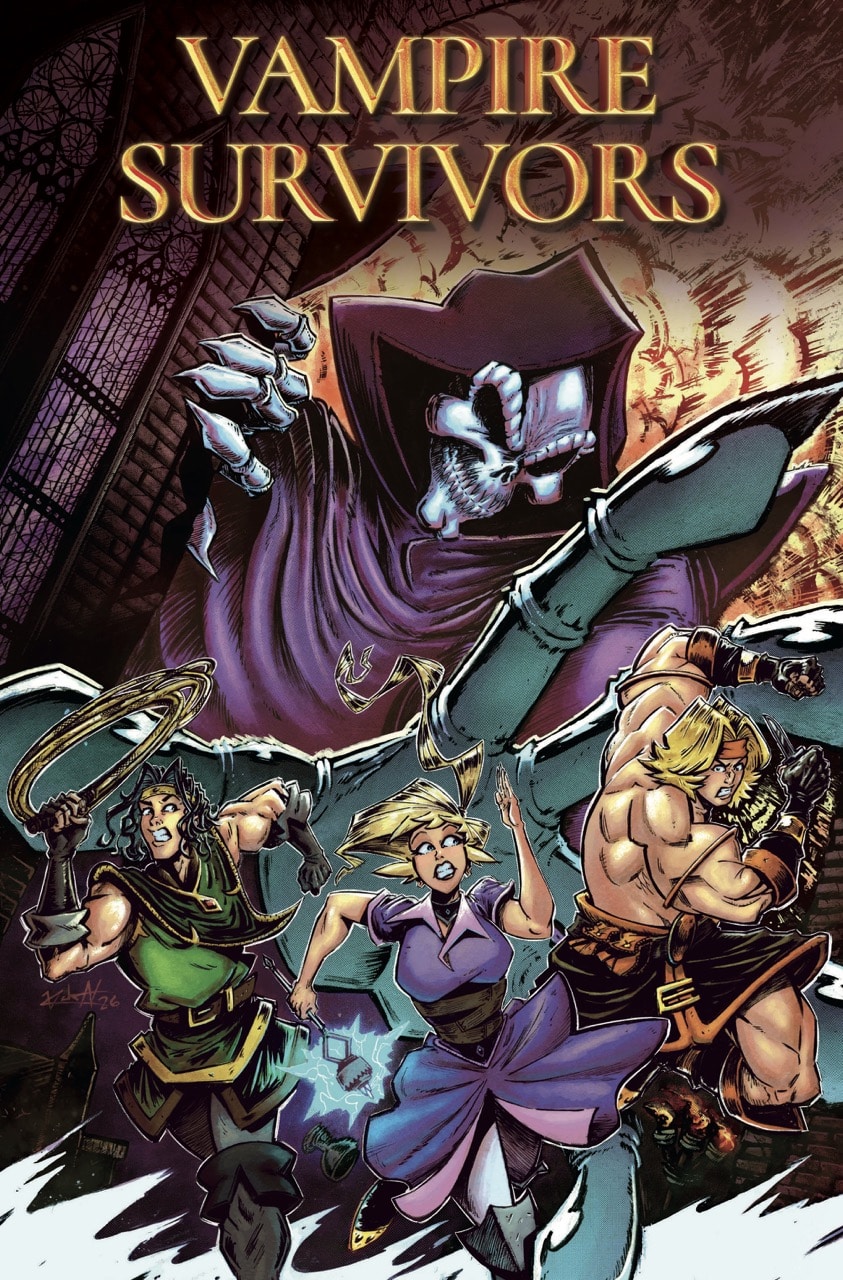
Vampire Survivors #1 has potential but an overall boring start

Vampire Survivors #1

The things that go bump in the night fear only one thing, survivors. They grow in strength and conviction and now use their expertise to vanquish those very creatures with whips, magic, knives, and garlic?!

When the Belpaese siblings are tasked with clearing out monsters, Imelda Belpaese stumbles upon The Trickster. An ancient evil so horrific it leaves only destruction in its wake, and now it looks to destroy one thing, Imelda’s mind. The Trickster follows Imelda, wreaking havoc all around her but is invisible to everyone else. And with the rivalrous Ladonna family applying pressure and the Belpaese siblings’ constant quarrels, the Trickster may just be able to destroy everything precious to Imelda.

Vampire Survivors #1 brings the video game to the comic page for a debut that has some interesting aspects but overall doesn’t deliver much new or exciting. I’ve never played the video game and know nothing about it, but I wanted to see what the comic was about and see what it might do that could be new or different. Beyond the relationship between characters, this is any off the rails fantasy adventure. It’s DnD focused on the action and not much of the story.

Written by David Hazan, the comic follows three monster hunter siblings who are focused on getting rid of vampires. One seems to be stalked by some evil only she can see but most of the issue is the trio, as well as another pair of monster hunters, battling strange forces while yelling at each other. Vampire Survivors #1 stumbles as it gives readers little to connect to. It’s an off the rails adventure without character we can cheer for or care about. The end result is a debut issue whose draw is the action and not the story… like so many video games.

The art by Jimmy Kucaj with color by Jão Canola is good. There’s a certain energy about it and it has a style that feels like other recent comic adaptations, it’s bright and very exaggerated. But it also feels like it plays things rather safe. Like the story itself, it doesn’t embrace its video game routes and the visuals are rather a run of the mill fantasy adventure with little unique personality to stand out.

Vampire Survivors #1 isn’t a bad debut but it also isn’t exciting. It doesn’t give us anything particular new or interesting. It’s best quality is the bickering between its characters as siblings. But, that too feels rather generic after a while. This is one for the diehards of the property, there’s fare too many similar stories that are far better to check out.

Story: David Hazan Art: Jimmy Kucaj Color: Jão Canola
Story: 6.5 Art: 7.0 Overall: 6.5 Recommendation: Pass

Titan Comics provided Graphic Policy with a FREE copy for review


Purchase: Zeus ComicsKindle

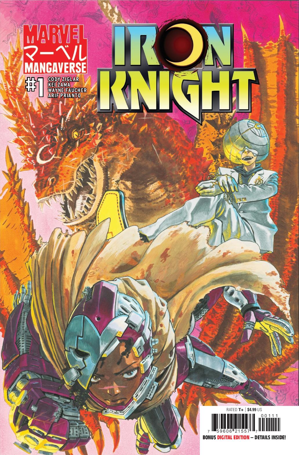
Marvel Mangaverse: Iron Knight #1 feels rushed and too short

Marvel Mangaverse: Iron Knight #1

With the city of New Chicago besieged by demonic yokai and trapped within a magical dome, Riri Williams has rigged a mana-powered mech suit to dole out justice and keep the streets safe as Iron Heart! But when the opportunity arises to avenge the death of a friend, Riri finds herself entangled on a dangerous quest for vengeance alongside legendary sorcerer, Moon Knight. Marvel Mangaverse: Iron Knight #1 continues the Marvel Manga saga but moves almost too quickly through its sliver of the story.

The reintroduced world of Marvel Manga has been interesting so far. Demons called yokai wander the Earth with technology on the fritz, the yokai’s mana is needed to power things. Mages have stepped up to fight the demons and yokai and those mages have their own conflict about the right direction of things. It works really well creating multiple conflicts and delivering some intriguing possibilities of where things can go. Marvel Mangaverse: Iron Knight #1 introduces this world’s Riri Williams who is on a quest of revenge for killing her friend. She meets Moon Knight who is on a quest to kill the same demon as Riri so the two team up.

Cody Ziglar delivers an interesting story with Marvel Mangaverse: Iron Knight #1 but overall it feels like it’s limited by the one issue and page count. Emotional moments never quite get a chance to really play out or hit right, instead last only a panel or two and things move on. The comic delivers a lot of conflict that could make for an intriguing story but again, the limits of the comic make them all compressed. It’s one that has to get you from point A to Z in one issue and can’t dwell too long on everything in-between. It makes for a comic that’s full of cool ideas that don’t feel fleshed out or don’t hit with much of an impact.

The art by Kei Zama is good but lacks the real manga punch we saw with the debut issue of this mini-event. While that issue mined the visual quirks of manga, this issue is pretty standard for a Marvel comic, feeling more like your average monthly floppy visually than action oriented manga. Zama is joined by Wayne Faucher on ink, Arif Prianto on color, and Ariana Maher on lettering and all together, the comic has some cool designs but not cool moments.

Marvel Mangaverse: Iron Knight #1 isn’t a bad issue, it’s a fine next chapter in what’s playing out among all of the Marvel Manga releases. But, it lacks the excitement of the first issue and it doesn’t hit the emotional punches its narrative goes for. It’s a comic held back by its format.

Story: Cody Ziglar Art: Kei Zama
Ink: Kei Zama, Wayne Faucher Color: Arif Prianto Letters: Ariana Maher
Story: 7.0 Art: 7.0 Overall: 7.0 Recommendation: Read

Marvel provided Graphic Policy with a FREE copy for review


Purchase: Zeus ComicsKindle

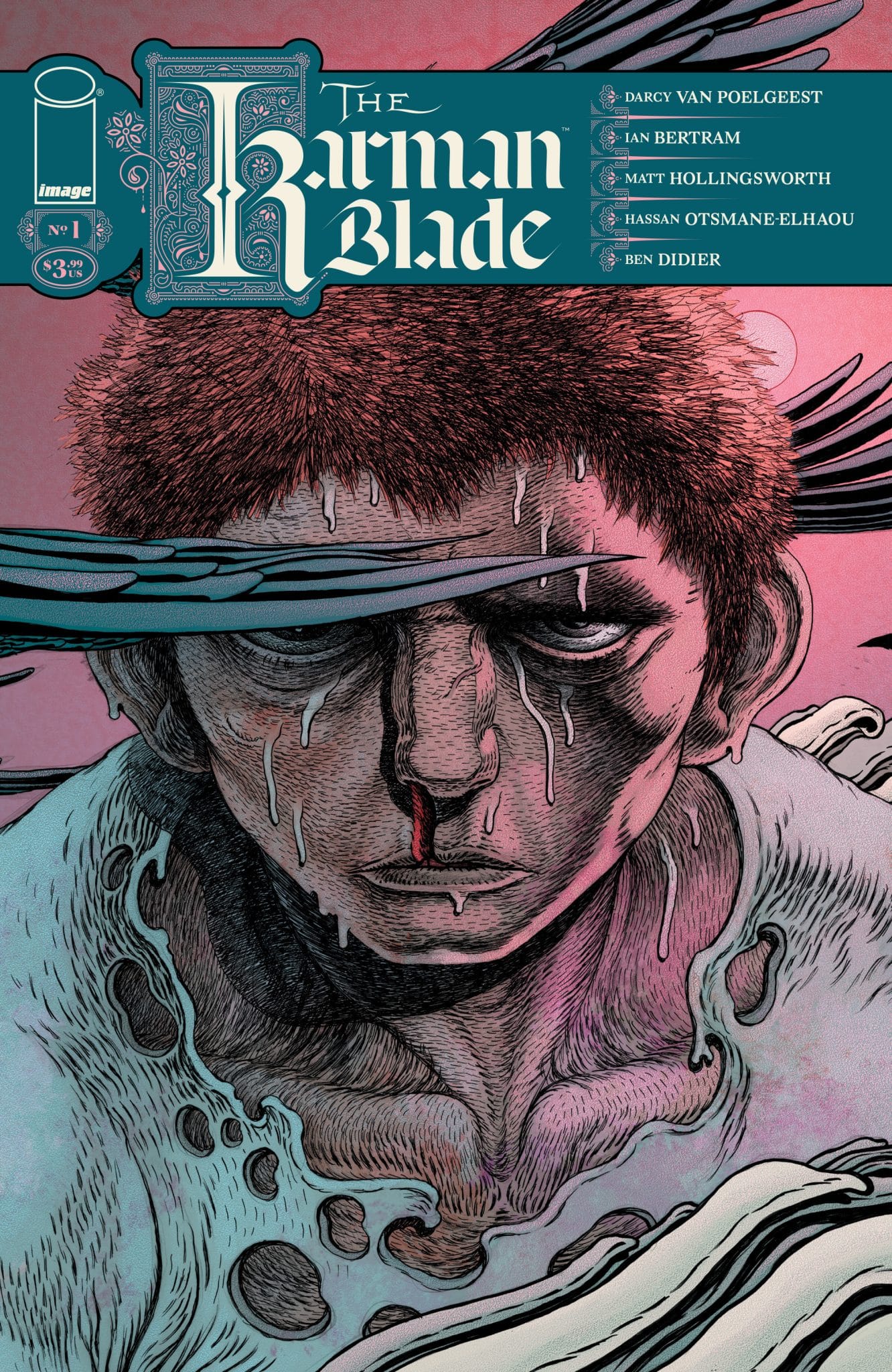
The Karman Blade #1 feels like an average fantasy adventure

The Karman Blade #1

A young man on the outskirts of a dying world is chosen by a blade forged of stars to slay the despotic deity, Kalu, and free the water he hoards in his Kingdom. Yet before the boy can begin his journey, he must first face the demons in his own life, and answer the Karman Blade’s call—“Are thou he, who taketh me in hand? Are thou he…who shall slay a God?” The Karman Blade #1 is interesting with a classic fantasy like narrative but feels like a story we’ve seen many times before.

A down individual receiving a sword to take on a tyrant, it’s a concept that has been done (though weapons may vary). The Karman Blade #1 is the latest entry into that space with interesting artwork and a way of telling that feels more like a daydream fantasy tale.

Created by Ian Bertram and Darcy Van Poelgeest, The Karman Blade #1 is written by Poelgeest and introduces a young boy who is haunted by his situation and the loss of his family, making him an orphan facing a daunting existence. It’s an interesting start that introduces readers to a rather morose life and world. It’s sad and depressing, leaving readers to wonder why the main character Anatta would want to continue. But, Poelgeest delivers a fate that could possibly lead to freedom for all and depose of the tyrant who’s responsible for everyone’s miserable existence.

Ian Bertram‘s art creates a dreamlike aspect to it all. With color by Matt Hollingsworth and lettering by Hassan Otsmane-Elhaou, the visuals add to the worn down world and characters. It’s an interesting style that’s not always clear in what’s going on but is interesting to explore and examine.

The Karman Blade #1 is an interesting start and for those who really enjoy fantasy tales, they may enjoy this. But, the first issue feels all too familiar. A person teased with a greater destiny and sword to defeat of despot has been done over and over. Dreams and crows telling of this destiny feels like it’s been done too. Overall, The Karman Blade #1 feels like an old familiar story with a new coat of paint.

Created by: Ian Bertram, Darcy Van Poelgeest Story: Darcy Van Poelgeest Art: Ian Bertram
Color: Matt Hollingsworth Letterer: Hassan Otsmane-Elhaou
Story: 7.5 Art: 7.5 Overall: 7.5 Recommendation: Rea

Image Comics provided Graphic Policy with a FREE copy for review


Purchase: Zeus ComicsKindle

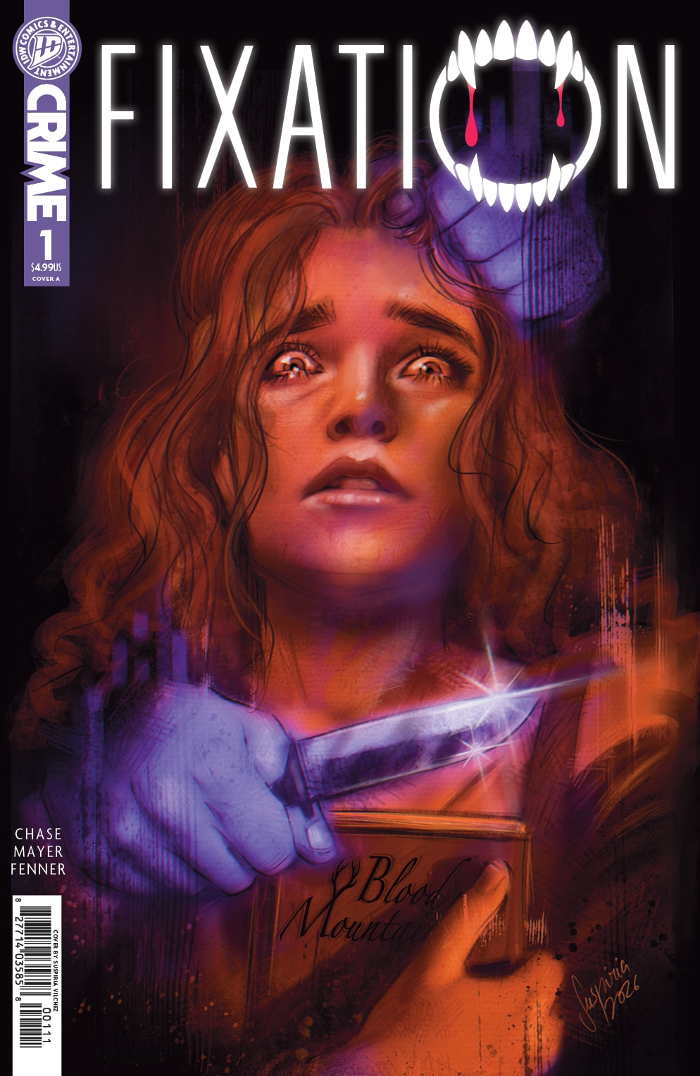
Fixation #1 is an interesting look at toxic fandom

Fixation #1

When superfan Taylor Van Owens wins a contest to stay in the legendary Mallard house—the most iconic filming location for the hit vampire book turned movie Blood Mountain—she and her best friend Karrah arrive in Vail expecting to sink their fangs into a weekend straight from a fangirl’s dream. The cast has reunited for a tenth-anniversary celebration, devotees have descended on the small town, and nostalgia hangs thick in the air. But shortly before their arrival, a young woman is found dead inside the Mallard house. The death is quickly brushed off as an unstable fan taking her fantasies too far, but rumors swirl as the police quietly open a murder investigation. With cameras rolling and ravenous Blood Mountain buffs to appease, production works overtime to keep the story from leaking, insisting the fandom is “one big family,” but unease spreads through the town. Resentful locals, jealous superfans, sensitive actors, and desperate producers overwhelm Taylor as she moves in a haze through meet-and-greets, vigils, and book signings. Every interaction feels loaded. Every corner holds a potential threat. Every vampire has a taste for blood. And the killer isn’t finished. They’ll stain the town red to ensure they go down in Blood Mountain history. This isn’t just a random act of violence—it’s a crime of passion a decade in the making. Fixation #1 kicks off an interesting concept that feels like it’s a bit of Scream mixed with Twilight and a focus on toxic fandoms.

Written by Amy Chase, Fixation #1 is a pretty solid start introducing the key characters and teasing the killer threatening a fan celebration for a popular book and movie franchise. The comic, and story, feels like it has a few influences and things it’s playing off of, but it all comes together for a nice horror franchise of its own. A superfan wins a contest to stay at the home of the popular film, but a murderer is stalking the town and has some connection, or beef, with the film and its stars.

Fixation #1 could easily just come off as the start of a horror story but Chase delivers interesting moments and plot points that make the debut a nice commentary on entertainment. A cover up by the studio would be enough but the lack of care about how the fandom is treating each other, as well as a shift in attitude when a star is threatened, feels like there’s more that’s being said. It’s a comic that can be enjoyed on multiple levels, from the slasher enthusiast to those looking for something a little more elevated and meta in their horror.

The art by Savanna Mayer is good. The style fits the genre well but there’s a roughness to it that doesn’t quite click for me. When it comes to the art, there’s nothing necessarily negative but overall it doesn’t play with its concept enough. We see the killer far too often, instead of teasing it out. The “scares” don’t really deliver as much as they should or could. It’s a lot more forward with cards on the table as far as what it reveals instead of teasing things and letting the tension build. Mayer is joined by James Fenner on color and Sandy Tanaka on letters and the trio deliver a comic that’s visually good but doesn’t really stand out from the pack.

Fixation #1 is a solid debut that shows off a lot of potential and interesting aspects. It has a little more to say than being a simple slasher and I want to find out more as to what’s going on. Overall, it’s a good start and fans of horror definitely should check it out.

Story: Amy Chase Art: Savanna Mayer
Color: James Fenner Letters: Sandy Tanaka
Story: 7.75 Art: 7.25 Overall: 7.6 Recommendation: Red

IDW Publishing provided Graphic Policy with a FREE copy for review


Purchase: Zeus ComicsKindle

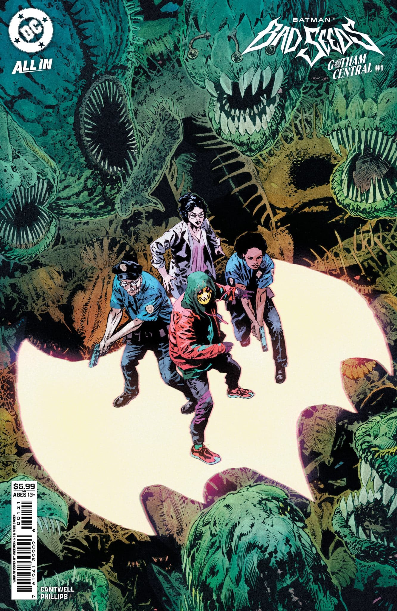
Batman: Bad Seeds – Gotham Central #1 has us wanting an ongoing GCPD series

Batman: Bad Seeds - Gotham Central #1

A killer is on the loose, someone is stalking Arkham Towers’ Dr. Zeller, the subways are out of control, and Anarky’s just pulled a big-time heist! With Vandal Savage diverting the GCPD’s resources to his single-minded war against the Bats and the Bat-Family trying to stop Poison Ivy while evading the GCPD, there’s almost no one left to do actual police work! Looks like officers Gordon and Espinoza have their work cut out for them. Batman: Bad Seeds – Gotham Central #1 is a fantastic issue that puts the spotlight on the GCPD during the chaos.

Gotham Central was one of the best series DC Comics ever released. The series focused on the GCPD and how they attempted to function and do their job in a city filled with masks and capes. It’s a concept we haven’t really had since, though there’s been some teases here and there, especially recently, as the GCPD has undergone radical changes with Vandal Savage becoming the Commissioner and James Gordon being demoted back to being a regular copy.

Written by Christopher Cantwell, Batman: Bad Seeds – Gotham Central #1 feels like a nod back to Gotham Central, with Gordon and his partner dealing with a dead body and possible murder even during all of the chaos that’s going on. It feels a little odd that Gordon isn’t knee deep trying to help out during the current “attack” by Ivy and her plant army, but there’s also something to the character bucking the focus on going after the “capes” in the city during it and not helping Savage and his agenda. Instead, Gordon and Espinoza go rather old-school dealing with a found body and determining if it’s just a victim of the plant attack going on or if there’s something else occurring.

Cantwell excels at delivering small details that elevate the story. How Gordon and Espinoza react to the orders from above is great, but it’s really how the two examine the body and the conclusions they come to that’s interesting. It’s solid and has the comic come off as real detective work instead of leaps. It also evolves from that simple homicide investigation to something far more tense with packed crowds and a killer hunting his victim. The comic blends a classic police story with a tense horror story of a murder hunting his next prey. To say it’s good, is an understatement.

The art by Jacob Phillips is near perfect. It’s so close but there’s some panels where the the light on top of Gordon’s police car just disappears and while that might seem minor, it’s a visible art error that I wound up focusing on (probably far more than I should have). It’s a small detail but an important one in an action sequence. Phillips excels at the reactions from Gordon, Espinoza, and the rest of the cast of characters as an investigation takes place then a desperate race to stop a murder begins. The art matches the tension well creating story and visuals that combine for an issue that you can feel the heart begin to race. Phillips is joined by Becca Carey on the lettering which adds to the emotions of the issue. There’s a cool and calm aspect to Gordon and Espinoza as things play out and the lettering reflects it and adds to the atmosphere of the comic.

Batman: Bad Seeds – Gotham Central #1 is a fantastic issue that gives us a tense race to stop a killer in the middle of a city in Chaos. It emphasizes the type of person Gordon is and delivers some surprises. The issue is perfect to be adapted for the small screen, or even the big one, and has us clamoring for a new series focused just on the GCPD for all its good and bad.

Story: Christopher Cantwell Art: Jacob Phillips Letterer: Becca Carey
Story: 10 Art: 9.5 Overall: 10 Recommendation: Buy

DC Comics provided Graphic Policy with a FREE copy for review


Purchase: Zeus ComicsKindle

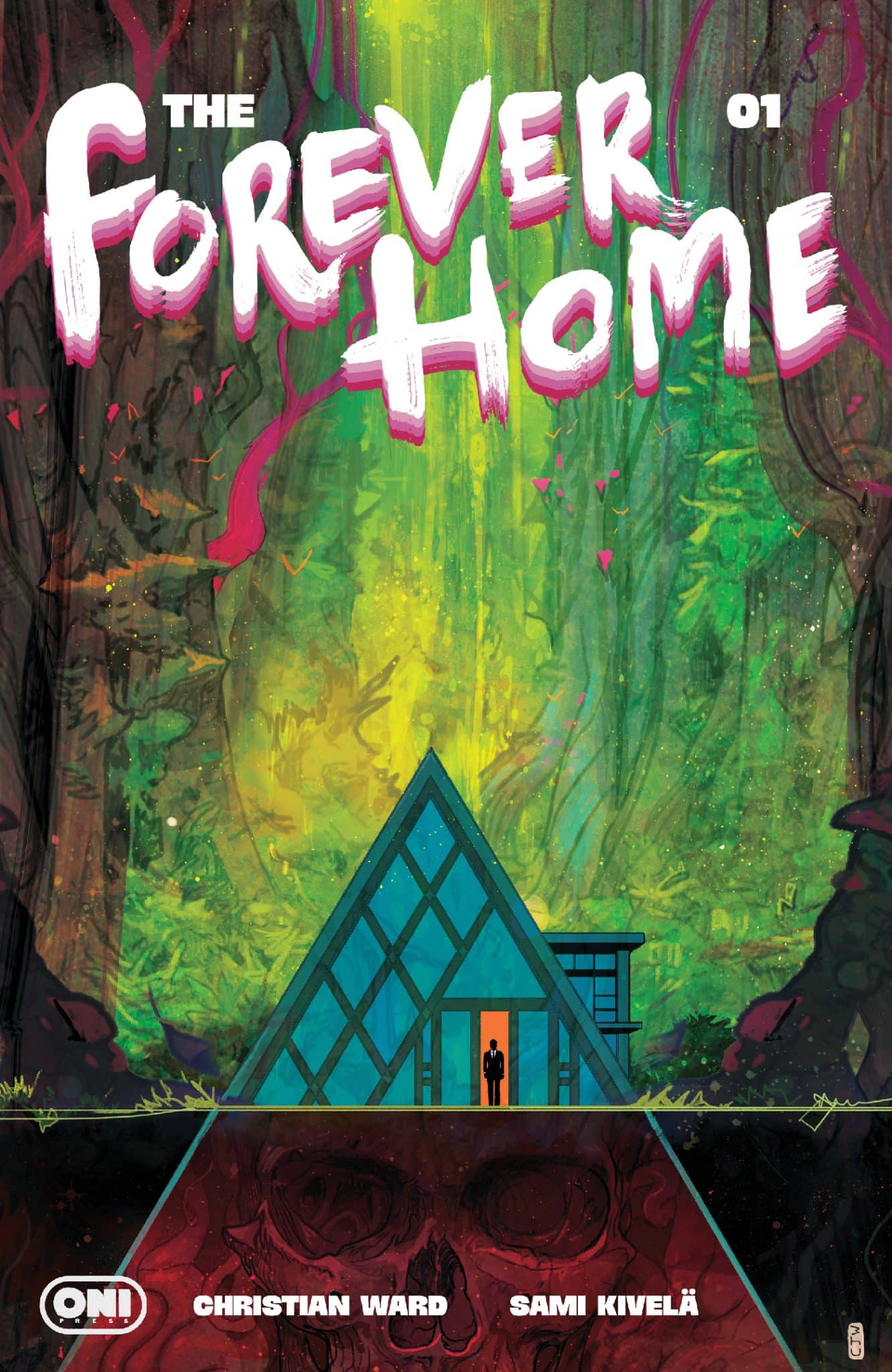
The Forever Home #1 is Intriguing and Engaging Sci-fi Horror full of Tension

The Forever Home #1

Infamous billionaire scientist Henry D’mour could have saved the world. But he didn’t. Instead, in a desperate bid to save himself, his wife, and their two children, he constructed The Forever Home—an ark of luxury and ultramodern convenience insulated from the agony of the planet’s death throes outside its walls . . . and even time itself. Inside The Forever Home, only 20 minutes pass for every year on the outside . . . allowing the D’mour family to slowly enact their plans for a new world as their automated environment and robotic companions keep them safe. Safe on the inside. Always inside. Until a childish misstep accidentally breaks The Forever Home’s barrier . . . and what’s outside decides it wants back in… The Forever Home #1 is a fantastic debut that keeps readers hooked and afraid to see what’s coming next.

Written by Christian Ward, The Forever Home #1 delivers a debut packed with tension. It’s the sort of story where you’re scared to see what’s next. Ward has crafted psychological and environmental horror that dips into commentary about the state of the world and the devastated future we march towards.

It’s early in the issue that it’s clear not all is well with the D’mour family. While they’re safe inside their home, the world outside is devastated and speeding along with whatever comes next. With two young children, the family is wrapped up safely inside the house. They’re unable to step outside due to the time speed difference, prisoners within. While Henry saved his family, you get the sense his children resent him and the adults who destroyed the world.

While the family is safe inside, the hints and teases build that something is on the outside. Is it human? Animal? No matter, Henry sees it as a threat to their “paradise” and safety. With those hints, you know something is going to go wrong, but it’s not until late in the issue exactly what is clear. By then, the story is clearly deep in horror, having build up to its twist that will drive the series. Safety, monotony, the order D’mour has created is threatened to come crashing down.

The success of the first issue’s concept and narrative is boosted by the art of Sami Kivelä. With color by Jason Wordie and lettering by Hassan Otsmane-Elhaou, the visuals boost and emphasize the stress of the situation. The kids’ disdain is clear by their facial expressions and body language. The mother says so much in how she’s depicted visual, far more than what’s said. The home feels sterile and cold like a museum. The outside world we get to see tells so much of a story as to where things stand and where it’s going. It’s packed with visual details that tells so much of the story and what type of world the D’mours live in. Add in colors that add in the cold feel of it all and teases of life anew outside, the art enhances an already intriguing concept and tells so much about the world.

The Forever Home #1 is a hell of a start that has us excited to see where it’s going. The fear of the unknown allows the series to tap into basic emotions that hit the reader and makes them nervous to see what’s next. It’s a hell of a start for what’s one of the more intriguing series of the year.

Story: Christian Ward Art: Sami Kivelä
Color: Jason Wordie Letterer: Hassan Otsmane-Elhaou
Story: 9.0 Art: 9.0 Overall: 9.0 Recommendation: Buy

Oni Press provided Graphic Policy with a FREE copy for review


Purchase: Zeus ComicsThird Eye ComicsKindle

A Ghost Arm Made of Angry Ghosts is a weird and fantastic superhero love letter to Washington, DC

From writer and colorist extraordinaire Oliver Mertz (The Monuments, First Law of Mad Science) and acclaimed artist Alex Diotto (Youth, Indigo Children) comes a weird tale of conspiracy, faded superheroics, and suburban angst in ’90s Washington, D.C.

Sixteen-year-old Ari Ackerman just witnessed a murder. Or two. Or maybe he didn’t. He’s not quite sure. What he does know is that he loves the Washington, D.C., punk scene and is trying very hard to process the perpetual impending death (and frequent resurrections) of his cancer-stricken father. Ari’s best friend, Maya Meng, just wants to hang out and go see Jawbox play at the Black Cat. But sadly, an escalating series of unexplained deaths can really ruin a perfectly good day.

For readers who like What’s the Furthest Place from Here?, Love and Rockets, David Lynch, Daniel Clowes, Seinfeld, Agatha Christie, Powers, Fugazi, and Wes Anderson, A Ghost Arm Made of Angry Ghosts is sure to evoke all the feelings that come with being an outsider, making sense of the world around you, and finding your place in it.

Story: Oliver Mertz
Art: Alex Diotto
Color: Oliver Mertz
Letters: Taylor Esposito
Special Choreography: Sarah Beth Oppenheim
Flats: Marcos Sales

Get your copy now at your local comic shop or digitally and online with the links below.

Bookshop
Amazon


This post contains affiliate links, which means that if you click on one of the product links and make a purchase, we’ll receive a percentage of the sale. Graphic Policy does purchase items from this site. Making purchases through these links helps support the site

« Older Entries Recent Entries »