Category Archives: Reviews

Review: The Brother of All Men #2

Private eye Guy Horn is attempting to find a missing woman and has gotten himself involved with a mysterious cult.

Story: Zac Thompson
Art: Eoin Marron
Color: Mark Englert
Letterer: Hassan Otsmane-Elhaou

Get your copy now! To find a comic shop near you, visit http://www.comicshoplocator.com or call 1-888-comicbook or digitally and online with the links below.

TFAW
Zeus Comics
comiXology/Kindle


AfterShock provided Graphic Policy with a FREE copy for review
This post contains affiliate links, which means that if you click on one of the product links and make a purchase, we’ll receive a percentage of the sale. Graphic Policy does purchase items from this site. Making purchases through these links helps support the site

Review: Where Starships Go to Die #3

A salvage crew attempts to recover the wreck of humanity’s first interstellar starship.

Story: Mark Sable
Art: Alberto Locatelli
Color: Juancho!
Letterer: Rob Steen

Get your copy in comic shops! To find a comic shop near you, visit http://www.comicshoplocator.com or call 1-888-comicbook or digitally and online with the links below.

TFAW
comiXology/Kindle
Zeus Comics


AfterShock provided Graphic Policy with a FREE copy for review
This post contains affiliate links, which means that if you click on one of the product links and make a purchase, we’ll receive a percentage of the sale. Graphic Policy does purchase items from this site. Making purchases through these links helps support the site

Review: Barbaric: Axe to Grind #1

Barbaric: Axe to Grind #1

Owen is back with his maniacal axe in an all-new adventure with all new companions! Something is back from his past and Owen will set off with Soren and Steel to take on the evil orc warlord that has returned. Barbaric: Axe to Grind #1 is everything that made the first volume great with over the top action, some down to earth characters, and a lot of laughs.

Written by Michael Moreci, Barbaric: Axe to Grind #1 drops readers right into the action. Owen and his buddy Axe are taking on vampires in hopes of freeing their friend Steel from the vampire’s control. With Soren there to help, the battle is as chaotic as one would expect with laughs a plenty as Axe drinks the blood of vampires and lets us know what it thinks. The comic hasn’t missed a beat at all with an opening that’s just so over the top, it’s great.

Moreci also does a fantastic job of creating a comic that’s new reader friendly. The issue at hand is clearly laid out as well as the adventure to come. We get a sense about Owen for those new and his companions are explained as well. You can caught up easily and enjoy the ride as if you missed nothing at all.

The art by Nathan Gooden is fantastic. With color by Addison Duke and lettering by Jim Campbell, the comic is so over the top with the visuals. Blood and gore flow as Owen and the crew battle vampires and then a kraken and there’s also a good bar fight in-between. There’s nothing subtle about this comic and Gooden’s art just enhances that aspect of the story.

Barbaric: Axe to Grind #1 is another fantastic debut for the series and a must for fans of the first volume and fantasy fans. It both embraces and spoofs the barbarian questing genre and most importantly entertains with every detail.

Story: Michael Moreci Art: Nathan Gooden
Color: Addison Duke Letterer: Jim Campbell
Story: 9.0 Art: 9.0 Overall: 9.0 Recommendation: Buy

Vault Comics provided Graphic Policy with a FREE copy for review


Purchase: TFAW Zeus ComicscomiXology/Kindle

Review: Justice Warriors #3

Justice Warriors #3

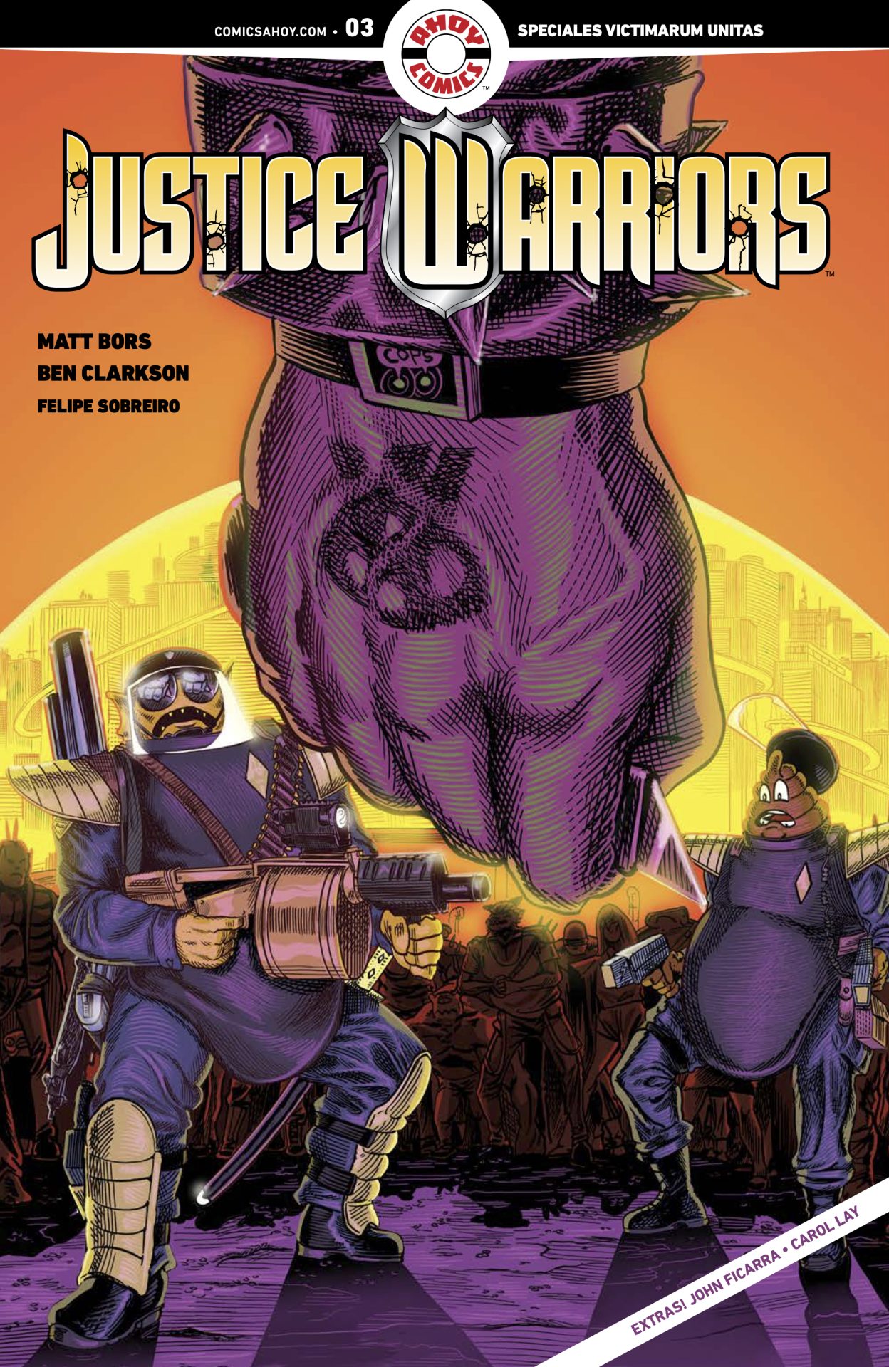
Desperate mutants riot in the Uninhabited Zone! Swamp and Schitt and their fellow riot police fight back! No one in charge knows what to do about it—until the pampered Prince of Bubble City gets one of his terrible ideas! Justice Warriors #3 continues a series that’s laugh out loud funny and amazing in how much it skewers our modern society.

Written by Matt Bors and Ben Clarkson, Justice Warriors #3 is another amazing issue and maybe the best one yet. Broken police, idiotic fiscal policy, new age hippies, and so much more is torn apart for laughs. And it’s really funny. I found myself laughing out loud multiple times in the issue as it gets better and better as the issue progresses.

Bors and Clarkson do an amazing job of taking so many of our society’s ills and giving them the middle finger. The duo take so much of what we know is going on and just eviscerates the logic behind it while delivering laughs. The police are utterly corrupt and worthless. The government leadership too. There’s about 5 years worth headlines shat on and made fun of in this issue alone. And it’s all deserved and then some.

But, most importantly the two creators can keep things fun. The comic is entertaining and delivers laughs. And it plays with expectations at times to do all of the above. A character’s last name creates one of the best punchlines of the issue while at the same time challenging standards of society and our ingrained expectations. Or, you can just enjoy the laugh.

Clarkson’s are is fantastic as usual. With color by Felipe Sobreiro and lettering by Bors, the visuals are as much of the joke as the writing. There’s so much detail and every character adding to the world and story. There’ a lot of thought put into all of that to help land the jokes and build the world. The visuals, like the story, features layers where you can enjoy them on the surface or dive deeper for an exploration of further meaning.

And as with AHOY comics, there’s extras including a single page comic strip from Bors and an essay written by John Ficarra and art by Carol Lay. It’s all a bonus considering how good the main comic is.

Justice Warriors #3 is another amazing issue and some of the smartest writing on the shelf right now. It delivers laughs and witty satire in a unique and entertaining package.

Story: Matt Bors, Ben Clarkson, John Ficarra Art: Ben Clarkson, Carol Lay
Color: Felipe Sobreiro Letterer: Matt Bors
Story: 8.75 Art: 8.75 Overall: 8.75 Recommendation: Buy

AHOY Comics provided Graphic Policy with a FREE copy for review


Purchase: Zeus ComicscomiXology/Kindle

Review: 20th Century Men #1

20th Century Men #1

I’m a sucker for alternate takes on history. Often, these stories take one vital event and sends reality in a new direction from there. They examine why these events are important and the societal and political realities surrounding those moments. 20th Century Men #1 does exactly this. While the story build through the decades before, it mainly focuses on the late 80s where the USSR’s battle in Afghanistan goes in a very different direction from reality.

Written by Deniz Camp, 20th Century Men #1 is an interesting debut. While it does a good job of laying things out, the comic is very focused on Afghanistan in the 1980s. Unless you know that history, much of the comic’s potential is lost on the reader. For those that don’t know, Russian forces invaded the country which became their own “Vietnam” dragging down the army and turning into a quagmire. The US had something to do with that as our clandestine operations trained the soldiers. Those soldiers would later turn that training back upon us attacked the United States multiple times in terrorist attacks. That eventually lead the United States to invade the nation and itself be dragged into a war there was little way to win much like the Russians decades before.

But in this world, things are going differently. The Soviet’s are lead by an “iron” hero who has things much more under control as far as the Afghanistan operations. The United States president is a superpowered individual and the country is looking to climb and lead again. Then there’s an Afghan woman who is looking to build a better life for her people. The comic mixes history, politics, and comic mythology to create an alternate history that has a lot of potential for where it could go.

The art by S. Moran is interesting. There’s some highly disturbing imagery and more that’ll leave you scratching your head. It’s all very good with a world that looks familiar and at times designs that look like they’re out of science fiction. The world looks lived in and all the details given thought. It’s all interesting, especially the Soviet designs which have the expected cold aspect about them missing a smooth flow we might see with other nations. There’s a utilitarian aspect to the comic that works so well.

20th Century Men #1 stands out due to those details. From the characters’ actions to what is said, everything feels carefully thought through. It’s one for poli-sci nerds that like a “what if” world. There’s a lot to mull over and chew on after reading the comic and maybe I’ll get through it by the time the second issue drops.

Story: Deniz Camp Art: S. Moran Letterer: Aditya Bidikar
Story: 8.0 Art: 8.25 Overall: 8.0 Recommendation: Buy

Image Comics provided Graphic Policy with a FREE copy for review


Purchase: Zeus ComicscomiXology/Kindle

Review: Trve Kvlt #1

Trve Kvlt #1

Marty Tarantella has been flipping burgers for 15 years. He has no kids, no hobbies, no love interests, and, essentially, no life. But, Marty wants to change that. And he’s going to change that by robbing some local stores. But, in his heist, he also steals something from a religious cult and they want that back. Trve Kvlt #1 kicks off an intriguing series that shows a lot of potential in its weirdness.

Written by Scott Bryan Wilson, Trve Kvlt #1 is an interesting start in that it delivers characters that are generally unlikeable. They’re Clerks without the charm. Marty is a loser. He goes on about his life and how he found a “family” with his job at Burger Lord, but overall we get a sense that he’s kind of worthless. He’s had this job for 15 years but hasn’t really gotten anywhere in life and we’re never really given a solid reason as to why. He just is… and his theft is really just a way to get things rolling as far as what’s to come. What that exactly is? That’s only hinted at.

The art by Liana Kangas is good. With color by Gab Contreras and lettering by DC Hopkins, a lot of the humor of the comic comes from its visuals. What Kangas does so well is nail down the body language and stances of everyone. Marty feels like he has a language all his own in how he presents himself. The robberies and after, and even before, give a sense of a person who is very antsy and skittish. That’s understandable considering what he’s done. But, it comes off really well on the page. There’s a physical humor in the panels that brings the story together.

Trve Kvlt #1 isn’t a bad start but there’s a sense of a scattered story that matches its lead Marty. The comic doesn’t focus at times and feels like it bounces around but misses some key motivations and depth to the main character. Due to that, he’s not one to really cheer for which makes the point of reading the comic to see how he’s going to mess up.

Story: Scott Bryan Wilson Art: Liana Kangas
Color: Gab Contreras Letterer: DC Hopkins
Story: 7.5 Art: 7.75 Overall: 7.5 Recommendation: Read

IDW Publishing provided Graphic Policy with a FREE copy for review


Purchase: Zeus ComicscomiXology/Kindle

Review: Batman: One Bad Day – Riddler

Batman: One Bad Day - Riddler

Riddle me this. When is a Riddler story more than a riddle? When writer Tom King and artist Mitch Gerads are involved. Batman: One Bad Day – Riddler kicks off a series of one-shots focused on Batman’s villains and it’s one hell of a start. By the end, not only do we get a better sense of the character’s motivations but also a whole new outlook.

Written by King, Batman: One Bad Day – Riddler is an interesting comic that starts off with a murder. In the wide open, the Riddler has killed a man. No riddle. No apparent motivation. Why has he done this? Why does he want to speak to Batman so badly?

The comic bounces back and forth between the Riddler’s current crime and his youth. We get a little of his motivation as to why he is the way he is. It creates some understanding and some sympathy but also a coldness. There’s a strange lull after reading the comic as you think about the Riddler’s life. There’s a disconnect in some ways. And that makes it all the more scarier. Add in the character’s new outlook at things and it becomes all the more uneasy. Where King takes the character is hopefully a direction other writers pick up on as it takes him from a character with a rather tired and played out schtick and turns him into a psychotic stone cold killer. It’s no longer about the riddles and more about how intelligent he is and how he uses that.

Mitch Gerads is once again in-sync with King. The art is fantastic with a a look that’s a little off. The character, the coloring, it all feels sickly in some ways, a scary nightmare of the Riddler’s we’re witnessing. The comic jumps back and forth in time using the colors to easily indicate when we are but there’s a brilliance to the transitions as it slides between the two visually and thematically. In the modern times the world is a sickly green, playing off the character’s iconic look but adding a drab aspect. It too signifies the radical change in the character.

Batman: One Bad Day – Riddler is a hell of a start to this series of one-shots. It delivers a rather unnerving tale as the Riddler unravels and builds himself back up. It’s a new status-quo that hopefully becomes the Riddler we know going forward creating an even more frightening foe for Batman to tangle with. On it’s own, it’s one hell of a read that’ll stick with you.

Story: Tom King Art: Mitch Gerads Letterer: Clayton Cowles
Story: 8.75 Art: 8.75 Overall: 8.75 Recommendation: Buy

DC Comics provided Graphic Policy with a FREE copy for review


Purchase: Zeus ComicscomiXology/Kindle

Review: A.X.E.: Death to the Mutants #1

A.X.E.: Death to Mutants #1

A.X.E.: Judgement Day has been an intriguing event so far. There’s a lot to do with religious extremism as the Eternals’ new leadership has declared mutants to be deviation. With an initial devastating strike the Eternals have declared war and the mutant nation is on the defensive. Caught in the middle are the Avengers who are attempting to bring peace. For the most part, we’ve seen events from the perspective of the Eternals who are front and center with a small group against the current actions. A.X.E.: Death to the Mutants #1 also focuses on the Eternals, but the “rebels” who are standing up against Druig and their role in current events.

Event mastermind Kieron Gillen writes this story filling in some of the gaps of the events that have taken place and showing us what the rebel Eternals are up to. This is the group that has a plan to create a new god and as we find out, have helped the mutants in other ways. There’s some small details that are nice here and makes the comic feel more like a companion read than something that stands on its own. Without reading the main series, this miniseries wouldn’t make a whole lot of sense overall.

The art by Guiu Vilanova is just ok for me. With color by Dijjo Lima and lettering by Travis Lanham, the characters look a like off at times and there’s a smoothness of the main series that’s missing here. The art at time looks a bit rough like there’s a final step missing. Characters have either a lot of detail or very little but also there’s an inconsistency in the looks, shapes, details of their faces. Inconsistent and incomplete is the general sense. The comic has its visual moments but overall falls very short.

A.X.E.: Death to the Mutants #1 is ok. It adds in details from the main event but that’s the entire draw of the issue. It feels like it should have been a part of the main series but the flow wouldn’t work combining everything. As is, you’re left with a comic that acts more like an addendum than a story on its own. It doesn’t work without all of the other issues released while those are fine without this. It’s a comic that feels like it’s the “director’s cut” that adds some context but overall it’ll be mixed as to whether it really enhances the experience.

Story: Kieron Gillen Art: Guiu Vilanova
Color: Dijjo Lima Letterer: Travis Lanham
Story: 7.35 Art: 6.85 Overall: 7.2 Recommendation Read

Marvel provided Graphic Policy with a FREE copy for review


Purchase: TFAWZeus ComicscomiXology/Kindle

Review: Do a Powerbomb #3

Do a Powerbomb #3

Do a Powerbomb could easily be seen as just a “wrestling comic.” But, in the three issues, creator Daniel Warren Johnson has crafter a story that has wrestling action, high stakes, humor, and also a lot of heart. The series goes much deeper than it’s highflying punches. Do a Powerbomb #3 highlights that delivering a little bit of everything that makes the series so good.

Lona Steelrose and Cobrasun have the same goal. Resurrect Lona’s mother that Cobrasun killed in the ring. What Lona doesn’t know is Cobrasun is actually her father underneath the mask. Yeah, that feels a little bit of a stretch but it also makes the drama that much more in the issue. It’s reveal was one of the best of the year on comics and absolutely took the series to another level. To get Lona’s mother back, the two have entered a wrestling contest in a hellish world featuring other tag-teams from around the universe. If they win, she returns. It also means the other teams are fighting for a lot too. Oh yeah, the wrestling isn’t fake here, it’s all real.

And that’s part of what makes Do a Powerbomb #3 so interesting. Johnson makes it clear that it’s not the moves and wrestling ability that’ll make it difficult for Lona and Cobrasun (going but the team name of Sun and Steel), it’s their getting over not holding back. Unlike on Earth, wrestling is very real and unscripted everywhere else it seems. The hits are actual hits. The moves can hurt. And while the wrestling we watch on television absolutely wears on the athletes and performers, it’s quite different than a punch actually landing or a move that can really hurt. This is wrestling with a bit of MMA.

With a contest where anything can happen, Johnson takes advantage. With color by Mike Spicer and lettering by Rus Wooton, the comic’s visuals pop. There’s so much personality in every aspect of the comic. The details and design of city and characters tell a story by itself. It’s fantastic to look at. The wrestling matches too pop with action that feels like Johnson has taken the best of manga and used that flare to emphasize the brutal moves.

Do a Powerbomb #3 is best described as full of personality. We meet the contestants and their finishing moves, we get a sense of the world, and the stakes are laid out for many. There’s a great mix of action but it’s the heart that really stands out to me. The guilt of Cobrasun and what he did is clear throughout the issue and ups the drama of everything going on. There’s an amazing focus on the weight he carries on his shoulders which has become center of the series. What started as a “wrestling comic” has turned into something so much more.

Story: Daniel Warren Johnson Art: Daniel Warren Johnson
Color: Mike Spicer Letterer: Rus Wooton
Story: 8.5 Art: 8.5 Overall: 8.5 Recommendation: Buy

Image Comics provided Graphic Policy with a FREE copy for review


Purchase: TFAWZeus ComicscomiXology/Kindle

Review: Dark Spaces: Wildfire #2

Dark Spaces: Wildfire #2

The first issue of this series blew me away. The concept was fresh, the art was amazing. It was a complete package and one of this year’s best debuts. Dark Spaces: Wildfire #2 does it again continuing an amazing story matched by wonderful art resulting in a second issue that keeps readers tense with the events within.

Written by Scott Snyder, the series follows a group of convicts who are also a part of a firefighting unit. This is a thing that exists and there’s a long list of reasons it’s an abusive practice. Snyder taps into that with a very capable team but one that sees the inequalities and abuse they receive from society as a whole.

In the appropriately titled chapter “Ignition,” the heist is underway as the team begins their mission and plan to rob a horrible person whose home is in the path of the fire. There’s a lot of discussion of “F.U.” which in this case means “flare-up”. It’s a lot of foreshadowing and a bit obvious that the “F.U.” Snyder hints at isn’t a flare-up at all so as a reader we continually look for where that “F.U.” might take place. We know it’s coming, Snyder shows his hand. But even doing that, there’s still a tension that something is going to happen, we just don’t know what. And when we get there, it’s both expected and unexpected.

The story is fantastic but again, the art shines. Hayden Sherman’s layouts and pencils, the color by Ronda Pattison, and lettering by Andworld Design come together for an issue that’s beautiful to look at. Sherman’s layouts continue to impress with an almost dreamlike feel at times. There’s so much extra visual detail added to the comic that goes beyond Snyder’s words. Pattison’s colors too add so much from the yellows and reds of the fire to blues and pinks. Like the debut issue, the art is beautiful.

Dark Spaces: Wildfire #2 is a hell of a second issue for one of the freshest series of the year. A unique concept with amazing art creates a reading experience that’s a must.

Story: Scott Snyder Art: Hayden Sherman
Color: Ronda Pattison Letterer: Andworld Design
Story: 8.5 Art: 9.0 Overall: 8.75 Recommendation: Buy

IDW Publishing provided Graphic Policy with a FREE copy for review


Purchase: Zeus ComicscomiXology/Kindle

« Older Entries Recent Entries »