Category Archives: Reviews

Things We Lost in the Fire: Four Graphic Stories is an interesting horror graphic novel anthology

Electric, disturbing, and wholly original, the stories of Things We Lost in the Fire explore multiple dimensions of life and death in contemporary Argentina. Each haunting tale simmers with the nation’s troubled history, but among the abandoned houses, black magic, and superstitions, there is also friendship, compassion, humor, and love.

Celebrated artist Lucas Nine transforms Enriquez’s unique blend of literary horror into a mesmerizing graphic adaptation of four of her “phenomenal” (Vanity Fair) stories. Featuring more than 100 pages of full-color illustrations, this edition maintains the suspense and psychological terror of Enriquez’s fiction, while adding new layers of visual meaning and immediacy to her “propulsive and mesmerizing” (New York Times) tales.

by: Mariana Enriquez
Adapted by: Lucas Nine
Art: Lucas Nine
Translator: Megan McDowell

Get your copy now!

Bookshop
Amazon


Hogarth provided Graphic Policy with a FREE copy for review
This post contains affiliate links, which means that if you click on one of the product links and make a purchase, we’ll receive a percentage of the sale. Graphic Policy does purchase items from this site. Making purchases through these links helps support the site

Winnie-the-Pooh: The Graphic Novel is magical. Celebrating 100 years, it’s perfect for the family.

Experience the idyllic magic of the Hundred Acre Wood like never before through this charming graphic novelization of A. A. Milne and E. H. Shepard’s beloved classic, Winnie-the-Pooh.

Adapted by Kevan Chandler and Eisner Award-winning artist Joe Sutphin, this enchanting adaptation brings all ten original Winnie-the-Pooh stories to life with soft, captivating colors and sprawling scenes that are faithful to the heartwarming spirit of Pooh and friends. Follow along for an adventurous romp through the Wood as Pooh helps Eeyore find his tail, gets stuck in a tight space after eating far too much honey, tries to catch a Heffalump with Piglet, joins Christopher Robin on an Expotition, and more.

Perfect for both new readers and lifelong fans of all ages, this beautiful graphic edition is a treasure to be cherished for generations to come.

Originally by: A. A. Milne and E. H. Shepard
Adapted by: Kevin Chandler, Joe Sutphin
Art: Joe Sutphin

Get your copy now!

Bookshop
Zeus Comics
Amazon


Ten Speed Young for Readers provided Graphic Policy with a FREE copy for review
This post contains affiliate links, which means that if you click on one of the product links and make a purchase, we’ll receive a percentage of the sale. Graphic Policy does purchase items from this site. Making purchases through these links helps support the site

My Hero Academia: Ultra Artworks is for the hardcore fans of My Hero Academia

Celebrate My Hero Academia with this PLUS ULTRA collection of author Kohei Horikoshi’s art!

Spanning ten years of Kohei Horikoshi’s work on his incredibly popular love letter to superheroes, My Hero Academia: Ultra Artworks includes covers, illustrations from Shonen Jump, and art from special events as well! Now readers can pore over the exuberantly dynamic artwork that made My Hero Academia the biggest manga in the world at a bigger size than ever. Plus, Horikoshi provides expansive insights on his craft, shares behind-the-scenes anecdotes for each illustration, and created an all-new cover for this art book!

by: Kohei Horikoshi

Get your copy now!

Bookshop
Amazon


VIZ Media provided Graphic Policy with a FREE copy for review
This post contains affiliate links, which means that if you click on one of the product links and make a purchase, we’ll receive a percentage of the sale. Graphic Policy does purchase items from this site. Making purchases through these links helps support the site

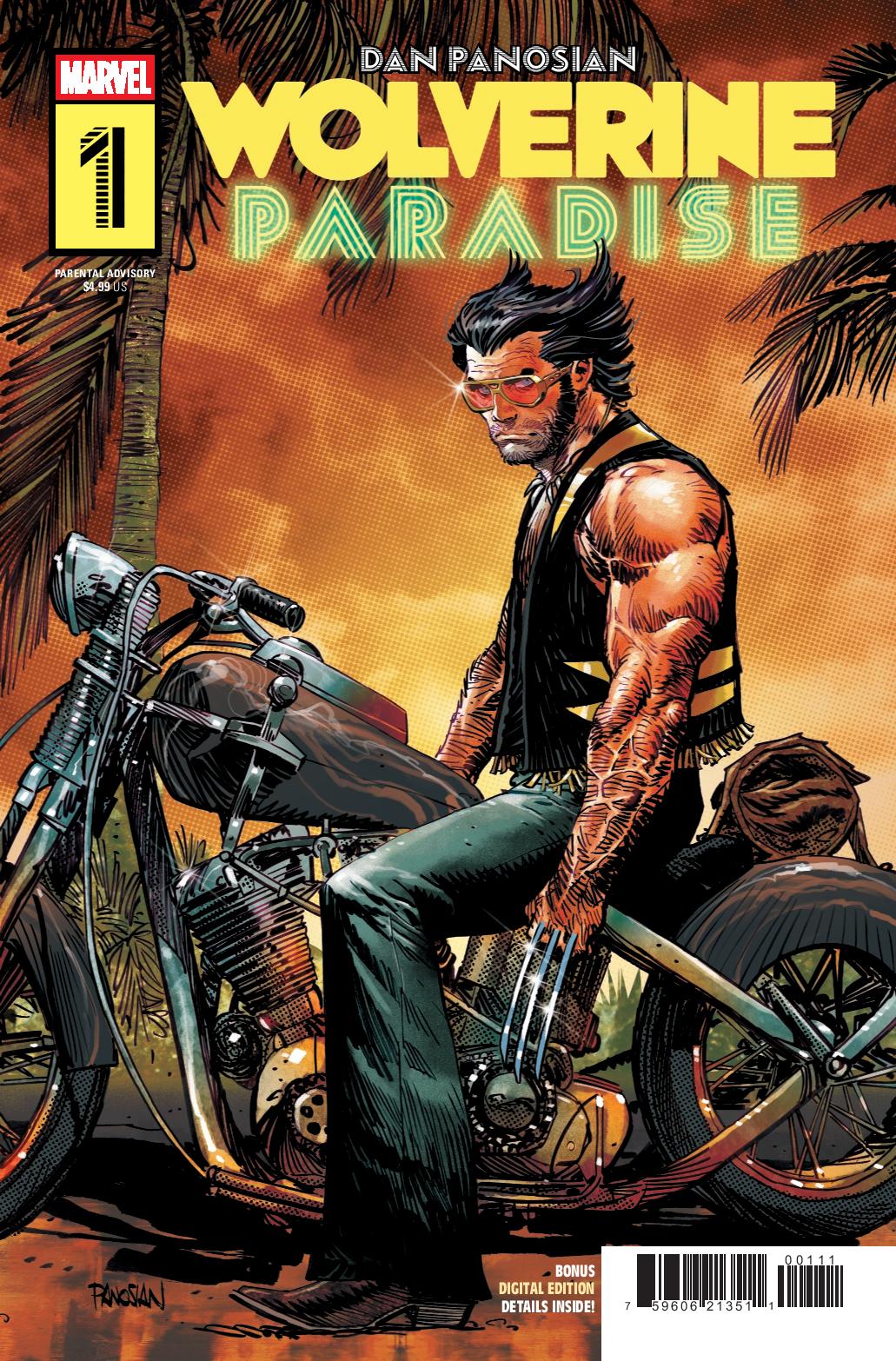
Wolverine: Paradise #1 feels a bit like a throwback to Marvel Comics Presents

Wolverine: Paradise #1

ESCAPE…INTO DANGER! LOGAN steps from the X-MEN…but awaiting under the glitz and glamour of MIAMI is a simmering criminal underworld, and a crucible that will bring out the warrior, the mutant–the Wolverine! Writer-Artist DAN PANOSIAN takes the reins of Wolverine, steering him into an all-new, can’t miss, auteur-driven adventure, where “paradise” ain’t exactly what you’d expect. Wolverine: Paradise #1 is an entertaining start that feels a little retro in a way like it’d fit in classic Marvel Comics Presents or the first ongoing volume of Wolverine.

Dan Panosian handles the writing and the art for Wolverine: Paradise #1 and the first issue is overall ok. Wolverine decides to take a break and head to Miami where of course trouble is going to be found. In this case, it has something to do with the mob and Dazzler. But, Panosian throws in a little something else with a mysterious character who’s following Logan on his trip.

The issue is one where you generally need to suspend disbelief a few times to enjoy it. There’s a mysterious person who knows Logan but Logan doesn’t know. It’s odd the Wolverine to just walk away from that. Then, there’s the random meeting with Dazzler and in such a large city, it’s just a little too odd for them to meet, especially when Dazzler could use Wolverine’s help (why didn’t she call anyone?). But, just go with the flow as the story, so far, feels like one of the stories you’d find in an arc of Marvel Comics Presents or in-between major arcs of Wolverine. Entertaining but not earthshattering.

Panosian brings his distinctive style to the comic which feels like a bit of a 70s vibe. Wolverine feels like he’d do well in a brawl while most characters feel like caricatures in a way. But, that’s part of the point. The action overall is good and there’s some small details that add some humor and fun to the comic. Overall, the art style gives the comic a sort of rough feel visually that makes it have a tone that feels more like the action B-movies of the 70s.

Wolverine: Paradise #1 is a fun issue you can just pick up and enjoy. It doesn’t feel like the miniseries is going to deliver anything that’ll really shake things up or deliver anything super new and different. Instead, it feels like it’s a simple, entertaining story of Wolverine beating the crap out of gangsters. And, there’s times that’s all you need out of a comic.

Story: Dan Panosian Art: Dan Panosian
Color: Dan Panosian Letters: Cory Petit
Story: 7.0 Art: 7.25 Overall: 7.0 Recommendation: Read

Marvel Comics provided Graphic Policy with a FREE copy for review


Purchase: Zeus Comics – Kindle

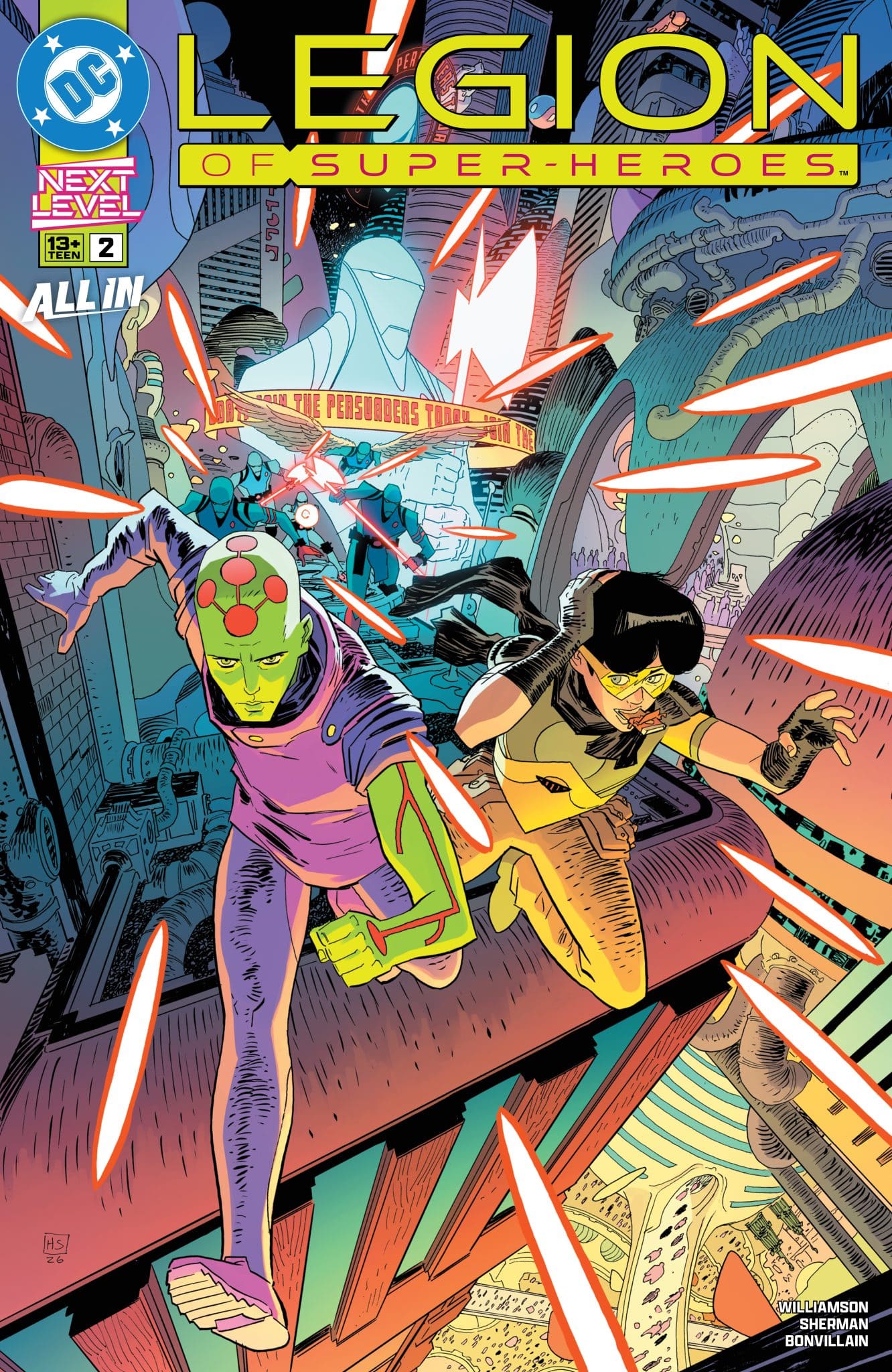
Legion of Super-Heroes #2 Delivers a Clearer Picture

Legion of Super-Heroes #2

The new future of the DC Universe continues as the Persuaders are hot on the trail of RJ Brande’s murderer. Will Brainiac 1 of 5 and Matter-Eater Lad solve the case before they’re forced to join the ranks of the enemy? Lightning Lad takes on a new trainer in his quest to be a superhero…but what happens when he learns that in order to be a great superhero, you must have a great super-villain?! Witness the unexpected creation of a new kind of Legion…and be prepared to get shocked! Legion of Super-Heroes #2 begins to create a clearer picture of what’s going on as it narrows its focus a bit and connects some dots.

At the heart of the new Legion of Super-Heroes is a muder mystery. Written by Joshua Williamson, the muder of RJ Brande seems to be the thread that’s connected to key individuals from the classic Legion of Super-Heroes. My knowledge of those characters and history is sparse, which made me appreciate the first issue but not totally love it. Legion of Super-Heroes #2 narrows the focus in some ways by primarily dealing with the murder but also the connections to everything else set up.

Williamson does a good job of both making things clear and not at the same time. There’s the murder mystery which is pretty clear in the story. Then there’s Lightning Lad who takes on a trainer and it’s hard to tell how much bullshit is being spewed. It’s a nice balance to make it clear that not everything is as it seems and leaves space to guess how straightforward what’s being presented is. Goals and beliefs feel like they my be exaggerated but it’s also easier to figure out who clearly the villains are here. It puts that first issue more in focus but not completely clear.

Hayden Sherman‘s art continues to be fantastic. With color by Tamra Bonvillain and lettering by Hassan Otsmane-Elhaou, the comic has a great style about it with fantastic layouts and solid settings that feel alien but not distracting. The character designs are solid as well. But, as usual, Sherman’s page layouts is where things really shine. Sherman has shone over and over again its a comic where the art is great but is taken to the next level in how it’s presented. This isn’t an artist who sticks to boxes to tell a story with the flow of the page helping add to the narrative.

Legion of Super-Heroes #2 is an entertaining issue that does a good job of building off of the debut. While the first issue might have been a little confusing for new readers, this second issue lays things out a bit easier and allowing the dots to be connected. It’s slowly building to the classic Legion it feels like while teasing at an even bigger story to come.

Story: Joshua Williamson Art: Hayden Sherman
Color: Tamra Bonvillain Letters: Hassan Otsmane-Elhaou
Story: 8.25 Art: 8.35 Overall: 8.3 Recommendation: Buy

DC Comics provided Graphic Policy with a FREE copy for review


Purchase: Zeus Comics – Kindle

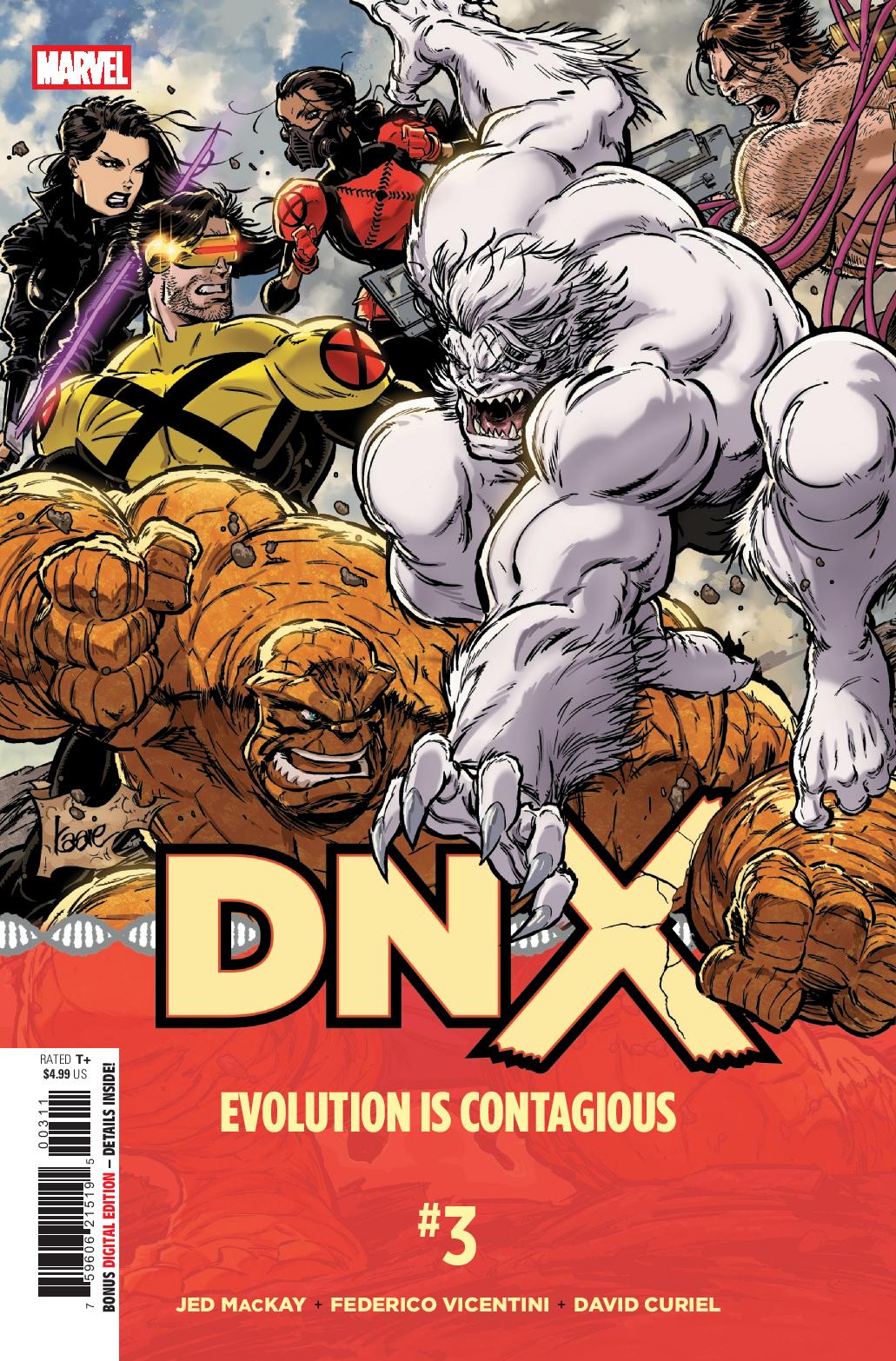
DNX #3 features Big Moments but a Choppy Story

DNX #3

While 3K’s counterstroke has shocked the X-Men, Philadelphia is no less in the shadow of disaster as the Chairman’s spoilsport plan comes into effect! The X-Men must look to the least of their number, while the Fantastic Four fight against time to deliver the data that can save the day! DNX #3 ups the action as the X-Men must deal with multiple disasters.

I’ve generally enjoyed the DNX storyline as it feels lit gets a bit back to basics for the X-Men. The X-Men are protecting everyone while the opposing side wants to expand the mutant nation to rule over humans. With the Fantastic Four mixed in, the event has been an interesting one that while short, it does a good job of wrapping up recent storylines while delivering a big bombastic battle. DNX #3 is a good issue when it comes to that battle with it clearly over for the Chairman and the X-Virus set loose. That’s not all, a giant ship is bearing down on Philadelphia threatening a second disaster.

Written by Jed MacKay, the comic is interesting and feels like a nice chapter of the overall story, but that’s the thing, it’s a chapter. This is an event taking place in the DNX miniseries as well as X-Men and Fantastic Four. This issue shows, if you haven’t been reading those other series, you’re missing out and missing key information. This is one where the main series can’t be read and appreciate on its own, it relies on its tie-ins for the main story, not ancillary information. It also relies heavily on readers having kept up with the X-Men, making it an interesting one for Fantastic Four readers not interested. A key character in this issue has been around since the beginning of the latest X-Men volume and if you haven’t been reading that series, the moments don’t hit in any way special. Still, there’s something fun about the issue and series as a whole.

The art by Federico Vicentini captures the chaos. With color by David Curiel and lettering by Clayton Cowles, the comic swings big in visuals and nails the frantic nature of what’s going on. The characters look great and it has a lot of visually dramatic moments. But, with a virus loose and a city panicking, the comic doesn’t quite capture any of that well. It all feels like after thoughts for the bigger action going on.

DNX #3 is one with big moments for a few characters. But, their moments flounder without knowledge from other comics. It’s an event that’s not so much contained but playing off of multiple years worth of storytelling and where each issue is key. With all of that, DNX #3 comes off as a sliver of a greater picture instead of big moments to be appreciated on their own.

Story: Jed MacKay Art: Federico Vicentini
Color: David Curiel Letters: Clayton Cowles
Story: 7.0 Art: 8.0 Overall: 7.0 Recommendation: Read

Marvel provided Graphic Policy with a FREE copy for review


Purchase: Zeus Comics – Kindle

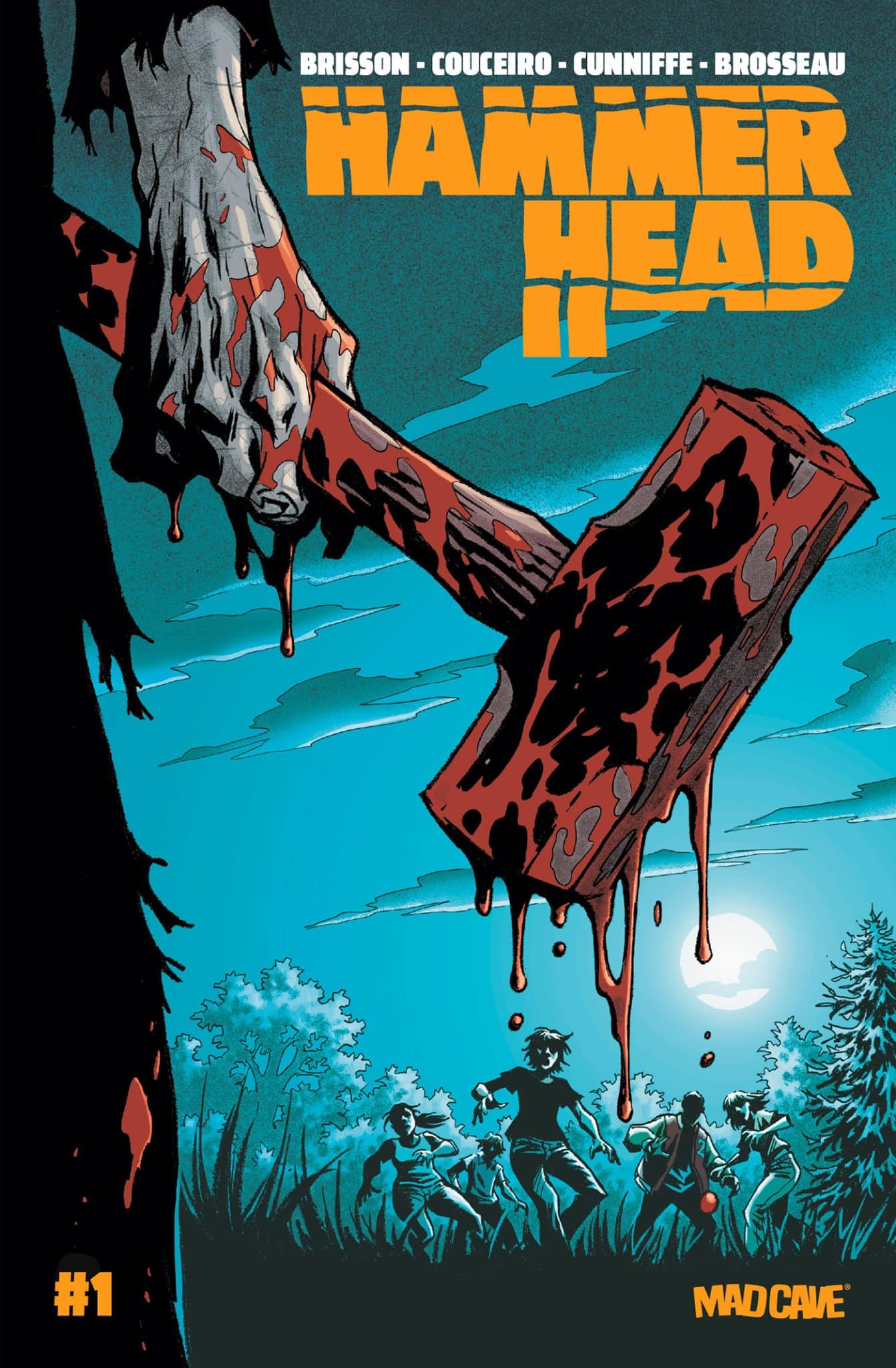
Hammer Head #1 Takes the Horror Genre in an Interesting Direction

Hamer Head #1

For 20 years, Jules has been hiding from her past. As the only survivor of the Hammer Head killing-spree, she carries the guilt and trauma of having watched as everyone she loved was brutally murdered. Every couple of years, Hammer Head rises from the dead to continue his reign of terror anew, and with each repeated massacre, Jules falls deeper into the warm embrace of her own dark coping mechanisms. When she’s thrown into prison with no trial and no hope, Jules finds herself part of a dark ritual built to force her back into the past that she’s spent her life trying to escape. Co-created by Ed Brisson and Damian Couceiro, Hamer Head #1 is an interesting take on the horror genre.

There’s been a lot of new and different spins on the horror genre lately. While some explore the DNA of these types of stories, others focus on horror’s ability to explore and talk about greater issues. Hamer Head #1 is an entry that feels like it could go either way as it goes off in an unexpected direction.

Written by Brisson, Hamer Head #1 quickly introduces us to Julie and her arrest making it clear that someone has a plan for her. Exactly what that plan is remains up on the air as the reader is introduced to others she shares a prison with. But, Brisson makes it clear early on that something isn’t normal about the situation. Men are mixed with women in this prison and the number of prisoners feels rather small for the size of the facility.

Damian Couceiro‘s art is solid delivering an unease as the story progresses. With color by Dee Cunniffe and lettering by Pat Brosseau, Hamer Head #1 saves surprising moments to really hit readers with. this isn’t one where it’s gore splashed all over, each violent moment comes quickly and from a surprising direction.

Hamer Head #1 is a good start that goes off on an unexpected path. The end leaves a lot of questions we want to find out the answers to and the lead up teases just enough you want to see where it goes. It’s an unexpected debut and one with some solid surprises that stands out from the horror pack.

Story: Ed Brisson Art: Damian Couceiro
Color: Dee Cunniffe Letters: Pat Brosseau
Story: 8.0 Art: 8.0 Overall: 8.0 Recommendation: Buy

Mad Cave Studios provided Graphic Policy with a FREE copy for review


Purchase: Zeus Comics – Kindle

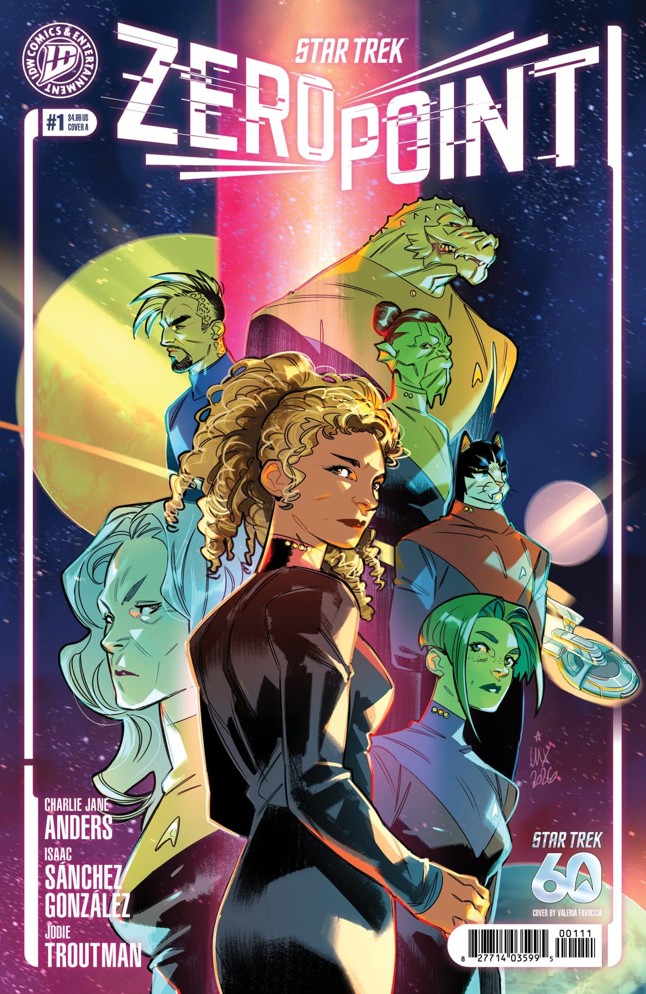
Star Trek: Zero Point #1 is Interesting But Feels Familiar

Star Trek: Zero Point #1

A starship graveyard on the moon. A captain haunted by failure. A mission that could change the future of the Federation…or end it entirely. Raffi Musiker takes command of the U.S.S. Endeavour—and is immediately handed a classified directive from Starfleet. Follow the guidance of a powerful, untested A.I., built from mysterious technology recovered in the Epsilon Corridor, that can predict threats before they happen. But these missions aren’t exploration—they’re a gamble. As systems fail, pressure mounts, and missions spiral out of control, Raffi must decide who to trust: her crew…or the machine guiding them. Because some discoveries are better left buried. And some warnings come too late. Star Trek: Zero Point #1 is an interesting companion series but feels a little familiar.

Written by Charlie Jane Anders, Star Trek: Zero Point #1 is a good start with an interesting concept for a Star Trek series. Taking place six years after Frontier Day, the comic sets off in a new direction with relatively new characters while also building off of Star Trek’s history. While you don’t need to know about Frontier Day, the event does play a role as a shadow over Star Trek: Zero Point #1. Raffi Musiker takes center stage with an interesting crew and a secret mission.

The secret mission makes Star Trek: Zero Point feel more like it should be called Star Trek: Pre-Cog. The missions are driven by an artificial intelligence to stop threats before they happen. It’s a concept we’ve seen before in so many stories and hopefully Star Trek, with its willingness to discuss moral and ethical dilemmas, will explore that many problems with the concept.

Star Trek: Zero Point #1 brings with it an interesting crew that again feels familiar. It’s a varied crew, going heavy in the alien direction and when brought together, the officers feel more like the various Lantern Corps. than your usual crew. There’s the logical Vulcan as engineer and a Trill counselor but it’s Caitian who looks like Dex-Starr, a Tzenkethi who looks like the Yellow Lantern Arkillo, and finally a Pandronian who reminds me of Marvel’s Slapstick. The variety of characters is great, don’t get me wrong. But, this crew feels like it’s drawing from other things out there visually and in that way slightly distracts.

But, Star Trek: Zero Point #1 is an interesting start setting the ship and its crew to a unique world that feels like there’s actual danger. It puts the ship into a situation that feels different and stands out from the many missions I’ve seen or read. So, the comic does deliver some unique aspects that make it overall feel like a hodgepodge of action and adventure.

The art by Isaac Sánchez González and lettering by Jodie Troutman is good. As mentioned earlier, the characters do look familiar at times but the comic has an interesting mix of familiar and new. It’s the situations that feel like they really stand out such as an opening of reflection on the moon and taking the ship into an icy ocean. It keeps readers on their toes of things they may feel like they’ve seen before while offering something new and different at the same time.

Star Trek: Zero Point #1 is a good first issue that delivers things both familiar and new. It has an interesting premise that hopefully it’ll address as a concept and a crew that is definitely new and interesting. Much like the main Star Trek series, this one is plotting a new course and direction from the franchise that both honors the past while heading into a new future.

Story: Charlie Jane Anders Art: Isaac Sánchez González Letters: Jodie Troutman
Story: 8.0 Art: 8.0 Overall: 8.0 Recommendation: Buy

IDW Publishing provided Graphic Policy with a FREE copy for review


Purchase: Zeus Comics – Kindle

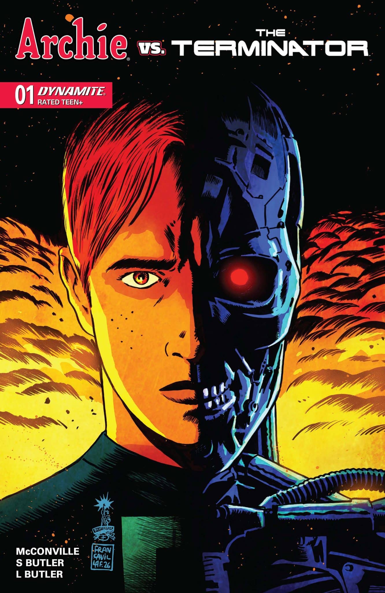
Archie vs. The Terminator #1 kicks off the crossover we never knew we wanted

Archie vs. The Terminator #1

When a teenage John Connor enrolls at Riverdale High, Archie and the gang soon find themselves in the crosshairs of a Terminator! Archie vs. The Terminator #1 is a fantastic start delivering a debut that mixes Archie’s wholesomeness with the world of the Terminator.

When it comes to crossovers, Archie has pulled off some of the craziest but also some of the best. Archie has met the Punisher, Predator, Evil Dead, and now the Terminator. And, it works and works really well. Written by Rory McConville, Archie vs. The Terminator #1 keeps things rather simple. John Connor and his mother have moved to Riverdale to hide out while using alternate names. It’s an attempt at a simpler and safer life, where a Terminator can’t find them… but of course one will.

Where McConville’s debut issue really works is that it keeps it an Archie comic. There’s a wholesomeness about each moment and it doesn’t try to change things up or change up John Connor. That’s part of what makes the comic great. John and his mother Sarah make observations about how disconnected from reality Riverdale is, with no idea the danger that’s out there and they don’t mean Terminators. The Connors point out that Riverdale’s issues are quaint. It’s about mundane and small things that really have no major impact in one’s life. Compare that to not what the Connors are going through, but the world as a whole. It’s a small observation that doesn’t make fun of Archie and the gang but points out how disconnected from reality they are.

The art by Steven Butler and Lily Butler with lettering by Jack Morelli is solid. The comic keeps the Archie look and attempts to make John, Sarah, and the eventual Terminator more like Archie’s world than have them stand out. It’d be easy to go moody with John but the comic’s style feels like it takes his T2 style but dials it down a little to work in Archie’s world. The comic also doesn’t censor itself with a gun making its way into the story, showing this is one that could get rather violent. Add in an opening that teases the fate of some of Riverdale and you have a comic that’s both set in Archie’s visual style but not letting that wholesomeness hold it back.

Archie vs. The Terminator #1 does rely a bit on knowledge of the Terminator. It doesn’t take time to explain who John or Sarah Connor are, so those new to that franchise might be a bit lost. There’s clear history there that you might need to know to really enjoy the first issue. But, overall, it’s another solid crossover from a franchise that is known for it’s strange crossovers that work.

Story: Rory McConville Art: Steven Butler, Lily Butler Letters: Jack Morelli
Story: 8.5 Art: 8.0 Overall: 8.5 Recommendation: Buy

Dynamite Entertainment provided Graphic Policy with a FREE copy for review


Purchase: Zeus Comics – Kindle
Home/World: A Circumnavigation of Our Shared Earth is a hell of a graphic memoir/graphic journal

Eisner award–winning author Ben Hatke recounts his epic circumnavigation of the globe in Home/World, a profound graphic memoir perfect for fans of Bill Bryson.

One spring morning, Ben Hatke walked out his door and headed east, carrying a sketchbook and the audacious trust that if he journeyed long enough, the curve of the earth would bring him home again. What he met was a world more perilous and more generous than he ever imagined.

In Home/World, the Eisner Award–winning creator chronicles this circumnavigation through ink-and-watercolor pages that capture not just the sweep of continents but flickers of human encounters: a shared meal in a village, a moment of terror at a border crossing, the language of laughter breaking through babel. Hatke’s storytelling transforms the travel narrative into something urgent and immediate—a reckoning with our fractured yet resilient planet.

In an age when the world feels boundless and claustrophobic, Home/World offers not an escape, but a return. A return to wonder, to hope, to the possibility that strangers may prove kinder than we think, and to the belief that art may yet hold humanity together.

by: Ben Hatke

Get your copy now!

Bookshop
Amazon


23rd Street provided Graphic Policy with a FREE copy for review
This post contains affiliate links, which means that if you click on one of the product links and make a purchase, we’ll receive a percentage of the sale. Graphic Policy does purchase items from this site. Making purchases through these links helps support the site

« Older Entries Recent Entries »