Category Archives: Reviews

Maniac of New York: Don’t Call It a Comeback #2 adds a lot to the latest volume

The Maniac is dead… or is he? What’s going on!? You can never keep a good slasher down as Maniac of New York: Don’t Call It a Comeback #2 adds to the body count and some interesting directions for the series.

Story: Elliott Kalan
Art: Andrea Mutti
Color: Andrea Mutti
Letterer: Taylor Esposito

Get your copy in comic shops! To find a comic shop near you, visit http://www.comicshoplocator.com or call 1-888-comicbook or digitally and online with the links below.

Zeus Comics
comiXology/Kindle


AfterShock Comics provided Graphic Policy with a FREE copy for review
This post contains affiliate links, which means that if you click on one of the product links and make a purchase, we’ll receive a percentage of the sale. Graphic Policy does purchase items from this site. Making purchases through these links helps support the site

007: For King and Country #1 continues Bond’s battle with Myrmidon

007: For King and Country #1

James Bond has been branded a traitor by his own government. As M sends the entire 00 division after 007, Bond must go underground with only one ally: Gwendolyn Gann, 003 – another traitor, presumed dead, secretly on a clandestine mission with global implications. 007: For King and Country #1 is the second chapter in Bond’s return and he’s now on the run.

Written by Phillip Kennedy Johnson, 007: For King and Country #1 continues the story that began with the six-issue series 007. Myrmidon has made huge steps becoming a global military force, one that’s been accepted by world governments. Bond and Gann have been revealed as double agents, accused of spying for the corporation and traitors to their country. Now, they’re lying low in an attempt to survive as everyone seems to be after them. 007: For King and Country #1 delivers a debut that’s full of global implications and lots of paranoia.

Johnson does an excellent job of keeping the story from the previous volume going but also creating a debut that is welcoming to new readers. You’re caught up as to where things stand while also not being bogged down with too many details. The issue also delivers action and really focuses on what’s to come and the real threat is. It’s the moments after the slick opening for a Bond film that really kicks things off instead of just delivering high octane action.

The art by Giorgio Spalletta is solid. With color by Francesco Segala, color assist by Agnese Pozza, and lettering by Jeff Eckleberry, the comic is able to mix action as well as quieter paranoia. From an opening that feels like a big budget sequence, the comic shifts to the duo hiding out but it’s all presented in a way that’s tense and makes you wonder what will happen next. You trust no one and through art that’s rather sparse as far as people, it allows you to focus on each person presented and each setting and wonder if anything will happen.

007: For King and Country #1 is an entertaining opening that puts Bond in an interesting position. It’s one we’ve seen before to some extent but with how things are presented, it’s never quite felt to this level. Add in how the issue wraps up, and this is a new series where it feels like everything is on the table and no one can be trusted. It’s Bond on his own versus the world.

Story: Phillip Kennedy Johnson Art: Giorgio Spalletta
Color: Francesco Segala Color Assistant: Agnese Pozza Letterer: Jeff Eckleberry
Story: 8.0 Art: 8.0 Overall: 8.0 Recommendation: Buy

Dynamite Entertainment provided Graphic Policy with a FREE copy for review


Purchase: Zeus ComicscomiXology/Kindle

Captain America: Cold War Alpha feels like being dropped in the middle of a story

Captain America: Cold War Alpha

I’ll admit, I haven’t been keeping up with the two Captain America series currently being released. While I enjoyed the first few issues of each, I fell off regularly reading them, as there’s so much coming out and only so much time. But, I tried to keep up with a general idea of what’s going on. And, as expected, the two series have come together for a crossover event, “Cold War” which kicks off here with Captain America: Cold War Alpha.

Written by Jackson Lanzing, Collin Kelly, and Tochi Onyebuchi, the comic and event brings together plot lines from each series. Bucky Barnes is now the Outer Circle’s New Revolution. He’s now teamed up with the White Wolf who he has freed from prison. Steve Rogers’ adopted son, Ian, A.K.A. Nomad, is abducted which has him bringing together his friends and allies Sam Wilson, Sharon Carter, and Misty Knight to help figure out what’s going on. Steve thinks Bucky is still on his side but playing a game they can’t figure out, but what’s shown throws so much into question.

If you haven’t been reading things up to this point, you might be lost starting with Captain America: Cold War Alpha. The issue does what it can to catch readers up but there’s a lot to pack into one issue. The very basics are laid out and you can limp your way through the issue but it’s a tough read and it feels like you’ve come into a film a missed the first half hour. Still, there’s some solid action and the comic captures a good action vibe.

That’s helped by the art by Carlos Magno. With color by Guru-eFX and lettering by Joe Caramagna, the comic has a big screen picture vibe about it. The scenes are over the top, settings feel grand, and the action is on a pretty big scale. None of this comic feels small or intimate, this is a big swing for entertainment.

Captain America: Cold War Alpha has its moments and feels like a summer popcorn action film, but, it also feels like a story that you really need to know what has been going on before. The issue does what it can to catch readers up but it doesn’t quite nail that down and might leave readers even more confused. If Dimension Z or Ian are completely foreign to you, this is a kick off that might fall a bit flat.

Story: Jackson Lanzing, Collin Kelly, Tochi Onyebuchi Art: Carlos Magno
Letterer: Joe Caramagna Color: Guru-eFX
Story: 7.0 Art: 7.75 Overall: 7.0 Recommendation: Read

Marvel provided Graphic Policy with a FREE copy for review


Purchase: TFAWZeus ComicscomiXology/Kindle

Superman: Lost #2 is a muted and slow lesson

Superman: Lost #2

As Superman struggles to re-enter his life on Earth, we begin the story of his epic 20-year journey home with an encounter with spacefaring scavengers who transport the Man of Steel to an unnamed earthlike planet whose properties redefine the limits of his powers, while the world’s ecological and political turmoil beckons for his help. Superman: Lost #2 is an interesting issue feeling a bit like a parable packed with lessons.

Written by Christopher Priest, Superman: Lost #2 continues what is an intriguing series. There’s so much to enjoy and so much to be frustrated by the series as a whole. The first issue felt littered with character depictions which never quite felt like the characters we know. The second issue has a little of that too with Superman shattered and broken by his trip home and in flashbacks, attempting to figure out what has happened.

When it comes to Superman, I’ve always felt like he’s a character who will step in to stop injustice no matter the situation. He wants to right the wrongs, which is partially what makes Superman: Lost #2 so frustrating. First salvaged by aliens, he’s dumped on a planet destroyed by war and ecological disasters but much like Earth. Yes, he’s limited by his powers but after finding some who aren’t so bad off, he just grabs some equipment to help him get home and takes off. The comic feels like there’s a lesson to the story but I’m not sure what it is and the lesson absolutely isn’t very Superman like. Even with issues concerning his powers, I’d expect the Man of Steel to spend time to try to save the planet and its people. Here, he just kind of bolts after learning the people don’t really seem to want help. “Fuck em” seems to be the lesson of the day.

The art by Carlo Pagulayan continues to be fantastic. There’s something beautiful and haunting at the same time with a sadness pervading over the sci-fi visuals. With Jason Paz on ink, Jeromy Cox on color, and lettering by Willie Schubert, the comic visually looks great with so much that feels familiar but alien at the same time. But, the tone of the comic is set up early as Clark personally deals with the reality of his time away, a tone that’s sad and morose.

Superman: Lost #2 is an interesting comic in that it feels like there’s a lesson there. It has a style that it’s a parable but I’m not quite sure what that underling thing is. It continues a series which feels grand in concept and execution but I’m not sure if that is really going to pay off.

Story: Christopher Priest Art: Carlo Pagulayan
Ink: Jason Paz Color: Jeromy Cox Letterer: Willie Schubert
Story: 7.75 Art: 8.4 Overall: 8.1 Recommendation: Read

DC Comics provided Graphic Policy with a FREE copy for review


Purchase: TFAWZeus ComicscomiXology/Kindle

Space Job #3 continues the laughs and cringe

Space Job #3

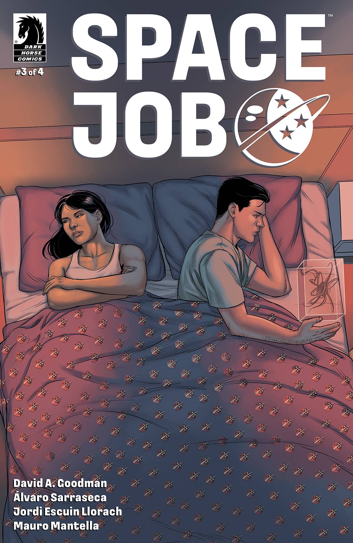
It’s about time someone on this ship took some initiative, and Ensign Masht is on the case! First thing, the late First Officer Sheridan needs a proper send off. While Masht begins work on Sheridan’s memorial, Travis prepares to jump ship (and careers), Dana might have to face the facts about her marriage, and Captain Olivier takes decisive action to outmaneuver the Clooney. Space Job #3 continues the office comedy, no, it’s not a Star Trek spoof.

Written by David A. Goodman, Space Job #3 is another fantastic issue of utter incompetence, staff revolt, and staff disgust. Goodman has put together a series that on its surface might seem like a Star Trek spoof but in reality it has more to do with The Office.

There’s a failing relationship, irritation at an inept boss, and staff looking to leave, it’s more what we experience at work than anything else. It just so happens to take place on a spaceship. What’s great is that the series remains so relatable inspite of its sci-fi setting.

The issue also delivers some ideas as to how the world has gotten to the point it has. We’ve yet to really get a good idea as to where things stand and how space travel was achieve but this issue fleshes all of that out as we now have a better idea as to why things are the way they are.

Goodman also keeps readers on their toes with comments and statements that feel like they come out of left field but also are right at home in the story. An alien explains it likes humans for the “food and porn” just nails the dry and absurd humor the comic is going for.

The art by Álvaro Sarraseca nails the tone of the series. There’s something about the minimalist nature of the series. It doesn’t go for lots of fancy technology instead leaving much of it empty and cold in a way. That’s enhanced by the color from Jordi Escuin Llorach which sticks to blues, greys, and whites, an almost sanitized feel in a way. The lettering by Mauro Mantellez too adds to the dry, clean, cool, nature of it all.

Space Job #3 is another great issue that adds to the workplace comedy. There’s something that anyone that has worked in an office or for others can relate to. While the look might say soaring through space, the reality is, the comic is very grounded.

Story: David A. Goodman Art: Álvaro Sarraseca
Color: Jordi Escuin Llorach Letterer: Mauro Mantellaz
Story: 8.25 Art: 8.0 Overall: 8.25 Recommendation: Buy

Dark Horse provided Graphic Policy with a FREE copy for review


Purchase: TFAWZeus ComicscomiXology/Kindle

Guardians of the Galaxy #1 kicks off an action packed space western

Guardians of the Galaxy #1

Grootfall is coming! For a bit now, we’ve been teased with whatever this event is and it’s role in kicking off a new volume of Guardians of the Galaxy. While Guardians of the Galaxy #1 gives us our first glimpse of the event, it really just opens up more questions than anything else, and that’s quite ok. The issue is the 15 minutes before the credits of the movie roll, delivering an action filled opener that teases what’s to come.

Written by Collin Kelly and Jackson Lanzing, the Guardians are a sliver of their former self. On a planet at the edge of the galaxy, they look worn, broken, and generally, not the heroes they once were. Kelly and Lanzing deliver a western dressed up as sci-fi as the team must not only save the town from impending planet wide doom but also protect them from the evil gang that terrorizes them.

Kelly and Lanzing deliver an interesting opening that starts off slow, and I’ll admit, a little bit of a drag. Like the western genre as a whole, it focuses in on that loan hero here to save the townspeople. It quickly expands from there, picking up steam as the story moves along until the ending which feels like a big budget escape sequence. It delivers adventure, excitement, tragedy, and teases a lot of pain and hurt in the Guardians’ past.

A lot of that is hinted at through the art of Kev Walker. With color by Matt Hollingsworth and lettering by Cory Petit, the visuals hint at a team that has seen some stuff. Damage to Star-Lord’s visor, the body language of the team, to what others are wearing, it all teases things went wrong at some point. Finding out what is part of the adventure to come. The team does an excellent job of blending the sci-fi and western genres to deliver a world where things don’t feel out of place and the concepts really work. Equipment looks worn and beat from the harsh environment, the clothing has a sci-fi look but also fits the desert/dust world around them. Things look lived in and used. It all adds to the story telling us a lot about this world, the people and most importantly Peter and his crew, without having to spell everything out.

What is Grootfall? What happened to the Guardians? Guardians of the Galaxy #1 teases a lot but answers little, instead focusing on a wild ride of an adventure that hits the right beats and becomes a cinematic wild ride once things really get going.

Story: Collin Kelly, Jackson Lanzing Art: Kev Walker
Color: Matt Hollingsworth Letterer: Cory Petit
Story: 8.25 Art: 8.25 Overall: 8.25 Recommendation: Buy

Marvel provided Graphic Policy with a FREE copy for review


Purchase: TFAWZeus ComicscomiXology/Kindle

Dark Ride #5 adds more questions and a lot of wtf

Dark Ride #5

Owen Seasons has been found, but the mystery around his death continues to haunt Sam Dante. As darker forces emerge in Devil Land, can Sam really control his family’s terrifying legacy? Dark Ride #5 is a hell of an issue adding so many questions to the horror series while also delivering a lot to be creeped out about.

Co-created and written by Joshua Williamson, we get a bit of a flashback teasing the deal that was made to build Devil Land. Something involving Sam and his sister is on the table as we learn about their mother and rather odd childbirth. But, that’s just to hint at the evil at play. Instead, the issue focuses on Sam as he attempts to dive into what exactly is going on. That involves having to help and ally with Owen’s sister who is in police custody and the only other person who’s sure something is wrong at the amusement park.

Williamson mixes this direction, an almost Scooby-Doo like plot, with Sam’s sister who is all in with the malevolent forces at work. She’s the “star” of the show wanting to put on a performance but also being haunted by images and demons. It’s all a solid way to show so much is at work and at play, especially when a whole new wrinkle to the story is revealed towards the end. What it all means, we’ll have to wait and see.

The series has done an amazing job of delivering a comic with an ominous and “scary” vibe and look without going over the top with the gore and scares. Something just feels very off. Co-creator and artist Andrei Bressan has been amazing when it all comes to that balancing a fine line and never crossing it which would possibly lead to distractions. Bressan is joined by Adriano Lucas on color and Pat Brosseau on lettering. The group has knocked it out of the park with every issue.

Dark Ride #5 is another stellar issue of the series. It keeps things moving while also adding more mystery and questions while also pulling back the curtain a bit hinting at the horrors going on. If you’re a fan of the horror genre, this is a series you don’t want to miss.

Story: Joshua Williamson Art: Andrei Bressan
Color: Adriano Lucas Letterer: Pat Brosseau
Story: 8.65 Art: 8.5 Overall: 8.65 Recommendation: Buy

Image Comics provided Graphic Policy with a FREE copy for review


Purchase: Zeus ComicscomiXology/Kindle

WildC.A.T.s #6 delivers a hell of a pivot to the story

WildC.A.T.s #6

With much of the team and personalities established and all the players in place now, WildC.A.T.s #6 is a hell of a pivot for the series. The hints, the teases, it all comes together here as a the bigger picture begins to unfold. It’ll leave the readers asking one question really, are we the baddies?

Written by Matthew Rosenberg, WildC.A.T.s #6 wraps up the first trade arc with the team somewhat scattered and reeling from the death of Cole, aka Grifter. But, not everything is at it seems as the issue delivers a whirlwind of twists and turns that’ll propel the series in its next arc which promises to be a hell of a new direction. It further cements the series and characters’ place in the DC Universe, making it one of the best integrations of the Wildstorm universe yet.

Up to this point, it’s clear something isn’t quite right. Halo Corporation, while seemingly benevolent, clearly has something up its sleeve. All of curtains begin to be pulled back as what’s left of the team smells that something is rotten.

What’s great about Rosenberg’s work as well is his integration of the DC Universe as a whole. Not only have the Court of Owls been the villains behind the scene but the use of Superman, and now Clark Kent, has been excellent as well. Another pretty big hero shows up here too adding to the intrigued of where things are going from here. It’s been a solid folding in of new and old.

The art by Stephen Segovia and Tom Derenick has been great. With color by Elmer Santos and lettering by Ferran Delgado, the comic has looked fantastic with a mix of action, mystery, and humor. The interactions of the characters has been key and the art has conveyed not just the humor of the series but also the relationships between each character as well. The body language and facial expressions have been key throughout.

The series as a whole has felt like it has cracked the code of how to bring Wildstorm and DC together and WildC.A.T.s #6 delivers a launch for the wild ride to come. The series has been full of nostalgia as well as forging its own path. A welcome return of the characters has me excited to see where things continue to go and evolve.

Story: Matthew Rosenberg Art: Stephen Segovia, Tom Derenick
Color: Elmer Santos Letterer: Ferran Delgado
Story: 8.5 Art: 8.5 Overall: 8.5 Recommendation: Buy

DC Comics provided Graphic Policy with a FREE copy for review


Purchase: Zeus ComicscomiXology/Kindle

Kitsune #1 has its moments but also a lot that holds it back

Kitsunichi Shimitzu is a ronin, a samurai who has become masterless. After twelve years of absence, he returns to his native lands and discovers that his master’s son is a weak man. Bandits terrorize the population, and strange rumors of a powerful enemy spread. Torn between past mistakes and a chance to redeem himself, Kitsunichi will have to fight for his life.

Story: Luca Frigerio, Emanuele Ercolani
Art: Emanuele Ercolani

Get your copy now! To find a comic shop near you, visit http://www.comicshoplocator.com or call 1-888-comicbook or digitally and online with the links below.

TFAW
Zeus Comics
Scout Comics


This post contains affiliate links, which means that if you click on one of the product links and make a purchase, we’ll receive a percentage of the sale. Graphic Policy does purchase items from this site. Making purchases through these links helps support the site

The Walking Dead Deluxe #60 isn’t the strongest issue but sets up what’s next

The Walking Dead returns in full color with extras! The Walking Dead Deluxe takes us back to the beginning with each issue now featuring full color. There are also extras of what might have been with notes as part of “The Cutting Room Floor.”

The Walking Dead Deluxe #60 isn’t a bad issue but feels more like an extension part of the previous issue as opposed to standing on its own with memorable moments.

What’s it like to revisit this modern classic? How does it change all these years later… and in color? Find out!

Story: Robert Kirkman
Art: Charlie Adlard
Color: Dave McCaig
Letterer: Rus Wooton

Get your copy now! To find a comic shop near you, visit http://www.comicshoplocator.com or call 1-888-comicbook or digitally and online with the links below.

TFAW
comiXology/Kindle
Zeus Comics


This post contains affiliate links, which means that if you click on one of the product links and make a purchase, we’ll receive a percentage of the sale. Graphic Policy does purchase items from this site. Making purchases through these links helps support the site

« Older Entries Recent Entries »