Author Archives: Logan Dalton

Review: Star Wars Doctor Aphra #1

Star Wars: Doctor Aphra #1

The new volume of Star Wars: Doctor Aphra (Which received a surprise digital release on Star Wars Day) combines the worlds of space adventure and academia into one entertaining package. The elevator pitch for Doctor Aphra is that she is Indiana Jones in space, but a queer woman of color. She also has a more dubious moral compass than Dr. Jones and is one of the best additions to the Star Wars canon since Marvel took over their comics license.

Alyssa Wong, Marika Cresta, and Rachelle Rosenberg do right by Aphra and focus on the archaeological side of her character as she teams up with a pair of female archaeologists to find the Rings of Vaale, which have great power, are cursed, and may not even exist. There’s an also an undercurrent of the conflict between intellectual curiosity and unbridled wealth in the comic’s antagonist, Tagge, a spoiled rich kid that thinks he can buy anything or anyone even an ex-tenured archaeology professor. But Doctor Aphra #1 isn’t all serious stuff. There’s also a healthy dose of gun play and intrigue to make the comic an even more enjoyable experience.

I haven’t read a Doctor Aphra comic since Kieron Gillen, her co-creator, left her solo title, but an action-packed cold open drew me into the story before the title page. Seeing Aphra in a snowtrooper disguise pulling double-crosses at Echo Base during the conclusion of the Battle of Hoth is pure fun and grounds the narrative in a time where the Empire thinks it has the Rebel Alliance on the ropes. Visually, Cresta and Rosenberg contribute smooth artwork to go with Wong’s quips, and it’s easy to follow every blaster bolt or sniper shot as well as surprise AT-AT’s. (It’s Hoth, what do you expect.)

In a bigger storytelling picture, Alyssa Wong and Marika Cresta resist the temptation to decompress and pad out scenes in Doctor Aphra #1. They provide the “great hits” of an action sequence, focusing on the coolest or most impactful moment like spending a single panel on Aphra and her crew’s flight from Hoth (Complete with speed lines.) after they spot the aforementioned AT-AT’s.

This economy of narrative extends to the quieter scenes too with Aphra, her former colleague Eustacia Okka, and bright-eyed and bushy-tailed grad student/fangirl Detta Yao laying out their character motivations and agreeing to team up to go after the Rings of Vaale in a single page. Aphra wants money, Eustacia wants her faculty position back, and Detta wants to write her dissertation and also has a kind of true believer connection to the Rings. Marika Cresta’s art is really what sells this pivotal page as she portrays Aphra as a pragmatist and poker player maneuvering to the side while she draws Detta with more open body language.

Alyssa Wong has done an excellent job crafting a core for these characters to build on throughout the series. This goes along with their distinct quirks like Aphra’s flexible approach to morality, Detta’s idealistic approach to the field of archaeology and academia in general, and Eustacia having a “TA” droid, which is this comic’s best joke. They are characters that I can really root for to accomplish their career goals and find the Rings, which will make their inevitable betrayal or moral compromise that much more painful. (This is usually the end result of running with Aphra; that or bumping into a certain Sith apprentice.)

Doctor Aphra #1 has all the hallmarks of a good Star Wars Expanded Universe story as it uses this rich world to tell an adventure story bursting with fun art from Marika Cresta and Rachelle Rosenberg and characters that are easy to connect to. Alyssa Wong also touches on deeper themes like faith and doubt and the connection between money and the academy. Fingers crossed that we see what an Outer Rim university tenure board review is like.

Story: Alyssa Wong Art: Marika Cresta
Colors: Rachelle Rosenberg Letters: Joe Caramagna
Story: 8.2 Art: 7.8 Overall: 8.0  Recommendation: Buy

Advance Review: Banned Book Club

Banned Book Club

Banned Book Club is an inspiring and educational piece of graphic non-fiction from writers Kim Hyun Sook and Ryan Estrada with manhwa-influenced visuals from artists Ko Hyung-Ju. It tells the story of the 1983 student protests about South Korea’s authoritarian Fifth Republic from the perspective of Hyun Sook herself, who begins as a young, timid girl that just wants to study English literature, and ends up joining the revolution via extracurricular activities. (I will be using Kim Hyun Sook for the character and Hyun Sook for the creator.)

However, between dodging cops, dealing with her friends being arrested, and sexual harassment from her once respected literature professor, Kim Hyun Sook finds self-actualization and also learns a little bit how the world works. I mean why would a regime ban books with fascist enemies if deep down, they didn’t see a little of themselves in these books. Banned Book Club is also a strong narrative argument for the power of literature, including fiction and nonfiction, to effect change and use things like imagery and metaphor to expose the truth about the world. In that case, maybe this comic is just a tiny bit metafictional.

Hyun Sook, Estrada, and Ko Hyung-Ju do an excellent job harmonizing the words and visuals in Banned Book Club to create a certain feel on different pages or get a point across. For example, there’s a flurry of word balloons when the members of the book club get in an argument when one of their members are jailed. On the other hand, they drop out the dialogue for more tense, action-driven scenes like when Hyun Sook takes multiple buses to deliver a package from the club to one at another university as part of her “public relations” duties.

Panel Mania: Banned Book Club by Kim Hyun Sook, Ko Hyung-Ju, and ...

This variety in storytelling keeps Banned Book Club interesting, and I love how Hyung-Ju’s characters wear their emotions on their sleeves. He also uses shadow and differences in line thickness to show when they’re afraid, embarrassed, or more relaxed. The relaxed emotion doesn’t pop up that much in the story, but it’s on full display during the club’s 2016 class reunion when they band together to protest another authoritarian South Korean president. This epilogue adds perspective to the events of the previous chapter and also is just a damn good testimonial to the power of protest. I mean, imagine if Americans went out and protested Trump every weekend of his impeachment hearings…

Hyun Sook, Estrada, and Hyung-Ju aren’t afraid to whip up a little controversy in Banned Book Club with the club member Jihoo reading the writings of North Korea’s authoritarian dictator Kim Il-Sung under the guise of a book of love poems. (Of course, he’s the one club member who actually gets arrested.) Jihoo gets some gentle ribbing from his friends for reading “government propaganda”, but it’s a testimonial to their dedication to freedom of speech and the press that he doesn’t get censured.

The pages where he reads Kim Il-Sung’s overwrought, loaded writing shows that the freedom to read extends to books that one doesn’t agree with. But it’s also connected to the freedom to critique books. I have to give kudos to Hyun Sook, Estrada, and Hyung-Ju for using this consequence-infused scene to add ambiguity to the club’s activities. They weren’t just reading Karl Marx, Jean-Paul Sartre, and Noam Chomsky and trying to save South Korea; they were also reading North Korean propaganda to compare it to the techniques their government were using. It’s an example of the book club just wanting to have freedom of inquiry at university instead of being stuck reading, thinking, and publishing (In the case of the school newspaper.) what the government approves.

Banned Book Club has its fair share of dark and tragic material like any time a member of the club is hauled in for questioning by the government. Hyung-Ju use thick cross hatching to show the pain and stress the club members are under, which is contrasted with Hyun Sook and Estrada’s dialogue for the guard, who talks about catching “bad guys” to his son on the phone. It’s the banality of evil in action showing that authoritarianism is propagated by its yes people.

Kim Hyun Sook, Ryan Estrada, and Ko Hyung-Ju turn in the next great historical non-fiction comic in Banned Book Club as they portray a pivotal time in South Korean history from a ground-level point of view. They also explore the relationship between politics and art through three-dimensional characters with even Hyun Sook’s father getting a spotlight when he tells the backstory of why he decided to start a steak restaurant and letting his daughter know that it’s okay to have dreams that aren’t in line with societal norms. Finally, Banned Book Club is a wonderful showcase for the connection between the visual and verbal, which is what the comics medium does best.

Story: Kim Hyun Sook, Ryan Estrada Art: Ko Hyung-Ju
Story: 9.0 Art: 9.2 Overall: 9.1 Recommendation: Buy

Banned Book Club is out May 19, 2020, Preorder: AmazonBookshop
Iron Circus Comics provided Graphic Policy with a FREE copy for review


This post contains affiliate links, which means that if you click on one of the product links and make a purchase, we’ll receive a percentage of the sale. Graphic Policy does purchase items from this site. Making purchases through these links helps support the site.

Review: Josie and the Pussycats in Space

Josie and the Pussycats in Space

In the digital comic series Josie and the Pussycats in Space, Alex de Campi, Devaki Neogi, and Lee Loughridge riff on the 1972 animated series Josie and the Pussycats in Outer Space. However, with the exception of the first issue, there isn’t a lot of pop music being played in space. Instead, there’s lots of cosmic body horror and applications of Murphy’s Law as the Pussycats go from their next tour stop to eluding a gooey alien parasite. As the five issue miniseries progresses, the setting shifts from United States Space Force ship to rescue pods and finally the vacuum of space.

Although there are definite elements of space horror films like Alien in Josie in Space, de Campi and Neogi do a fantastic job putting their own spin on the genre through suspenseful storytelling and the out-sized personalities of the Pussycats and their supporting cast members Alan M (Who is now a hunky starship captain), Socks, and of course, the Cabot siblings. They use most of the comic’s first issue to establish the friendships and also tension between the band as they’re tired of touring non-stop and living in such close quarters and want to hang out with other people and try other musical endeavors. As well as creating chemistry between the band, it also allows for a classic, slow burn horror setup that succeeds thanks to de Campi’s tight plotting and Neogi’s clear storytelling.

Speaking of Devaki Neogi’s storytelling, she and colorist extraordinaire Lee Loughridge create tension and generally keep things interesting in Josie in Space thanks to varied layouts and color palettes. The comic starts out with a lot of nine panel grids as it seems like it’s just another week in the life of spaceship-setting pop stars. However, then, Neogi uses Dutch angle panels to create a feeling of unease as the ship loses power, time is a little wonky, and the alien parasite starts to pick off the redshirts. Loughridge matches this energy with color palette using flat reds like alarms blaring. I love how depicts the parasite as an all-consuming blackness that matches the tone he uses for some of the space sequences.

Even though this is a series featuring heightened characters in a (sometimes literally) bone-chilling genre, Alex de Campi peppers her script with human moments. For example, Valerie practices grounding exercises with Melody when she has panic attacks a couple times throughout the series. This validates Melody’s emotions and reactions and reinforces her bond with Valerie. In that moment, they aren’t pop culture ciphers, but people reacting to stress. Devaki Neogi reinforces this with her artwork that features a lot of close-up/medium panels so that readers can empathize with the Pussycats and the supporting cast instead of seeing them as monster bait.

Josie and the Pussycats in Space can definitely be read as enjoyable transposition of Americana icons into a science fiction horror setting with a suspenseful plot. However, the inclusion of the actual United States Space Force (Albeit with interplanetary travel capacities) hints at the layered satire of parasitic American imperialism. The inclusion of the Cabots, whose approach is basically to solve problems through money, explosions, and asking questions later is basically American foreign policy since JFK was shot. Also, it’s only hinted at in the first and final chapters because this is more of a comic about scary things than pop music, but Josie and the Pussycats themselves are just another cog in promoting the military industrial, I guess, space complex instead of being countercultural. Maybe, that’s the real reason why Valerie wants to work on solo material.

After that political interlude, Josie and the Pussycats in Space channels this cartoon band’s strangest era into a riveting thriller. Alex de Campi, Devaki Neogi, and Lee Loughridge masterfully transform a cool tour vehicle into an interstellar charnel house and definitely answer the question of “Could Josie and the Pussycats survive Alien?” This comic is worth a download for fans of all-girl pop bands, horror movies, or just exciting, well-crafted stories.

Story: Alex de Campi Art: Devaki Neogi
Colors: Lee Loughridge Letters: Jack Morelli
Story: 8.0 Art: 8.6 Overall: 8.3 Recommendation: Buy

Archie Comics provided Graphic Policy with a FREE copy for review

Webcomic Review: Grind Like A Girl

Grind Like A Girl is an autobiographical webcomic (Available on Gumroad) from cartoonist Veronica Casson about growing up as a transgender girl in the 1990s. I saw some pages from the most recent chapter on Casson’s Instagram, immediately saw that she had an eye-catching art style and an incredibly personal narrative and decided to go back and read the story from the beginning. This review covers the first four chapters of Grind Like A Girl available on Gumroad. However, chapter five and parts of chapter six are available on Sasson’s Instagram.

Nearly every page of Grind Like A Girl tells a complete story and illustrates a pivotal step of Veronica Casson’s coming of age. From the first page where the protagonist tries on dresses in an elementary school class and is scolded for it by her teacher, Casson plays with different styles to get her point across. In this case, Chapter 1/Page 1 is almost an homage to Charles Schulz’s Peanuts in the way that Casson draws eyes and also how the teacher immediately doesn’t consider the protagonist’s point of view and drones on like the teacher in Peanuts. However, as the story progresses, Casson goes from the dot eyes to more expressive ones to mirror the protagonist growing up and coming into her identity as a woman.

Veronica Casson also varies her color palettes to give each page and chapter a distinct mood. There’s the dark lighting and flat pinks and blues of the punk rock show that our now high schoole age protagonist goes to escape her life, the baby blue freedom of the K-Mart dressing room, and finally a muted palette when she shows up to a family dinner with makeup smudged on her face. Color is a weapon in Casson’s storytelling arsenal and can create raw energy like during the punk shows, when the protagonist is talking with a cute alternative boy about the new Elastica album, or is going out with her female friends.

Color can also be used for tension like deep blues when the protagonist comes out as trans to her friend Jason and speaks openly about how she feels and her gender identity when in previous issues they would just drink booze and shoot the shit about Dungeons and Dragons and X-Men comics. To expand on this, the protagonist’s appreciation of and the escape she finds through comics and manga is great recurring detail and connects to Veronica Casson’s virtuosic storytelling in Grind Like A Girl. When she was bullied or feeling dysphoric, she would escape to the world of fantasy novels, video games, indie music, and yes, comics. Having these and her friends’ interests pop up in the story add texture to its world and ground it very much in a time and place.

Grind Like A Girl definitely has its share of empowering and even adorable moments like any time the protagonist articulates to her friends that she’s a woman and wants to live her truth. However, Veronica Casson also shows the terrible transphobia she had to deal with, especially going to a Catholic high school. For example, in chapter one, one of the protagonists’s “friends” in grade school says that she “grinds like a girl”, which leads to her saying that she is, in fact, a girl complete with a powerful facial expression and bright lighting. But this is undercut by the boy using slurs and beating her up that leads to a montage of bullying to wrap up the chapter while she just counts down the days to high school in a new district.

However, high school leads to new complications as the protagonist must present as male to her parents and at school while she can be her true self around her friends. Veronica Casson shows this visually in chapter four through a double page spread/cut out diagram of the protagonist’s car where she stashes clothes and makeup showing the lengths she has to go to be herself. It’s great that the protagonist gets to be femme before graduating high school, but this leads to some issues like the aforementioned incident with her family. Also, some romantic elements start to show up in this chapter All of this shows that Casson isn’t just doing a blow by blow autobiography, but can also create stakes and tension too.

Veronica Casson’s Grind Like A Girl is a stylish and poignant look at growing up as a trans teenager in New Jersey in the 1990s. I admire its storytelling techniques, layouts, and color palettes as well as feel empathy for our protagonist and look forward to following the rest of the series on Instagram and Gumroad.

Story/Art: Veronica Casson
Story: 9.0 Art: 9.4 Overall: 9.2 Recommendation: Buy

Webcomic Review: Fangs is a Wholesome Romance Webcomic

If you are somewhat on the Internet, you’ve probably seen the work of cartoonist Sarah Andersen, who is best known for her self-deprecating, autobiographical comics Sarah’s Scribbles. However, in late 2019, Andersen branched out into the world of paranormal romance with a new webcomic, Fangs that is hosted on Tapas at this link and is published twice weekly. I stumbled on out of context panels of this comic on an anime Facebook page one night, and I know to read the comic in proper order.

Fangs is a romance comic about the relationship between a vampire named Elsie and a werewolf named Jimmy, who meet at a dive bar in Asheville, NC, have instant chemistry, and become a couple. What follows are little vignettes from their life together and the idiosyncrasies that make each other perfect for one another. Fangs works as both a romance and a comedy with sweet sequences like Elsie scratching Jimmy’s ears on the couch while they watch Twilight Zone book followed by comics where he immediately jumps at the door like a pet dog when she says the word ” walk”. Fangs is funny, sweet, and sometimes sexy, especially when Elsie calls Jimmy “boy” and asks about his blood type during their meet cute.

Sarah Andersen uses a simple, easy to follow art style in Fangs with lots of deep blacks, especially when Elsie is involved. However, Andersen switches up the format and layout of Fangs throughout its run from five panel gag type comics like when Jimmy demonstrates he can talk to dogs to powerful splash pages like Jimmy and Elsie sharing their first morning together. Jimmy has the light on his side while Elsie is in the grey scale shadows so she doesn’t spontaneously burst into flames. In a single image, Andersen shows that Jimmy and Elsie work well together, but might have to make some compromises. This is all without dialogue as she uses lighting, body language, and composition to tell the story.

Fangs hits peak adorable when Jimmy is in his wolf form, which happens in scattered Sarah Andersen doesn’t pull a Buffy the Vampire Slayer and make some epic arc out of his lycanthropy. No, it’s just some shit that happens and gives Andersen a chance to draw some really cute wolves and moments like Elsie and Jimmy cuddling up in her coffin, or Ellie making her “pet” an excuse of why she can’t go out that night. It also shows that Jimmy and Ellie work well together because of their monstrous natures, and not in spite of it. For example, she can drink the blood, he can eat the meat, and that’s dinner sorted. This isn’t something they could do if they were dating humans even though it’s kind of sad that Elsie doesn’t show up in Jimmy’s selfies in a modernization of the whole vampires don’t appear in mirrors thing.

Sarah Andersen’s Fangs is low stakes, slice of life romantic goodness with a dash of humor and Gothic/paranormal fiction. Its lead characters are honestly relationship goals, but Andersen does introduces little dashes of tension in the book like Elsie talking about how many people she’s killed and a random jogger hitting on Jimmy while he’s sitting on a bench. But, for the most part, this is Young Romance for the Tales of the Crypt crowd, and it’s nice to see a monster-on-monster love story without townspeople in pitchforks raising the hue and cry.

Story/Art: Sarah Andersen
Story: 8.4 Art: 8.8 Overall: 8.6 Recommendation: Subscribe

Review: Lost on Planet Earth #1

Lost on Planet Earth #1

Lost on Planet Earth #1 is a new sci-fi series from Kim and Kim and Morning in America‘s Magdalene Visaggio and Claudia Aguirre. It’s set in a futuristic Richmond, Virginia where the Earth has basically become Star Trek. The only thing that our protagonist, Basil, wants in life is to become a captain in the Interplanetary Fleet. First, she has to pass a battery of tests that make the SAT look like an open book quiz.

What resonated with me the most about Lost on Planet Earth is how relatable Basil’s life situation is. Sure, the book is set in the future, and she takes her big exam via some kind of hologram pod, but there’s still that universal conflict between what you think society wants you to do and what you want to do.

Visaggio spends the first half of the comic showing Basil’s incredibly rigid life routine. That includes skipping yummy chilaquiles for nutrition shakes and listening to educational recordings instead of upbeat music while practicing judo. This rigidity extends to Aguirre’s artwork. There’s a tenseness to Basil’s movements. That’s only broken by a hilarious breakfast reaction panel and getting pushed into the pool by her friend Charlotte. These sequences make you wish that Basil wasn’t so hard on herself and just got to be a kid. Hey, that wish might just come true.

To go with Aguirre’s depiction of Basil’s body language and Visaggio’s prose, this uniformity and sense of order on Lost on Planet Earth #1 extends to the storytelling and panel transitions. It’s so nice to see form married to content like a memorable scene where Basil stands in the same position with the same sad expression on her face while her family and friends fade into the background. She’s in her own little world and not even paying attention to their words and touches of encouragement. This single page nails the character of Basil. It acts as a deep breath before the plunge of the rest of the issue.

Another aspect of Lost on Planet Earth that I enjoyed was that it embraced the commentary on human civilization, relationships, and family on science fiction while putting action on the backburner. (For now.) Visaggio peppers her plot with great conversations. Basil. chats with her mom about why she never aspired to become a captain in the Interplanetary Fleet. That leads to a heart-to-heart about choosing family and passions (Art, in this case.) over career advancement. This is the complete opposite of the current American late capitalist, productivity culture and also Basil’s “no fun until retirement” regimen. Honestly, Basil’s family is great and supportive.

Lost on Planet Earth #1 is a stellar example of science fiction. It provides a vision of the future and also how one young woman reacts to it on a personal level. Magdalene Visaggio and Claudia Aguirre also increase the book’s energy and vitality level with every page and even introduce a supporting character, who will probably end up being my favorite character in the whole damn thing. If you’re tired of the rat race of school and career and find utopian societies a little uptight, then Lost on Planet Earth is the book for you.

Purchase: comiXology

Story: Magdalene Visaggio Art: Claudia Aguirre Letters: Zakk Saam
Story: 8.5 Art: 9 Overall: 8.7 Recommendation: Buy

Comixology Originals provided Graphic Policy with a FREE copy for review


This post contains affiliate links, which means that if you click on one of the product links and make a purchase, we’ll receive a percentage of the sale. Graphic Policy does purchase items from this site. Making purchases through these links helps support the site

Review: In Vitro

In Vitro

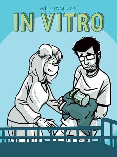
In Vitro is a sweet, funny French graphic memoir by cartoonist William Roy about him and his wife’s quest to have a child via in vitro fertilization. What follows is an emotional, educational, and sometimes downright hilarious look at the IVF process. Guillaume (The protagonist) and Emma deal with all kinds of doctors with weird bedside manners, all kinds of invasive medical procedure, their friends and families, and the comic’s biggest subplot: Guillaume’s strained relationship with his biological father, Jean-Pierre.

In Vitro is rendered with a light, cartoonish touch from Roy, who has a background in documentary filmmaking, and agilely transfers this skill set to comics. This is evident in Guillaume using cinema to make sense of stressful situations like a memory of falling in love with movies when his dad took him to Empire Strikes Back when he was a child to an IVF doctor reminding him of Clint Eastwood’s Dirty Harry.

The cinematic influence is most seen in some of the techniques that Roy uses to tell the story like a kind of Super 8, reel to reel panel layouts to show how he fell in love with his wife Emma, and later on, to show how he lost touch with his father. The color palette is the difference is the scene with Roy choosing a more romantic palette for the love story and a dark, melodramatic one for the father/son story. The shift in panel style also signals to the reader that these sequences add important context and layers to In Vitro‘s key relationships: Guillaume and Emma and Guillaume and his father.

On the flip side, Roy is also a master of storytelling in a single image. Think New Yorker single panel cartoon, not a superhero splash page, or God forbid, Family Circus. He uses a lot of white space on these pages, which boosts the importance of the art in the scene. Sometimes, Roy even drops the dialogue out like when he draws a panel of the sterile container with his semen at the doctor’s office, hoping, that this time it will lead to a viable embryo and then a child. Other times, he uses it to emphasis a plot point, like a cliffhanger in a serial comic, like when his dad sends him an email: his first contact in 20 years.

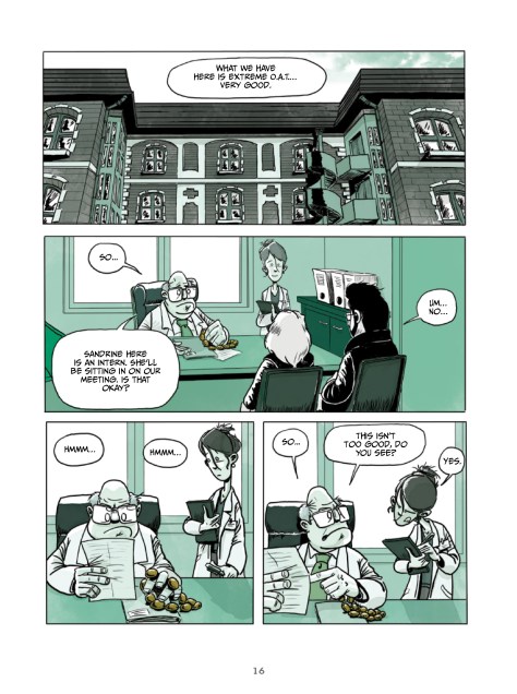
William Roy’s sense of humor in In Vitro is what endeared me to his work and to this book. His first great gag in the comic is when Guillaume sees a doctor holding something that looks like rosary beads in spectacularly awkward scene at his and Emma’s first IVF appointment. An intern is present so Guillaume is definitely feeling uncomfortable, and that feeling is tripled when he finds out that what he thought were rosary beads is a medical device that is used to measure his testicles. Roy finds the funny, surreal in all of it, and makes quite a few masturbation jokes as Guillaume and Emma deal with rude, incompetent doctors and finally find someone good ones thanks to his surprisingly compassionate boss at the TV network where he works as a film editor. Also, he goes into full cartoon mode every time he explains the medical context of the story and even creates a silly, exasperated doctor character to deliver the exposition in an amusing way.

Speaking of the boss, William Roy, for the most part, avoids stock character types in his storytelling in In Vitro and instead revels in the idiosyncracy of human nature. One gynecologist seems sleazy, not making eye contact while he converses with while an anesthesiologist is a terse, bundle of nerves quickly asking Emma what kind of anesthesia she would like during the IVF process. To go with the cinematic elements again, Roy is a skilled cast director, picking the right character actors to people the halls, offices, and corridors of the clinics and hospitals that Guillaume and Emma find themselves at.

William Roy is vulnerable, funny, and turns in some great sequential storytelling In Vitro showing a real mastery of layout, color palette, and having symbolism tie into the story instead of just having it to make him look clever. He can do both sad (Guillaume looking at the kids with their parents on the playground.) and wacky (Guillaume as a sperm) and is a cartoonist who I would definitely want to see more of.

Story: William Roy Art: William Roy
Story: 8.6 Art: 8.8 Overall: 8.7 Recommendation: Buy

Humanoids/Life Drawn provided Graphic Policy with a FREE copy for review

Review: Crowded #12

Crowded #12

Crowded has always been a comic where everything is turned to 11, constantly. That’s thanks to the witty and occasionally sentimental writing of Christopher Sebela, the high energy art of Ro Stein and Ted Brandt, and the varied colors of Triona Farrell. This high tension applies to action sequences, dramatic backstory reveals, and especially the feelings between the two lead characters. Charlie is the so-called normal girl with a price on her head via crowdfunding app Reapr and Vita is the bodyguard hired via Dfender. Crowded #12 is no exception. Charlie and Vita conspire to break out of the survivalist-meets-MLM cult missile silo they’re trapped in and talk about their emotions too.

Weirdly enough, Crowded has turned into a romance comic in its second year. The unlikely lustfest/romance between Charlie and Vita has really taken center stage. It’s fitting that we get a sepia-colored flashback of their first time making out and sleeping together. I love how Stein and Brandt include Dog’s reaction to their activities. He wanders around the frame eventually finding some nice cheese puffs to munch on. The active nature of their artwork with all kinds of gestures, background jokes, or interesting things to look at along with the contrasting color stories that Farrell created keeps the tense, “will they, won’t they” nature of Charlie and Vita’s relationship an ongoing concern as the plot moves along.

Sebela does this too through his writing. He uses a relatively “quiet” scene of Vita and Charlie preparing to leave the missile silo into the closest thing they’ve had to heart to heart for a while. Their conversation while prepping guns and a big-ass parachute is a little one-sided. Vita wants to know the old companies that Charlie sabotage while Charlie wants to get to know Vita personally. It feeds into Crowded #12’s ongoing thread of Charlie wanting Vita to see her as more than a client, but as someone she can build a future with. This emotionally dynamic beat ends up bleeding into the main plot for maximum suffering and feels.

As the issue progresses, Sebela, Stein, and Brandt indulge in even more dysfunctional relationship tropes. A pet turns out to be the emotional glue of the couple. A character storms off for basically this story universe’s equivalent of a pack of cigarettes. In a very contemporary moment, the disconnect from each other on the app where they found each other. Sebela very much plays into the “downer” second part of a trilogy idea. He wisely applies it to the relationship between Charlie and Vita instead of having them surrounded by armies of money-hungry, wannabe mercenaries.

That kind of spectacle showed up in earlier issues of Crowded. More recent installments have focused on the intricacies of love, lust, work, and relationships. However, Sebela, Stein, Brandt, and Farrell have dialed down the quirky, thrilling bits of the book. The escape from the missile silo is a highlight and example of this comic’s humorous approach to capers and setpieces.

There’s an added bonus of the antagonist, Ophelia, being fleshed out in a fantastic double-page spread. Sebela, Stein, and Brandt create a unique connection between her and Vita. Vita sees a little bit of her own hypercompetence and ability to create plans out of thin air and offers to be a kind of remote mentor to her. As a youngster, Vita was shifted from foster home to foster home with no real adult figure to lean on. She wants to pay that forward and be that figure to Ophelia. It’s a really well-developed subplot and good respite from the Vita and Charlie arguing and sometimes smooching and other things parts.

Crowded #12 is the latest, shining example of a comic that has it all. It features compelling chemistry between lead characters, thrilling plot elements with a dash of humor, engaging visuals, and a color palette that adds depth to characters and the events of the story. Crowded #12 ends on a cliffhanger with an air of menace. I can’t wait to see how Christopher Sebela, Ro Stein, Ted Brandt, Triona Farrell, and Cardinal Rae wrap their tale of road trips, romance, and creepy technology in volume 3.

Story: Christopher Sebela Art: Ro Stein, Ted Brandt
Colors: Triona Farrell Letters: Cardinal Rae
Story: 8.6 Art: 9.2 Overall: 8.9 Recommendation: Buy

Image Comics provided Graphic Policy with a FREE copy for review

Early Review: Ludocrats #1

Ludocrats #1

Ludocrats #1 is a wild, decadent comic. Many years in the making, it’s from writers Kieron Gillen and Jim Rossignol, artist Jeff Stokely, colorist Tamra Bonvillain, and letterer Clayton Cowles, who gives the book a definite “Euro” vibe. The story follows the misadventures of Otto and Hades. They’re a part of an aristocratic group dedicated to having a good time. It is an utter paean to the art of hedonism: the comic book equivalent of Dionysus giving Apollo a spanking.

First up, there’s a wedding between Elaina and Lord Pulderwart, a “boring” person. It’s a wondrous occasion for a first issue and turns the classic comedy structure of ending with a wedding on its head reflecting the topsy turvy world order of Ludocrats. Gillen and Rossignol indulge in their most florid and absurd prose. Especially through the character of Otto, who is introduced completely nude, covered in blood, and with his penis out. Otto is pure id and gets the best lines as he is the arbiter of all things “ludicrous”. He is the offspring of Shakespeare’s Falstaff. More so the Merry Wives of Windsor Falstaff than the Henry IV duology Falstaff. Otto is the physical representation of this comic’s themes and attitudes.

Jeff Stokely’s artwork in Ludocrats is Asterix and Obelix by way of Brandon Graham. It features all kinds of fun and hilarious background details that are expanded upon in the issue’s back-matter. Stokely and Tamra Bonvillain’s double-page spread of a wedding set the tone and almost singlehandedly build the world of Ludocrats. It’s like the Mos Eisley cantina on acid. You’re introduced to a world where knights read the newspaper, some folks have goldfish bowls for heads, and a bag of wheat gets a seat all to themselves for some reason or another.

Everything in Stokely’s artwork is exaggerated. It fits the tone of Ludocrats #1 from the aforementioned nude and bloody Otto taking up an entire full-page spread. There’s no room for deadpan (Except for the cool Dr. Hades.), everything is ham in this comic. Even though Ludocrats has the clear structure of a wedding, Kieron Gillen and Jim Rossignol are liberated to write some of the strangest dialogue I’ve seen, especially when Otto tries to flirt with one of the party guests. Who knows that a satire of heteronormativity could be so damn funny, especially when Stokely adds cartoon physics to the mix?

Although its characters behave in unrestrained manners and constantly try to outdo each other in the matters of eccentricity, Ludocrats #1 is a comic that’s fairly easy to follow. Its focus is two main characters and a variety of visual and verbal jokes. Instead of relying on boring exposition (This is actually a plot point), Gillen, Rossignol, Stokely, and Bonvillain throw you straight in the middle of the world without a life vest. This is an admirable storytelling point, and Ludocrats #1 is a true party of a comic that you should safely try to acquire when it’s released.

Story: Kieron Gillen, Jim Rossignol Art: Jeff Stokely 
Colors: Tamra Bonvillain Letters: Clayton Cowles
Story: 8.0 Art: 8.7 Overall: 8.4 Recommendation: Buy

Image Comics provided Graphic Policy with a FREE copy for review

Review: X-Ray Robot #1

X-Ray Robot #1

In X-Ray Robot #1, writer/artist Michael Allred and colorist Laura Allred run their usual 1960s space-age aesthetic through a body horror filter. It’s basically that bad trip of a cover of “Lucy in the Sky with Diamonds” that Flaming Lips, Miley Cyrus, and Moby did in 2014 as sequential art. The comic is a tale of a scientist named Dr. Max Wilding discovering interdimensional travel with the help of a nifty robot. However, his journey to the “other side” is not without its effects. It messes up his home and work life while kick-starting this miniseries’ ongoing plot.

X-Ray Robot #1 gets off to kind of a weird start. It looks like the CEO of Wilding’s funding company, Reynolds, makies an unwanted pass at the only female member of their scientific team. Later, she kisses Wilding on the mouth in front of his wife and kids. Honestly, the character’s motivation doesn’t make sense to me. It’s the single, real flaw in a visually stunning, engrossing, and sometimes terrifying comic.

X-Ray Robot #1

After the initial awkwardness, Mike Allred easily rights the shop by making interdimensional travel look like the process of drawing, but with a robot and a splash of yellow from Laura Allred. Instead of having unnecessary exposition, we get to experience the journey with Wilding and the growing bond between him and his robot. Each trip (Pun definitely intended.) has its own distinct style with consciousness transfer and an incredibly psychedelic double-page spread appearing as the story progresses.

However, a key strength of X-Ray Robot #1 is its juxtaposition of the normal with the otherworldly beginning with Dr. Wilding’s wife and children showing up at his launch and even the banter between scientists as he begins his journey. At first, they seem like scientists, who took design notes from Jack Kirby’s Fantastic Four, Osamu Tezuka’s Astro Boy, and yes, Mike Allred’s earlier work, who have normal lives otherwise. But, then, the unsettling nature of Wilding’s journey creeps up on him while he’s pushing his kid on the swing, in bed with his wife, and finally, hurtling down the passageways of his lab. The man, who had enough wit and grit, to ask his boss for an increase in funding is no longer tethered to reality anymore.

Mike Allred shows this by having a constant sense of movement in his line art and foregoing a boring ol’ grid for fun and new panel shapes. Laura Allred adds the icing on top with intense background colors because X-Ray Robot #1 is really pop art gone loony, or Andy Warhol spending way too much time with Luis Bunuel.

X-Ray Robot has all the pulp science fiction trappings, like intrepid scientists with cool outfits going on a wondrous journey beyond what scientists in our current time can do. Mike Allred combines these elements with the mecha genre, including a cool looking robot that has But he cuts the story together in a way that looks like an avant-garde fever dream at times. Some of the ways he does this is by reality turn on a dime, making Dr. Wilding the ultimate unreliable narrator, and transforming his and Laura Allred’s wonderfully refined artwork into raw pencils.

X-Ray Robot #1 may end up being another scientist and robot team up to save the world from a threat beyond our knowledge, but for now, Mike Allred and Laura Allred subvert these well-trodden tropes and give readers a unique experience of traveling to another dimension and bonding with another consciousness. The way they shift their art style when Dr. Wilding goes to another dimension and the cutting together of tranquil domesticity with violent unreality makes X-Ray Robot #1 a fantastic reading experience and worth pouring over for the Allreds’ dynamic storytelling alone.

Story/Art: Michael Allred
 Colors: Laura Allred Letters: Nate Piekos
Story: 8.0 Art: 9.5 Overall: 8.7 Recommendation: Buy

Dark Horse Comics provided Graphic Policy with a FREE copy for review

« Older Entries Recent Entries »