Review: Bowie: Stardust, Rayguns, & Moonage Daydreams
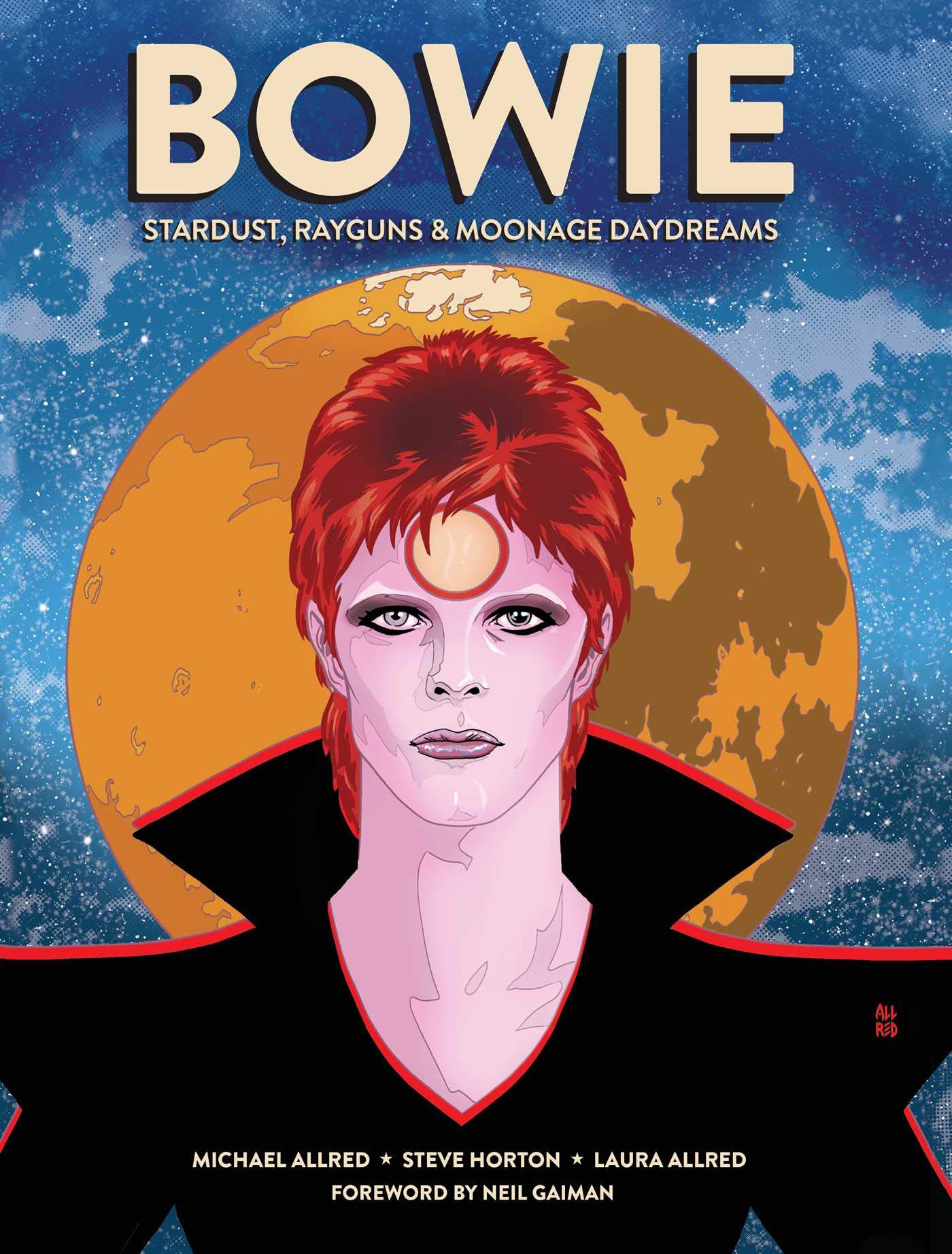
Michael Allred, Steve Horton, and Laura Allred’s graphic biography Bowie: Stardust, Rayguns, & Moonage Daydreams is a love letter to musical legend and bisexual chameleon, David Bowie. The book mainly focuses on his Ziggy Stardust period with the Allreds beautifully illustrating a montage of live shows as Bowie’s creation and the Spiders from Mars come to vivid life in Europe, North America, and Asia. Horton and Allred use the Spiders’ final gig at London’s Hammersmith Odeon as a framing narrative. Because Bowie had a six-decade recording career, this narrative strategy is effective and also turns the comic into a history of a certain period of pop music when peace beads and flower headdresses were replaced with elaborate makeup, big guitars, and all things glam.
Although the ever-shifting image of David Bowie himself is always at the center of Bowie, Horton and Allred tell their story in what is basically a series of montages. There will be a beautiful dream sequence with a trippy color palette from Laura Allred that visually shows the inspiration of hit songs like “Space Oddity”, “Life on Mars”, or “Rock n Roll Suicide” to name a few, and then we’ll get a list of various celebrities at a Ziggy Stardust show or a check-in on what’s happening with his contemporaries like T. Rex’s Marc Bolan or Lou Reed.
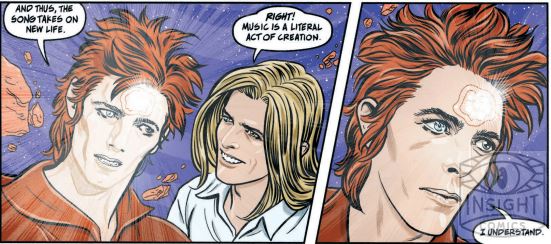
For the most part, Horton uses minimal captions and lets Mike Allred’s art and Laura Allred’s tell the story. But when the comic calls for it, he can inject moments of humor like Bowie’s reaction to his son Zowie (Now director Duncan Jones) destroying his record collection or poignancy when Bowie reflects on his family’s history of mental illness or begins to articulate the idea of Ziggy Stardust and the Spiders from Mars to his band. Horton and Allred draw parallels between both Ziggy and Bowie’s hubris as he turns a blind eye when his corrupt lawyer is paying long term band members three times less than relatively new keyboard player, Mike Garson. Although they’re iconic images, there is an air of ego to Bowie’s famous Aladdin Sane photo shoot with Allred’s use of negative space crowding the Spiders from Mars out of the frame even though guitarist Mick Ronson was a vital part of his music and helped keep him focus when he was too busy flirting with his lover-turned-wife, Angie.
However, what will stay with me most from Bowie are the Allreds’ ability to capture the energy of live music while still doing spot-on likenesses of historical figures performing. When Mick Ronson and Bowie harmonize on “Starman” or (controversially) embrace on a Top of the Pops performance, there is a camaraderie and almost sexual chemistry between the two men that makes the later “breakup” scene emotionally resonant. Although Allred mainly puts Bowie at the center of the frame, he makes sure to cut to the audience and their hands as they are inspired and reaffirmed that it’s okay to be a little strange or non-heterosexual by this benevolent, iconic alien before them. The Allreds add some flourishes like Kirby Krackle every time Bowie does something that is especially extraterrestrial like floating in space in an early film that was a companion to “Space Oddity”.
Underneath the heavily researched and striking fashions and celebrity cameos, Bowie is about creating an identity out of the things one is passionate about. For example, Bowie and his band mates saw A Clockwork Orange when it was first release, and it immediately impacted the costuming, visual design, and even the intro of the Ziggy Stardust live show. Basically, he was a huge nerd for pop and folk music, high fashion, literature, and film, and it shown out in both his art and the way he approached the world. Bowie is filled with moments where Horton and Allred (And by extension, David Bowie) respects their fellow artists like a full page splash homage to Bob Dylan and Elvis, bringing up Lou Reed on stage, running around Detroit with Iggy Pop, and inspiring the young Morrissey and Bruce Springsteen during his concerts. It shows that art can lead to friendship, lifelong influences, and sometimes tragedy like the aforementioned tension between Ziggy Stardust and the Spiders from Mars.
Bowie: Stardust, Rayguns, and Moonage Daydreams is a highly stylized, yet infinitely human look at an important period in David Bowie’s career from Mike Allred, Steve Horton, and Laura Allred. The graphic biography captures the feeling of the music of Ziggy Stardust and Aladdin Sane through dreamlike visuals as well as adding historical context to these songs and albums and personal anecdotes that add both vulnerable and mystique to Bowie’s story. Its epilogue also kind of made me want a sequel featuring the Thin White Duke and some of Bowie’s later personas. This book truly feels like a passion project and transported me to a bittersweet day six years when a closeted, sad teenager listened to the CD of The Rise and Fall of Ziggy Stars and the Spiders from Mars and felt “not alone”. It’s a must read for any Bowie fan, especially those who love his early-1970s work the best.
Story: Steve Horton and Michael Allred
Art: Michael Allred Colors: Laura Allred
Story: 7.5 Art: 9.5 Overall: 8.5 Recommendation: Buy
Insight Comics provided Graphic Policy with a FREE copy for review
Purchase: Amazon (Regular Edition) – Zeus Comics