Author Archives: Logan Dalton

Review: Heavy #1 Puts a Fun Spin on the Man-Pain Vigilante Genre

Heavy #1

Writer Max Bemis, artist Eryk Donovan, and colorist Cris Peter deconstruct the shit out of the whole “bad guy kills a good guys wife so he becomes a vigilante and takes revenge on them” genre in Heavy #1. The premise of the comic is that Bill lost both his wife and his life to the bullets of an Irish mobster and got stranded in a place called The Wait. Think Purgatory, but more Uber and less Dante. He plays the role of “Heavy” in The Wait killing and using violence to keep the multiverse “righteous” and maybe be reunited with his wife one day. Bemis mines a vein of dark humor in Heavy and couples it with a little of the old ultraviolence from Donovan and Peter while also caring about Bill’s mental health.

Heavy #1 is a laugh out loud funny and outrageous satire of the old tough guy mentality. Bemis’ script makes many references to action movies and heroes while undercutting their tropes. For example, Bill isn’t good at his Heavy job because he was ex-military; he’s good because of the non-stop repetition of his work. If something is the only thing you do all day, every day, you’re bound to get good at it. Donovan and Peter illustrate this in a single jaw-dropping image of Bill doing cool things with guns over and over. But then Bemis undercuts it with a quick one-liner as if taunting the reader to not find fist pumping entertainment value from Bill doing badass things when he’s basically the gun-toting anti-hero version of Sisyphus rolling his boulder up the hill.

This rhythm of badass thing followed by joke at the badass thing’s expense starts in basically the first scene of the comic where Bill gives a teenage bully a taste of his own medicine with a powerful punch and an acid drop of pink. Then, Bill is back in office with his boss Kyle, who is yelling at one of her other Heavies. It adds a touch of humanity to Bill as a character. He’s Charlie Brown getting the football yanked out from under him, but with more violence and weirdness. Max Bemis and Eryk Donovan even take some time to riff on the whole flashback visions of the dead wife trope, and while Cris Peter uses an extra-radiant palette for Bill’s dearly beloved, she gives him such a good advice as moving on and finding friends. But, of course, Bill doesn’t listen, and he won’t even take a Heavy partner to give him a better chance of getting out of The Wait and finding bliss.

Seriously, Heavy #1 goes to some weird places and is a better book for it. It will probably take a life time of brain bleach for me to scrub out the image of an alternate universe Leonardo da Vinci, who has gone from designing futuristic machines, to creating machines to remove the unsuspecting citizens of Renaissance Italy’s colons whilst indulging his foot fetish and lounging with his cock out. But that’s the mark of a good artist, and Eryk Donovan is perfectly fine indulging in absurdity while Cris Peter adds garish colors that symbolize both decadence and carnage. Because who needs photoreality when you’ve got pinks and oranges blasting through the Vatican, and Bill landing cheesy, yet epic one-liners about da Vinci forgetting to invent bullets while he was too busy doing his steampunk thing. And when he gets to do that, Bemis and Donovan remind readers that Bill is an incredibly competent killer thanks to his hours of practice and not much else going on. But he definitely needs some help in the mental health and self-actualization department.

Max Bemis takes the dark humor of both his songs with Say Anything and great comics like Moon Knight and Foolkiller combines it with unparalleled violence and wild, eye-popping visuals from Eryk Donovan and Cris Peter. There’s also strong, Vertigo-style supernatural world-building with tongue firmly placed in cheek; think less Sandman and more Preacher. Whether you like vibing out and thinking about the multiverse, afterlife, and moral philosophy, or just reading about a guy who kills the shit out of people thanks to his ever-present man-pain, Heavy #1 is a strong debut and the comic for you.

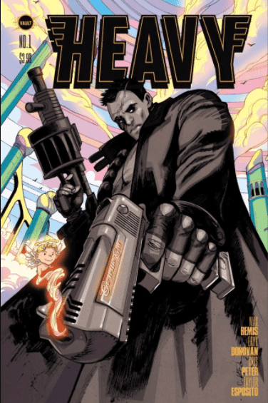
Story: Max Bemis Art: Eryk Donovan
Colors: Cris Peter Letters: Taylor Esposito

Story: 8.4 Art: 9.0 Overall: 8.7 Recommendation: Buy

Vault provided Graphic Policy with a FREE copy for review


Purchase: comiXology – Kindle – Zeus Comics

Comics Deserve Better Episode 9: Copra Round One by Michel Fiffe

In the penultimate episode of this season of Comics Deserve Better, Brian, Darci, and Logan talk about the re-release of the Scott Pilgrim beat ’em up and the Little Bird prequel. However, the main attraction is a lively chat about Michel Fiffe‘s ass-kicking Silver Age-Ditko-meets-Bronze-Age-Ostrander pastiche, Copra. Other comics mentioned, include On the Stump, Klaus Hargreeves’ solo comic, Slaughterhouse-Five, Flower of the Deep Sleep, and Heavy #1.

Review: You Look Like Death: Tales from the Umbrella Academy #1

YOU LOOK LIKE DEATH TALES UMBRELLA ACADEMY #1

Everyone’s favorite member of the Umbrella Academy, Klaus Hargreeves aka Seance, finally gets his own solo series in You Look Like Death: Tales from the Umbrella Academy #1 from writers Gerard Way and Shaun Simon and the (sadly underrated in the United States) artist I.N.J. Culbard. The book also acts as a bit of a prequel to the main Umbrella Academy series and is set after Klaus is expelled from the Academy for drug use and other shenanigans by his exacting adoptive father, Sir Reginald Hargreeves. But it’s an entertaining story in its own right full of, well, drug use, vampire chimpanzee crime lords, a dash of humor, and clean, evocative art and colors from Culbard.

With a varied power set and a charismatic personality in both the Umbrella Academy show and comics, Klaus’ escapades are ripe fodder for a solo spinoff. Way, Simon, and Culbard spend the first small bit of the book establishing why Klaus is so out of place at the Umbrella Academy and establishing his frenemy-ish relationship with his siblings Luther, Allison, and Diego as well as his enmity-filled relationship with Sir Reginald through zippy, humorous vignettes. Culbard uses grid-like layouts to show how Klaus is trapped in the orderly world of the Academy before opening up the page when he hits the road to The City and beyond with a dream and a cardigan. (And a suitcase for accuracy purposes.) His color choices also match this mood going from neutral tones to basically candy with the ever-present green whenever Klaus uses his abilities, such as possessing people or communicating with the dead.

Something I love about Umbrella Academy is how much it embraces the strangeness of superpowers and the folks that wield them starting in the first issue of the series when the young Umbrella Academy fights Zombie-Robot Gustave Eiffel in Paris. Gerard Way, Shaun Simon, and I.N.J. Culbard continue that tradition in You Look Like Death #1 while maintaining laser focus on the character of Klaus and what he does to keep busy/have fun/keep the talking to dead people pain away while being away from his siblings. The miniseries has been advertised to take place in Hollywood, but the lion’s share of You Look Like Death #1 takes place in The City.

Way, Simon, and Culbard dig into the generic superhero city, NPCs, and all aspect of the setting as soon as Klaus packs his bags. I will probably never stop laughing at a place where you can obtain drugs at a shop with a neon sign that says “Drugs” and is probably part of larger 7/11-esque franchise owned by the aforementioned chimpanzee vampire drug lord. This playful approach to setting persists even when Klaus hits the West Coast, and he goes from standing out to being just part of the scenery. And speaking of the scenery, I.N.J. Culbard adds all kind of wonderful background dressing when Klaus goes out and about, like interesting back tattoos or darkly humorous posters in adoption centers, that add to the liveliness of the world that he, Gerard Way, and Shaun Simon have crafted. I am definitely down to follow Klaus down some dark alleys and into buildings with fun graffiti patterns and even more fun denizens inside.

You Look Like Death #1 is a direct hit to the pleasure-feeling parts of your brain. I got the same feeling from reading this comic as I did driving into cop cars and hapless civilians in the Grand Theft Auto games sans all the unnecessary carnage. Klaus uses his powers for pure hedonism, angers authority figures, and has a good time, rinse and repeat. There’s also a bit of void-filled darkness because what else would you expect from a co-writer, who sang lead vocals on “Helena”. However, that’s background radiation. For now, You Look Like Death is the feel-good party comic with queer lead of 2020, but drink plenty of water and get ready for that hangover in subsequent issues…

Story: Gerard Way and Shaun Simon
 Art: I.N.J. Culbard Letters: Nate Piekos
Story: 8.5 Art: 9.0 Overall: 8.8 Recommendation: Buy

Dark Horse Comics provided Graphic Policy with a FREE copy for review


Pre-Order: comiXologyKindleZeus Comics

Early Review: You Look Like Death: Tales from the Umbrella Academy #1

YOU LOOK LIKE DEATH TALES UMBRELLA ACADEMY #1

Everyone’s favorite member of the Umbrella Academy, Klaus Hargreeves aka Seance, finally gets his own solo series in You Look Like Death: Tales from the Umbrella Academy #1 from writers Gerard Way and Shaun Simon and the (sadly underrated in the United States) artist I.N.J. Culbard. The book also acts as a bit of a prequel to the main Umbrella Academy series and is set after Klaus is expelled from the Academy for drug use and other shenanigans by his exacting adoptive father, Sir Reginald Hargreeves. But it’s an entertaining story in its own right full of, well, drug use, vampire chimpanzee crime lords, a dash of humor, and clean, evocative art and colors from Culbard.

With a varied power set and a charismatic personality in both the Umbrella Academy show and comics, Klaus’ escapades are ripe fodder for a solo spinoff. Way, Simon, and Culbard spend the first small bit of the book establishing why Klaus is so out of place at the Umbrella Academy and establishing his frenemy-ish relationship with his siblings Luther, Allison, and Diego as well as his enmity-filled relationship with Sir Reginald through zippy, humorous vignettes. Culbard uses grid-like layouts to show how Klaus is trapped in the orderly world of the Academy before opening up the page when he hits the road to The City and beyond with a dream and a cardigan. (And a suitcase for accuracy purposes.) His color choices also match this mood going from neutral tones to basically candy with the ever-present green whenever Klaus uses his abilities, such as possessing people or communicating with the dead.

Something I love about Umbrella Academy is how much it embraces the strangeness of superpowers and the folks that wield them starting in the first issue of the series when the young Umbrella Academy fights Zombie-Robot Gustave Eiffel in Paris. Gerard Way, Shaun Simon, and I.N.J. Culbard continue that tradition in You Look Like Death #1 while maintaining laser focus on the character of Klaus and what he does to keep busy/have fun/keep the talking to dead people pain away while being away from his siblings. The miniseries has been advertised to take place in Hollywood, but the lion’s share of You Look Like Death #1 takes place in The City.

Way, Simon, and Culbard dig into the generic superhero city, NPCs, and all aspect of the setting as soon as Klaus packs his bags. I will probably never stop laughing at a place where you can obtain drugs at a shop with a neon sign that says “Drugs” and is probably part of larger 7/11-esque franchise owned by the aforementioned chimpanzee vampire drug lord. This playful approach to setting persists even when Klaus hits the West Coast, and he goes from standing out to being just part of the scenery. And speaking of the scenery, I.N.J. Culbard adds all kind of wonderful background dressing when Klaus goes out and about, like interesting back tattoos or darkly humorous posters in adoption centers, that add to the liveliness of the world that he, Gerard Way, and Shaun Simon have crafted. I am definitely down to follow Klaus down some dark alleys and into buildings with fun graffiti patterns and even more fun denizens inside.

You Look Like Death #1 is a direct hit to the pleasure-feeling parts of your brain. I got the same feeling from reading this comic as I did driving into cop cars and hapless civilians in the Grand Theft Auto games sans all the unnecessary carnage. Klaus uses his powers for pure hedonism, angers authority figures, and has a good time, rinse and repeat. There’s also a bit of void-filled darkness because what else would you expect from a co-writer, who sang lead vocals on “Helena”. However, that’s background radiation. For now, You Look Like Death is the feel-good party comic with queer lead of 2020, but drink plenty of water and get ready for that hangover in subsequent issues…

Story: Gerard Way and Shaun Simon
 Art: I.N.J. Culbard Letters: Nate Piekos
Story: 8.5 Art: 9.0 Overall: 8.8 Recommendation: Buy

Dark Horse Comics provided Graphic Policy with a FREE copy for review


Pre-Order: comiXology

Comics Deserve Better Episode 8: Fearscape by Ryan O’Sullivan, Andrea Mutti, Vladmir Popov, and Andworld Design

Brian, Darci, and Logan court controversy yet again by discussing the news about the Keanu Reeves/BOOM! Studios KickStarter BRZKR as well as the announcement of the 4 Kids Walk Into the Bank film and the 2020 Ignatz Awards. But the main event of the episode is a discussion of Ryan O’Sullivan and Andrea Mutti‘s Vault Comics fantasy series Fearscape. Two of our hosts liked this book, but one was definitely drinking the haterade. You’ll have to listen to the episode to find out who’s who. Finally, other comics mentioned in this episode include Tartarus, Akagami no Shirayukihime, Grendel Kentucky, Ice Cream Man Presents: Quarantine Comix, Seance Tea Party, and Powers: The Best Ever. (Episode art by Andrea Mutti)

Early Review: Commanders In Crisis #1

COMMANDERS IN CRISIS #1

“When all our hope is gone, we have to hold on”- Nine Inch Nails, “We’re In This Together”

Like master alchemists, writer Steve Orlando, artist Davide Tinto, and colorist Francesca Carotenuto turn in a comic that is part “crisis” crossover, part high concept superhero story, and just a whole lot of fun with side of intrigue. Commanders in Crisis #1 also features a truly diverse and multicultural cast of superheroes, who have unique abilities and personalities that aren’t stereotypes. Frontier, Prizefighter, Originator, Sawbones, and Seer might remind you of characters that appear in comics written by creators like Grant Morrison and Kurt Busiek and drawn by Frank Quitely and George Perez, but Orlando and Tinto weave these visual and verbal influences into a wonderful, new multiversal tapestry.

Commanders in Crisis has blockbuster stakes, but Orlando and Tinto seed in personal and human moments for their team of heroes aka the Crisis Command, who get introduced with a double page splash and bold lettering from Fabio Amelia. After a drab, mystery tinged start, colorist Carotenuto pours a metaphorical Jelly Belly machine of colors onto the page as the Crisis Command springs into action against the aptly named Mind Muggers. The name of the baddies alone show the blend of street-level and cosmic action that Commanders in Crisis brings to the table. Whether your ideal superhero story is Final Crisis or the bits in Spider-Man 2 where Peter Parker has no powers and isn’t in costume, this comic has a moment, page, or panel for you. There’s cool, complicated parts, parts that makes you feel, and parts that makes you feel like you’re a kid watching Saturday morning cartoons or picking a book off the spinner rack again.

Commanders in Crisis #1 also does what some of my favorite superhero stories do: it uses eye-popping and memorable things like punching, flying, or something more conceptual like using the power of language to save the day to stand in for abstract ideas like truth, justice, and all that stuff. But, mostly, hope. There is hope in the fact that Prizefighter (aka my new favorite queer superhero) immediately goes from a world-ending team battle to a solo excursion to save a burning building. And Steve Orlando and Davide Tinto create similar hopeful moments from the other members of Crisis Command while building up a formidable opponent that made me instantly want to know what happened in issue two. I would definitely read a long-running series with this team.

Hope also comes through Davide Tinto and Francesca Contenuto’s visuals as well as Orlando’s scripting in Commanders in Crisis #1. Tinto turns in clean, iconic superhero poses while also drawing emotionally open facial expressions when the team is “off the clock”. (I can definitely get into a superhero comic that addresses work/life balance.) His designs hint at the inspirations for each member of Crisis Command while also making something memorable, novel, and connected to their personality. As mentioned earlier, Carotenuto’s varied color palette contributes to their memorable nature. These are characters I would definitely buy merch or action figures of, and I also care deeply whether they live or die.

Commanders in Crisis #1 reads like the comic book equivalent of a doctorate dissertation in superhero comics from writer Steve Orlando and star-making turn for artists Davide Tinto and Francesca Carotenuto. It’s the first chapter in an epic saga that doesn’t neglect character in the midst of its multiversal scope and also leaves room for fluid action, clever concepts, and moments that will make you smile or shudder. This is while basking in the glow of a cast that is truly inclusive, who I can’t wait to see overcome monumental challenges in subsequent issues.

Commanders in Crisis #1 is set to be released on October 14, 2020. You can preorder a copy at your local comic book store using the below form until the final order cutoff of September 21, 2020.

Story: Steve Orlando Art: Davide Tinto 
Colors: Francesca Carotenuto Letters: Fabio Amelia
Story: 9.0 Art: 8.5 Overall: 8.8 Recommendation: Buy

Steve Orlando/Image Comics provided Graphic Policy with a FREE copy for review


Pre-order: comiXologyKindle

Early Review: The Impending Blindness of Billie Scott

The Impending Blindness of Billie Scott

The Impending Blindness of Billie Scott is a coronation for writer/artist Zoe Thorogood as one of the great cartoonists of this decade. The comic chronicles the life of Billie Scott, who has been contracted by an art gallery to make ten paintings for an exhibition. However, an altercation that detaches her retina, throws a spanner in the works, and she learns that she is going to go blind in a couple weeks. This diagnosis acts as a kind of wake-up call as she actually interacts with her flatmates and hits the road to London meeting a dynamic cast of characters along the way while also making wonderful art that truly captures the human condition.

This memorable cast of characters also provides Thorogood with an opportunity to create a kind of art within the art as she draws the sketches of the subjects that lead to Billie’s paintings. This comic shows that she is fascinated by people and their inner workings, and Billie Scott has a sense of hope and wonder despite its protagonist’s loss of sight. Along with Billie, Thorogood populates her comic with a wonderful cast of characters from folk punk artist Rachel (who keeps getting thrown out of bars) and bride-to-be Sara to Falklands war veteran Arthur and mysterious “cool girl” Iris. Billie builds relationships with them that directly influences her art.

To lead off, Billie Scott has the most authentic portrayal of the lonely and isolating nature of the creative act in almost any work of art sans the early lyrics of Morrissey. Zoe Thorogood plays with expectations and opens the comic on a group of flatmates who one might think might be the ensemble cast that surrounds the then-unseen Billie Scott. But, apparently, they’ve never met or spoken to her. Then, cut to utter isolation and the gorgeous dark pinks that Thorogood punctuates the comic with. Throughout the early part of The Impending Blindness of Billie Scott, she portrays her protagonist as being wholly focused on her art at the detriment of having a social life, support system, or proper sleep schedule. Billie unpacks this feeling later on in conversations with folks at the shelter and trash dump that she crashes at in London as she comes to terms with her earlier isolation and the new community that she’s found by the end of the comic.

Zoe Thorogood’s loose line work, Ben Day dots, and varying panel structures keeps Billie Scott fresh and comforting except in its several tense sequences like Billie trying to figure out what to do with herself when she books a train ticket to an unknown destination after learning she will go blind. Billie uses this train trip to try on some new personalities even though she ends up mostly hanging out with Rachel in the end. One of these personalities is hen party confidant as her active listening and keen observations almost call off a wedding while Thorogood captures the zesty energy of a night out with spots of color and swirly lines and layouts. It’s a shot of an adrenaline for the basically housebound Billie and launches her journey to meet and draw people. (And one cute dog.)

The supporting character that gets the most depth is Rachel as Zoe Thorogood digs deep into her family background, her passion for activism, and creates a nice rapport between her and Billie through dialogue and facial expressions. Like all great friendships, there is some tension later on the book, but Thorogood develops it organically and connects it to Billie’s past isolation and extreme introversion. She uses a nine panel grid for many of Billie and Rachel’s every day interactions with Rachel trying to play a gig at a local bar while Billie paints in an alley that gives feeling of comfort and routine that later gets disrupted. Also, Rachel and the aforementioned Arthur are a gateway to the communities of Third Chance (A shelter) and Funland from where Billie meets even more interesting people and finds more subjects for her paintings. It also showcases Zoe Thorogood’s ability to write different character voices.

The Impending Blindness of Billie Scott is a glorious and heart-rending look at creativity and relationships via the care-filled art and poignant writing of Zoe Thorogood. It shows all the bumps and bruises on the way to finding a found family and really captures what it’s like to deal with some life changing shit and come out pretty okay on the other side. I definitely look forward to checking out Thorogood’s future comics after being truly touched by this one.

Story: Zoe Thorogood Art: Zoe Thorogood
Story: 9.0 Art: 9.5 Overall: 9.3 Recommendation: Buy

Avery Hill provided Graphic Policy with a FREE copy for review


Pre-Order (8th October (UK) / 14th October (USA)): Amazon

Comics Deserve Better Episode 7: Suffrajitsu: Mrs. Pankhurst’s Amazons by Tony Wolf, Joao Vieira, Josan Gonzales, and Ed Dukeshire

In this episode of Comics Deserve Better, Brian, Darci, and Logan remember the life and work of actor Chadwick Boseman, discuss the racist behavior of cartoonist Noelle Stevenson on a She-Ra livestream, and preview the Harvey Awards. Then, they chat about the super fun alternate history comic Suffrajitsu: Mrs. Pankhurst’s Amazons by Tony Wolf and Joao Vieira. Other comics mentioned on the show include Ghosted in LA, Winter Parting, Inkblot, Lonely Receiver, We Only Find Them When We’re Dead, and the upcoming Department of Truth. (Episode Art by Joao Vieira)

Advance Review: The Department of Truth #1

The Department of Truth #1

The Department of Truth #1 opens on November 22, 1963, the fateful day in Dallas when President John F. Kennedy was assassinated with Martin Simmonds’ artwork evoking fuzzy video coverage like shots of cryptids or a second shooter on that grassy knoll. As the comic progresses, Simmonds’ visuals and James Tynion IV’s larger premise for the series come into sharper focus, but in the end, there are still more questions than answers. And, honestly, that’s what you want out of an ongoing monthly comic, especially one driven by conspiracies within conspiracies within, well, conspiracies.

A key reason that I enjoyed The Department of Truth #1 was Martin Simmonds’ art. He marries grid layouts with the fully painted art style of Duncan Fegredo and Paul Johnson’s work in the early 1990s or even the panache of David Mack and Bill Sienkiewicz. However, it’s not just pretty pictures or cool compositions but has motion and storytelling weight too. Simmonds can also be a vicious caricaturist, like in his drawing of the Flat Earth Society members that match the dry, snarky narration that Tynion writes for the protagonist, Cole.

You can tell he doesn’t have a high opinion of most of these characters, and it drives his line art and color palette to new heights like a blood red composition of a couple of rich, conspiracy-mongering assholes through Cole’s shades. Everything is more memorable from the perspective of sunglasses, and that goes for both film and comics. Martin Simmonds’ layout choices match the story’s pace with lots of small, skinny panels during interrogation sequences to big splashes for reveals or when he and Tynion want to touch on a big picture theme. I enjoyed Martin Simmonds’ work on the Punks Not Dead comics for IDW as well as his fill-in issue of Immortal Hulk, but Department of Truth is a true level up for him as a cartoonist with him crossing into Sienkiewicz-esque territory with his depiction of corruption, deceit, and maybe once or twice, truth.

Unlike the 1990s when conspiracy theories seemed fun and quirky (Think X-Files.), they have become scarier thanks to folks like QAnon, who bundle their outlandishness and useless misdirection with plenty of white supremacy and anti-Semitism. Tynion is aware of that and bakes in conspiracy’s current right-wing nature while also making references to its let’s say, cuddlier, past starting with the JFK assassination. This conflict and need for finding a happy medium feeds into the book’s underlying theme and also makes it seem more relevant with characters popping up that you might Google to see if they’re not some obscure far-right commentator on one of those websites or premium cable news channels that make Fox almost seem (Emphasis on the almost) fair and balanced. While the plot begins to unfold and the premise is established, James Tynion and Martin Simmonds also delve into the mindset of the conspiracy theorist, and why it’s so attractive. Think Grant Morrison’s Invisibles, but in the age of Pizzagate and 8chan.

The Department of Truth #1 is an engaging debut issue with James Tynion tapping into the expansive worldbuilding of his previous titles like Memetic and its sequels while Martin Simmonds shows that painted art can have a few, new tricks up its sleeves in 2020. They also introduce some actually compelling mysteries and tap into our fearful zeitgeist where believers and spinners of harmful conspiracies have entirely too much power.

Story: James Tynion IV Art: Martin Simmonds Letters: Aditya Bidikar
Story: 8 Art: 9 Overall: 8.5 Recommendation: Buy

Image Comics provided Graphic Policy with a FREE copy for review


Pre-Order, out September 30: comiXologyKindle

Comics Deserve Better Episode 6: Laura Dean Keeps Breaking Up with Me by Mariko Tamaki and Rosemary Valero-O’Connell

In a jam packed episode of Comics Deserve Better, Brian, Darci, and Logan discuss the latest indie comics news, including Valiant’s move to L.A., Peter Milligan’s new comic for Ahoy, and comics used as tools of democratic activism in Thailand. But the main topic of the podcast is the YA LGBTQ+ comic masterpiece Laura Dean Keeps Breaking Up with Me, and some of us get a little personal in chatting about this beautiful story of friendship, romance, growing up, and toxic relationships. Other comics mentioned on the show include Gideon Falls, Adler, and Mega Man: Fully Charged as well as the Source Point Press titles Bug Bites and Burning Tree.

(Episode art by Rosemary Valero O’Connell)

« Older Entries Recent Entries »