Review: My Riot
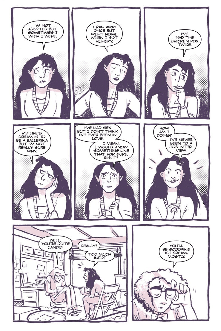
What if the “she” of Avril Lavigne’s 2002 hit “Sk8er Boi” was both a punk and did ballet? Rick Spears and Emmett Helen succeed in answering this question in their upcoming riot girl personal narrative My Riot. My Riot is about a teenager named Valerie, who has lived a pretty regimented life up to this point. Her parents are fairly conservative, and she dances ballet and works an after school at an ice cream shop. Her only acts of rebellion are sometimes fooling around with guys and smoking cigarettes to “make weight” for the ballet’s performance of Swan Lake. However, witnessing a riot changes her life, and she ends up going to punk rock shows with her new friends Kat and Rudie (Who gets some of the book’s funniest lines) and starts a band ironically called The Proper Ladies even though she can’t play an instrument. There are love triangles, arguments, pitfalls, and yes, triumphs along the way as Spears and Helen tell a coming of age story through the trappings of early 1990s punk rock.
Throughout My Riot, Emmett Helen matches the energy of his artwork to the emotions that Valerie is feeling at any given time. He uses light lines and washed out, monochromatic baby blues in the beginning of the story as Valerie goes through the motions of ballet. She loves to dance, but hates the control that her teacher has over her body weight and shape and the cruel comments she makes. Helen’s palette stays sickly and suburban until he shows Valerie’s first meeting with Kat, who is vandalizing a teacher’s house and then swipes one of her cigarettes. This darker color palette and more chaotic line work shows up later when rioters throw a brick in the window at Valerie’s work and rise to a peak at Valerie’s punk rock show where she realizes she’s attracted to Jake, the sex negative, straight edge guy that talked shit to her for drinking soda with artificial sweetener. With its minimal color, Ben-Day dots, and “glued together” grid layouts, sometimes My Riot feels like one of the zines that The Proper Ladies’ fans bring to their show and exchange with other fans of riot girl music.
Emmett Helen’s art gets even more intense whey he depicts The Proper Ladies’ first gigs, and he has a real knack for iconic imagery, like Valerie’s perfect stage dive, or the venom and agency she has when she calls out some audience members for their sexist behavior. However, Rick Spears doesn’t rush to the fun, drama-filled rock star part and shows the bumps and bruises of learning how to play guitar, cohere as a band, and win over an audience. There’s an added degree of difficulty with Valerie being grounded by her parents as she learns chords from Jake at school and then jams with Kat over the phone. However, there is a real passion in these early sessions that contrast with the listlessness of her ballet practice even though she thinks her partner, Danny is kind of cute.
A major theme of My Riot is Valerie is taking control of her own life through music, and Rick Spears’ lyrics for The Proper Ladies echo her emotions and earlier events in the comic. For example, she has a real napalm strike of a song called “Fucking” that is connected to how her mom acts when she finds condoms in her room and also how Jake feels when she tells him that she’s not a virgin. Religion and purity culture aren’t mentioned in this book, but the male characters especially are firm followers of the Madonna/whore complex. However, Spears’ characterization of Valerie’s parents is balanced; they’re strict, but not Amish even though she has to work around them to start the band and use some fake sleepovers as excuses for their first tour dates. He and Emmett Helen even include scenes where they talk about how they might be too hard on her, and this friendly, yet complicated, and very relatable relationship gets some real emotional payoff in the back end of the book.
Rick Spears and Emmett Helen dig deep and capture the epic emotions of growing up through the language of spot colored, ink slinging punk rock comics in My Riot. Valerie is a well-developed protagonist with a complex web of relationships that directly bleed into her music and lyrics. It’s really beautiful to see her journey from simply being to becoming as some very un-punk philosophers would say.
Story: Rick Spears Art/Colors: Emmett Helen
Story: 8.5 Art: 9.0 Overall: 8.8 Recommendation: Buy
Oni Press provided Graphic Policy with a FREE copy for review
Purchase: comiXology – Kindle – Amazon – Zeus Comics