
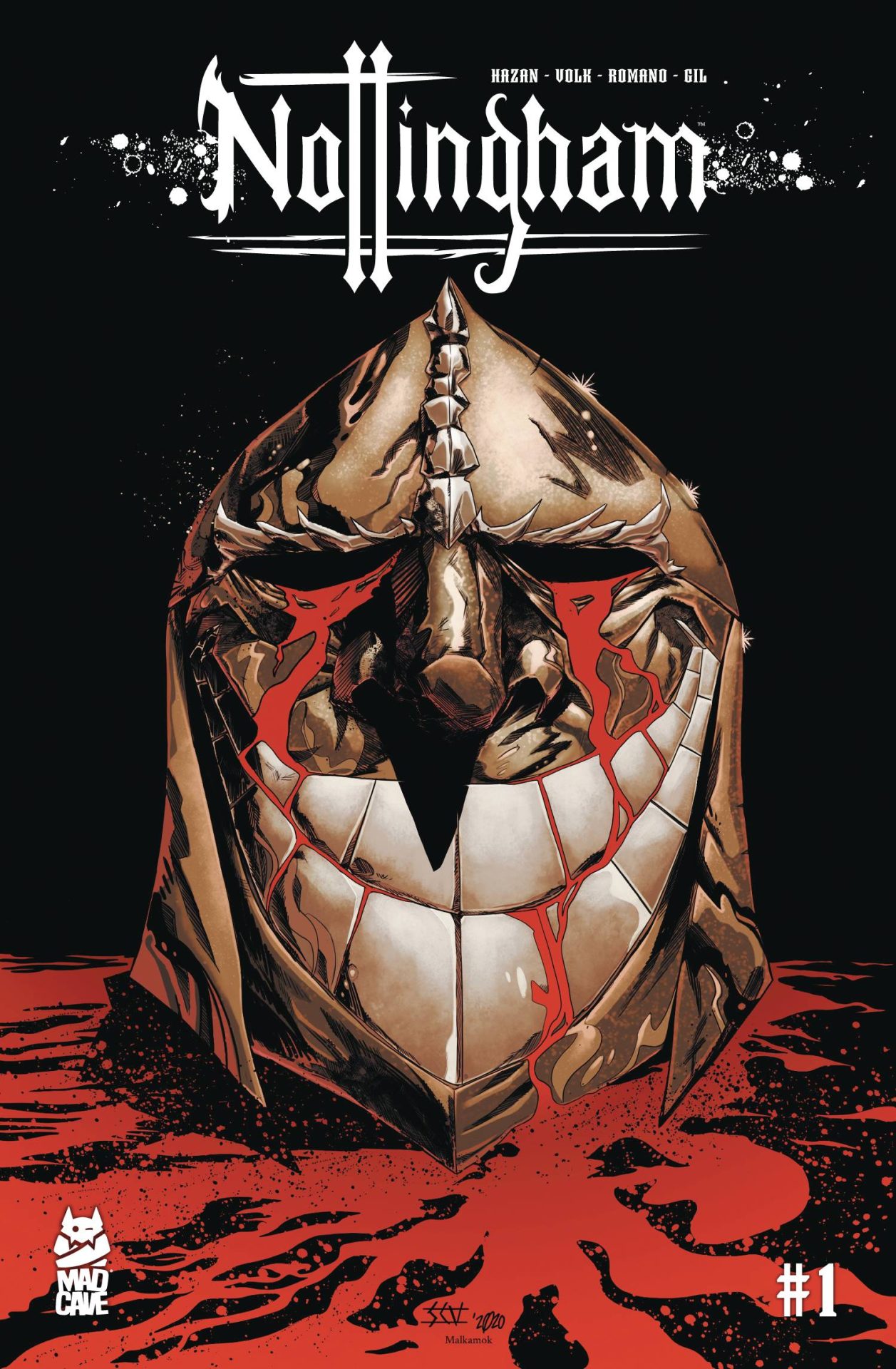
Review: Nottingham #1
The story of Robin Hood has been told many times and in many ways. In my experience, there are three stand out versions and everyone has their favorite. There’s the animated Disney version with the anthropomorphic animals. There’s Prince of Thieves with Costner, Freeman, Slater, and Rickman. Or there’s Mel Brooks’ seminal Men in Tights. Regardless of which version you think is best (*fake cough* Costner), get ready to add a new favorite into the mix. This March, Mad Cave Studios plans to tell Robin Hood’s story in a new and unique way with Nottingham #1.
In Nottingham, series writer David Hazan gives readers a dark, grittier version of the characters with which we’re all familiar. I was lucky enough to get a sneak peek at the first issue. Normally, I save my recommendation until the end of the review, but I just can’t wait. This is a title you’ll want to add to your pull list before it releases on March 3rd. One of Hazan’s many unique spins on the classic Robin Hood tale is that the story is told from the perspective of the Everard Blackthorrne, the Sheriff of Nottingham.
The entire first issue had the feel of a detective story and the Sheriff has all the qualities one would expect. He’s astute, stoic, and has a bit of an attitude. He also has a history of dealing with extremists, having fought in the crusades. All of Blackthorne’s skill and clout will be tested as he tries to track down a band of killers called the Merry Men, and their leader the mysterious Hood. The search for Hood and the Merry Men starts off rather slow but by the end of the issue, I was hooked by equal doses of action and intrigue.
Artist Shane Connery Volk’s illustrations truly transport the reader to twelfth-century England. He takes the time to draw every uneven brick in the walls of castles and buildings. There’s a scene set in the pouring rain where the raindrop hatch marks add a level of complexity to what’s drawn on the page. However, the characters’ faces are rather diminutive, especially compared to how richly drawn the comic’s setting is. Many of the faces look carelessly drawn, almost as if they were an afterthought. Colorist Luca Romano rectifies this to some extent by adding shading and shadow to the faces, but most of the time they still look like they were drawn by a child and not a professional comic book artist. These simplistic faces really threw off my reading, pulling my attention away from the scenes themselves.
This March, David Hazan begins a new chapter in the Robin Hood mythos with Nottingham #1. One filled with murder plots, zealous intrigue, and an element of mystery. Although the pacing of this first issue was a little slow, it picks up toward the end and it finishes with an exciting conclusion. The ending left me wanting to know more about this version of Robin Hood’s world. Volk’s artwork hits a lot of high points but the low points, namely the level of detail put into the characters’ faces, make it hard to stay completely engaged in the story. The world Volk draws feels real though, even when the character’s faces look off. Despite my criticisms, this is a series you’ll want to have on your radar, if not in your personal collection.
Story: David Hazan Art: Shane Connery Volk
Color: Luca Romano Letterer: Joamette Gil
Story: 8.0 Art: 8.0 Overall: 8.0 Recommendation: Buy
Mad Cave Studios provided Graphic Policy with a FREE copy for review
Purchase: comixology – TFAW
Discover more from Graphic Policy
Subscribe to get the latest posts sent to your email.