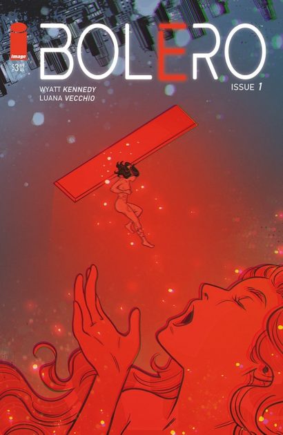
Review: Rain #1
Joe Hill is a master of emotional horror, of crafting stories that rip through the spectrum of human expression and into the darker things that pump life into his characters. Those things vary in form, be it the fears that accompany motherhood as seen in NOS4A2 or the excesses of life and the extremes they push us into in Heart-Shaped Box. In Image Comics Rain, adapted from a Joe Hill story of the same name by David M. Booher and Zoe Thorogood, the darkness comes from the concept of sudden loss and how unfair life can be when it comes to love.
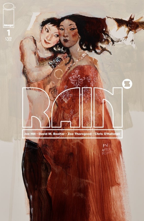
Rain follows two young women who are in the process of moving in together. Each one has had to go through the harrowing process of coming out to their parents and their experiences range from surprisingly good to deeply traumatizing. As they arrive on the day the move actually starts, sharp crystal-like nails fall from the sky, killing everyone caught outside enjoying what was originally an invitingly sunny day.
Zoe Thorogood’s art goes for a dark fairy tale feel that frames the story in a kind of magically realistic world that’s as wondrous as it is lethal. It’s a curious approach given the only fantastical element thus far, in the first issue, is the rain of nails. Regardless, the strangeness of the event is enough to make the entire story play out as if realism isn’t an unanimously agreed upon condition.

That’s not to say it works to its detriment. Booher’s script manages to effectively translate the scope of Hill’s emotional arcs into the comic and it does a phenomenal job of keeping things grounded in that regard. It makes for a unique marriage of text and art, but one that succeeds in telling a story that requires more fantasy than usual to get its point across.
There’s also a fair bit of worldbuilding on display in Rain’s first issue, especially in terms of how the couple’s relationship fits into a time and place where acceptance isn’t as widespread as we’d hope it to be. This helps make the world the characters inhabit feel unsafe, a place where people would’ve been right to expect an actual rain of deadly nails to descend upon them at any moment.
Booher and Thorogood’s adaptation of Hill’s novella is a great example of what a creative team can conjure up when it so fully understands the vision behind a story. Adaptation is no easy task, especially when it comes with the expectation it has to be as good (if not greater) than the source text. Fortunately for Rain, the first issue starts the series out on the right foot, with the promise of more darkly curious things to come.
Story: Joe Hill and David M. Booher Art: Zoe Thorogood
Story: 9.0 Art: 9.0 Overall: 9.0
Recommendation: Buy and keep a metal-plated umbrella handy. The way things are going, we should be getting sharp nail showers any minute now.
Image Comics provided Graphic Policy with a FREE copy for review purposes.
Purchase: comiXology – Kindle – Zeus Comics – TFAW