Tag Archives: neil uyetake

Review: Dungeons & Dragons: At The Spine Of The World #1
Dungeons & Dragons: At The Spine Of The World #1

First off, a bit of a confession. I love the Dungeons & Dragons comics that IDW Publishing has put out and because of that, I jumped at the opportunity to check out the debut ot the latest mini-series, Dungeons & Dragons: At The Spine Of The World #1. I was a bit down on the fact that it wasn’t going to be another series starring Minsc and it was not going to be written by Jim Zub. For the last few years, he’s written the adventures of one of D & D’s best characters. But, I still love D&D and I thought the non-Zub story A Darkened Wish was exciting.

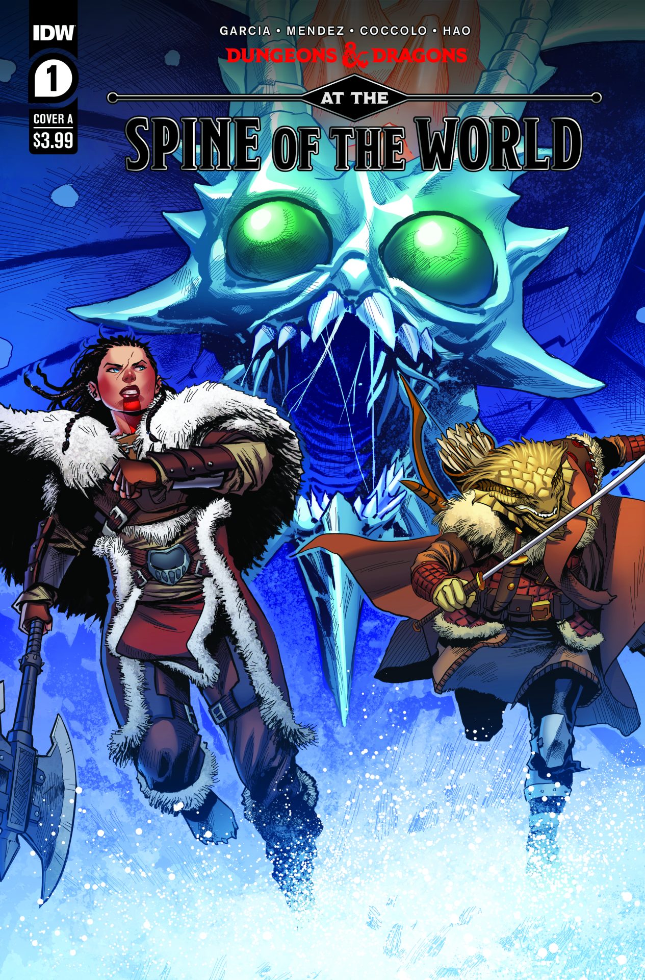
At The Spine Of The World, so far, is a tale thick in chardalyn, a magical rock of high power, and the mining expedition at the Spine Of The World go berserk on their travel to Ten Towns and more-or-less wipe each other out. A member of the Uthgardt clan sworn to protect the mountain comes across the wagon dogs. As they come back to the wreckage of the wagons, a Remorhaz breaks through everything, looking to finish what’s left of the expedition.  From there, it’s a trip to Ten Towns and more trouble, courtesy of the chardalyn.

Part of the fun of these books is seeing what locals or beasts are being used in the story. Getting a town set in Icewind Dale is awesome enough. I’m sure with the Icewind Dale: Rime Of The Frostmaiden campaign being fairly new, it may have been a no-brainer for series writers Aimee Garcia and AJ Mendez to put something together that placed a party within Icewind Dale. They’ve put together a very exciting story with the first issue that feels like a random encounter in a campaign.

My favorite moments with the art was due to the battle. Martin Coccolo’s art was eye-catching in this issue. I loved how the fight between the main characters and the Remorhaz went down. I feel like Coccolo’s detail in his art reminds me a bit of both Andy and Adam Kubert and I mean that as a compliment. He implements a good amount of character detail but nothing too heavy. I wasn’t as impressed with the art when it was a variety of characters just standing around talking. The colors by Katrina Mae Hao were very vibrant. I especially thought the snowy mountain scenes had great color. The 1:25 cover was really superb and well worth checking out.

I love the world that Dungeons & Dragons encompasses and IDW Publishing continues to do right by the properties with their comics. Dungeons & Dragons: At The Spine Of The World #1 has me excited for more issues. There’s something for everyone with these kind of stories and they put a spotlight on folks from all sorts of fantasy walks of life. At The Spine Of The World explodes with a rush of adventure from the get-go and is just the sort of tale any hardened fan of fantasy can enjoy.

Story: Aimee Garcia and AJ Mendez Art: Martin Coccolo
Color: Katrina Mae Hao Letterer: Neil Uyetake Edits: Megan Brown
and David Hedgecock
Story: 7.5 Art: 7.0 Overall: 7.5

IDW Publishing provided Graphic Policy with a FREE copy for review


Purchase: comiXology – Amazon – Kindle – Zeus Comics
Review: Transformers/Back to the Future #1 (of 4)

Transformers/Back to the Future #1

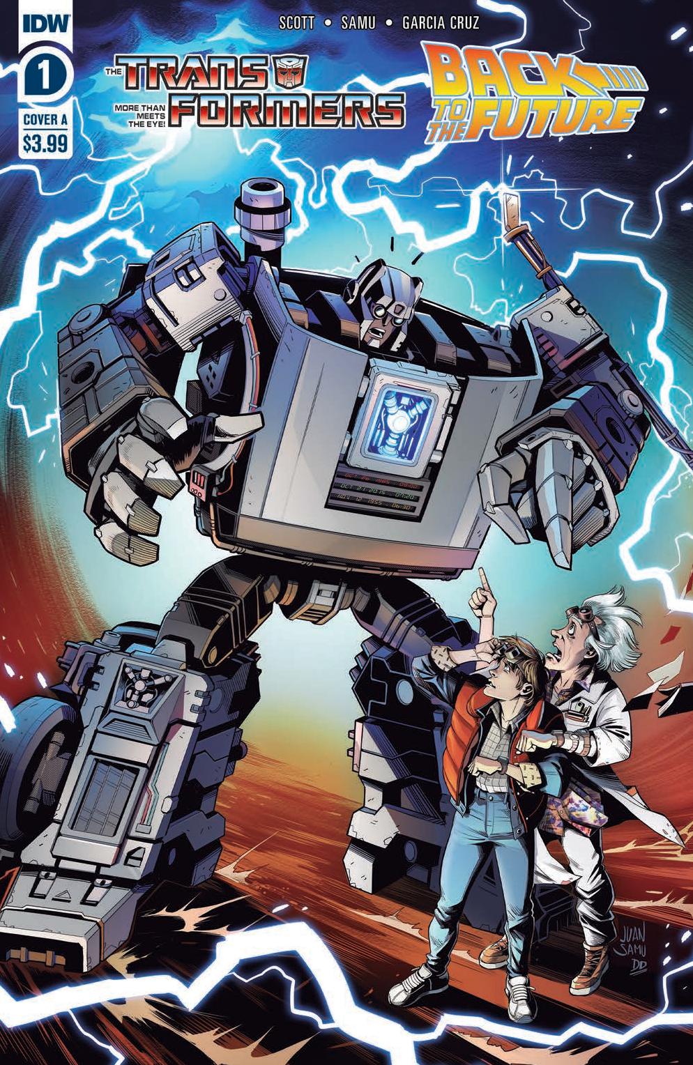
IDW Publishing has been having fun lately bringing together properties you’d never expect. Much has revolved around the Transformers who have had recent comic miniseries featuring My Little Pony and Ghostbusters. And, both of those have been great with a fun spin on the properties and a crossover that works. The latest adventure for the Transformers takes them through time as Marty McFly and Back to the Future takes center stage. Transformers/Back to the Future #1 kicks things off with a story that works, makes sense, and uses the strength of both properties.

Written by Cavan Scott, Transformers/Back to the Future #1 is the setup to the familiar ending where Marty is told he needs to go and fix the timestream to save everything. The debut issue is full of the familiar in both winks and nods and it’s storytelling. There are scenes directly lifted from the original Back to the Future but done in a way that it sets up what happens and helps introduce that classic film to new readers.

What’s interesting is that Scott just blends the two worlds. This isn’t a story where they’re part of a multiverse or some weird portal like the My Little Pony crossover. Instead, it’s 1984 and the Decepticons and Autobots are on Earth like the classic television series and comics. It just so happens Marty and Doc Brown also live on the world as well and doing their thing. It’s just a simple solution to bring the two properties together and avoids a messy explanation. It also plays a bit with what feels like the original crossover with the Transformers and G.I. Joe. They just so happen to be on the same planet.

Scott delivers a straightforward concept for those that enjoy Back to the Future and the direction from the first issue is simple. And keeping it simple is a good thing. With time travel it can get complicated and here it’s not with motivations that make sense for all. We’re left with similar questions from other films, what needs to be done to fix the timestream and how did it get messed up in the first place? That’s all part of the fun to come.

The art for Transformers/Back to the Future #1 is interesting. The style takes its queues from IDW’s Back to the Future comics with a more comedy/comic style to it. Juan Samu delivers exaggerated characters in the humans which creates a cartoon-like quality about it all. David Garcia‘s colors add to that with an end result that feels a lot like the Back to the Future cartoon. That works for the most part but with the more “serious” aspect of the Transformers, it’s at times a weird mix that leads to some tonal issues for the comic. There’s some comedy but then there’s enslavement? It’s a weird mix and clashes in some ways.

I generally enjoyed Transformers/Back to the Future #1. There’s a fun aspect to it all where it doesn’t take itself too seriously. It also knows its material and feels like it revels in switching up some of the roles and aspects in Back to the Future to fit the Transformers in. It’s what comics should be, fun. For fans of both properties, it’ll get you to want to buckle up and go back in time.

Story: Cavan Scott Art: Juan Samu
Color: David Garcia Cruz Letterer: Neil Uyetake
Story: 8.0 Art: 8.0 Overall: 8.0 Recommendation: Buy

IDW Publishing provided Graphic Policy with a FREE copy for review


Purchase: comiXology – Amazon – Kindle – Zeus Comics
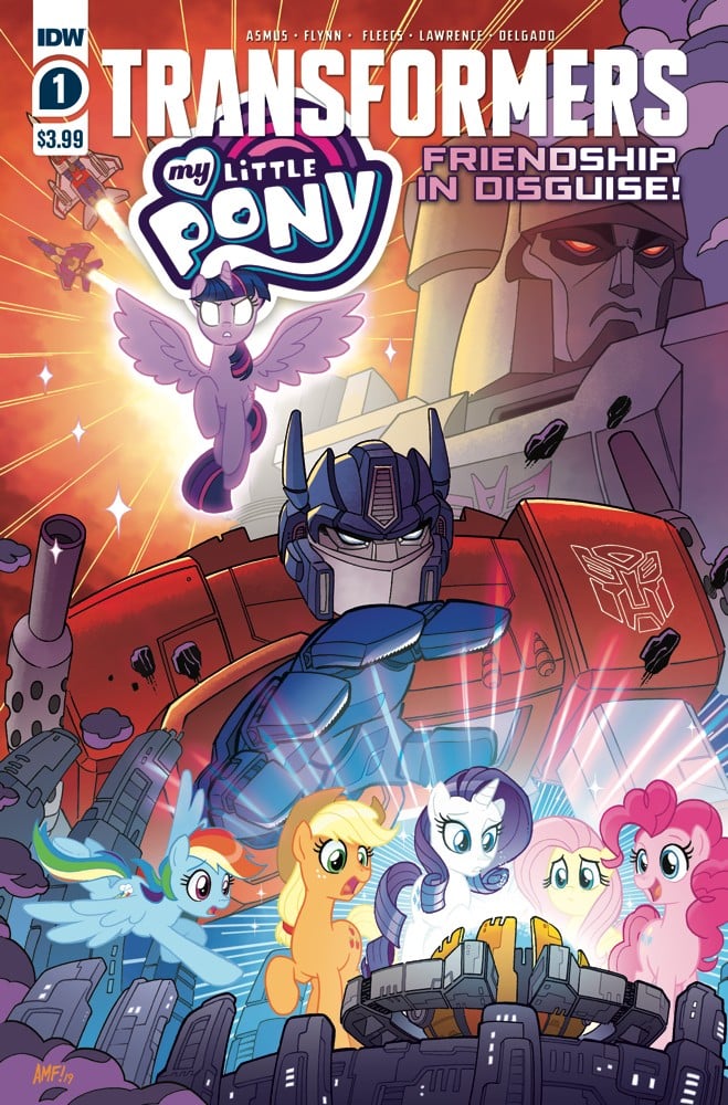
Review: My Little Pony/Transformers #1

MY LITTLE PONY/TRANSFORMERS #1

Two properties that I’d not expect to crossover are My Little Pony and Transformers. The exception might be the more kid-friendly Transformers: Cyberverse or Rescue Bots. The concept of robots that turn into things and ponies in the same universe just doesn’t quite jive. Not to mention the fact My Little Pony, in my little experience, doesn’t exactly scream intergalactic civil war, lasers, and death. But, despite being so different, My Little Pony/Transformers #1 actually works!

The story is simple. An evil wizard pony wants allies and through a spell accidentally pulls Decepticons and Autobots through their space bridge into the world of My Little Pony. From there, the battle begins as Decepticons attempt to take over Equestria while the Autobots play their best defense and try to figure out what’s going on.

My Little Pony/Transformers #1 actually features two stories but they’re blended together in a seamless transition that makes it so it’s not noticeable at all. James Asmus handles the first story involving the mashing of worlds while Ian Flynn does the second focused on Arcee who takes on Starscream.

Despite the tonal differences between the two properties, the comic works and works well. The strengths of each are played off of each other and the general “wtf” reaction from everyone makes the story feel a bit more grounded. The characters seem to recognize the silliness of it all in a sort of meta self-awareness.

The violence of the Transformers is downplayed a bit and lets face it, the Decepticons would probably roll through Equestria fairly quickly if they wanted. But instead of the violence we get Starscream’s ego being his downfall and logically preventing a genocide of ponies. He wants the adulation and followers, and needs ponies the achieve that.

The art style of the comic is interesting with Tony Fleecs and Jack Lawrence handling the first and second stories. Their styles are really close to each other so there’s a pretty easy transition from one to the other. The Transformers are adapted to be more in the style of My Little Pony and I think that’s the one thing I don’t enjoy. It’d have been interesting visually to have each kept their distinctive look and style. The tone of the series would be different though and it wouldn’t be as kid-friendly as likely. Visually though, it could have been cool.

Fleecs, Lauren Perry, and Luis Antonio Delgado provide the colors for the comic, and Jake M. Wood and Neil Uyetake handle lettering. The art team really set the tone of the series making it much more geared towards younger readers. A shift in look more towards the Transformers could have made the result feel a bit more adult.

The concept might seem like it shouldn’t work but the team pulls My Little Pony/Transformers #1 off. It doesn’t take itself too seriously and seems to know it’s a bit goofy. But, more importantly, it knows it should just have fun. I never mashed up these toys into battle together as a kid but as an adult I get to see what might have been and escape into some innocent and fun entertainment.

Story: James Asmus, Ian Flynn Art: Tony Fleecs, Jack Lawrence
Color: Tony Fleecs, Lauren Perry, Luis Antonio Delgado Letterer: Jake M. Wood, Neil Uyetake
Story: 8.0 Art: 8.0 Overall: 8.0 Recommendation: Buy

IDW Publishing provided Graphic Policy with a FREE copy for review


Purchase: comiXology – Amazon – Kindle – Zeus Comics
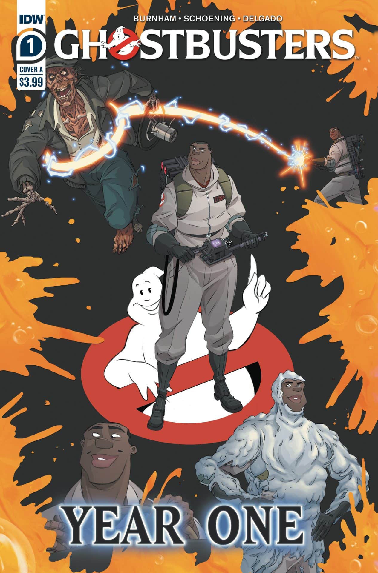
Review: Ghostbusters: Year One #1

Ghostbusters: Year One #1

We know the story of the Ghostbusters from numerous films, animated shows, and comics. But, what about that first year in business: Ghostbusters: Year One #1 kicks off the untold stories of our favorite paranormal investigators.

Written by Erik Burnham, Ghostbusters: Year One #1 focuses on the “newest” of the original Ghostbusters, Winston Zeddemore. Framed as an interview with a journalist writing a book, we get to learn some details about his experience joining the team.

Burnham adds in details that fit quite well with what we know. It’s a nice “in addition” as opposed to a retcon. We learn about what Winston was doing before joining the team and even get to see some more of the questions he was asked in his interview. But, most importantly, we learn more about him as a person and how he fit into the group and his training. It’s a great example of expanding a known universe.

The art by Dan Schoening with color by Luis Antonio Delgado is unique and stands out. It’s a style you don’t see elsewhere with a cartoon-like quality about it. Schoening’s style is one that you don’t see elsewhere and it’s hard to describe. There’s a slight homage to the cartoon series but at the same time it’s own style. What’s solid is it works for the ghosts. It doesn’t skew to horror but still fits that genre. Delgado’s colors are key with the ethereal popping from the page. Neil Uyetake‘s lettering is also key in giving the ghosts a voice to themselves through the lettering style.

Ghostbusters: Year One #1 kicks off what feels like could be a fun series. I also expect there’s more to what’s presented. The team has a nice grasp of fitting in new knowledge and deliver enough winks and nods for long-time fans. A must for fans of Ghostbusters or want a good chuckle.

Story: Erik Burnham Art: Dan Schoening
Color: Luis Antonio Delgado Letterer: Neil Uyetake
Story: 8.15 Art: 8.15 Overall: 8.15 Recommendation: Buy

IDW Publishing provided Graphic Policy with a FREE copy for review

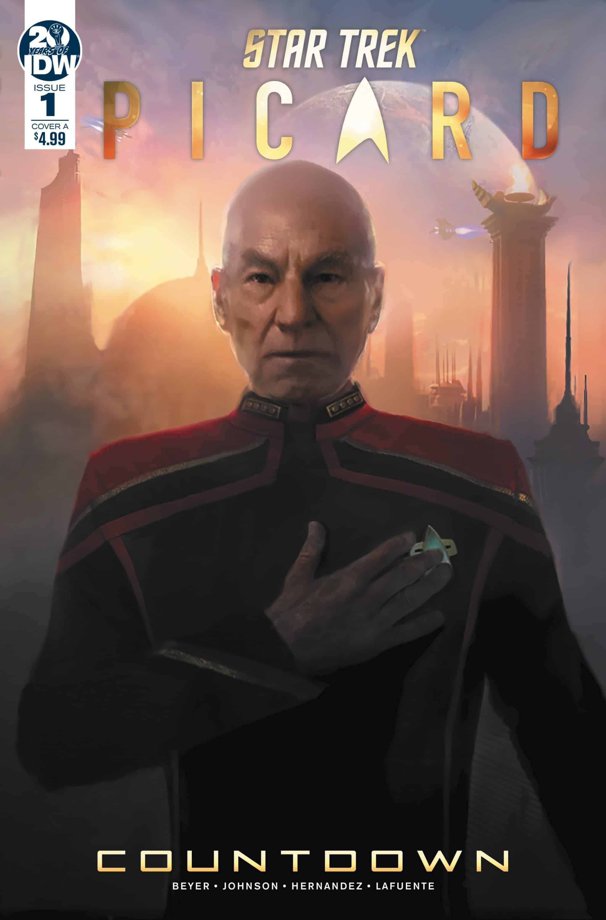
Review: Star Trek: Picard Countdown #1

Star Trek: Picard Countdown #1

With the upcoming CBS All Access show Picard on the horizon, Star Trek: Picard Countdown #1 kicks off the lead-up. In one issue, we’re provided so much detail as to the status of various characters from Star Trek: The Next Generation. We’re also presented the current state of things. And things are a bit mixed.

Picard is now an Admiral in charge of evacuating the Romulans. They’re under threat from a supernova that may wipe out their entire people. But, their secrecy and mistrust of the Federation has made the effort difficult. Dispatched to a world where he’s told only 10,000 Romulans live, Picard is faced with a twist that threatens the operation and the peace.

Written by Kirsten Beyer and Mike Johnson, the comic is a solid introduction to this next phase of the Star Trek universe. The two find the opportunity to update us on the many characters we’ve come to known. They also do it in a way that feels natural and not forced. The dilemma presented feels very Star Trek and a classic issue they’d need to deal with. It also feels very pertinent. With issues like climate change challenging populations and a wave of immigration due to strife, the need to evacuate the Romulans feels like it is a classic sci-fi allegory.

The art by Angel Hernandez is solid. With colors by Joana Lafuente and lettering by Neil Uyetake, the characters all look like their real-world selfs. The design of the world and Romulans also look like they’d fit into any of the recent Next Generation films or later seasons. There’s a beauty to some of the design that hides the insidious nature of it all.

The comic is a solid re-introduction to Picard and teases what should be an excellent television series. The comic feels like classic Star Trek with its blend of solid storytelling and socio-political undertones. This is one that Trek fans, and those excited about the show, should check out.

Story: Kirsten Beyer, Mike Johnson Art: Angel Hernandez
Color: Joana Lafuente Letters: Neil Uyetake
Story: 8.25 Art: 7.75 Overall: 8.0 Recommendation: Buy

IDW Publishing provided Graphic Policy with a FREE copy for review

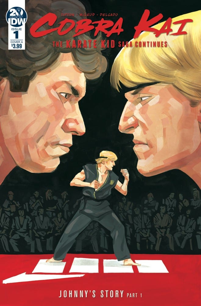
Review: Cobra Kai: The Karate Kid Saga Continues #1

Cobra Kai: The Karate Kid Saga Continues #1

Cobra Kai: The Karate Kid Saga Continues #1 is a comic I’ve been looking forward to since it was announced. The idea of seeing the original Karate Kid film from Johnny Lawrence’s perspective is an interesting one. That becomes more so with the recent Cobra Kai digital series and the concept that Johnny wasn’t really the bad guy of the film.

As a first issue, the comic is interesting. Writer Denton J. Tipton frames the story as Johnny telling it to his new students, the comic begins early in his life. There’s abuse there and that’s not unexpected. It also is handled as an adult in a way that seems realistic for a guy his age and the era he grew up in.

From there we get some of the lead up to his introduction in Karate Kid. There’s some history as to him and the tournaments. His meeting Ali. Why the broke up. And then ending where his role in the film begins on the beach. It’s an interesting comic that builds to the expectation. And in that way it succeeds.

I fully expected Cobra Kai: The Karate Kid Saga Continues #1 to be more like the end of the comic but instead, it veers in the beginning then leads the reader to where it thought it was going to start. It defies expectations, gets you to accept that, then dovetails into expectations in a good way.

The art is where the comic fails. The characters look awful. Kagan McLeod just doesn’t capture the look of the actors well and mixed with a weird lack of detail along with odd detail it falls apart. Eyes are strange, faces bland, and designs that at times look like something you’d get by a Boardwalk artist.

The comic delivers potential. It’s the build-up to the story we know from the film but doesn’t quite deliver that yet. Instead, it focuses on Johnny the person adds some depth to him and shows us where he’s coming from. Now, we can get to the interesting stuff we all came for to start.

Story: Denton J. Tipton Art: Kagan McLeod
Color: Luis Antonio Delgado Letterer: Neil Uyetake
Story: 7.0 Art: 5.0 Overall: 6.5 Recommendation: Read

IDW Publishing provided Graphic Policy with a FREE copy for review

Review: Star Trek: The Q Conflict #1

Star Trek: The Q Conflict #1

When a dispute between godlike beings threatens the galaxy, it will take all of Starfleet’s best captains to stop them. Join James T. Kirk, Jean-Luc Picard, Kathryn Janeway, and Benjamin Sisko as they go head-to-head in a competition that will determine the fate of the Earth and beyond. Will they be able to emerge victorious, or will they be torn apart by The Q Conflict?

The crews of The Next Generation, The Original Series, Voyager, and Deep Space 9 come together to face their biggest challenge yet!

I’ve enjoyed Star Trek but am not a huge fan. The concept of bringing together the crews of so many different series is rather interesting enough to get me interested in checking out this new miniseries.

Written by Scott Tipton and David Tipton, the first issue issue feels like the beginning of a Next Generation film with Starfleet scrambling to evacuate a planet about to be consumed by a dying star. But, there’s something unnatural about it and things begin to get weird as Q becomes involved and it turns out it’s all a game of higher beings.

The first issue is a solid setup getting to the conflict while delivering an issue that feels like it’d fit right on the big screen. The build is solid and when we get to the end the conflict we expect isn’t quite as straightforward with a hint things are going to be mixed up a bit.

The art by David Messina with ink by Elisabetta D’Amico, color by Alexandra Alexakis, and lettering by Neil Uyetake is not bad but doesn’t quite meet the quality of the story itself. There’s too much of a drop off in detail at times and just a general lack of dynamic moments to make it really stick out. The art does the job but also isn’t a selling point. The story is the driver here.

The issue’s story is good but the art falls a bit short in making it truly exciting. There’s a lot of potential here and the start of a story that could be rather exciting and be a story that fits right into the Star Trek cannon. The story is entertaining and definitely worth it for Star Trek fans. For the rest, it’s a crapshoot.

Story: Scott Tipton and David Tipton Art: David Messina
Ink: Elisabetta D’Amico Color: Alexandra Alexakis

Lettering: Neil Uyetake
Story: 8.25 Art: 6.95 Overall: 7.65 Recommendation: Read

IDW Publishing provided Graphic Policy with a FREE copy for review

Preview: Star Trek Discovery Annual 2018

Star Trek Discovery Annual 2018

Story: Kirsten Beyer & Mike Johnson
Art: Angel Hernandez
Color: Mark Roberts
Letterer: AndWorld Design
Cover A: Angel Hernandez, Esther Sanz
Cover B: George Caltsoudas
Production Design: Neil Uyetake
Editor: Sarah Gaydos
Editorial Assistant: Chase Marotz

The U.S.S. Discovery is a ship unlike any the galaxy’s ever seen, developing tech based on an unstable mycelial network… and it is all in the hands of Science Officer Lt. Stamets, tasked with perfecting it to win the war against the Klingons.

FC • 48 pages • $7.99

Preview: My Little Pony: Legends of Magic #12

My Little Pony: Legends of Magic #12

Story: Jeremy Whitley
Art: Tony Fleecs
Color: Heather Breckel
Letterer: Neil Uyetake
Regular Cover: Tony Fleecs
Subscription: Brenda Hickey
Cover RI: Meaghan Carter
Editor: Bobby Curnow

The most legendary ponies are all gathered, and now they must face the might of the Sirens! The future of Equestria is at stake, and hidden danger looms in the group’s midst!

FC • 32 pages • $3.99

Preview: G.I. JOE: A Real American Hero #250

G.I. JOE: A Real American Hero #250

Story: Larry Hama
Art: Netho Diaz
Ink: Netho Diaz, Alisson Rodrigeus, Thiago Gomes
Color: Milen Parvanov
Letterer: Neil Uyetake, Robbie Robbins
Cover A: Netho Diaz, Milen Parvanov
Cover B: Brian Shearer
Retailer Cover A: John Boyle, Jagdish Kumar, Edgar Delgado
Retailer Cover B: Mateus Santolouco
Editor: Tom Waltz
Assistant Editor: Chase Marotz

“Dawn of the Arashikage,” Part 5! Here it is—the conclusion to the latest explosive chapter in G.I. Joe: A Real American Hero lore! Dawn Moreno has battled dangerous enemies and her own inner demons as the ghost of  Snake-Eyes threatens to possess her mind and soul. Will she survive the psychic onslaught, or be lost to the dark memories of the mysterious ninja for all time? Find out in this special oversized milestone issue!

FC • 40 pages • $4.99

« Older Entries Recent Entries »