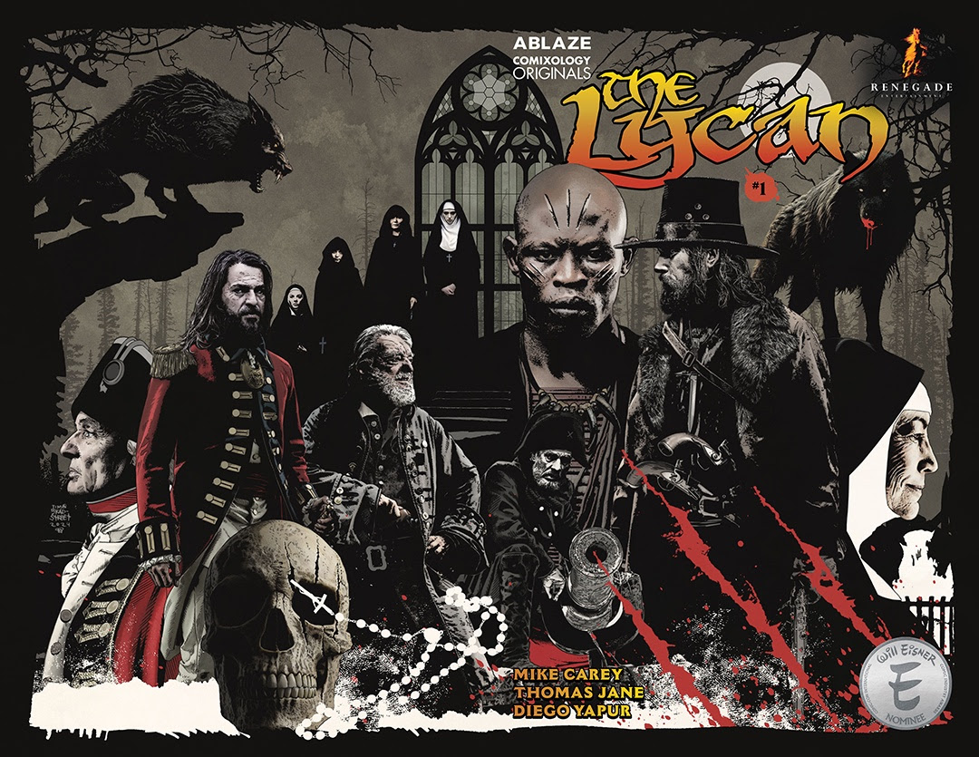
Tag Archives: d.c. alonso

Actor Thomas Jane’s Renegade Entertainment Brings The Lycan to comiXology Originals

Actor Thomas Jane is bringing his horror comic book series The Lycan to comiXology Originals. Jane is the co-founder, along with Courtney Lauren Penn, of Renegade Entertainment.

With The Lycan, Thomas Jane takes on the new role of editor. He’s assembled an incredible group of talent. The Lycan is based on a story by screenwriter David James Kelly and Jane, with a script by writer Mike Carey, art by artist Diego Yapur, coloring by D.C. Alonso, and lettering by AndWorld Design. The 6-issue series is the first from Renegade Entertainment and will be released monthly from Amazon’s comiXology Originals exclusive digital content line with covers by acclaimed artist Tim Bradstreet.

The story takes place in 1777. After a successful expedition in Africa, a hardened band of international big game hunters set out to return home with their bounty when their voyage takes a turn and the men are shipwrecked off a small British island.

Under the tutelage of Absalom Coffin, the men make a deal with Lord Ludgate, ruler of the island. In exchange for fresh supplies and the repair of their good ship The Calydonian, the men are assigned a task they are particularly well suited for: find the Berserking Beasts that have been eating his subjects, including a group of young Benedictine Nuns, and destroy them. But the men encounter more sinister and dangerous beasts than anyone expected.

Review: Sun Eater #1

Sun Eater #1

Ninth century Norway is a land of bloody and civil strife, fanatical religious upheaval, and exploration. At its center is the warrior Kveldulf Bjalfisson, a drug addict and father willing to become a monster in order to save his son from his sworn enemy – King Harald Fairhair. 

I don’t know what I expected when I picked up a comic written by Dylan Sprouse with Joe Harris. It wasn’t a story with dialogue that reads like a Shakespearian play. At first, I felt the character’s conversations were like it was being written in a blend of the traditional pirate style of speech and the English version of Latin from the AMC show Spartacus. It’s slightly off-putting after you realize that it isn’t just being used for the sacrifice that opens the comic. Instead, it’s a conscious choice throughout the book, and then you fall into it. The speech patterns of the characters mean that you have to actively read every word so that you’re not missing the meaning of the words on the page, which helps you understand the story a touch more.

The first issue of SunEater doesn’t do a whole lot more than establishing the ground rules for the story; we learn who the major players are, get an idea what Kveldulf Bjalfisson is motivated by and what he’s aiming to do. And behind it all we see Woten, or Odin, is playing a game entirely his own. You’ll also see a large number of hard to pronounce names that look authentically Norse and are subsequently hard to pronounce (I say look authentic because I’m not well versed in historical Norse names and so won’t pretend that I am), but add another layer of immersion to the comic.

Sun Eater #1 is brought to life by Diego Yapur and D.C. Alonso, responsible for the line work and colors respectively. Yapur’s artwork is decisive and striking; detailed where it needs to be, and barren when you need to focus on something specific. The facial expressions are without a doubt some of the most honest and realistic I’ve seen in a while; it also helps that most characters wouldn’t be seen on a runway – these characters look like a snapshot of the Norse people of yesteryear; grubby, angry, ugly… it’s a grimy looking comic, but Alonso makes it look beautiful. Frankly, the art is some of the best sequential work I’ve seen in a while.

I won’t lie; I picked Sun Eater #1 up because I was morbidly curious what a story created by Dylan Sprouse would be like, and I’m more than happy to say that it left me impressed. As the first issue in a longer miniseries (it was originally billed as nine, but I think it may have increased to twelve now), the creative team has delivered exactly what you want in the opening chapter of a story. Sun Eater #1, published by Heavy Metal, is a fantastic read. Whether you’re just into capes and cowls, or you like to dabble in fantasy, this is a comic you really need to check out.

Story: Dylan Sprouse with Joe Harris Art: Diego Yapur
Colorist: D.C. Alonso Letterer: Saida Temofonte

Story: 8.9 Art: 9.4 Overall: 9.2 Recommendation: Buy

Heavy Metal provided Graphic Policy with a FREE copy for review


Purchase: comiXologyHeavy MetalZeus Comics

Review: Sun Eater #1

Sun Eater #1

Ninth century Norway is a land of bloody and civil strife, fanatical religious upheaval, and exploration. At its center is the warrior Kveldulf Bjalfisson, a drug addict and father willing to become a monster in order to save his son from his sworn enemy – King Harald Fairhair. 

I don’t know what I expected when I picked up a comic written by Dylan Sprouse with Joe Harris. It wasn’t a story with dialogue that reads like a Shakespearian play. At first, I felt the character’s conversations were like it was being written in a blend of the traditional pirate style of speech and the English version of Latin from the AMC show Spartacus. It’s slightly off-putting after you realize that it isn’t just being used for the sacrifice that opens the comic. Instead, it’s a conscious choice throughout the book, and then you fall into it. The speech patterns of the characters mean that you have to actively read every word so that you’re not missing the meaning of the words on the page, which helps you understand the story a touch more.

The first issue of SunEater doesn’t do a whole lot more than establishing the ground rules for the story; we learn who the major players are, get an idea what Kveldulf Bjalfisson is motivated by and what he’s aiming to do. And behind it all we see Woten, or Odin, is playing a game entirely his own. You’ll also see a large number of hard to pronounce names that look authentically Norse and are subsequently hard to pronounce (I say look authentic because I’m not well versed in historical Norse names and so won’t pretend that I am), but add another layer of immersion to the comic.

Sun Eater #1 is brought to life by Diego Yapur and D.C. Alonso, responsible for the line work and colors respectively. Yapur’s artwork is decisive and striking; detailed where it needs to be, and barren when you need to focus on something specific. The facial expressions are without a doubt some of the most honest and realistic I’ve seen in a while; it also helps that most characters wouldn’t be seen on a runway – these characters look like a snapshot of the Norse people of yesteryear; grubby, angry, ugly… it’s a grimy looking comic, but Alonso makes it look beautiful. Frankly, the art is some of the best sequential work I’ve seen in a while.

I won’t lie; I picked Sun Eater #1 up because I was morbidly curious what a story created by Dylan Sprouse would be like, and I’m more than happy to say that it left me impressed. As the first issue in a longer miniseries (it was originally billed as nine, but I think it may have increased to twelve now), the creative team has delivered exactly what you want in the opening chapter of a story. Sun Eater #1, published by Heavy Metal, is a fantastic read. Whether you’re just into capes and cowls, or you like to dabble in fantasy, this is a comic you really need to check out.

Story: Dylan Sprouse with Joe Harris Art: Diego Yapur
Colorist: D.C. Alonso Letterer: Saida Temofonte

Story: 8.9 Art: 9.4 Overall: 9.2 Recommendation: Buy

Heavy Metal provided Graphic Policy with a FREE copy for review


Purchase: comiXologyHeavy Metal