Category Archives: Reviews

Review: Phantom on the Scan #1

A mysterious phenomenon gives a bunch of individuals psychic abilities. But, those with powers are now dying. A group of them get together in an attempt to figure out what’s going on before their time is up.

Story: Cullen Bunn
Art: Mark Torres
Letterer: Dave Sharpe

Get your copy now! To find a comic shop near you, visit http://www.comicshoplocator.com or call 1-888-comicbook or digitally and online with the links below.

comiXology
Kindle
Zeus Comics
TFAW

AfterShock Comics provided Graphic Policy with a FREE copy for review
This post contains affiliate links, which means that if you click on one of the product links and make a purchase, we’ll receive a percentage of the sale. Graphic Policy does purchase items from this site. Making purchases through these links helps support the site

Review: Proctor Valley Road #2

Proctor Valley Road #2

The first issue of Proctor Valley Road I was a bit mixed on. There was a lot I liked but also it felt like so many other comics out there. Proctor Valley Road #2 delivers enough to get the series to now stand out from the pack with details that make this an intriguing series.  August, Rylee, Cora, and Jennie are the prime suspects in the disappearance of the missing boys. The theory is the boys headed across the border to escape the draft for Vietnam.

Alex Child and Grant Morrison have crafted a series that’s an interesting one. Proctor Valley Road #2 really emphasizes that with its infusion of real history and the popular “group takes on ghosts” genre that’s currently seeing a lot of releases. Set in any other time period and the series would simply have the girls be murder suspects. By setting it during the Vietnam War, the girls’ patriotism is questioned resulting in an intriguing ripple of reactions from their families. It’s a nice detail that really adds to the series and makes it a bit different than similar stories.

There’s also a lot of mystery thrown into the mix. The elements feel a bit Blair Witch 2 in numerous ways but it’s done so in a way the reader will drop “wtf” multiple times. There are also moments I swear were the end of the issue. They’d have been perfect to end with leaving a solid cliffhanger, and again the “wtf”. But, that’s not the case creating a comic with a bit of a different beat to it as far as the actual deliver of the story.

Naomi Franquiz‘s art is interesting. It’d be so easy to deliver a dark, brooding, and downright scary, version of this series. Franquiz’s style is much more in the line of BOOM! Studios‘ “style” that’s become so prevalent with the publisher. Along with color by Tamra Bonvillain and lettering by Jim Campbell the visuals of the series does a good job of balancing that fun, light-hearted style and the horror aspects. It’s an interesting style for the story and in some ways it emphasizes the “wtf” of it all. A darker style and look, the comic would be downright scary but as presented you linger on the page wondering what the hell is happening.

Proctor Valley Road #2 is a solid second issue. It takes the ideas started in the debut and ramps them up a bit. The time period is more of a factor. The small town aspect too comes into play a bit more. It’s all small details that really adds to he series and makes it much more interesting. The seeds laid out to start are really paying off and has me clamoring to find out what happens next.

Story: Alex Child, Grant Morrison Art: Naomi Franquiz
Color: Tamra Bonvillain Letterer: Jim Campbell
Story: 8.0 Art: 8.0 Overall: 8.0 Recommendation: Buy

BOOM! Studios provided Graphic Policy with a FREE copy for review


Purchase: comiXologyAmazonKindleZeus ComicsTFAW

Review: Non-stop Spider-Man #2

Non-Stop Spider-Man #2

There are so many different ways to tackle Spider-Man. You can have a series more focused on Peter and those around him. You can have takes where he takes on global threats. Then there’s the version that’s focused on the action with a kinetic spin to it all. Non-Stop Spider-Man #2 continues that last take with an issue that’s full of energy and over-the-top action.

Joe Kelly keeps up the adventure as Spider-Man is on a personal mission to find out what’s going on with the drugs being sold to smart individuals. As the comic teases, there’s clearly something going on with who the drugs are being targeted but the comic dances around that reveal.

Instead, Kelly keeps the action coming with big explosions and big sequences you can really only do in a comic. Buildings explode from a helicopter attack, a truck makes its way into the sewer, it’s all so insane it’s hard to not smile and just enjoy.

What Kelly also does is give us a Spider-Man that’s off his game in a way. The drug use has hit him close and impacted a friend. He’s working on anger as much as anything else which has the character a little off his usual leading to small mistakes. He’s a half-step off and makes things more of a challenge.

Chris Bachalo‘s art is the draw. As much as Kelly’s story is entertaining, it’s the insane visuals that really draw the reader in. Bachalo is joined by Tim Townsend, Al Vey, and Wayne Faucher on ink, Marcio Menyz on color, and Travis Lanham on lettering. The situations Kelly concocts are so insane but Bachalo delivers it all with an energy and style that only he can pull off. You can hear the explosions. The page layouts continue to impress as well with a flow and look that’s so unique.

Non-Stop Spider-Man #2 is a lot of fun. The art pops from the page. The story is interesting. It’s a second issue that delivers as much excitement as its debut, not an easy thing to do. There’s debates as to how many series are too many for characters but when they’re as unique as this, bring more on!

Story: Joe Kelly Art: Chris Bachalo
Ink: Tim Townsend, Al Vey, Wayne Faucher Color: Marcio Menyz Letterer: Travis Lanham
Story: 8.25 Art: 8.85 Overall: 8.5 Recommendation: Buy

Marvel provided Graphic Policy with a FREE copy for review


Purchase: comiXologyAmazonZeus ComicsTFAW

Review: Guardians of the Galaxy #13

Guardians of the Galaxy #13

When the Guardians of the Galaxy relaunched under Al Ewing‘s guidance I was excited to check the series out. I followed it through its first arc and enjoyed where it was going. But I fell off and found myself reading an issue here and there that tied into something else. With Guardians of the Galaxy #13, the issue feels like another good jumping on point. It’s perfect for new readers as well as long-time fans.

My experience with the Guardians of the Galaxy goes back to the team from the future but I fell in love with the team during the Abnett and Lanning days. Since then there’s been ups and down (a lot of downs, lets be honest) but Ewing’s run has been solid (of what I’ve read of it). With The Kree and Skrulls now in an alliance, The Guardians of the Galaxy have a new role, that of superheroes. They’ve been soldiers, misfits, and thieves, but now they’re getting a more formalized take… Avengers in space. And that’s not a bad thing. With a large cast of heroes, the teams can now tackle multiple issues and try to help the infinite issues out there.

Guardians of the Galaxy #13 kicks off with two, an attack on the Kree/Skrull capital planet and the mystery of a cult on a mysterious planet. Each provides different aspects to the issue. With one we get the big-screen adventure and action. The other builds a mystery that will clearly play out down the line. We also get to know each team and members and how the various personalities play out. There’s also a bit of uniformity now too hearkening back to those classic days of matching uniforms (with a bit of a throwback to them).

The art by Juan Frigeri is fantastic. Frigeri is joined by Federico Blee on color and Cory Petit on lettering. There’s some amazing visuals that make you take notice. From the opening of Throneworld II to Super Skrull managing the teams, to the Guardians arriving to battle, and more, there’s so much to enjoy. There’s a fun energy about the art. The colors help and the lettering adds personality to so many of the characters. All of that combines into a visual treat that makes the comic fun!

Guardians of the Galaxy #13 is a near-perfect jumping-on point. There’s just one sequence between Peter and Gamora that feels really out of place. But, beyond that, the comic is a fun adventure. There’s a certain energy and excitement about the issue that jumps from the page. If you’ve wondered about the Guardians of the Galaxy, this is the point to hop and because it looks like it’s going to be an awesome ride.

Story: Al Ewing Art: Juan Frigeri
Color: Federico Blee Letterer: Cory Petit
Story: 8.4 Art: 8.5 Overall: 8.45 Recommendation: Buy

Marvel provided Graphic Policy with a FREE copy for review


Purchase: comiXologyAmazonKindleZeus ComicsTFAW

Review: The Tankies

The Tankies

Within The Tankies are three tales: in “The Tankies”, we meet Corporate Stiles, a hardened vet who is ready to bring his men against the German Tiger tank, a machine feared to be unrivaled. Then in “The Firefly & His Majesty”, Stiles and co. lead a Firefly, which is a Sherman tank, up against the German’s newest weapon, the King Tiger. Lastly, “The Green Fields Beyond” sees Stiles and company’s involvement in Korea against the Communists.

These stories were originally published under the “Battlefields” title that Dynamite had going with Garth Ennis from back in 2011. Last year saw Dead Reckoning release The Stringbags, which was another WW2 Ennis book. That said, it’s nice to see these stories see light again and to also be dedicated to longtime Ennis collaborator and Judge Dredd co-creator Carlos Ezquerra, who passed away in 2018. Like any Ennis-written War Story, they certainly aren’t for the squeamish and the language is something totally beyond colorful. I do feel that a good Ennis war story is as good as it gets.

Reading through The Tankies, you can see that the research has been done to be accurate to the times portrayed. You’ll almost feel like an expert in tanks after reading this. There’s a great afterword by Ennis at the end that really encompasses the amount of research done for such a book as The Tankies. And to finish the book, a section of sketches from Carlos Ezquerra.

I’ve always appreciated the artwork of Carlos Ezquerra. He worked with Ennis on many stories, from Kev at Wildstorm to World Of Tanks at Dark Horse, just to name a few. With The Tankies, I feel like he took this job seriously and put forth a great amount of detail in everything from weapons of destruction to the people using them. His character expressions are great. I have a real appreciation of the art within these pages.

I enjoyed reading The Tankies very much. Honestly, I buy every war story Ennis works on when I know about them. While some might not enjoy the destructive power of war or the violence man casts upon themselves with it, I always appreciate the history lesson of it and the little things that Ennis and Ezquerra inject into it. If you enjoy war or if you like what Garth Ennis brings to comics, The Tankies is just the book for you. It’s not as funny as Ennis and Ezquerra’s work in The Adventures Of The Rifle Brigade but certainly feels similar in tone to World Of Tanks.

Story: Garth Ennis Art: Carlos Ezquerra
Ink: Hector Ezquerra Color: Tony Avina Letterer: Simon Bowland
Story: 10 Art: 8.0 Overall: 9.0 Recommendation: Buy

Dead Reckoning provided Graphic Policy with a FREE copy for review


Purchase: AmazonTFAWBookshop

Review: Savage #3

Savage #3

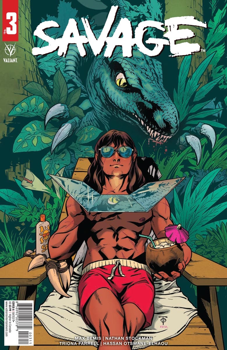
Mad geniuses Max Bemis and Nate Stockman take you to a magical place in Savage #3. It’s filled with sun, fun, and… monsters trying to eat you?!

Project Bizarre’s quest to unleash the creatures from the odd dimension known as the Faraway beyond the British Isles is ON — the Giant Dinos have gone GLOBAL! Can Savage save the tropics or will the dinos rule Earth again?

Full disclosure: I’m not entirely sure what to make of this comic. I’ve never really pegged Savage as being a comedy series, though Bemis’ writing has had comedic moments peppered throughout his run with the character, Savage #3 reads more like an actual comedy book that at times borders on the silly. And honestly, I’m not sure how well it works for me overall as the comic moves from a story with humorous elements closer to an actual comedy comic. As I said, it’s not what I expected from this iteration of Savage – even though I did enjoy the way Bemis played into the absurdity of the evil corporation in Savage #2 – but it wouldn’t seem as out of place in a Quantum and Woody or Archer and Armstrong story.

Perhaps because of the ratio of comedy to not that had me notice a few things that bugged me just a little (mostly dialogue choices) that I doubt I’d have picked up on at all had I been enjoying the story a bit more. The comic’s plot is also somewhat nonsensical; a month after the second issue, Savage has given up on humanity and now lives on a private island that artificially mimics the island he grew up on to get away from the hangers-on, meanwhile the planet is attacked by giant monsters and Savage’s brother rages at the news in a way that either indicates somebody is controlling the events or that it’s purely coincidental (and because of the comic’s tone to this point, I’m genuinely not sure which it is).

I’m going to quote myself from the previous review, because it’s still true.

Nathan Stockman, Triona Farrell, and Hassan Otsmane-Elhaou round out the creative team for Savage #2 as artist, colorist, and letterer respectively. Otsmane-Elhaou’s work is noticeably good in this issue, which is a rare feat for a comics’ lettering to stand out in a positive way, with his liberal use of colored fonts and upper and lower case becoming more than just a method to convey Bemis’ words. This book is an example of lettering as its own art form, a comic to show those who claim that anybody can throw words onto a page, which although that is a true statement, the same is also true; anybody can write a story or draw a picture – but there’s a difference between my pictures and Nathan Stockman’s pictures). Stockman’s art is great; there’s a very punky feeling to the comic, at times evoking Pushead’s art style, but almost consistently embodying the rebellious nature of the title character.

Review: Savage #2

Although the comic is still really interesting to look at, the humor strayed just a touch too far into the comedy and away from what I was hoping would be more of an exploration about the nature of fame and how easy it can be to lose yourself when people are pulling you a hundred different ways. Instead, we got a comic that had a lot of story (I’m genuinely surprised at how much story Bemis fits into the pages of the comic) with some comedic elements that just fell a little flat for me. Savage #3 is significantly elevated by the art and lettering, which goes a long way to balance the drawbacks of the comic. It might be that I’m a little tired, but I missed the balance of humor and social discourse from earlier comics

Ultimately your mileage will vary, but based on this issue, I really want to see Max Bemis take a crack at writing either an Archer and Armstrong or a Quantum & Woody series in the near future because although the level of humor may not have sat quite right with me in Savage #3, I think it’d be perfect for one of the duos.

Story: Max Bemis Art: Nathan Stockman
Colours: Trionna Farrell Letters: Hassan Otsmane-Elhaou
Story: 6.9 Art: 8.4 Overall: 7.5 Recommendation: Read

Valiant provided Graphic Policy with a FREE copy for review


Purchase: comiXology – Kindle – Zeus Comics – TFAW

Review: Home #1

Home #1

Fuck our immigration system. Fuck taking kids from their parents. Our system is broken and needs vast reform. This is where I’m coming from going in to reading Home #1, the new comic series published by Image Comics. Home follows a young boy who is torn away from his mother while seeking asylum at the U.S. border. The trauma unleashes something within him, causing him to gain superhuman abilities. Yes, that latter part of the concept might sound familiar but it’s the raw and heartbreaking setting within which it happens that is different, though a reality that’s not new.

Written by Julio Anta, Home #1 opens with a riff on real words from former Attorney General Jeff Sessions. The address was delivered in 2018. The comic follows a mother and her son as they flee their home of Guatemala in hopes of seeking asylum in the United States. What they don’t know is that policy changed while they were making their journey morphing into the horrible policies under former President Donald Trump. Anta doesn’t name Trump or Sessions but the words used, the hate inflicted, the cages, it’s all clear that the administration is the inspiration for this story.

Anta delivers a heartbreaking story. While we’re given only a bit of the details of why these two, Mercedes and Juan Gomez, are fleeing their country, it’s no less difficult to read. The comic gives an overview of the difficult journey of the two but what’s presented is nowhere near the brutal reality many face. And what’s presented is still difficult to read. We’re also taken through the immigration system with guards and bureaucrats whose racism and hate flows from their mouths at ease. The comic reminds us that due to the election of Trump, far too many in the nation felt it was ok to look at others as less than human. That compassion was something that wasn’t deserved. The hate is present.

Anna Wiesczyk‘s art is really nice to look at. With color by Bryan Valenza and lettering by Hassan Otsmane-Elhaou the art emphasizes the emotion of its two travelers. It’s heart is in the looks of fear, sadness, and anger. There’s a dip towards the end of the comic where it dips into a bit of a cartoon look that reminded me of Don Bluth but the visuals overall will stick with you. The big thing that stands out though is things are a bit too “clean”.

There’s a worn-down grittiness that’s missing in the art style which stood out to me. But, depending on where the series goes, that style might not work. We’ll see. If anything, the “lighter” style of the art doesn’t quite match the tone and subject for me. It’s good though and if anything lightens up what would be a very dark and emotionally straining comic otherwise.

Home #1 isn’t perfect and has some bumps in its narrative but it’s an important read. The end of the comic is a bit rocky and doesn’t match the quality of everything up to that point. Some dialogue feels a bit comical in its delivery, an unfortunate distraction. But, the majority of the comic is heartbreaking. Home is attempting to address a wrong that persists and it’s doing so through the long tradition of using entertainment as its messenger.

Story: Julio Anta Art: Anna Wiesczyk
Color: Bryan Valenza Letterer: Hassan Otsmane-Elhaou
Story: 7.5 Art: 7.0 Overall: 7.45 Recommendation: Read

Image Comics provided Graphic Policy with a FREE copy for review


Purchase: comiXologyAmazonTFAW

Review: Sh*tshow #2

There was once an Age of Heroes, a time Earth was protected by the demigod hero Legend and his band of heroes called Legend’s Legion until one day, the three-headed demon Balam was summoned to the planet. In the ensuing fight, the powers were ripped away from any enabled beings on the planet — heroes and villains, alike. Battered, broken, and losing his entire Legion in the process, Legend was able to cobble together whatever remaining powered beings he could find but by that time, Balam was long gone.

This is the story of what happens after… when Balam returns!

Story: Adam Barnhardt
Art: Samir Samão
Color: Warnia K. Sahadewa
Letterer: Lettersquids

Get your copy now! To find a comic shop near you, visit http://www.comicshoplocator.com or call 1-888-comicbook or digitally and online with the links below.

Scout Comics
Zeus Comics

This post contains affiliate links, which means that if you click on one of the product links and make a purchase, we’ll receive a percentage of the sale. Graphic Policy does purchase items from this site. Making purchases through these links helps support the site

Review: Children of the Grave #3

Earth has been reset. Now known as Terra, the populace lives in blissful ignorance of the centuries of unrest that plagued mankind. They’re taken care of by the “Providers”. Daniel is determined to find the truth.

Children of the Grave #3 reveals the truth as to what’s going on and it’s not what we expected!

Story: Sam Romesburg, Ben Roberts
Art: Gioele Filippo
Color: Marco Lesko
Letterer: Justin Birch

Get your copy now! To find a comic shop near you, visit http://www.comicshoplocator.com or call 1-888-comicbook or digitally and online with the links below.

Scout Comics
Zeus Comics

This post contains affiliate links, which means that if you click on one of the product links and make a purchase, we’ll receive a percentage of the sale. Graphic Policy does purchase items from this site. Making purchases through these links helps support the site

Review: Batman: The Detective #1

Batman: The Detective #1

Bat-computer, queue “Holliday Road” because it’s “Batman’s European Vacation”! Batman: The Detective #1 kicks off a European mystery for Batman as a Wayne Airlines jet goes down due to terrorist action. This gets Bruce, as Batman, out of the Batcave and across the ocean to figure who is behind the attack and why.

The story is a good one with a simple action and mystery to it that feels like a fun, self-contained story. With an opening that’s worthy of the big screen, writer Tom Taylor balances things well. There’s an emphasis on a Batman who has been beaten down. He’s older, and slower, than his opponents. But, he still has the skill the rely upon and defeat the enemy. It forces Taylor to dance between the detective aspect of the character and that of the skilled fighter. By, the issue’s end, Batman has figured out what stands out about the individuals on the downed plane but not why. And in-between figuring that out, there’s fantastic action serquences.

The art is by Andy Kubert with Brad Anderson on color and Clem Robins on lettering. The art has a bit of a retro-feel to it in a good way. The art and story together remind me a bit of the oversized Batman comics I read growing up where a story was wrapped up in two-issues. Kubert delivers a punch, literally. The action sequences are big and the fights sequences solid. Kubert and the team also capture a broken Batman. Bruce looks worn down and tired, Kubert captures this perfectly. You can see and “feel” the pain.

Batman: The Detective #1 is a fun start to a self-contained Batman story. It takes him to unfamiliar territory and seems to mix his different aspects well. It’s a nice break from the greater macro Batman story taking place currently in other series. There’s some that’s a bit classic about it, a comic you can just pick up and enjoy.

Story: Tom Taylor Art: Andy Kubert
Ink: Andy Kubert Color: Brad Anderson Letterer: Clem Robins
Story: 8.25 Art: 8.4 Overall: 8.3 Recommendation: Buy

DC Comics provided Graphic Policy with a FREE copy for review


Purchase: comiXologyKindleZeus ComicsTFAW

« Older Entries Recent Entries »