Author Archives: Joe Bones

Review: The Phantom of the Opera

The Phantom of the Opera

When I saw that I had the opportunity to review The Phantom of the Opera graphic novel, my first thought was, is it going to play music when I open it, like one of those novelty greeting cards? Then I read a little further into the email from A Wave Blue World and knew that I needed to review this title. You see, Hungarian artist Varga Tomi doesn’t take the same approach as Andrew Lloyd Webber or Joel Schumacher. Instead, Tomi gives readers a direct adaptation of Gaston Leroux’s 1910 novel, the inspiration for every other version of The Phantom of the Opera most of us have likely seen before.

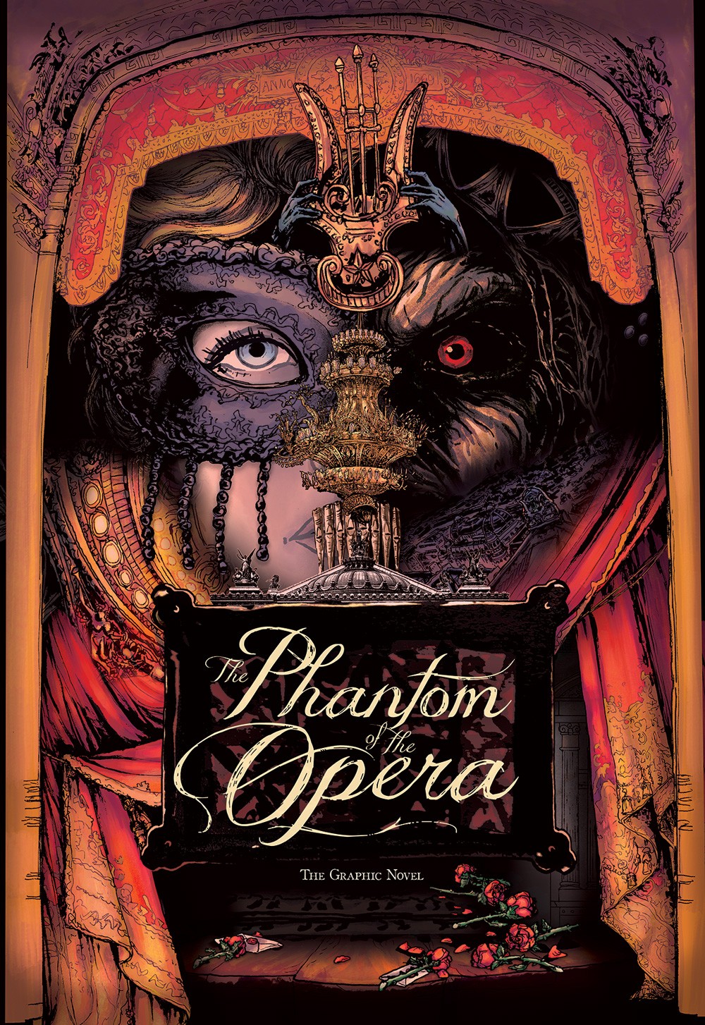
Every artistic detail in this graphic novel is gorgeous. From the intricate page layouts to the color choices, to the sophisticated lettering, every page of this book is a work of art. Before starting in on this adaptation, Tomi traveled to Paris to study the city’s architecture. The sketches he made during his travels are directly transposed onto the page. Many panels are framed by the opera house’s architectural design and the building itself looks real. This turns the opera house into a player in the story and not just a background setting.

Tomi’s color choices further elevate his illustrations of the opera house. Tomi uses soft, warm colors for flashbacks. These colors reflect Raoul’s fond memories of his childhood with Christine. The scenes set beneath the opera house really look like they’re set in a cave. Tomi colors these scenes while taking into consideration where the light source is located in each panel. The shadows created by this effect add intensity to scenes that are already spooky.

My only complaint about the art is that I found it difficult to tell certain characters a part. This was especially true for minor characters that appear briefly in a scene and then aren’t seen again until later. Despite this complaint, I do need to mention that the Phantom is very creepy. In other adaptations, the Phantom looks more or less like a normal guy until his mask is removed. Tomi’s Phantom looks like there is something off about him, even when he’s wearing the mask. Tomi draws him with a sinister air, even in the scenes that are set in innocuous locales, such as the parlor of the opera house.

For those who have only seen the musical, the story from the original novel plays out a little differently. Leroux’s novel is a classic example of gothic fiction. These days most people hear “gothic” and think of stories set in a creepy old mansion. With the opera house as a grand backdrop, Tomi chooses to focus on the other elements of gothic fiction, namely hints of the supernatural, an air of forbidden romance, and characters cursed with dark fates. Even though there are differences between the musical’s story and the novel’s, the big moments are still present in the graphic novel, such as the chandelier crash, the masquerade ball, and the underground river. Not to sound like a broken record, but thanks to Tomi’s artistic talents, these big moments look amazing.

This graphic novel adaptation of The Phantom of the Opera is perfect for fans of gothic fiction. It’s the sort of book that a person could buy solely to look at the art. Admittedly, the story within may not appeal to everyone, as it’s different from the version with which they’re most familiar. Tomi also presents a faithful adaptation of Leroux’s novel and doesn’t update any of the language for a modern audience. This doesn’t make for the easiest read for those who aren’t used to reading works from the last century. For those who like the story of The Phantom of the Opera, but don’t care for musicals, this graphic novel is a perfect compromise. If after reading this review, you’re unsure as to whether you want to buy this graphic novel, check out our preview. Don’t be surprised if the beautiful art wins you over immediately. This graphic novel is available now digitally and hits comic book stores on October 21st.

Story: Gaston Leroux Script: Varga Tomi Art: Varga Tomi Letters by Varga Tomi
Story/Adaptation: 10 Art: 9.0 Overall: 9.5 Reccomendation: Read

A Wave Blue World provided Graphic Policy with a FREE copy for review


Purchase: comiXologyAmazonKindle Bookshop

Early Review: Grimm Tales of Terror Quarterly: 2020 Halloween Special

Grimm Tales of Terror Quarterly: 2020 Halloween Special

Sorry warm woolen mittens, but short stories, horror fiction, and comic books are a few of my favorite things. Lucky for me, Zenescope has combined all my favorites into a single comic book. As an added bonus, this special one-shot is coming out just in time for Halloween. The Grimm Tales of Terror Quarterly: 2020 Halloween Special, due to hit comic shops on October 21st, collects three original tales of terror. Each story is introduced by Keres the goddess of death.

Keres may be the goddess of death, but in this Halloween Special, she’s moonlighting as a fortune teller. Each of the three tales in this comic revolve around people who walk into her shop hoping to learn what fate holds in store for them. This connecting story sets up the high point of the comic, Tarot card inspired page breaks, drawn by Sheldon Goh and colored by Ivan Nunes. These page breaks are so gorgeous, I found myself wishing I could hang them up on my wall. Different teams of artists illustrate and color each of the three stories. Unfortunately, not all of their work is of the same quality as the page breaks.

The first story has a lot of flashbacks, but artist Dario Tallarico and colorist Maxflan Araujo don’t do much to distinguish these scenes from those set in the present. The reader eventually catches on, but some sort of deviation of color would have helped make the change of setting much clearer. The second story looks much better than its predecessor. Oliver Borges uses perspective to great effect. He draws panels from varying angles, giving the story a cinematic look. Plus, the monster he gets to draw looks fearsome and badass.

Artist Novo Malgapo puts fine detail into some aspects of the third story, but seems to slack off in other aspects. Most notably, the proportions of the main character are sometimes drawn very poorly, making him look misshapen. As for the connecting story, Babisu Kourtis draws New Orleans in a very recognizable way. Even if the narration didn’t explain that New Orleans was the setting for the connecting story, the reader would be able to tell the location just by taking in the illustrations.

Unlike some of the artwork, the stories contained in this comic are all high quality. The first story has a lot of different horror elements, but the writers are able to connect everything into a creepy story. In the second story, the writers put a cool twist on a classic monster myth. The final story takes a familiar premise and brings it into the modern world. The obsessive nature and depravity of the main character in this story made my skin crawl. Plus, it’s got a surprising ending that’s tinged with a touch of dark humor.

Before I wrap up this advance review, there’s one more thing I want to mention. I find it really cool that Zenescope’s President and Chief Creative Officer Joe Brusha is not only one of the writers on this special, but he also created the Grimm Tales of Terror series. It’s not like it is unheard of for a publisher’s executive to contribute to a comic, but I feel like these days they only come off the bench for big events or anniversary issues. It’s refreshing to see a CCO take the time to write an entire holiday special. Grimm Tales of Terror Quarterly: 2020 Halloween Special is due to be released on October 21st, just in time for Halloween.

Writer: Joe Brusha Story: Joe Brusha, Ralph Tedesco, Dave Franchini
Art: Novo Malgapo, Sheldon Goh, Babisu Kourtis, Maxflan Araujo, Oliver Borges
Color: Ceci de la Cruz, Ivan Nunes, Fran Gamboa, J.C. Ruiz, Maxflan Araujo, Grostieta

Letters: Taylor Esposito Art & Colors: Various Art Teams
Story: 10 Art: 6.0 Overall: 8.0 Reccommendation: Buy

Zenescope provided Graphic Policy with a FREE copy for review


Pre-Order: Kindle/comiXology

Review: Sherlock: A Scandal in Belgravia Vol. 1

SHERLOCK HOLMES: A SCANDAL IN BELGRAVIA VOL. 1

Sherlock Holmes and Dr. Watson are two of my favorite characters. I’ve read the lion’s share of Sir Arthur Conan Doyle’s Sherlock novels and many of the works they inspired from later writers. I can practically quote the Guy Ritchie films. I’ve even portrayed Dr. Watson on stage and brought other Doyle characters to life in adaptations of classic radio dramas. So when I saw a Sherlock Holmes comic on the list of titles available to review this week, I was ecstatic. I soon realized that Sherlock: A Scandal in Belgravia is an adaptation of the British television series. The first volume of this Sherlock series, presented as a manga by Titan Comics, presents a direct adaptation of the series’ fourth episode.

Now I’ve never seen Sherlock, though I’ve heard good things. Most of the praise revolves around the fact that Benedict Cumberbatch is the star. I’ve got nothing against Mr. Cumberbatch, but hearing his name is not enough to make me seek out a movie or film in which he’s featured. Plus, I don’t have cable. However, after reading A Scandal in Belgravia, I find myself motivated to head over to one of the streaming services I subscribe to and seek out the show. Since I haven’t seen the specific episode, I can’t say how faithful of an adaptation this manga is to the original show. What I can say is, this first volume was a very enjoyable read.

The original version of this manga was published in Japan by Kadokawa. The folks at Titan Comics have translated the issues into English so that those of us who don’t speak Japanese can enjoy this Sherlock Holmes adventure. For those who are fans of the television show, artist JAY. does a great job of capturing the likenesses of Cumberbatch and Martin Freeman (who plays Watson on the show). My favorite panels were those that show Sherlock engaged in the process of deduction. The way JAY. highlights the details of the person Sherlock is observing makes the reader feel like they are looking through the detective’s eyes. JAY. also cleverly illustrates the fact that Sherlock can’t get a read on Irene Adler.

This is a modern take on Sherlock Holmes, and it took me quite a few pages to get used to Watson writing a blog on a computer and Holmes talking about his website. There’s quite a bit of humor in the manga and as one would expect from an adaptation of a British television show, the dialogue is very pithy. Steven Moffat, who wrote the episode the manga is adapting, does a great job of capturing the tone and pacing of the conversations between Watson and Holmes. Moffat seems to have a rich understanding of the detectives’ relationship and this detail is evident throughout the story. Moffat also does a good job with the interactions between Adler and Holmes. JAY. helps sell the moments between adventuress and detective by illustrating quick glances and meaningful looks between the two. Adler playfully besting Holmes in a game of wits is a common scenario in Sherlock stories. Moffat not only puts a creative spin on his version of their first tête-à-tête but also leaves the reader excited to see future interactions between the two characters.

There’s a lot to like about Sherlock: A Scandal in Belgravia, but it’s probably not the right book for every comic reader. The story is dialogue-heavy and has slow pacing. Although the artwork is well-drawn, this book is still manga. There are no bright colors and most of the panels feature people talking. As a result, those who aren’t used to reading manga, or those who aren’t as interested in a modern adaptation of Sherlock Holmes, may find that this book fails to hold their attention. It is for those reasons that I’m giving A Scandal in Belgravia a general recommendation of ‘Read.’ That all being said, if you’re a fan of Sherlock Holmes, regardless of the adaptation style, this is a book you’ll want to consider adding to your collection.

Created by Mark Gatiss and Steven Moffat Written by Steven Moffat
Art and Adaptation by JAY Lettering by Amoona Saohin
Story: 10 Art: 10 Overall: 10 Recommendation: Read

Titan Comics provided Graphic Policy with a FREE copy for review


Purchase: comiXologyAmazonKindleBookshop

Review: Slaughterhouse-Five OGN

Slaughterhouse-Five

Slaughterhouse-Five is one of my favorite books, and is hands down my favorite of Kurt Vonnegut’s novels. I happened upon it in college, with no prior knowledge of its content and no awareness of who Vonnegut was. Something about the book cover just drew me to the novel. I ended up missing class the next day because I stayed up all night reading it. Then once I’d finished, I turned right around and read it again. I may not have learned anything in class the day after buying the book, but Slaughterhouse-5 taught me a lot about what good fiction can deliver to the reader.

Published by Archaia, a division of Boom! Entertainment, Slaughterhouse-Five has now been adapted into an original graphic novel. Vonnegut’s classic anti-war allegory disguised as science-fiction is presented by writer Ryan North as it never has been before. Presenting the story, and its purposely non-linear narrative as a graphic novel is brilliant. Linking visuals to Billy Pilgrim’s time displacement fills out the storylines in a satisfying way. This adaptation is pretty faithful to the original novel. North uses much of Vonnegut’s prose and includes nearly every scene from the novel, even those small scenes casual readers may have forgotten. North does leave out one detail, however, the narrator from the novel, who is meant to represent the voice of Vonnegut himself.

Instead, North provides a bit of his own narration and exposition via text boxes placed throughout the story. In essence, he inserts himself as the narrator. Although these asides occasionally leaned toward humorous, I don’t feel like they added much to the narrative. To be frank, it felt to me like adding lines to a production of Shakespeare. In trying to retell one of Vonnegut’s stories, North effectively cuts him out of the narrative completely, and the representative character out until the very end. There are also some asides during scenes in the German prison camp where North points out Vonnegut (who was actually captured by the Germans during the war). Altogether, I think these asides are meant to mimic Vonnegut’s technique in the novel. Unfortunately, what is a sophisticated meta-textual literary device in Vonnegut’s hands feels more like pandering under North’s.

Along those same lines, I could have done without the seven pages of illustrated introduction. If a reader picks up this graphic novel, and has no idea it’s based on a Vonnegut novel, they should be allowed to enjoy it without pretense. North also gives a timeline of Billy Pilgrim’s “journey” through time, which basically amounts to a huge spoiler for a story that hasn’t even started yet. Plus, illustrating this introduction just felt unnecessary. One page of printed introduction, as is common in other graphic novels, would have sufficed. Or the illustrated introduction could have been tacked on to the end. The context it tries to impart would have had more impact after a reader has finished the graphic novel. Place at the beginning, it seemed like a waste of time for fans of Slaughterhouse-5, and wasn’t a good way to engage new readers.

Albert Monteys artwork is but not spectacular. The best way to describe my feelings of the illustrations is with the phrase “missed opportunity.” Slaughterhouse-five offers an artist the chance to draw battlefields, prison camps, flying saucers, an alien zoo, and the ward of a mental institution. Although Monteys renders all these settings well, they all look too similar. His linework rarely changes and the result is the exotic settings have the exact same look as the mundane ones. He does change his style at a few points, producing some cool visual effects, including: several underwater panels where the reader can see the ripples in the water, the scene where Billy Pilgrim watches a documentary on the war is drawn like a storyboard, and the pages of the Tralfamadorian book are appropriately abstract and psychedelic.

Luckily, Monteys’ use of color compensates for his uniform illustrative style. His color deviations accurately depict the settings within the story. Even without reading Vonnegut’s prose, the reader can instantly distinguish Germany during WWII from Billy Pilgrim’s optometry office in the 1950’s. The colors Monteys uses not only visually sum up the setting, they also convey the tone of each scene.

This graphic novel presentation of Slaughterhouse-Five is a great adaptation, but not necessarily a one-hundred percent faithful one. The story and most of the dialogue and text are purely Vonnegut. Unfortunately, North’s artistic liberties and literary additions don’t add to the quality of the story. In my opinion, North’s additions are actually more of a distraction then a quality accompaniment. Monteys’ artwork is a bit uniform despite the varied settings within the story, but all of his illustrations clearly covey the life of Billy Pilgrim to the reader. For those who have never read Slaughterhouse-five, I highly suggest starting with the novel, then checking out this graphic novel adaptation. Fans of Vonnegut’s work will probably want to add this graphic novel to their bookshelves, moreso to add to their collections than for the quality of the product.

Story: Kurt Vonnegut Written: Ryan North Art: Albert Monteys
Story: 10 Adaptation: 3.0 Art: 8.5 Overall: 7.2 Recommendation: Read

BOOM! Studios provided Graphic Policy with a FREE copy for review


Purchase: comiXologyAmazonKindleZeus Comics

Early Review: Heavy #1

Heavy #1

Purgatory. Limbo. Outside of Dante’s Divine Comedy, these are concepts rarely touched upon in the commonly dichotomous concepts of heaven and hell. What if, instead of a person’s entrance to heaven or hell being predicated on what they did over the course of their life, a person had a chance to earn their place in heaven after their death? That’s the question posed by Heavy #1. This new series from Titan Comics is due out on September 16th.

In Heavy #1, writer Max Bemis explores how far one man is willing to go in order to ascend to heaven and be reunited with his wife. To earn his way to heaven, Bill is sent all over the multiverse. He works as an enforcer, protecting timelines and dealing punishment to the villains of history. Bill’s tough guy persona quickly drew me to the character but it was his sensitive side that won me over. It’s not common to see the hero in an action story motivated by feelings that come off as believable and realistic. As if the premise, plot, and character development weren’t enough to draw me in, the first issue also ended with a shocking reveal. Throughout the first half of the comic, I wasn’t impressed with the artwork. It was good but not spectacular. Then, I got to an aerial fight scene and was blown away. The framing of the panels is dynamic and the colors are quite striking.

Heavy #1 is an action packed, existential thrill ride. Just like a multiverse, the story could branch from here into any number of possible storylines as Bill continues his quest to be reunited with his wife. For an action comic with a science-fiction twist, the story has quite a bit of heart. Readers will find themselves invested in the plot after only a few pages. Be sure to pick up Heavy #1 when it releases on September 16th.

Story: Max Bemis Art: Eryk Donovan
Color: Cris Peter Letterer: Taylor Esposito
Story: 9.0 Art: 7.5 Overall: 8.3 Recommendation: Buy

Vault Comics provided Graphic Policy with a FREE copy for review


Pre-order: comiXology

Review: Nobody is in Control Volume 1

Nobody is in Control

In M. Night Shyamalan’s film, The Village, the characters are warned to stay out of the woods. In Nobody is in Control Richard follows a stranger into the woods, thinking the man needs help. It’s obvious to me that Richard has never seen that movie or at least didn’t choose to heed the warning. Soon, following the stranger leads Richard to stumble upon a conspiracy that has been going on for decades. The four-issue story arc is collected in this trade paperback from Black Mask Studios.

My favorite part about this story is that it reads like an actual novel. Writer Patrick Kindlon composes dialogue the way playwrights and novelists write it. All of it reads like a natural conversation. These conversations cover a vast array of subjects, from various known conspiracy theories to the flora and fauna of Georgia, to seemingly mundane topics. Even though these conversations seem random they reveal small details about both the stranger’s history and Richard’s past. The narrative Kindlon creates from these fractal character details, and intensive dialogue is full of suspense. I was so engrossed in this book that I read all one hundred thirty-two pages in a single sitting.

There are a lot of interesting layouts throughout this first volume. Artist Paul Tucker maximizes his chances for visual storytelling by using many panels on the majority of the pages. Yet, even the smaller panels are drawn with a level of detail that I had no trouble figuring out what I was looking at in each panel, no matter its size.

Throughout the book there are also info-graphs highlighting the things Richard observes. There’s some trippy imagery as well. Characters transform into the subject of conversations and settings change around the characters as they talk. I’m not sure if these transformations are meant to be symbolism or just supposed to add visual interest because the other characters in the conversation don’t react to the changes. Whatever they’re meant to be, they make dialogue heavy scenes visually interesting and keep the pages from being filled by stationary figures talking to one another. This level of detail also makes for elaborate backgrounds and gorgeous full-page spreads.

As Ivy learns in The Village and Richard learns in Nobody is in Control, sometimes to solve a mystery, a person must venture into the woods. Nobody is in Control is part survival story and part conspiracy thriller, that combines to form an exhilarating story. The art is expansive, and the illustrations are highly detailed. The narrative is unique and unexpectantly works well in a graphic format. This is my favorite Black Mask comic I’ve ever read, and at this point might just turn out to be my favorite comic I’ll read this year. Treat yourself to a different kind of comic book, with awesome art and an enthralling story, and pick up a copy of Nobody is in Control.

Story: Patrick Kindlon Art: Paul Tucker Letterer: Wallace Ryan
Story: 10 Art: 10 Overall: 10 Recommendation: Buy

Black Mask Studio provided Graphic Policy with a FREE copy for review


Purchase: comiXologyAmazonKindle

Review: Belle: Ghost and Goblins

Belle: Ghosts and Goblins

I don’t know anyone who doesn’t enjoy a good story about monsters. Whether we’re talking Kaiju, werewolves, or a mad scientist’s creation, monsters are fun to watch. What I enjoy most about these types of stories are the characters who hunt down and fight those monsters. So Belle: Ghosts and Goblins was right up my alley. In this new one-shot from Zenescope, Belle continues her family’s monster hunting legacy. Strange creatures are kidnapping people off the streets of Philadelphia. Belle must track the creatures through the city’s alleyways in order to rescue the abductees and figure out their intentions.

Writer Dave Franchini tells a tight story in Ghosts and Goblins. No space is wasted and the storyline fits perfectly into this one-shot’s thirty-four pages. The story is book-ended by two exciting action sequences with solid character development in between. It is a clever touch on Franchini’s part to keep the creatures mysterious by waiting to fully show them to the reader. We’re shown their shadows, but it’s not until toward the end of the issue that the reader actually sees what Belle is up against. This added mystery to the plot and made for an exciting reveal.

I really liked the book’s artwork and artist Igor Vitorino draws Belle in such a way that both her strength and femininity are apparent at first glance. I love Belle’s costume. It’s reminiscent of a superhero costume, but has a realistic look. One thing I didn’t care for was that every page looked a little blurry, almost as if it was out of focus. I don’t know if this is true solely for the digital review copy I received or every issue of this one-shot, but the blurriness was a real disappointment. It made the dialogue harder to read and took away from Vitorino’s finely detailed line work.

Belle: Ghosts and Goblins is a very fun read. There’s a lot of action and the whole thing centers on a strong and independent female protagonist. This one-shot is a great introduction to Belle for those who’ve never read any comics featuring her character. On the other side of the coin, this issue is an awesome next chapter for those who have been following Belle’s adventures for some time.

Story: Joe Brusha, Ralph Tedesco, and Dave Franchini
Art: Igor Vitorino Colors: Adriano Augusto Letters: Kurt Kathaway
Story: 10 Art: 8.5 Overall: 9.3 Recommendation: Buy

Zenescope provided Graphic Policy with a FREE copy for review


Purchase: comiXologyAmazonKindleZeus Comics

Advance Review: Sherlock: A Scandal in Belgravia Vol. 1

SHERLOCK HOLMES: A SCANDAL IN BELGRAVIA VOL. 1

Sherlock Holmes and Dr. Watson are two of my favorite characters. I’ve read the lion’s share of Sir Arthur Conan Doyle’s Sherlock novels and many of the works they inspired from later writers. I can practically quote the Guy Ritchie films. I’ve even portrayed Dr. Watson on stage and brought other Doyle characters to life in adaptations of classic radio dramas. So when I saw a Sherlock Holmes comic on the list of titles available to review this week, I was ecstatic. I soon realized that Sherlock: A Scandal in Belgravia is an adaptation of the British television series. The first volume of this Sherlock series, presented as a manga by Titan Comics, presents a direct adaptation of the series’ fourth episode.

Now I’ve never seen Sherlock, though I’ve heard good things. Most of the praise revolves around the fact that Benedict Cumberbatch is the star. I’ve got nothing against Mr. Cumberbatch, but hearing his name is not enough to make me seek out a movie or film in which he’s featured. Plus, I don’t have cable. However, after reading A Scandal in Belgravia, I find myself motivated to head over to one of the streaming services I subscribe to and seek out the show. Since I haven’t seen the specific episode, I can’t say how faithful of an adaptation this manga is to the original show. What I can say is, this first volume was a very enjoyable read.

The original version of this manga was published in Japan by Kadokawa. The folks at Titan Comics have translated the issues into English so that those of us who don’t speak Japanese can enjoy this Sherlock Holmes adventure. For those who are fans of the television show, artist JAY. does a great job of capturing the likenesses of Cumberbatch and Martin Freeman (who plays Watson on the show). My favorite panels were those that show Sherlock engaged in the process of deduction. The way JAY. highlights the details of the person Sherlock is observing makes the reader feel like they are looking through the detective’s eyes. JAY. also cleverly illustrates the fact that Sherlock can’t get a read on Irene Adler.

This is a modern take on Sherlock Holmes, and it took me quite a few pages to get used to Watson writing a blog on a computer and Holmes talking about his website. There’s quite a bit of humor in the manga and as one would expect from an adaptation of a British television show, the dialogue is very pithy. Steven Moffat, who wrote the episode the manga is adapting, does a great job of capturing the tone and pacing of the conversations between Watson and Holmes. Moffat seems to have a rich understanding of the detectives’ relationship and this detail is evident throughout the story. Moffat also does a good job with the interactions between Adler and Holmes. JAY. helps sell the moments between adventuress and detective by illustrating quick glances and meaningful looks between the two. Adler playfully besting Holmes in a game of wits is a common scenario in Sherlock stories. Moffat not only puts a creative spin on his version of their first tête-à-tête but also leaves the reader excited to see future interactions between the two characters.

There’s a lot to like about A Scandal in Belgravia, but it’s probably not the right book for every comic reader. The story is dialogue-heavy and has slow pacing. Although the artwork is well-drawn, this book is still manga. There are no bright colors and most of the panels feature people talking. As a result, those who aren’t used to reading manga, or those who aren’t as interested in a modern adaptation of Sherlock Holmes, may find that this book fails to hold their attention. It is for those reasons that I’m giving A Scandal in Belgravia a general recommendation of ‘Read.’ That all being said, if you’re a fan of Sherlock Holmes, regardless of the adaptation style, this is a book you’ll want to consider adding to your collection.

Created by Mark Gatiss and Steven Moffat Written by Steven Moffat
Art and Adaptation by JAY Lettering by Amoona Saohin
Story: 10 Art: 10 Overall: 10 Recommendation: Read

Titan Comics provided Graphic Policy with a FREE copy for review


Pre-Order for September 22 release: comiXologyAmazonKindleBookshop

Review: Leap M

Leap M

There are many different types of crime stories. Leap M, a new one-shot from Action Lab‘s Danger Zone imprint, is one of the most original I’ve come across in a long time. It has the mood of a noir story, the emotional charge of a revenge fantasy, and the futuristic edge of a science-fiction thriller. The premise of Leap M revolves around a brutal but efficient means of controlling prison populations. This method gives new meaning to the saying, “the only real prison is your mind.” Convicted prisoners are chemically aged to match however much time they’ve been sentenced to serve. Then a virtual reality chip is inserted into the prisoner’s skull. The chip simulates the full length of their sentence within their mind and then runs a rehabilitation program. 

After being framed for a murder he did not commit, Wilbur submits to his punishment and is aged forty-five years while undergoing the rehabilitation program. Once he’s released from prison, Wilber sets out to get revenge on those who framed him. Once Wilbur has been introduced and the plot details established, the story moves forward at an enthralling pace. Writer Doug Wood makes the most out of every page as Wilber works to discover who framed him and then sets out to enact his revenge. There’s a lot of visual storytelling, which I always enjoy. Wood generally keeps the dialogue to a minimum. When there is text in a panel it is narration that adds to a scene instead of just explaining what the reader is already seeing on the page. The narration sets the tone and the dialogue and action follow it seamlessly.

Artist Matt Battaglia doesn’t use the most refined or detailed style, but his illustrations fit the tone of Leap M perfectly. His heavy lines and dark shadowing are well suited for a gritty revenge story. The colors used by Battaglia in this comic differ from those of classic noir works. Instead of black and white with the occasional pop of bright red or another accent color, Battaglia uses muted greens and blues. Accent colors are used to fill in the background of panels. There’s also a flashback that is presented in full color. In the flashback, Battaglia does a great job of capturing the ferocity and direness of a battlefield. 

Leap M has everything I want out of a crime story. Action that gets your adrenaline pumping, high stakes that deliver palpable tension, and a conclusion that produces an emotional response. I must confess that I’m not usually the biggest fan of the comics Action Lab puts out. However, Leap M has truly converted me. From the writing to the page layouts to the art, this one-shot is a prime example of quality comic book storytelling. 

Story: Doug Wood Art: Matt Battaglia Letters: Justin “Lettersquids”
Story: 10 Art: 10 Overall: 10 Recommendation: Buy

Action Lab provided Graphic Policy with a FREE copy for review


Purchase: comiXology

Review: Wretches Vol. 1

WRETCHES TP VOL 01

Wretches is a high octane science-fiction adventure published by Scout Comics. The first six issues of the series are now available in trade paperback. The plot of Wretches is like a cross between Blade Runner and Taken, but with a badass female protagonist. The storylines also reminded me of the novel that inspired Blade Runner, Philip K. Dick’s seminal “Do Androids Dream of Electric Sheep?” Some of the same themes are examined in the comic as in that novel, but with a backdrop of nearly non-stop action.

Created and written by James E. Roche, Wretches features complex storytelling. There are a lot of characters in play, but the main storyline focuses on sibling bounty hunters Sean and Shea. Even though Shea is a fictional character, I couldn’t help envying her abs and admiring her tenacity. I was very impressed with the interconnected storylines in this first arc. Roche’s narrative is full of shifting alliances and the resulting triumphs and betrayals. Roche also achieves an impressive amount of world-building in a limited number of pages. The scale of the setting is grand while the character interactions are satisfyingly intimate.

Salo Farias‘ artwork caught my attention within the first dozen pages. The comic opens with a chase scene that is superimposed over flashback images of Shea and Sean’s past. These overlapping images also blend well with the narration text boxes. There’s another well-plotted sequence in the third chapter where two scenes are depicted simultaneously. The panels on the left side of the page show one scene while the panels on the right show the other. These are just two examples of the synchronicity between Roches’ script and Farias’ artwork. However, there was one minor disconnect in their collaboration. There were times that I had difficulty telling a few of the robot characters apart.

I also really liked the architecture of the buildings. The structures look futuristic while still being obviously functional. The buildings aren’t bright and shiny either. Through Farias’ detail work the reader can see that the buildings have become worn by the planet’s elements and in places have fallen into disrepair. The robot’s encampment, an arrangement of decommissioned and interconnected spaceships was visually and architecturally interesting as well. Having finished the first volume of Wretches, I hope the series continues on from here. Roche has created a world rich with potential for more tales of sci-fi adventure. Hopefully this isn’t the last we’ll see of Sean and Shea.

Story: James E. Roche Art: Salo Farias
Colorist: Chunlin Zhao Letterer/Editor: Chas! Pangburn
Story: 9.0 Art: 9.5 Overall: 9.3 Recommendation: Buy

Scout Comics provided Graphic Policy with a FREE copy for review


Purchase: Scout Comics

« Older Entries Recent Entries »