Author Archives: Joe Bones

Review: The Picture of Everything Else #1

The Picture of Everything Else #1

It’s Sweeney Todd meets The Picture of Dorian Gray in this new series from Vault Comics. In The Picture of Everything Else #1, Paris’ elite begin turning up dead, their bodies looking as if they’ve been torn apart.

The story is told from the perspective of two struggling artists, Alphonse and Marcel. This is a smart choice on writer Dan Watters’ part. It elevates the story beyond a standard Gothic thriller. This choice of narrators allows him to explore themes of art and wealth as they relate to identity in a natural and nuanced way. Nothing in the story is forced, it all flows smoothly from one plot point to the next. Watters strikes a great balance between providing the reader with context and hinting at implications, leaving the reader to make their own assertions and discoveries.

As someone who is not well versed in art terminology nor early twentieth century history, a lot of the references went over my head. However, I was still drawn into the story. I was so captivated by Marcel that there were times I forgot this comic was a thriller. Then, almost without warning, Watters shocked me into remembrance. From that point onward, the story becomes equal parts forbidden romance and sinister plot.

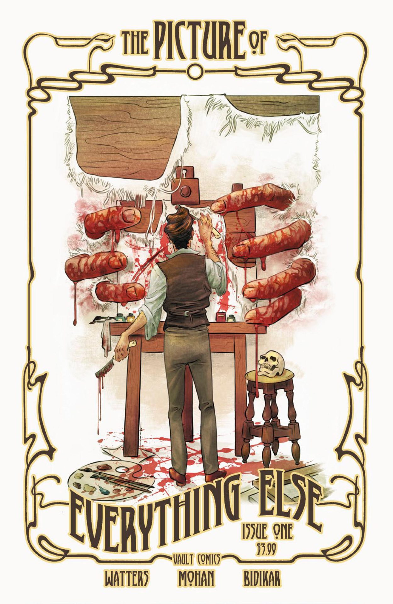
Kishmore Mohan’s draws this first issue elegantly. If it weren’t impossible, I’d swear that Mohan traveled to Paris in 1897 and modeled this comic on what he saw. The artwork perfectly fits the picture that forms in my mind’s eye when I read novels set in this time period. Mohan’s color choices are wisely reminiscent of the types of oil paintings that comprise the subject matter of the story. All of his colors are muted or subdued, yet he is still able to capture the warmth of a sunset or the coolness of a canal street. Much like the comic’s story did, the artwork lured me into a state comfortability. Then my senses were awakened by a brutal and bloody full-page illustration of a gruesome murder.

In my opinion, The Picture of Everything Else is a comic book love letter to Oscar Wilde. It’s a modern philosophical examination of the nature of art and the role of the artist, that retains the setting and tone of The Picture of Dorian Gray. It has lovely art and a story that, while inspired by Gothic romance and Wilde’s imaginings, still has a contemporary feel. As much as I loved this comic, I recognize that it may appeal to all readers. This is a solid first issue, but it may lack enough action or mystery to engage those looking for a traditional murder mystery thriller. For those who always wondered what happened to Basil Hallward however, this is a series you’ll want to pick up.

Story: Dan Watters Art: Kishmore Mohan
Color: Kishmore Mohan Letterer: Aditya Bidikar
Story: 10 Art: 10 Overall: 10 Recommendation: Buy

Vault Comics provided Graphic Policy with a FREE copy for review


Purchase: comiXologyKindleZeus Comics

Review: Cinderella Annual: Bloody X-Mas

Cinderella Annual: Bloody X-Mas

One of my favorite things about being a part of the team here at Graphic Policy is that I get the chance to review the titles published by Zenescope Entertainment. Honestly, getting to read Zenescope’s comics has been one of my highlights during this train-wreck of a year. I love that their comics fracture fairy tales while adding in science-fiction or horror elements. In Cinderella Annual: Bloody X-Mas, characters from folklore and horror elements are combined with Christmas to create a holiday adventure.

Cinderella is back in this Christmas themed annual, written by Dave Franchini. In a savage twist of holiday spirit, Cinderella is pitted against Krampus, the child punishing demon from Central European folklore. I’m new enough to Zenescope’s Grimm Universe that I don’t know Cinderella’s back story in this world. This annual doesn’t give the reader any details on Cinderella’s history other than a footnote of her last comic book appearance. On one hand, the reader doesn’t need to know her history to jump right into this annual. On the other hand, I spent the entire issue thinking that Cinderella is an odd choice for Uma Thurman’s character in a Kill Bill styled revenge story. Yes, this is a fractured fairy tale, but I kept thinking that Cinderella is the last princess who has a reason to be vengeful. I mean, in her fairy tale, her stepfamily gets their comeuppance and she gets to settle down with a handsome prince without all the borderline date-rapey subtext of princesses like Snow White or Sleeping Beauty. I found it odd that Cinderella would be out for revenge against anyone, let alone a Christmas themed demon.

Throughout the story in Bloody X-mas, Cinderella came across as a knock-off Harley Quinn. She spends a good chunk of the story talking to herself and making quips. Harley Quinn is one of my favorite characters and so I actually enjoyed Cinderella’s punchy dialogue, even if it was derivative of another publisher’s creation. I did enjoy the pop culture references, including the nods to Terminator, Star Wars, Charlie Brown, Gremlins, and a myriad of Christmas movies. I thought the homages to How the Grinch Stole Christmas were especially funny. At the end of the day though, the story is heavy on dialogue and light on action and these pop culture references do little to elevate it beyond nostalgia and cheap humor.

Another detail about Bloody X-mas that I found confusing was the fact that so many different artists worked on it. Seven different illustrators and two colorists contributed to this issue. For the most part, all the artists do a good job of meshing their styles together. Unless a scene is an homage to another creative property, it’s hard to tell that multiple people drew this annual. Unfortunately, there is one exception to this. The level of detail put into the characters’ faces changes noticeably, and sometimes dramatically from one page to the next. Regardless of who happens to have the art duties on any particular page, the flow of the story is always clear and the action sequences are drawn well. If I’m being honest, the artwork in this annual did not blow me away. None of it is bad, but there’s nothing impressive or nuanced about it either.

For those who have been following Cinderella’s adventures through the Grimm Universe for the last few years, you’ll probably want to pick up Bloody X-mas. For everyone else, this comic may turn out to be hit or miss. The story is dialogue-heavy and full of attempts at cleverness. For me, not all of the jokes and quips landed, but humor is subjective so individual reader experiences may vary. I enjoyed Cinderella’s character, but recognize that there are those who would quickly become annoyed by her. The artwork isn’t bad, and the various artists work well together. However, few of the pages stand out as exceptional and some might find the random switches between artists to be visually jarring. At the end of the day, Cinderella Annual: Bloody X-mas accomplishes its goal of telling a wacky Christmas story. For those who decide to read it, here’s some advice. Don’t think too hard about what you’re reading and just enjoy the ride.

Story: Dave Franchini
Art: Manuel Preitano (1, 43, 46-49), Salvatore Cuffari (2-10, 44, 45, 65), Adrián Gutiérrez (11-23), Dario Tallarico (24-32), Eduardo Garcia (33-42), Moy R. (50-58), Marc Yarza (59-64)
Color: Manuel Preitano (1,43, 46-49), Leonardo Paciarotti (2-42, 44, 45, 50-65)
Letterer: Taylor Esposito (of Ghost Glyph Studios) with Rienna Bates
Story: 5.0 Art: 5.0 Overall: 5.0 Recommendation: Read

Zenescope provided Graphic Policy with a FREE copy for review


Purchase: comiXologyKindleZeus Comics

Review: Byte-Sized #1

Byte Sized #1

Cullen Bunn, master of science-fiction storytelling, brings his talents to a Christmas story in Byte-Sized #1. The first issue of this four-part series from AWA Upshot is due to hit stands on December 9th. Every kid looks forward to opening presents on Christmas morning. On this particular Christmas morning, siblings Katy and Ben are in for a surprise bigger than whatever Santa Claus is planning to bring them. A group of robots possessing artificial intelligence had escaped from a government research facility and has found their way beneath Katy and Ben’s Christmas tree.

A sense of mystery bubbles beneath the surface of the entire first issue, culminating in an exciting cliffhanger. Bunn does a great job of setting up the story while keeping the robots’ intended purpose and full capabilities unknown. The combination of the magic of Christmas, the innocence of children, and the mysterious agenda of the robots make for a very compelling start to this limited series. I would have liked to see a little more happen in this first issue as several scenes seemed to drag. More panels were dedicated to certain events in the story than seemed necessary. Out of all the characters in this issue Gizmo, the family’s dog, stood out the most by far. Gizmo drives the second half of the plot forward and is adorable while doing it. In my opinion, one thing that would have improved on the story is if the entire thing was told/drawn from the perspectives of Gizmo and the robots. Those panels where this was the case were the strongest in the entire issue.

Nelson Blake II’s artwork fits the story of Byte Sized #1 perfectly. His style makes the characters look realistic while always capturing the tone conveyed by Bunn’s script. Even locales as mundane as a truck stop or a laundry room are brought to life by Blake’s artwork. He does a great job of rendering expressive faces, especially the characters’ eyes. Each character’s eyes are vibrant and perfectly capture the emotions that character is feeling in any given scene. Colorist Snakebite Cortez ups the ante on Blake’s illustrations with an expert use of shading, adding depth to the character designs. Every panel in this first issue, even the ones where people are just standing around talking, has a dynamic look and feel to it because of the art team’s collaboration.

In Byte-Sized #1 Cullen Bunn once again showcases his talent for blending genres. This first issue has horror and sci-fi elements, all wrapped up in a Christmas bow. The last few pages left me legitimately excited to see where the story will go from here. The art team breathe life into Bunn’s script and give each panel a unique look. Plus, you can’t go wrong with cute doggie action! Get in the holiday spirit and pick up your copy of Byte-Sized #1.

Story: Cullen Bunn Art: Nelson Blake II
Color: Snakebite Cortez Letterer: Sal Cipriano
Story: 8.0 Art: 9.0 Overall: 8.5 Recommendation: Buy

AWA Studios provided Graphic Policy with a FREE copy for review


Purchase:

Early Review: Byte-Sized #1

Byte Sized #1

Cullen Bunn, master of science-fiction storytelling, brings his talents to a Christmas story in Byte-Sized #1. The first issue of this four-part series from AWA Upshot is due to hit stands on December 9th. Every kid looks forward to opening presents on Christmas morning. On this particular Christmas morning, siblings Katy and Ben are in for a surprise bigger than whatever Santa Claus is planning to bring them. A group of robots possessing artificial intelligence had escaped from a government research facility and has found their way beneath Katy and Ben’s Christmas tree.

A sense of mystery bubbles beneath the surface of the entire first issue, culminating in an exciting cliffhanger. Bunn does a great job of setting up the story while keeping the robots’ intended purpose and full capabilities unknown. The combination of the magic of Christmas, the innocence of children, and the mysterious agenda of the robots make for a very compelling start to this limited series. I would have liked to see a little more happen in this first issue as several scenes seemed to drag. More panels were dedicated to certain events in the story than seemed necessary. Out of all the characters in this issue Gizmo, the family’s dog, stood out the most by far. Gizmo drives the second half of the plot forward and is adorable while doing it. In my opinion, one thing that would have improved on the story is if the entire thing was told/drawn from the perspectives of Gizmo and the robots. Those panels where this was the case were the strongest in the entire issue.

Nelson Blake II’s artwork fits the story of Byte Sized #1 perfectly. His style makes the characters look realistic while always capturing the tone conveyed by Bunn’s script. Even locales as mundane as a truck stop or a laundry room are brought to life by Blake’s artwork. He does a great job of rendering expressive faces, especially the characters’ eyes. Each character’s eyes are vibrant and perfectly capture the emotions that character is feeling in any given scene. Colorist Snakebite Cortez ups the ante on Blake’s illustrations with an expert use of shading, adding depth to the character designs. Every panel in this first issue, even the ones where people are just standing around talking, has a dynamic look and feel to it because of the art team’s collaboration.

In Byte-Sized #1 Cullen Bunn once again showcases his talent for blending genres. This first issue has horror and sci-fi elements, all wrapped up in a Christmas bow. The last few pages left me legitimately excited to see where the story will go from here. The art team breathe life into Bunn’s script and give each panel a unique look. Plus, you can’t go wrong with cute doggie action! Get in the holiday spirit and pick up your copy of Byte-Sized #1 when it hits shops on December 9th.

Story: Cullen Bunn Art: Nelson Blake II
Color: Snakebite Cortez Letterer: Sal Cipriano
Story: 8.0 Art: 9.0 Overall: 8.5 Recommendation: Buy

AWA Studios provided Graphic Policy with a FREE copy for review


Purchase:

Skeletons From My Stack: Lumberjanes Volume 1: Beware the Kitten Holy

Lumberjanes Volume 1

Like most bibliophiles, I keep a stack of books by my bed that I one day plan to read. Unfortunately, between reading review materials, participating in reading challenges, books I’ve had on hold at the library for ages becoming available, and the lure of new books, that stack never seems to get any smaller. So I’ve decided to make an effort to finally tackle some of the books from my bedside “to-be-read” stack. So sit back and enjoy reading my thoughts on some of the skeletons from my book stack.

Lumberjanes is a series that has intrigued me for a long time. Brandy, the lady who owns my local comic book store, loves the Lumberjanes. It’s her favorite series. She’s got a discerning palate when it comes to comics, so a recommendation from her carries a lot of weight. Over a year ago, someone gave me a box of books. In that box was Lumberjanes Volume 1. I donated most of the rest of the books to charity, but I kept the Lumberjanes trade paperback. It has sat waiting on my stack until the day I got around to finally reading it. That day is today!

Five female best friends at a summer camp in the woods. Sounds like the plot of a slasher movie (or a porno). Sorry to disappoint fans of horror films (or porn enthusiasts) but Lumberjanes is a girl-powered fantasy adventure series. Best friends Jo, April, Mal, Molly, and Ripley are spending the summer at Miss Qiunzella Thiskwin Penniquiqul Thistle Crumpet’s Camp for Hardcore Lady-Types. This is no ordinary summer camp. Mysteries lay nearby, waiting to be uncovered and the surrounding woods are full of fantastic and mythical creatures.

From the dialogue to the sight gags, this is a really funny comic book. The girls’ friendship really shines through. Their relationships are very endearing and stand out from the purposely ridiculous nature of the story. Each chapter is preceded by a section out of the Lumberjanes field manual. These excerpts tie into the events of each chapter and provide cute background info to the story. I really liked all the pop culture references contained within the dialogue. I also enjoyed all the references to famous women from history. Admittedly, I had to Google a few to realize who was being referenced, but that isn’t a bad thing. Any comic that inspires people to learn on their own is doing something right.

Artist Brooke Allen’s style reminded me a little of Captain Underpants. Except, she used darker inks and much fuller levels of detail. The colors are so vivid and bright that there were times where I considered wearing sunglasses to read this book. Even the scenes set at nighttime are given a rich vibrancy by Maarta Laiho’s color choices. I really liked how Allen draws faces. They convey emotion while retaining the elasticity and wackiness of a cartoon character.

Lumberjanes Volume 1 was well worth the wait. I’m glad I chose it as the first book to remove from my stack. This comic is geared toward young people, and the story is very silly. So although it’s suitable for all readers, it may not appeal to those used to more mature titles. The first volume contains a joyful adventure story full of heart and humor. I’m not sure if I’ll read any further into the series, but I do regret waiting so long to check it out. Lumberjanes made for a fun afternoon of reading. Now onto the next title in my stack…

Story: Noelle Stevenson and Grace Ellis Art: Brooke Allen
Color: Maarta Laiho Letterer: Aubrey Aiese
Story: 3.0/5.0 Art: 4.0/5.0 Overall: 3.5/5.0


Purchase: comiXologyAmazonKindleBookshop

Early Review: The Orville #3 – Heroes Part 1

The Orville #3

Light Spoilers to Follow…

Dark Horse transport readers back into space with another two-part adventure featuring the voyages of the starship Orville. In The Orville #3 – Heroes Part 1 the inhabitants of a planet known only as HR 5070 have developed advanced technologies that should be far beyond their grasp. The Okudum should not possess the means to create a quantum reactor, yet after scans clearly show the presence of such a device, the crew of the Orville is sent to investigate.
Each of these Orville stories gives fans background information of certain members of the Orville’s crew. In Heroes, it’s Ensign Talla who’s history is expanded on. She’s an expert on the Okudum and the alien race holds a special place in her heart.

In my opinion, these Orville comics aren’t writer David A. Goodman’s best work. This is the second one I’ve read, and for the second time, I’ve gotten the sense he’s just missing the point of the show. I don’t feel that these Orville comics are a good adaptation of the FOX television show. Created by Seth Macfarlane, the TV show is meant to be part parody and part homage. The episodes are humorous while still maintaining the feel of a classic Star Trek story. I find these Orville comics to not only lack humor, but feel that they’re desperately in need of a joke or two. A lighter tone or more action would certainly improve things.

Without the humor or light-heartedness, these comics feel less like a homage and more like a low-quality rip off of both Star Trek and the Orville show. Goodman just doesn’t do enough to capture the voices of the actors when he writes their comic book counterparts’ dialogue. The dialogue of the characters in the comic reads very generically. The dialogue sounds like it could be spoken by anyone, instead of famous actors. Goodman’s scripts also lack the sophistication and emotional tension of a Star Trek episode. In The Orville #3, the character’s in this comic just sit around and talk. There’s no urgency, seemingly no real threat, and the character interactions seem more like co-workers who are forced to work together and not crewmates who must rely on one another to accomplish the mission. It’s not like Goodman doesn’t have source material to pull from between the Orville show and untold episodes of Star Trek. Instead, he comes up with these bland “space procedurals” where the first part is all set up for the second part, except without any excitement or plot twists that make the reader want to buy part 2 and finish the story.

David Cabeza’s illustrations contain a great amount of detail. He’s just as good at drawing an alien landscape as he is at rendering expressive faces. The small details he includes help distinguish different characters and species of alien from one another and give each one their own unique look. Colorist Michael Atiyeh adds depth to these details through shading and shadow. This adds an element of realism to the expressions and physical forms of the characters. I was also impressed by the accuracy of Cabeza’s drawings of the actors who play the Orville characters on the TV show. Seth MacFarlane’s character is especially well done.

Fans of classic Star Trek or the Orville TV show might find something to like about The Orville #3, but there’s not much in this comic to hook most readers. The story is boring, the plot predictable, and the dialogue flat. The artwork is of good quality but doesn’t offer many impressive visuals. Ninety percent of this comic is just people standing or sitting around talking. Goodman has a plethora of sources to pull inspiration from, yet he gives the reader a drama with no real tension. Hopefully one day, Seth Macfarlane can be convinced to consult and punch up the dialogue or story. Otherwise, I find little that would make someone want to buy any of these The Orville inspired comic books.

Story: David A. Goodman Art: David Cabeza
Colors: Michael Atiyeh Lettering: Richard Starkings & Comicraft’s Jimmy Betancourt
Story: 1.0 Art: 6.0 Overall: 3.5 Recommendation: Pass

Dark Horse provided Graphic Policy with a FREE copy for review


Purchase: comiXologyKindle

Review: Backtrack Vol. 1

Backtrack Vol. 1

Allow me to start this advance review off with an original poem: Backtrack is about a death race through time. A life-changing prize awaits, for the first to cross the finish line. When a stranger offers her the chance to change her past, Alyson vows to drive fast, and beat the rest of the comic’s cast. That sums up the plot for this action/adventure series, written by Brian Joines. Backtrack Vol. 1 collects the series into a trade paperback and published by Oni Press, is due for release on November 18th in book stores, and can be found in comic shops now.

I think it’s awesome to see a story about a female get-away driver. It was also refreshing to see that none of the female drivers were sexualized. Regardless of gender, all the drivers look like real people. There’s no exaggeration of body proportion to make them sexier and none of the characters are portrayed as sex objects. Early in the story, I would have liked to see a roster or gotten a little more backstory on the other drivers. They start dropping like flies on the first leg of the race, and although their deaths are pretty cool, seeing the nameless side characters die didn’t make much of an impact. Even once the characters start introducing themselves, they’re little more than just names, as we hardly see the characters’ faces up close for long enough to form a mental connection. By the end of the book, the main characters are pushed to the forefront and the reader gets a clearer idea of some of their motivations for joining the race, but I still would have liked to see more character development early on.

Showing the race map superimposed over black and white images was a clever way to show the passage of time. However, I wish the actual racing had been shown in more detail. The reader is basically shown the start of a leg, a few shots of Alyson and maybe a few other racers, and then a page later we’re at the end of the leg. Honestly, the race becomes less of a vehicle for the story (pun intended) and more of a gimmick that the story must weave around. The story is exciting, but it doesn’t move beyond ‘time travel adventure to fix the past.’ Now, it technically doesn’t have to move past that theme, as the story is still compelling; but if Joines had put more emphasis on the race and the drivers, then this comic would have been something really special. As it stands, Backtrack is a solid action/adventure story that just so happens to include time travel and car racing.

I really liked the dark linework and hard edges of Jake Ephick’s illustrations. This series gives Ephick a chance to showcase his artistic talents. Throughout the course of the first volume, he gets to draw several different points in time, including the Cretaceous Period and the height of the Roman Empire. He also gets to play with scale in a visually interesting way, with each leg of the race providing the opportunity for differences in the size of objects in the same panel or differences in perspective and distant between objects in the same panel. Each character has their own unique design, but unless they’re drawn in a close-up, I found it hard to tell each driver apart from one another. It would have been nice if the same amount of effort that went into the more exciting panels had also been applied toward either visually distinguishing the characters’ cars or their clothing. This would have made it easier to identify one character from another regardless of the perspective from which a single panel was drawn.

Backtrack Vol. 1 collects the first five issues of this action-packed series. This first volume contains a really well-written action/adventure story that doesn’t take full advantage of its hook, concept, or settings. The art team gets to show off their skills in certain scenes, but other scenes lack a level of detail that would have improved the visual clarity. This series is good but is kept from reaching greatness by its own shortcomings. One cool touch I want to mention in closing, included in the back is an unofficial soundtrack to Backtrack. It includes some great song choices, and fans of this series may want to put them on in the background while diving into this trade paperback.

Story and Created by Brian Joines Art: Jake Elphick
Colors: Doug Garbark Letterer: Jim Campbell
Story: 6.0 Art: 8.0 Overall: 7.0 Recommendation: Buy

Oni Press provided Graphic Policy with a FREE copy for review


Purchase: comiXologyAmazonZeus Comics

Review: The Scumbag #1

The Scumbag #1

Everyone wants to be a hero. Or at the very least, everyone loves to root for the hero. They’re good looking and they’re tough. They’re smooth and they’re smart. They may have a troubled past, but they always have a chance for redemption. Plus, they always get the girl. Ernie Ray Clementine, the hero of The Scumbag #1, is none of these things. Yet, he’s the only thing that can save the world from Armageddon in this new ongoing series from Image Comics.

This series, penned by Rick Remender, takes a crass, illiterate, drug addict, injects him with an experimental super serum, and throws him into the world of high stakes espionage. The first issue introduces us to Ernie and sets the stakes for the first arc. Unfortunately, it doesn’t go much further than set up. Which wouldn’t be a bad thing, except that everything in this first issue, and some of the best lines within the issue for that matter, were laid out in the synopsis to the comic book.

A character profile and introductory letter to the reader, written by Remender and included at the end of the issue, actually give us more of Ernie’s background than the comic does. Full disclosure, if you buy the first issue, maybe flip to the back and read the letter, as it gave me more of an appreciation for the type of character Ernie is supposed to be than the actual comic did.

The story does have a science-fiction element that I found surprising. Though, outrageous and fantastical as this comic’s premise is, the sci-fi element just seems like one story element too many. For a comic where the plot doesn’t move forward beyond the synopsis, there’s almost too much going on in this first issue. That all being said, one thing I did love about this issue was that the background characters break the fourth wall. As the narrator’s voice is introducing us to Ernie, these characters affirm or add to the details being shared.

Each issue of this series will be drawn by a different artist. In The Scumbag #1, Lewis LaRosa gets first dibs. LaRosa’s art style is like a cross between an impressionist painting and street graffiti. His line work is sparse, yet the images in each panel are always clear. The artwork really sells the locations of each scene and makes the one fight sequence in this first issue look amazing. The colors used by Moreno Dinisio are bright, but were obviously applied digitally. I’m not sure either of these details act as the best compliment to LaRosa’s illustrations. In addition to a rotation of main artists, each issue of this series will have will have multiple variant covers drawn by a string of A-List artists.

The Scumbag #1 is not for everyone. The first issue alone has blood, gore, diarrhea, masturbation, and heavy drug use. Fans of action movies and anti-heroes will surely find something to like about this series. Those who enjoy character development and complex plots should probably choose a different title. Honestly, considering the string of artists slated to draw covers for each issue, this might be the type of series a person buys just for the cover art. In any case, give this one a browse before you commit to purchasing it.

Story: Rick Remender Art: Lewis LaRosa
Colors: Moreno Dinisio Letters: Rus Wooton
Story: 3.0 Art: 8.5 Overall: 5.8 Recommendation: Read

Image Comics provided Graphic Policy with a FREE copy for review


Purchase: comiXologyKindleZeus Comics

Review: The Phantom of the Opera

The Phantom of the Opera

When I saw that I had the opportunity to review The Phantom of the Opera graphic novel, my first thought was, is it going to play music when I open it, like one of those novelty greeting cards? Then I read a little further into the email from A Wave Blue World and knew that I needed to review this title. You see, Hungarian artist Varga Tomi doesn’t take the same approach as Andrew Lloyd Webber or Joel Schumacher. Instead, Tomi gives readers a direct adaptation of Gaston Leroux’s 1910 novel, the inspiration for every other version of The Phantom of the Opera most of us have likely seen before.

Every artistic detail in this graphic novel is gorgeous. From the intricate page layouts to the color choices, to the sophisticated lettering, every page of this book is a work of art. Before starting in on this adaptation, Tomi traveled to Paris to study the city’s architecture. The sketches he made during his travels are directly transposed onto the page. Many panels are framed by the opera house’s architectural design and the building itself looks real. This turns the opera house into a player in the story and not just a background setting.

Tomi’s color choices further elevate his illustrations of the opera house. Tomi uses soft, warm colors for flashbacks. These colors reflect Raoul’s fond memories of his childhood with Christine. The scenes set beneath the opera house really look like they’re set in a cave. Tomi colors these scenes while taking into consideration where the light source is located in each panel. The shadows created by this effect add intensity to scenes that are already spooky.

My only complaint about the art is that I found it difficult to tell certain characters a part. This was especially true for minor characters that appear briefly in a scene and then aren’t seen again until later. Despite this complaint, I do need to mention that the Phantom is very creepy. In other adaptations, the Phantom looks more or less like a normal guy until his mask is removed. Tomi’s Phantom looks like there is something off about him, even when he’s wearing the mask. Tomi draws him with a sinister air, even in the scenes that are set in innocuous locales, such as the parlor of the opera house.

For those who have only seen the musical, the story from the original novel plays out a little differently. Leroux’s novel is a classic example of gothic fiction. These days most people hear “gothic” and think of stories set in a creepy old mansion. With the opera house as a grand backdrop, Tomi chooses to focus on the other elements of gothic fiction, namely hints of the supernatural, an air of forbidden romance, and characters cursed with dark fates. Even though there are differences between the musical’s story and the novel’s, the big moments are still present in the graphic novel, such as the chandelier crash, the masquerade ball, and the underground river. Not to sound like a broken record, but thanks to Tomi’s artistic talents, these big moments look amazing.

This graphic novel adaptation of The Phantom of the Opera is perfect for fans of gothic fiction. It’s the sort of book that a person could buy solely to look at the art. Admittedly, the story within may not appeal to everyone, as it’s different from the version with which they’re most familiar. Tomi also presents a faithful adaptation of Leroux’s novel and doesn’t update any of the language for a modern audience. This doesn’t make for the easiest read for those who aren’t used to reading works from the last century. For those who like the story of The Phantom of the Opera, but don’t care for musicals, this graphic novel is a perfect compromise. If after reading this review, you’re unsure as to whether you want to buy this graphic novel, check out our preview. Don’t be surprised if the beautiful art wins you over immediately.

Story: Gaston Leroux Script: Varga Tomi Art: Varga Tomi Letters by Varga Tomi
Story/Adaptation: 10 Art: 9.0 Overall: 9.5 Reccomendation: Read

A Wave Blue World provided Graphic Policy with a FREE copy for review


Purchase: comiXologyAmazonKindle Bookshop

Early Review: The Scumbag #1

The Scumbag #1

Everyone wants to be a hero. Or at the very least, everyone loves to root for the hero. They’re good looking and they’re tough. They’re smooth and they’re smart. They may have a troubled past, but they always have a chance for redemption. Plus, they always get the girl. Ernie Ray Clementine, the hero of The Scumbag #1, is none of these things. Yet, he’s the only thing that can save the world from Armageddon in this new ongoing series from Image Comics.

This series, penned by Rick Remender, takes a crass, illiterate, drug addict, injects him with an experimental super serum, and throws him into the world of high stakes espionage. The first issue introduces us to Ernie and sets the stakes for the first arc. Unfortunately, it doesn’t go much further than set up. Which wouldn’t be a bad thing, except that everything in this first issue, and some of the best lines within the issue for that matter, were laid out in the synopsis to the comic book.

A character profile and introductory letter to the reader, written by Remender and included at the end of the issue, actually give us more of Ernie’s background than the comic does. Full disclosure, if you buy the first issue, maybe flip to the back and read the letter, as it gave me more of an appreciation for the type of character Ernie is supposed to be than the actual comic did.

The story does have a science-fiction element that I found surprising. Though, outrageous and fantastical as this comic’s premise is, the sci-fi element just seems like one story element too many. For a comic where the plot doesn’t move forward beyond the synopsis, there’s almost too much going on in this first issue. That all being said, one thing I did love about this issue was that the background characters break the fourth wall. As the narrator’s voice is introducing us to Ernie, these characters affirm or add to the details being shared.

Each issue of this series will be drawn by a different artist. In The Scumbag #1, Lewis LaRosa gets first dibs. LaRosa’s art style is like a cross between an impressionist painting and street graffiti. His line work is sparse, yet the images in each panel are always clear. The artwork really sells the locations of each scene and makes the one fight sequence in this first issue look amazing. The colors used by Moreno Dinisio are bright, but were obviously applied digitally. I’m not sure either of these details act as the best compliment to LaRosa’s illustrations. In addition to a rotation of main artists, each issue of this series will have will have multiple variant covers drawn by a string of A-List artists.

The Scumbag #1 is not for everyone. The first issue alone has blood, gore, diarrhea, masturbation, and heavy drug use. Fans of action movies and anti-heroes will surely find something to like about this series. Those who enjoy character development and complex plots should probably choose a different title. Honestly, considering the string of artists slated to draw covers for each issue, this might be the type of series a person buys just for the cover art. In any case, give this one a browse before you commit to purchasing it.

Story: Rick Remender Art: Lewis LaRosa
Colors: Moreno Dinisio Letters: Rus Wooton
Story: 3.0 Art: 8.5 Overall: 5.8 Recommendation: Read

Image Comics provided Graphic Policy with a FREE copy for review


Purchase: comiXologyKindleZeus Comics

« Older Entries Recent Entries »