
Review Gideon Falls #1
 Jeff Lemire doesn’t sleep. Ever.
This is the only reasonable conclusion I can draw from the immense workload that the man puts out on the regular, whether it be as a writer (Bloodshot: Salvation, Moon Knight, Descender, and about a billion besides) or as an artist (his recent work on A.D.: After Death comes to mind among a girth of others), or as both artist and writer (Royal City, Trillium, Sweet Tooth, The Underwater Welder…the list goes on). I started working my way through his immense portfolio after discovering Trillium on a fluke at my local shop a few months back, which is more difficult than you might think: the minute I’m finishing one, Lemire is churning out thirty more.
One of those newly churned series is Gideon Falls, his latest authorial work alongside artist Andrea Sorrentino, colorist Dave Stewart, and letterer Steve Wands. Graphic Policy was fortunate enough to have the chance to review the first issue before its March release, and having done so I am now forced to revisit and expand upon my initial premise: Jeff Lemire doesn’t sleep – and with Gideon Falls, he and the rest of the creative team promise that none of us will either.
The initial adverts for Gideon Falls billed it as having something of a horror vibe, and without going into too details here the first issue promises something truly creepy to come. There’s a sense of some of the common threads that tie Lemire’s other works to each other, chief among them the premise of two disparate worlds lashed together by the machinations of A Veiled Grand Design, but rather than feel contrived or predictable this structural unity provides the familiarity normally associated with a genre study. Lemire’s world-blending manifests in the as-of-yet unspecified shared circumstances of city-bound obsessive Norton and errant, possibly disgraced Father Wilfred, culminating in a final pages reveal that can be described only as “creepy as all get-out”.
Ominously titled “The Speed of Evil”, Gideon Falls #1 carries a cinematic quality, the story unfolding as one might expect from the first act of a crime drama or, appropriately, psychological horror flick. We’re given glimpses of central charater Norton’s deteriorating mental state as he picks through his city’s garbage, alongside indications that he may not be as sick as others think he is, but it isn’t until the final few pages that the depths of his vision – or the depths of his psychosis – become clear. The same is true for Father Fred, a priest whose apparent exile to Gideon Falls isn’t touched upon save for vague flashbacks concerning an apparent fall from grace. While readers expecting any sense of the wherefores or hithertos out of issue one are going to leave sorely disappointed, those that dig a gripping sense of what’s-to-come will be delighted: we stumble onto the nuances of the mystery alongside the Norton and Fred, and so when they are perplexed or left with a chill, so too are we.
Lemire’s work couples nicely with Sorrentino’s character designs and backgrounds. The dinge of the city and the lazy small town atmosphere is carried nicely through Stewart’s contrasting warm/cool color schemes, and there is haze of decay over most everyone and everything that makes a few brilliant moments of red stand out as alien – and dangerous – in an otherwise fugue-like world. Sorrentino’s characters are distinct and yet ghostly, and a deliberate lack of detail around eyes and in expressions isn’t so much jarring as a little unsettling, especially fitting in a world that we begin to understand is not quite right.
I likewise applaud the creative team for its excellent use of silence: the panels are unencumbered by nearly all effect bubbles, which ironically makes the depicted ambient noises – the jangle of trash, the passing of a car, the rustle of a grassy field – all the more effective. It’s proof positive of the notion that less is more, and it likewise underscores the eerie, deliberate absence of something that runs throughout this largely-quiet first issue.
What that something is, I can’t say – not because this is a spoiler-free review, but because so many threads have been left purposefully loose that as a reader all I grasped was an off-putting sense of wrongness permeating the fabric of Fred and Norton’s world before a final reveal that, while shocking, delivered only more questions. I look forward to discovering what lurks beneath the surface of the desolate, deceptively innocent world that they inhabit – a world that isn’t quite right, but isn’t yet ready to tell its secrets.
If you’re a fan of a good story, eerie imagery, and bleak, evocative coloring – or you’d like to cure an excess of sleep with a solid case of the creeps – you should be first in line to pick it up.
Image Comics provided Graphic Policy with a FREE copy for review
 A few weeks ago at my local comic shop, I got to talking to a fellow comics fan, a guy who was looking to dig into a few new titles. He was looking for something with a solid story, sympathetic characters, a sense of catharsis – everything that the traditional cape stories he was taking a break from didn’t provide.
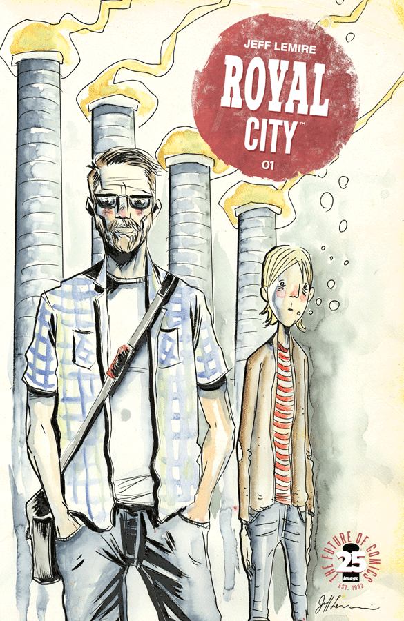
 I’m five issues in at the time of this writing and eagerly awaiting the drop of issue six, what will be the beginning of the second story arc for the series, and not since Ales Kot’s run of Bucky Barnes: Winter Soldier have I had less of an idea of where a story is heading yet been so keenly invested in its characters. Lemire’s way of worldbuilding is at once lush, nuanced and full, and barebones, veiled, and reserved. His characters come into themselves as much through what is left unsaid as through what is known, leaving a great deal of their motivations and pasts up to the speculation of the reader. His environments, owed to his signature art style and washed out, weathered coloring, are bleak in the best possible sense of the word. As in A.D. and Trillium, Lemire balances humanity with fantasy in a way that allows for fantastic events – the voice of a dead boy hauntingly reaching out to his father through a radio, for instance – to occur without a blink.
 The second story arc of Royal City begins with issue six in a week’s time and promises a trip back in time: into the early nineties, and to a time when young Tommy Pike was more than an agonized projection of his siblings’ guilt. The story promises more of Lemire’s excellent worldbuilding to bring us into a world at home and apace with the titular setting: a town that hasn’t changed much in two decades, and whose aversion to the times seems poised to drag it to ruin. It’s the kind of small town that exists, for me, in my memories: it isn’t my home town but at the same time it is, in many respects, and it’s the kind of place that I can look on with contempt and nostalgia in equal parts – and I’m certain I’m not alone in those feelings.
 It’s said that no work of literature is written in a vacuum.
 Matthew and Arlene Daley’s Not-So Secret Society promises an adventure appropriate of all ages, crafted by its creators’ background as parents and educators. In
  As I read on, it became clear that the Daleys were driving toward that exact point with their story. The Society’s involvement in a city-wide science fair, a rivalry with fellow scientist team The 5Zs, and the revelation that their “living candy” experiment all quickly swerves the work toward science fiction rather than science fact, and left me wondering about the classroom application of the work as a whole – that is, until I stopped reading the work as a testament to the joys of hard science and started to appreciate it for what it was: an extremely well-crafted work about the importance of ethics and morality in the S.T.E.M. fields. While there is a little light science mixed in here and there, the bulk of the narrative seems far more interested in the why and how rather than the what – a unique angle that’s both far more essential and much more engaging.
 Taken as a comic book, The Not-So Secret Society does a great deal to make itself visually as well as conceptually appealing. Wook Jin Clark’s art style is reminiscent of the Saturday morning cartoons I grew up on with a bit of a manga flare thrown in for good measure (note the exaggerated “shock” lines when a character is taken by surprise, or the phantom limbs that mark where arms and legs were when a character makes a quick gesture). The paneling that makes up most pages is clean and easy to follow, frequently broken up by splash pages that do a wonderful job of setting the tone and scope of the Society’s world while making exceptional use of Elonora Bruni’s immensely varied color palette. The world of the Society looks expansive, vibrant, and alive, the perfect mix for the enthusiasm that the Society (and the Daleys) bring to the story.
 Matthew and Arlene Daley’s The Not-So Secret Society is the next in a long line of comics made for and by educators with the explicit purpose of classroom use – a line that often varies in its quality and content, but generally has its heart in the right place.