Author Archives: christopher scott author

Review: Syphon #1

Syphon #1

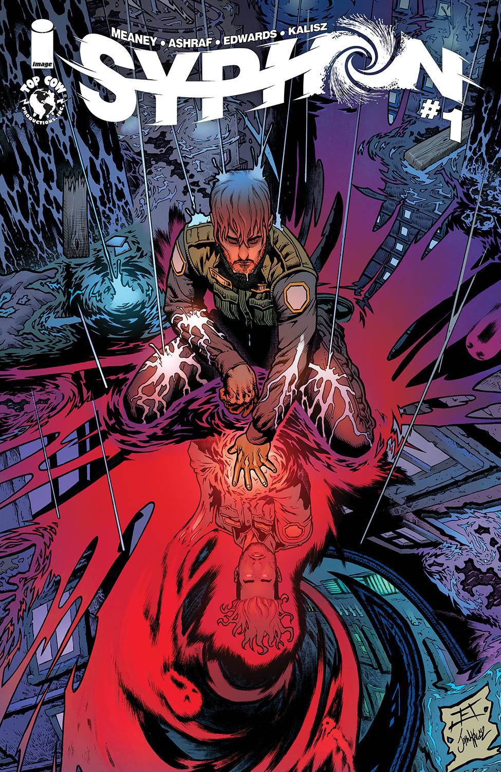
When a fast-living EMT is entrusted with the power to sense and siphon pain from others, Sylas is presented with a new purpose: to ease the misery of those around him. But the more he uses this gift, the more it curses him with carrying the burdens of others’ pain. And it soon attracts the attention of mysterious forces who covet the power for themselves, forcing Sylas to decide whether he will continue his mission or revert to his old ways. Syphon #1 kicks off an interesting new series with a dip in fantasy and noir.

Syphon #1 is a promising debut issue from Mohsen Ashraf and Patrick Meaney that merges fantasy with the modern world. Sylas is a hard-working EMT striving to make a difference in a cold, hard world. Yet, that principled work ethic and morality may prove to be his undoing. Something unnaturally empathic has chosen Sylas to be its next host.

The debut is a good one teasing a new world and mythos to explore. We can see Sylas’ slide as this mysterious power takes its root and the pain of others begins to weigh on him. His life begins to suffer and we see the impact in his relationships.

The debut issue is brimming with spectacular artwork from Jeff Edwards. The art is used heavily to hint and tease at the supernatural origin of the power Sylas is given. Along with John Klasiz’s color, the art does an interesting job of balancing the dark nature of the pain Sylas deals with and a neon glow that goes along with his newfound power.

Syphon #1 is a good start mixing a few genres and delivering nice artwork. It’s a debut that does an excellent job of teasing what’s to come through the artwork and giving us a quick run-through of the burden that gets our main character to the next part of his journey.

Story: Mohsen Ashraf Written: Patrick Meaney, Mohsen Ashraf Art: Jeff Edwards Colors: John Kalisz
Story: 9.0 Art: 8.5 Overall: 8.75 Recommendation: Buy

Image Comics provided Graphic Policy with a FREE copy for review


Purchase: comiXologyKindleZeus ComicsTFAW

Review: Parasomnia #1

Parasomnia #1

Trust in writer Cullen Bunn? Parasomnia #1 takes us into a dark fantasy split between dreams and reality. Featuring beautiful art by Andrea Mutti, the debut is a comic that begs to be read again and again to soak it all in. Parasomnia #1 features two stories, after his son disappears, a broken-down man braves a nightmarish dreamscape in order to find him–and battle the ruthless cult that seeks to rule the land of dreams as the barrier between realities starts to collapse.

Parasomnia #1 is an interesting debut issue from the talented mind of Bunn. Bunn has shown time and time again his series deliver and are well worth sticking around for as the puzzle pieces come together. This debut features the horror tone Bunn has become a master of. The story splits its time between the real world and fantasy world and a missing boy in each. The connection between the two is hinted at and danced around teasing the reader and giving just enough to want to find out more.

Mutti’s unique style really shines in this debut issue. Mutti creates a lot of distinctions between the real world and the world of dreams though they work well together. There’s an impressive amount of detail that adds to each world and helps deliver the story. But, those details also tie the two worlds together. The mystery is also mixed in with a lot of action in both worlds and it works so well bringing excitement balancing the dread also found within.

Parasomnia #1 is an intriguing beginning that may leave many confused but also sets up a hell of a mystery and world. There’s such beauty and dread in the art and it all comes together to deliver a start that has me wanting to see where it all goes from here.

Story: Cullen Bunn Art: Andrea Mutti Color: Andrea Mutti
Story: 9.0 Art: 9.0 Overall: 9.0 Recommendation: Buy

Dark Horse Comics provided Graphic Policy with a FREE copy for review


Purchase: comiXologyKindleZeus Comics

Review: Nocterra #3

Nocterra #3

Know the signs: black gums, gnarled bones, and haunting yellow eyes. When you spot a human shade out there in the endless night…run. Nocterra #3 continues the darkness enveloping series adding dread at every turn.

Writer Scott Snyder has done an excellent job of balancing the past and present in the world of Nocterra. Nocterra #3 opens with a glimpse of the past as the world struggled with what was happening. It also provides us the reader a solid way of learning more about how one turns into Shades and what it means as Val and her brother must confront their infected parents.

Nocterra #3 has no problem shifting gears continuing the high octane pursuit as Val, her brother, and her cargo must stay ahead of Blacktop Bill. But, even that hints at more. We find out there’s more to Bill’s pursuit hinting more at the world before.

Snyder has done a fantastic job of balancing this world building and action. The series has balanced between the two playing with its themes of dark and light. Nocterra #3 drops a bit of religious connotation into that with discussions of prayers and the dichotomy of what happens once one turns into a Shade.

The art continues to impress. Tony S. Daniel‘s art brings so much to the world. He’s able to mix a tinge of horror with the science fiction elements. A great example is the tragic opening with Val’s parents is an example of that. Tomeu Morey‘s colors help add a ton as the colors deliver a neon hue that brings a little light to the world. The art really brings home the tension that Snyder creates throughout the series.

Nocterra #3 is another great issue that delivers a deeper view into the world and building up the tension. There’s a lot packed into the issue from visual hints to outright terror. It keeps up the action while shining a little light onto the world and its characters.

Story: Scott Snyder Art: Tony S. Daniel
Color: Tomeu Morey Letterer: AndWorld Design
Story: 9.0 Art: 8.5 Overall: 8.75 Recommendation: Buy

Image Comics provided Graphic Policy with a FREE copy for review


Purchase: comiXologyKindleZeus ComicsTFAW

Review: Home Sick Pilots #2

Home Sick Pilots #2

The Old James House has lost its ghosts. With her new powers, it’s up to Ami to bring them back…whether they want to come home or not. Even when they’re really big ghosts wrapped in metal, with lots of sharp edges and things. Home Sick Pilots #2 continues the intriguing horror series giving us a better idea as to what to expect going forward.

Picking up where the debut issue left off, Ami attempts to retrieve a lucky horseshoe in Home Sick Pilots #2. The horseshoe seems to have an agenda of its own not wanting to return to the house. The issue delivers a tragic tale of someone who has experienced nothing but good from the haunted horseshoe. What will her life be without it and does she want to return to that existence? Writer Dan Watters delivers a story that feels almost like a parable mixed with a little ghostbusting.

The issue hints a bit more as to what we can expect with the series. Its focus isn’t a missing Ami, presumably killed by the house. Instead, the house is using her to gather these items and ghosts, we assume. It’s a house with a mission and something on its mind apparently as it’s also not being clear with Ami as to what it’s done and what it wants.

The artwork by Caspar Wijngaard and letterer Aditya Bidikar continues to impress. The art delivers an intriguing visually intertwined narrative of Ami and her friends. We get the story around the Old James House which doesn’t seem as much of a horror story but that’s juxtaposed by the blood covering her friends as they attempt to figure out what to do. We also get a look at the ghost Ami captures in multiple ways and each is a fascinating design well worth examining.

Home Sick Pilots #2 moves the story along as well as delivering the backstory of Ami and her friends. It’s a solid horror story that feels like some classics in the genre. It’s not completely clear what’s going on but what has been presented is surely interesting and well worth checking out.

Story: Dan Watters Art: Caspar Wijngaard
Letterer: Aditya Bidikar Designer: Tom Muller
Story: 9.0 Art: 9.0 Overall: 9.0 Recommendation: Buy

Image Comics provided Graphic Policy with a FREE copy for review


Purchase: comiXologyKindleZeus Comics

Review: Protector #1

Protector #1

Protector #1 kicks of a new series and world that’s equal parts Conan the Barbarian, Mad Max, and The Expanse. Of all the tribes that dwell in the hot ruins of far-future North America, the Hudsoni reign supreme, but even they fear and obey the godlike Devas. When the Devas warn of an old-world demon in the conquered city of Shikka-Go, Hudsoni war chief First Knife decides to deal with the threat personally.

Protector #1 introduces us to a post-apocalyptic America, that is equal parts fantasy and science fiction. Following the accidental awakening of a machine by a slave-girl and Yanqui Priestess. The Devas manage to warn the Hudsoni war chief of the destruction that is to come. Will they manage to stop this dangerous remanent of a world that no longer exists?

Writers Simon Roy and Daniel Bensen deliver a reading experience that feels like a graphic introduction to a fantastical roleplaying world. It teases out the narrative with hints as to what was. It relies on the reader to piece together what’s going on and the current world. This roleplaying game feel is enhanced by back material explaining the world, maps included.

The artwork simultaneously captures the beauty of a post-apocalyptic landscape and the rise of new civilizations. It shows off how humanity has endured, even if they only show one brief glimpse of Sussem Ri. Artyon Trakhanov‘s art reveals glimpses of the past, not just by the details of scenes but the details of how the characters dress. The colors of Jason Wordies deliver a palette that’s both post-apocalyptic and grounded in nature with browns and greens.

The first issue is focused on world-building. It challenges the reader to fill in gaps and surmise what’s going on not just through dialogue but the hints peppered throughout the art. It’s a start that has us wanting more than just a comic but something we can explore ourselves.

Story: Simon Roy, Daniel Bensen Art: Artyom Trakhanov
Color: Jason Wordie Letterer: Hassan Otsmane-Elhaou
Story: 9.0 Art: 9.0 Overall: 9.0 Recommendation: Buy

Image Comics provided Graphic Policy with a FREE copy for review

Review: Space Riders: Vortex of Darkness #1

Space Riders: Vortex of Darkness #1

It’s been twenty years since the riders defeated the Destroyer God of Evil and saved the galaxy. But when The Mother of All Evil Gods appears and threatens to take control of every dimension and every strain of possible reality, the now cybernetically-enhanced ex-riders will come together and travel into her mind to ASSASSINATE HER SOUL! Space Riders: Vortex of Darkness #1 kicks off a suicidal mission into an infinite vortex of blood and death!

Space Riders: Vortex of Darkness #1 jumps twenty years ahead since the last volume and the riders have separated from each other. The issue has no problem dropping you into the action with assassins attacking Peligro delivering attitude fantastic visuals. From there, it’s space gods and cosmic weirdness. It’s clear writer Carlos Giffoni loves Jack Kirby as the series drips the cosmic craziness.

Twenty years have passed since the events of the previous two volumes, separating the riders from each other. Things start off with, assassins attacking Peligro for reasons unknown. Yet, they are swiftly eliminated in battle when Mono calls him using the stars themselves. Peligro manages to arrive in time to save Mono from the spirt of Maria Lionza. Mono reveals the strange, mystical origin story of the women and the threat her return represents to the universe. Will the riders save the universe again?

The art by Alexis Ziritt is a fantastic blend of psychedelic color schemes and science fiction. It took feels like a love letter to Kirby and psychedelic 70s rock posters. Ziritt shows us the lethality and combat prowess Peligro has retained, as he easily fights off and dispatches his assassins. It sets up the character as one who might be able to take on a god. Ziritt also delivers some fantastic visuals as we learn more about the gods and what threat looms.

Space Riders: Vortex of Darkness #1 is the start of the latest cosmic space opera that is a love letter to comic creator greats while forging its own path.

Story: Carlos Giffoni Art: Alexis Ziritt Letters: Ryan Ferrier
Story: 9.0 Art: 9.0 Overall: 9.0 Recommendation: Buy

Black Mask Studios provided Graphic Policy with a FREE copy for review

Review: The Long Con Vol. 1 TPB

The Long Con Vol. 1

The world is over, but the con has just begun.

Five years ago, a cataclysmic event obliterated everything within a fifty mile radius of the Los Spinoza Convention Center — right in the middle of Long Con, the world’s biggest (and longest) pop culture convention. Underdog reporter Victor Lai barely escaped with his life, but his nerdy friend Dez Delaney — publicist for an indie darling comics publisher — wasn’t so lucky.

Now, Victor finds himself with the story of a lifetime — that the con-goers not only survived inside the center’s cavernous Cold War-era halls… they kept the convention going.

It doesn’t take long for Victor to get trapped inside, find Dez, and run afoul of a totalitarian sci-fi fandom ruled by a mysterious figure known as “the Special Guest.” Breaking out is impossible, and resistance is futile — but maybe, just maybe, Dez and Victor can recruit some unexpected allies from the warring factions of fans, pros, and D-list celebrities that still roam the show floor…

Things get strange in the first volume of The Long Con as Victor returns to the Los Spinoza Convention Center where he ran from five years ago. Victor, as well as the readers, find out what was believed to be a dead zone inside a no-mans land is teaming with life. The life being former con attendees living in a make-shift geek inspired post-apocalyptic endless comic con. The series showcases both past and present as Victor chases a story, that he may not live to publish as we learn more about Victor and what happened.

The series, written by Ben Coleman and Dylan Meconis, does a great job of using geek culture for the basis of the adventure and laughs but at no point really making fun of the topic. There’s a send-up quality about it all that never crosses the line into mean-spirited.

The art by E.A. Denich manages to balance the past and the present, as Victor returns to the convention center. The art pokes enjoyable fun at the more obsessive side of geek culture and uses the details to tell as much of the story as anything else.

This first volume is a send-up of the chaos that is a convention and uses it for an interesting twist, loving fandom for what it is and never crossing the line from respect into meanness.

Story: Dylan Meconis and Ben Coleman Art: E.A. Denich
Story: 9.0 Art: 9.0 Overall: 9.0 Recommendation: Buy

Oni Press provided Graphic Policy with a FREE copy for review

Review: Prodigy #1

prodigy-1-of-6_728876a2a3

Edison Crane’s not content being the world’s smartest man and most successful businessman—his brilliant mind needs to be constantly challenged. He’s a Nobel Prize-winning scientist, genius composer, Olympic athlete, an expert in the occult, and now international governments are calling on him to fix problems they just can’t handle.

Prodigy #1 is an entertaining beginning to a new series from the man behind Kick-AssSuperman: Red Son, and so much more. In this first issue we meet Edison Crane who is burdened with a prodigious mind from birth. This is emphasized over and over as we see him devouring knowledge from an early age well in to his adulthood where he runs his own company while performing ludicrous stunts. But that combination isn’t weird enough, writer Mark Millar takes us further with alien incursions and the possibility of an asteroid hitting Earth. There’s just a lot here and Millar delivers it with his usual style and flair.

The artwork by Rafael Albuquerque is impressive. It effortlessly showcases both Edison’s youth and adulthood taking us through so many different and varied situations, each telling us a story. It brilliantly demonstrates Edison’s massive learning curve over everyone else on the planet. In addition to showing some brief but impressive fight scenes early in the issue. The art has it all and it’s great to see Albuquerque deliver his amazing style to this series.

The first issue plants a flag as to who Edison Crane is and what we should expect. It has a solid set-up and a cinematic flair about it all.

Story: Mark Millar Art: Rafael Albuquerque
Story: 9.0 Art: 8.5 Overall: 8.75 Recommendation: Buy

Image Comics provided Graphic Policy with a FREE copy for review

Review: The Long Con #1

693582._SX360_QL80_TTD_

Five years ago, a cataclysmic event obliterated everything within a fifty-mile radius of the Los Spinoza Convention Center — including the attendees of Long Con, the world’s biggest (and longest) comic convention. But unknown to the outside world, the con-goers not only survived, they kept the convention going. When proof of their survival surfaces, reporter Victor Lai is sent to investigate — after all, he was covering the con that fateful day and escaped mere minutes before everything went kablooie… abandoning his nerdy pal Dez in the process. So clearly he’s the perfect person for the job, and he won’t get trapped inside like some kinda idiot. Right?

Things get weird in the premiere issue of The Long Con, as past and present collide in numerous ways. The comic teases what happened in the days before a cataclysmic event decimated everything inside a fifty-mile radius of Los Spinoza Convention Center where it just so happens that a major comic convention was being held. The comic uses the location and premise to have fun with it all delivering a first issue that never fully reveals what happened. It also pokes fun at fandom, and Star Trek, but never so in a mean way. You can tell there’s a love of the subject matter and it’s all in a good and harmless way. The characters are varied and while we only have two main ones so far, there’s more than enough to stand them apart.

The art style manages to balance the before and after events of the quarantine well giving a very clear delineation between the time periods. The true surprise, and fun, lies in the present as Victor enters the Los Spinoza Convention Center. The art takes inspiration from geekdom and conventions and uses it all in some entertaining ways. Like the writing, the art is having fun with it all.

There’s a love of the subject matter and this is a solid entry into the growing genre of comic conventions gone wrong. A lot of the fun will be what winks and nods to fandom will be throughout and as a start, this is solid, fun, entertainment.

Story: Ben Coleman, Dylan Meconis Art: E.A. Denich
Color: M. Victoria Robado
Cover: E.A. Denich, M. Victoria Robado
Story: 8.5 Art: 8.5 Overall: 8.5 Recommendation: Buy

Oni Press provided Graphic Policy with a FREE copy for review

Review: Farmhand #1

Farmhand_01-1

Jedidiah Jenkins is a farmer—but his cash crop isn’t corn or soy. Jed grows fast-healing, plug-and-play human organs. Lose a finger? Need a new liver? He’s got you covered. Unfortunately, strange produce isn’t the only thing Jed’s got buried. Deep in the soil of the Jenkins Family Farm, something dark has taken root, and it’s beginning to bloom.

Creator Rob Guillory delivers a brand new series in Farmhand that feels like it shares a lot with his previous Chew. Both are dark comedies with a quirky twist on the current world.

In Farmhand #1, a son returns to the family farm with a family of his own in tow. It’s an attempt to mend bridges with his father Jedidiah as well as his sister. What he discovers is a farm unlike which he left. It’s now a tourist destination where science has gone sinister with agriculture growing organs and body parts, all lead by his father. In the process of the family reunion, someone breaks into the farm leading to the real meat of the series. What secrets is Jedidiah Jenkins hiding at his farm? What horrors await? Farmhand builds on a weird and twisted mystery like Chew did and that’s a good thing. The formula works, roll with it.

The art style by Guillory, with color by Taylor Wells, manages to balance the macabre with the a small town, down home farmer lifestyle. The art shows off the strange nightmares of the farm creating a world that’s both full of wonder and horror. There’s something very off about it all but the style in which it’s all presented creates a comedic tone no matter how dark it gets. It never goes fully dark that way.

The first issue sets up a fascinating world and a mystery that’s exciting to see what comes next. Guillory has a style all to his own in both look and tone and this comic delivers on that. A twisted and weird debut that has us coming back for more.

Story: Rob Guillory Art: Rob Guillory
Color: Taylor Wells Lettering: Kody Champerlain
Story: 8.5 Art: 8.5 Overall: 8.5 Recommendation: Buy

Image Comics provided Graphic Policy with a FREE copy for review

« Older Entries