
Stars and Memories: CANOPUS #1-2 Review
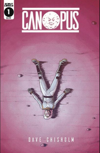
Canopus #1-2 is written, drawn, colored and lettered by Dave Chisholm, with color flats by Dustyn Payette and production by Kurt Knippel; published by Scout Comics.
Helen wakes up marooned on a lifeless alien planet 300 light years from Earth with no memories beyond a hazy sense of extinction-level urgency to return to Earth. Joined by her robot companion, Arther, she explores the planet to find materials necessary to repair her ship. However, circumstances are not as straightforward as they seem: along their perilous path, Helen’s most painful memories return to her, as monstrous manifestations hellbent on her destruction. In this mind-bending sci-fi adventure, Helen’s story unfolds into her past and future, revealing a poignant conclusion that will leave you speechless.
Dave Chisholm is a creator who seems to always be pushing new boundaries. Always trying something new, or doing old ideas in new fashions; always trying new genres, and trying new things with his signature art style. More importantly, he always approaches each project with a thematic goal in mind. He’s not just trying to be all style. There’s always a substantial theme that every artistic and storytelling decision circles around in, exploring every corner that he can before bringing it all together in a satisfying conclusion. For Canopus, his first foray into science fiction, Chisholm delivers yet again, this time with the addition of colors and a theme of letting go of grudges.
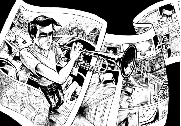
Chisholm’s previous work, Instrumental, was black and white and took full advantage of that aesthetic by experimenting with linework, inking, and the whole plate of comic art basics. He did so much to push the boundaries of what black and white comics could look like that he created a unique, experimental, and surreal style of art that was far above and beyond even some of the great comics done in color. It would take too much time to describe it all, so I’m just gonna leave this image here. I think you’ll get the picture:
In Canopus, Chisholm decides to embrace color, and while the heavy amount of stylistic experimentation from his previous book is absent, he more than makes up for it by just how good the coloring is. I don’t know if these colors were implemented traditionally or digitally, but either way they bring an atmospheric layer to the setting. Purples, blues, and the impenetrable blackness of space pierced only by the blaring whiteness of stars really gives that sci-fi feel. This really becomes apparent when Chisholm does both establishing and long shots in his panels. You really get a real sense of scale and a surprising amount of detail on this mysterious, seemingly empty planet. I think a good chunk of credit also must go to Dustyn Payette whose flats keep the colors clear and distinct without losing its character.
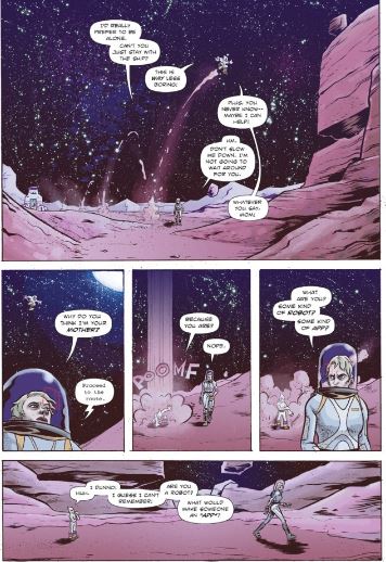
Panel layout is probably the strongest element of Canopus. There are, on average, about 7-9 panels per page. However, never once does it feel cluttered. That’s because the dialogue is straight to the point and lettered in a thinner font than usual; Another aspect is the art itself. It’s kind of like European comics, particularly the works of Moebius and Herge, where panels are drawn so that environments, characters, and action are all able to coalesce without a detriment to any one of these elements. You really do feel like you’re on this planet, traversing it with Helen and Arther, and taking in all the wondrous, natural spectacles around you. It’s so much more absorbing than having an avalanche of mindless action and particle effects that clutter the page just to shove as many trademark characters as possible. At that point, you might as well stare at the sun until you’re blind.
Chisholm goes to great lengths to make his characters as visually unique as possible. Keep in mind, there’s only three so far and some dudes that show up in the flashback scenes, but I can’t help admiring how distinguishable they all are, particularly how looks match up with personality: Helen’s short, slightly spiky hair reflecting her headstrong attitude; Arther’s large eyes and sock puppet body that are characteristic of his childish sense of wonder. Even more detailed are the mysterious monsters that the duo encounters. These things are straight out of nightmares, packed with metaphor, symbolism, and repressed trauma; Freud and Jung would probably be huge fans. They’re scary, really scary. You’ll probably find yourself both terrified and unable to look away just because of how ingenious their designs are. Even if it doesn’t have the same level of madness as Instrumental, Chisholm still brings a lot of surrealism to Canopus.
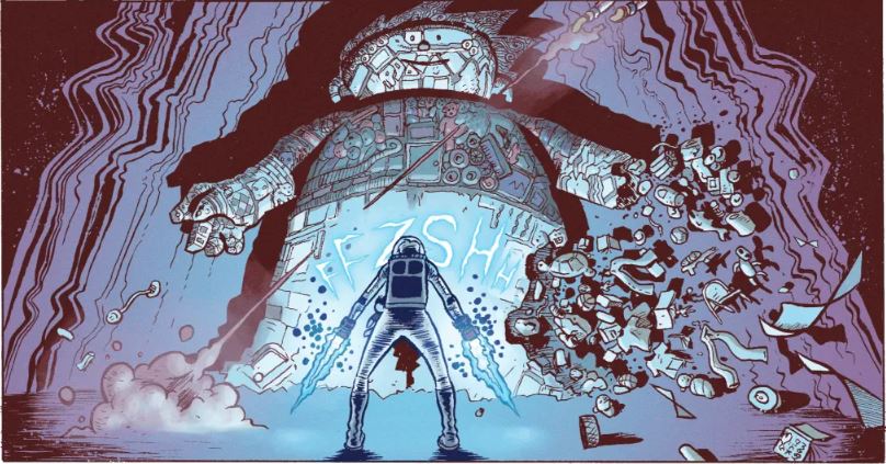
Don’t let me forget the action scenes! Yes, even though Canopus is a highbrow sci-fi with a focus on atmosphere and character, that doesn’t mean our heroes don’t occasionally bring out the kung fu against their psychoanalytical foes. Thanks to Chisholm’s expert panel layouts, these scenes are very well-paced. Blows are satisfyingly delivered with close-ups used to build up anticipation, then pulling back for a medium shot when impact is made. Even though these action scenes aren’t the main focus, it is incredible how Chisholm can do just about any type of scene.
Probably the cream of the crop of art in this series are the two-page spreads. These occur whenever Helen finds a familiar-looking object that triggers a forgotten memory. It can be a doll, a pair of dentures, or even a pair of socks. From these objects, we’re open to the spread:
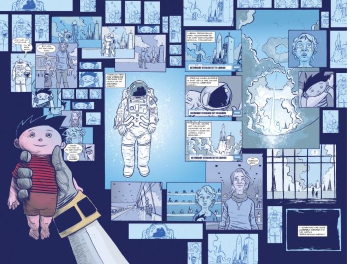
These flashbacks are all four pages long, starting with the object that triggered the memory, and ending on them as well. The spreads might seem like a mess, multiple panels of a particular object in descending order, all over the page like multiple packs of scattered cards. However, there is a deeper reason for this.
In my interview with Dave Chisholm, he told me that the biggest influence on the formatting for these flashbacks was the graphic novel Asterios Polyp by the legendary David Mazzuchelli. He described to me in a scene from that book where the main character has a flashback triggered by a blistered toe, then something in that flashback triggers another memory, and so on and so forth until the memories become a kaleidoscope of sorts. It’s a visual representation of how memory can be processed sometimes, where we try to put together in order seemingly random sights, sounds, smells, and whatnot into an order so we can recollect. Remember that Helen has amnesia, so every time she recollects a lost memory, it probably hits her so hard that she finds herself transported back to the past and relives an experience. It’s sort of like PTSD, although Chisholm also made it clear to me that such a serious mental illness does not dictate the layouts. He is not trying to visualize PTSD.
What Chisholm does visualize however, is a genius kind of layout to represent recollection of memory that puts the reader in Helen’s shoes. You might find yourself confused at first, trying to find a recognizable sequence of events.It does not take long though and, again, like Helen, you soon figure out what happened, why this memory is so important and even how these events both led Helen to where she is now and how they shaped her as a person. Another part of this is how each flashback has a unique color palette to it. These palettes are restricted to very few colors, usually with the prominence of two certain colors. I’m not sure there is a deeper meaning to these choices, but hey they look awesome and distinguish each flashback so much that the images will stick in your own memory long after you’re done reading.
Of course, fantastic art on this scale is nothing without a solid story, especially in comics right now where the science fiction genre has taken off so expediently that it can be hard at times to find the sweet bread amongst the stale white loafs. Chisholm gives us the best kind of sci-fi, or really any kind of genre fiction, where the genre is used to explore deeper themes beyond mere entertainment. Paraphrasing Chisholm, Canopus is about letting go of past hurts, and this all starts with the main character.
Helen Sterling is an obvious protagonist. She is intelligent, strong, courageous, and determined to save Earth from an unspecified armageddon. This makes her the most likely person to cheer for, however at times she’s not always likeable. She can be stubborn, easily angered, and has a tendency to hold onto grudges. The worst of her tendencies come out in her interactions with the only other person…well, “person” on the journey.
Arther is a highly advanced robot with a special kind of body. It’s not metal but something of a flexible substance that gives him a cartoonish appearance. The comparison that comes immediately to my mind is Fone Bone from Jeff’s Smith Bone. The difference between the two is that Arthur’s main power, at least so far, is the ability to turn his body from that of a toddler to that of freaking Flex Montello by blowing on his thumb.
Temperamentally though he is always like that of a child. I don’t mean that he’s constantly in need of attention or guidance. He’s actually surprisingly mature-minded in a lot of ways. It’s more like he has a sense of wonder to the world. He is programmed to look forward to learning new things and having new experiences. He is also intensely attached to Helen, so far as calling her “Mother”. Arther is loyal to Helen and will protect her from anything.
Which is why it seems odd that even with their very first interaction, Helen is hostile toward Arther. She will dismiss him, accuse him of slowing her down, and at one point yells at him furiously. Also, his reference to Helen as “Mother” annoys her to no end, so, honestly, it doesn’t shine Helen in a good light. At the same time, Arther is not all that innocent. He seems to be holding back a lot from Helen despite her amnesia. If he was really loyal, you would think he would tell her everything.
Also, it is revealed that Arther is tied to one of Helen’s memories, a pretty terrible one involving betrayal. Helen is someone that throughout her life has experienced heartbreak, loss, and betrayal at every stage in life. It’s no wonder she has issues with anger. In this way, the sci-fi/fantasy elements come to serve the purpose of Helen’s story, particularly the flashback scenes and symbolic monsters. Helen is not just trying to save the world, she is confronting her past. How this all plays out will have yet to be seen in the next two issues.
There is also an ongoing motif involving plant roots. Don’t know exactly what that is about yet, but definitely keep your eyes on it.
There are very few issues that I have with Canopus. One is the amnesia plot. I don’t think it’s bad. In fact, Canopus is one of those rare stories where amnesia is used as a proper story device and not a cheap trick. The only issue is how selective it is. Helen doesn’t remember where she’s at or how she got there, doesn’t remember anything about her life, and yet she immediately knows how to communicate with the ship using the correct terminology. Another issue has to do with the manifestation of an important person from Helen’s past. I won’t spoil it, but Helen, with all her intelligence, falls for it. At first, it seemed reasonable enough since she had no idea what was going on, but even after she deduces that the planet is somehow taking her memories and conjuring monsters from them, she still keeps this person around. She shows a lot more suspicion toward Arther. I’m still trying to figure out why she made this choice.
Whatever flaws there are in Canopus, they are small. This series is two issues in and already shows so much promise. Art full of atmosphere and color, panel layouts that take full advantage of these qualities, complex and characters that are both complex and uniquely designed. The two-page spread flashback scenes are by far the best part of the series, an ingenious art technique that I hope everyone will consider the highlight by the end. How exactly the theme of letting go of grudges plays is yet to be seen, but already the seeds have been placed, and I am confident they will grow into something spectacular.
Story: Dave Chisholm Art: Dave Chisholm
Color Flats: Dustyn Payette Production: Kurt Knippel
Story: 9 Art: 10 Overall: 9.5 Recommendation: Buy
 Black Suit Of Death… When I opened the prelude comic, Ides Of March, I had no idea what it was about, and while that probably won’t be the case for you if you keep reading, it was a rare treat for me to go into a comic utterly blind.
 Black Suit of Death #1 takes a drastically different direction than the prelude issue as it takes place roughly ten thousand years or so after Ides Of March. We spend the majority of it following Edd Grimes as his life spirals ever downward. The art team is different this issue, with Dexter Wee providing pencils and inks and Bryan Arfal Magnaye on board for the colouring. The switch does change the aesthetic of the comic, although with the shift in the story’s focus I think that the shift is actually for the better as there’s less of the Sci-Fi horror twist to the art that worked so well in the prelude issue, but wouldn’t fit quite as well with this issue.