Category Archives: Reviews

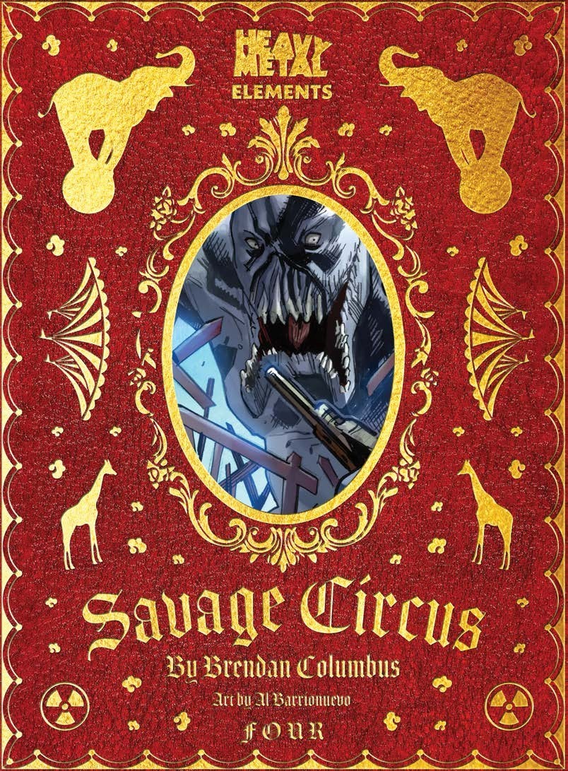
Review: Savage Circus #4

Savage Circus #4

It’s chaos in the town and Brady is tasked with capturing the thieves. Of course, he also has to not get killed by wild animals in Savage Circus #4. The issue is a decent one with some solid action moments. Overall, it isn’t quite as fast-paced as the previous issue.

The first three issues were the setup for what’s to come. They put Brady in the position of dealing with thieves while having to dodge the vicious animals. With his quest beginning, writer Brendan Columbus gives Brady some company in his mission. Columbus has set up Brady as an interesting character. While he’s a sheriff, he’s also been thrown into that position. He comes off as a bit of a slacker who will be forced to stand up and do the right thing. But, that also means he’s going to likely screw that up. Michelle will be his balance. She shows she has a bit more brains and a bit of a knack for problem-solving. Brady is the blunt instrument to Michelle’s finesse and the two together on the case will be an interesting combo.

Columbus gives us some action and more of the cinematic feel for the issue as Brady heads to Michelle to see how she’s doing before he’s off in his mission. The visuals and what happens has more of a horror vibe going for it. That’s helped by Al Barrionuevo‘s art. His layouts delivers a play-by-play aspect to what happens in the use of panels and expressions of each character. While what happens feels a bit fantastical (Brady would not be functioning) Barrionuevo’s style also delivers a bit of humor to things as well. Candice Han‘s colors are fantastic delivering a look that has both a horror vibe but also has a bright aspect to it. It fits the rather playful and over the top aspect of the concept of the series. Dave Sharpe‘s lettering is consistently solid and helps emphasize the emotion of it all.

Savage Circus #4 is another solid entry in the series. While it doesn’t quite feel as packed in as previous issues and slows things down a little, it’s a lull that helps emphasize the action in some ways. It’s an issue that continues to set up Brady’s mission giving him someone to play off of and getting rid of the Rambo feel the series could easily have gone. Most importantly, Savage Circus #4 keeps its eyes on entertainment mixing in humor with the action for a result that feels like the quiet before the likely (shit) storm.

Story: Brendan Columbus Art: Al Barrionuevo
Color: Candice Han Letterer: Dave Sharpe
Story: 8.0 Art: 8.0 Overall: 8.0 Recommendation: Buy

Heavy Metal provided Graphic Policy with a FREE copy for review


Purchase: comiXologyZeus ComicsTFAW

Review: Miles to Go #4

Miles to Go #4, Amara Bishop and her daughter Alea learn that running away can’t help the family left behind, and retired assassin Moses Graves realizes that retirement isn’t always permanent. And the truth behind Amara’s childhood affinity for killing leads to a frightening new understanding of her daughter.

Story: B. Clay Moore
Art: Stephen Molnar
Color: Stephen Molnar
Color assists: Nova Lee-Fortier
Letterer: Dave Sharpe

Get your copy now! To find a comic shop near you, visit http://www.comicshoplocator.com or call 1-888-comicbook or digitally and online with the links below.

comiXology
Kindle
Zeus Comics
TFAW

AfterShock provided Graphic Policy with a FREE copy for review
This post contains affiliate links, which means that if you click on one of the product links and make a purchase, we’ll receive a percentage of the sale. Graphic Policy does purchase items from this site. Making purchases through these links helps support the site

Review: Sam and His Talking Gun #2

Sam is back. He has his talking Gun. And no matter the cost, no matter the consequence: Colt has to pay for breaking Sam’s mind and putting a bullet into the only other person Sam had left.

Sam and His Talking Gun is a John Wick like action story… just with a talking gun sidekick.

Story: Drew Ferguson
Art: Lee Ferguson
Letterer: DC Hopkins

Get your copy now! To find a comic shop near you, visit http://www.comicshoplocator.com or call 1-888-comicbook or digitally and online with the links below.

Scout Comics
Zeus Comics
TFAW

This post contains affiliate links, which means that if you click on one of the product links and make a purchase, we’ll receive a percentage of the sale. Graphic Policy does purchase items from this site. Making purchases through these links helps support the site

Review: Project: Patron #1

Patron is the world’s greatest superhero. He died in battle and returned! Or did he? There’s a secret that Project: Patron #1 reveals and can shake the world!

Story: Steve Orlando
Art: Patrick Piazzalunga
Color: Carlos Lopez
Letterer: Thomas Mauer

Get your copy now! To find a comic shop near you, visit http://www.comicshoplocator.com or call 1-888-comicbook or digitally and online with the links below.

comiXology
Kindle
Zeus Comics
TFAW

AfterShock provided Graphic Policy with a FREE copy for review
This post contains affiliate links, which means that if you click on one of the product links and make a purchase, we’ll receive a percentage of the sale. Graphic Policy does purchase items from this site. Making purchases through these links helps support the site

Review: Geiger #1

Geiger #1

Geiger #1 kicks off the high-profile indie series from Geoff Johns and Gary Frank. The duo previously worked on DC’s Doomsday Clock, a series that overall fell short of expectations. Geiger #1 does the same.

Geiger #1 really should be called “Old Man knock-off”. The series focuses on the myth of a glowing individual out in the desert who survives the irradiated wastes without a radiation suit. We’re taken through the tragedy of a man who lost his family and was caught in a nuclear explosion leading to today.

The problem is, the setup doesn’t really help the story at all. Johns and Frank leave far too many questions that distract from the main story. It also feels like a retread of so many stories before. There just isn’t that originality or spark to make the debut stand out. It’s not bad, it just doesn’t deliver an interesting enough debut.

In Tariq, aka The Meltdown Man, we get an origin that’s been done to death, an individual caught in a nuclear explosion. With his family safely in a shelter, he’s caught outside to experience things along with attackers attempting to take over the shelter from his family. It’s a fine enough start but there’s no attachment at all. These aren’t characters we get to know. There’s little to feel sympathy for what they go through. Some racism is thrown in by the attackers in what I think is an attempt to do that but it falls flat overall. The attack too comes out of nowhere. There’s not a lot of setup, it just happens which causes a distraction. There’s a detachment with the story due to those two things.

Frank’s art is good. Along with Brad Anderson‘s color, the story is nice to look at. But, as presented we get a world that also doesn’t feel one and the same. There’s scavengers in irradiation suits, the Meltdown Man in his superhero gear, and then a kingdom… where they don’t wear suits? It’s all a little odd and doesn’t make a whole lot of sense visually. But, it looks nice. Rob Leigh‘s lettering packs in a lot as Johns scripts tend go dialogue heavy. It’s impressive how much makes it on to some pages and panels without issue. The only thing is one bit of dialogue at the bottom of a panel that feels like it’s cut off by the imaginary border.

Geiger #1 has a lot of good ideas. It just doesn’t present them well. There’s a choppiness to the story and a disconnect that has me not caring about the characters or what happens. It’s concepts without logic or heart. Maybe it comes together a bit more down the line but as is, this is a debut that doesn’t live up to the excitement and hype.

Story: Geoff Johns Art: Gary Frank
Color: Brad Anderson Letterer: Rob Leigh
Story: 5.0 Art: 7.5 Overall: 5.5 Recommendation: Pass

Image Comics provided Graphic Policy with a FREE copy for review


Purchase: comiXologyAmazonKindleZeus ComicsTFAW

Review: The Silver Coin #1

The Silver Coin #1

The Silver Coin #1 kicks off a new horror anthology revolving around… a silver coin. Taking place in 1978, The Silver Coin #1 follows a down on their luck rock band. With disco the popular music of the time, their sound doesn’t go over and they linger. Then, the guitarist finds a coin in a box which he uses as a pick for his playing. This small coin changes everything and soon they’re packing the house. But, like every good horror story, there’s a catch.

The Ticket” is written by Chip Zdarsky who captures some tragic magic in his story. The characters aren’t likable but you still feel empathy for them. Things aren’t going well and despite the work, the band is lingering. This is something that so many of us experience in different ways. But, disco isn’t totally to blame for that and Zdarsky gives us enough friction that the eventual issues that arise aren’t surprising or come out of left field. He delivers an escalation to the finale that’s logical steps but nonetheless tragic.

Michael Walsh handles multiple roles providing the art, colors, and lettering. All of it is solid and Walsh’s style fits the rock and roll focus of the issue. There’s a grittiness to it that really fits the subject. But, it’s the subtle things that Walsh includes in his art that stand out. There are subtle hints at the tragedy to come as the story progresses that only adds to the sad tale. It’s these small details that really help build the horror vibe of it all. There’s also a focus on the story’s characters that really works. The art doesn’t play gotcha with unnecessary scares in the art. What it does is subtle and overall enhances the story.

The Silver Coin #1 is a solid start to an interesting anthology. The end I expect leads in to what’s next and has me wanting to read more. This series might work a bit better as graphic novel or trade but as presented it has you wanting to find out what happens next but also appreciate its one and done nature.

Story: Chip Zdarsky Art: Michael Walsh
Color: Michael Walsh Letterer: Michael Walsh
Story: 9.0 Art: 9.0 Overall: 9.0 Recommendation: Buy

Image Comics provided Graphic Policy with a FREE copy for review


Purchase: comiXologyKindleZeus ComicsTFAW

Review: The Rise #1

The Rise #1

Night of the Living Dead is an influential film that sparked a genre. It saw imitators and innovators come after but that film remains a classic. The Rise #1 kicks off a prequel to the “Living Dead universe” focused on the “death, destruction, and tragedy that led to the birth of the modern zombie”. It’s an interesting start that feels more 28 Days Later than Living Dead.

Set upon the backdrop of the Cuban Missile Crisis, The Rise #1 introduces us to Dr. Cartwright, a man working on a way to block out fear. As shown early on, that lack of fear creates rage and also the lack of fear of death. It feels like the early steps of “Rage”, the disease that fueled the zombie outbreak in the 28 Days Later franchise.

Writer George C. Romero infuses the story with politics by using the backdrop. It gives a solid reason for such work to be done as the world was gripped by the fear of nuclear disaster. Romero takes things further by hinting at the weaponization of this research, yet another military-fueled idea that ends in disaster for the world. It’s the type of underlying message Romero’s father embraced in his films. How much the series will lean into it is unknown but there’s clear finger-pointing and blame for the destruction of mankind.

Diego Yapur‘s art is fantastic. Along with limited colors by DC Alonso, and lettering by Saida Temofonte, the visuals are top-notch. The comic keeps it simple with the use of black, white, and reds for colors. It’s an interesting color palette that adds some aspects to be debated on. The red could represent the fear that the world is gripped by, the Communist threat, or the pouring of blood to come. It’s a solid artistic choice that adds an exclamation point to generally beautiful art that captures the time period well.

The Rise #1 is a solid comic. It does well to establish why this dangerous work is happening and hints as to the tragedy to come. It feels like a prequel to so many zombie stories though and not sure it really nails down Romero’s father’s work. But, it’s still really good with a build-up of the tragedy we know will come.

Story: George C. Romero Art: Diego Yapur
Color: DC Alonso Letterer: Saida Temofonte
Story: 8.0 Art: 9.0 Overall: 8.15 Recommendation: Buy

Heavy Metal provided Graphic Policy with a FREE copy for review


Purchase: Zeus Comics

Review: Tankers #1

Tankers #1

There’s a lot to like about Tankers #1. The comic is both action and over-the-top satire. An oil company decides it wants to extend oil production by delaying the comet that killed the dinosaurs using time travel and a laser. It’s the type of sci-fi concept that could be a comedy played straight. And, Tankers #1 sort of does that. But, the comic has a lot of bump aspects that are hard to get past.

Robert Venditti nails so much with this debut. The concept of a Texas oil company doing this sort of plan is hilarious. The characters presented are such caricatures that they deliver laughs at the silliness of it all. The plan itself is funny and so extreme, it too deserves laughs. The fact the comic goes in a predictable direction that no one thought of is groan-worthy. It’s to a point that the comic wraps up with an end that’s something we’ve seen so many times before, it’s like when people in zombie or horror stories have clearly never seen a zombie or horror story. Tankers #1 is the Butterfly Effect plain and simple. And sadly that kills the creativity.

The fact the comic goes in the direction that’s expected is a killer. I had hoped the series would deliver something new or different. There’s so much leading up towards the end that would indicate that. The sci-fi satire nails so much right. The oil execs, the gung-ho soldiers, they all play to laughs at the ludicrousness of it all. Sadly, the comic winds up in a spot that’s not new and seen a mile away. For as creative as it opens, Tankers #1 closes exactly where you expect it to.

Juan José Ryp‘s art delivers an exaggeration that plays to Venditti’s story. There’s both seriousness and silliness to the design and characters. The action scenes would fit in the testosterone-fueled 80s and that’s where this comic belongs in many ways. Along with Andrew Dalhouse‘s colors, the art nails down the over-the-top satirical nature of it all. The soldiers are all alpha in their looks and attitudes. The dinosaurs splatter by raining blood everywhere. It’s so simple in the ridiculousness of it all. Dave Sharpe‘s lettering adds a macho flavor punctuating the cliched dialogue. It adds to the comedic feel of it all.

Venditti and artist Jorge Monlongo deliver a backup that feels like it fits the satirical nature of the main story. Involving President Lincoln, it’s best to experience the short which has a lot of potential to it. It’s bizarre and a direction that’s unexpected but quite welcoming.

Tankers #1 is an interesting comic. It has so much going right, it’s unfortunate that it doesn’t stick the landing. A great concept that skewers its subjects loses its impact with an ending that’s far to predictable. There’s something that can be read into that but the fact no one mentions the obvious direction feels like an opportunity lost. A few more lines, and the comic would have nailed the humor of it all. I’m hoping the second issue of Tankers surprises me by heading into a different direction but as is, this is a story we’ve seen before too many times.

Story: Robert Venditti Art: Juan José Ryp, Jorge Monlongo
Color: Andrew Dalhouse Letterer: Dave Sharpe, Jorge Monlongo
Story: 7.5 Art: 7.85 Overall: 7.5 Recommendation: Read


Purchase: Zeus Comics

Review: ENIAC #2

ENIAC #2

ENIAC delivered a solid debut with a story that mixed action and a bit of history. The combination felt like a story that came from the headlines but with a fantastical spin. ENIAC #2 delivers more of the same quality with an issue that features more history and a lot of action.

Matt Kindt does a nice balancing act of a story that feels like classic 80s action films. But, mixed in the clichés and explosions is some history and 90s paranoia. ENIAC #2 delivers a story about technology gone wrong. ENIAC is loose and counting down to something which has forced a crack squad to attempt to destroy the computer. What we learn is ENIAC is far more advanced than we first expected. The computer isn’t just toying with life but also delivering peace as well. It has created the balance and safety that social systems like Marxism promised. The computer has achieved what humans could not. But, at what price?

Kindt delivers a wrinkle in that way. The series could easily be a countdown to destruction, much like the latter half of Wargames. But, with this new bit of information we’re challenged to debate if ENIAC is all that bad. ENIAC #2 creates a bit of a gray area for our villain. It also throws up a huge question mark for readers to questions the motives surrounding its destruction. Is this computer really a threat? We assumed the countdown would lead to destruction. What if it would bring peace to the world instead? Isn’t that as much a threat to leaders?

Dough Braithwaite’s art continues to be top-notch. It dances between the past and present with a detail and look that’s fantastic. Diego Rodriguez delivers colors and Dave Sharpe the lettering. The look of the comic balances that action vibe with that of horror. ENIAC #2 really is an action-horror story. Numerous images deliver a shock while others increase the tension as you wonder who will survive or what might explode. The art nails down the tension that Kindt’s story sets up.

Kindt also delivers a backup story with artist David Lapham. “The Bloody Mess” feels like a solid Twilight Zone addition. The story is about a husband who crawls out of a shallow grave only to be accused of killing his wife. The mystery zigs and zags and leaves you guessing until the very end. Its punchline is a direction that’s unexpected. The only downside is the story doesn’t match in “tone” to the main feature creating a combination that’s a bit disjointed. They’re both quality stories though.

ENIAC #2 is a great second issue. The series is a hell of a start and high bar for new publisher Bad Idea. It mixes solid action with a techno-thriller mixed in with a little bit of horror. The combination is a fresh take on a classic concept. The series may be hard to get being limited to a couple hundred comic shops but it’s one that’s well worth seeking out.

Story: Matt Kindt Art: Doug Braithwaite, David Lapham
Color: Diego Rodriguez Letterer: Dave Sharpe
Story: 8.5 Art: 8.5 Overall: 8.5 Recommendation: Buy


Purchase: Zeus Comics

« Older Entries Recent Entries »