Category Archives: Reviews

The Witch and the Knight Will Survive Vol. 1 delivers some solid fantasy drama

Agredios, the son of a local landowner, arrives home from a long hunt…only to find his village silent and devoid of its usual laughter and commotion. What he discovers is an unimaginable agony that sparks a desire to avenge his fallen people by slaying the witch of the forbidden woods. But is the witch truly as vile as rumors say?

Story: Dai Chikamoto
Art: Gonbe Shinkawa
Translation: John Thomas Neal
Letterer: Muhammad Arbash Mughal

Get your copy now! To find a comic shop near you, visit http://www.comicshoplocator.com or call 1-888-comicbook or digitally and online with the links below.

Bookshop
Amazon
Kindle


Yen Press provided Graphic Policy with a FREE copy for review
This post contains affiliate links, which means that if you click on one of the product links and make a purchase, we’ll receive a percentage of the sale. Graphic Policy does purchase items from this site. Making purchases through these links helps support the site

Terrorwar #1 is Ghostbusters with nightmares

Terrorwar #1

Terrorwar #1 kicks off a sci-fi horror series about working people fighting mind-bending monsters. Blue City was the last livable place on Earth. Now it’s crawling with Terrors-creatures that transform into their victims’ worst fears. Humanity’s last hope? Muhammad Cho and his overworked, underpaid crew of freelance Terrorfighters.

Written by Saladin Ahmed, Terrorwar #1 is an interesting start of a series that feels like Ghostbusters but with nightmares instead of ghosts. Much like that iconic series, this one features what feels like a blue collar crew who are trying to make a dollar while eliminating threats. It’s the detail and the world itself that makes this debut feel like more than just a reskin.

Set in the future, the series has a look and style that feels like it’s been thought out. The visuals blend The Fifth Element and Blade Runner to deliver a worn down city where the tech feels both futuristic and a bit janky. The end result makes the debut feel like Ahmed is playing as much game master as storyteller with a focus on small details that enrich the series as a whole. A quick description of a weapon or a simple conversation adds so much to what could easily have been an action focused series.

The art by Dave Acosta helps with this. With ink by Jay Leisten, color by Walter Pereyra, and lettering by Shawn Lee, the comic is packed with tons of detail. Every bit of it adds to the world and story help telling what this world is like. What also stands out is the Terror-creatures themselves. The first had me pause and laugh as it felt so out of place while the second evokes a classic character. Both help make the tone of the series bounce around a bit and keeps readers on their toes. Much like Ghostbusters, it adds a bit of humor and levity to the series and situation.

Terrorwar #1 is a great start with an overall concept that might feel familiar but the end result is a well worn world due to the detail and thought put into it all. It’s an entertaining debut that has us wondering what terrors lie in the next issue and wanting to find out.

Story: Saladin Ahmed Art: Dave Acosta
Ink: Jay Leisten Color: Walter Pereyra Letter: Shawn Lee
Story: 8.1 Art: 8.1 Overall: 8.1 Recommendation: Buy

Image Comics provided Graphic Policy with a FREE copy for review


Purchase: Zeus ComicscomiXology/Kindle

Chicken Devils #3 begins to mix things up and still a lot of fun

Mitch has finished off the mob that was after him, but what now? How about covering up his crimes and trying to fix his relationship with his family!

Story: Brian Buccellato
Art: Mattia Monaco
Color: Mattia Monaco
Letterer: Buddy Beaudoin

Get your copy in comic shops! To find a comic shop near you, visit http://www.comicshoplocator.com or call 1-888-comicbook or digitally and online with the links below.

TFAW
Zeus Comics
comiXology/Kindle


AfterShock Comics provided Graphic Policy with a FREE copy for review
This post contains affiliate links, which means that if you click on one of the product links and make a purchase, we’ll receive a percentage of the sale. Graphic Policy does purchase items from this site. Making purchases through these links helps support the site

Hungry Ghost is a tough but touching read

Valerie Chu is quiet, studious, and above all, thin. No one, not even her best friend Jordan, knows that she has been binging and purging for years. But when tragedy strikes, Val finds herself taking a good, hard look at her priorities, her choices, and her own body.

Story: Victoria Ying
Art: Victoria Ying

Get your copy in comic shops! To find a comic shop near you, visit http://www.comicshoplocator.com or call 1-888-comicbook or digitally and online with the links below.

Bookshop
Amazon
Kindle


First Second provided Graphic Policy with a FREE copy for review
This post contains affiliate links, which means that if you click on one of the product links and make a purchase, we’ll receive a percentage of the sale. Graphic Policy does purchase items from this site. Making purchases through these links helps support the site

Superboy: The Man of Tomorrow #1 is a fun start to Conner’s quest

Superboy: The Man of Tomorrow #1

After the events of Dark Crisis, Conner feels out of place with the rest of the hero community. He doesn’t fit in with the rest of the Superman Family, and the rest of the world doesn’t really need him with so many Supers in Metropolis. He doesn’t want to rely on Tim, Cassie, and Bart, so Conner looks to the stars as a place he might be able to call his own and carve out his own path. But what lurks in the great unknown? Are bravado and swagger enough to help Superboy find his new calling? Superboy: The Man of Tomorrow #1 kicks off a solo series for the popular character and delivers a fun start.

I remember when Conner debuted many years ago but the character’s journey over the years isn’t one I followed. The ups. The downs. It’s all specifics that for me don’t seem to matter with this debut. Writer Kenny Porter keeps Superboy: The Man of Tomorrow #1 pretty simple and focused. With so many in the Superman family in Metropolis, how does Conner stand out? What’s a superhero to do when there’s other superheroes who take care of things? As I said, a simple idea that’s done well.

Where Superboy: The Man of Tomorrow #1 does really well is Conner’s attitude. Porter is able to create a character who is a little bit arrogant and a little bit full of himself but he never crosses a line to the point he’s unlikeable due to any of that. He’s a kid basically and full of all of the self assured aspects that brings. And the story plays into that as well with Conner being a bit overwhelmed in the situation he goes into.

The attitude of the comic bleeds over into the art by Jahnoy Lindsay. The look of the comic pops with a style that fits the enthusiasm of the main character. With color by Lindsay and lettering by Lucas Gattoni, the comic’s look matches its fun style and attitude of Conner. It also still feels like it fits with other Superman comics, not standing out too much. There’s a youthful energy about that art that’s fantastic and helps make the comic an enjoyable read.

Superboy: The Man of Tomorrow #1 is a good start. While it doesn’t totally blow me away, it’s a fun time and left me wanting to see what happens next. Overall, this may play better with Conner fans but for those new to the character it does an excellent job of catching readers up and setting him along his adventure.

Story: Kenny Porter Art: Jahnoy Lindsay
Color: Jahnoy Lindsay Letterer: Lucas Gattoni
Story: 7.75 Art: 8.35 Overall: 7.9 Recommendation: Read

DC Comics provided Graphic Policy with a FREE copy for review


Purchase: TFAWZeus ComicscomiXology/Kindle

Darkwing Duck #4 delivers a solid finale to its two-parter

Darkwing Duck #4

Bushroot has taken over the community garden! Newly retired from the crimefighting game, Drake Mallard refuses to become Darkwing Duck again, insisting that he can take out Bushroot as a civilian! But when Bushroot turns the garden into an immense, evil vegetable maze, can Drake stand idly by and not unleash the Terror Within Him That Flaps In The Night? Darkwing Duck #4 wraps up the second part of Bushroot’s attack as Darkwing must flap into action!

Written by Amanda Deibert, Darkwing Duck #4 is another solid issue that’s a lot of fun and leaves us wanting more. Like the issues before it, the comic captures the fun and pacing of the animated series and for fans of that series, you can see the motion in the pictures.

Deibert has fun with the issue quickly getting into the action as Bushroot’s attack continues and spreads. And though the issue plays out as expected, it’s the small jokes and moments that make it all fun. Deibert has done an amazing job of capturing the essence of the character and series which is a mix of action/satire/homage and it’s own thing at the same time. It’s full of eye rolling groaning moments that you love despite how cheesiness of it all. But, that’s part of the fun of it all.

Carlo Lauro‘s art continues to capture that series and characters. There’s a motion to it all that despite it being on the page, you can still get a sense of motion and movement from the comic. Jeff Ekcleberry‘s lettering also nails things down adding to the fun and excitement. The comic feels like it’s ripped from the cartoon and no time has passed between the animated series and this.

Darkwing Duck #4 is another fun issue that hints at a bigger story to come while keeping everything focused. For long time fans it’s a welcome return of the characters but for new readers the team has been introducing everyone slowly. Lots of fun that captures or childhood.

Story: Amanda Deibert Art: Carlo Lauro
Color: Carlo Lauro Letterer: Jeff Eckleberry
Story: 8.4 Art: 8.4 Overall: 8.4 Recommendation: Buy

Dynamite Entertainment provided Graphic Policy with a FREE copy for review


Purchase: TFAWZeus ComicscomiXology/Kindle

Harrower #3 delivers a lot of wtf moments

Harrower #3

The Harrower proves difficult to kill, but killing comes easy for him. With the group split in two, no cell service, and the police being suspiciously useless-someone won’t make it out alive. Harrower #3 ups the body count and both answers questions and deepens the mystery as to exactly what’s going on.

Writer Justin Jordan delivers twists and turns in this third issue as the fight against the Harrower continues and some of what has been shown gets a deeper look. It all comes together to deliver a comic that begins to tease exactly what’s going on and makes the series even that much better.

From the beginning of the series, we’ve known there’s some deeper conspiracy that involves the Harrower and the town but we don’t know exactly what. There’s some long history and clearly some “cult like” activity but the details have been few. Harrower #3 starts to answer that aspect of things as the group of kids do their best to escape the Harrower’s killing spree while stumbling upon answers as to some of the killer’s tricks.

The series has been great for a whole host of reasons. It’s mixed classic slashers with a more modern aesthetic and the more modern horror releases we seen as far as characters and pacing. But, this issue also has a bit of fun with moments that remind me more of Scooby-Doo than anything else. There’s a sense of the comic that it takes itself seriously but also have a bit of fun with the genre overall in how everything rolls out.

Part of the solid aspect of the series is the art by Brahm Revel. The comic is horror and a slasher, so you expect a body count and blood, but Revel’s art never crosses the line so it distracts. The specifics of the kill and gore can be a focus on times in other stories but this one keeps it simple, focusing on the act and the who than zeroing in on the how and lingering on the blood and guts. With lettering by Pat Brosseau that combined with the body language tells so much, the visuals really help with the pace and in this case adds to the fun spookiness of it all.

Harrower #3 ends things with a nice what the hell moment. It plays into some of what has been hinted at but we’ll finally get a better sense of things. The issue leaves things in an exciting place and one hell of a final page that’ll leave readers wanting to find out where things are going and get to the truth of it all.

Story: Justin Jordan Art: Brahm Revel Letterer: Pat Brosseau
Story: 8.5 Art: 8.5 Overall: 8.5 Recommendation: Buy

BOOM! Studios provided Graphic Policy with a FREE copy for review


Purchase: Zeus ComicscomiXology/Kindle

X-Force #39 ushers in a bright new age for the team

X-Force #39

The fallout of the Beast’s crimes! A new X-force! And a new Wolverine? All this and more in X-Force #39! Benjamin Percy and Robert Gill bring their A-game in X-Force #39, the latest issue in Percy’s epic ushers in a new chapter for the titular X-Force.

X-Force #39 comes off the heels of the “Beast Agenda” arc of Wolverine. When Beast’s crimes finally catch up to him, he goes on the run, abandoning X-Force. The team is left to pick up the pieces and redefine what X-Force means in the wake of these events. X-Force #39 firmly expects you to have been keeping up with Wolverine, also by Percy. X-Force and Wolverine are two sides of the same coin. They are two books heavily intertwined in plot. I can’t recommend reading one without the other.

X-Force #39 is mostly set up, but Percy and Gill keep it lively and fun. Much of the issue is spent on the politicking of the governing body of Krakoa, The Quiet Council, over Beast’s vile machinations. It’s a surprising and engaging dialogue that gets to questioning the utility of his actions. Percy uses the Quiet Council as an analog to real-world governments and how they justify the crimes of agencies like the CIA.

Gill brings spectacular art aided by the always wonderful coloring of Guru-eFX and the lettering of VC’s Joe Caramagna. The art is bright and colorful but has an undeniable edge to it. That edge is on display when it comes time for Gill to deliver a gloriously gorey action sequence.

X-Force #39 is a great first chapter to a new age. It gives closure to Beast’s plot (for now!) while establishing the foundations for a bright new future. Overall, I’m excited to see where Percy and Gill take the book next!

Story: Benjamin Percy Art: Robert Gill
Color: Guru-eFX Letterer: VC’s Joe Caramagna Design:  Tom Muller w/ Jay Bowen
Story: 9.0 Art: 8.5 Overall: 9.0 Recommendation: Buy 

Marvel provided Graphic Policy with a FREE copy for review


Purchase: TFAWZeus ComicscomiXology/Kindle

The Mighty Barbarians #1 gathers warriors from across reality to save existence

The Mighty Barbarians #1

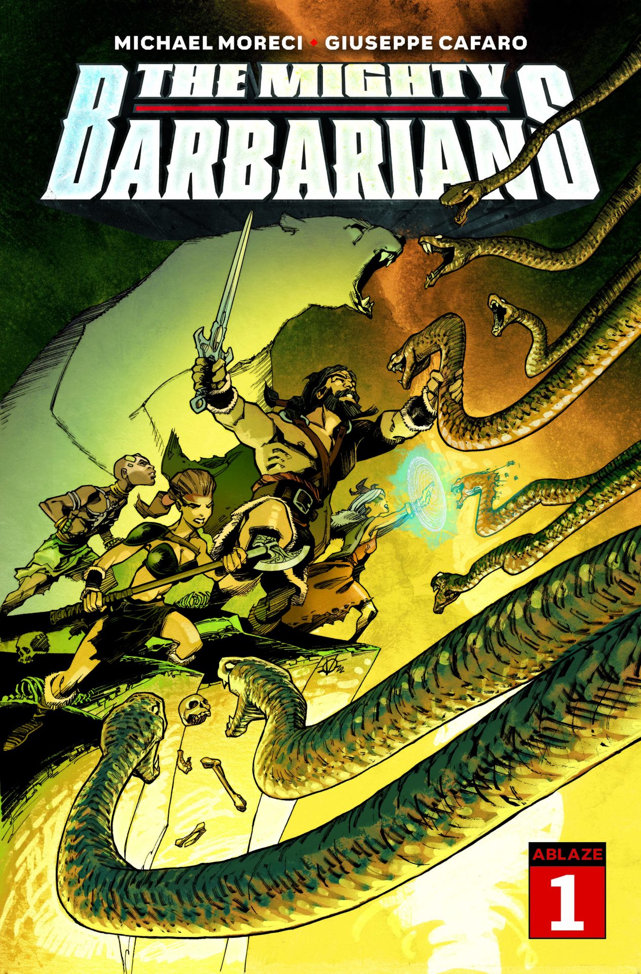
When an unstoppable force starts consuming one world after another, sorceress Morgan Le Fey uses her magic to assemble a team of skull-cracking warriors who must somehow work together to save all of existence. There’s the young trickster Anansi, Viking shield maiden Birka, the shape shifting Nanook, and their leader, heir to a fallen kingdom and mightiest of warriors, KULL! The Mighty Barbarians #1 kicks off an uneasy alliance to take on a mutual enemy and leave a path of ruin through everything that stands in their way to do so.

Writer Michael Moreci is one of those creators whose projects I want to check out when I see their name on them. Moreci’s Barbaric, published by Vault Comics, has taken the sword and sorcery genre and infused it with a lot of new and interesting elements that has made the series stand out. So, going into The Mighty Barbarians #1, I was intrigued to see what Moreci might do with another sword and sorcery fantasy series and how it’d be different. The answer is simple, by playing it relatively straight.

The Mighty Barbarians #1 has existence being threatened by the Aleph forcing Morgan Le Fey to travel across worlds and recruit a team to stop them and save existence. Moreci in the setup has taken a concept and opening that feels like it’d be quite at home in any of the superhero team comics by the big two. It’s a start that’s familiar, we’ve seen so many times. The difference is the fantasy setting and characters that have been established on their own through their various publishing/storied histories. The team brings together characters and personalities we might have not seen interact before setting up a very intriguing and entertaining potential.

At it’s heart, the story feels like a traditional superhero comic in concept, with a fantasy setting. Scenes feel right at home in the Avengers or Justice League and you could see those characters replacing these easily. Hell, with “snake men” being the villains, it feels like a side companion to the recent Savage Avengers run. But what’s interesting is how Moreci makes the comic different from all of those and Barbaric. Despite the setup and imagery, the comic plays things rather straight. There’s little comedy. There’s little jokes. It feels like a fantasy comic in every way. Unlike Barbaric which pokes fun at tropes and norms of the genre, The Mighty Barbarians #1 feels like it leans into them a little, though doesn’t play them up. This is a team fantasy adventure so far, no more, no less.

The art by Giuseppe Cafaro fits the feel Moreci goes for perfectly. The character designs have both a fantasy feel but also a little bit of a “superhero” vibe to it all. The images are full of excitement and energy as the team is assembled and the short segments of battle introduces us to each member. Like the tone of the comic itself, the look has more in common with the Avengers than it does with Conan. That’s not a bad thing as it helps deliver a pop of a start that’s energetic and makes the comic stand out a bit.

The Mighty Barbarians #1 is a fun start. It takes the traditional fantasy adventure and mixes it with a more modern sense and style. While the comic itself doesn’t blaze any really new paths, it does deliver an entertaining start that fans of the characters or fantasy adventure will want to check out.

Story: Michael Moreci Art: Giuseppe Cafaro
Story: 8.1 Art: 8.15 Overall: 8.1 Recommendation: Buy

Ablaze provided Graphic Policy with a FREE copy for review


Purchase: Zeus ComicscomiXology/Kindle

K-On! Shuffle Vol. 1 has its moments and is cute but also drags

Yukari is all fired up about playing the drums after hearing a certain teatime-loving band play at the Sakuragaoka High School Festival! She makes big plans with her best friend, Kaede, only to run into a wall: Her school doesn’t have a Pop Music Club! But after the duo use their momentum to bring in a pair of quirky girls (a basketball player and a pop music “researcher”), nothing stands in their way! Except, that is, the fact that none of them own their instruments―or even know how to play them…

Story: kakifly
Art: kakifly
Translation: Stephen Paul
Letterer: Rachel J. Pierce

Get your copy now! To find a comic shop near you, visit http://www.comicshoplocator.com or call 1-888-comicbook or digitally and online with the links below.

Bookshop
Amazon
Kindle/comiXology


Yen Press provided Graphic Policy with a FREE copy for review
This post contains affiliate links, which means that if you click on one of the product links and make a purchase, we’ll receive a percentage of the sale. Graphic Policy does purchase items from this site. Making purchases through these links helps support the site

« Older Entries Recent Entries »