Author Archives: Josh Rathbun

Review: The Mighty Crusaders: The Shield
The Mighty Crusaders: The Shield

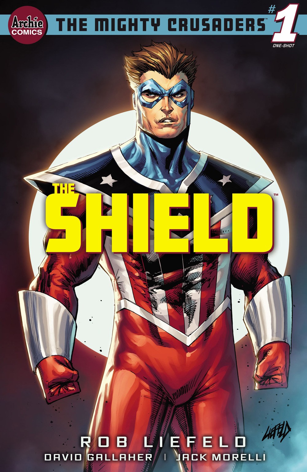
Archie Comics latest attempt at making the Mighty Crusaders characters work has brought Rob Liefeld into the fold to try and launch this into something that sticks around. If The Mighty Crusaders: The Shield is any indication of how it’ll fare, I doubt Rob or this attempt will be on long.

The original Shield is lost in time. There are others who have carried the name. The Shield that is leading the Mighty Crusaders is telling the rest of the team of another. The latest is a man with little memory but enough to know he’s a near-invincible hard-ass who can eat bullets like they are nothing and just smash some random people who bust in his house for an unknown reason. And that’s it!

The Mighty Crusaders: The Shield seems to come off as a story drawn out first and then they had to add some story pages and that’s probably being generous. Sadly, I think the visuals are pretty bland. It has the feel of a book of pin-up shots with a story being secondary. Liefeld does some good work explaining all the different people who were The Shield and there’s enough mystery with this current person who has taken up the mantle. I do think the art is decent and the coloring and lettering work well but Rob’s writing isn’t helping this much.

I’m not looking to take shots on someone in the industry but I just don’t feel like The Mighty Crusaders: The Shield is a great comic or really good use of Liefeld’s art. I do think The Mighty Crusaders: The Shield ends up recycling a lot of his poses and typical artistic foibles. Archie Comics just doesn’t stick to anything that’s not the Archie digests and I would not be surprised if this newest launch just disappears. I guess you can just enjoy The Mighty Crusaders: The Shield while it lasts but I doubt this is going to last long at all.

Story: Rob Liefeld Script: David Gallaher Art: Rob Liefeld Letterer: Jack Morelli
Story: 4.0 Art: 6.0 Overall: 5.0

Archie Comics provided Graphic Policy with a FREE copy for review


Purchase: comiXologyKindleZeus ComicsTFAW

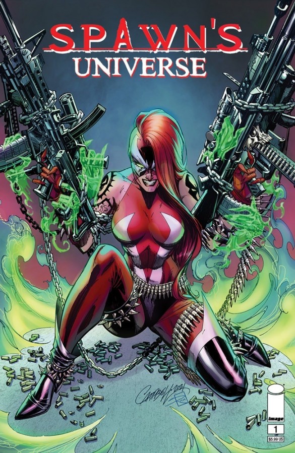
Review: Spawn’s Universe #1

Spawn's Universe #1

Big things are happening in Spawn’s universe expanding the world beyond the title character. The hope is to spawn (no pun intended) a universe of stories. Spawn’s Universe #1 is the next step in creator Todd McFarlane‘s plan to do exactly that.

Spawn’s Universe #1 is home to a lot of great comic artists and I thought they all knocked it out of the park. Whether it was Jim Cheung doing the main character, or Brett Booth on Gunslinger, Stephen Segovia working with Medieval, or Marcio Takara on art for She-Spawn’s story, I thought all of the artists working on this issue really nailed the look and feel of what they were given to illustrate. Art-wise, this is the kind of effort that I think could get people interested in this book. There’s not an ugly page to be found here and each artists’ style feels so distinct from one another. The various colorists and letterers put the cherry on top of a fantastic-looking issue.

Todd McFarlane handled the writing duties on all the stories and the one thing I’d say is I do kinda like how he writes. It feels like a mix of old and new, still decompressed for the newer era of comics but with a nice bit of narrative caption boxes throughout the issue. The story did seem to have a few problems. My main one is that I’m pretty sure there are characters used here and I have no idea who they are. Who is the guy on Omega’s island? Who was the guy with angel wings? Are these people that read the monthly title would know? There’s a lot of action in the pages and Spawn’s still a cool character but adding in some more of the Spawns and Cy-Gor was an added treat. The short stories are good starting points for what will happen with the supporting cast. I thought Gunslinger Spawn’s solo story was the best of the lot.

Overall, Spawn’s Universe #1 is a tiny bit confusing to read but it’s nice to look at. I’m hoping it’s just that I’m not a monthly Spawn reader that causes it but then it begs the question: is this a good jumping-on point for new readers to Spawn? I think that Spawn’s Universe will be a rewarding experience for those who have stuck with the title but that’s it, outside of just simple artistic enjoyment. Still, Spawn is 300+ issues old and a new launching pad should still offer something for the older readers. Hopefully, newer readers can make sense of it all.

Story: Todd McFarlane Art: Jim Cheung, Brett Booth, Stephen Segovia, Marcio Takara
Inks: Adelso Corona, Todd McFarlane Lettering: Tom Orzechowski, Andworld Design
Colors: Fco Plascencia, Andrew Dalhouse, Peter Steigerwald
Story: 5.0 Art: 9.0 Overall: 7.0

Image Comics provided Graphic Policy with a FREE copy for review


Purchase: comiXology KindleZeus ComicsTFAW

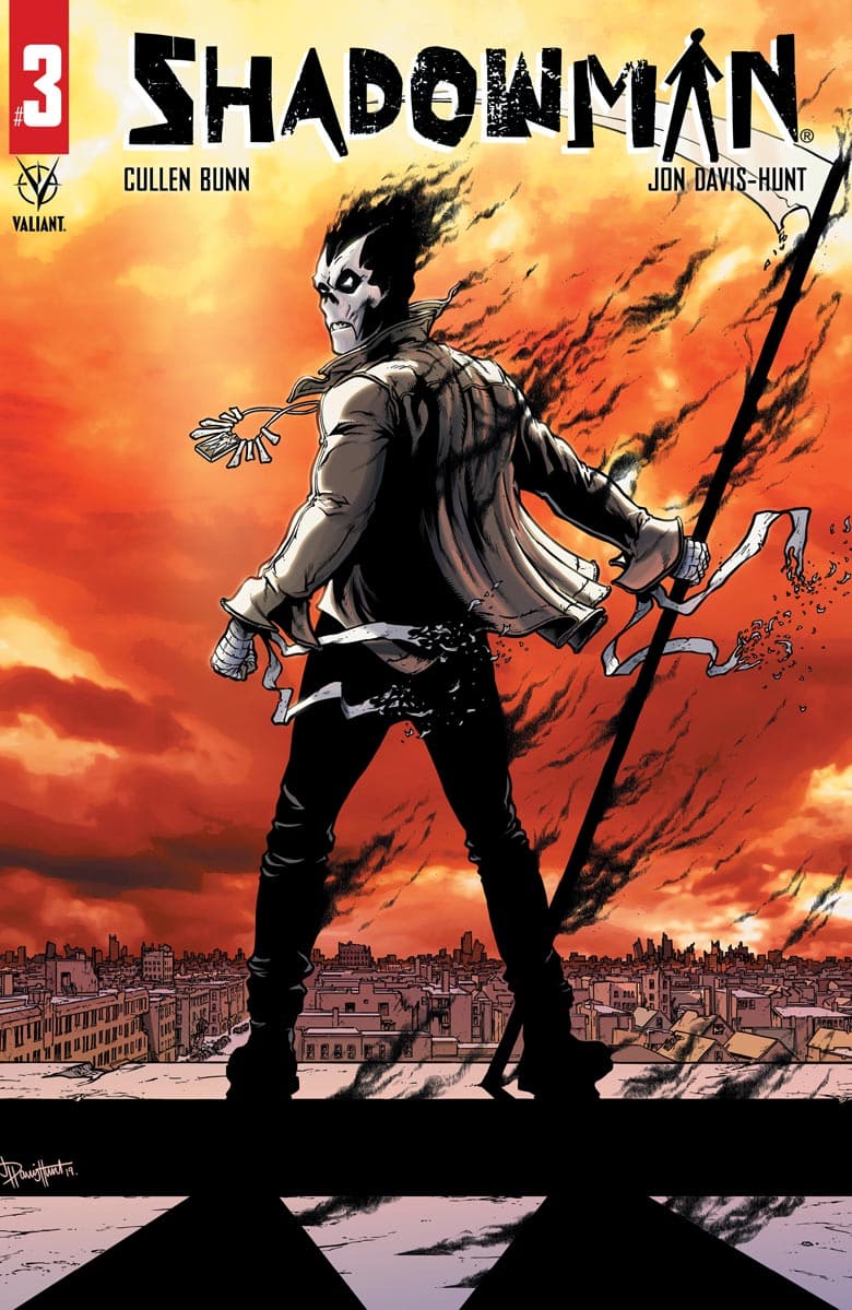
Review: Shadowman #3

Shadowman #3

Shadowman #3 sees the Shadowman bounce from Haiti to Barcelona, still trying to figure out who is trying to cause the blights from the Deadside to break through. Shadowman meets his match in the Pallbearer, a supernatural threat who is killing those associated with loas, the spiritual interm

I’m not sure what I like more on Shadowman, Cullen Bunn’s writing or John Davis-Hunt’s artwork. With Jordie Bellaire’s colors and Clayton Cowles’ letters, they really do make for a special creative team for Shadowman. The approach seems to be single-issue stories, driven by a central threat to the overall arc, and for me, it totally works. Cullen does horror really well and his approach appears more like a horror story than a superhero one. This issue also saw Josef, who was in Cullen’s Punk Mambo series, pop up to assist Shadowman and Baron Samedi. Speaking of Samedi, he certainly comes off as an untrustworthy ally but he doesn’t chew the scenery much and ends up offering small bits of humor. I hope for the series that he’s more like an ally and less of the untrustworthy variety.

There’s a lot of dark and creepy creatures that John Davis-Hunt has to illustrate and lots of dark, eerie settings and this issue wasn’t any different than the last couple but he has a style that really helps build on the dark atmosphere of Shadowman. He might be responsible for the best-looking Shadowman. I just think his version looks the coolest. That said, he does a grand job drawing lots of disgusting things for Shadowman to face.

Shadowman #3 is a continuation of outstanding single issues. This relaunch has been absolutely fantastic and I’m excited about where this is going. The creative team is doing some big-time work on the book and after reading this issue, I want more. Shadowman’s story is beautiful, dark and disturbing, and every bit captivating. If you are looking for something a bit different than your typical fare, Shadowman is that book.

Story: Cullen Bunn Art: John Davis-Hunt
Color: Jordie Bellaire Letterer: Clayton Cowles
Story: 9.0 Art: 9.0 Overall: 9.0 Recommendation: Buy

Valiant provided Graphic Policy with a FREE copy for review


Purchase: comiXologyKindleZeus ComicsTFAW

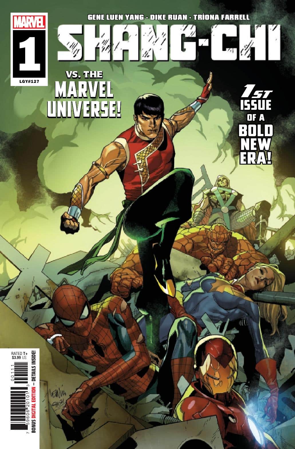
Review: Shang-Chi #1

Shang-Chi #1

In Shang-Chi #1, Shang-Chi has toppled his father and his organization. Now, he stands as the head of the Five Weapons Society, he’s using the organization to fix some of his father’s wrongdoings. Easier said than done, as attackers with beast-like hands start to attack, which leads to Shang-Chi locating a shop owner with a mysterious root created from an old Chinese Yeti. Even worse, Spider-Man is after a drug ring and believes both to be connected. Shang-Chi isn’t ready to divulge his association to his father’s old group. It’s only after Spider-Man falls prey to the yeren root that Shang-Chi has no choice but to fill Spider-Man in on everything. The only question that remains is whether it puts Shang-Chi at odds with his superhero brethren.

I’ve never read anything written by Gene Luen Yang before this issue. I know, it’s a total oversight and I know of all sorts of comics that everyone just loves but I just never had the chance until this moment but I left this issue feeling like I am going to just love where he’s going with Shang-Chi. I’m a fan of Shang-Chi, the character, and with this being billed as Shang vs. the Marvel Universe, I’d love to see how he handles some of the other heroes he’s going to run into with this series. He’s called the Master Of Kung-Fu. I hope Shang-Chi gets to prove it.

Now, outside of my own childhood fantasies of characters throwing down, I think the story is intriguing, with the yeren root, which is named after a mythological Chinese yeti. Just having something like that pop up here lead me down the Google rabbit hole of reading all about Chinese yetis. Awesome stuff. Gene’s dialogue feels really fresh throughout the entire issue and he does such a great job making everyone sound so different and really establishes their personalities.

Dike Ruan and Triona Farrell make the art team on Shang-Chi and there’s a good quality dynamic at work here. Dike employs a good amount of detail but doesn’t overdo it. There’s not a lot of wasted linework with his art. Triona Farrell’s colors just come off a hair too dark for me throughout the entire issue but it’s not enough to ruin my enjoyment of what I’m seeing on every page.

In the end, I’m glad one of my favorite characters is finding ways to stay in print and with a movie in the near future. It’s a good time to be Shang-Chi. I love the position he’s in and the fact he’s not going to play nice with others is even better. This first issue is definitely worth checking out.

Story: Gene Luen Yang Art: Dike Ruan
Color: Triona Farrell Letterer: VC’s Travis Lanham
Story: 8.0 Art: 7.0 Overall: 7.5

Marvel provided Graphic Policy with a FREE copy for review


Purchase: comiXologyKindleZeus ComicsTFAW

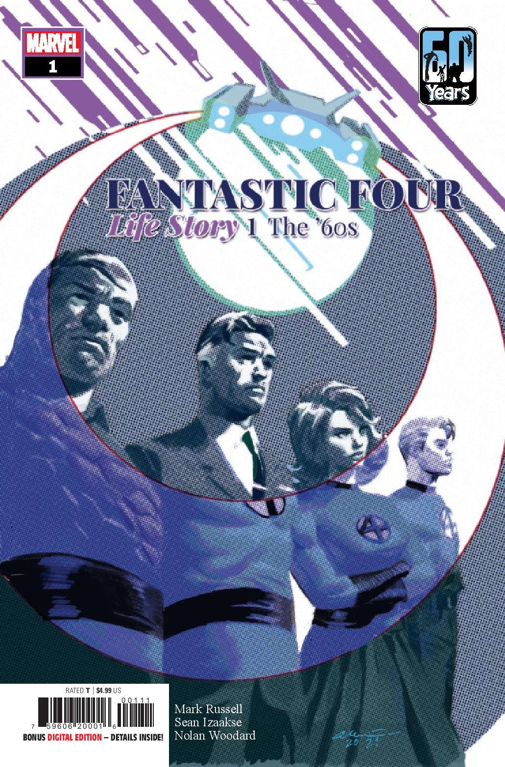
Review: Fantastic Four: Life Story #1

Fantastic Four: Life Story #1

It’s a story that all comic book fans know: Four people go up to space on an experimental rocket where they are bombarded with cosmic rays. When they crash down to Earth, each of the four display a multitude of super abilities. They decide to band together for the betterment of humanity and call themselves the Fantastic Four. Fantastic Four: Life Story #1 kicks off a new take on Marvel’s first family.

The Fantastic Four have such a classic origin story. Why even tinker with it? That’s the question I was left with after reading this. I am not sure if this is meant to be canon within the Marvel U or what. With this latest rehash of Marvel’s first family’s origin, things are expanded in ways that sometimes just feel a bit unnecessary. I don’t want to nitpick everything because it’s not fair to the creative team and, to be honest, I’m a huge fan of the FF, going back to when I was a kid. They were one of the first Marvel books I picked up. Is it a case of me being too much of a fan and not wanting to accept change? Is it just a mediocre attempt at looking at the Fantastic Four in the 1960s?

Mark Russell’s update of the FF sees them being the fourth group to try and reach space. Reed meets with President Kennedy. Also present is Dr. Jones, another big-mind who ends up being passed on time after time due to Reed’s intellect and approach. The entire project shuts down and Reed is left to assemble a team and sneak a rocket up into space. With some minor tweaks, the FF is born from the flight, and Reed is left with a shocking vision from space, one of a devourer of worlds being out there.

So it falls to me to be a fan that can’t get past certain things. I just don’t like quite a few of the retcons thrown into this. It’s still not a bad book and I think someone new to the characters might get enjoyment from it. As a reviewer and a long-time fan, there’s a part of me that wants to chalk it up to not being the best story but I really think it comes down to just being an older fan set in his ways with these characters. And for a team of adventurers who’ve had the stories they’ve had, there’s not a whole lot of action within this book. Maybe one of the biggest problems I had with this is that going through the FF’s 1960 adventures, we got the mole man and a glimpse of Galactus and…that’s kinda it. No Doom, no Namor, no Frightful Four, or even the discovery of the Inhumans.

That said, I think one of Mark Russell’s strength’s is dialogue and there were a few times in this book where I really liked what was said. Reed’s 1967 answer to the question of the existence of aliens really stood out to me. And I did like Dr. Jones and the way he was woven into their history in key moments.

Life Story does have consistent good art throughout the issue. Sean Izaakse and Nolan Woodard do some solid work on this book. I really liked the colors throughout this issue and that can certainly go a long way. Like I said in my critique of the writing, there’s not a lot of action here so there’s not a bunch of cool-looking scenes of the FF’s adventures but Izaakse and Woodard make a lot of pages of people talking look pretty good.

Am I too hard? Am I too much of a fan of the Fantastic Four, unable to budge? Probably that’s the case. That said, I still found some enjoyment in this and it was way better than the Ultimate version from the early 2000s.

Story: Mark Russell Art: Sean Izaakse
Color: Nolan Woodard Letterer: Joe Caramagna
Story: 6.0 Art: 7.0 Overall: 6.5

Marvel provided Graphic Policy with a FREE copy for review


Purchase: comiXologyKindle Zeus ComicsTFAW

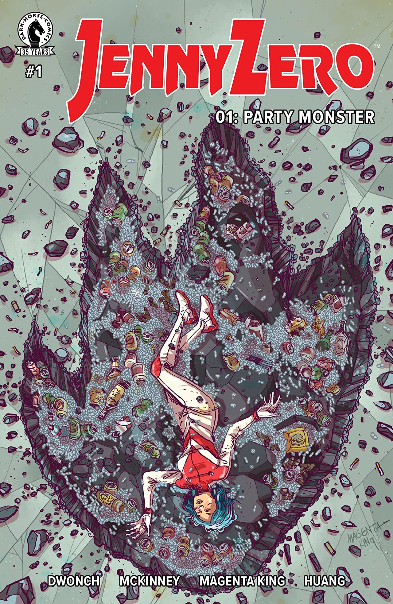
Review: Jenny Zero #1

Dave Dwonch and Brockton McKinne

Jenny Zero is the story of super-uber-bad-ass-Kaiji-killin’ Jenny Zero. She has a seriously shitty attitude and personality and drinks and drugs like most people breathe. She doesn’t want to live up to the legacy of a father who set her on this path. However, she’s got a job to do and a really weird gun for killing kaiju. As the city is attacked, she mistakes the situation for a killshot and makes it even worse, for her and those around her.

Jenny Zero certainly has a cool premise but the biggest detraction for me was the main character. I felt Jenny was pretty much unlikeable. Jenny just comes off a bit too angry for me. Writers Dave Dwonch and Brockton McKinney do a lot to set up Jennys’ world and some truly exceptional work in building up the supporting cast. The dialogue felt fresh and Jenny is certainly put through a lot in this first issue. Ultimately, there’s not much redeemable about Jenny in the first issue to help me see past her as something other than someone who is on a downward spiral of drugs and family issues.

I could go back and forth about the art by Magenta King. At times, I did feel it wasn’t consistent and then there are times I would look at a page and just love it. It happens. I do feel that Megan Huang’s color work over King’s pencils really took the art to a level that I did enjoy. There is certainly something appealing about Magenta’s style. And while it isn’t built on high detail, the panels are full of art. The dance club pages, I thought, really showed some good attention to background detail that didn’t take shortcuts.

I’m not big on Jenny Zero #1. I really wanted to like it because what’s not to like about some bad-ass gal and her bad-ass gun just gunning down big critters? Sadly, I think the first issue (possibly) doesn’t do the main character much justice and just traps her as another edgy loose cannon with a chip on her shoulder the size of the world. That said, there’s definitely a character secret that reveals itself at the end that’s got me interested in what’s to come.

Story: Dave Dwonch and Brockton McKinney Art: Magenta King
Color: Megan Huang Letterer: Dave Dwonch
Story: 5.0 Art: 6.0 Overall: 5.5

Dark Horse Comics provided Graphic Policy with a FREE copy for review


Purchase: comiXology

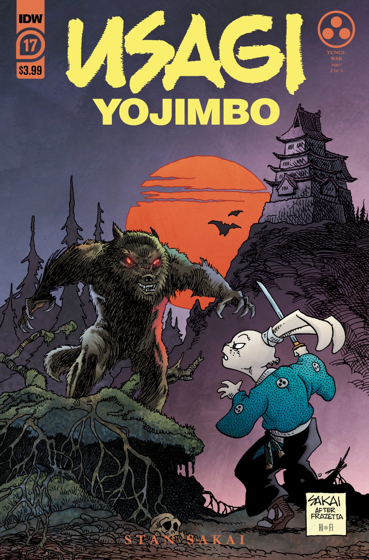
Review: Usagi Yojimbo #17

Usagi Yojimbo #17

Usagi Yojimbo #17 features part two of “Tengu War”. The comic opens with Usagi and his former sensei Sojobu are surrounded by the Tengu. The big fight happens and while Usagi can hold his own, Nozomi appears to help turn the tide in Usagi’s favor. However, she has her own issues with Usagi, who she refuses to see as an equal until he proves himself in combat against one of her companions. Eventually, cooler heads prevail with a bit of wisdom.

It might not be flashy and Stan Sakai’s artistic style might not be for everyone but it’s what Usagi Yojimbo has always been and Sakai has always kept things looking the same. I know longtime colorist Tom Luth retired but with Hi-Fi Design handling that part, I  had no problems with the colors. Usagi is a pretty wonderful character. He’s just been fleshed out so much by Sakai over the years and I feel like his behavior just seems so natural and it’s something that I feel sets him apart from so many characters. As a character full of wisdom, it seemed proper that when put into the situation of proving himself to Nozomi, he refused to kill his combatant and successfully pleaded for said combatant’s life, as they’d need every sword available for the Tengu. And while I appreciate the action inside the pages, I just feel like Usagi’s character is tops.

Overall, Usagi Yojimbo #17 is another enjoyable issue of Usagi Yojimbo. Honestly, I have been reading UY off and on for so many years and feel like it just doesn’t skip a beat and has maintained a quality form of storytelling. As part of a 3-issue story, this chapter doesn’t feel like the slow part in the story and had a lot of good action and storytelling. I feel confident in stating that Usagi Yojimbo is one of the best books I read each month and Usagi Yojimbo #17 is no different.

Story: Stan Sakai Art: Stan Sakai
Letterer: Stan Sakai Color: Hi-Fi Design
Story: 8.0 Art: 6.0 Overall: 7.0

IDW Publishing provided Graphic Policy with a FREE copy for review


Purchase: comiXologyKindleZeus Comics

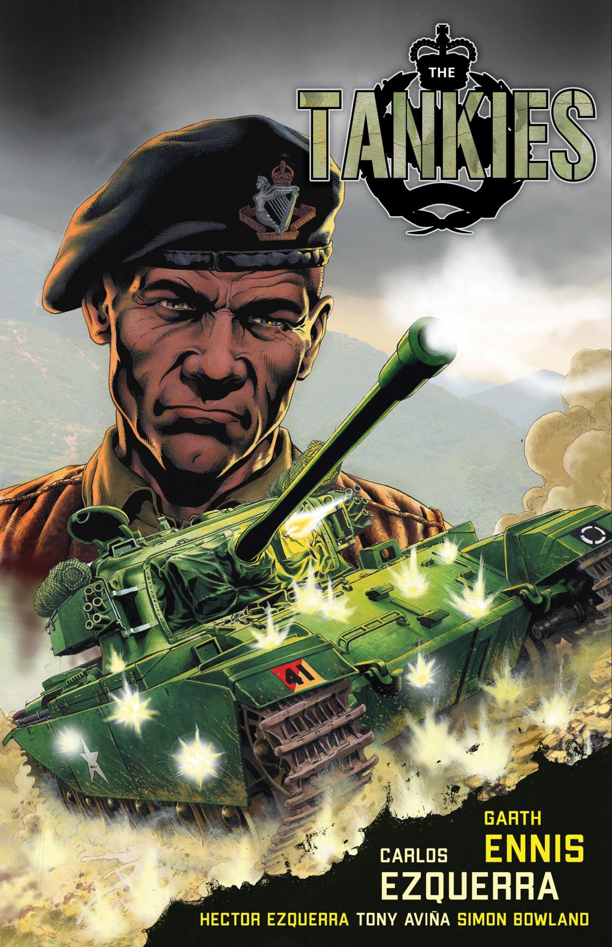
Review: The Tankies

The Tankies

Within The Tankies are three tales: in “The Tankies”, we meet Corporate Stiles, a hardened vet who is ready to bring his men against the German Tiger tank, a machine feared to be unrivaled. Then in “The Firefly & His Majesty”, Stiles and co. lead a Firefly, which is a Sherman tank, up against the German’s newest weapon, the King Tiger. Lastly, “The Green Fields Beyond” sees Stiles and company’s involvement in Korea against the Communists.

These stories were originally published under the “Battlefields” title that Dynamite had going with Garth Ennis from back in 2011. Last year saw Dead Reckoning release The Stringbags, which was another WW2 Ennis book. That said, it’s nice to see these stories see light again and to also be dedicated to longtime Ennis collaborator and Judge Dredd co-creator Carlos Ezquerra, who passed away in 2018. Like any Ennis-written War Story, they certainly aren’t for the squeamish and the language is something totally beyond colorful. I do feel that a good Ennis war story is as good as it gets.

Reading through The Tankies, you can see that the research has been done to be accurate to the times portrayed. You’ll almost feel like an expert in tanks after reading this. There’s a great afterword by Ennis at the end that really encompasses the amount of research done for such a book as The Tankies. And to finish the book, a section of sketches from Carlos Ezquerra.

I’ve always appreciated the artwork of Carlos Ezquerra. He worked with Ennis on many stories, from Kev at Wildstorm to World Of Tanks at Dark Horse, just to name a few. With The Tankies, I feel like he took this job seriously and put forth a great amount of detail in everything from weapons of destruction to the people using them. His character expressions are great. I have a real appreciation of the art within these pages.

I enjoyed reading The Tankies very much. Honestly, I buy every war story Ennis works on when I know about them. While some might not enjoy the destructive power of war or the violence man casts upon themselves with it, I always appreciate the history lesson of it and the little things that Ennis and Ezquerra inject into it. If you enjoy war or if you like what Garth Ennis brings to comics, The Tankies is just the book for you. It’s not as funny as Ennis and Ezquerra’s work in The Adventures Of The Rifle Brigade but certainly feels similar in tone to World Of Tanks.

Story: Garth Ennis Art: Carlos Ezquerra
Ink: Hector Ezquerra Color: Tony Avina Letterer: Simon Bowland
Story: 10 Art: 8.0 Overall: 9.0 Recommendation: Buy

Dead Reckoning provided Graphic Policy with a FREE copy for review


Purchase: AmazonTFAWBookshop

Review: Magic #1

Magic #1

Welcome to Ravnica, the home of magic. Kaya the Ghost-Assassin. Ral Zarek the Stormheart. Vraska the Queen of the Downtrodden. While each resides somewhere different in Ravnica, each will face down many foes due to a sudden attack in Magic #1. Who sent them is unknown but it’s part of the mystery of the multiverse of Magic.

I’m coming into Magic #1 as someone who knows absolutely zero about Magic: The Gathering but with any fantasy system, it’s about finding the components and putting them into terms you are familiar with. As someone who has played Dungeons & Dragons and Pathfinder, I wasn’t completely confused with the goings-on of this first issue. It’s definitely a good setup issue. It provides an introduction to Ravnica and the various Planeswalkers and a couple of steps into what each is capable of. I’m not ready to go get a deck but the character work laid out within the pages is definitely enough to keep me entertained.

I’m fairly impressed with Magic #1. Jed McKay put together a simple enough story, which is great for someone like me who doesn’t understand MTG and yet there’s enough of the terms and abilities and such thrown about that it quickly brings you into the fold. McKay has put in a good amount of worldbuilding, action, and intrigue to really help make Magic #1 a quality fantasy comic.

Add Ig Guara’s art to the mix, I really like the art style used here. One of the great things about fantasy is the mixture of the strange and exotic and there’s definitely a lot of strange and exotic with this issue and having an artist up to the task of drawing all of this up is key. I know some of this has to come from the game itself but there’s a lot of cool character designs here. It’s a comic book with a lot of bright and vibrant colors. Arianna Consonni’s colors really add to the fantasy feeling and with Ed Dukeshire’s letters, I feel this issue of Magic is an adventurous first issue.

Magic #1 is very much in the vein of IDW’s Dungeons & Dragons comics, which I also really enjoy. We can never have enough fantasy-driven work in comics so if that’s what you like, take a chance with Magic.

Story: Jed MacKay Art: Ig Guara
Color: Arianna Consonni Letterer: Ed Dukeshire
Story: 8.0 Art: 8.0 Overall: 8.0

BOOM! Studios provided Graphic Policy with a FREE copy for review


Purchase: comiXology – Amazon – Kindle – Zeus Comics – TFAW

Review: Savage Dragon #258

Savage Dragon #258

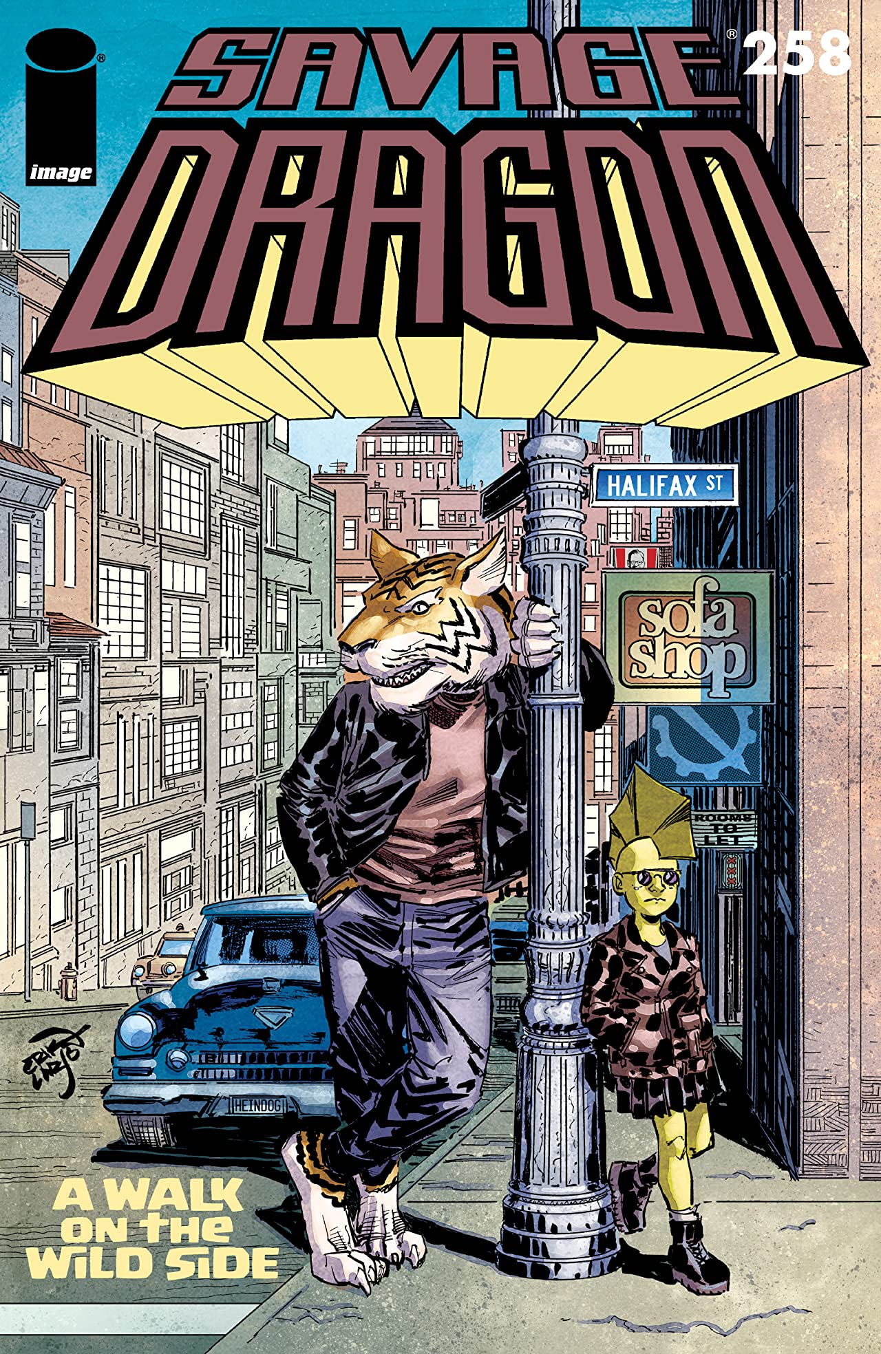
Savage Dragon #258 takes readers on “A Walk On The Wildside”. Amy Dragon sneaks off on an adventure with Walter, the talking tiger. Sadly, dinnertime is not the time for such actions and they find themselves in trouble (and snow) moment after moment.

To be honest, Savage Dragon #258 was a bit of a snoozer. Amy and Walter’s little adventure wasn’t that exciting. The most exciting part was the beginning where Malcolm was battling the God of Thunder. After that, it delved into something a lot more chill and peaceful which didn’t really resonate with me. Partly, I don’t get to read every issue of Savage Dragon that comes out. I do want to say that while the story wasn’t my cup ‘o tea, I think that it’s an impressive feat that series creator Erik Larsen can keep Savage Dragon in some oddball adventures like this one, which helps it be unique.

While I wasn’t blown away by the story, Larsen’s art is still something to behold and this issue had quite a few moments where I liked what I was seeing. The opening page was full-on Kirby (in a good way) and what followed was a very energetic two-page splash. Nikos Koutsis is a fantastic colorist for Larsen’s work and I thought that this issue showed that. I do feel like Larsen has gotten a bit loose with his pencils, as compared to how I think his older issues of Savage Dragon look but I do still think there are quality visuals in this issue. It’s good to know that I can still appreciate the art on a book like this, even if the story doesn’t click with me.

Story: Erik Larsen Art: Erik Larsen
Letterer: Ferran Delgado Colorist: Nikos Koutsis Flats: Mike Toris
Story: 5.0 Art: 7.0 Overall: 6.0

Image Comics provided Graphic Policy with a FREE copy for review


Purchase: comiXologyKindleZeus ComicsTFAW

« Older Entries Recent Entries »