Author Archives: Troy Brownfield

MegaCon 2023: From journalist to comic writer, Steve Ekstrom talks SOKO

Steve Ekstrom

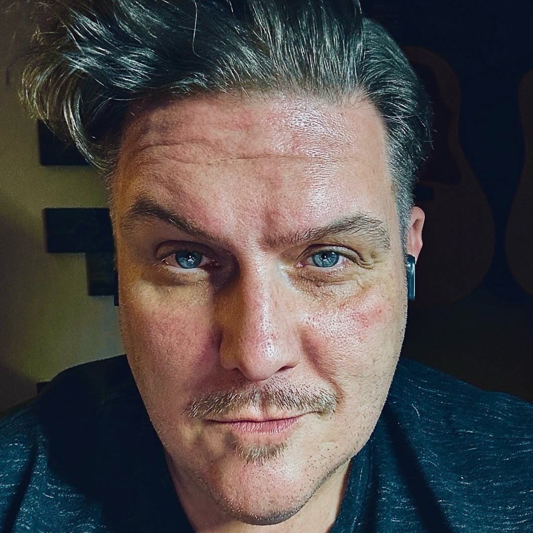
Steve Ekstrom made the jump from comics journalism to comics writer. Now at Sumerian Comics, he’s a Senior Editor on the verge of seeing his creator-owned book SOKO, hit stores. We talked to Steve as MegaCon opened.

GRAPHIC POLICY: For the people who haven’t met you yet, please allow you to introduce yourself.

STEVE EKSTROM: Hi, I’m Steve Ekstrom; I’m a Scorpio who likes long walks on the beach… (haha)

I’m a former journalist in the industry who wrote for Newsarama, MTV Geek, FreakSugar and a few other noteworthy websites. I started writing comics in 2007 and I’ve been published by 803 Studios, Image Comics, DC Comics (through the ZUDA webcomic imprint), as well as Top Shelf, Tin Star Studios, Imminent Press, and now Sumerian Comics (formerly Behemoth).

GRAPHIC POLICY: Let’s start with how you got involved with Behemoth Comics first.

EKSTROM: Through a friend of a friend, actually…networking pays off.

I was talking to my friend, Mark Bertolini, and he introduced me to Nathan Yocum during the pandemic. Nathan and I had one of those moments on a phone call that was like the movie Step Brothers where we were like, “Did we just become best friends? Yep.” and everything slowly kind of came together. He’s such a great guy and a good friend. He helped me through a rough patch of time by just talking to me and letting my opinions about these damn pamphlets matter.

I’d take a bullet for that guy.

Gushing aside, I pitched SOKO to him and Behemoth was interested. Over time, I earned the trust of Nathan and Ryan (Swanson) and we started working on the notion of working together full-time. I’m really grateful for everything they’ve entrusted me with so far. The two of them did something almost no one else could…they prospered and grew during the pandemic when everyone else was hurting or shutting down. Their success (at Behemoth) and their graduation into their roles at Sumerian really is a testament to their monstrous work ethic together. They’re like this two-headed beast that you’d think twice about running into on the convention floor…they’re here to succeed and I think they’re going to have prolific careers in this industry.

They’re giving me a “belle of the ball” moment by publishing my first foray into creator-owned indie comics. I couldn’t be happier.

GRAPHIC POLICY: In March of 2022, Sumerian Records & Films acquired Behemoth. Could you give us some insight on that, and why was Behemoth such an attractive acquisition for Sumerian?

EKSTROM:
It’s really not my story to tell, honestly. I’m definitely a drinker of these guys’ Kool-Aid, though. There are times when you know in your gut that something is going to be “big”…Sumerian Comics is going to be something new and different as the market changes and grows with direct-to-consumer avenues like the globalized online marketplace and, hopefully, as the digital marketplace provides readers with a new way to engage the medium. I think a lot of creators would like to harness the internet more as business models improve and show profitability. Hell, I would…but I digress.

When Nathan told me about Behemoth’s acquisition, I was genuinely excited for them but I didn’t know if I was going to have a place at that table, initially. Nathan and Ryan both were really supportive and they introduced me to Ash Avildsen, the new owner of the company, and he and I clicked as well. There’s something to be said about destiny and when something of substance comes together the way this squad has solidified itself.

Trust me when I say that nothing gets me going more than talking about the business side of comics with these three dudes and, then, you toss in Sumerian Comics’ tenacious Creative Director, Adriana Gough, and you’ve got an unstoppable juggernaut who is just starting to gain momentum.

Adriana’s work ethic makes me feel absolutely inadequate at times and I find myself comforted by the notion that we’re on the same team at the end of the day.

SOKO #1

GRAPHIC POLICY: At Sumerian Comics now, you’re Senior Editor. Readers hear all kinds of job and editorial titles, and every one is a little bit different. What does being an editor at Sumerian entail for you?

EKSTROM: Well, like the rest of the industry, when a book does well…the creative team is lauded; however, when a book does poorly…you blame the editor. That still applies (haha).

In all seriousness, I edit the creative work of others. I swing my weight when my opinions are needed for ad materials, covers, layouts, and other technical aspects of the publication process like lettering and making sure our pages meet the specs of the printer.

It’s a lot of work and, dammit, I love it even when I have Ryan breathing down my neck for files that are due.

A really cool part of this job is that I get to talk to other creatives about comic books all damn day and, honestly, it doesn’t get any better than that. Being in an editorial position like this is VERY empowering if you have a creative soul that is passionate about this medium.

Comic books have been a part of my life since I was very young. You know the old adage, “Find something you love and let it kill you…”

If comics don’t kill me, Ryan Swanson will. I kid…but, seriously, watch that kid. He’s got a darkness about him. (haha)

GRAPHIC POLICY: What separates Sumerian from the rest of the comics pack right now?

EKSTROM: I was actually talking about this with Ash (Avildsen) at dinner last night. Nathan and Ryan captured lightning in a bottle when they started Behemoth; they created a very “punk rock” feeling brand that had VERY indie feeling books that, ultimately, connected with a new generation of comic book readers. I really want to continue to foster that sensibility with the content we’re beginning to put together with Sumerian.

We have a great body of indie work shaping up that we’re going to begin to couple with licensed projects that you would have never imagined were going to wind up with fresh comic book content featuring rising stars in the industry.

It all started at Wonder Con when we started rolling out some of our content that will be hitting shelves later this year.

Minds will be blown.

GRAPHIC POLICY: We know that comics fans can be particular about what they choose to check out and why. Do you think that being attached to a successful record label makes it easier to promote a comic (name recognition, etc.) or harder (the way some fans see “outsiders,” etc.), and why?

EKSTROM: I think it’s a double-edged sword, to be frank. It gives us this amazing level-up in terms of having a new platform to promote to a wider audience that boasts bands like BAD OMENS, SLAUGHTER TO PREVAIL, and the SMASHING PUMPKINS.

But that also sets the bar higher for us when you think about it.

You can’t rest on your laurels. You can’t just hope to sell merch and watered down content together. We want to give people comics and reading experiences that they’ll never forget.

We get to do that with synergistic content tied to bands that are chart-topping as we speak. How fucking cool is that?!

Comic books and rock music are counter-culture cousins if anything. It’s a perfect pairing when you consider the challenges of coming up with fresh, innovative content in a constantly evolving consumer marketplace that voraciously devours content.

Soko #1
Page from Soko

GRAPHIC POLICY: What is Sumerian’s overall approach to title development? With horror, crime, etc., you’re not just sticking to one genre. What’s the mission statement, and what makes a book uniquely Sumerian?

EKSTROM: I don’t think we have a clear cut “mission statement”, I don’t think that would be very “punk rock” of us, honestly, if you consider the humble origins of Behemoth and, now, Sumerian Comics.

I think what people need to know when they see our brand on  a book is that we give a shit about the quality of the entertainment they’re investing in when they pick up our stuff off or a convention table or shelf in a shop. Nathan, Ryan, and Adriana…they all omnivorous consumers of comics. There are stacks of books from other publishers all over our office that we are constantly showing each other and saying, “Hey, I really like this, how can we do this…but better and in our own way.”

I think that’s the most important thing you can do in the modern comic book market now that Millennials have become the primary adult consumers of content: give an actual shit and care about the work as much as your fans care about you.

GRAPHIC POLICY: Your own title, SOKO, is dropping from Sumerian. You’ve had that in development for a while. Now that it’s solicited, how do you feel?

EKSTROM: I keep disassociating when I get in my car…like way too much. Like I don’t know how I haven’t gotten in an accident. It’s surreal to have something this majestic with your name on the cover.

You worry. You’re taking your five year-old to their first day in kindergarten and you drop them off and you wave and you hope the other kids don’t eat your kid alive. You hope your kid doesn’t spend the day eating paste…I can carry this metaphor out to prom but I know for a fact that the five people who have continued to read my blather at this point don’t want any of that smoke.

That’s how it feels to have your first big time comic on the shelves in stores…well, that’s how it’s going to feel on April 12th. I don’t know the pre-order numbers yet. I kinda don’t wanna know because I’ll probably lose my lunch at least once.

Honestly, I’ve never felt more alive. All I’ve ever wanted to do is make comic books. I took the time to learn my craft as a storyteller and then I studied the medium of comics and how to make them. It took me roughly twenty years to get to this point…and I’m just getting warmed up. I wish I could talk about some of the stuff I’m attached to but, unfortunately, I can’t…for now.

SOKO is a wild ride and I’m excited that people like Ross Ritchie, Mark Waid, and Howard Chaykin were kind enough to write glowing endorsements for our book.

Soko
Page from Soko

GRAPHIC POLICY: Tell everybody about SOKO and your team.

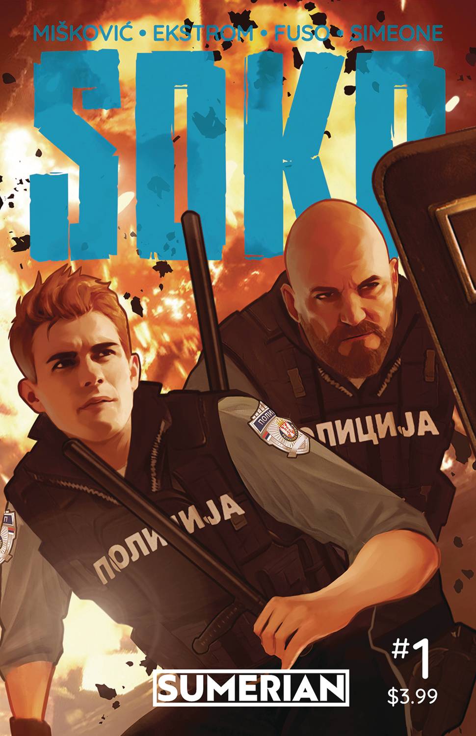
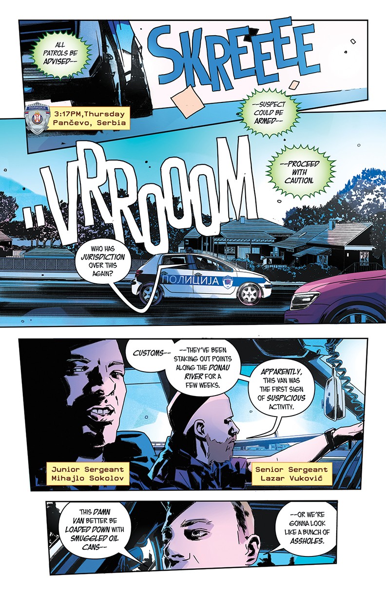
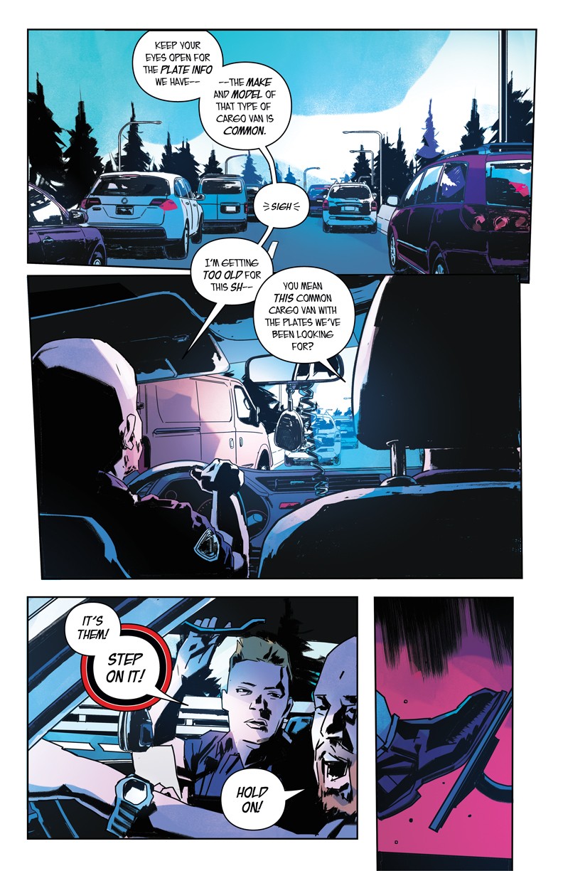
EKSTROM: SOKO (which translates to “falcon” in Serbian) is a fast-paced police procedural and crime-thriller about two beat cops who uncover a mountain of systemic corruption within the law enforcement system of Serbia that’s deeply connected to the Serbian mob and human trafficking.

The intimal concept was created by my Serbian writing partner, Vanja Miskovic. He’s the heart of this book. We’re very fortunate to be working with veteran artist, Antonio Fuso. Antonio has been on a tear lately with a lot of successful indie projects getting optioned like WYRD at Dark Horse and STARGAZER at Mad Cave. We also have two really talented colorists, Stefano Simeone, artist for MEGA MAN: FULLY CHARGED at Boom! as well as Emilio Lecce who worked on DR1VE for IDW.

I was brought in to initially letter an 8 page short Vanja created. Eventually, I was asked to letter and edit. After that, Vanja was like, “Why don’t you just co-write the project with me…” and the rest is history.

Our cover artist roster is really stacked as well. We have rising stars Francesco Tomaselli who has graduated to doing cover art Todd MacFarlane’s SPAWN and Lorenzo Tammetta over at Marvel killing it on projects like MURDER WORLD: GAME OVER.

But my favorite part is that Serbian artist, R.M. Guera, artist for Vertigo’s SCALPED provided us with a cover for the first issue of SOKO. I couldn’t be more honored. As fan of comics, Scalped is probably my favorite contemporary comic of the 21st Century, hands down.

GRAPHIC POLICY: What’s your big picture view of comics at the moment, and where do you think comics as a whole will be one year from now? What’s going to be the biggest issue, and what’s one important takeaway you want to leave for readers?

EKSTROM: Comics are in a really precarious place where we are expanding and contracting at the same time. There is always someone talking about how the sky is falling and the medium is dying and there’s always someone pointing out the rising profits of print books and graphic novels from the past couple of years.

“It was the best of times, it was the worst of times…” right?

I think we’re still wrestling with a proper method of delivery in terms of digital content and I think that frontier is still rough terrain for publishers because there is no true, clear-cut path to substantial profitability. There is no primary mode of delivery. I think that’s going to be a detriment to the rise of digital content and eventual supplanting of the print market for the foreseeable future…like it has been for the past decade.

Tablets are a luxury item in most homes even though they’re more proliferated than ever. Don’t get me started about attempting to read comics on a phone…I’ll blow a gasket.

We’re consuming more screen-based content than ever, collectively speaking. Comics have to provide something that competes with video games, cartoons, and television programming.

It’s funny to think about when you consider that comics are a cornerstone of the development of those industries in terms of storyboards essentially being simplified comics themselves. It’s like asking an egg to fight a full-grown chicken on steroids. (haha)

Getting books in hands and butts in seats will always be my primary concern no matter if I’m making the comics myself or helping to produce them as an editor for a really great new brand that’s going to be bringing the thunder this year.

I hope that my enthusiasm and the enthusiasm of the crew at Sumerian will inspire you to want to check out our books.

But, seriously, buy more comics, people. See you at MegaCon. Come to the booth and tell Ryan Swanson you think he has a heroic jawline. You’ll have my undying admiration if you do.

It’s Sword-and-Sorcery Infused with The Terminator. David Pepose Talks Savage Avengers

Savage Avengers #1

Announced in February, Savage Avengers returns this May with a whole new lineup and a whole new creative team.

Writer David Pepose guides Conan the Barbarian, Daredevil (Elektra), Anti-Venom, Black Knight, Cloak & Dagger, and Weapon H along with Carlos Magno in a whole new adventure. They’ll fight their way through the Hyborian Age with an evil Deathlok hot on their trail!

We got to talk to David about what we can expect from his Marvel ongoing series debut as well as his upcoming take on Moon Knight.

Graphic Policy: David, for the people out there that haven’t met you yet, please introduce yourself and tell them about your various minis and Ringo Award-winning exploits.

DP: Sure thing! I’m David Pepose, and I’m the writer of books like Scout’s Honor at AfterShock Comics, Spencer & Locke and Going to the Chapel at Action Lab, and my Ringo Award-winning Kickstarter series The O.Z. I’ve been reading comics my entire life, and it’s been a real honor to work in the independent comics scene — and a tremendous privilege to now be making my Big Two debut at Marvel.

GP: And now you’re on Savage Avengers. You’ve commented before that a few particular team books were favorites and influential in your approach. Let’s talk about when you first encountered those books and the particular elements that affect how you yourself write a team.

DP: For sure — some of the big influences behind Savage Avengers were Al Ewing’s work in Mighty Avengers, Rick Remender’s Uncanny X-Force, and of course Grant Morrison’s seminal JLAJLA was probably the earliest book I’d encountered, and I really enjoyed the way Grant found creative ways to utilize their cast’s powers, but while still distilling their voices and establishing really fun character dynamics amongst their roster. 

I think Al Ewing did a similar thing in Mighty Avengers, which was a book that I nearly passed over — but I’m so glad I gave it a shot, because he did such an incredible job at taking characters I didn’t have any knowledge or affection for (especially newer legacy heroes like White Tiger and Power Man) and made them into a cohesive unit that you really cared about. Al’s work is probably the biggest influence on Savage Avengers, and it’s always a comfort to know you’re being inspired by the best.

Rick Remender’s work in Uncanny X-Force, meanwhile, has always influenced me in terms of rhythm — his voice is so singular because of the pacing and intensity of his writing, and that’s something I’ve tried to incorporate into Savage Avengers as well. But there’s also that throughline in his Marvel work of dysfunctional groups having to hash it out and learn to cooperate, and that plays a big role here, too.

GP: You had a hand in picking most of the team members you’re using in Savage Avengers. Can you describe how you approached that process, and what kind of give-and-take goes into (forgive me) assembling a team for Marvel?

DP: When my editor Tom Brevoort first reached out to me about potential ideas for Savage Avengers, my first instinct was to see if we could establish a permanent roster for the book, since Gerry Duggan’s spectacular run had more of a rotating cast of characters that would cross paths with Conan during his wild adventures in the Marvel Universe. So I approached this roster with two directives: how do I speak to Gerry’s iconic original roster of Conan, Punisher, Elektra, Wolverine, Venom and Doctor Voodoo, but how do I do that in a way that lets me put my own stamp on the book?

With that in mind, I figured I could have my cake and eat it, too — on the one hand, we’ve got legacies of the core original Savage Avengers, with Conan, Elektra, Anti-Venom, and Weapon H. On the other hand, we’re building up this really cool sword-and-sorcery element to the team with Black Knight, Cloak and Dagger. But ultimately, they all share a similar throughline — these are all characters struggling with their dark side, and they’re going to wind up having to help each other navigate through that darkness.

Back-and-forth is a great way to describe how a roster like this comes together. Especially when you’re a new writer taking a swing this big, you’ve got to be flexible — that doesn’t mean you need to settle, but it means you need to come up with backup plans that have just as much love and affection as the number-one thing you’re pitching. There are very, very few characters that I’d consider “bad” — there’s always a way to make someone everyone else is overlooking and polish them into a show-stopping, A-list-quality character. And maybe that’s the real throughline for this entire roster, y’know?

But the thing is, there’s a ton of other books going on, and when you’re just starting out like I was, you’re never going to be privy to everything — so you wind up putting together a massive list of characters that you think could be a potential fit, and you work your way down. Is Flash Thompson busy? What about Elektra as Daredevil — is there a way to fit her in that doesn’t mess with Chip Zdarsky’s plans? There’s a lot of behind-the-scenes coordination, but I was honestly pretty fortunate in getting just about everything I wanted on the first pass. The only characters I told Tom that I’d go to the mat begging for were Cloak and Dagger, and thankfully I didn’t get any pushback on them. (Laughs)

Savage Avengers

GP: You’ve developed a reputation for both being really good with a pastiche, weaving in satire, and punctuating things with dark humor. In what way does the “Pepose brand” manifest itself in the book?

DP: The “Pepose Brand” for Savage Avengers is really in the high concept, since this series feels almost like a sword-and-sorcery-infused version of The Terminator. As a warrior hailing from the Hyborian Age, Conan the Barbarian is now a man out of time in the modern Marvel Universe… and that puts him head-to-head with Deathlok, who has charged Conan with crimes against the timestream.

So we’re able to take elements that you might be familiar with, but subvert them in some really cool and exciting ways — Conan is a natural-born warrior, but he’s going to find himself pushed to his limits against this soldier from the future. Meanwhile, the rest of the Savage Avengers are going to find themselves way out of their depths as the Deathlok’s rampage takes some surprising turns. Mashups are something that really interests me as a writer, as it lets me cover a pretty wide spread narratively and can make some really unexpected and fun sparks start to fly.

GP: Conan the Barbarian has a mammoth cultural history. Was it intimidating to take on that character? What are the elements that you believe must be in a Conan story, and what are the challenges and/or exciting parts of bumping him against the members of your cast?

DP: Hugely intimidating. (Laughs) But I think having Conan in the mix is part of the reason why I was so excited to tackle this book in the first place — it’s the mashup ethos, it’s having a team of scrappy Marvel superheroes alongside one of the biggest icons in sword-and-sorcery! But my favorite Conan stories are both dramatic and just purely fun escapism — like, living in the Hyborian Age is hard… but it’s also kind of fun to vicariously live through Conan’s adventures as a sword-swinging badass, y’know? So figuring out Conan’s unique voice was a really cool experience for me — sometimes he’s got this amazing bravado in the heat of combat, other times he can be hostile and even selfish. He’s complex, but he’s also larger-than-life, and that makes him a perfect leading man for this series.

That quality also makes him the perfect foil for the rest of our roster. Conan’s closest with Elektra, having interacted with her throughout Gerry Duggan’s run on the series, and he’s also teamed up with Black Knight briefly in the tail end of that run — but Conan is unapologetically himself, and as the target for Deathlok, the rest of the cast is going to be inherently curious as to what kind of man is worth all this hassle. Conan’s also very good at cutting through B.S., and his bluntness is a great way to either strip our Savage Avengers of their self-deceptions, or to make them rise to the challenge and defend their beliefs.

GP: The villain, at least initially according to advance information, is a version of Deathlok. Why Deathlok, and what makes him different than other versions of the character that have played a villain’s role?

DP: Deathlok, in a lot of ways, is the elemental opposite of Conan as a character — whereas Conan is this mountain of muscle from the distant past, Deathlok is this hard-edged metal machine from the far future. They’re both men out of time, and Deathlok has this laser-focused mad-on for Conan that is going to put every bit of the Cimmerian’s strength and strategy to the test. But since this is also a team book, I needed to find ways to stack the deck, to make sure this Deathlok could conceivably take down a whole roster of superheroes — and I’m really happy with the various ways we’ve done it.

But I’ve always appreciated the inner duality of Deathlok as a character — I thought Dwayne McDuffie did such an amazing job with the Michael Collins incarnation of Deathlok, which was the version of the character that I grew up with. So to me, there’s always been this question of morality at the heart of Deathlok as a concept — he’s ultimately someone committed to doing the right thing, but what does that look like? How do his circumstances as a cyborg zombie dictate what the right thing even is? And what about the vaguely sinister implications of conscripting corpses as a multiversal peacekeeping force? Without spoilers, Deathlok’s mission in Savage Avengers is perhaps more complicated than even he knows, and his growth as an antagonist is one of my favorite elements of the entire series.

GP: Your partner in savagery is Carlos Magno, who has done KangAvengers Forever, and Fantastic Four, among others. The preview art looks fantastic; what does Carlos bring to the book, and how does his art affect the way that you write?

DP: I couldn’t be more fortunate or grateful to be working with somebody as incredible as Carlos Magno. He is as gracious as he is talented, and the thing I like most about working with him is he’s clearly as hungry for this book to succeed as I am. He’s a diehard Conan fan, and it’s been a real treat watching him crush every page that our legendary Cimmerian is on — but boy, seeing the way he’s translated the rest of our cast has been so inspiring. In particular, the way he draws Cloak is an absolute show-stopper, and I downright adore the way that he draws Anti-Venom, especially in Flash’s feral state. It’s a really fun way to take John Romita, Jr.’s unique visual iconography, but in a way that makes it his own, y’know?

But Carlos’ work evokes bits of Phil Jimenez and Bryan Hitch, which honestly has just inspired me to keep thinking of more larger-than-life scenarios to really play to Carlos’ style. The craziest part of all this, though? He keeps raising the bar for himself — like, seeing the jump just from Issue #1 to Issue #2 blew my mind. So I hope that readers recognize just how much effort Carlos is putting into these pages, and I really hope to keep working with Carlos as long as he’ll have me. He’s absolutely the Real Deal.

Savage Avengers

GP: I know that you interned at the Distinguished Competition years ago, but this is your first time working for Marvel and your first time writing for the Big Two. Your work for smaller companies and Kickstarted books have all been creator-owned. What’s the adjustment of being the captain and commander of the story to being the custodian of major players like Conan and Elektra? And what’s it like working with an editor like Tom Brevoort, who knows a thing or two-hundred about the process?

DP: The thing is, I’m approaching this series as not just a fan of Marvel, but as a fan of these particular characters — I’d hand-picked this entire roster, because I want the comics-reading populace to love them as much as I do. There’s so much potential to this roster, and because I know these characters and their voices, Savage Avengers as a whole has been this really fun dance between reclaiming cool personality traits and dynamics, while simultaneously finding new angles to build on all these characters in some really additive ways. Sometimes that’s figuring out new ways to exercise their powers, sometimes it’s finding surprising commonalities or massive conflicts in their personalities — but it’s been a fairly straightforward process for me because I know in my heart of hearts, none of these characters are broken. There’s just pure potential, and I’m excited to be part of the team showing it off.

Beyond that, really the biggest learning curve is figuring out the traffic grid of it all — especially when you’re starting out like I am, you have to really trust your editors to be able to tell you if something works within everything else going on in the general Marvel constellation, or if you need to think of a different angle because it’s bumping up against something else that’s already in the works. 

But that’s where I’ve been really fortunate to be working with my editors Tom Brevoort, Martin Biro and Annalise Bissa, who have honestly made this as painless of an experience as I could have imagined. Tom in particular is… honestly, the best way I can describe Tom is he’s an editorial Jedi master. (Laughs) And that’s a good thing! I tend to overthink a lot of my story elements, and while that’s led to what I think is a career of pretty good writing, that means I tend to have a lot of questions, backup plans, alternate options to agonize over… and he gives me such well-considered responses to all of it. It’s been such a great experience working with someone who’s given me an immense amount of latitude, while also nudging me in the right direction if the story isn’t adding up. So yeah, I’m very grateful — there’s a lot of moving parts to navigate working at Marvel, so I’m really lucky that I’m in good hands with all of it.

GP: I’d be remiss if I didn’t also ask about your forthcoming Moon Knight story.

DP: Our Moon Knight story is so much fun. I’m teaming up with Leonardo Romero on a story that’s a day in the life of Marc Spector — as well as his other personalities, which makes it a little bit of a mystery as well. With a 10-page real estate, you either get into a short and punchy adventure, or you dive deep into a character study — but with a character as rich and layered as Moon Knight as well as an artist as insanely talented as Leo, I got to do both. That story will in Moon Knight: Black, White & Blood #2, which is currently scheduled to hit stores the same day as Savage Avengers #1!

GP: What separates Savage Avengers from every other book on the stands, and why, in your estimation, is it something that readers shouldn’t miss?

DP: There’s a sense of scale to our adventure that I think is really engaging, and I think one that’s accessible for anyone, whether or not they’ve read any previous Conan adventures or even any adventures with the rest of our cast. And there’s a real intensity to it all that I hope stands out amongst the pack, tempered with a real sense of heart that I think people might not expect from a book called Savage Avengers. But ultimately, I think the big draw for this series has to be the unexpected dynamics that we’re building amongst our roster, and Carlos Magno’s exceptional artwork — I think we’re really firing on all cylinders for this series, and if you want a superhero adventure that tackles both sci-fi and fantasy, and you’re definitely going to want to check out the genre-crossing jam band that is Savage Avengers

GP: Last thing: tell the good people what else is coming up and where they can find you and your work online.

DP: For sure — I’m working on a lot of different stuff right now that I can’t talk about quite yet, including my ongoing work on Savage Avengers, a few more hush-hush projects, as well as a brand-new original series that’s scheduled for later this year, as well as the return of The O.Z. to Kickstarter closer to the end of 2022. I’ve also got my new short story The Master of Kung Fthulhu in Russell Nohelty’s Cthulhu Is Hard To Spell: Battle Royale Kickstarter, which you can order today at cthulhuishardtospell.com. As for me, you can find me on Twitter and Instagram at @Peposed, as well as on Facebook at @DavidPeposeComics, on my personal website at davidpepose.com, and you can subscribe to my newsletter PEP TALKS. But no matter what, I’m just so grateful for this opportunity, and I’m excited for people to see what else we’ve got coming down the pike in 2022!

Super-Articulate: Whole Lotta Legends

We remain in the era of a veritable tsunami of Marvel Legends. Even as I write this, I’ve just gotten word that the Spider-Man/Armadillo BAF assortment is en route to my house, along with the X-Force multipack. The Excalibur multipack should arrive any minute, and the second assortment of Age of Apocalypse awaits its turn on the fabled Air Hockey Table of Figure Opening. I still have the Retro FF to open, although I did take the two villains to include today. Here, then, is a massive catch-up.

World Domination Tour M.O.D.O.K with The Captain

This is really a hilariously niche set. Nextwave: Agents of Hate ran for 12 gloriously insane issues between 2006 and 2007, and those issues serve as the inspiration for this HasCon exclusive. The two included figures are The Captain and a repurposed deluxe M.O.D.O.K. that can be modified with, yes, Elvis parts (so, M.O.D.Elvis, if you prefer).

The Captain is a well-executed figure, but he probably won’t be that recognizable to anyway that didn’t follow the original series or his handful of appearances since then. The design is based on the art by the great Stuart Immonen, and they’ve done a great job of capturing the likeness. I took some shots of The Captain next to his various Nextwave teammates, but I was, frankly, too lazy to put them all together. I think that The Captain would actually appreciate that.

As for the M.O.D.O.K., I’m just delighted that something this batshit crazy exists. Figures are supposed to be fun, right? This is ridiculously fun. Yes, it’s the earlier Deluxe version with extra Elvis parts, but what else would you expect? The touring case box design is a real work of art. If you’re a M.O.D.O.K. fan, I hope you got this.

What If? Sylvie, Zombie Captain America, Captain Carter

This is a rare assortment that I didn’t complete. Maybe eventually. But for now, we’ll take just a quick look at these three.

Sylvie: A solid likeness, and the cloak looks good, but the figure’s poseability is definitely hampered by the cloak. Accessories include the dagger and extra hands. It fits well with the earlier Disney+ figures, but it’s not the most visually striking.

Zombie Captain America: This is just great. There are a lot of tremendous details here, including thigh wounds that go all the way through. The skin color is a near-exact match for the animation. This is a figure that’s a winner based on the obvious care and forethought that went into design and execution.

Captain Carter: This is a near-perfect representation of the character. Captain Carter was a great idea, and the original character design with the Brittania shield is terrific. It translates amazingly well to the figure. What a great flagship for What If? in general. My only knock is that the figure is occasionally a bit hard to balance in the posing department. But it looks outstanding.

Retro FF – The Bad Guys: The Retro-carded Fantastic Four assortment contains Reed, Ben, Sue, and Johnny, with Sue and Johnny variants available at Hasbro Pulse. I’ll be getting to those soon, but today we’ll hit the other two figures: Psycho-Man and the High Evolutionary.

Psycho-Man: Psycho-Man has the distinction of having appeared on the original version of this FF card in the Toy Biz FF animated line of the ‘90s. The Hasbro team has captured the character in all of his Kirby craziness right here, and I’m delighted to see it. I believe that the first time I saw Psycho-Man in a book myself was Micronauts #17 (volume 1, from 1980), which saw the titular heroes team with the FF against the emotion-manipulating bad guy.

Probably the best feature of this figure is the care given to the exo-tubing. This could have been an easy dodge, but the design team actually figured out how to make these structures work on the figure. They also did a bang-up job on the Control Box, which projects fear, doubt, and hate. I also dig the metallically tinged paint apps on this. An excellent addition to the Legends line, which is, curiously overall, generally lacking in FF villains.

High Evolutionary: Again, I’m always happy to see the lesser-known character get a spotlight. And yes, the Evolutionary is NOT actually lesser-known in the comics sphere. The character has had his hand in a number of big events over the years  in addition to creating the Knights of Wundagore. The figure finally making the line is definitely an “about time.”

This is another rock-solid job that captures the comic-accurate look of the character. The head-ridge is well-sized, the tunic doesn’t totally impede leg movement, and the individual rivits on the outfit are painted. Like Psycho-Man, we have some metallic finishes and extra hands. My only regret is that they didn’t figure out a way to give him the “captive Avengers globe” from the cover of Avengers Annual #17.

Retro-Carded Avengers: That’s not necessarily in the name of this expression; the Hasbro gang referred to it previously as the Marvel Super-Heroes card. But with Wanda and Vision getting a West Coast label, and these two having been Avengers . . . it just seems appropriate.

Tigra: I know that there had been a lot of anticipation over this one. The original Tigra was, IIRC, a Walmart exclusive and was generally hard to find. I have one and I like it, but there was room for improvement. I’m happy to report that they done a generally terrific job with this.

The figure comes with swappable heads (one with wild hair and a feral expression, the other more of a resting-Tigra face) and hands (gotta have claws), although I feel like the regular head could have maybe used a little more volume in the hair. Regardless, the sculpt is really good overall. Of course, Tigra does indeed slot in with the West Coast Avengers, being one of the original five. The presence of this figure and the upcoming cards for Vision and Wanda (as well as context clues in a certain Disney+ show) have me holding out hope that we might finally get a classic Mockinbird.

Hercules: Admittedly, I wasn’t quite as enthused about Herc, as we just got a good modern version not long ago. However, I have to say, this is awesome. The happy head sculpt in particular is great, and the sheer mass of the figure gives him a rather mythic look. There’s a lot of finely expressed detail, too. Look at the sandals and toes! This was a well-considered and well-rendered new version of the character. It’s a substantial upgrade from the very first version of Herc we got (though I still have that guy parked with my Champions set-up). I won’t mind too terribly about repeated figures if they’re going to be this good.

Super-Articulate: Marvel Legends Eternals

Talk about a contentious group. Not only have audiences and critics been divided on Eternals (I personally really enjoyed it), there has been a strong current of bitching about the Marvel Legends figures since the first glimpses leaked. Granted, there is a solid component of ML fans that have no interest in MCU figures, but also take a profound interest in telling everyone that they have no interest in MCU figures. For my part, I generally get both comic-based and MCU figures, so that wasn’t a problem for me. However, figure buyers have been as sharply divided on the look of the figures as movie people have been divided on the film itself. Whatever your proclivity, the figures have dropped, and in generally available numbers. I’m going to start with the two exclusives and the deluxe, and then movie into the BAF wave.

Thena (Target Exclusive): Like many of you, I used to curse the sky in the name of Target exclusives. However, in the past year or so, Target has done a much better job of making stuff orderable online and in their app. Combine it with a Red Card for 5% off and free shipping, and it becomes easier and cheaper to grab one. I’ve successfully done it several times now, including last year’s Rogue and Gambit, Katy from Shang-Chi, Mobius from Loki, and now Thena.

Most movie figures live or die based on their likeness to the adapted actor, and in this case, the design team did a very good job adapting Angelina Jolie. Here’s a blanket statement for all of the Eternals to follow: Overall, the costume details and color apps on these figures are outstanding. If you’ve seen the film or studied the stills, you’ll see that each character has some very intricate design work in their costume. Hasbro has done an incredible job of transferring those notes into the figures, some of which only become really visible under stronger light. The effect is even stronger when the figures are grouped together, because the metallic finishes and design bits become more pronounced when you have say, Makkari’s red next to Druig’s black, and so on.

For Thena in particular, she comes with the most accessories, four weapons that reflect her ability to manifest same in the film. The figure is fairly poseable, though in Thena and some other figures, the flexible vinylish tunic gets in the way a bit. Still, the armed figure is pretty striking. I might have liked an extra head, given the way that slight spoiler her eyes occasionally change in the film. Overall, a strong figure and one of the best of the bunch.

Ajak (Walmart Exclusive): I preordered Ajak online during Walmart’s fan event, but happened to run across it in-store (I’m aware of the rarity of that), so I picked it up and cancelled the pre. I think that at this point we’re all aware that Salma Hayek made fun of the figure’s expression on Jimmy Kimmel. I have to say that the main head with the headdress has, let’s say, an unfortunate expression. The free-flowing hair look head that’s included looks more like Hayek, but it’s probably not the head most fans would use, given that she appears the other way more often.

Outside of the head/face sculpt, the rest of the figure is pretty great. Ajak’s robes are rendered well, the colors (as noted) are really nicely done, and the general look is good. I also feel that the figure scales nicely height-wise with the others. I do think that it’s unfortunate that Ajak was made a Walmart exclusive, giving the historical difficulty that retailer has with exclusives versus the fact that Hayek has an important role and an essential character for the group.

Kro (Deluxe Figure): Kro’s a little bit tougher for some people to reconcile. If you don’t like the look of the Deviants in the film, then you probably won’t like Kro. The early preview pics did it no favors. However, I do think that the figure looks better in person and out of the box. In terms of successfully representing the character as seen in the movie, the design team did a good job.

In terms of accessories, Kro comes with four sets of tentacle-like attachments. Two fit into the back, and two go on the figure’s arms. It’s important to note that even though the figure has removable hands, these tentacles DO NOT attach at the wrist. The figure has forearm breaks that allow the forearm and hand to be removed on each arm so that the tentacles can plug into those spots. The wider feet give the figure a better base to stand with tentacles attached, but there’s still a bit of tilting and leaning involved to get it to stand.

For my part, I think Kro looks decent enough for what it is, but it’s still of a bit of a let-down for me. I’m not wild about the Deviant design (they remind me a lot of Bay’s original Megatron), and the figure takes up A LOT of room on a shelf for someone that’s really a fairly minor character.

Gilgamesh BAF Wave overview (7 figures and 1 BAF)

I’ll restate the general sentiment: the design details and colors are great. Most of these figures come with, at least, extra hand accessories. I’ll note accessories outside of that in individual character write-ups. Individual notes really come down to likeness thoughts and other accessories.

Sersi: Great likeness of Gemma Chan. The figure really captures her character from the film, and the green sets off well against the other figures. It’s a strong entry.

Ikaris: Another really strong likeness. I like the idea of the extra head with the eye beam effect, but I’m honestly not sure where I land on it. Some days I like how it was depicted, and some days I’m less sure. In general it’s a good sculpt with and a solid representation.

Kingo: Kumail Nunjiani is a really expressive actor. The figure tries to capture that . . . and misses. From a couple of angles, I get what the sculptors were going for, but in execution, it’s not great. On the upside, the “finger guns” and energy effects work well, and the color of the costume is particularly great. It’s just unfortunate that the head takes ahead from everything else that works.

Sprite: The height is great, but this is another head sculpt that leaves a little to be desired. The likeness is okay, but the head feels a little big for the body. This is a figure that could have really used a power effect accessory or something extra. Essential for completing the set, but fairly bland.

Phastos: On the other hand, this is a really good likeness on a sculpt that captures the physical presence of the actor. Another stand-out in terms of costume color, Phastos pops. I also like that you can easily pose Phastos in his signature “creation power” move. One of the better figures in the line.

Makkari: I was great idea to assign one hand for sign language, given the character’s status as the first deaf character in the MCU. The head sculpt is good, but I would have preferred a second one with the braid that Makkari sports for the last third of the film, including the climax. The figure is generally poseable, but is hampered a bit by the tunic. Good effort on this one.

Druig: The red color details on this figure are just insane in the right light; they look great. The likeness is also terrific. However, the poseability is hampered by costume design and there aren’t any other accessories to counter that. I mean, it looks great, and I liked the character in the film more than I expected, but it is, color aside, kind of boring.

Gilgamesh: The Don Lee likeness here isn’t bad, but it’s not as spot-on as, say, Sersi. Still, the figure captures Lee’s physicality and the fists allow him to get in a good boxing pose. The only real let-down is that there’s no accessory for the sort of “energy boxing glove/gauntlet” that Gilgamesh manifests during the action scenes in the film. Overall, it’s pretty solid, but lacks a wow factor.

All Together Now: Interestingly, this is an assortment that I totally think looks better as a group that as stand-alone figures. Put together, the colors play off each other well and the line-up really captures that sort of cinematic moment of all the Eternals together that appears in both the trailer and the film. I get the disappointment from people that would have preferred some really Kirbyesque comic-based figures, but I also understand the notion of these falling in MCU style for their first figures. I would not be surprised at all to see a comic-based Sersi in the next year, given her status as an Avenger and significant presence in the ‘90s books that the design team seems to dig. A comic-based Ajak would be a good move, given how different that character is in the comics. Still, it was kind of a bold choice for Hasbro to go this way, and I don’t mind them doing things differently on occasion.

Super-Articulate: Nova, Mobius, Aurra, and Tech

The stuff never stops rolling out of Hasbro these days, so here’s a bit of housekeeping before I drop a big Eternals piece in time for the movie. That one will include the entirety of the BAF assortment, the deluxe Kro, and the exclusives Thena and Ajak. For today, we have two Marvel exclusives and two Star Wars figures in general release. We’ll hit those first.

Star Wars Black Series: Aurra Sing

I’ve been waiting on this one for some time. The bounty hunter that popped up in Episode I and had a much bigger presence in The Clone Wars (and also apparently got knocked off before Solo) is a distinctive character with an interesting look. I’m a fan of the bounty hunters in general, so this was a natural for me.

I’ll start with weapons first, for once. Sing comes with two dual-trigger blasters and sniper rifle (is it a Fallan hyper-rifle?). These are the obvious, and a great, choices, though it might have been cool to get some trophy lightsaber handles.

As for the overall look, it’s just right, acknowledging the height, her unique hands, and costume details. Of particular note are the holsters (including that excellent chain) and the vest. It’s really strong work, set off by an excellent face sculpt. The head antenna also looks great; I was a bit concerned that it could be damaged during removal from the package, but it turned out just fine. I have to say that the color is really nicely done; outside of pilot outfits, we don’t get a lot of orange, so it’s nice to see this shade rendered with care. Well-done.

Star Wars Black Series: Tech from The Bad Batch

One more member of the Bad Batch down! Like the other figures, Tech comes with multiple accessories which include a backpack, a blaster, and his helmet. The helmet is my favorite part of the figure, due mainly to those large optics. The blast shield does drop over the eyes, which is a detail that I appreciate. The best detail is the tool pouch on the characters left thigh, with exposed and removable tools. That’s just a great touch.

Overall, the body is comparable to the other clones, but the paint apps do a great job of differentiating the look. Like Sing, the holster is well-rendered. The face sculpt, scene here in a couple of photos, is another fine execution based on the animation. I don’t have a ton to say about Tech overall, but it’s a good, solid figure and a fine addition to the line.

Marvel Legends: Target Exclusive Mobius

Getting exclusives from Target has gotten a lot easier, in my opinion. I use the Target app and I have a Red Card, so preorders get made quickly and come with 5% off. I also use the free pick-up option. It certainly worked great for both Thena (coming soon to this space) and Mobius.

Mobius was a totally logical figure to make. He has a big role in Loki, so of course it makes sense to add him. It’s not a hugely exciting figure, but I’m glad it exists. The suit body is the now-familiar buck. I know some people have made fun of the head sculpt online for looking a little like Alex Trebek, but I think they did a fairly decent likeness of Owen Wilson in the role.

The figure comes with two accessories. The first one is the TVA time baton that the group uses as both weapon and transport device. The other is a TVA TemPad. I kind of feel like Mobius got the accessories and not Loki so as to create a value-add for this figure. Loki is Loki; he’ll sell anyway. Whereas, some might be on the fence about Mobius and go over the edge of purchasing because of the extras. Like I said, not hugely exciting, but cool enough. (By the way, if you want to give him a jetski . . . here.)

Marvel Legends: Walgreens Exclusive Nova

No need to hold back. I loathe the Walgreens Exclusive process. They only sporadically make the ML exclusives available online and social media is alive with tales of how much people hate the distribution. And that was PRE-pandemic.

So while there have been lots of reports on people spotting Nova on the East or West Coasts, I live Indiana. We are about the last to get anything, and that’s certainly been true of Nova. When I saw a seller have one for an extremely reasonable price, I jumped on it. Thankfully, that hunt is over. Now I’m on the lookout for Quasar. Sigh.

At any rate . . . hey! This Nova is excellent! The figure comes with “fight” and “flight” hands, but the best extra is Nova Corps member Qubit with a flight stand. It’s a great touch that Hasbro gives us small characters like this from time to time.

This particular Nova is based on the characters classic look and is just a great sculpt overall. It’s really poseable and has some great paint apps. I also like the blue-glow eye effect; it sets this Nova off from other versions. I got this Nova particularly to display with my New Warriors, which I did. While I could have done without fruitless Walgreens searches, the actual figure was worth the wait.

Super-Articulate: More Infinity Saga and a Big Clone

Figures having been falling like rain for the last few weeks, and I have fallen further behind. In hand and waiting to be reviewed, I have the Eternals assortment (and Thena) and the Star Wars Black Series Tech, among other. Today, I’m knocking off the last of the Infinity Saga and Tech’s teammate.

Star Wars Black Series: Wrecker

I pre-ordered Wrecker the day he came available on Hasbro Pulse many months ago. There was a brief spate of the figure showing up in stores, but then I saw a lot of reports of it being difficult to find. Mine finally arrived, for which I’m glad, but I not sure what prompted the various shifting dates.

Wrecker got the Deluxe treatment, so it’s a higher price point ($29.99 on Pulse). The figure IS larger, fitting the character’s nature, which is the right decision. I like that Wrecker has some mass, and it makes him stand out next to (for example) Hunter.  The face sculpt is strong, and the overall paint app is really good. It might be the best of the three Bad Batch figures I’ve reviewed so far. I found the poseability to be fairly strong. Both larger characters and armored characters can sacrifice articulation at times, but Wrecker has a good balance.

The figure comes with four accessories: a helmet, backpack, vibroknife, and blaster. The helmet has a very good, show-accurate deco, the backpack has some good detail work, and the weapons are the usual dependable Hasbro Star Wars quality. This is another good-looking new character for the line, and I look forward to getting Tech opened and set up with the others.

Marvel Legends: The Infinity Saga Avengers Endgame Iron Man LXXXV & Thanos two-pack

Yes, I open this review acknowledging that a good many of you are Thanosed out after repeated BAFs and releases since 2018. There’s been the unarmored BAF, a tweaked version of same in a three-pack, the armored BAF, the Deluxe comic version, and now this one. Part of the reason for this version of Thanos existing is rather simple: there is stuff here that would have been major spoilers in 2019.  I was pretty uncertain about it myself. But I have to say that the team did a really fine job here.

The basics: two figures, seven (!) heads, and a bunch of accessories. If you look closely, you’ll see that this two-pack is basically meant to cover every stage of the final battle from Endgame, beginning when Thor, Capt, and Iron Man engage Thanos on up until the Mad Titan’s dusting. You have the weapon that Tony first uses to attack Thanos, Tony’s energy shield, and four additional Iron Man hands (one of which is for the climactic snap). There’s an unblemished Tony head, an Iron Man head/helmet, and the wounded Tony for the snap. On the Thanos side, there’s his rotor blade, a helmeted head, two unhelmeted heads with different expressions, and an oh-shit-I’m-dusted-now head. Thanos has closed fist Stark Gauntlet with stones, and a snap-gesture Stark Gauntlet with the stones removed (that, my friends, is attention to detail).

Overall, the details and paint apps here are killer. Take a look at some of the pictures to see the fine notes on each set of armor. Both are well-articulated, and the posing potential is really strong. Of course, I put Tony on the shelf in the final “I am Iron Man” kneel. If you’re happy with previous versions of the characters released over the life cycle of the film, then by all means, enjoy those. But these are some top-notch efforts that make me feel like the scenes are complete on my shelf in a way. Really nice work all around.

Marvel Legends: The Infinity Saga Thor:Ragnarok Surtur

I love this guy. I love him because he’s huge and crazy. After Ragnarok passed, I didn’t think we get cinematic Surtur (or any Surtur), but I was delighted when this was announced. It’s hard to conceptualize how big 13” is against other Legends, but Surtur is pleasantly huge. He’s also got an insanely big Twilight Sword (which even huge-sword-wielding Guts from Bezerk must admire).

Take a look at the pics to see Surtur next to Thor. Sure, he’s not as big as he gets in the climax of Ragnarok, but that’s impressively large in non-HasLab Legends terms. I know some didn’t like the overall color appearing, but I like the face and flame details here. The figure is pretty poseable overall, but balance is an issue with the figure’s size.

I feel like putting out a big figure like this at an elevated price point ($52.99 initially) was kind of a risk for Hasbro, but I’m glad they did it. Recent years have seen them show a willingness to stretch the notion of bigger or Deluxe figures with releases like MODOK. I’m glad that they’ll take chance just because there are fans out there that have off-the-wall stuff that they want to see. I like that this guy even exists, and I appreciate the work that went into it.

Super-Articulate: The Infinity Saga and More

You don’t need me to tell you that supply chains have been wacky. As such, not everyone is getting their figures at the same time, whether by in-store or pre-order. Sometimes, they come like a chain of fireworks. That’s been happening to me, as I had a number of figures from the Marvel Legends Infinity Saga arrive one right after the other. To that end, today I’ll be cover the following figures from that expression: Happy Hogan/Iron Man XXI, “Endgame” Thor, Odin, Quicksilver, and the Captain Marvel/Rescue two-pack. I’ll also throw in the Diamond Select/Marvel Select Titanium Man, which arrived in August but took a little more time to get to me. Let’s dive in.

The Infinity Saga Overview
The Marvel Legend Infinity Saga subset is an expression consisting entirely of MCU figures. It contains a few characters that have never been done before (Quicksilver, Odin, Surtur, Obidiah Stane, Happy Hogan), different undone versions of familiar characters (Endgame versions of Thor and Captain Marvel), and some that are more seen as updates (Rescue). On a personal level, I decided to give a few a miss (the individual Iron Man, the redo of Infinity War Cap, the Obidiah/Iron Monger two-pack). I remain curious about some characters that weren’t put into the Infinity Saga subline (notably Wong and Kraglin), but I suppose they could be tucked into a regular assortment down the road. As an overall concept, it’s a good idea for people that try to make as complete an MCU as possible, and I feel like quite a bit of work went into a few figures in particular.

Happy Hogan & Iron Man XXI: Let’s face it. I straight up ordered this for Happy. Jonny Favs is the man behind the scenes; after all, he made Iron Man work and he co-brought us The Mandalorian (and Swingers!). And I’ve particularly enjoyed the dynamic between Happy and Spider-Man in the movies.  The design team absolutely nailed Favreau’s face here. That, coupled with Happy’s ever-present phone, makes for a great figure that can lend itself to some comedic posing. Parts of the body build have been used before, but there’s nothing wrong with repurposing suit elements.

Speaking of suit elements, I thought the XXI was a little meh until I looked at it in person. The thing that I like the most is use of gray in the joints. It adds a touch of color that a) you don’t see in most pictures and b) breaks up the monochrome. I know that some people tire of Iron Man versions, but I’m never down on another suit, given their ubiquity in both the comics and Iron Man 3 in particular. Would I like to see Igor someday? Of course, but this one is pretty cool if you get a close look, and fairly poseable.

Endgame Thor: Here’s a figure people have been asking for pretty much since Endgame premiered. Call him Final Battle Thor if you want, but it’s the version of the Odinson that we get near the film’s end. Having been on his traumatic journey and attempting to emerge on the other side, Thor summons both Mjolnir and Stormbreaker, adoring himself in armor once again and throwing in a great Vikings-inspired beard to boot. This is a tremendous figure. This wasn’t just slapping a belly on Thor and calling it a day. There is considerable new work in the heavier torso, the arms, the legs, and the intricacy of the armor design. We see quite a bit of detail in the face, beard, and hair. The powered-up blue eyes were a good choice as they sort of reflect the exact moment that Thor becomes this version of himself. Obviously the figure comes with the two weapons, as well as attachable lightning effects and an extra pair of hands. Putting this figure on the shelf really felt like I was adding a missing piece. It’s great.

Odin: It’s been 10 years since Odin appeared in the MCU for the first time, so . . . better late than never? Odin comes with two heads (one helmeted, one not and with his hair down) and his spear, Gungnir. I chose to go with the helmeted look. The figure looks nice; it’s certainly a good sculpt. And I’m glad there’s pop of red from the cape, because the brown, while fairly accurate to some of Odin’s onscreen scenes, is fairly drab here. I like the figure well enough, and I’m glad that it exists, but it’s not the most exciting of the batch.

Quicksilver: Turning back to missing pieces . . . Quicksilver made his MCU debut in the post-credits scene of Captain America: The Winter Soldier in 2014 and finally makes it into the Legends line here. Don’t let anyone dissuade you: this is a GREAT figure. While it certainly looks good (and the multi-toned hair is well-done), the major reason for its success is poseability. It rivals the recent MCU Shang-Chi on that level. You can do a number of running and fighting poses (the two sets of hands also lend themselves to sprinting and action). This guy just looks REALLY good. It struck me that there’s actually no Marvel Legends AoU Wanda counterpart for Quicksilver; Wanda’s film figures prior to WandaVision come from the very end of AoU or Civil War. Regardless, this Quicksilver is, again, GREAT. Well done, team.

Captain Marvel/Rescue: I sort of ordered this for completeness/accuracies sake in terms of my Endgame shelf, but I’m ultimately really glad I did. I like this set a lot. Captain Marvel accurately reflects the color-flip that the character’s costume got in Endgame, and the headsculpt over course recognizes that hairstyle that she sports after the five year jump. Like Quicksilver, the figure is very poseable, and the loose sash hangs well. The best accessory is the Stark Gauntlet, which can be tucked under Carol’s arm just like in the film. I like that they made this take on Carol; you really do need her for your Endgame set-up.

As for Rescue, this is basically a re-do. The body is similar to the original movie-time release, but the helmet sculpt has been improved and the pack includes two additional heads. One is a helmetless pony-tailed Pepper (essentially the look when she joins Captain Marvel in the “She’s got help” scene) and the other is the flipped-up faceplate look from when she enters the Assemble scene and lands by Tony. The biggest addition is that expanding set of weapon attachments that connect to the backpack. Special note here: there are two backpacks. You have to use the one with highlighted silver panels, and those panels have to come off in order in attach the expanded weapon array. With all that on, it’s a fairly impressive figure; for display purposes, I used the pony-tail head because that was the look my wife preferred.

And here’s another thing . . .

Diamond Select/Marvel Select Titanium Man: I don’t normally pick up Marvel Select figures, but I saw a couple of people online displaying this late-August arrival with their Winter Guard and I had to pick it up. This figure is monstrous. I mean it’s HUGE. In package, it was bigger than the steering wheel on my Hyundai. I took a picture of the package next to the Expanded Version of The Stand because it’s almost comically big. But wow, does it look great. There’s a ton of detail here. The Boris head is suitably angry, and the “helmet head” captures the original feel of the character. Lots of care was taken with the sculpt, from the bumps on the armor to the treads on the boots. It’s also surprisingly poseable for such a big figure. It might not be to everyone’s tastes and purists may want a Legends-only display, but I think he looks great with my own Winter Guard and adds a dimension and density to it that I otherwise would not have had.

Super-Articulate: Marvel Legends Bring on the Bad Guys!

Hey! I know it’s out of order! And late!

Here’s the deal: I actually got the previously reviewed Iron Man/Ursa Major BAF wave ahead of completing the Bad Guys/Xemnu BAF assortment. Also, I live in Indiana, which is seemingly the last place to get anything that isn’t basketball. At any rate, it resulted in a situation where some venues got their Bad Guys weeks ago, and I didn’t complete mine that long ago. Plus, it’s been a little crazy over here for other writing and life reasons, none of which would interest you that much (except for maybe the inter-company crossover I wrote that I can’t talk about yet). Therefore, with no further delay, Bring on the Bad Guys!

Overview: I previously said that the Ursa Major wave was my favorite of the year. I think it’s now duking it out with this one. Eight (counting Xemnu) classic comic villains, some of whom have never been done before, and a couple of whom that have never been done before in their classic style for Marvel Legends, would have been an automatic get for me anyway. But the design team really outdid themselves here. There are great flourishes for each figure and some excellent accessories.

The Hood: I’m going to start with the much maligned Hood. First off, you guys must secretly love him if you’ve made him the star of memes without end. And I’ll give you, the face sculpt is an odd choice. His expression is that of a man that just stepped in a bear trap. But I’m honestly just happy that The Hood finally exists. Parker Robbins was a major villainous presence in the Marvel Universe for much of the 2000s, appearing in or impacting events like Secret Invasion, Dark Reign, Siege, and the Heroic Age.

I feel like the figure gets a number of things right, but I do think it’s a touch short for the length of the, well, hood. The pistols and their effects turned out really well, and I think that it’s great to have the character alongside members of the crew he assembled in comics. I don’t think it’s bad, but it’s a solid okay.

Red Skull: Okay, there’s no question for me. Of the two heads that come with this figure, it’s the smile version all the way. There’s some serious Kirby/Erik Larsen energy in that leer. I love it. Remarkably, this is the first time that the Skull has been depicted in figure form in the straight-up green Hydra costume. This is indeed a very classic Skull, and the sculptors nailed it.

In terms of accessories, I have to give a hat tip to whomever decided to make the grasping hand big enough to really grip the Cosmic Cube. That makes a ton of difference in posing, and opens up other options. The pistol looks perfect for this version of the character as well. The new Skull is pretty striking, and of all the different versions (including Iron Skull, Red Onslaught, etc.), this is my favorite.

Arcade: IT’S ABOUT TIME. Think of all the times that Arcade has appeared in Marvel video game media alone! That original X-Men PC game, Ultimate Alliance, etc.? And Arcade has figured into some truly memorable storylines; there’s his first appearance, his team up with Dr. Doom (Doombot, whatever), Avengers Arena. It’s crazy to think that there has NEVER been an Arcade figure. This is a huge character choice win. As far as the design, I think it’s great. It’s an extra mile figure, too, in terms of detail. Look at the lifts in his shoes. Check out the number of tiny paint apps here. The extra head (with the Arena look) is a welcome surprise. He looks so good, it makes me want to build death traps for my X-Men. Well done.

A.I.M. Scientist Supreme: This was the figure that I was least sure of, but I love this guy. It’s just a terrific realization of the overall look of one of my favorite costumes in comics: the A.I.M. “beekeeper suit.” But the great bits are how the figure incorporates the modernized elements of the look. The shiny finish, the belt, the joints . . . all look especially good. I really enjoy how poseable the head is, making it easy for the Scientist Supreme to look at his data pad and despair how much repeated Avengers ass-kickings are costing them. Sometimes, it’s just the look, y’know. This one just looks great.

Dormammu: I’ve always thought that the SDCC Exclusive “Book of the Vishanti” Dormammu was well done, and it still looked good when it reappeared as a BAF. However, I’d always wanted the classic look. The first book that I recall owning that included Dormammu was Marvel Feature #2, starring The Defenders. While this look isn’t exactly the same as that one, it’s the idea that I have when I picture classic Dormammu. Like Red Skull, I feel like this is a fairly definitive take on the comic version of the figure. That maniacal face sculpt just puts it over the top.

Lady Deathstrike: The Marvel Legends line had an early Lady Deathstrike and it, well, had some problems. Notably: the arms with the mechanical extrusions which drastically limited poseability. However, this one is just excellent. It’s one of those instances where it looks like it was just peeled off the page. And this is definitely a figure that benefits from updated and added poseability. It’s like night and day to the original version. The billowy sleeves are a nice touch, but it’s the outstanding hand sculpts and the vastly improved face that really make it.

Doctor Doom (Secret Wars): God Emperor Doom! Secret Wars was a sprawling story filled with some memorable scenes (not the least of which was an Infinity Gauntlet-wielding Black Panther and Sub-Mariner teaming up), but one of the stand-outs was Doom’s utter demolition of Thanos. If you’re into Mortal Kombat-fatality homages, this figure is for you. In what has to be one of the grossest and most hilarious accessories in ML history, Doom comes with the spinal column and skull of Thanos. It’s tremendous. As for Doom himself, the look is great, the finish is solid, and the eyes are very well done. However, I have seen some reports that the figure is fragile on the underside, so be careful with your leg posing. I wouldn’t say this is necessary for the casual fan that has other recent Dooms, but it’s a solid pick-up for the deep bench collector.

Xemnu BAF: Never in a million years did I think we’d see a BAF of Xemnu the Titan! The long-time Hulk antagonist was created by Stan Lee and Jack Kirby in 1962, and he’s popped up a number of times over the years, including in The Immortal Hulk. I know that some were disappointed that this BAF was a more obscure character, but not me. I’m a huge fan of the “Universe” aspect of Marvel Legends, so any new inclusion is fine by me. It also makes sense to repurpose parts (like from Sasquatch) when the need arises. And honestly, I just love the look of it. Plus, we can always use more huge bad guys, right? I find this to be an extremely fun figure, and I’m glad they used the BAF slot on it.

Super-Articulate: Marvel Legends Ursa Major BAF Wave

No preamble. Let’s get into it.

Overview: This might be my favorite assortment of the year so far. There’s a lot to be said for an assortment that is so heavily, well, comic book. We’ve gotten some great movie figures this year, with more to come, but my favorites are always going to be the ones heavily rooted in the Marvel mythos. Couple that with a couple of long-terms Wants, and this turns out to be a real delight.

Stealth Iron Man: Yes, this is essentially the same body as the 80th Anniversary figure and the recent A.I. Iron Man. HOWEVER. Like many of the armored figures in the assortment, it makes great use of the metal finish. Back in the ‘90s Toy Biz Iron Man line, they called it vac (vacuum) metallization. Whatever the process name is now, it looks great. The metallic sheen looks great in the deep blue in particular. Even if you have an earlier pass at the Stealth Iron Man, this still looks extremely good. I was lukewarm on this at the announcement, but I really like it in person.

Vault Guardsman: Though it wasn’t at the top of my Want List, it was still a figure that I wanted to see. I’ve been digging the Guardsmen at least since the Avengers two-parter back in #236 and #237 in 1983. It’s a fun story with Spider-Man, Blackout, Moonstone, and yes, the Guardsmen. This is a strong representation of the characters from the comics, and it also deploys the metal process. There’s also a slight bulkiness to the frame that I think looks good; it varies the size of the armored figures and is a great look for a character that’s a potential threat. I also really like the green, which is a generally unrepresented color in the armored figures.

Hologram Iron Man: My very first thought upon seeing this in person was how much it reminded me of the Tomy Tron figures from 1982. I loved the look of those, and I would be surprised if it wasn’t a touchstone of inspiration for the design team. As you know, the Hologram Tony has figured into the books in a number of ways over time. And like the green of the Guardsman, this figure is striking because it stands out among the other armors. I enjoy the fact that Hasbro is willing to take risks with oddballs like this. As you know, I’m always for the most complete version of the Marvel Universe that we can get, and this fits the bill.

Ironheart: Similarly, you know that I’m given to go on about the hair work that the designers do on the figures. In that regard, this is a (no pun intended) champion. The Riri head is spectacular. That is top-flight hair and face sculpting. This is one of those instances where it looks like the figure was peeled off of the page. It’s just outstanding.  Another great note is the slim build for the figure; this LOOKS like an armored teen. I knew that I would like this figure, but it’s really terrific to look at once you get it out of the package. Ironheart also looks great next to fellow Champions Ms. Marvel, Miles Morales, and Nova (Sam). This is the part where I stump for Brawn (Amadeus Cho) and Snowguard. If you’re on the fence about this one, remember that it will likely skyrocket in price once the impending Disney+ series gets closer. Don’t be left out.

Modular Iron Man: Can a review just be the Daniel Bryan “Yes!” chant? The much-demanded look that debuted in Iron Man #300 and was the cornerstone of the ‘90s animated series gets the modern Hasbro version it deserved. This sculpting, the finish, and the over coolness of the original design merge into an absolutely terrific figure. The only possible knock is that it would have been cool for the Modular armor to come with a couple of attachments outside of blasts and extra hands. I could totally see some of those coming down the road, though. In fact, here’s my second stumping: how about some Hasbro Pulse accessory packs and/or alternate heads? I could see some modular arm and back attachments for this one; for something like the Crimson Dynamo assortment Black Widow, I could see a sniper rifle and an alternate head with braided or lose hair like she sports in the film’s climax. That aside, I know that this was long-awaited, and the team didn’t let us down.

Darkstar: You know I like to fill out teams. And Darkstar fills a gap in both the Winter Guard and the original Champions. I’ve dug this character since I was about 10 years old, so it’s great to see her become a Legend. This has another top-notch hair sculpt; happily, the extra mass of the hair doesn’t unbalance the figure. I know that some have grumbled about the frequent use of the “conjuring” hands, but I think that they’re a perfect fit for a figure of a character with her particular powerset. Darkstar also works well in terms of height next to the rest of her team. Rock solid delivery.

Ultron: Not gonna lie. This is the Ultron I’ve always wanted. It’s the classic look from the classic stories that I grew up on, from the Crimson Cowl to “This Evil Undying” to the original Secret Wars. And the use of the Kirby Krackle is just a work of insane genius. What a treat this figure is. Shoulder spikes, ear pieces, that face . . . this is fabulous, kids. Nothing more I can say.

Ursa Major: I am unreasonably happy that this exists. Hasbro did tremendous work on the claws, and the overall paint ops are spot-on. Love the head, too, which looks appropriately savage. Kudos also for that sort of carapace over the back that fills out the overall appearance of the figure. It would have looked oddly thin without it; with it, it makes Ursa look more like a bear in full. As good as this looks on its own, it’s even better when grouped with Darkstar, the Crimson Dynamo BAF, and the comic Red Guardian. I can’t believe that Hasbro gave us a Winter Guard! That’s awesome, kids.

We’ll have to see how the rest of 2020 shakes out, but this is a strong contender for my favorite assortment this year. A mix of much-wanted characters, surprises, and generally strong craftsmanship makes this a winner for me. How about you?

Super-Articulate: Marvel Legends Disney+/Captain America Wave

Let’s just dig right in . . .

Vision: With a wave based entirely on the Disney+ wave of the MCU, the figures need to accurately reflect the look of the show. And I think Vision does particularly well in that regard. The face sculpts in this wave are a big level-up, with you can tell. I also like the choice of making the cape semi-transparent; it’s a very cool look and no other Marvel Legends figure has something quite like it.

Scarlet Witch: I love the WandaVision outfit. It’s a terrific design, and the figure really captures it. In fact, it has a few details packed in that I overlooked on screen. It’s really nice work, but the best thing about the entire figure is that face. This IS Elizabeth Olsen; it’s an incredible likeness. Similarly, that hair is beautifully done. This is a figure where intent, design, poseability, and execution all come together so smoothly. Just a top-flight job all around.

Winter Soldier: I thought it was an interesting choice that, considering the Winter Soldier figures all the way back to that two-pack many years ago, Hasbro opted not to include a weapon with this figure. I kind of like that, especially since weapons weren’t really Bucky’s thing in this series. The detail on the vibranium arm might be my favorite part. I found this to be a good update figure for the MCU, but it’s not particularly distinguished outside of costume detailing.

Zemo: Two heads are definitely better. Again, great face sculpt, but there’s just something a little cooler about the masked version. Maybe it’s because we finally got to see it in live-action in the series. At any rate, excellent job on Zemo’s coat, and the shush/pointing hand is a clever inclusion. Speaking of clever, throwing in the Winter Soldier code book was a great touch. Only negative: the coat sculpt makes the figure a little hard to stand.

U.S. Agent: Yes, I’m aware that the big upset is the lack of white stripes. And yet, this still looks good. The figure really captures the look and attitude of John Walker. For me, the main minus is that there was no additional Cap shield, no black and red Agent shield, or no janky homemade shield. But as a figure itself, it’s well-done.

Captain America: What a terrific job they did on Sam. Great likeness, tremendous realization of the suit, and good poseability. The shield and backpack look great, the paint ops are on the point, and they really nailed the look of the goggles. This is my favorite of the group next to Wanda. Of course, he isn’t really complete without . . .

BAF: Cap’s wings and Redwing: I do get where some fans were upset that the BAF was the wing structure. However, I can see why that is with what they were going for. The wings are great, with additional hinges and moving parts.  The addition of a flight stand specifically designed for the figure makes sense, and Redwing is icing. Frankly, I’m pleased that they figured out a way to give us a Sam Cap that looks this great.

Loki: You notice that I keep addressing fandom gripes? Before the show even started to air, discontent mounted over the outfit chosen for Loki. And then . . . it’s exactly what’s he’s been wearing. Seriously, people will demand things as esoteric as Patch Wolverine in a tux, but bitch about TVA Variant Loki? The likeness is there, the costume is show-accurate, and it’s Loki unlike any other we’ve had. Damn it, I like it.

All right, campers. What do you think?

« Older Entries